This post may contain affiliate links. If you make a purchase through these links, we may earn a commission at no additional cost to you.
Most people start a room with the wrong question.
They ask whether the woods match, and the answer is usually no, so the room stalls.
Matching is a narrow target, and missing it by a little looks worse than missing it by a lot.
The better question is whether the wood tones relate to one another through a clear governing idea.
That reframe changes what you shop for and what you keep.
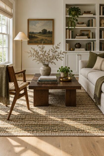
It also makes a room feel collected rather than assembled from a single catalog page.
The Almost-Match Trap
The most common mixing mistake is not too many wood tones.
It is finishes that sit close together without being the same.
A medium oak table beside a medium-brown chair in a slightly different stain reads as a failed attempt at matching, and the eye registers the near miss as accidental.
Learning how to mix wood tones in a room starts with training your eye on that gap.
Either commit to a close match or push the difference far enough that it reads as a choice.
The middle ground is where rooms feel unresolved.
Light makes this harder.
Warm bulbs can pull a cool brown toward orange, and daylight can pull an orange-brown toward gray.
Two pieces that look identical in a store may separate sharply once they are in your space.
Stand back from the arrangement and ask one question: is the relationship between these two woods obvious?
If you have to squint to decide whether they match, they are almost-matching, and that is the condition to fix.
Establish a Dominant Wood Tone
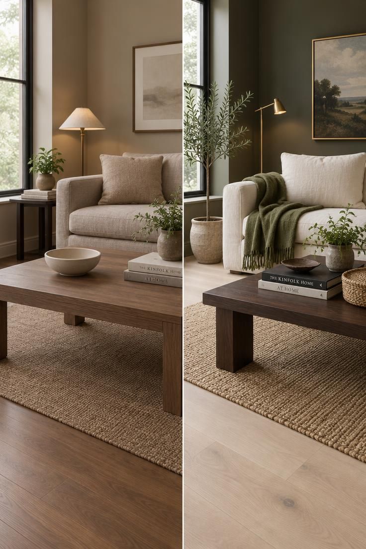
A room needs one wood tone that clearly leads.
Usually that is the largest fixed surface: the flooring, the kitchen cabinetry, a wall of built-ins, or a large piece such as a dining table or bed.
Pick that piece first, because supporting tones are chosen in relation to it rather than in competition with it.
A common decorating framework assigns roughly 60 percent of the wood presence to that dominant tone, 30 percent to a secondary tone, and 10 percent to accents.
Treat this as a visual guideline for hierarchy, not a measured standard.
It answers a practical question about how much of each wood to use, and it explains why one of every tone fails.
Identifying the dominant wood tone in a living room is often simpler than it sounds.
Look at the floor first, then the largest furniture piece, then the built-ins.
Whichever wood covers the most visible area and is hardest to change takes the lead by default.
Renters and anyone with fixed flooring face a different task.
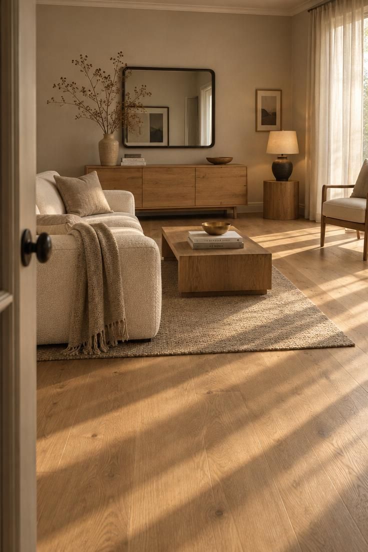
When the dominant wood cannot change, the rest of the room adapts to it.
Choose secondary pieces that share its undertone rather than fighting its color, and let contrast come from cushions, art, and smaller movable items.
Accent pieces do not need to match the dominant tone exactly.
A tray, a lamp base, or a picture frame only needs to share a similar depth or undertone to feel related.
The payoff is quieter than it sounds.
One tone leading means the eye has somewhere to rest, and the other woods read as supporting voices rather than rivals.
Learn to Read Undertones
Undertone matters more than exact shade.
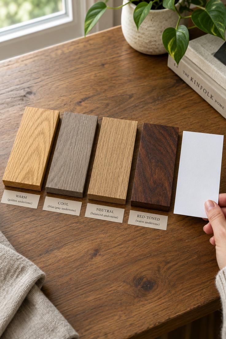
Warm and cool wood undertones describe the temperature a finish leans toward, and that temperature is what the eye reads first when two woods sit near each other.
Warm woods read yellow, orange, or red.
Cool woods read gray, ash, or faintly blue.
Neutral woods sit between the two and borrow from both sides.
Sorting your existing pieces by undertone takes a few minutes and changes every decision after it.
Hold a piece of white paper against each wood surface in daylight.
The paper gives your eye a neutral reference, and the wood’s lean becomes easier to name.
Two strategies follow from that sorting.
The first keeps the undertone consistent and varies the lightness, such as a pale natural oak floor with a mid-tone warm walnut table.
The second uses clear undertone contrast and links the two with a bridge material.
The combination that causes the most trouble is warm orange wood placed directly beside gray-washed wood with nothing between them.
The problem is not light against dark.
It is an unresolved temperature shift, and the eye keeps trying to reconcile it.
A gray-washed console beside an orange oak floor can look unfinished even when both pieces are handsome on their own.
Add a rug, a textile, or a painted surface that carries both temperatures, and the same two woods begin to read as a pair.
Make Contrast Legible, Then Repeat It
Contrast only helps when it is obvious.
A pale oak floor under a dark walnut table reads instantly, because the gap between them is wide.
Two medium-brown woods of slightly different stains read as muddled, because the gap is narrow and the eye cannot decide what it is seeing.
Once a contrast is clear, repeat it.
Any secondary tone should appear at least twice in the room so it registers as chosen rather than leftover.
A walnut coffee table paired with a walnut picture frame, a walnut lamp base, or a walnut tray turns a single piece into a theme.
Repetition does not demand an exact finish match.
Similar depth or a shared undertone usually carries far enough, and slight variation between the two appearances keeps the room from looking like a showroom set.
Texture gives you another way to create contrast without adding another color.
Smooth walnut cabinetry beside open-grain oak, or a polished table beside a rough woven stool, adds visual distance between finishes that are otherwise close in tone.
Grain scale works the same way, since a fine tight grain and a bold open grain read as different even when the color is similar.
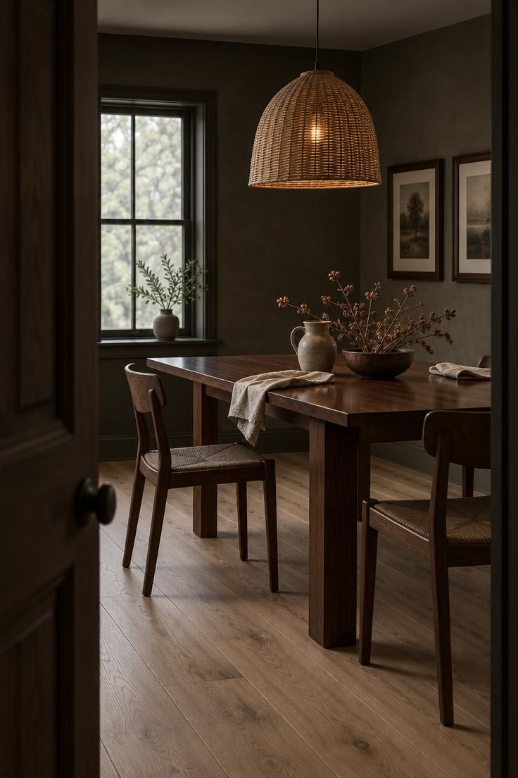
Design Pro-Tip: When two wood tones sit close in color, change something other than color. Swap in a piece with a visibly different grain scale, a rougher surface, or a different sheen, and the near-match becomes a readable contrast.
Use Painted Wood as a Neutral Pause
Painted wood is a deliberate non-wood surface, and that is exactly its value.
When several natural finishes are already in play, a painted chair, side table, or cabinet gives the eye a place to rest between them.
This tool matters most when the fixed woods cannot change.
Adding a painted piece is far simpler than refinishing a floor or replacing cabinetry, and it shifts the options from restyle or replace to reconcile what is already there.
A painted wood cabinet as a neutral pause between wood tones works because it interrupts the comparison.
The eye stops asking whether the two natural finishes match, and the painted surface absorbs that tension without competing.
Choose the painted color in relation to the room’s palette rather than in isolation.
A soft white, a muted sage, or a deep charcoal can each work, but the color should echo something already present in the textiles, stone, or wall color.
The caution is balance.
A room where every surface is wood leaves no relief, and the mix starts to feel heavy rather than layered.
One or two painted elements usually do more than a full painted scheme.
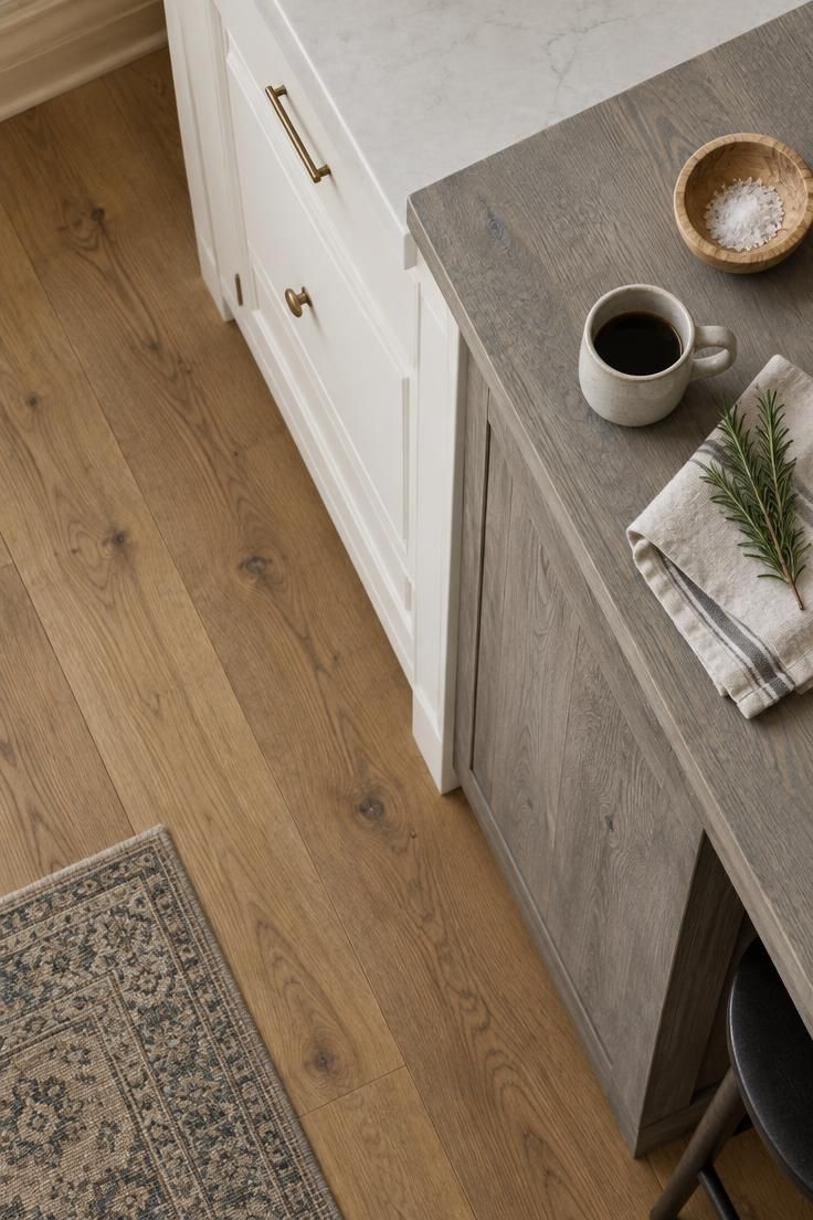
Connect Floors and Furniture with a Rug
A rug does two jobs at once.
It separates furniture legs from the floor, so the eye stops comparing the two finishes side by side, and it offers a palette that can pull from both wood tones at the same time.
Choice criteria matter more than pattern here.
Look for a rug that contains the lighter and the darker tone from your woods somewhere in its weave, whether in the pattern, the fringe, or a subtle tonal variation.
A rug that carries both colors gives the eye a shared reference point.
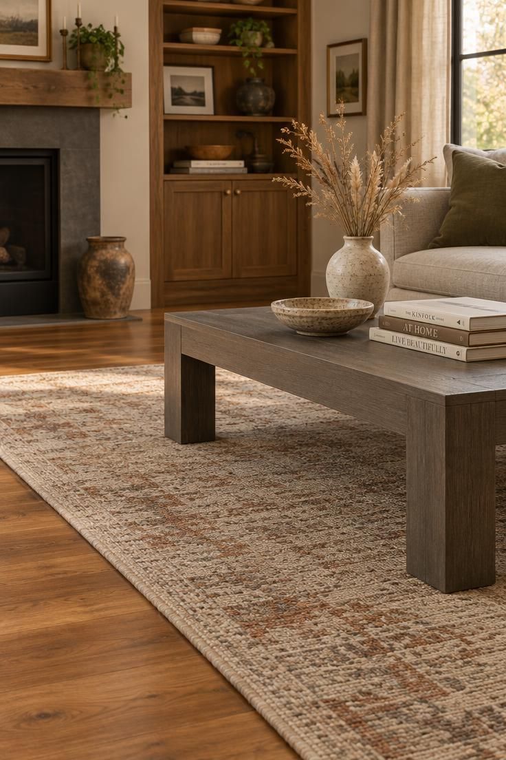
A walnut and oak furniture pairing becomes easier to hold together with a rug that repeats both depths.
A flat-weave wool rug in cream and warm taupe under a walnut table and pale oak chairs ties the two tones without asking either to change.
The bridging logic works beyond wood.
A cherry-toned floor with a gray-washed table can settle with a rug that includes muted rust, warm taupe, and gray-green, because the rug speaks both languages.
Textiles, leather, stone, and artwork serve the same function when a rug is not practical.
Wood Popularity in Kitchens and Moderate Use Elsewhere
Useful context exists for this topic, and it is worth being precise about what it does and does not say.
Wood cabinetry remains common in renovated kitchens.
The 2026 U.S. Houzz Kitchen Trends Study, which surveyed 1,780 U.S. Houzz users planning, completing, or recently completing a kitchen renovation, reports wood cabinetry in 29 percent of renovated kitchens, divided into medium wood at 15 percent, light wood at 11 percent, and dark wood at 3 percent.
That tells us wood is common and that medium and light tones currently outpace dark ones.
A broader finding comes from a Swedish Wood research publication, where a room containing both wood flooring and wood furniture was generally accepted across styles.
The study did not require the two wood surfaces to match.
A study of 425 spruce boards published in Annals of Forest Science found that consumers could distinguish seven visual categories of the wood, with five rated most favorably.
Visual character such as grain and pattern influenced response alongside color.
None of this proves that mixed wood tones are preferred over matched ones.
No high-quality survey directly compares the two.
What the research supports is narrower and still useful: wood is widely accepted in rooms, moderate wood use reads as normal, and the visual character of the wood matters to how people see it.
That is enough to justify treating deliberate mixing as a reasonable approach.
It is not enough to justify a claim that one strategy beats the other.
A Short History of Mixing Wood Tones
Deliberate mixing has a long precedent, which is worth remembering when the matching instinct feels like a rule.
Eighteenth-century French furniture makers routinely combined different woods within a single piece, using one timber for structure and others for veneer, inlay, and contrasting borders, as documented in the Metropolitan Museum of Art’s publication on the Wrightsman Galleries for French Decorative Arts.
The variation was part of the craft, not a compromise.
The Arts and Crafts movement took a related position, emphasizing honest construction, visible grain, and a unified relationship between architecture, furniture, and furnishings, as described by the V&A’s overview of Arts and Crafts design for the home.
Rooms in that tradition held multiple species and other natural materials together rather than forcing them into one finish.
Using a rug to connect mismatched wood floors and furniture is a modern version of the same instinct, a way of holding varied surfaces in one composition rather than eliminating the variation.
The matching-suite habit is comparatively recent and tied to how furniture was sold rather than how rooms were actually lived in.
Variety carried through a room can read as collected, and that reading depends on the relationships between pieces rather than on their sameness.
Room-by-Room Applications Without a Formula
Different rooms raise different decisions, and the same three-tone recipe does not fit all of them.
In a living room, the main decision is separation.
A rug between the floor and the furniture keeps the two finishes from being compared directly, which buys you freedom to use a darker table over a lighter floor.
In a bedroom, the decision is clarity between the bed and the nightstands.
Those two pieces sit close together, so a near-match reads as an error.
Push them apart in tone until the difference is unmistakable, then let the bedding and a woven bench carry lighter texture.
In a dining room, the decision is weight.
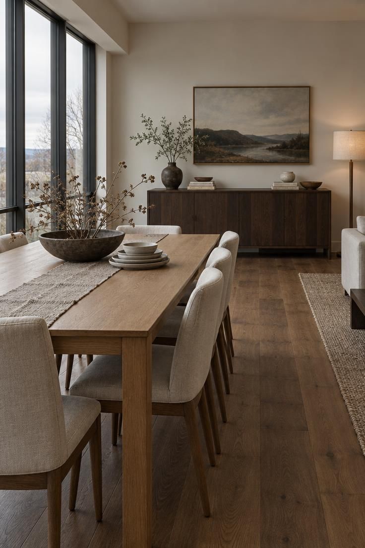
A dark table can dominate a space, so lighter chairs, a pale rug, or a light pendant softens its presence.
A vintage or antique piece at the table adds the collected quality that a matched set rarely has.
In a kitchen, the decision is division.
Painted perimeter cabinetry with a single natural wood element, such as an island or open shelves, keeps one wood finish in charge instead of scattering several across the room.
In an open plan, the decision is continuity.
Treat the whole space as one room rather than giving each zone its own palette, and repeat one tone across zones so the dining area, living area, and entry feel connected.
Each of these is a starting point rather than a template.
The tradeoff you accept in one room, such as a darker table for stronger contrast, may be the opposite of what another room needs.
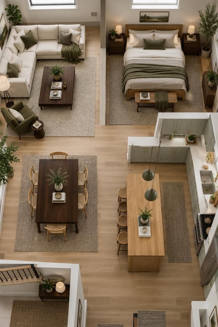
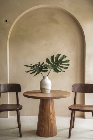
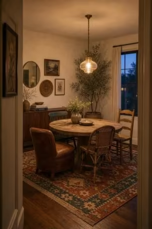
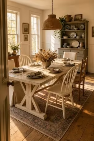
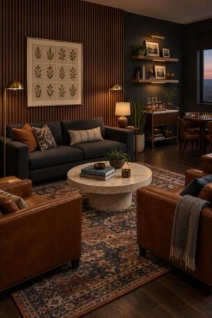
Illustrative design concept created with AI assistance and reviewed by the Simple Spaces editorial team.
Design Pro-Tip: Before buying anything, compare your existing woods in daylight rather than under warm interior bulbs. Warm bulbs shift browns toward orange, and a piece that looks wrong under a lamp often reads correctly once you see it beside the floor in natural light.
Common Problems and Practical Fixes
Most mixing failures are diagnosable conditions rather than matters of taste.
Too many unrelated tones is one of them, and a small room usually handles two or three major wood tones comfortably.
Past that, reduce the number or push some pieces into a supporting role.
Almost-matching finishes are the next condition, and the fix is a commitment rather than an adjustment.
Move toward a close match or push the contrast further until the difference is obvious.
Ignored undertones show up as a warm orange surface against a cool gray one with nothing between them.
Introduce a rug, a textile, or a painted piece that carries both temperatures, and the tension resolves.
Dark wood clustered on one side of the room creates imbalance, because dark pieces carry more visual weight than their size suggests.
Distribute the dark tone or repeat it on the opposite side in a smaller element.
An orphan tone used only once tends to look like a leftover.
Echo it somewhere else in a frame, a tray, or a lamp base, and it starts reading as a choice.
Rooms where every surface is wood need relief, so add fabric, stone, metal, glass, ceramic, or a painted surface.
Running through these checks before you shop eliminates most of them without spending anything.
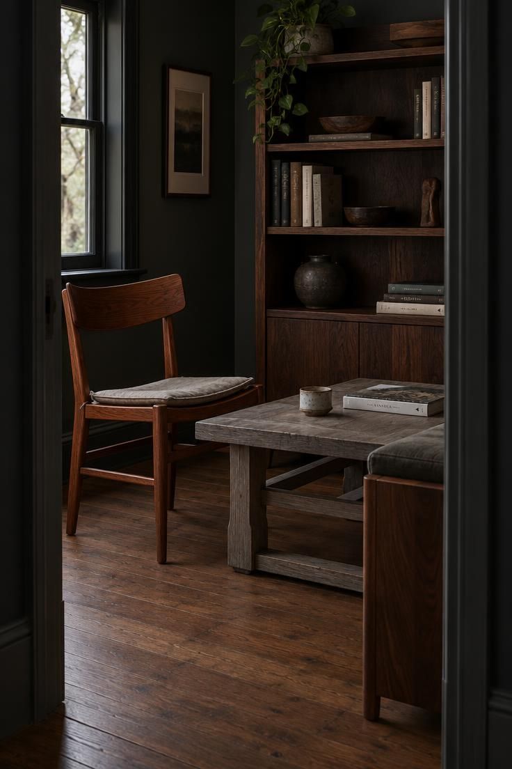
The Soft Middle Ground Between Match and Contrast
A mixed wood scheme becomes easier to plan when one finish acts as a bridge between the largest pieces in the room.
That bridge tone usually sits in the visual middle: lighter than dark walnut legs but deeper than raw oak shelves, or warmer than a gray-washed floor but quieter than a golden maple table.
Look for the bridge in small doses before committing to a large piece.
A narrow side table, picture frame, tray, stool, or lamp base in a medium tone can test whether two competing finishes begin to feel connected.
This middle tone rarely needs to match either side exactly.
Instead, it can borrow one quality from each neighboring wood, such as warmth from the floor and grain visibility from the furniture.
A room without a bridge tone can still look deliberate, but it often requires two unrelated finishes to share enough repeat contrast to avoid feeling accidental.
Adding one middle finish gives the eye a shorter path between extremes and makes an imperfect pair read as an intentional range.
The same bridge strategy works when a new piece arrives later.
If the room already has a medium wood object, the next wood addition has a reference point even when it is not a direct match.
Style Blueprint:
- Choose a medium wood object that repeats one visible trait from each dominant finish.
Place it where the two larger woods meet, such as beside a sofa leg, under a lamp, or at the edge of a rug.
- Medium walnut tray between pale oak flooring and dark stained chairs.
- Teak stool bridging a walnut coffee table and a white oak bench.
- Cherry picture frame connecting mahogany side tables and a maple bookcase.
- Mid-tone oak lamp base placed near a dark bed frame and light dresser.
- Pecan bowl on a sideboard that sits between two contrasting wood chairs.
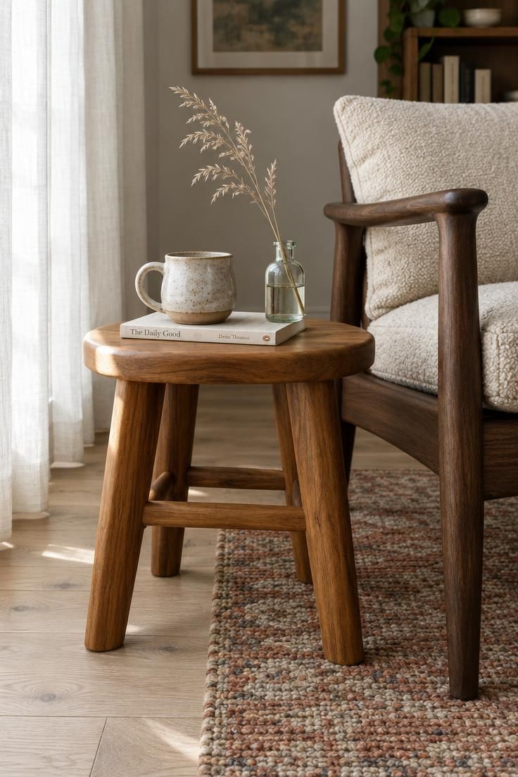
A Working Method for Your Own Room
A repeatable process makes this manageable, and it starts before any shopping.
Examine your existing woods in daylight, since artificial light exaggerates yellow and orange and will mislead you about what you actually have.
Inventory everything wood in the room.
Floors, doors, trim, cabinetry, ceiling beams, furniture, and small decorative objects all count, and the trim and doors are easy to overlook.
Identify the dominant wood, usually the floor or the cabinetry, and classify each remaining piece along three axes: light, medium, or dark; warm, cool, or neutral; rustic, smooth, or formal.
The classification gives you a map of where the tension sits.
Choose a strategy.
Either keep the undertone consistent and vary the lightness, or use a clear contrast and plan a bridge material from the start.
Repeat the secondary tone in at least two places, then add a bridge such as a rug, leather, woven fabric, stone, a painted surface, or metal.
Check samples in both daylight and evening light before committing.
Warm bulbs shift how undertones appear, so a finish that reads balanced at noon can turn orange after dark.
Run the method on one room first rather than the whole home.
A single room teaches you how your particular light behaves, and that knowledge transfers to the next space.
Reliable Combinations and the Ones That Need Work
Some pairings hold together easily.
White oak with walnut and cream textiles is forgiving because the depth gap is wide and the undertones sit close.
Natural oak with black-stained wood and neutral upholstery works for the same reason.
Dark walnut with pale oak leans on the contrast and benefits from a brass or bronze accent to warm the space.
Warm wood beside painted wood is another dependable route, since the painted element acts as a visual pause rather than a third competitor.
Teak with walnut holds when the walls and fabrics stay in warm neutrals.
Other combinations need more attention.
Orange oak beside gray-washed wood usually needs a rug, a wall color, black accents, or natural textiles to bridge the temperature shift.
Several reddish woods in equal amounts, such as cherry, mahogany, and red oak, can become heavy unless one clearly leads.
Three or four medium-brown woods of similar depth often read as a showroom because nothing dominates and nothing contrasts.
Highly rustic wood beside highly polished wood clashes in personality more than in color.
The pattern behind both lists is the same idea restated: related or intentionally opposed, never accidentally similar.
No combination is wrong when a clear relationship exists and one tone leads, so use these as diagnostics rather than rules.
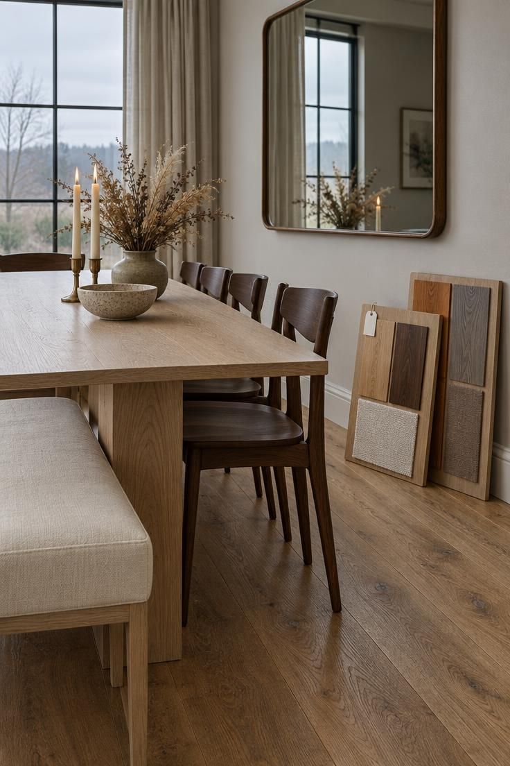
Honest Limitations of the Advice
This guidance does not claim a universal rule.
No measured preference establishes that mixed wood tones outperform matched ones, and the available research does not settle the question either way.
The 60/30/10 proportion is a design mnemonic for visual hierarchy, not a validated statistic.
The combination lists are starting points drawn from practical experience, and the undertone vocabulary is a descriptive way to group finishes rather than a technical standard.
Fixed elements constrain what is possible.
Flooring, cabinetry, and trim are expensive or impractical to change, so the framework prioritizes working around the dominant fixed wood rather than replacing it.
Lighting changes how wood appears, which is why checking samples in the actual room matters more than any general advice.
Taste and context vary genuinely between homes and between people, and the goal here is personal confidence rather than correctness.
Conclusion
The question is not whether your wood tones match.
It is whether they relate, and that relationship is something you can build deliberately rather than hope for.
Three decisions carry most of the work.
Establish one dominant wood, usually the largest fixed surface.
Classify the remaining pieces by undertone so you know where the temperature shifts are.
Repeat your secondary tone at least twice so it reads as chosen.
Then add a bridge.
A rug, a painted piece, a leather chair, or a stone surface gives the eye a shared reference point and lets two very different woods coexist without competing.
Start with the method rather than a purchase.
Photograph and inventory what you already own, write down the dominant tone and the undertones, and only then shop for pieces that strengthen a relationship already present in the room.
The one thing to try first is the daylight check.
Take a small movable piece, set it beside the floor and the largest furniture item near a window in the middle of the day, and step back far enough to see all three at once.
If the relationship is obvious from that distance, keep it.
If you have to squint, push the difference further or add a bridge, and the room will start reading as collected rather than accidental.