This post may contain affiliate links. If you make a purchase through these links, we may earn a commission at no additional cost to you.
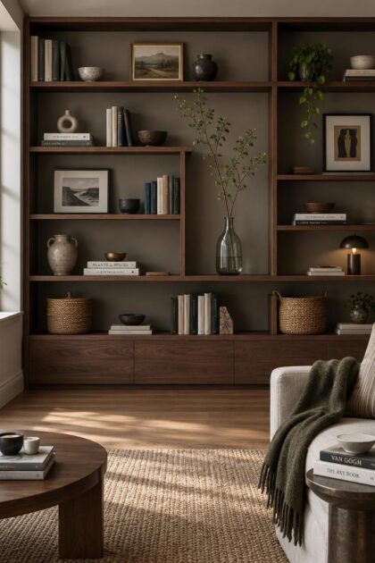
A shelf lined with carefully chosen objects can still feel unsettled, and a nearly empty one can feel just as unresolved.
What separates the two from a shelf that simply works is rarely the objects themselves.
It comes down to how visual weight is distributed across each level and how much of the surface stays open, two variables any reader can control.
Balance Is About Visual Weight, Not Mirror Images
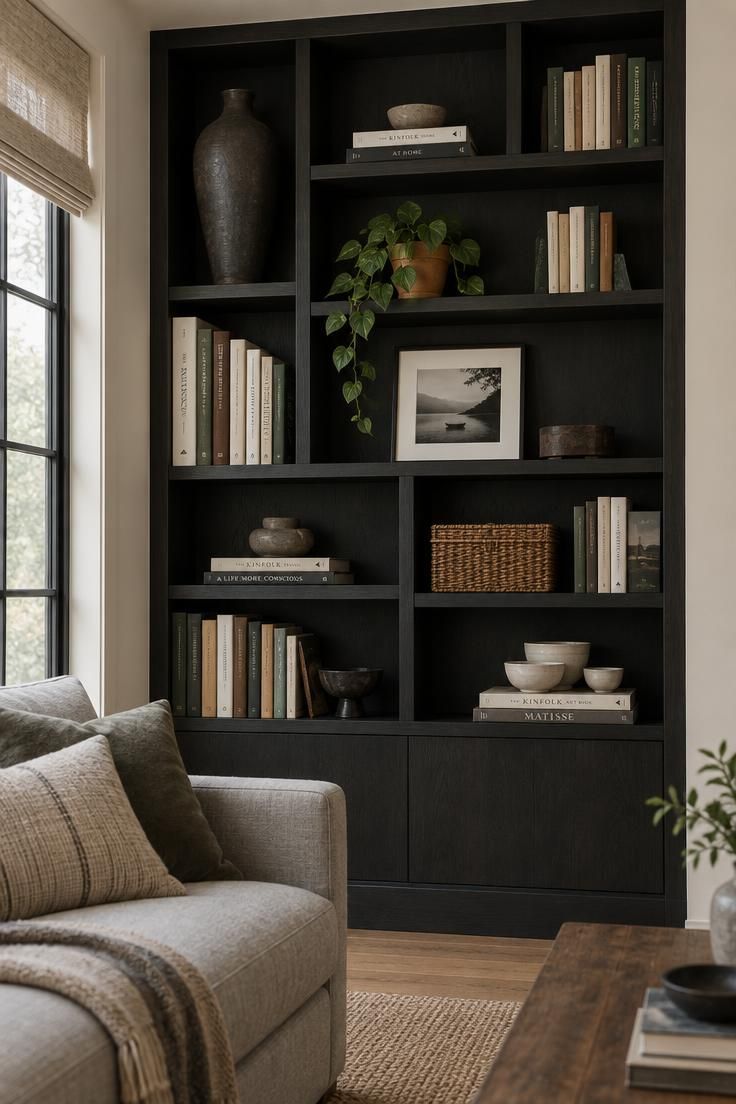
Balance on a shelf has little to do with matching pairs.
It describes how much visual weight each object carries and where that weight sits.
A tall dark vase reads as heavy.
A small pale ceramic reads as light, even when the two sit on the same board.
Distribution matters more than symmetry.
A gentle diagonal across the unit keeps the eye moving, with a heavy piece placed high on one side answered by a lighter grouping set lower on the other.
That approach applies whether the surface is a deep bookcase or a narrow mantel shelf display, where the same principle plays out across a shorter horizontal run.
One anchor object per shelf is usually enough.
Give it a partner of similar weight on the opposite side, then let smaller pieces fill the space between without competing for attention.
A quick working method: step back, scan for the side that feels overloaded or empty, and move a single weighty object rather than adding several small ones.
Squinting at the shelf softens the details and makes the heavy and light zones easier to spot, which is often faster than studying individual pieces.
Design Pro-Tip: Squint at the shelf from a few steps back and note which side pulls your eye first. Correcting that one imbalance usually settles the whole arrangement.
Spacing Works Only When You Count Empty Surface as a Material
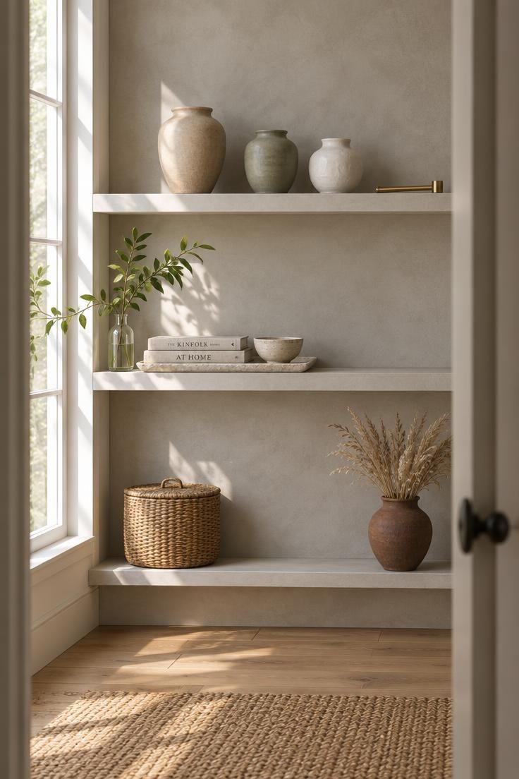
Empty shelf surface does real work.
It separates objects, gives the eye a place to rest, and keeps a collected arrangement legible instead of chaotic.
Filling every corner by default is the most common habit that works against it.
Visible back panel between pieces prevents a shelf from reading like a retail display, where every inch is merchandised.
A useful starting target is roughly sixty percent filled surface and forty percent open or lighter material.
That split shifts with function.
A kitchen shelf may need more usable surface for daily items, while a decorative arrangement can stretch toward half open without feeling sparse.
Shelf styling with negative space becomes easier once the open areas are treated as part of the design rather than leftover gaps.
Style the shelf completely, then remove pieces until the remaining empty areas feel deliberate rather than accidental.
Design Pro-Tip: Group tiny objects on a tray or shallow dish so they read as one element. This keeps their visual weight without consuming the open surface around them.
Purpose Decides Object Count Before Any Formula Does
Before any arrangement formula applies, the shelf has to answer a basic question: what does it need to do?
A living-room display balances books against decorative objects.
A kitchen shelf favors useful, washable pieces within easy reach, with fewer purely ornamental items.
A bathroom shelf leans toward moisture-tolerant materials and closed containers rather than untreated wood or delicate paper.
Object count follows from those answers.
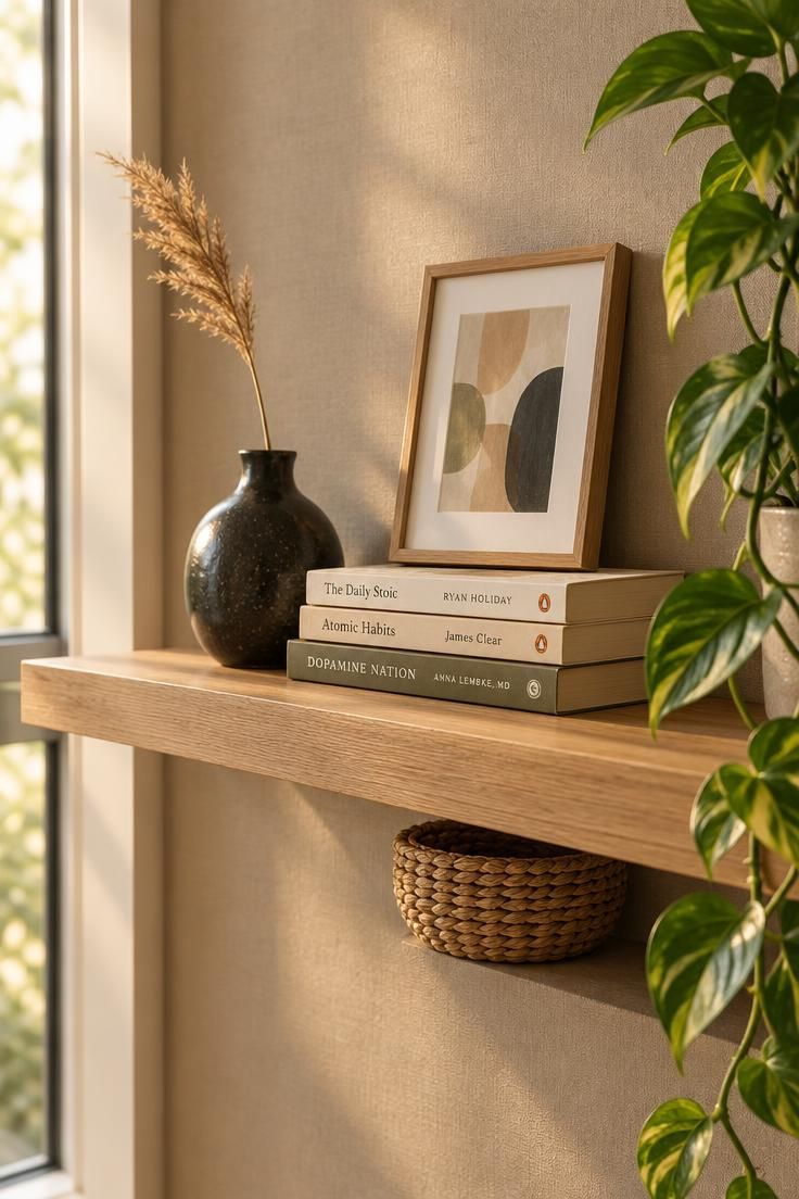
Floating shelves are typically narrower, so one framed print, one small vase, and a short stack may be the entire arrangement.
Built-ins can absorb more, yet not every compartment needs equal treatment; empty sections give a large wall room to breathe, which is a useful principle for built-in shelf decor across a wide span.
The same logic covers children’s areas, where lower shelves hold books and soft storage while heavy or fragile pieces sit higher.
On children’s shelving and any tall freestanding unit in a child’s space, anchor the furniture to the wall and keep heavy or breakable objects out of reach as part of learning how to decorate shelves responsibly in a family home.
An object that is neither used nor meaningfully displayed is a candidate for storage elsewhere.
That single decision rule resolves most disagreements about whether a piece belongs.
Design Pro-Tip: Write the shelf’s function on a sticky note before arranging anything. A mixed-use shelf that tries to store, display, and hide at once rarely reads clearly.
A Working Set of Arrangement Moves, With Built-In Exits
A starter vocabulary of composition moves helps, as long as each one comes with a stopping point.
Height variation keeps a shelf from reading flat.
Combine tall anchors, medium pieces, and low horizontal elements, then stop when every level matches the same profile.
Layering gives depth.
A foundation of books or baskets, structure from art or a tall vase, and personality from smaller objects creates a readable stack of visual information.
Small groupings carry more weight than scattered singles.
Two or three related objects can hold a shelf the way one large piece would.
Mixing book orientation creates movement.
Vertical runs, horizontal stacks, and an occasional outward-facing cover work together better than any single system applied throughout, and these habits sit at the center of most bookshelf arrangement ideas worth borrowing.
Repeated color or material ties unrelated objects together.
Two or three recurring qualities drawn from nearby furniture or wall color make an eclectic mix feel intentional.
Texture matters most when the palette is restrained, since smooth ceramic against rough stone or woven fiber supplies contrast that color alone cannot.
The misuse to watch for is repetition.
Applying the same formula to every shelf produces a catalog look, and varying which object plays the star role is what keeps a wall of shelves coherent.
Design Pro-Tip: Limit recurring colors or materials to three. Beyond that, repetition stops reading as cohesion and starts reading as noise.
Shelf Type Changes the Rules, Not the Goal
Different shelf types shift object count and scale without changing the underlying approach.
Floating shelves reward restraint.
Fewer objects, careful layering, and clear space around each piece keep a narrow surface from feeling crowded.
Built-ins carry the most visual weight because they occupy a large wall.
Break up the run with empty compartments, artwork, lighter objects, and repeated materials so the unit reads as composed rather than dense.
Kitchen shelves work best with items that are attractive and simple to clean, daily pieces kept within reach, and enough open space around objects to wipe the surface beneath them.
Bathroom shelves call for moisture-tolerant materials and closed containers, with paper goods and untreated wood kept elsewhere.
Children’s shelves put heavy and fragile items up high, with books and soft storage below.
The goal stays constant across all of them: distribute visual weight and protect open space in proportion to what the shelf can hold.
Why the Collected, Somewhat Imperfect Look Holds Attention
Strict minimalism has given ground to a warmer direction described across recent design reporting as curated and collected rather than sparse.
The 1stDibs designer survey cited in that reporting identifies maximalism and eclecticism as leading aesthetics, with chocolate brown, burgundy, dark green, and vintage pieces gaining favor.
That finding describes what surveyed designers reported preferring, not an outcome any arrangement produces.
Warm and deep accents reward a collected shelf because they give varied objects a shared tonal base.
Books with visible spines, handmade ceramics, small framed paintings, and inherited pieces all support the look.
So does a quieter interpretation built on wood, stoneware, woven baskets, branches, and generous empty space, which suits kitchen open shelving decor where practical pieces already supply most of the visual interest.
The test worth applying is whether a shelf looks like it evolved over time rather than being purchased and arranged in one session.
Either direction works: lean quiet with wood, stoneware, and open space, or lean collected with more objects anchored by repeated material.
Books Are Either the Strongest Material or the Loudest Clutter
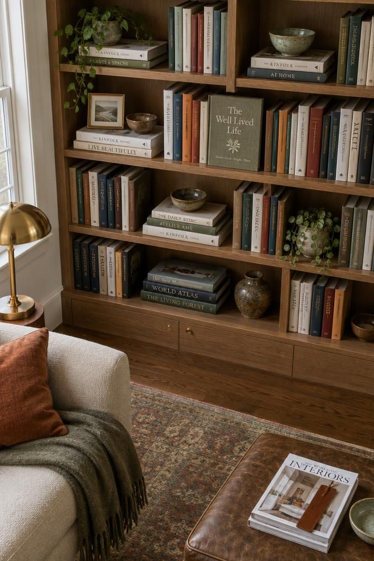
Books do more structural work on most shelves than any other object.
A vertical run gives order.
A horizontal stack doubles as a platform for a small object on top.
An outward-facing cover breaks the rhythm and draws the eye deliberately.
The problem starts when these approaches fight each other across a whole unit.
Survey data offers a useful reality check: among Americans who own books, roughly 22 percent organize by genre or subject, with smaller shares organizing by size, and only about 3 percent by color.
Color-based organization is a stylistic choice rather than a common habit, which is worth knowing before rearranging an entire collection around spine color.
Combining systems makes the most sense: organize the majority by subject, then use a few horizontal stacks as platforms or visual breaks.
Two habits work against the result.
Compressing books so tightly that removing one becomes difficult, and using books purely as props for other objects, which reads as staged rather than lived with.
Design Pro-Tip: Rotate seasonal or recently read books to the front of the shelf. Titles stay relevant without the collection growing beyond what the shelf can hold.
Knowing When to Stop Prevents the Shelf From Becoming a Chore
A shelf that is hard to maintain will be dismantled by ordinary use, which makes stopping before full a practical decision rather than an aesthetic one.
Overfilling is the most common failure.
Every occupied space flattens the importance of individual objects, so removing a portion of the arrangement and reassessing usually restores it.
Too many small objects reads as clutter.
Grouping them on a tray, or replacing several with one larger piece, corrects it.
Excessive symmetry reads as formal and static. Balance weight without mirroring the two sides.
Ignoring scale lets small objects disappear on deep shelves while oversized pieces crowd shallow ones.
Match object size to the surface and the room.
Decorating only at eye level leaves the upper and lower levels flat.
Carry interest through all three zones.
A photograph often reveals imbalance, repeated shapes, or missing height variation more clearly than close inspection, since the distance flattens the arrangement the way a passing glance would.
Open shelves also collect dust, and leaving clearance around objects makes cleaning beneath and behind them possible without dismantling the display.
Conclusion
The goal is not a full shelf but a balanced one.
Three moves carry most of the work: decide what the shelf is for, remove more objects than feels comfortable, and vary where the visual weight sits rather than mirroring it.
Start by emptying the shelf completely and cleaning it, which prevents rebuilding the same arrangement by habit.
Then rebuild using no more than two-thirds of what was there, keeping the open areas as deliberate as the filled ones.
Treat the result as an ongoing edit rather than a finished arrangement, since how to decorate shelves well is a practice of adjusting rather than a single completed task.