This post may contain affiliate links. If you make a purchase through these links, we may earn a commission at no additional cost to you.
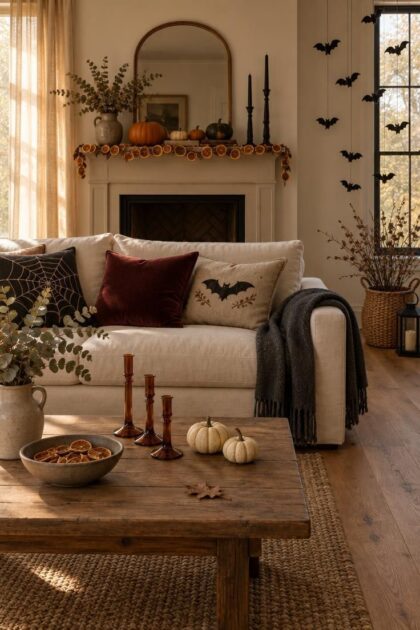
A living room, bedroom, dining room, or entry can read as Halloween without turning into a full haunted house.
Coziness comes from layering texture and warm light over familiar furniture, not from covering every surface with themed objects.
Each idea below describes a specific arrangement: what sits in the frame, how the heights stack, what the light is doing.
Some ideas store flat, some suit small rooms, and some lean family-friendly while others lean moody.
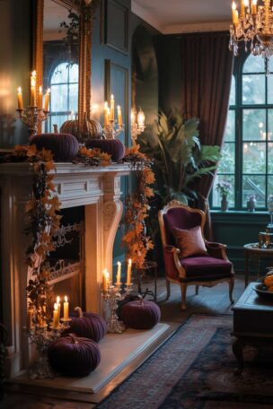
Layer a Three-Height Mantel Vignette with Amber Candlesticks
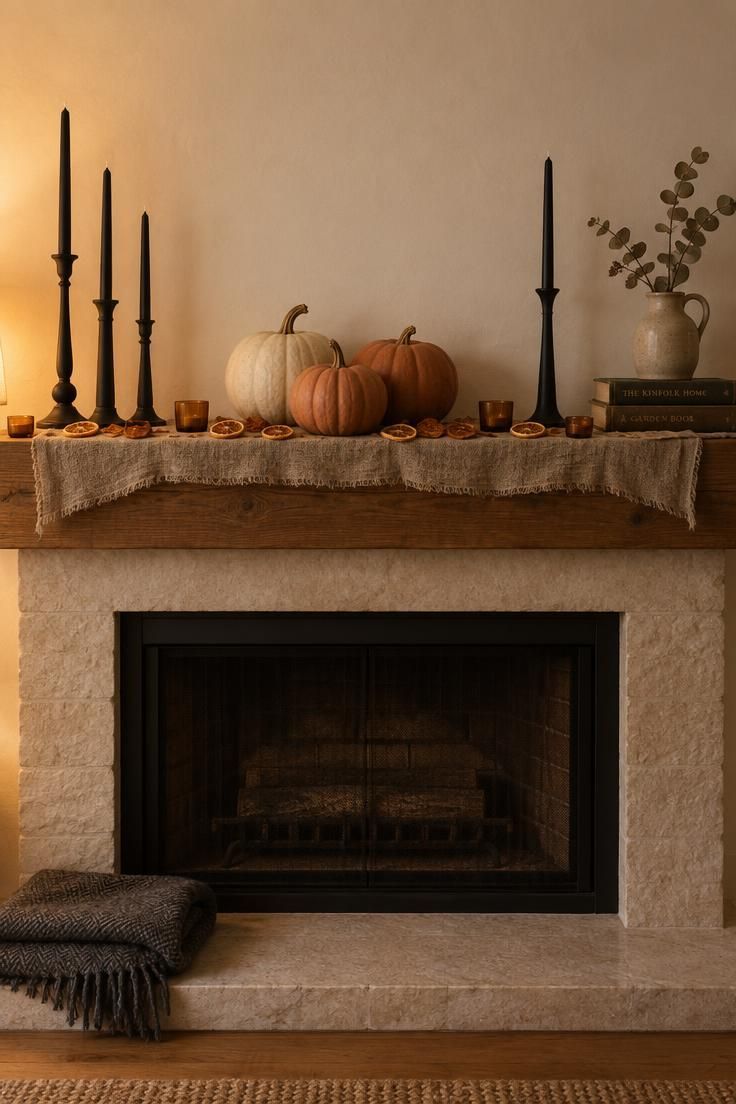
Candlelight at three heights gives the mantel a depth that a single row cannot.
Darker objects sit at the back so the bright front row reads against them.
Odd numbers and an asymmetric balance keep the arrangement from looking like a store display.
A warm white, cream, and burnt umber scheme with one oxblood accent shifts neatly into Thanksgiving after October.
Flameless LED tapers read as calm and repeatable, while real wax tapers give a live flame flicker and come with their own handling instructions printed on the packaging.
Candlesticks that store flat or stack are easier to keep year to year than wide ceramic bases.
Keeping the front row under three inches tall preserves the layered look without hiding the objects behind it.
Style Blueprint:
- Cream and burnt umber for a warm, unspooky mantel
- Matte black candlesticks over glossy finishes
- Dried orange slices instead of faux autumn leaves
- Keep the front row under three inches tall
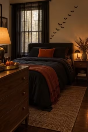
Float a Drift of Felt Bats Above a Window
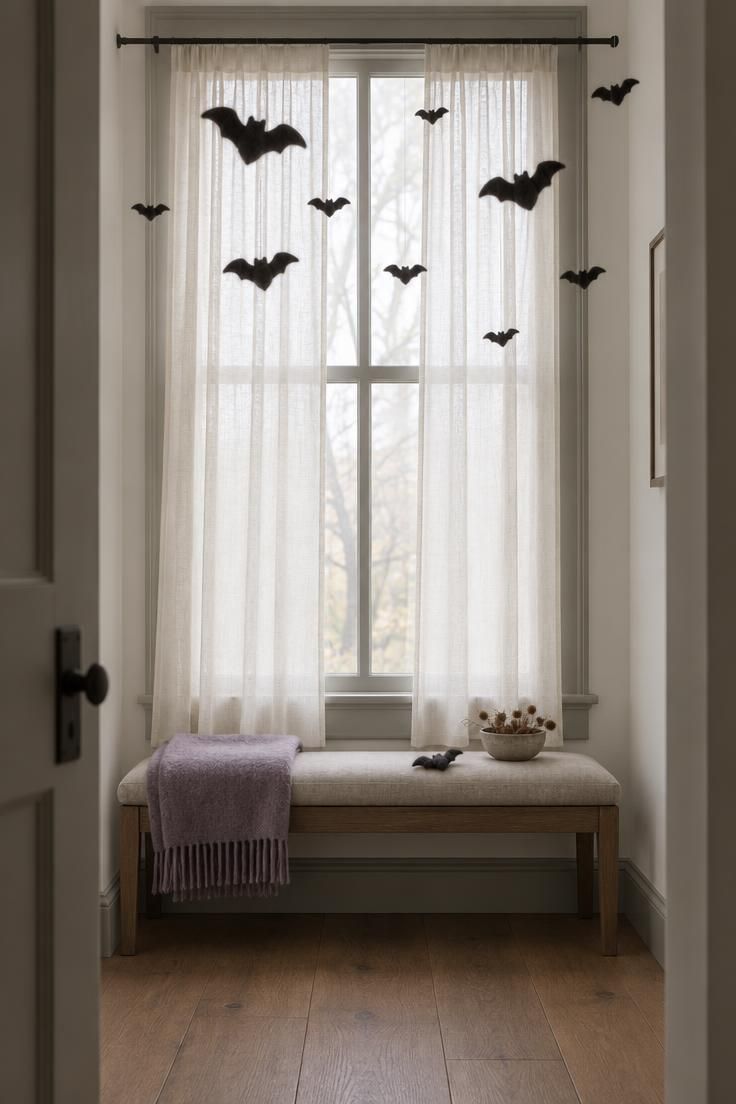
This is halloween living room decor that works in the smallest bedroom because it uses the air above furniture instead of floor or wall area.
Felt is heavier than paper, so each bat holds its shape and casts a slightly softer shadow than a cardstock cutout.
Varying the height and horizontal spacing makes the drift feel scattered rather than strung in a line.
Two or three loose clusters read better than an even row across the whole window.
Felt collects dust over a season, and a soft brush between seasons keeps it presentable.
Flat storage prevents creasing, though felt takes more storage volume than paper.
Paper bats store flatter and cost less, but they crease and curl over time.
Style Blueprint:
- All-black felt with no glitter for a quiet read
- Charcoal and cream mix for a softer, less graphic wall
- Skip the string and suspend on fine monofilament for a floating look
Build a Dark-Runner Tablescape with Low Centerpieces
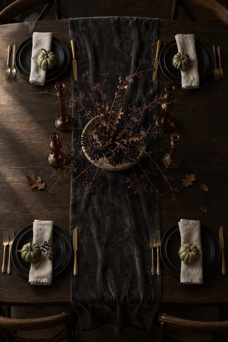
Keeping the centerpiece low preserves sightlines across the table, which matters more at a dining table than at a console.
A charcoal, oxblood, antique gold, and muted green palette sets a moody direction distinct from classic orange and black.
Velvet runners crease in storage, so hanging or rolling one keeps the surface smooth between seasons.
Dried branches shed, and a shallow tray underneath makes cleanup easier.
For a small apartment, the same idea scales to a coffee table with a narrow tray, three candlesticks, and two gourds.
Dried botanicals are one-season and brittle, while faux stems last for years but read flatter in close-up.
This is the moody direction for readers who want halloween dining room decor that adults at a dinner party will notice without the room shouting.
A low bowl at six inches or less keeps the arrangement below eye level when guests are seated.
Style Blueprint:
- Oxblood and antique gold for a refined table
- Amber glass candlesticks instead of black metal
- Low bowl at six inches or less so guests can see across
- Mismatched place settings for a collected, lived-in feel
Swap Gallery Wall Prints for Halloween Art in the Same Frames
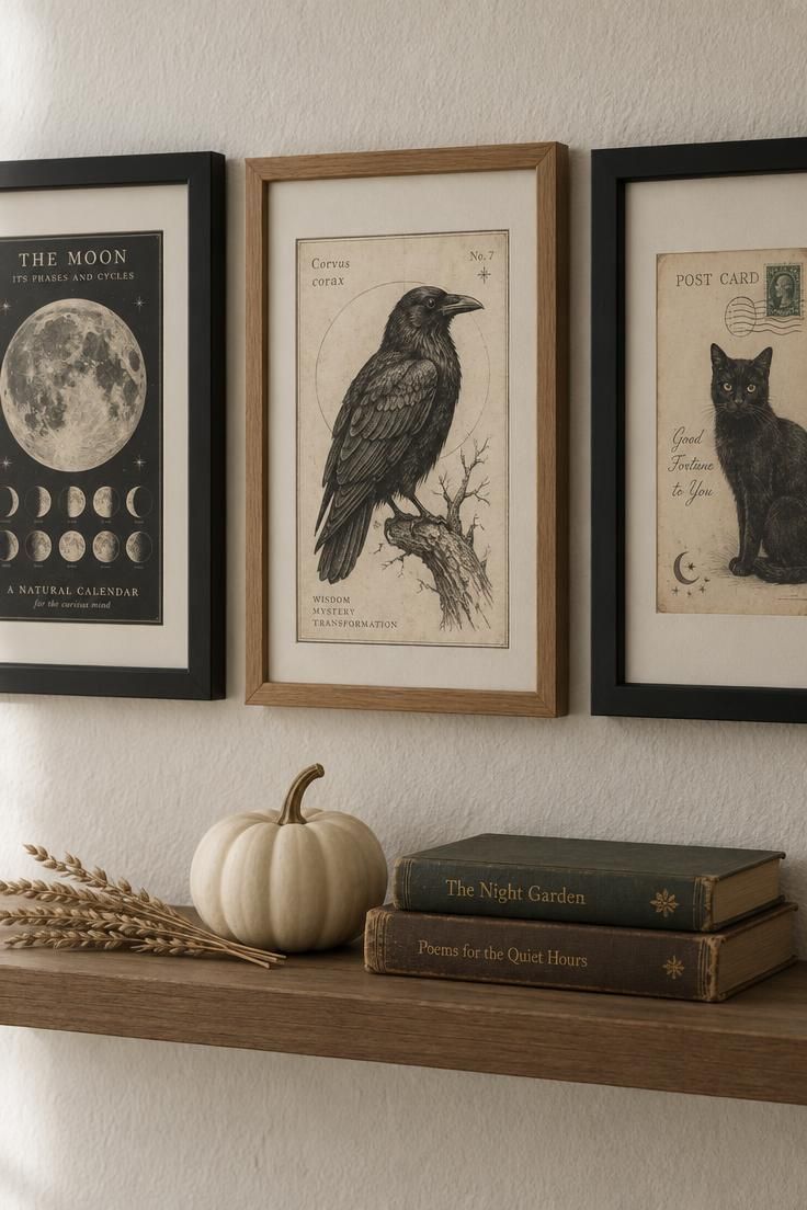
Keeping the frames and layout unchanged preserves the room's everyday coherence, so the seasonal shift reads as an edit rather than a takeover.
Matte paper prints sit quietly next to glossy photos, so mixing matte Halloween paper with existing prints keeps the wall from looking patched.
Paper prints store flat in a folder and take almost no space, which makes this the easiest idea to keep year to year.
This suits halloween decorations in a living room or hallway where a gallery wall already exists and adding more objects would crowd the room.
Moody illustrations read better than cartoon graphics in an adult room.
One printed reference and one silhouette give the wall balance without repetition.
Style Blueprint:
- Moody illustrations over cartoon graphics for an adult room
- Mixed cream and off-white mats to soften black frames
- One printed reference and one silhouette for balance
Design Pro-Tip: Photograph a gallery wall straight on from the center frame, not at an angle, so the reflection in the glass disappears and the spacing reads true.
Tuck Small Seasonal Objects Into a Bookcase
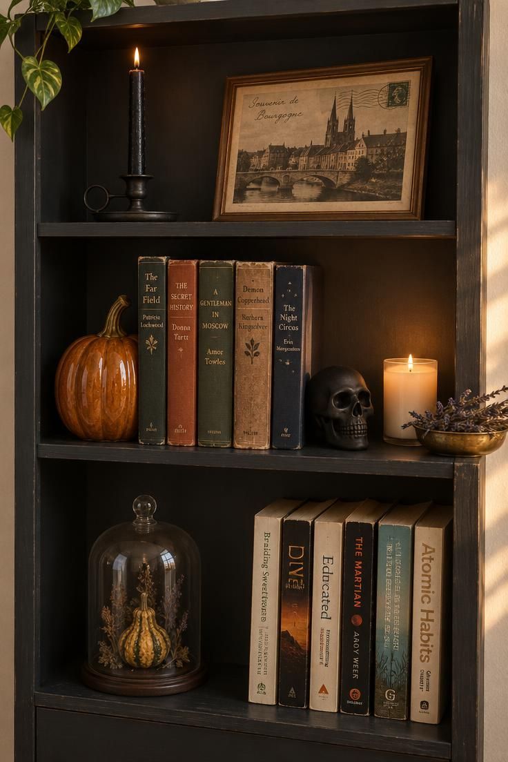
The contrast between ordinary books and seasonal objects is the point, since objects tucked between everyday items read as collected rather than staged.
A neutral base with one warm accent color keeps the shelf from competing with the room's existing palette.
Heavier ceramic and metal pieces sit better on lower shelves, where they are more conspicuous in a photograph.
Glass cloches over a small object add a museum-case feel.
A bookcase takeover needs no wall space and no floor space beyond what the furniture already uses.
Ceramic and metal pieces are heavier but last many seasons, while small paper items need a flat folder or they warp.
Felt and plush objects tolerate contact better than glass or ceramic at low, reachable heights.
Too many small objects on a shelf turns into clutter, so edit two everyday items off the shelf before adding seasonal ones.
A leaning print rather than a hung one keeps the shelf arrangement casual.
Style Blueprint:
- Ceramic pumpkin and matte-black skull as the two anchors
- Warm white candle instead of a colored one
- One framed print leaning, not hung, for a casual shelf
- Remove two everyday objects before adding three seasonal ones
Create a Cozy Corner with a Seasonal Pillow and Floor Cluster
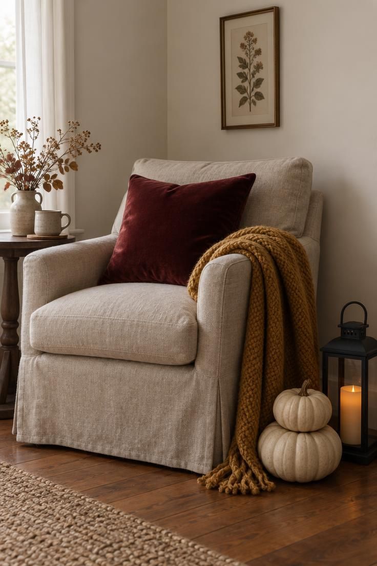
The low floor cluster balances a busy wall above and grounds the corner so the eye has somewhere to rest.
This is the single most adaptable idea in the list because it works in a bedroom, a living room, or a reading nook without moving furniture.
Mustard and cream give a retro-leaning corner, while charcoal and black give a moodier read.
A pillow cover in velvet or cotton stores flat and can be swapped seasonally without buying a new insert.
Floor clusters are easy to knock over in a walkway, so keeping them beside a chair or sofa, out of the path of traffic, is the practical placement note.
Velvet over cotton gives a deeper read for the pillow, and a chunky throw in a seasonal color folded rather than draped keeps the shape clean.
Two pumpkins at different heights make a low stack that reads as intentional.
Style Blueprint:
- Velvet pillow cover over a cotton one for a deeper read
- Chunky throw in a seasonal color, folded not draped
- Black metal lantern instead of a glass one for a quieter look
- Two pumpkins at different heights for a low stack
Set a Bedside Vignette with a Small Gourd and a Seasonal Print
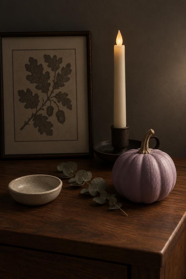
Halloween bedroom decor leans cozy over spooky, with warm low light rather than bright or colored light, and soft textures instead of harsh surfaces.
Three heights again: the framed print leaning at back, the taper at mid, the gourd and dish at front.
Painted or uncarved gourds last longer indoors than carved ones, and the paint keeps them from looking farm-stand plain.
A single nightstand-sized vignette takes fifteen minutes to set up and stores in a shoebox.
Framed prints store flat with paper between them, and a taper fits in a drawer with no problem.
The vignette is small, so each object has to earn its place, since a fourth object usually crowds it.
Dusty lavender and cream against warm wood give a softer read than classic orange and black.
An iron taper holder over brass keeps the moodier tone consistent.
Style Blueprint:
- Dusty lavender and cream against warm wood
- Iron taper holder over brass for a moodier read
- One printed motif only, do not stack themes
Drape a Doorway with a Fabric Swag and Beaded Garland
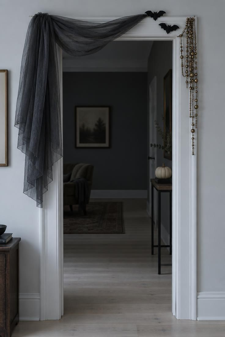
The asymmetrical drape and off-center garland create halloween entryway decor that announces a theme without blocking sightlines or traffic.
Tulle and lace drape softly and pack down into almost nothing.
Beaded garlands tangle if stored loose, so a small box or a sealed bag keeps them usable.
The entry or hallway is the natural spot for this because it sets a tone before the room itself is fully in view.
The same treatment works over a bedroom door or a stair opening.
Charcoal tulle over black lace gives a softer edge, and antique gold beads add a warm accent.
Two or three hanging pieces are enough, since filling the frame tips the look toward a party decoration.
Style Blueprint:
- Charcoal tulle over black lace for a softer edge
- Antique gold beads for a warm accent
- Two or three hanging pieces only, resist filling the frame
Style a Console or Sideboard as a Potion Station
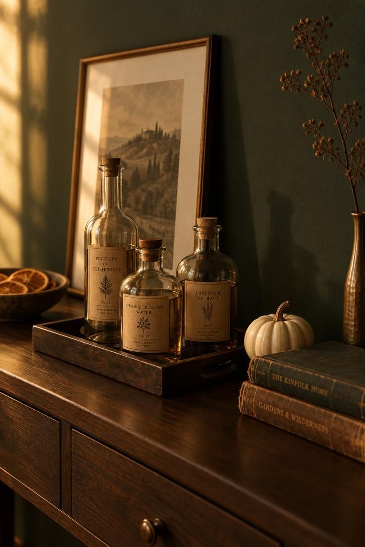
A tray groups loose objects into one visual unit, which keeps a busy console from looking scattered.
Glass bottles with handwritten labels read as deliberate, while the same bottles with printed adhesive labels read as kitschy, so label style is the deciding detail.
This console doubles as a candy station for a party or a drink station for a movie night, so the idea earns its floor space.
Antique gold, deep green, and oxblood give a moodier read, while cream and mustard give a retro one.
Bottles with narrow necks are harder to clean than wide-mouth jars, and wide-mouth jars also read as more literal specimen jars, which can tip toward kitsch.
A tray keeps small pieces contained between seasons, and empty glass bottles store on a shelf with no special handling.
This arrangement needs a flat surface with some depth, so it works less well on a narrow entry shelf.
A low bowl rather than a tall vase keeps height under control.
One accent color across the tray holds the arrangement together better than three.
Style Blueprint:
- Handwritten labels on kraft paper, not printed stickers
- One accent color across the tray, not three
- A low bowl rather than a tall vase for height control
- Leaning framed print at the back to anchor the vignette
Design Pro-Tip: Group the smallest objects on a tray before placing them on a console, since the tray does the visual work of organizing the surface for you.
Hang a Celestial Mobile of Paper Moons and Stars
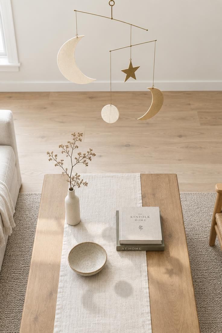
The mobile draws the eye up, which is useful for diy halloween room decor in a living room where wall and floor surfaces are already spoken for.
One mobile with three or four shapes at varied lengths reads as deliberate, while a dense one reads as a party decoration.
Matte cardstock with a slightly heavier weight holds shape and reads crisply against a plain wall, while lightweight paper curls.
Cream and antique gold give a celestial, warm read, and charcoal and cream give a cooler, more graphic one.
Mixing the sizes of the moons keeps the mobile from feeling repetitive.
A single star among the moons adds a point of difference without clutter.
Style Blueprint:
- Matte cardstock over foil or glitter
- Antique gold string for a warm accent
- Three or four shapes per mobile, not seven or eight
Dress a Sofa with Patterned Pillows and a Wool Throw
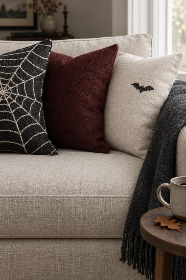
Mixing one patterned pillow with two solids keeps the pattern as the accent rather than the theme, so the sofa still reads as a sofa.
Pillow covers with hidden zippers store flat and can be swapped onto existing inserts.
Wool throws hold a folded edge better than acrylic.
Choose patterns at two different scales or the sofa reads busy, since a web pattern next to a small embroidered motif works while a web next to a candy-corn stripe does not.
A neutral cream base with black and oxblood accents also reads as fall room decor, so it can stay up past Halloween.
Throw pillow covers are the least expensive way to shift the color of a room seasonally, since the inserts stay put.
A wool throw needs gentle care and a place to store without creasing, while a cotton one is more forgiving but reads flatter.
Skipping orange in this arrangement keeps the sofa from looking like a costume.
Style Blueprint:
- One patterned pillow, two solids, always in that ratio
- Oxblood or charcoal as the solid accents
- Wool over acrylic for the visible folded edge
- Skip the orange, this reads as an autumn scheme
Arrange a Monochrome Corner Using Texture and Shadow
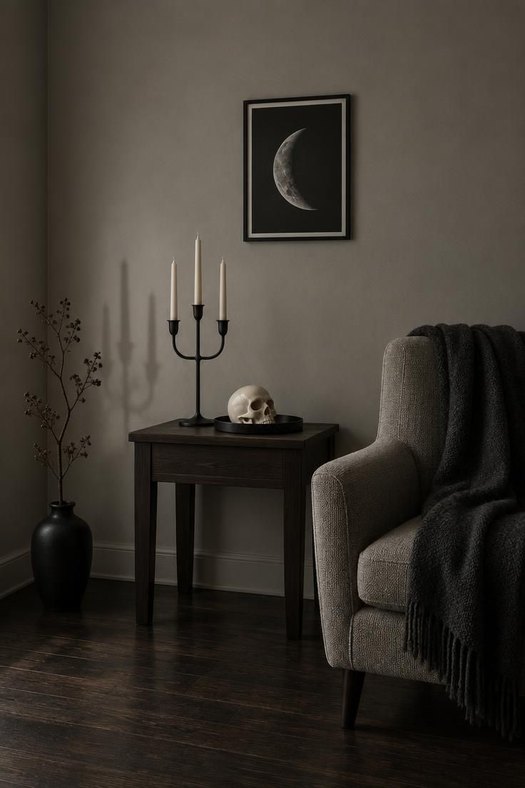
With no color to organize the frame, texture does the work: matte against gloss, woven against smooth, hard against soft.
Black and cream plus one soft grey middle tone keep spooky room decor cool and restrained.
This suits a modern or minimal room where seasonal color would fight the existing palette.
Matte finishes absorb light and read quiet, while gloss reflects and reads graphic, and either can carry the corner as long as the mixing is careful.
Monochrome relies on the lighting in the room already being low or directional, since a brightly lit monochrome corner flattens.
Matte black metal over painted metal keeps the finish consistent across the candelabra and tray.
Cream ceramic over white ceramic adds warmth against the dark wood.
One woven element breaks up the smooth surfaces and gives the eye a place to land.
Style Blueprint:
- Matte black metal over painted metal
- Cream ceramic over white ceramic for warmth
- One woven element to break up smooth surfaces
Design Pro-Tip: For monochrome arrangements, keep the background plain and let a single directional light source cast the shadow, since the shadow is the accent color.
Cluster Lanterns and Pumpkins on the Floor Beside a Console
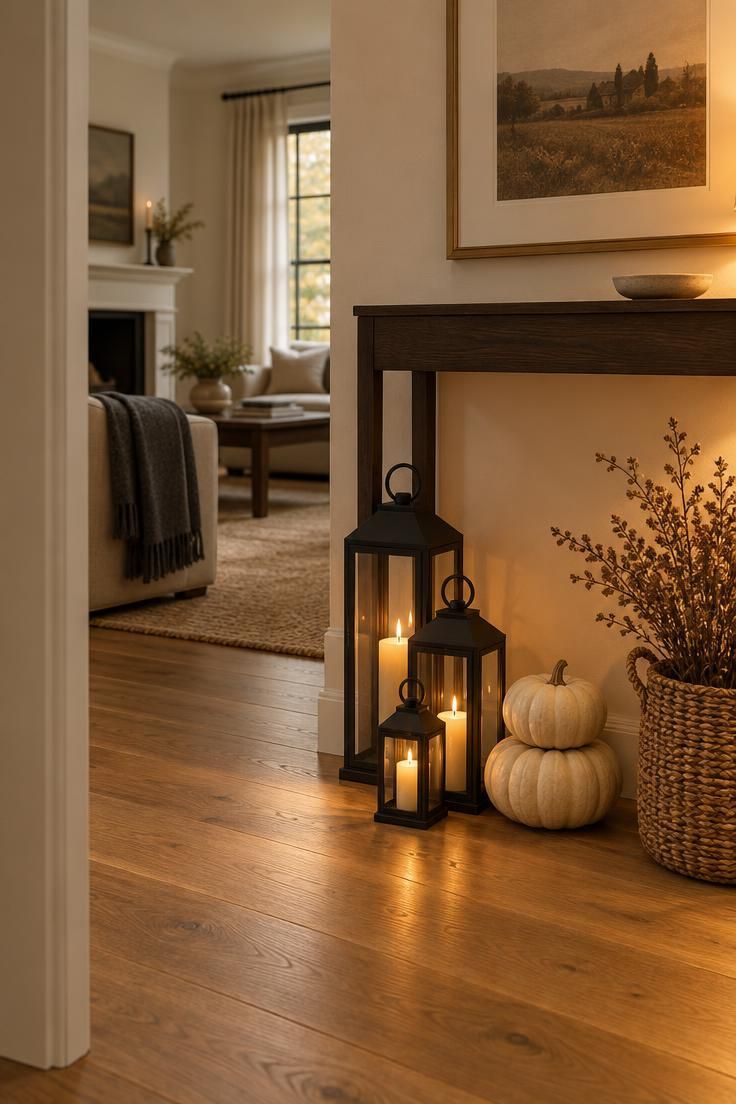
The floor cluster grounds the vertical line of the console above it, so the two elements read as one arrangement rather than two.
This approach to halloween home decor keeps lanterns in matte black metal reading as grown-up, while a woven basket adds a warm natural texture that balances the harder metal.
Floor arrangements near a walkway get bumped, so keeping them tucked beside furniture rather than in a path is the placement note that matters most.
Floor clusters take real floor space, so they suit rooms with a wide enough gap between furniture pieces.
Graduated lantern sizes give the cluster a visual hierarchy.
Cream pumpkins instead of orange give a softer read against the dark metal.
A woven basket rather than a plastic bin keeps the branches looking intentional.
Keeping the tallest lantern at eighteen inches or less holds the cluster low and keeps it from competing with the console.
Style Blueprint:
- Graduated lantern sizes for visual hierarchy
- Cream pumpkins instead of orange for a softer read
- A woven basket, not a plastic bin, for the branches
- Keep the tallest lantern at eighteen inches or less
Conclusion
Coziness comes from layering over existing furniture rather than replacing it, with warm light, texture, and one or two well-placed heights per surface.
The ideas here span a range of registers, from classic and moody to retro, monochrome, and fall-adjacent, so two or three that suit the room you already have will go further than trying all of them.
Flat-storing paper and fabric pieces last year to year, and editing two everyday objects away before adding seasonals keeps any arrangement from crowding.
Real candles and flameless candles are different choices, and the packaging instructions for whichever is used are the relevant guide.
Cozy halloween decor keeps the room recognizable, only warmer.