This post may contain affiliate links. If you make a booking or purchase through these links, we may earn a commission at no additional cost to you.
A front door is a narrow vertical canvas, and it gets viewed from three distances at once: the sidewalk, the walkway, and the threshold.
Most displays only work at one of them, which is why a jumble of props can feel festive up close and invisible from the street.
Curb appeal here is a composition question rather than a shopping question, and silhouette, contrast, layering, and scale decide the answer.
Each idea below is anchored to a different compositional move, so you can pick one direction instead of piling on more items.
The standard running through all of it: an entry that still looks intentional at noon and reads clearly at dusk.
Black Bat Colony Across a Pale Door
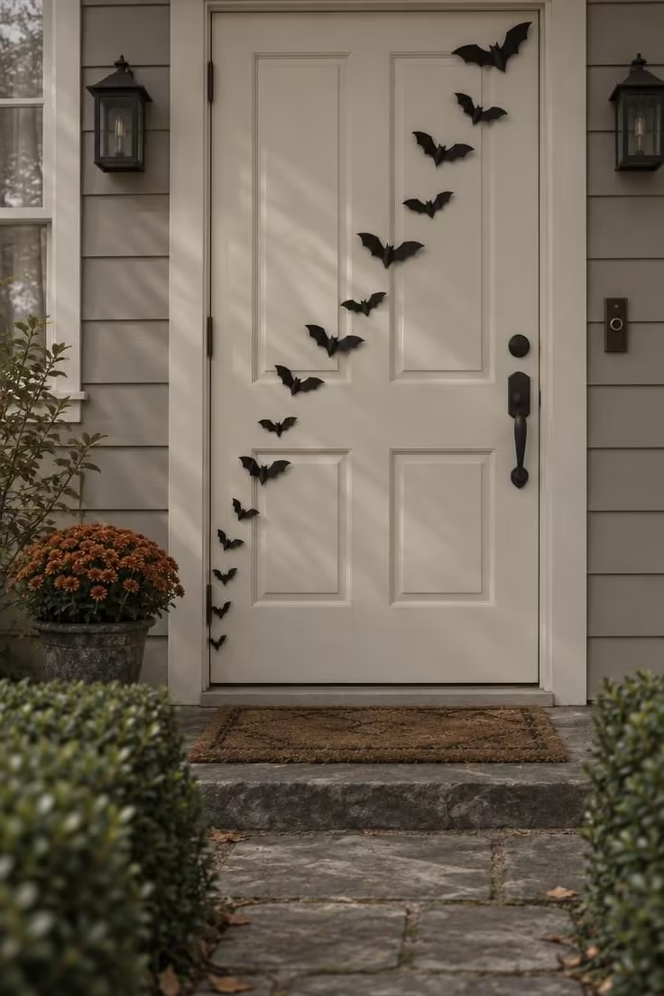
A pale or mid-tone door is the starting condition for this idea, since the whole composition depends on the gap between dark cutouts and door color.
Against a black door, the bats simply disappear.
Mixing scales is what creates the sense of lift.
A few bats cut large enough to register from the sidewalk carry the design, while smaller ones reward a closer look at the threshold.
Paper takes the crispest silhouette, felt softens the edges and tolerates a damp porch better, and thin painted wood holds its shape across seasons.
Keep the bats rising in one consistent diagonal, largest at the bottom, rather than scattering them evenly.
For halloween front door decorating, this bat colony works because the narrow vertical face of the door becomes a single graphic field rather than a backdrop for a collection of props.
Before committing to a layout, step out to the sidewalk and judge the spacing from there, because a cluster that looks crowded up close is often correctly spaced at street distance.
Flat cutouts also stack in a folder at the end of the season, which makes this one of the easier displays to store and redeploy.
Style Blueprint:
- Matte black bat cutouts in at least three distinct sizes
- A light or mid-tone door surface to work against
- Removable adhesive putty or low-tack dots for repositioning
- A step-back vantage point at the sidewalk for spacing checks
- A flat folder or envelope for off-season storage
Asymmetric Twig Wreath with a Single Raven
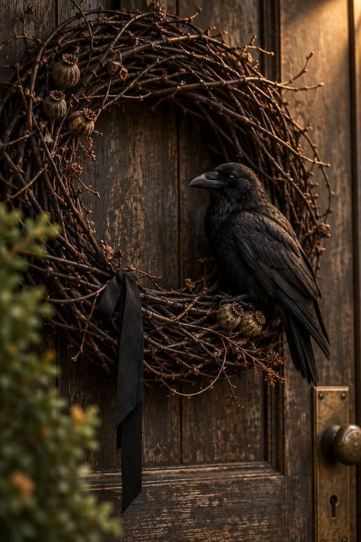
A wreath gives the door a fixed focal point, and shifting it left or right breaks the formal symmetry that makes many halloween door wreaths feel interchangeable.
Bare twig structure reads as October rather than December, so the wreath stays in season instead of drifting toward holiday territory.
One dramatic accent does the work here.
A black raven, a black cat silhouette, a bundle of dried branches, or a small aged-paper tag can each carry the same role, and the idea only holds when there is one accent rather than three.
Push the wreath too far toward the hinge and it crowds the door edge, which makes the offset look accidental rather than chosen.
Dried grapevine and birch hold their shape well but shed small pieces over time, while faux twig reads flatter in daylight and sheds less.
On a door already carrying a year-round wreath hanger, a name plaque, or a house number, an offset wreath tends to compete with those fixed elements instead of anchoring around them.
This approach pairs naturally with other halloween door decor that leans on restraint, since the twig texture and single accent already carry the season without extra props.
Style Blueprint:
- A dense dark twig or grapevine wreath
- One black raven, cat, or branch accent
- Narrow matte black ribbon for the hanger
- A door free of competing plaques or hardware
- Dried seed pods for tucked-in texture
Design Pro-Tip: Choose the ribbon width relative to the door rather than the wreath, since a ribbon that looks generous in hand often reads as a thin stripe once the door is seen from the walkway.
Garland Frame with an Empty Center
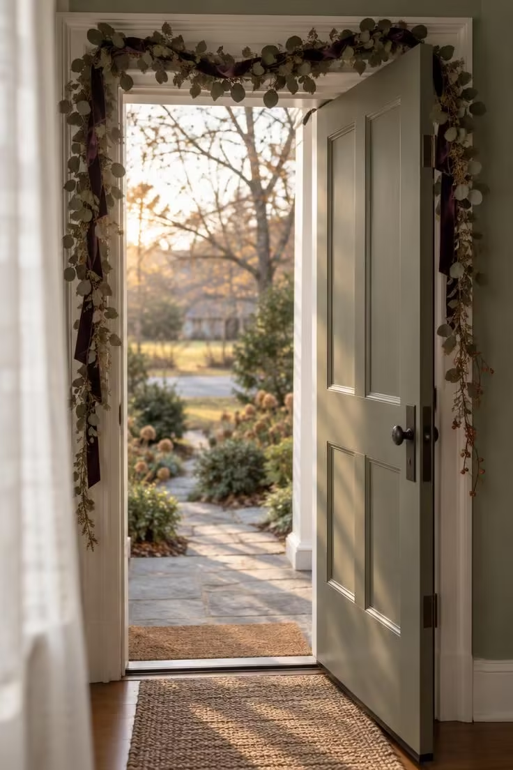
Decorating the frame and leaving the door blank inverts the usual approach, and the bare door becomes the negative space that makes the garland read.
Doorway trim gives the garland a natural line to follow, so the composition is settled by the architecture rather than by guesswork.
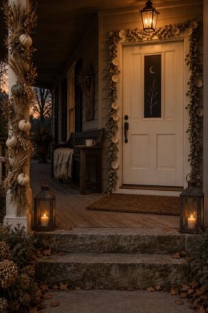
Dried eucalyptus, preserved magnolia, or faux bittersweet in rust and burgundy tones nudges the display toward autumn rather than strictly toward Halloween.
Stopping the side runs at roughly the upper third of the frame keeps the garland reading as a frame instead of crowding sidelights and small windows.
A wide matte black or deep plum ribbon tied at the top center gives the arrangement a visual anchor without adding another object.
Contrast matters against the door color, because a dark garland on a dark door vanishes from the sidewalk while the same garland on cream trim holds clearly.
Dried botanicals read well in daylight and go flat after dark unless porch lighting reaches the top of the frame, so an evening check before finalizing placement is worth the walk outside.
On an entry where halloween porch decor already fills the steps and urns, this frame idea works best as the single vertical element, tying the doorway together without adding another cluster at ground level.
Garlands are bulkier to store than flat cutouts but pack down more easily than urns or lanterns.
Style Blueprint:
- Dried eucalyptus or preserved magnolia garland
- Wide matte ribbon in black or deep plum
- Door trim with enough contrast to frame the greenery
- Light or mid-tone door and trim colors
- A few dried bittersweet or seed sprigs for variation
Chalkboard Sign Door with a Chalk-Drawn Motif
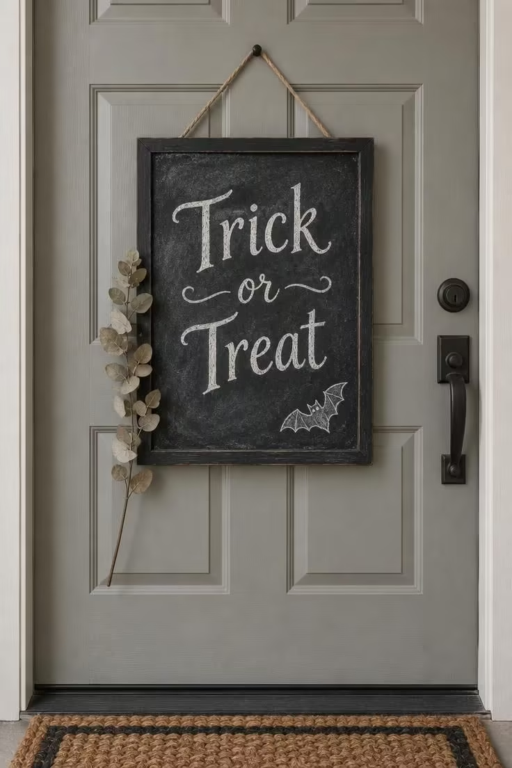
On a type-driven door, the sign is the entire decoration, which puts the weight on lettering quality and sign size.
The board needs to occupy a meaningful share of the door's width to stay legible from the sidewalk, and a small sign reads as a tag rather than a focal point.
Chalk gives a softer hand-made look and can be erased and redrawn each year.
Paint pen produces a crisper edge but locks in a single message.
A small chalk bat, moon, or cat drawn in a corner reinforces the theme without turning the arrangement into a prop display.
Among halloween door decor, this is the version that leans on wording more than props, which keeps the entry from sliding toward a set of spooky door hangers and dangling figures hung at several heights.
Placement has to account for existing hardware, since a centered sign sits naturally below a peephole or knocker but conflicts with a mail slot or a handle positioned at mid-height.
The same board can carry a harvest message through October and be redrawn for other seasons, which makes it a low-storage, high-reuse choice.
Style Blueprint:
- A framed chalkboard sign sized to the door width
- Chalk or a fine paint pen in white
- A small motif stencil for the corner detail
- Door hardware that leaves a clear center area
- A soft cloth for seasonal redrawing
Design Pro-Tip: Photograph the door from the sidewalk at midday and again at dusk before committing to a layout, since the two views rarely agree and the sidewalk view is the one neighbors actually see.
Hanging Arrangement at Three Heights
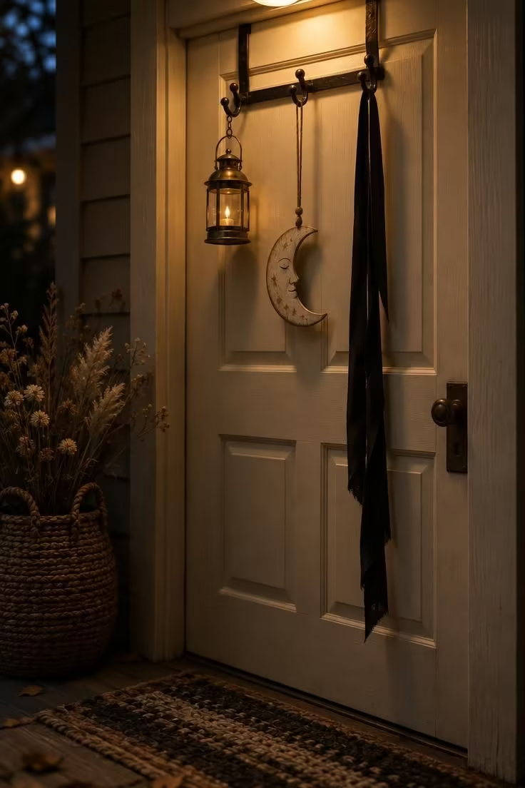
Suspending elements rather than attaching them flat gives the door a foreground and a background, which is what makes a display feel composed rather than applied.
Three elements is usually enough, and a modest count keeps the arrangement readable, while more elements at more heights turns depth into clutter.
Drop lengths need visibly different gaps, because elements hung at nearly the same height read as one messy line.
A battery lantern or candle-look light at the longest drop gives the arrangement a lower focal point that catches the eye after dark.
Flat companions, such as a painted wooden moon, bat silhouette cutouts, or an aged tag, keep a dimensional lantern from making the group bottom-heavy.
This approach to halloween door decor also suits halloween front door decorating that needs to work on a narrow canvas, since halloween door wreaths and heavier halloween porch decor can crowd a tight entry while a hanging group stays compact.
Anything hanging in the path of the door swing or across the latch will become a daily irritation, so drop lengths should clear the door's movement.
Light paper elements swing and tangle in wind, while heavier wood or metal pieces hold position but can knock against the door in a gust.
Two of the three elements should be large enough to register from the sidewalk, with the smallest reading only at the threshold.
This is one of the better fits for apartment and corridor doors because everything hangs in a narrow vertical band rather than spreading sideways.
Style Blueprint:
- An over-door hanger with three suspension points
- One small lantern or candle-look light
- One flat painted shape such as a moon, ghost, or bat silhouette cutouts
- Black ribbon in a matte finish
- A mix of drop lengths planned before placement
Oversized Spider on a Garage Door
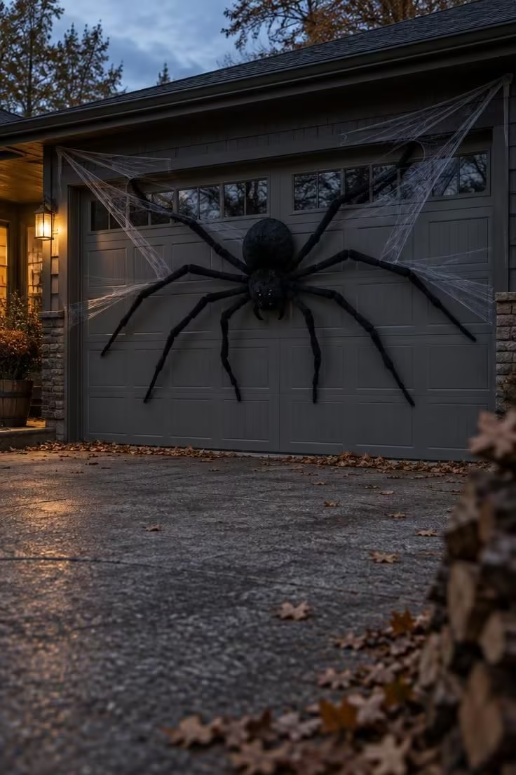
A wider, taller surface is viewed from farther away, so elements that would overwhelm a front door read as correctly scaled on a garage door.
Thin webbing lines radiating from the spider give the flat surface a sense of organization rather than a random blob.
Legs need to be long and clearly jointed at this scale, since short legs on a large body read as a beetle rather than a spider.
Pulled thin and uneven, faux cobweb accents suggest age, while dense clumps hide the door surface and muddy the silhouette the whole idea depends on.
Outdoor webbing collects leaves, dust, and damp, so it works best as a short-season element rather than something left up for weeks.
If the garage door carries the large graphic, a simpler front door prevents two displays from competing for the same attention.
A felt spider and bundled webbing flatten into a small box at the end of the season, which makes this one of the easier large-scale ideas to store.
Style Blueprint:
- Black felt spider with long jointed legs
- Lightweight faux webbing for thin stretched runs
- Low-tack fasteners for repositioning
- A side glow or porch light for evening depth
- A storage box for off-season flattening
Design Pro-Tip: Hang the lowest element first and work upward, since spacing is much easier to judge when the arrangement grows toward the door frame instead of down from it.
Apothecary Bottle Garland Across a Narrow Door
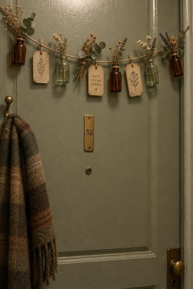
Shorter horizontal runs suit apartment and corridor doors, where a full-width garland would crowd the frame.
Bottle scale carries the idea, and small bottles in muted amber and green read as a Victorian apothecary note while large bottles turn the garland into a shelf.
Aged-paper tags add a typographic detail that rewards close viewing at the threshold, whether hand-lettered or printed.
Sprigs of dried lavender or seeded eucalyptus between the bottles soften the hard line of glass and twine and tie the garland to the rest of the season.
This stays low-profile and flat against the door, which matters on corridor doors where protruding decor is harder to live with.
Style Blueprint:
- Small glass bottles in amber and green
- Aged-paper tags with lettering
- Twine or jute string for the line
- Dried lavender or seeded eucalyptus sprigs
- A narrow door with clear upper space
Monochrome Ghost Door in Ivory and Cream
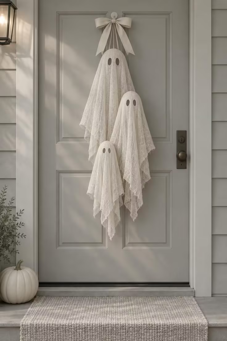
Restricting the composition to cream, ivory, and pale gray makes a familiar motif read as understated rather than cartoonish.
Graduated sizing from large to small implies a family grouping and gives the door a quiet hierarchy that flat repetition lacks.
Cheesecloth drapes softly and holds a ghost shape, but its loose weave frays at cut edges, so a finished hem or trim keeps the drape tidy.
The fabric hangs better with a small weighted base or a shaped interior form, which keeps each ghost from reading as a flat sheet.
This palette depends on contrast, so a mid-tone or darker door is the right setting, while a white door makes the whole composition vanish from the sidewalk.
Ivory fabric under warm porch light glows softly, which is why this idea often reads better at dusk than at midday.
Look at pumpkin themed door ideas and the difference is obvious: they lean on orange and texture, while this approach trades warmth for a narrow, tonal palette that sits quietly against year-round entry decor.
Fabric folds flat for storage, and the ghosts can be re-draped slightly differently each year to change the arrangement without new purchases.
Style Blueprint:
- Loose-weave cheesecloth in ivory or cream
- A light gray or mid-tone door surface
- Small interior forms or weights for the drape
- Pale ribbon for the top accent
- One white pumpkin for the base
Design Pro-Tip: Group the three ghosts so their widths step down evenly, since a smooth size progression is what keeps a monochrome arrangement from reading as a single pale mass.
Rustic Harvest Door with Real Heirloom Pumpkins
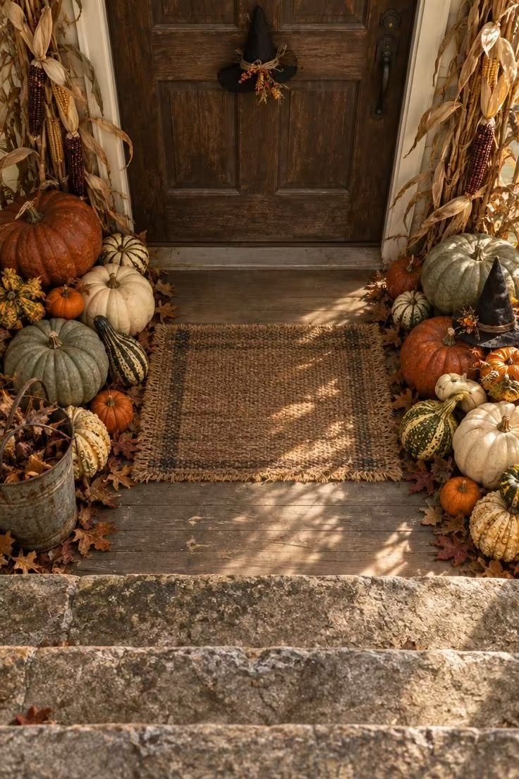
The porch floor carries half of this composition, and it is the part that porch lighting actually reaches after dark.
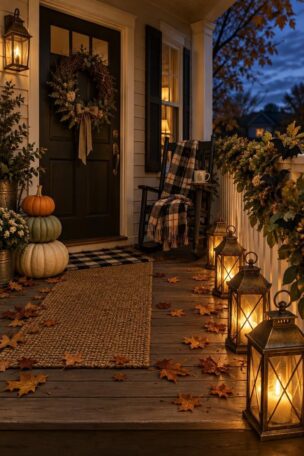
Heirloom shapes give the display its texture, since flattened, ribbed, and warty varieties in muted rust and sage offer visual variety that uniform orange pumpkins cannot.
Clustering pumpkins into two massed groups at the base of the door reads as designed, while spreading them evenly across the porch reads as leftover.
A scaled-down witch hat door decor accent, propped among the gourds rather than hung on the door itself, adds a single Halloween note to an otherwise harvest-toned grouping.
Dried corn stalks at the frame tie the floor-level display back up to the door and keep the composition from feeling bottom-anchored.
Because the palette is harvest-toned with only one witch hat door decor piece mixed in, the arrangement can stay up longer without looking stale.
Real pumpkins and gourds in exposed areas are food-adjacent and can draw animals in some locations, so this is a display to monitor rather than set and forget.
Style Blueprint:
- Heirloom pumpkins and gourds in mixed shapes
- Dried corn stalks for vertical height
- A textured woven doormat
- An aged bucket or crate for grouping
- One small witch hat door decor accent placed among the gourds
- A sheltered porch position to check often
Vintage Die-Cut Entry with Aged Paper Accents
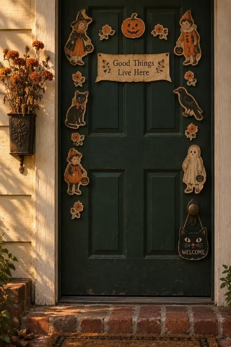
Reproduced die-cuts carry a graphic nostalgia that modern printed cutouts rarely match, and the faded palette is what keeps them from reading as new merchandise.
Arranging the figures in a loose border rather than a tight cluster lets the door surface show through and keeps the composition from looking pasted over.
A small aged-paper banner at the center gives the border a focal point, so the eye has somewhere to land.
A black cat door sign at handle height adds an everyday element at a natural viewing level, and it can carry the message while the border carries the mood.
Because the paper is thin and light-sensitive, a sheltered porch position keeps the colors and edges in better condition through the season.
Flat card figures store between sheets of tissue, so this is an easy display to build into a collection over several years.
Vintage halloween cutouts vary widely in size and condition, and mixing a few larger figures among smaller ones gives the border a sense of rhythm rather than a single flat ring.
Style Blueprint:
- Reproduced vintage die-cut figures in a faded palette
- An aged-paper banner or small sign
- A black cat door sign at handle height
- Tissue paper for flat storage
- A sheltered porch or covered entry
Conclusion
A halloween door decor idea earns its place when it reads at all three distances and holds up in both daylight and porch light.
Across these ten directions, the strongest entries tend to lean on one clear move, whether that is a silhouette field, a frame, a hanging arrangement, or a base at the porch floor, rather than several competing ones.
Restraint is what separates a designed entry from a decorated one, and leaving part of the door bare is often what makes the rest of it read.
Flat, modular elements store and redeploy more easily than dimensional props, which matters when October ends and the boxes come out.
Pick one compositional direction, adapt it to your door type, and let the entry do the rest.