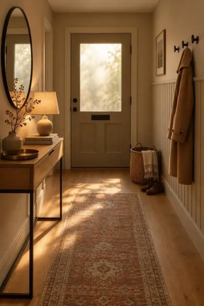
This post may contain affiliate links. If you make a purchase through these links, we may earn a commission at no additional cost to you.
The entrance hallway is the first interior frame a visitor sees, and in a small home it often arrives with a narrow footprint and a single sightline to work with.
An enclosed corridor owns its walls and its light, while an open entrance hallway shares both with the room beyond it.
Either way, the design task is visual before it is anything else.
Decide what sits on the door-to-room axis first, then choose the supporting surfaces around it.
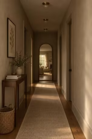
Shallow Console With One Large Framed Work
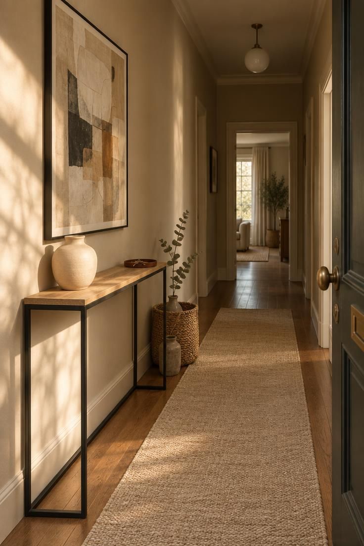
A shallow console keeps the walking line visually open because the wall does the decorating rather than the furniture.
Art width should track the console and the wall segment it occupies, not the floor area of the room.
One object on the landing surface holds the composition; a second object competes with the frame for the same glance.
Keeping the frame finish and the console frame in the same family, black metal with black, or oak with oak, makes the vertical stack read as one unit rather than two separate purchases.
A surface this shallow holds very little, so a key tray should replace the sculptural object rather than sit beside it.
Wood tops want coasters and occasional conditioning, while painted or laminate tops are simpler to live with in a corridor where wet coats pass through.
This arrangement suits an enclosed corridor with one clear long wall, and it becomes awkward in an open entrance hallway where the console would float against shared living space.
Style Blueprint:
- Slim console, roughly thirty to thirty-five centimeters deep, metal frame with wood top
- One framed work with a width close to the console width
- Single matte ceramic object, low profile
- Flatweave runner in a tone drawn from the artwork
Design Pro-Tip: Choose the artwork’s width before buying the console, since scaling art to furniture is easier than hunting for furniture that fits existing art.
Gallery Wall on the Long Wall, End Wall Left Bare
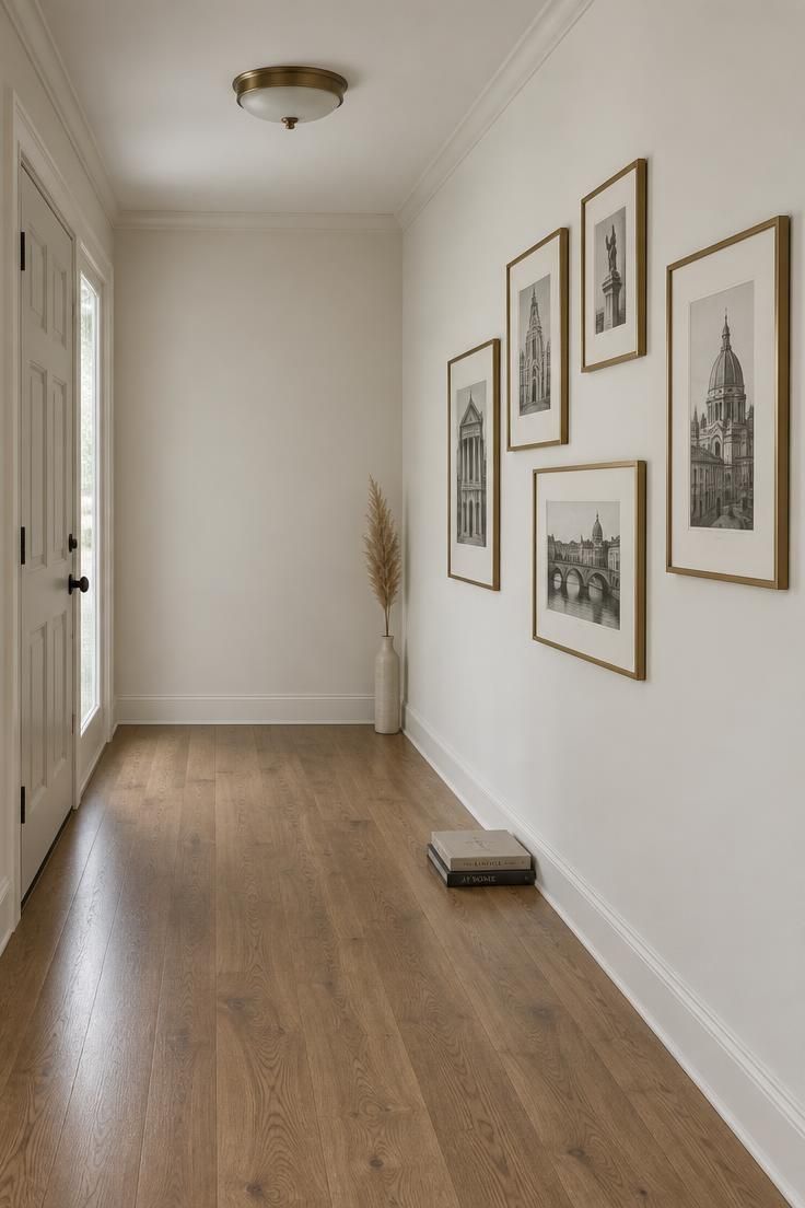
Using the corridor’s length as the display surface turns an awkward run of wall into the room’s main feature.
Matched frame finishes matter here, because mismatched finishes in a narrow run read as visual noise rather than character.
Hanging height should be keyed to the center of the cluster rather than calculated frame by frame, which keeps the group reading as a single unit.
This approach works especially well where the long wall is the only uninterrupted surface in the entrance hallway.
Rearranging the arrangement means filling and repainting old fixing points, and a picture ledge avoids that chore at the cost of a different, more casual look.
Frames gather dust along their top edges, and glass collects smudges at hand height in a tight corridor.
The look suits an enclosed corridor best, since in an open entrance hallway the group competes with whatever already hangs in the adjacent living space.
Style Blueprint:
- Five to six frames in one unified finish, mixed sizes
- Neutral wall paint in a washable sheen
- Bare or lightly sealed timber floor
- Flush or semi-flush ceiling fixture
- No furniture on the floor
Design Pro-Tip: Lay the frame arrangement out on the floor at the wall’s exact length before committing, because corridor walls run longer than they appear.
A Runner That Draws the Walking Line
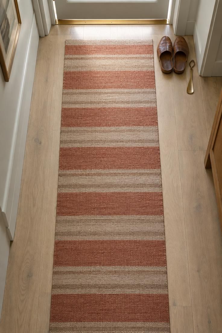
A runner reads as the path into the home and ties the entrance to adjacent rooms by repeating a floor tone that appears elsewhere.
Leaving floor visible on both sides keeps the corridor from looking wall-to-wall carpeted, which matters in a space this narrow.
Centering the runner on the walking line rather than on the wall is the right call when the front door sits off-axis.
A low-contrast runner keeps the floor quiet, while a patterned runner becomes the room’s focal point and should then be the only one.
Deep pile shows traffic paths and is harder to clean, so flatweave and washable cotton are more forgiving in homes with pets or children.
A runner that shifts or curls near the threshold is a common annoyance, and a non-slip underlay plus a runner that spans the full walking length reduces the problem.
This idea works in both enclosed and open entrance hallways, since the floor plane runs continuously through either configuration.
Style Blueprint:
- Flatweave or washable runner, narrow enough to leave floor visible on both sides
- Non-slip underlay
- Floor finish in a tone the runner picks up
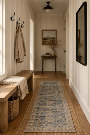
Bench With a Run of Hooks Above
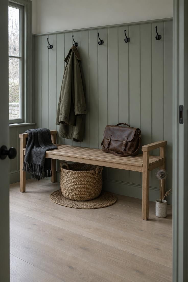
The hook run creates a repeating vertical rhythm that gives a narrow wall order without any furniture depth.
Spacing the hooks evenly and running them slightly past the bench ends makes the wall read wider than it is.
A panel behind the hooks, whether beadboard, slat wood, or a painted rectangle, gives the arrangement a defined edge and keeps coats from marking the wall directly.
The bench seat serves as the landing surface, while the area beneath it holds baskets rather than loose items.
Open hooks look styled only when they stay near-empty, and a busy household will see coats hanging there constantly.
Slatted benches show dust between the slats, and upholstered versions hide it but need vacuuming.
Keep the floor directly in front of the bench clear so the walking line stays open.
This pairing suits enclosed corridors and generous open entrance hallways; in a very shallow zone, the hooks alone may be the better half of the idea.
Style Blueprint:
- Slatted wood or upholstered bench with a shallow seat depth
- Five to seven hooks on a painted or panelled back
- One or two woven baskets beneath the bench
- Wall paint in a washable sheen behind the hooks
Design Pro-Tip: Center the hook run on the wall rather than on the bench, so the rhythm reads as a wall feature the bench happens to sit under.
Mirror Opposite the Door
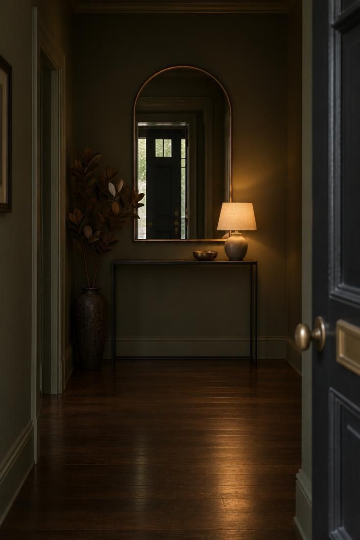
The mirror gives the sightline a destination and reflects whatever sits behind the viewer, usually the front door or daylight coming through it.
What the mirror reflects is the whole decision, since a cluttered reflection simply duplicates the clutter.
Arched and round shapes soften a rectangular corridor, while rectangular mirrors read more like architecture and less like objects.
A framed mirror carries as much visual weight as artwork, so the frame becomes the room’s focal finish.
Smudges and fingerprints collect at hand height, and keeping the mirror above the landing-surface line reduces contact.
A mirror facing a coat-covered hook run shows those coats twice, which defeats the effect.
This idea works best in an enclosed corridor where the end wall is fully visible from the door, and in an open entrance hallway the mirror often lands on a shared living-space wall instead.
A slim console table beneath the mirror anchors the reflection and gives keys or a small lamp a place to land.
Style Blueprint:
- Arched or round framed mirror scaled to the end wall
- Slim console or wall shelf beneath it
- Single small table lamp
- Frame finish repeated on one other element in the hallway
- Nothing else on the end wall
Wall-Mounted Shelf as a Micro-Console
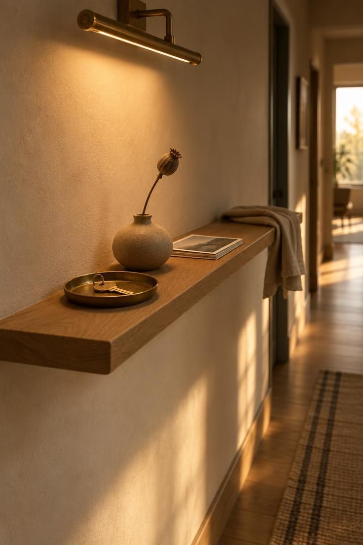
A wall-mounted shelf replaces a floor console in entrance hallways too narrow for any furniture depth at all.
The shelf holds three objects at most, since beyond that the arrangement reads as a ledge of things rather than a composed vignette.
A picture light or slim plug-in wall lamp above turns the shelf into a lit focal point and gives the wall a second purpose.
Leaving the wall below completely bare preserves the visual depth the shelf is meant to protect.
There is no drawer, so keys and post need a tray or migrate elsewhere in the home.
Objects on a high shelf are seen from below, which means low, wide silhouettes read better than tall thin ones.
This solution suits narrow enclosed corridors best, and it becomes less useful in open entrance hallways where a full console usually fits without crowding the walking line.
Style Blueprint:
- Floating shelf in a wood or painted finish matching the wall
- Small tray plus one low vase, nothing more
- Slim picture light or plug-in wall lamp above
Design Pro-Tip: Match the shelf finish to the wall color and let the objects supply the contrast, which keeps the corridor feeling wider.
Floor-to-Ceiling Narrow Storage Painted to Match the Wall
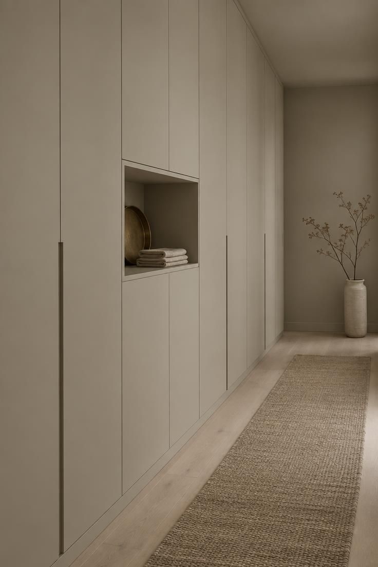
Painted to the wall color, a tall storage run recedes and reads as wall rather than furniture, which is what keeps a narrow corridor from feeling compressed.
Shallow depth preserves the walking width, while deeper units close the space visually even when they hold more.
One open niche breaks the flat plane and gives the eye a focal point in an otherwise uniform surface.
Slim or integrated handles keep the doors reading as panelling rather than cabinetry.
This approach offers more storage than a console, but it commits the wall permanently and limits future rearrangement.
Painted joinery in a high-traffic corridor shows scuffs at hand and shoe height, and a washable sheen helps.
Doors need occasional tightening and cleaning along the edges where fingers land.
This idea suits enclosed entrance hallways with one uninterrupted wall, and it rarely fits an open entrance zone where cabinetry would interrupt the adjacent room.
An entryway bench tucked inside the storage run adds a spot to set down bags without widening the footprint.
Style Blueprint:
- Shallow full-height cabinetry in the wall color
- Slim handles or push-latch doors
- One open niche with a tray
- Wall paint in a washable sheen
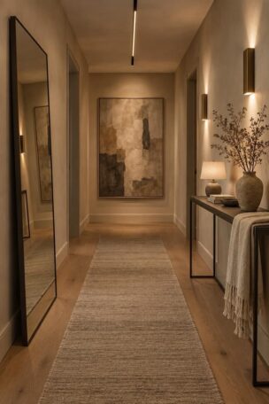
Three Light Layers: Ceiling, Wall, Surface
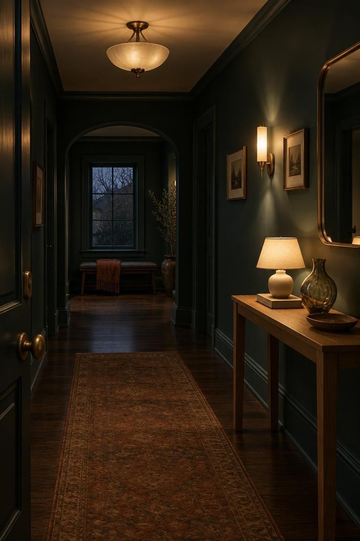
Overhead-only light flattens a corridor, and a second source washes the wall while a third grazes the landing surface.
Each layer occupies a different height, so the eye reads three planes rather than one bright box.
Sconces should sit between or beside wall elements rather than behind them, so light lands on the wall instead of being blocked.
A picture light works as the wall layer where a sconce would crowd a frame arrangement.
More sources means more switches, and a single wall switch for multiple fixtures or plug-in options keeps operation simple.
Shades and pendants collect dust and need occasional bulb replacement, which is worth weighing in a fixture-heavy scheme.
Cord routing for plug-in wall lamps is visible in a narrow corridor, so the run needs planning or a fixture style that manages it.
This layering works best where an enclosed entrance hallway has its own lighting circuit, since open entrance hallways often inherit the adjacent room’s fixtures.
A narrow foyer gains depth when the ceiling, wall, and surface layers each carry a distinct source, so the smallest zones still read as separate planes of light.
Style Blueprint:
- Semi-flush or flush ceiling fixture
- One wall sconce or picture light
- One small table or shelf lamp
- Warm bulb tone across all three
- A single point of control where possible
Design Pro-Tip: Switch the ceiling layer off first when testing the scheme, and if the wall and surface layers hold the room alone, the layering is doing real work.
One Saturated Wall, Everything Else Kept Quiet
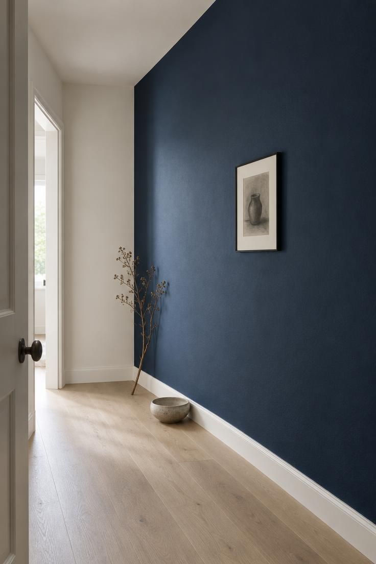
A single saturated surface, whether one wall, the door, or the runner, reads cleaner than several competing accents.
The colored wall is usually the one facing the door or the long wall seen on entry, since that is where the eye lands first.
Matte finishes absorb light and deepen the color, while eggshell and satin bounce more light and read lighter on the same paint chip.
Keeping the ceiling and adjacent surfaces plain prevents the corridor from feeling compressed by the color.
Matte paint shows scuffs in a high-traffic corridor, and higher sheens are easier to wipe but change the color’s depth.
Repainting a saturated wall is a bigger job than repainting a neutral one, and the color should be checked against the adjacent rooms it opens onto.
This idea works best in enclosed entrance hallways with clear wall boundaries, and in open entrance zones the colored wall needs to make sense with the room beyond it.
Style Blueprint:
- One saturated wall in matte or eggshell
- Off-white ceiling and opposite wall
- Single framed work or mirror on the colored wall
- Floor left bare or finished with a neutral runner
Beadboard or Slat Panelling Behind the Hooks
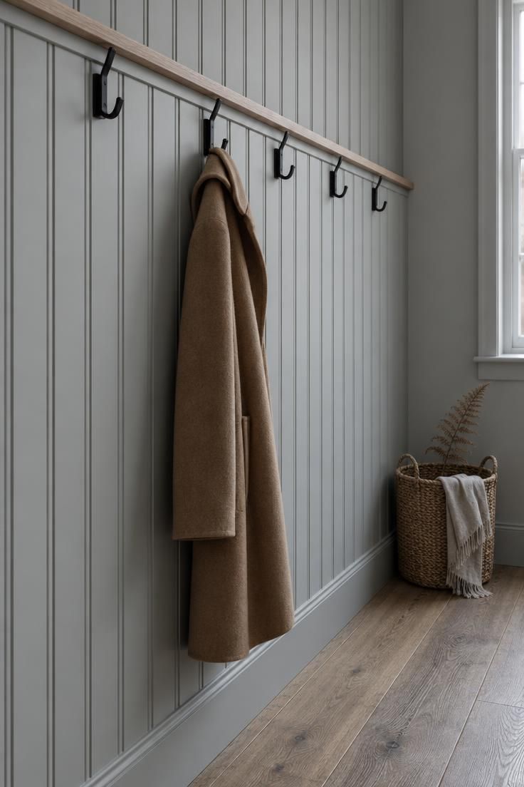
Panelling gives the eye texture without adding furniture depth, which matters in a narrow entrance hallway where every centimeter of floor space counts.
Vertical slats and beadboard read as height, while horizontal runs read as width, so the direction of the panel changes how the wall performs visually.
Painting the panel the same color as the wall keeps the texture subtle, and a contrasting color turns it into a feature in its own right.
The panel’s top edge becomes a natural line for hooks, a picture rail, or a shelf.
Grooves collect dust and are slower to wipe than a flat wall, and a panel is more permanent than paint, so repainting it later takes more work.
This treatment suits enclosed corridors with one long wall, and it works in open entrance hallways only where the panel can be contained within the entry zone.
Style Blueprint:
- Beadboard or slat panel in the wall color or a tone a step lighter
- Hooks mounted along the panel line
- Top edge finished with a trim or rail
- One coat on a single hook, the remaining hooks empty
- Floor left bare so the texture stays the focus
Design Pro-Tip: Run the panel to the same height as the door’s lower rail, since the alignment makes a small corridor read as designed rather than patched.
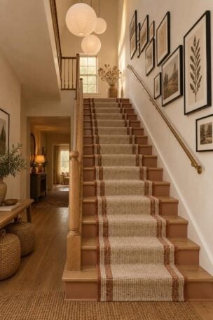
A Slim Textile or Flatweave Rug Layered Over Carpet
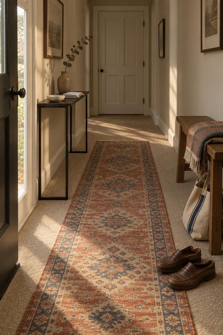
A thin flatweave or low-pile textile laid over existing carpet gives a narrow hall a second visual floor line without adding bulk.
Choose a runner that stops short of the door swing and the first step into the next room, leaving a border of the original carpet visible on both long sides.
That visible border separates the two surfaces and keeps the runner reading as a deliberate layer rather than an attempt to hide what sits underneath.
Pattern does the heavy lifting here.
A small repeating motif suits a short, tight corridor because the eye can take in the full repeat without the design feeling cropped.
Wider geometric bands work better on a longer hall, where they pull the gaze forward along the walking line.
Keep the palette tied to the walls and the woodwork rather than introducing a third competing scheme.
Color can come from the border, the field, or a single accent stripe, and one of those is usually enough.
Texture matters as much as pattern.
A flatweave has a dry, matte surface that sits quietly against pile carpet, while a woven cotton or jute blend brings a little more tooth.
Both stay low enough that a door can pass over the edge if the rug is positioned with the door clearance in mind.
If the existing carpet is a strong color or a busy pattern, lean toward a solid or nearly solid runner with a contrasting bound edge.
That edge becomes the only line the eye needs.
Where the carpet is neutral and plain, a patterned runner can carry the personality for the whole hallway with no other change.
Weight the runner with a nonslip pad cut to fit beneath it, since a light textile over carpet can shift underfoot.
In a very short entrance hallway, a two-by-four or two-by-five flatweave often reads better than a long runner, which can look truncated.
Use the same textile idea as a small mat at the door if you want the two zones to feel related.
The result is a layered floor that adds warmth and definition to a small entrance hallway ideas palette without rebuilding anything.
For entrance hallway design, this is one of the least invasive ways to introduce pattern, color, and a clear sense of arrival.
For narrow entrance hallway ideas, a runner rug in a low-pile weave keeps the walking path clear while adding a graphic stripe of color over the carpet.
Look for a runner rug with bound edges so the layer stays tidy along a busy route.
Style Blueprint:
- Runner width: leave a strip of the underlying carpet visible on both long sides rather than spanning wall to wall.
- Pattern scale: small repeats for short halls, wider bands for longer corridors.
- Palette: pull two colors from the walls and woodwork, add one accent at most.
- Texture: dry matte flatweave for contrast, woven cotton or jute for a little more surface interest.
- Edge detail: a contrasting bound or serged edge gives a solid runner the definition a pattern would supply.
Design Pro-Tip: Before committing to a runner, lay a bedsheet or a length of paper on the floor at the intended width and length. It shows immediately whether the border of carpet on each side reads as intentional or as an accident, and whether the runner stops in a spot that lets the door clear it.
Conclusion
The entrance hallway is a sightline problem before it is a storage problem, and the first decision is what sits on the axis from the front door.
The approaches above range from a slim console and a long-wall gallery to a single saturated wall, a lit shelf, and a run of panelling, and they are not meant to be combined in one corridor.
A practical order helps: choose one anchor for the sightline, one ground plane for the floor, and one light layer for the walls, then stop.
Tradeoffs rise as the scheme becomes more built-in, since storage, permanence, and maintenance all increase together.
The simplest test is to stand at the front door with the room as it is now and decide what the eye should land on first.