This post may contain affiliate links. If you make a purchase through these links, we may earn a commission at no additional cost to you.
Most mantel advice treats the surface as a display problem: how many objects fit, how tall they should be, where to put the candles.
That approach produces arrangements that look full and forgettable.
A mantel is better understood as a stage, and styling one well means deciding what deserves the spotlight.
Balanced proportions rarely come from filling space evenly.
They come from restraint, from giving a few pieces room to register, and from knowing when to stop before the surface starts to argue with itself.
The process below moves from the wall to the surface to the final edit, with an honest look at what goes wrong along the way.
Why a Mantel Is a Stage, Not a Shelf
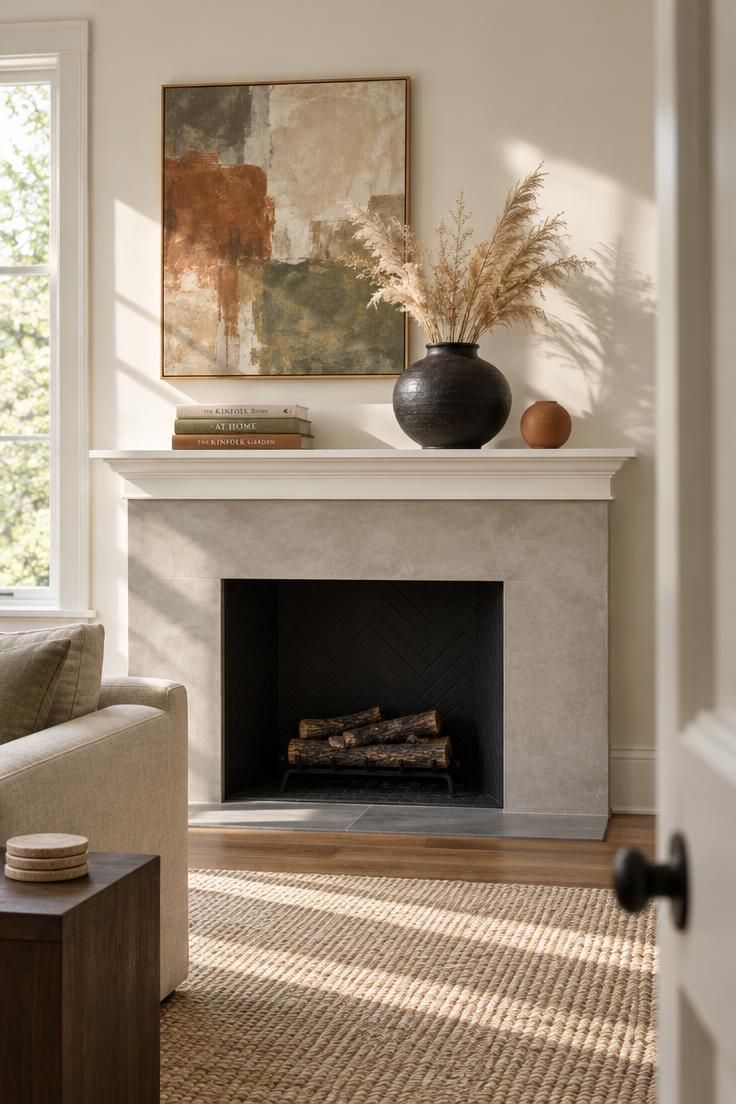
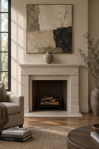
Designer Leann Conquer of Chroma explained to Vogue that “The biggest mistake people make is treating a mantel like a shelf instead of a stage for art.”
It’s one of the few places in a home where a single piece can completely command a room.” That reframing changes what minimalist mantel decor is for.
The point is not to empty the surface but to decide which object earns the attention.
A mantel sits at eye level in the middle of a room’s most socially important wall.
Everything placed there reads against the fireplace architecture behind it, so each addition competes for the same slice of attention.
Minimalism, in this reading, is a hierarchy rather than a style: one object leads, and the rest answer it.
This is also where minimalist styling separates from the layered, collected look that many mantel features favor.
Ashley Ferguson of Ashley Ferguson Interiors told Elle Decor that she prefers to keep mantel decor relatively simple, noting that dense photo-and-trinket arrangements belong to a different design language.
Neither approach is wrong, but mixing them on one surface tends to produce neither.
Households with a working fire, renters with a decorative surround, and anyone sharing the mantel with a television all face different constraints, yet the visual principle holds: fewer pieces, chosen with intent, register more clearly than many pieces chosen to fill.
Design Pro-Tip: Clear the mantel completely and leave it bare for a day before styling. The empty surface resets your sense of how much space the wall actually offers.
Start With the Wall, Then One Anchor
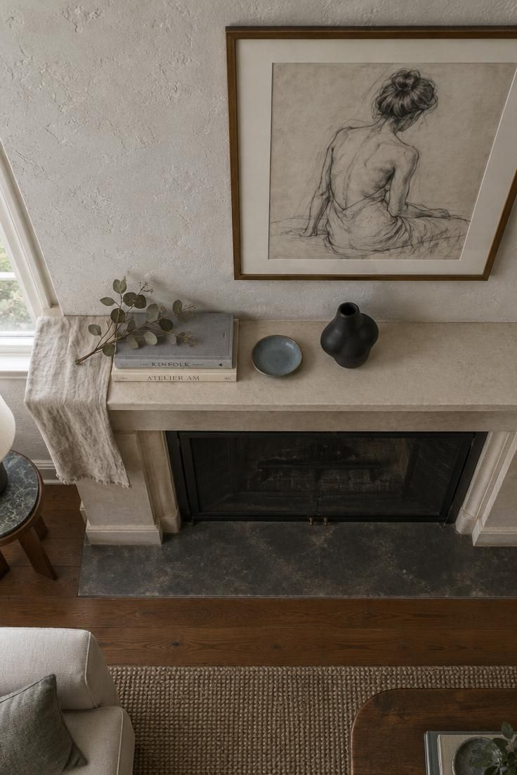
The first decision happens above the shelf, not on it.
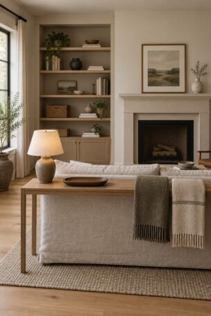
Hanging a picture or mirror above the mantel is often the first step in creating a balanced arrangement.
A fireplace organized around a television can make styling more challenging, as the screen tends to dominate the wall and draw attention away from the mantel itself.
Still, plenty of households have nowhere else to put a screen, and the wall decision is a constraint to work within rather than a failing.
With the wall settled, the anchor-first method begins.
Place a single object on the surface and let it establish the height ceiling and visual weight that everything else must answer.
One useful approach is to set out a single vase or sculptural object and leave it alone for a while before adding anything, allowing you to see how one piece holds a long, low surface.
From there, build the arrangement gradually: tall piece first, then medium, then small.
The anchor is not necessarily the biggest thing on the shelf.
It is the piece with the most presence, whether through silhouette, finish, or an unusual shape.
A small dark sculpture can anchor a surface that a wide, pale platter would leave floating.
Learning how to balance mantel decor starts with recognizing that the anchor sets the terms of the composition, and the supporting pieces exist to keep it from looking lonely or accidental.
Supporting pieces work best as a group rather than a mirror image.
Matching candlesticks can look too formal and predictable, while mixing shapes, finishes, and materials gives the arrangement a more natural, collected appearance.
Symmetry is also a legitimate route, with two lamps or two urns flanking a centered piece, provided the pairs introduce enough variation in texture or style so the arrangement does not read as a matched set.
Build Proportion Through Height and Weight, Not Symmetry
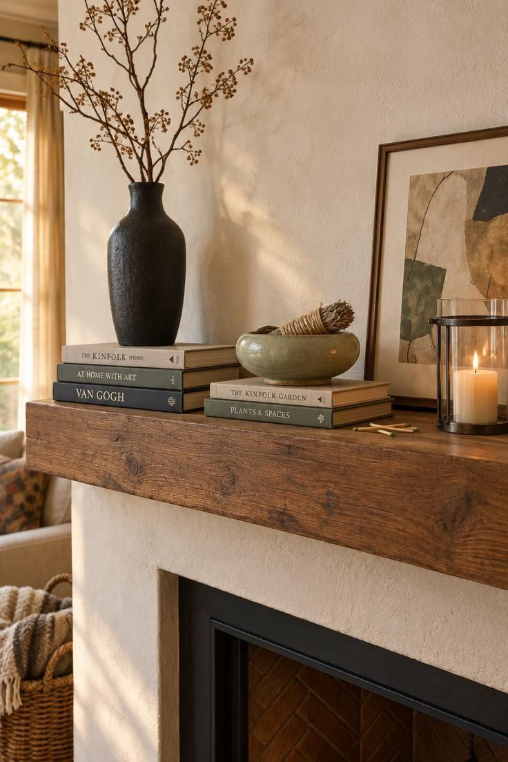
A flat line of equal-height objects is the most common proportional failure on a mantel, and it is easy to spot from across the room.
Mixing taller pieces with lower ones keeps the surface from reading as one horizontal stripe.
Think of the arrangement as a skyline: tall, then lower, then tall again, so the eye travels rather than sliding across.
Asymmetry usually feels more natural than a perfectly matched pair, because a home is not a showroom and slight imbalance reads as human.
The tradeoff is maintenance.
Remove one object from an asymmetrical group and the whole arrangement can drift; symmetrical pairs tolerate substitution far more easily.
Neither is superior, but knowing which you have built helps when a piece breaks or gets moved.
Books make good risers for lifting smaller objects into the composition.
A short stack under a low bowl raises it into the visual field without adding another freestanding object, and the stack’s own horizontal lines contrast with vertical pieces nearby.
Plenty of fireplace mantel styling ideas circulating online arrive with precise numeric rules attached: art at a fixed fraction of the mantel width, a set number of objects per foot of shelf, or a measured distance to stand back when judging.
These figures are better treated as suggestions than established design standards, since following them too rigidly can produce arrangements that satisfy a ruler while ignoring the room.
Relational guidance, such as going larger when a piece looks undersized against the surround, is more useful than any fixed number.
Keep the Palette Small and the Textures Contrasting
Limiting the mantel to two or three tones drawn from the surrounding room keeps the composition quiet enough for proportion to be judged.
Choosing two main colors plus one soft accent creates a balanced palette, while two main materials and one accent material can provide the same sense of balance through texture.
Within that narrow palette, contrast becomes the source of interest.
Pairing rough stoneware with a lacquered piece, for example, allows raw and polished surfaces to give the eye something to explore without introducing another color.
The same principle applies to selecting a family of related objects, pieces that share a common visual note rather than match exactly.
The result reads as cohesive without the stiffness of a set.
A useful approach is to remove saturated pieces from the mantel first, then judge proportion with the quieter objects remaining.
This makes it easier to assess the arrangement without strong colors competing for attention.
The underlying point is simple: color and proportion are separate judgments, and separating them makes both easier.
Let the Mantel’s Own Material Set the Volume
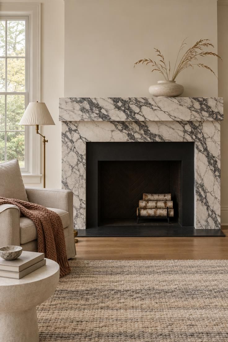
The fireplace surround is part of the composition whether or not you plan for it.
A heavily figured marble, a warm veined limestone, or a strongly grained wood already supplies pattern and color, and styling over that material at full volume produces a fight.
When the stone has a strong visual presence, keeping the mantel design minimal allows the material to speak for itself.
This approach works particularly well with richly textured surrounds, where leaving the mantel nearly bare gives the natural patterns room to stand out.
A plain plaster, block, or painted surround carries no such argument, which frees the mantel to hold bolder shapes and darker finishes.
The distinction is straightforward: quiet architecture invites a stronger object, while busy architecture rewards restraint.
Reading the surround before choosing objects is a step many styling guides skip, and it is often the difference between an arrangement that looks considered and one that looks imposed.
Shelf depth matters too, in a qualitative way.
A shallow ledge rewards leaner pieces, tall and flat rather than wide and round, because bulky objects crowd the wall behind them.
A deep shelf can hold larger forms and a little more breathing room around them, though depth alone does not justify more objects.
The idea is to keep the relationship between object scale and the surface that holds it in view, which is the working heart of how to style a minimalist mantel.
Design Pro-Tip: Look at the styled mantel through a black-and-white filter to judge form alone. Color can flatter an arrangement whose heights and shapes do not actually balance.
Seasonal Swaps Without Accumulation
Seasonal styling on a minimalist mantel works best as substitution rather than addition.
One statement seasonal piece replaces the year-round anchor or a supporting object for a few weeks, then comes off again.
The arrangement stays sparse, the seasonal marker reads clearly, and nothing has to be stored on the surface in the meantime.
A useful editing question is whether the arrangement would still look right in November if the leaves outside were gray and the sky was flat.
This simple test encourages choosing pieces that hold up in dull light rather than pieces that only work against a bright autumn backdrop.
Dried stems, cream and white pumpkins, and a single sculptural object tend to pass; a crowd of small themed items tends not to.
For a longer-term approach, keep holiday pieces you already own but change their setting each year, and skip trends that do not relate to your personal style or your house.
That approach resets the arrangement annually without requiring new purchases, and it keeps a small collection of objects in rotation rather than constantly adding to storage.
If You Don’t Have a Fireplace: The Micro-Mantel
A micro-mantel is a narrow shelf or ledge styled as a focal scene, treated with the same care as the surface above a fireplace.
This approach works particularly well in apartments and rental homes, where a small decorative shelf offers an opportunity to personalize a space without committing to large furniture or extensive wall installations.
The anchor-and-edit method carries over directly; only the scale changes.
A lone vase, a small stack of books, or three objects of clearly different heights can hold a narrow ledge, while a scattered collection will overwhelm it.
Micro-mantel shelf styling rewards the same restraint as its full-size counterpart, with even less tolerance for clutter because there is less surface to absorb it.
The composition questions are identical.
What leads?
What answers it?
What can come off?
A ledge has no firebox beneath it to establish a focal point, so the wall treatment above and around the shelf has to do that work.
A single piece of art, a well-placed mirror, or a deliberately empty wall all serve.
Keep this strictly a styling exercise.
The visual logic of a ledge as a stage does not change based on how it is fixed in place, and the arrangement should be judged on how it reads, not on what it took to put there.
What Goes Wrong, and the Upkeep Nobody Mentions
The recurring failures on a minimalist mantel are consistent enough to name.
Treating the surface as storage is the first, since even a few unrelated objects can quickly turn a carefully arranged mantel into a convenient place to leave things.
Matched sets that read as formal and predictable come second, followed by the flat skyline of equal-height objects.
Competing with a busy mantel material is a fourth, and filling space out of obligation finishes the list.
The corrective for that last one is simple: meaningful items need room to stand alone to be appreciated.
Negative space is the working material of this style, which makes the upkeep different from a busier arrangement.
With mantel styling with negative space, every gap is visible, so a single out-of-place object reads immediately.
That is the tradeoff: the style is easy to maintain in the sense that there is little to dust around, and demanding in the sense that nothing hides.
Dust and, near a working fire, fine ash residue collect on any horizontal surface, and porous matte ceramics and dried botanicals are harder to clean than glazed or glass pieces.
Dried grasses and wheat shed; place them where fallen bits are easy to remove, and expect to replace them each season.
Candles deserve a specific note.
A lit candle on a mantel directly above an active firebox places an open flame where heat and air movement from the fire can affect it, so unlit or battery-operated candles are a reasonable substitute when the arrangement calls for candlelight and the fire is going.
This is a siting question, not just a styling question, and it applies only when both elements are present.
Leaning a framed piece against the wall instead of hanging it reads informal and uses more shelf depth; hanging reads more formal and frees the surface.
Both are aesthetic tradeoffs.
The asymmetrical arrangements described earlier also drift out of balance when a single object is removed or swapped, so plan on a quick recheck after any change rather than a full restyle.
Conclusion
A useful checklist is short.
Decide what happens on the wall first, then set one anchor object and leave it alone long enough to see how it holds the surface.
Build a group with varied heights, limit the palette to two or three tones, and pull contrast from texture rather than color.
Then edit by removal, again and again.
The goal is a mantel that reads as intentional rather than sparse.
A rental with a decorative surround, a non-working fireplace in a condo, and a micro-mantel ledge in an apartment all follow the same process, simply at smaller scale.
Start this weekend.
Before arranging anything, clear the surface and choose the one object that deserves the spotlight.
Build around it, step back, and notice whether any piece is shouting for attention.
Remove that piece, and the arrangement is probably finished.