
This post may contain affiliate links. If you make a purchase through these links, we may earn a commission at no additional cost to you.
Many homes accumulate objects by default: gifts, purchases, hand-me-downs, and the small things that arrive without a decision.
Clearing a room can feel satisfying for a week, then the surfaces fill again.
The missing piece is rarely effort.
It is a repeatable set of decisions about what earns a place.
A useful minimalism checklist does not ask you to strip a room bare.
It asks you to decide, deliberately, what stays, what gets stored, and what you will review again later.
The distinction matters because subtraction alone tends to produce rooms that look unfinished rather than calm.
This guide treats pared-back living as a method of editing.
It covers the questions to ask before starting, a seven-step sequence, the warmth that keeps a spare room from feeling cold, compact-home adaptations, upkeep habits, and the situations where minimalism is genuinely the wrong tool.
Why a Checklist Works: The Editing Principle
Vyanca Soto, owner and principal of Market Studio Interiors, describes the practice as “editing with intention” and insists that “It’s not about emptiness, it’s about breathing room.”
Interior designer Mikel Welch puts the same idea another way: “Minimalism isn’t about having less, it’s about having more of what matters.”
Those two statements reframe the whole task.
A workable minimalism checklist is not a list of objects to banish.
It is a sequence of decisions, each one recorded so you can repeat it next season without starting from zero.
The counterargument deserves attention too.
Meeshie Fahmy, founder and creative director of Haus of Meeshie, argues that pared-back design has often drifted into “a cold lack of expression and more of a copy-and-paste design,” pointing to tonal paint and clean lines that carry a “standoffish quality.” Her critique is not a reason to abandon the approach.
It is a reason to build a checklist that protects expression while it removes excess.
That protection comes from making the keep decision as explicit as the remove decision.
Most decluttering fails because it only asks what to take away.
A room edited that way loses its evidence of a life: the books someone actually reads, the bowl from a trip, the chair that fits the corner perfectly.
Reesa Emadi, cofounder and creative director of Poppy Street Interiors, warns that removing too much leaves a space feeling “staged rather than lived in.”
Editing and emptying look similar in the first hour and diverge by the second week.
Emptying produces a room with nothing left to arrange, so objects drift back onto bare surfaces.
Editing produces a room with fewer objects and clear reasons for each one, which makes the arrangement easier to restore after a busy week.
The practical rule is simple to state and harder to follow.
Before anything leaves the room, name what will stay and why.
Write the keep list down if the room is large, because memory is generous with objects you have owned for years.
The Pre-Check: Does This Room Suit Pared-Back Design?
Not every room rewards a spare treatment equally, and pretending otherwise sets up a disappointing result.
Stephanie Hunt, founder and creative director of The Flairhunter, notes that pared-back design is harder to pull off in homes “that lack architectural interest or those with lackluster finishes,” where a “more lived-in and collected look can be easier to achieve.”
That observation translates into a short diagnostic before you touch a single shelf.
The first question is whether the room has lines worth looking at: a strong window, a good ceiling height, a mantel, built-in shelving, or a doorway with trim.
Those features give the eye somewhere to rest when there are fewer objects competing for attention.
The second question is whether the room holds things with genuine personal weight.
Bani Singh, founder and head of design at Grounded Design, recommends keeping “meaningful items, such as a favourite artwork, cherished heirlooms or objects with sentimental value.” A room with several such pieces supports a spare approach well, because each object can hold its own space.
If both answers come back thin, a collected look may serve the room better than a strict edit.
That is not a failure of resolve.
It is editing with intention in home decor, applied at the level of the whole room rather than the shelf.
Knowing which rooms to leave alone is part of the method.
The Seven-Step Minimalism Checklist
The sequence below draws on practices that recur across independent designer sources, so each step has a rationale beyond personal preference.
Treat the order as a framework rather than a rigid formula.
Skip a step if the room does not need it, and repeat the sequence in another zone when the first one holds.
- Choose one zone. Mikel Welch recommends a single small surface such as a nightstand or console rather than a whole room, because a contained finish teaches the method faster than an open-ended purge.
- Empty it completely. Taking everything off a surface or out of a cabinet lets you see the actual volume, which is usually larger than it appears in place, and it forces a decision on each item.
- Return only function-and-meaning items. Welch urges keeping pieces that “add meaning, function, and beauty” and letting go of what is “just taking up space,” a two-part test that covers both the lamp you use and the bowl you love.
- Edit the display by removing one or two objects. Designers at Furniture Row describe styling a shelf and then taking an item or two away as a regular habit, which leaves gaps that let what remains read clearly.
- Assign a permanent home for what stays. Among respondents to an Ipsos iSay survey who shared upkeep habits, 49% named a designated place for everything as their leading practice, a small structural decision that prevents daily drift.
- Adopt an intake rule. The one-in, one-out principle appears both in survey responses and in many design glossaries, and it works as a guardrail at the moment of acquisition rather than months later during a clear-out.
- Schedule a recurring review. A seasonal pass through the same zone keeps the edit current as life changes, and it costs far less time than a full reset because the decisions already exist.
Step four deserves extra attention because it is where warm minimalism texture layering begins.
Removing an object creates a gap, and the gap is an invitation to add texture rather than another item.
A folded throw or a woven basket fills visual space without adding visual noise.
The list is deliberately unglamorous.
It involves no purchases, no storage products, and no matching containers.
Its value comes from repeatability: the same seven decisions apply to a kitchen counter, a bathroom shelf, a linen closet, or a child’s bookshelf, with only the objects changing.
Written down, the sequence takes about a minute to review.
That brevity matters, because a checklist long enough to feel like a project gets abandoned in the second week.
Adding Warmth: Texture and Color Without Clutter
A spare room stays comfortable when materials do the work that pattern and quantity once did.
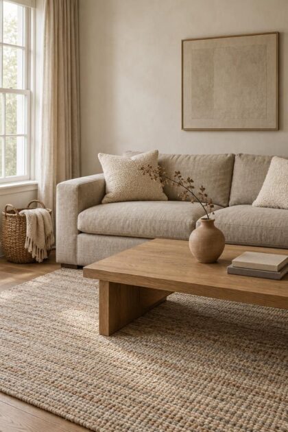
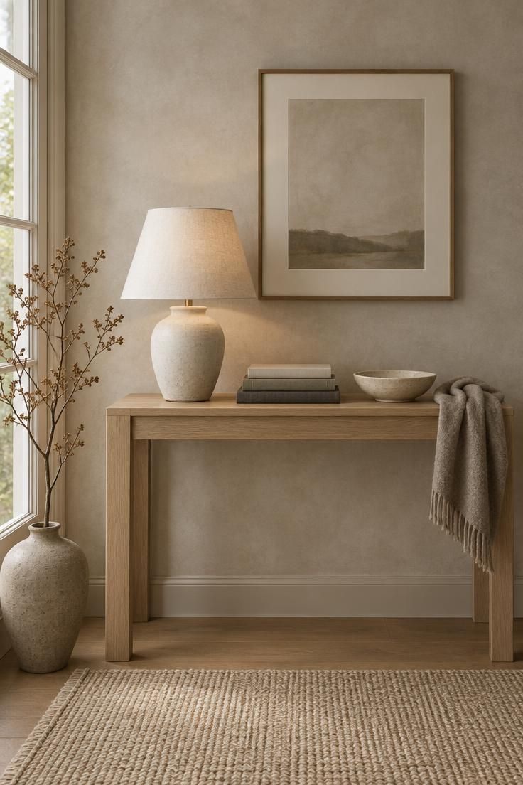
Vyanca Soto points to “limewashed walls, oak wood, bouclé textiles, and soft linen curtains,” and observes that “In the absence of bold color or pattern, texture becomes the main character.”
That sentence is the whole principle in miniature.
Start with soft materials at the scale of the room.
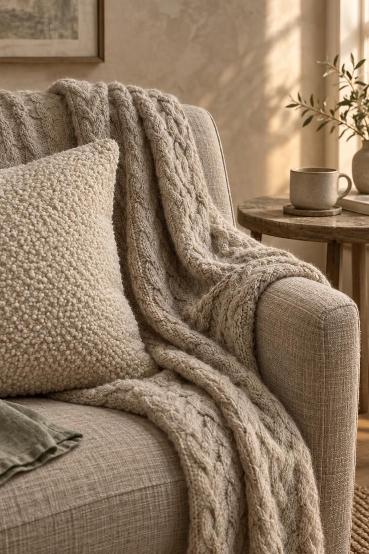
Meeshie Fahmy describes layering as “a must,” naming knit or chunky throws, textured pillows, and light neutral pattern as the pieces that keep a pared-back room from reading as clinical.
A wool throw over a linen chair back, a bouclé cushion against a smooth sofa, and a nubby rug underfoot give the eye three distinct surfaces within a small area.
The corollary is that fewer but better furniture choices make those textures legible.
Ania Agárdy, a Miami-based interior designer, notes that because fewer pieces are incorporated, “the budget actually allows for higher quality furniture with emphasis on comfort.”
A single well-made chair in a nubby fabric does more visual work than four upholstered pieces in assorted finishes.
Color works the same way, through restraint rather than absence.
Cassie Hanson, founder and principal of Dae Planner, frames the rule as “choose one or two hues, and use them sparingly.”
Soto adds that “A soft sage green, muted ochre, or dusty rose can all live beautifully in a minimalist space when used in clean silhouettes and balanced proportions.”
Choose the hues from what the room already contains.
A rug with a faint terracotta band, a stone counter with warm veining, or a piece of art with a single strong note gives you a palette that will not fight the architecture.
Repeat that note twice in the room, in a cushion and a ceramic, and then stop.
Natural materials carry the warmth farther than synthetic surfaces of the same color.
Stone, matte ceramics, linen, wood, and natural fibers appear across multiple designer lists as the texture-first vocabulary for spare rooms.
Their variation within a narrow color range gives the room visual information without requiring additional objects.
Let the floor hold a large share of the texture.
A flat, smooth rug under sparse furniture makes a room feel emptier than it is, while a rug with visible wool or jute pile anchors the arrangement and absorbs the visual gap between pieces.
Choose the rug before the accessories, since it sets the palette more quietly than a painted wall.
One caution about the warmth layer: it can become a new collection.
Three throws in the same knit, each a slightly different shade, recreate the clutter problem in a softer palette.
Limit the layers to one per surface type, then stop adding and start living.
Design Pro-Tip: Run your hand across two surfaces in the room and notice whether any contrast comes from material rather than from a separate object. If every surface feels the same, add texture rather than another item, and if the materials already vary, leave the room as it is.
Small-Space Application: Concealed Storage and Multi-Function Pieces
In a compact apartment or condo, fewer visible objects rarely means fewer possessions.
It means the possessions need somewhere to live that is not on display.
That distinction turns storage into a design decision about composition rather than a construction project.
Design-history summaries describe concealed storage, such as flush-fronted cabinetry and wardrobe fronts that sit level with the wall, as a mechanism that keeps belongings out of sight without requiring you to get rid of everything you own.
The visual logic is straightforward: a closed, flat plane reads as calm surface, while open shelving full of varied objects reads as activity.
Minimalist small space storage furniture earns its place by doing two jobs at once.
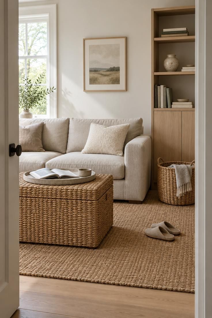
A storage ottoman serves as a footrest, a coffee table substitute, and a place for blankets.
A daybed sits as a sofa by day and holds bedding inside.
A shelving unit with closed lower cabinets puts books above and hides the mismatched items below.
Multi-function pieces also solve a composition problem that small rooms face.
When a room holds two or three large, purposeful objects instead of six small ones, the eye has less to process and the floor reads as more open.
Choose pieces with a consistent finish and let the functions vary rather than the materials.
Baskets deserve their own mention because they bridge display and storage.
A woven basket beside a sofa holds throws within reach while adding texture and a natural material note.
The contents stay accessible, the surface stays clear, and the basket itself contributes to the room’s warmth.
Weight and scale matter more than exact dimensions in a small room.
A piece that is slightly too large reads as generous and deliberate, while several pieces that are slightly too small read as scattered.
Repetition of one shape, such as two matching ottomans or a row of closed cabinets, gives a compact room visual order without requiring more furniture.
Keep the storage decisions reversible where possible.
Freestanding cabinets, lidded ottomans, and under-bed boxes can move to another room or another home, which makes them a safer first experiment than fitted joinery.
Live with a freestanding arrangement for a season before committing to anything permanent.
Maintaining the Edit: Habits and the One In One Out Rule
The first clear-out is the easy part.
What determines whether a room stays edited is the small, repeated behavior that follows, and the survey evidence on upkeep habits points toward short daily actions rather than seasonal marathons.
Among respondents to an Ipsos iSay survey, 57% named a few minutes of daily tidying as their top maintenance tip, and 52% said they discard junk mail immediately.
The two habits share a quality: each takes less time than the mess it prevents.
A few minutes before bed returns a room to its baseline, and a piece of mail handled at the door never becomes a pile.
The one in one out decluttering rule works as an intake guardrail rather than a removal strategy.
When a new object enters, an old one of the same category leaves.
Ipsos iSay respondents reported the practice at 24%, which suggests it is less common than daily tidying but effective for the people who use it.
Applied strictly, the rule can be tiresome.
Applied loosely, it works best at the moment of purchase, when the decision is still fresh and the object is still returnable.
Keep a donation bag in a closet so the outgoing item has somewhere to go immediately rather than sitting on a counter as a second problem.
A designated place for everything is the quiet partner to the intake rule.
Ipsos iSay respondents named it at 49%, and its effect is structural: an object without a home becomes surface clutter by default.
When you assign a home during the checklist’s fifth step, you are setting up the habit that keeps the room from reverting.
Reviews should be scheduled rather than spontaneous.
A monthly pass through one zone, or a seasonal pass through a whole room, gives the edit a maintenance rhythm.
The frequency is a personal choice, and a household with young children will likely need a shorter interval than a single-person apartment.
Two failure modes are worth naming.
The first is a review that becomes a full clear-out, which is exhausting and rarely repeated.
The second is a review that never happens because nothing feels urgent, which lets a room drift for a year.
A short, fixed appointment on a calendar avoids both.
Design Pro-Tip: Pick the room you walk through first each morning and apply the intake rule only to that threshold for one week. Once the habit holds there, extend it to the next room rather than starting everywhere at once.
When Minimalism Is the Wrong Tool
An honest checklist has to name its own limits.
Several of them are practical rather than philosophical, and knowing them in advance prevents a project that ends in frustration.
The first limit is quality expectation.
A general design reference notes that “Real minimalism requires a noticeable investment in the few items chosen; quality, materials, and proportion matter enormously when nothing else is competing visually.”
Fewer objects means each one is examined closely, which raises the standard for every piece that remains.
The second is budget direction.
Agárdy’s point that fewer pieces allow “higher quality furniture with emphasis on comfort” describes a reallocation rather than a saving.
A pared-back room can cost more than a full one, because the money moves from quantity to material and construction.
Architecture is the third limit, and Hunt’s observation about homes with little architectural interest belongs here as well as in the pre-check.
In a room with flat walls, standard trim, and bland finishes, a sparse arrangement has nothing to hold the eye, and a collected approach often settles in more comfortably.
Family life is the fourth.
A design glossary notes that minimalism “works less well in family homes with kids and accumulating life,” which is a fair description of how quickly a spare room absorbs school papers, sports gear, and gifts.
A household with young children may need a version of the checklist that leans on concealed storage rather than on fewer possessions.
The fifth limit is austerity.
The same glossary warns against going too austere, and the critique from Fahmy about cold, copy-and-paste interiors describes what that looks like typically.
A room with no texture, no personal objects, and no color has removed the very things that make a home legible.
The reassuring part is that none of these limits requires an all-or-nothing decision.
Welch states plainly that “People think you have to throw away everything you love; this is not true.”
A checklist can apply to one room and not another, or to the surfaces of a room while the closets stay full.
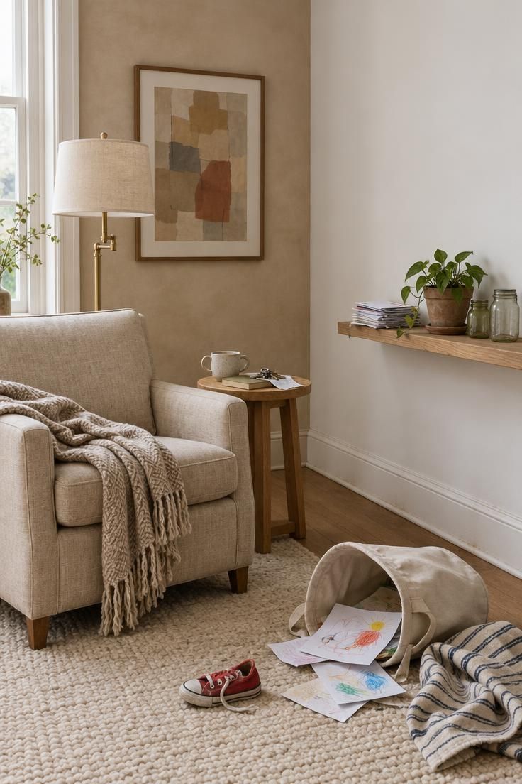
Budget Rhythm: Why a Checklist Lowers Replacement Pressure
A minimalism checklist works because it changes the pace of spending.
Most rooms do not become cluttered through one large purchase.
They become cluttered through small decisions made quickly: a bowl on a counter, a stack of books on a floor, a second set of sheets bought before the first set wears out.
Those decisions rarely feel expensive in the moment.
Yet each one carries a hidden follow-up cost, because the object needs a home, occasional cleaning, and eventually a replacement or disposal choice.
A checklist interrupts that loop by making the intake decision visible before the money is spent.
The checklist also reduces the pressure to redecorate when a season changes.
A room that already has a clear limit for surfaces, textiles, and decorative objects is easier to assess.
The household can rotate what it owns instead of buying a new set of accessories to refresh the room.
This does not require a stark or colorless interior.
A checklist can permit color, pattern, and collected objects, provided each item has a designated place and a clear reason for being there.
The difference is that the room returns to its baseline after use, not to a new accumulation.
The result is a slower rhythm of acquisition and release.
That rhythm matters more than any single organizing method, because the real cost of decor is not the first purchase but the ongoing obligation to manage it.
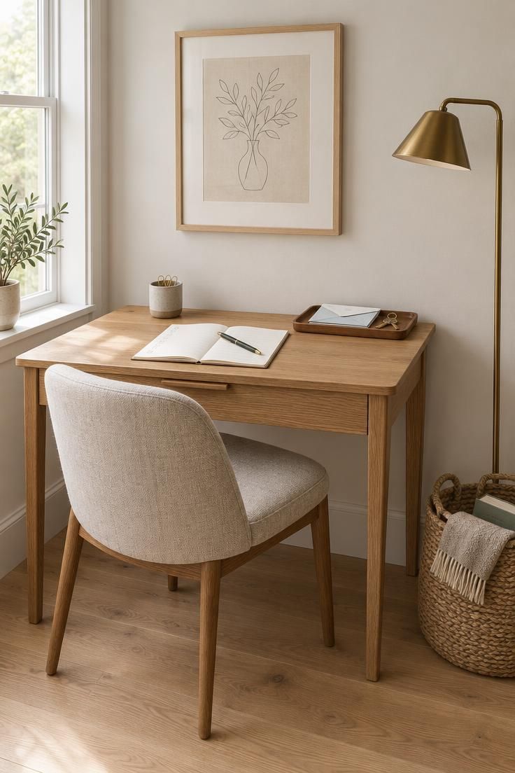
Conclusion
A minimalism checklist is a decision tool, not a purge.
Its purpose is to make the keep choice as deliberate as the remove choice, so that a room loses excess without losing the evidence of the people who live in it.
Three parts hold the result together.
The keep column preserves function and meaning.
The warmth layer of texture and restrained color keeps a spare room from reading as cold.
The maintenance habits, from a few daily minutes to an intake rule, keep the edit from dissolving within a month.
Before adding or removing anything, apply one test: is it functional, meaningful, or repeated elsewhere?
Functional items earn their place by use, meaningful items by memory, and anything repeated elsewhere can usually go.
That single question covers most of the decisions a full checklist would ask you to make.
Start with one surface this week, ideally the one you see first in the morning.
Empty it, return only what passes the test, and give each remaining object a home.
The room that results will feel edited rather than empty, and the habit will be easier to repeat than to abandon.


