This post may contain affiliate links. If you make a purchase through these links, we may earn a commission at no additional cost to you.
A minimalist desk can look beautiful in a photograph and still fail on a Tuesday morning.
The missing charger, the stack of papers with nowhere to go, the second monitor balanced on a book: these are the quiet failures of a workspace styled for appearance rather than use.
Real minimalism at home is less about absence and more about fit.
The desk, storage, light, and materials are chosen around what a household actually does each day, so the room reads calm because nothing is fighting for attention.
Knowing how to create a minimalist workspace starts with that shift in priorities.
The goal is a home office where work happens easily, not a styled corner that only looks composed when no one is using it.
What a Minimalist Workspace Is, and Isn’t
Minimalism as a design tradition traces back to the art movement of the 1960s and 1970s in the United States, later absorbed into architecture and residential interiors through German rationalist and Japanese aesthetic ideas.
The familiar phrase “less is more” belongs to that lineage, and it describes a method of subtraction rather than a decorating trend.
Monica Arango of C’est Ici Interior Design offers a sharper definition in an interview with identity.ae: “Minimalism isn’t about emptiness; it’s about precision and purpose.” That framing is useful for anyone planning a home office, because it moves the conversation from how little can be displayed to how well each item earns its place.
Minimalism is often confused with modern design, and the two are not the same.
Modern design has broad twentieth-century roots and happily accommodates decoration, comfort, and sentimental objects.
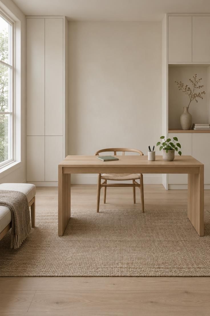
A minimalist workspace is the more disciplined version, built on negative space, a restrained color range, and a smaller material palette.
That discipline can alarm people who worry the result will look unfinished.
Bani Singh of Grounded Design, also speaking with identity.ae, advises readers to “resist the urge to fill every surface or corner,” adding that leaving room for objects to breathe creates a sense of calm and intentionality.
The empty area is part of the composition, not evidence that the room is incomplete.
For a household desk, the practical reading of all this is straightforward.
Keep the working surface lean, let storage carry the volume, and treat every visible object as a deliberate choice rather than a default resting place.
The Warm-Minimalist Turn in Home Workspaces
Recent home-decor reporting describes a shift away from cool beige interiors toward warmer minimalism, where wood, stone, plaster, and leather do the work that pattern and color once did.
The style keeps the restraint but swaps the chill for texture.
Jamie Winspear of Oak by Design, quoted in Homes & Garden coverage of a warm-minimalist office, points to solid timber, natural stone, and plaster as materials that bring weight and tactile feeling to a room.
Winspear also describes what draws people to them: how a door closes, how a surface feels under the hand, how light moves across a wall.
Texture is the mechanism that keeps a restrained workspace from reading clinical.
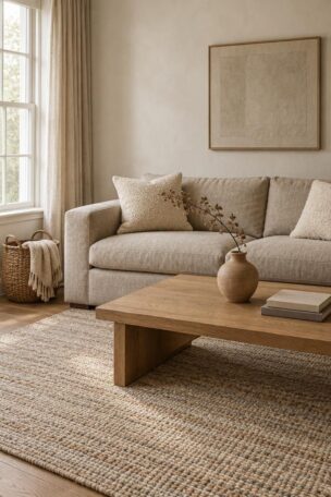
A neutral room layered with linen, stone, jute, and matte plaster can feel rich rather than bare, which is why warm minimalism suits a home desk so well.
The palette stays quiet while the surfaces carry the interest.
Treat this as one useful direction rather than a rule.
If cool whites and smooth finishes match the rest of the house, that version of minimalism will feel more coherent than a warm scheme imported from a magazine page.
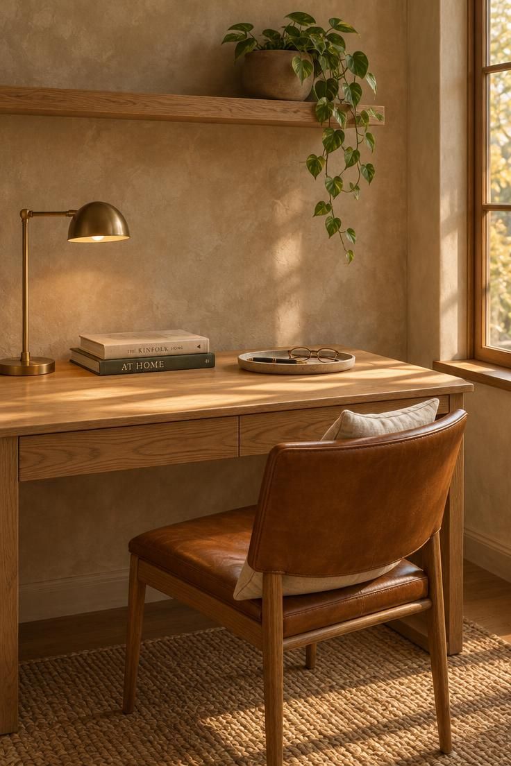
Start with the Surface: What Actually Belongs on the Desk
The modern home desk is increasingly sized around devices rather than paper.
Alison Green of Élan Design House, quoted by Design News Now, notes that home office users “have a laptop, maybe a screen and they’re not really needing a lot of desk space anymore for papers.” That observation is the most useful starting point for anyone choosing a desk surface.
The practical question becomes relative rather than absolute.
Look at what sits on the desk on a normal working day, then choose a surface that holds those items with a little breathing room.
A leaner top with clear margins usually reads more intentional than a broad expanse crowded with extras.
A few objects will always stay out, and pretending otherwise invites failure.
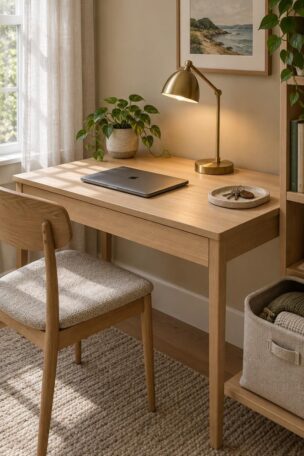
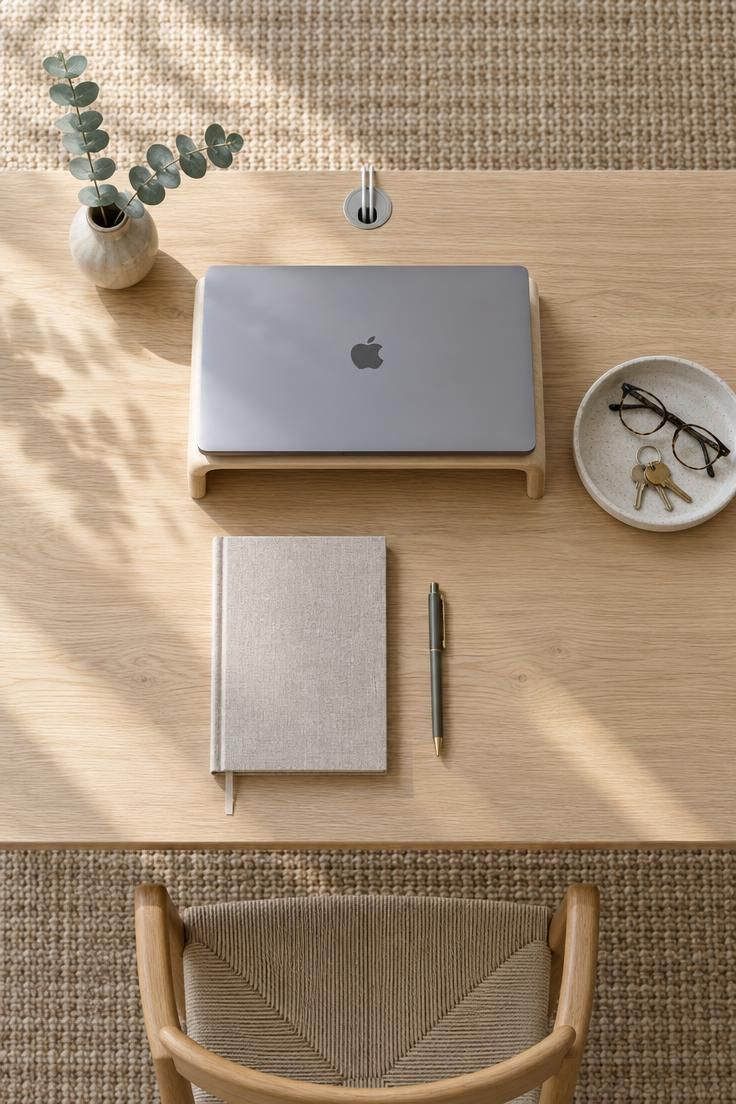
A small tray or shallow bowl can act as a landing zone for the items in daily rotation: a pen, glasses, a phone, keys.
The tray gives those objects a defined home so they stop scattering across the surface.
Cables are the larger culprit in most home offices.
Green’s line that solutions for corralling cords matter more than methods of corralling paper is worth pinning above the desk.
Routing cords behind a desk panel or into concealed desk storage for a home office keeps the top edge clean in a way that tidying never sustains.
Storage that hides the working clutter, rather than the working essentials, is the right target.
The laptop and the lamp can stay visible; the spare chargers, adapter bricks, and loose cables belong behind a door or inside a drawer.
The first step is small and concrete: clear the surface completely, then return only what was used in the past week.
Everything else should have a place off the desktop or leave the room.
Storage Is the Load-Bearing Wall of Minimalism
A restrained desk only works if the room has somewhere for everything else to live.
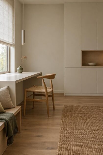
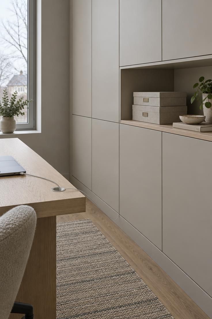
An uncluttered interior depends on smart concealed storage, including built-in cabinetry, flush-fronted wardrobes, and other closed volumes.
Minimalism without storage is just deprivation.
Allison Babcock, profiled in Mansion Global, describes integrating storage into the architecture itself through panelized millwork, concealed doors, and hidden charging, so everyday necessities disappear behind clean lines.
Her framing lands the balance well: “Clutter-free interiors don’t mean empty rooms.”
Philipp Nagel of Neatsmith, quoted in a Yahoo home-decor piece, offers a planning checklist worth borrowing before any cabinet decision.
His list covers screens, charging points, camera positions, filing type, and bookshelf depth.
Working through those questions on paper reveals how much closed volume the room truly needs and what shape it should take.
That exercise also separates two different kinds of storage.
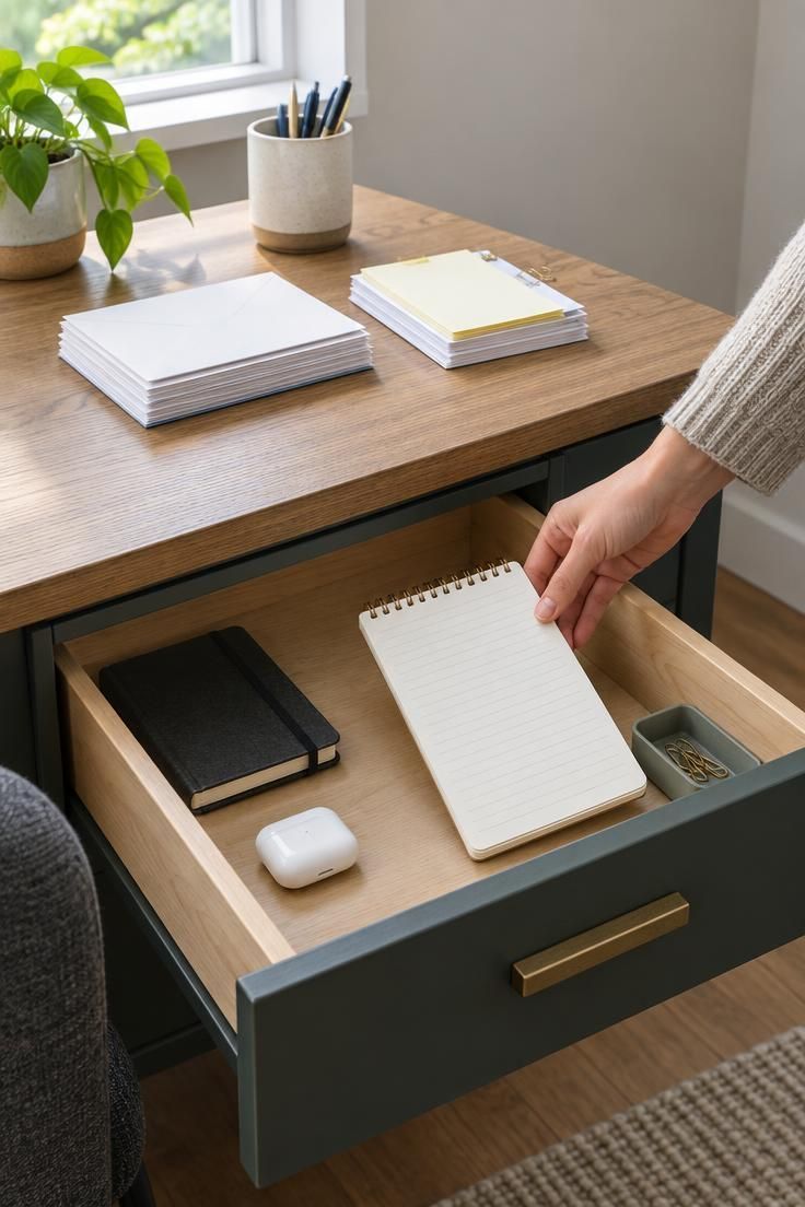
Daily items need to be reachable in seconds, which points to a drawer or shallow shelf at desk height.
Infrequent items can go higher or deeper, as long as retrieving them doesn’t require emptying a cabinet.
Hidden charging is the detail that most distinguishes a functional minimalist office from a merely tidy one.
When devices charge inside a drawer or behind a panel, the surface stays clear through the working day rather than only in the morning.
The failure mode to watch for is hidden hoarding, where closed doors conceal accumulating clutter that never gets addressed.
Plan for an occasional clear-out from the start, so the cabinets stay genuinely usable and the storage doesn’t quietly become the problem.
Design Pro-Tip: Before ordering any storage, list the screens, chargers, camera gear, and paper files the household actually uses, then match drawer depth and shelf height to those items rather than to the room’s wall length.
Choosing the Desk and Chair as Functional Objects
Desk sizing becomes clearer once devices drive the decision.
Device-centered desk sizing asks what the household actually runs each day, then gives that equipment a comfortable footprint with a margin on either side.
A laptop and a single screen need far less surface than two monitors and a document tray, and matching the desk to the real load prevents both crowding and wasted space.
The chair deserves a simple physical check that most buyers skip.
When the chair slides fully under the desk, the room reads neat even on a busy day, because the working seat disappears into the composition.
A chair that stands proud of the desk front leaves the whole area looking in use.
Adjustable-height desks appear in most current home-office reporting as an option for people who want to alternate between sitting and standing through the day.
Treat this as a preference rather than a requirement, and choose it only if the household will genuinely shift posture.
Rooms that serve more than one job change the desk calculation.
A slim desk that doubles as a console or a dressing table can carry two roles without a second piece of furniture.
The key is an unbroken front, a shallow depth, and enough clear floor around it to read as intentional in both uses.
Selection criteria matter more than style labels here.
Measure the devices, test the chair tuck, decide whether the surface has a second job, and only then choose a finish.
The material is the last decision, not the first.
Color, Material, and Light as Composition
Color in a minimalist workspace works best as a background system.
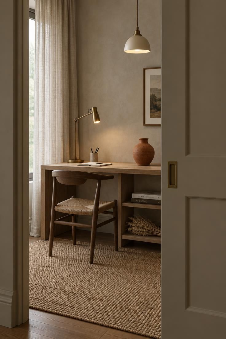
A neutral base of white, warm beige, taupe, or muted grey gives the room a steady field, and a small number of earthy accents, such as terracotta, dusty sage, or caramel, add life without creating visual noise.
Texture carries warmth that color alone cannot.
Linen, jute, matte plaster, and visible wood grain give the eye something to register at close range, which keeps a restrained palette from feeling flat.
A neutral room layered this way reads rich rather than bare.
Light deserves the same planning as furniture.
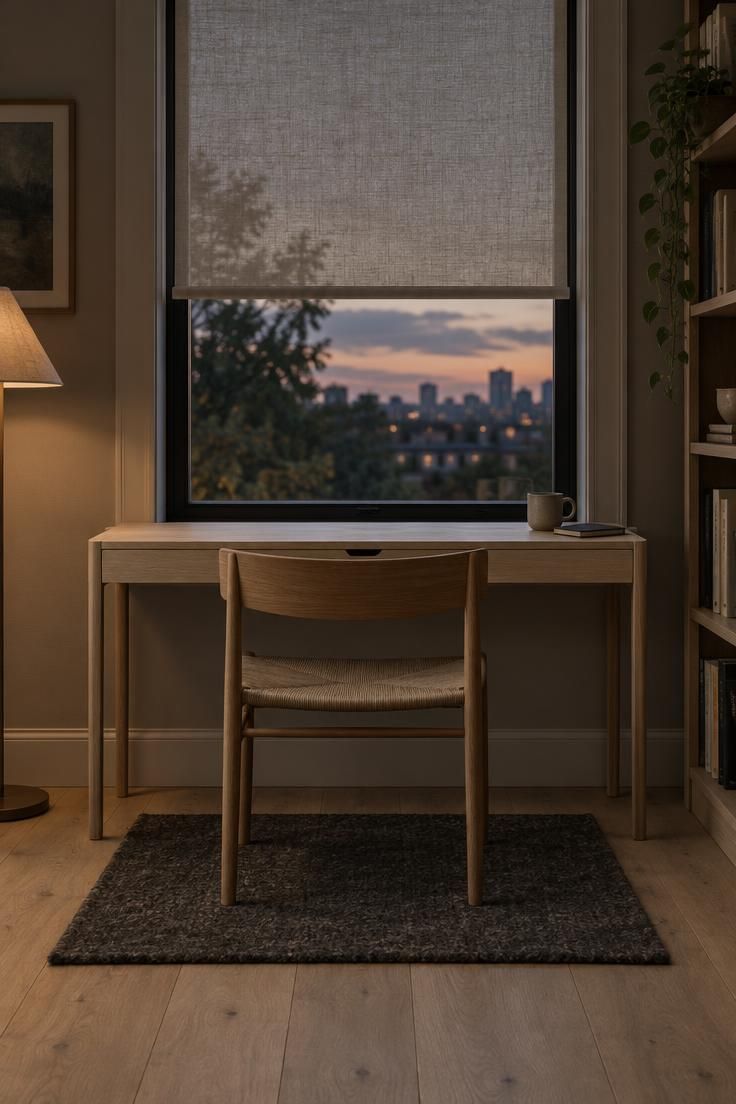
Daylight comes first, softened by sheer linen or a simple roller blind rather than heavy curtains, so the working surface stays evenly lit through the day.
Warm-white bulbs and a layered mix of ambient and task light are aesthetic choices that keep the room from feeling clinical, and they read better than a single bright ceiling source.
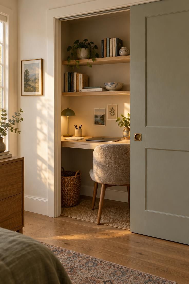
A cloffice with sliding doors shows how these decisions converge in a small footprint.
The closet interior takes a pale neutral wall, a shallow wood desk, and one terracotta accent object, while the sliding panel can close the whole composition away.
The palette stays consistent inside and out, so the office reads as part of the room even when concealed.
The order of decisions matters.
Choose the base color, then the two or three textures that will carry warmth, then the light sources, and only then the accent objects.
Building the room in that sequence keeps the accents from multiplying.
Small Rooms, Shared Rooms, and Rooms That Do Other Jobs
Most home workspaces share their footprint with something else.
A 2023 survey of designers and stagers reported by Designers Today, drawn from 71 completed responses, found multi-functional space cited by 77 percent as the biggest home-office trend, with minimalism at 39 percent.
The sample is small and drawn from the design community, but the pattern matches what small homes demand.
The cloffice, a closet converted into an office, is the clearest expression of that pattern.
CasaCor documents the approach, including sliding doors that conceal the workspace when the day ends.
A shallow desk, a narrow chair, and wall-mounted shelves can turn a closet into a working nook while the room around it stays a room.
A multi-functional guest room office relies on the same logic at larger scale.
A Murphy bed or a pull-out sofa lets the office occupy the floor by day and yield it to visitors at night, and the desk often doubles as a console along one wall.
The workspace has to be genuinely stowable, not merely pushed aside.
Shared offices work better when the room is divided deliberately.
Two people can split a long wall into separate stations, each with its own light and its own storage, so the space reads as two composed zones rather than one crowded desk.
Open-backed shelving can run the divider, hiding cables while keeping the room from feeling heavy.
Amy Peltier of Peltier Interiors, quoted by Design News Now, describes the home office as “a multifunctional room that might be on par with a kitchen,” and advises paying attention to function first and then layering in the beautiful design.
That sequence is the practical core of small-space adaptation.
Treat these as planning and composition choices rather than construction instructions.
The useful work is deciding what the room must do, where each function sits, and what closes away when the day ends.
Design Pro-Tip: For a room that serves two purposes, draw the floor plan twice, once for each function in use, and confirm the desk, chair, and storage all have a workable position in both versions before committing.
Keeping It Minimal Over Time
A minimalist workspace is maintained, not finished.
A weekly reset, where the surface returns to its few daily items, keeps the desk from slowly becoming a general-purpose landing pad for mail, cups, and chargers that belong elsewhere.
Storage has to stay accessible for that routine to hold.
Everyday essentials should sit within easy reach, while infrequent items live further away, so retrieving anything doesn’t require unpacking a cabinet.
When a drawer becomes hard to open, it has signaled that the clear-out is overdue.
Layered desk lamp and daylight planning pays off here as well.
A task lamp that can be repositioned and a window that supplies soft daylight let the workspace shift through the day without adding objects.
Light that works reduces the temptation to clutter the surface with decorative extras.
The distinction worth keeping is between a settled workspace and a cluttered one.
A Yahoo home-decor piece on lived-in offices argues that full bookshelves and a pen cup can still read as settled rather than messy, and that framing is a more realistic target than an empty desk.
Hidden hoarding is the predictable failure of concealed storage.
Address it with an occasional decluttering pass rather than a constant purge, so the cabinets stay genuinely useful and the room keeps its composure.
When a Bigger Surface Is the Honest Answer
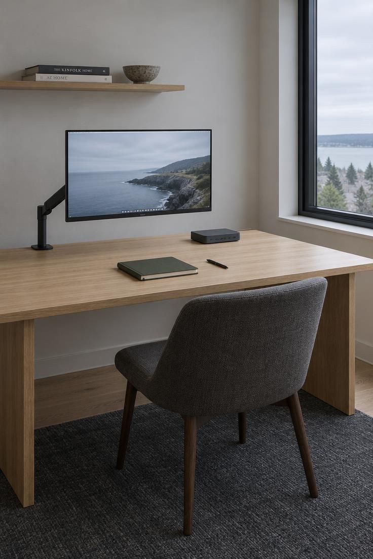
Minimalism has limits, and forcing a large workflow onto a small surface produces visual clutter rather than restraint.
A generous monitor, a paper-heavy process, or a two-computer setup can make a larger desk the more honest choice, because everything finally has room instead of spilling onto the floor.
A bigger surface with clear margins often reads leaner than a cramped desk with overflow stacked behind it.
The measure is proportion rather than absolute size: enough desk to hold the equipment with space left over, and walls that stay clear of accumulated extras.
Nagel’s planning framework helps settle the question.
If the screens, charging points, camera positions, filing type, and bookshelf depth add up to more volume than a small desk and a shallow drawer can hold, a larger surface plus open shelving may produce a calmer room than a minimalist facade that fights the daily routine.
The practical decision rule is simple.
If the household is fighting the surface every day, rearranging the same objects and shifting stacks from one side to the other, the surface needs to grow rather than the routine needs to shrink.
Design Pro-Tip: If the desk has been rearranged three mornings in a row to make room for the same items, treat that as a sizing signal and consider a wider surface instead of more organizers.
Conclusion
A minimalist workspace is defined by what the household can use easily, not by what the room can hide.
The desk holds the daily tools, the storage absorbs everything else, and the surfaces carry texture and light rather than objects.
Build the room in a deliberate order.
Clarify the daily routine, choose a surface sized to the devices and work, resolve where everything lives, then layer texture, color, and light.
Revisit the setup periodically so it keeps pace with how the work changes.
Start with one small action: remove a single object that has not been used in a week.
Notice whether the desk feels more capable afterward or simply emptier, and let that answer guide the next choice.