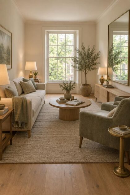
This post may contain affiliate links. If you make a purchase through these links, we may earn a commission at no additional cost to you.
Most rooms do not need more square footage.
They need a clearer visual path, better distributed light, and fewer pieces competing for attention.
The dimensions rarely change.
What changes is how the eye travels through the space, where brightness collects, and whether the objects in the room relate to one another or simply coexist.
That distinction keeps the advice honest: these are composition strategies, not spatial transformations.
Why Small Rooms Read Small
A room looks small because the eye keeps hitting stops.
The walk from the doorway to the far wall is interrupted by a tall shelf, a heavy sofa, a dark corner, or a cluster of small objects.
Each interruption shortens the perceived distance, and short distances read as confinement.
Perceived spaciousness comes down to four levers.
Sightline length is how far the eye can travel before something blocks it.
Visual continuity is whether surfaces read as one field or as competing fragments.
Reflected and distributed light is whether brightness spreads around the room or collects in one harsh pool.
Compositional scale is whether the pieces in the room relate to one another and to the room itself.
This approach is not a decorating fad.
Ancient Roman interiors used illusionistic wall painting, with painted architecture and receding lines that made flat walls appear to open into other spaces, as documented in the Metropolitan Museum of Art’s coverage of Roman wall painting.
Renaissance painters later formalized the convergence of lines toward a vanishing point, treating the painted surface as a window onto another space.
The useful takeaway from that history is modest.
People have been managing perceived depth for a very long time, and the tools have not changed much: pull the eye farther, reduce visual breaks, spread the light.
Those principles sit behind most small room layout ideas, which is why the ideas work better when you understand the reasoning rather than copying a formula.
Start With the Sightline
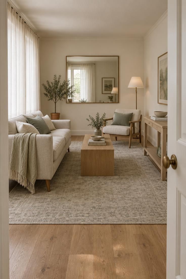
A sightline is the longest unbroken view from a main entry point.
When the eye can travel from the door to a window or a far wall without interruption, the room feels more spacious.
Block that view early with a tall bookcase or a heavy sofa back, and the room reads as closed.
The most common fix costs nothing.
Move tall storage away from the doorway and off the wall directly facing the entrance.
Put low furniture near windows so the eye travels over it and out.
Angle seating toward the longest available wall rather than against a short one.
Windows do a lot of quiet work here.
When a low sofa sits below the sill line, the eye reads the floor plane continuing past the furniture and out through the glass, which extends the perceived depth of the room without moving a single wall.
Very small rooms do not always allow furniture to be pulled away from walls, and that limitation is real.
Even so, small adjustments help: turning a chair slightly, swapping a tall bookcase for a lower console, or clearing a few inches at the end of a sofa can open the view enough to matter.
Furniture: Fewer, Better, and Off the Walls When Possible
Too many small pieces create visual noise.
A cluster of tiny side tables, small art, and slender accessories makes the eye stop repeatedly, and every stop shortens the perceived size of the room.
A few properly scaled pieces read as calmer and more deliberate.
Start with three anchors: one main seating or sleeping piece, one rug that defines the zone, and multifunctional storage.
Storage ottomans, nesting tables, extendable dining surfaces, and beds with integrated drawers reduce the number of objects on the floor, which is itself a spacing strategy.
The point is not the object but the reduction in visual clutter.
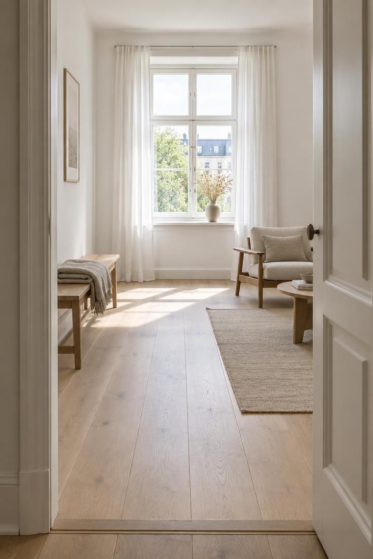
Furniture with exposed legs lets the floor plane continue underneath and behind, keeping the room from feeling bottom-heavy.
Bulky skirted pieces occupy more visual volume, and that tradeoff is worth stating plainly: skirted furniture can be comfortable and appropriate, but it fills more of the eye’s frame.
The old habit of pushing every piece flush against the walls often backfires.
It leaves an awkward empty center while making the room feel rigid and undifferentiated.
Where the room allows, pulling a sofa slightly forward improves circulation and makes the arrangement look intentional rather than defensive.
Anyone researching how to make a room look bigger will find this counterintuitive move in most thoughtful guidance, and the reason is simple: the gap behind the sofa reads as depth.
Not every room can spare those few inches, and in a genuinely tight space the wall-hugging arrangement may be the only option.
That is a limitation to accept, not a failure.
The other levers, light and scale, still have room to work.
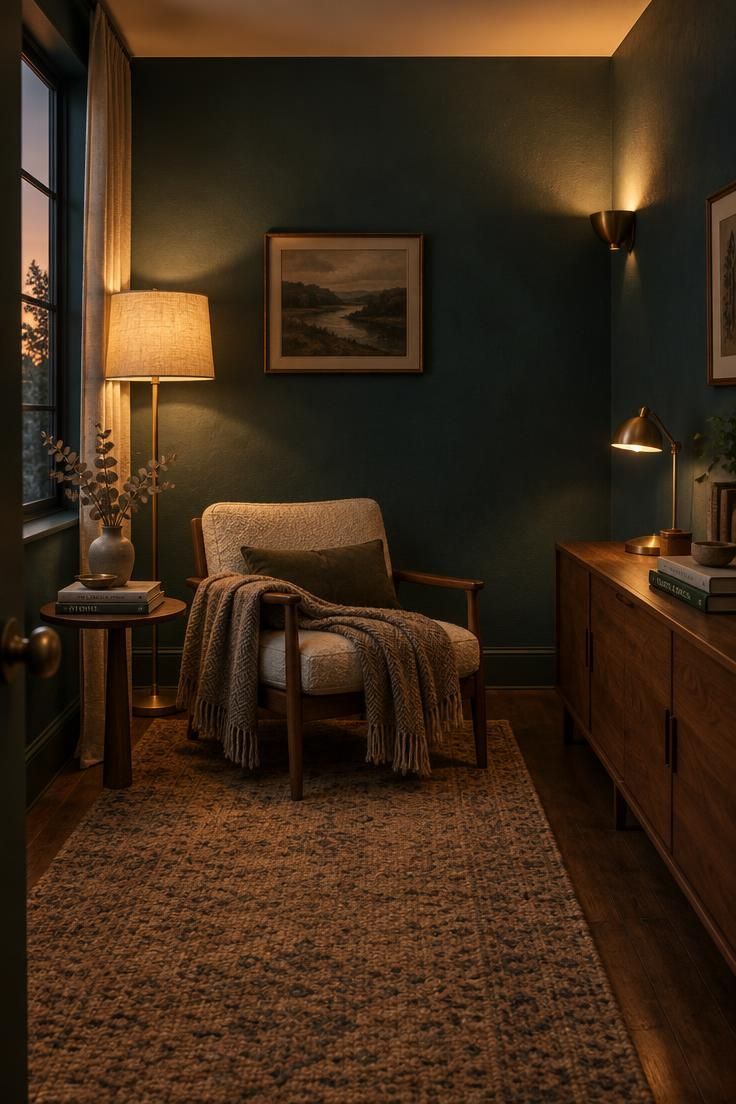
Light in Layers, Not in One Place
A single central ceiling fixture tends to create harsh shadows and leave corners dark.
Dark corners visually pull walls inward, which is why a room can feel smaller at night than it does at noon even though nothing has moved.
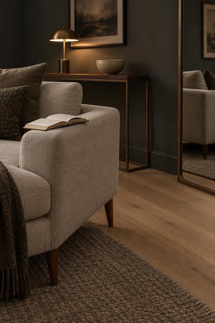
Layered lighting for small rooms distributes brightness across three cooperating roles.
Ambient light provides general illumination from a ceiling or pendant fixture.
Task light serves a specific activity, such as a desk lamp or a reading light.
Accent light washes a wall, highlights art, or lifts a corner through sconces, picture lights, or floor lamps.
Lighting vertical surfaces matters more than most people expect.
When a wall receives light, the perimeter of the room reads as expanded rather than compressed.
Aiming a lamp upward or bouncing light off a pale wall pushes the apparent boundary back.
A 2017 Houzz survey of more than 200 community members living in homes of 1,000 square feet or less found that 57 percent said lots of natural light helped their home feel more spacious.
That figure describes the habits and impressions of surveyed Houzz users, not all homeowners, and it does not establish that light causes any perceptual outcome in a general sense.
Dimmers let one room shift between bright daytime use and a warmer evening atmosphere.
The practical tradeoff is that layered lighting means more lamps, more cords, and more switching points to manage, which is worth weighing before adding a fifth light source to a small room.
Windows and Curtains
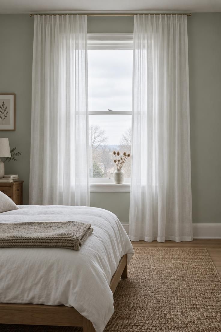
Window treatments change how tall a wall reads and how much daylight reaches the room.
Hanging a curtain rod close to the ceiling draws the eye upward and makes the window appear taller than its frame.
Full-length panels that reach the floor keep the wall reading as one continuous vertical surface.
Extending the rod beyond the window frame exposes more glass and widens the apparent opening, which is a simple change with a visible effect.
Lightweight or sheer fabrics diffuse daylight across the room rather than concentrating it.
Short or heavy curtains visually close a window and chop the wall into sections, which works against both the height and the light goals.
The same Houzz survey found that 35 percent of surveyed small-home residents used mirrors to make the most of their space, which is a useful bridge to the next decision.
Mirrors and windows cooperate: one brings light in, the other sends it back into the room.
Mirrors: One Large, Well Placed
Several small decorative mirrors fragment the visual field and add the same kind of noise as a cluster of tiny objects.
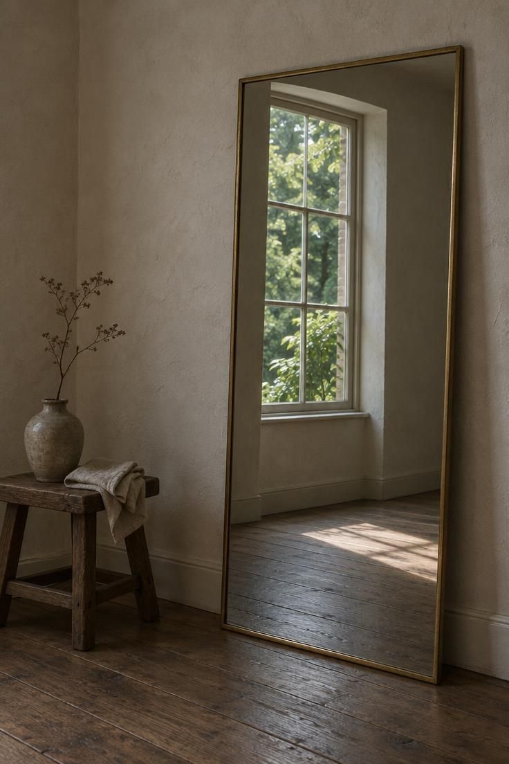
One large mirror does the opposite: it extends the sightline by showing the eye a second version of the room.
Large mirror placement works best where it reflects something worth looking at.
Opposite or adjacent to a window, a mirror pulls daylight deeper into the room.
At the end of a narrow room or hallway, it stretches the perceived depth.
On the longest uninterrupted wall, it doubles the apparent width of the space.
The common mistake is aiming a mirror at a blank wall, a television, or a cluttered storage area.
A mirror only helps when the reflection is worth extending.
Point one at a wall of open shelving stuffed with small objects and the room reads as busier, not larger.
The Hall of Mirrors at Versailles, completed in the 1680s, remains the famous historical example of this idea, with mirrored arches placed opposite windows so the reflections carried light and the view of the gardens back into the hall, as described by the Château de Versailles.
The principle is the same at any scale: reflect light, reflect a view, and the room gains apparent depth.
Design Pro-Tip: Before buying anything new, stand at the room’s main entry point and look toward the farthest wall to identify the first object that interrupts the sightline, then move that object.
Rugs, Art, and the Case for Going Larger
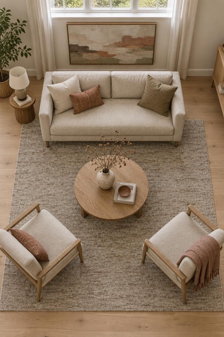
An undersized rug visually fragments the floor and makes the room feel disconnected.
When a small rug floats in the center with bare floor showing on every side, the eye reads separate patches instead of one zone.
The fix is counterintuitive: choose a bigger rug.
The working guideline for rug size for small living room layouts is that the rug should be large enough for at least the front legs of the main furniture to sit on it.
That single move unifies the seating group into one visual zone and lets the floor beyond read as continuous open space rather than leftover margins.
The Houzz survey found that 48 percent of surveyed small-home residents used room-defining area rugs, which illustrates a common habit rather than a cause-and-effect result.
In a narrow room, a runner placed lengthwise with a subtle directional pattern such as broad stripes can guide the eye along the long axis and make the room feel deeper than it is.
Art follows the same logic.
One large piece reads as calmer and more spacious than a dense gallery wall, because a small room has limited wall area and many frames fill it quickly.
Gallery walls can be attractive in larger or more expressive rooms, and that is a fair tradeoff to consider rather than a rule to follow.
The limitation is physical.
A very tight room may not accommodate an oversized rug, and a smaller rug may be the only realistic option.
In that case, choose one with low-contrast tones so the edges do not draw the eye and break the floor plane into obvious fragments.
Color Continuity and the Case Against Default White
Color continuity reduces visual breaks and makes a room read as one continuous volume.
When walls, trim, and ceiling share a family of tones, the eye stops registering the joints between surfaces and instead reads the room as a single shape.
A perception study cited by SAGE Journals found that lighter walls and ceilings made rooms appear taller, with floor color having a weaker effect.
That is a finding about perceived height under controlled conditions, not a claim about mood or wellbeing.
Benjamin Moore’s small-spaces paint guidance favors warm off-white, pale beige, soft gray-green, light blue, and light gray for rooms that need to feel airy.
These tones keep walls and trim close in value so the boundary between them softens.
The idea that every small room must be painted white is outdated.
Color drenching, which uses one color family across walls, trim, ceiling, and sometimes furnishings, produces an enveloping effect that works in small rooms when the lighting is layered and reflective surfaces are present.
Darker shades give a cozy, sheltered feeling, and that is a deliberate tradeoff: atmosphere instead of maximum apparent size.
Strong horizontal color bands should generally be avoided in small rooms because they slice the wall into separate zones and interrupt the vertical read.
Save the bold stripe for a larger wall or a room with more ceiling height.
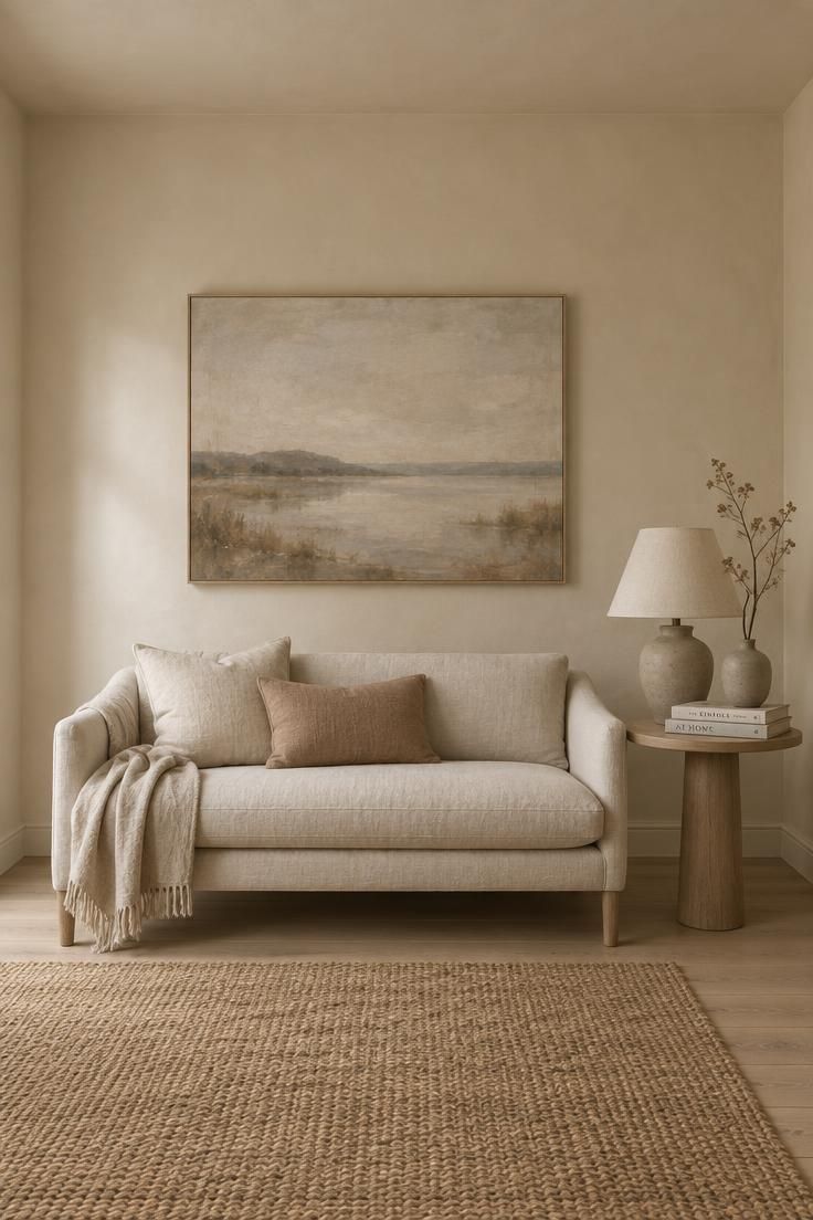
By Room Shape: Square, Narrow, Low-Ceiling, Dark, Open-Plan
A small square room resists long sightlines because every wall is roughly equidistant.
One large mirror on a single wall, furniture arranged around the perimeter, and a round or oval coffee table that softens the boxy geometry all help.
Keep wall colors continuous and avoid making each wall a separate focal point.
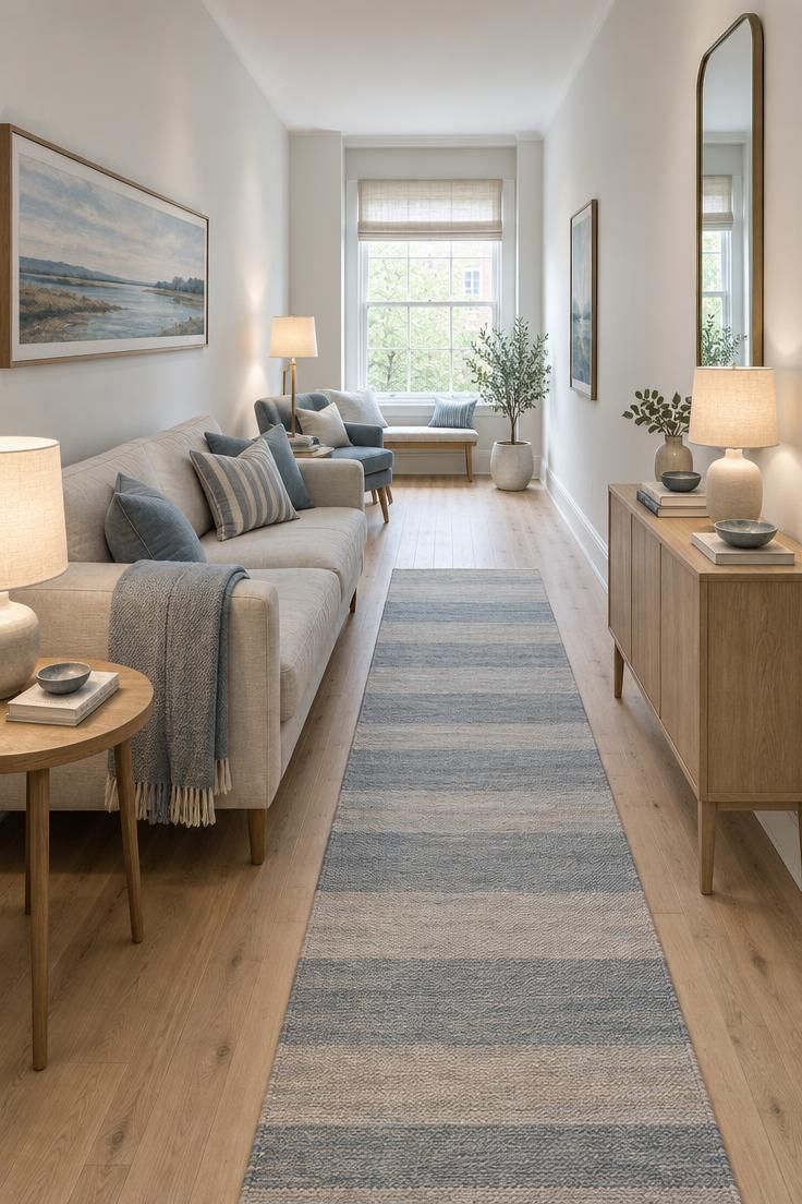
A narrow room benefits from moves that stretch the long axis.
Horizontal artwork or shelving, a runner placed lengthwise, shallow-depth furniture, and lighting at both ends all pull the eye down the length of the space.
Mirrors on a long wall add depth, and a clear sightline end to end keeps the room from reading as a corridor of furniture.
A narrow room furniture arrangement should avoid lining everything along one side unless the room is genuinely a passage or gallery.
Staggering pieces along both walls, even by a few inches, breaks the tunnel effect and gives the eye more to travel across.
A low-ceiling room gains height from vertical moves.
Curtains mounted high, vertical artwork, tall narrow bookcases, and low-profile furniture all draw the eye upward.
Keep ceiling and wall colors similar so the ceiling does not read as a separate lid, and avoid strong horizontal bands and low-hanging fixtures.
A dark room needs surfaces that bounce light.
Light-reflective wall colors, mirrors near windows, sheer window coverings, and multiple small lamps distribute brightness across the perimeter.
Pure white can look stark in a room with little natural light, so a soft warm neutral often reads better.
An open-plan room gains coherence from consistency.
One flooring material throughout, a restrained palette, and zones defined by furniture, rugs, and lighting rather than contrasting colors or partial walls keep the whole space reading as one generous volume instead of several cramped ones.
What Usually Backfires
Too many small mirrors reflect nothing useful and add visual noise.
A mirror only works when it catches light or a view worth extending, so several small ones usually fragment the wall instead of opening it.
A room full of tiny furniture looks crowded rather than spacious.
Small tables, small rugs, small art, and many accessories create repeated stops for the eye, and each stop shortens the perceived distance across the room.
Pushing every piece flush against the walls leaves an empty center and makes the arrangement feel rigid.
Where the room allows a few inches of breathing space behind the sofa or chairs, the gap reads as depth.
Heavy, short curtains close a window visually and can make a ceiling feel lower by cutting the wall into horizontal sections.
Too many contrasting colors do similar damage by dividing the room into separate color zones rather than one continuous volume.
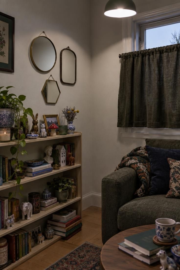
Dense gallery walls and shelves filled with small objects both create visual noise.
In a very small room, one large piece of art or a few well-chosen objects reads as calmer than a wall covered in frames or a shelf crowded with trinkets.
A single harsh overhead light leaves corners dark and flattens the room, pulling the walls visually inward.
The assumption that every small room must be painted white is outdated advice and often produces a stark, cold result that does not feel larger, only emptier.
A Reasonable Order of Operations
Start with the changes that cost nothing.
Remove unnecessary furniture and objects first, then clear the main walking path so the longest sightline in the room is open.
This step alone often produces a visible difference before any purchase.
Move to the inexpensive adjustments next.
Shift curtain rods close to the ceiling and let panels reach the floor.
Replace several small decorations with one large artwork, and add one large mirror where it can reflect light or a view.
Use lamps to brighten the corners that stay dark after the overhead light is switched off.
Save the more involved changes for last.
Paint walls and trim in a unified tone, then choose a rug large enough to connect the main pieces of furniture, and keep the floor and walking path clear as a final check.
This is a suggested order of operations rather than a required sequence, and different rooms will prioritize differently depending on what is already there and what bothers you most.
Conclusion
The most effective way to make a room look bigger is not to buy more space.
It is to manage what the eye sees: clear the sightline, spread light across the perimeter, and choose fewer, larger-scale pieces that relate to the room and to each other.
Start with one layout change, one light source, and one scale adjustment this week.
Move the tall bookcase away from the doorway, add a lamp to the darkest corner, or replace three small frames with one large piece.
Reassess before adding anything else, because the first change often makes the second one obvious.
Look for interruptions, dark corners, and undersized objects as you reassess.
Those three things account for most of what makes a room read as smaller than it is.