This post may contain affiliate links. If you make a purchase through these links, we may earn a commission at no additional cost to you.
Thanksgiving decorating often stops at the table, leaving the walls around it quiet and bare.
Warm thanksgiving wall decor carries the mood of the holiday upward, so a dining room or entry feels gathered rather than decorated in isolated pieces.
The short display window rewards arrangements that read clearly from across the room and come down without a fight when the season shifts.
Harvest textures, muted autumn color, and layered groupings do most of the work here.
Each idea below begins with a visual plan, then covers scale, mix, and the practical points worth knowing before committing to a wall.
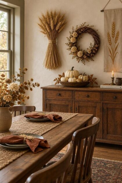
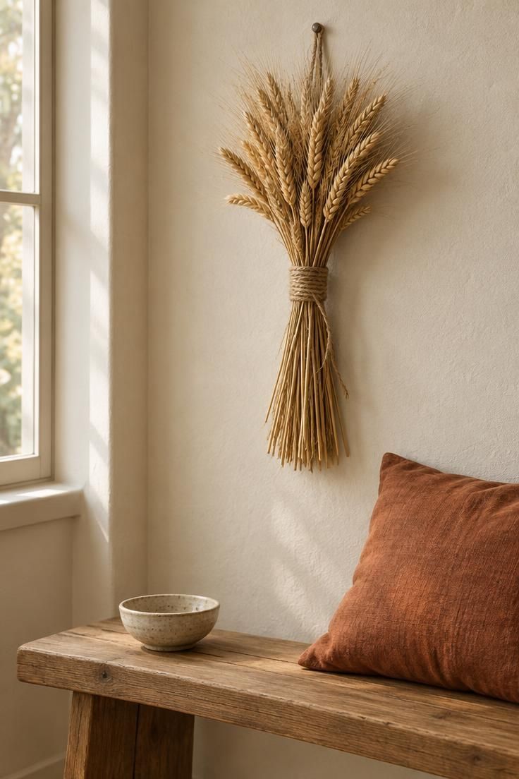
Dried Wheat Sheaf Hung as a Vertical Wall Piece
A dried wheat sheaf wall piece brings height and texture to a wall that would otherwise sit empty above a console or bench.
The tied bundle reads as a single object, with stalks running vertically and grain heads fanning slightly at the top.
Against a matte wall, the pale gold stalks catch light along their length, which gives the piece depth without any frame or glass.
Placement matters more than quantity.
A tie set roughly two thirds down the bundle keeps the visual weight low and the top airy, so the sheaf does not look top-heavy above furniture.
Where the wall is narrow, one generous sheaf reads as a deliberate focal point.
A wider wall can take two smaller bundles hung as a pair with a gap between them.
The tie itself changes the character.
Twine or jute keeps the look rustic and casual, while a wide ribbon in rust or olive pushes the piece toward something more finished.
Either way, dried grass sheds, so a spot slightly away from a table edge or a high-traffic pass stays tidier.
Consider height relative to the furniture below.
A sheaf that ends well above the console top leaves breathing room, while one that nearly touches the surface can crowd the arrangement.
Check the wall in daylight and again in the evening, since the stalks shift from pale gold to shadowed brown as the light changes.
Style Blueprint:
- One generous dried wheat bundle tied with jute twine
- A plain warm-white or soft greige wall
- A simple wood bench or console in a natural finish
- A rust linen cushion for a warm color echo
Gourd and Branch Wall Cluster Above a Dining Sideboard
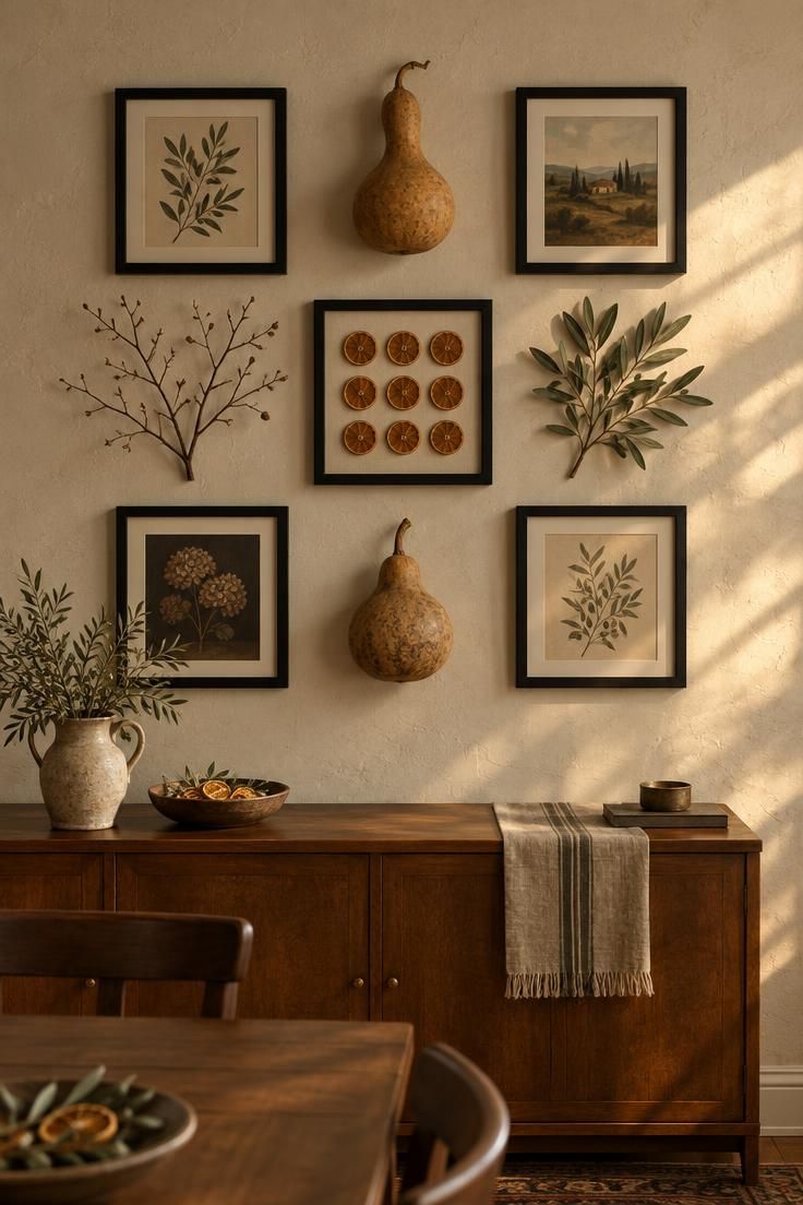
A loose grid of small frames, dried gourds, branches, and painted leaves turns a wide dining wall into a collected arrangement.
The grid does not need to be rigid.
Slight variations in spacing and object size keep the cluster informal while the shared frame color or material holds it together.
One unifying element prevents the group from looking accidental.
Matte black frames across the whole cluster, or a single wood tone repeated in every frame, gives the eye a rhythm.
Within that structure, gourds, olive-toned leaves, and dried orange slices add seasonal texture without competing.
Watch the round shapes.
Too many gourds clustered in one corner pulls visual weight there and leaves the rest of the grid feeling thin.
Spread the rounded pieces across the arrangement and balance them with flatter elements like frames and leaves.
Flat-backed gourds sit more cleanly against a board or frame than full round ones.
Real gourds bring depth and slight variation in color, though they soften over time and need an occasional check if they are displayed close together.
Faux gourds hold their shape and color through the whole season, which suits anyone who wants to set the cluster up once.
Either choice works; the tradeoff is between natural variation and longevity.
Position the cluster where the eye lands when standing in the room, usually centered above the sideboard rather than pushed toward the ceiling.
A sideboard that anchors the lower half of the wall lets the cluster feel connected to the furniture instead of floating alone.
The branches and leaves can extend past the frames slightly, which softens the grid edges and keeps the arrangement from reading as a formal gallery.
Keep the outer edges of the cluster roughly even so the whole group stays visually balanced.
Style Blueprint:
- Matte black frames in mixed small sizes
- Flat-backed dried gourds and painted leaves
- A few bare twig branches for height
- Dried orange slices for warm color accents
- A wood sideboard to anchor the wall below
Gratitude Word Sign with Slim Wood Lettering
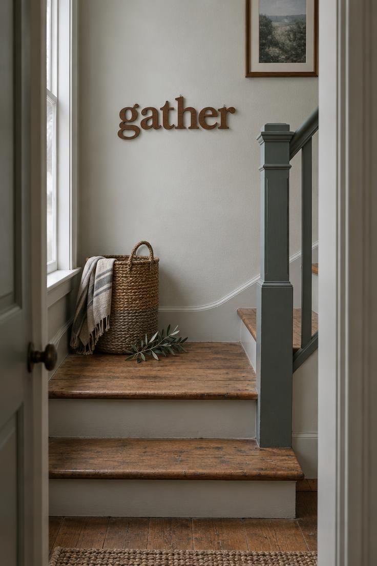
A gratitude word sign works as wall art when the lettering is slim and the scale is calibrated to the space.
Thin cut letters applied directly to the wall, or set on a narrow board, read more current than a heavy framed placard.
The word itself carries the seasonal message, so the sign needs little else around it.
Shape matters as much as the word.
A long, low phrase suits a wall above a pass-through or along a hallway, while a single tall word fits a narrow wall beside a doorway.
A square block of text tends to look cramped in most rooms and can fight with nearby furniture.
Choose the orientation that matches the wall's proportions first, then pick the word.
Finish options range from raw wood to painted or stained lettering.
A stain that echoes existing wood tones in the room ties the sign to the furniture, while a painted contrast color makes the word stand out against a lighter wall.
Either approach keeps the piece feeling purposeful rather than store-bought.
The sign can also sit beside a doorway rather than centered above furniture, which suits entry areas where guests pass through on the way to the table.
In that spot, the word reads at close range and does not need to compete with a larger wall arrangement.
Style Blueprint:
- Slim cut wood letters in a single word or short phrase
- A stain matched to existing wood tones, or a painted contrast
- Placement above a pass-through, in a hallway, or beside a doorway
Grapevine Harvest Wreath with Dried Flower Additions
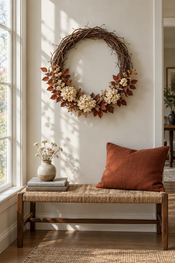
A grapevine wreath with dried flowers and preserved eucalyptus offers a Thanksgiving alternative to evergreen.
The open, twiggy base keeps the piece from reading as winter decor, and the muted rust and cream palette carries harvest color without bright orange.
The wreath's composition benefits from asymmetry.
Clustering dried blooms along one lower arc and leaving the top open lets the vine structure show and keeps the piece from looking like a uniform ring.
A heavier vine base reads as weighty on a wall or interior door without any glossy finish to distract from the dried materials.
Size should follow the wall.
A wreath hung on a large blank wall can carry more width than one placed above a bench or beside a doorway, where a smaller diameter keeps the proportions calm.
Judging the wreath against the furniture below helps set the right scale before hanging.
Dried flowers fade faster in direct sun, so a spot with indirect light keeps the colors present through the season.
The vine base itself holds up well and can be reused with new dried stems in later years, which makes it a piece worth storing carefully.
Pair the wreath with warm textiles nearby.
A rust pillow on a bench below or a woven throw in ochre echoes the palette and connects the wall piece to the rest of the room, which is how thanksgiving wall decor starts to feel like part of the space rather than an addition.
Style Blueprint:
- A grapevine wreath base with an open structure
- Dried cream blossoms clustered on one lower arc
- Preserved eucalyptus and rust-toned leaves
- A woven bench with a rust pillow below for palette continuity
Linen Banner with Painted Harvest Motifs
A fabric banner brings softness to a wall of hard frames and flat objects.
Natural linen or burlap-textured cloth with a hand-painted wheat sprig or a single gourd introduces movement and a relaxed edge that suits the holiday's gathered spirit.
The material tradeoff is real.
Fabric wrinkles and can curl at the bottom, so a light rod pocket at the top or a weighted paper edge keeps the banner hanging cleanly.
Ironing or steaming the cloth before hanging helps, and rolling rather than folding it between seasons avoids sharp creases.
Color choice sets the tone.
Ochre paint on natural linen feels warm and casual, while muted plum on cream reads slightly more formal.
A single motif keeps the banner from looking busy, and leaving generous margins around the design lets the cloth breathe.
Length should follow the wall.
A short banner works over a small entry table, while a longer drop suits a stair wall where the eye travels vertically.
The banner can shift into late autumn easily if the palette stays neutral, which extends its display window past the holiday.
Layer the banner with a wall vignette nearby to tie it into the room.
A harvest wall vignette that pairs the cloth with a small framed print or a dried bundle gives the wall a collected feel without requiring a full gallery.
Style Blueprint:
- Natural linen or burlap-textured cloth
- A hand-painted wheat sprig in muted ochre
- A slim wooden dowel and rod pocket for a clean hang
- A short or long drop chosen to match the wall height
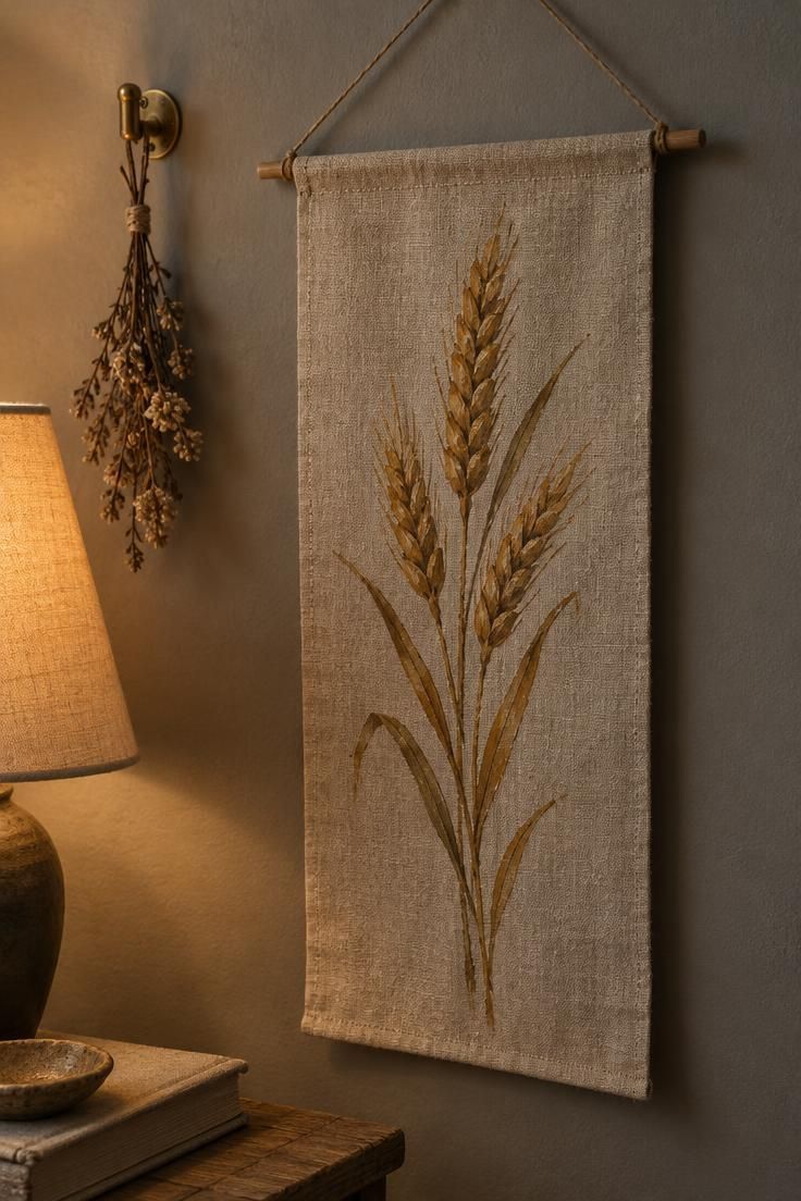
Design Pro-Tip: Steam or press a fabric banner before hanging, then store it rolled rather than folded so it drops cleanly the next time it goes up.
Seasonal Plate Wall Display with Symmetric Spacing
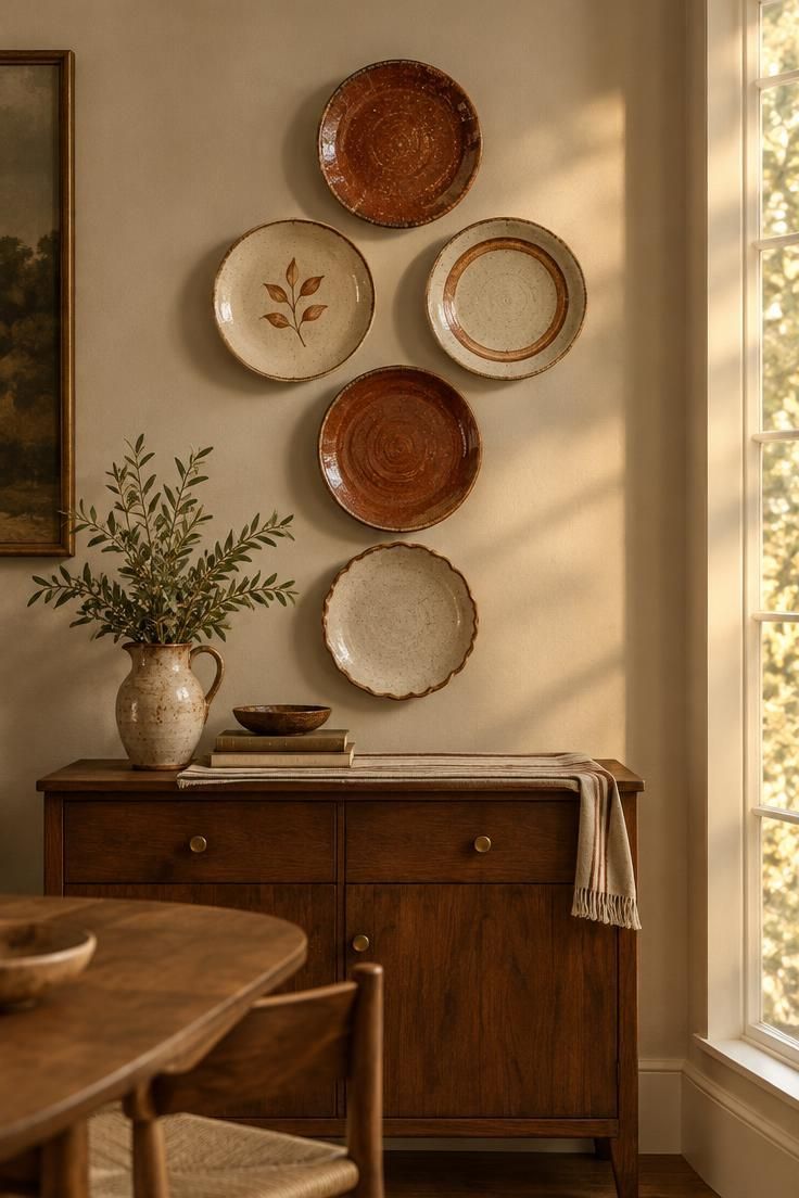
A seasonal plate wall display ties the wall to the table, which suits a holiday built around shared meals.
Decorative or harvest-printed plates arranged in a symmetric cluster or a single row bring round shapes and warm color to a dining wall without any framed art.
Consistent spacing and a shared rim color or diameter do most of the visual work.
An odd number of plates in a diamond or vertical cluster reads as intentional, while a single row suits a narrow wall above a sideboard.
Mismatched antique plates in one harvest palette can look collected rather than matched, provided the color story stays tight.
Removable adhesive plate hangers make the display easy to swap after the holiday.
Plates stored between seasons can return next year or give way to a different arrangement, which keeps the wall flexible.
Checking that each plate sits flat against the wall helps the cluster look even.
The display also transitions well.
Plain cream or white plates can stay up through late autumn, while seasonal prints come down and go back into storage.
That flexibility makes the plate wall a practical choice for anyone who wants decor that earns its space beyond a few weeks.
Choosing plate size for the cluster depends on the wall width.
A wide wall can carry larger dinner plates in a loose diamond, while a narrow strip above a sideboard suits smaller salad plates in a single row.
Style Blueprint:
- Five ceramic plates in muted rust and cream
- Removable adhesive plate hangers
- A vertical diamond or single-row layout with even spacing
- A small sideboard to anchor the display
- Storage space for swapping plates after the holiday
Fall Garland Draped Over a Framed Mirror
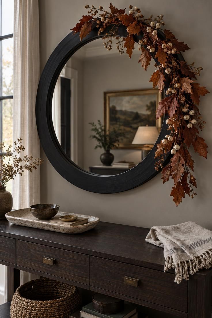
A fall garland mirror pairing works when the garland stays light and asymmetrical.
Dried leaves and small seed pods draped along the top edge of a framed mirror add seasonal color while the glass keeps doing its job of reflecting light and opening up the room.
Asymmetry is the key move.
A swag that gathers on one upper corner and trails slightly down the side lets the mirror remain the main event, while a garland spread evenly across the top can look like a wreath substitute.
One draped section is enough; more can crowd the frame.
Choose lightweight dried botanicals so the garland settles naturally rather than pulling the frame or shifting over time.
Rust leaves, cream seed pods, and a few preserved eucalyptus stems mix well, and the palette can carry into early winter if the tones stay neutral.
Frame color sets the contrast.
A simple black or natural wood frame keeps the mirror grounded and lets the garland stand out.
Ornate frames with heavy carving compete with the dried material and can make the whole arrangement feel busy.
The mirror placement matters too.
Above a console in an entry or dining room, the garland catches the eye as guests arrive and ties the wall to the table setting nearby.
A round mirror softens the composition, while a rectangular one gives the garland a straighter line to follow.
Style Blueprint:
- A round or rectangular mirror in black or natural wood
- A light garland of rust leaves and cream seed pods
- An asymmetrical drape gathered on one upper corner
- Preserved eucalyptus stems for subtle green contrast
Large Pressed Leaf Prints in Simple Frames
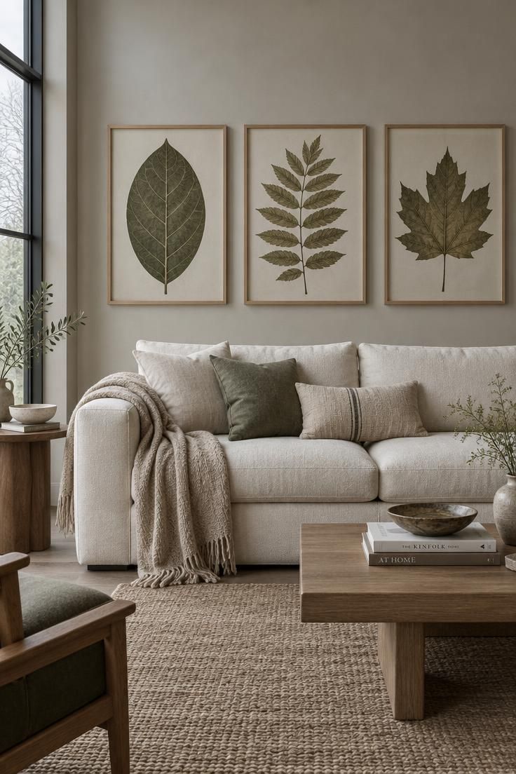
Oversized pressed leaf prints deliver a strong wall presence with very little effort.
A pair or trio of large-scale leaves in thin wood or metal frames lets the detail of each leaf carry the wall, and the muted color reproduction keeps the arrangement from feeling loud.
A nearly bare wall shows off the leaf detail best.
Hanging the prints in a row above a low bench or narrow table gives the eye a clear focal point and leaves breathing room around the frames.
Crowding the prints with other decor dilutes the effect.
Framing choices stay simple.
No mat, or a very narrow one, keeps the focus on the leaf itself.
Thin frames in natural wood or matte metal let the prints sit quietly against the wall, which suits a room that already has plenty of texture elsewhere.
These prints also hold up beyond Thanksgiving.
The muted palette and botanical subject read as late autumn rather than holiday-specific, so the frames can stay up through November and into early winter without a swap.
Scale relative to the wall deserves a check before committing.
A single oversized leaf can anchor a small wall, while a row of three suits a wider wall above a sofa.
Judging the print size against the furniture below keeps the arrangement proportional.
Prints with finer vein patterns tend to read better from close seating, while bolder leaf silhouettes stay legible across a room, so consider viewing distance before settling on a single style.
Style Blueprint:
- Three oversized pressed leaf prints
- Thin natural wood or matte metal frames
- No mat or a very narrow mat
- A low cream sofa or bench below to anchor the row
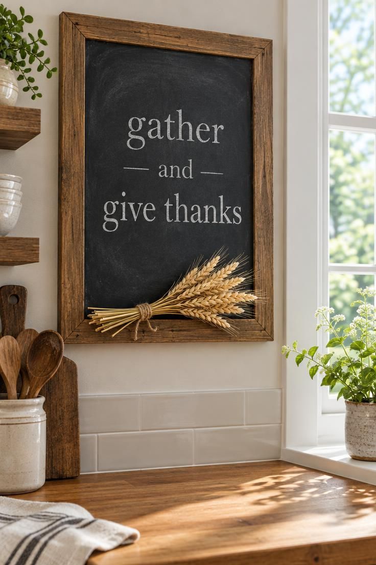
Wall-Hung Chalkboard With a Thanksgiving Menu or Countdown
A wall-hung chalkboard serves double duty as decor and household communication.
In a kitchen or beside a dining nook, a handwritten menu, a short gratitude line, or a countdown gives the wall a purpose while carrying the holiday theme.
Frame color and size should follow the wall.
A wood-framed board warms up a kitchen with natural cabinets, while a black frame suits a lighter, more modern wall.
A board scaled to the wall width reads as intentional rather than as a small note tacked up.
Lettering style shifts the mood.
Tight serif chalk lettering looks orderly and classic, while loose script feels casual and personal.
Either works, and a mix of both within one board lets the menu and the message stay distinct.
Dark chalkboard surfaces pair well with warm wood counters and dining furniture, and the contrast makes the lettering easy to read from across the room.
Chalk dust is a minor tradeoff; wiping the board with a damp cloth between changes keeps the surface clean.
A spot near the pantry or breakfast nook lets the board read as part of the room's routine, not a decoration that sits unused.
That placement also means guests pass it on the way to the table, where the menu or message lands naturally.
Style Blueprint:
- A wood-framed chalkboard sized to the wall width
- Simple serif or loose script chalk lettering
- Placement near the pantry or breakfast nook
- A damp cloth kept nearby for quick cleaning
Layered Ledge with Framed Art and Small Gourds
A narrow picture ledge mixes flat and dimensional decor in one vertical zone, which makes it a useful small-space strategy.
A framed print leaning at one end, a small gourd in front, and a low candle or bud vase gives the wall a layered look without spreading objects across the whole room.
Editing tightly is the main discipline.
A ledge holds fewer objects than it looks like it should, and filling every inch makes the arrangement feel cluttered.
Three to four pieces with visible gaps between them read better than a dense row.
A short stack works well: one frame, one rounded object, and one small vertical element from a candle or vase.
Leaning the frame slightly back against the wall adds depth, and placing the gourd in front creates a foreground layer that catches light.
The ledge's slight front edge helps keep items in place, and round gourds should sit in a stable position or be faux versions that hold their shape.
A narrow ledge above a low console or beside a doorway keeps the display compact and easy to change with the season.
Empty wall space above the ledge matters as much as the objects on it.
Leaving room around the arrangement lets the display read as intentional and keeps the eye from feeling crowded.
Style Blueprint:
- A narrow wood picture ledge
- One small framed autumn print, leaned at one end
- Two small cream pumpkins or gourds
- A short brass candlestick for vertical contrast
- Visible empty wall above the display
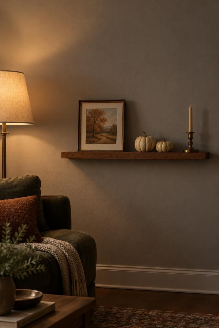
Design Pro-Tip: Leave at least as much empty wall above a picture ledge as the objects themselves occupy; the gap is what makes a short stack look deliberate.
Woven Textile Wall Hanging in a Warm Harvest Palette
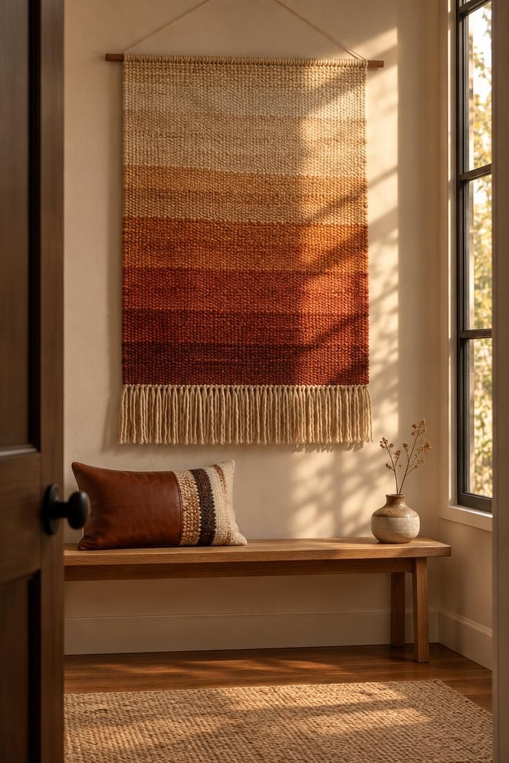
A woven textile wall hanging softens a plain painted wall in a way frames and hard objects cannot.
Rust, ochre, and cream gradients in cotton or wool add warmth, and fringe or an uneven lower edge gives the piece movement without any seasonal motifs.
The textile absorbs visual harshness on a bare wall, which suits rooms where framed art feels too formal.
A wide hanging can anchor a console, while a narrow one suits a small entry wall where a large piece would overwhelm.
Texture carries the look.
Natural fiber weave, visible knots, and a slight variation in dye tone keep the hanging from reading as a flat panel.
Gradient bands or a subtle geometric pattern add interest without competing with the rest of the room.
Maintenance deserves a thought before committing.
Textiles collect dust and may need occasional spot-cleaning or a gentle vacuum between seasons.
Direct sunlight can fade the dye over time, so a wall away from a strong window preserves the palette longer.
Hanging height relative to furniture below keeps the composition balanced.
A hanging that ends well above a bench leaves room for a cushion and lets the textile stay the focal point rather than crowding the seating.
Style Blueprint:
- A woven cotton or wool hanging in rust and cream
- Visible fringe or an uneven lower edge
- A narrow wood dowel for hanging
- A thin wood bench with a leather and wool pillow below
Conclusion
Thanksgiving wall decor lands best when it leans on harvest-specific cues: dried wheat, gourds, gratitude lettering, and a muted autumn palette rather than generic fall or early-winter signals.
The short display window means each piece should earn its spot, either by anchoring one wall or by grouping with other pieces for a collected look.
Compare the ideas by effort, from the single dried sheaf and the row of botanical prints to the layered ledge and the mixed-material cluster.
Pick one wall as the focus, keep scale proportional to the room, and let a couple of key pieces carry the seasonal message while the rest of the space stays calm.