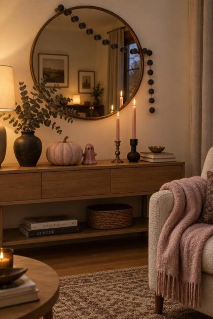
This post may contain affiliate links. If you make a purchase through these links, we may earn a commission at no additional cost to you.
Pink halloween decor works because it refuses the expected.
Swap orange for blush, dusty rose, or hot pink and the whole season softens into something whimsical without losing its edge.
The trick is pairing each pink with a grounding partner color so the scheme reads intentional instead of sweet.
Across mantels, tables, doors, shelves, and porches, these ideas range from one small object to a full surface, and every one of them starts with a single choice: which pink is doing the work.
Blush Pumpkin Cluster with Mixed Matte and Pearlized Finishes
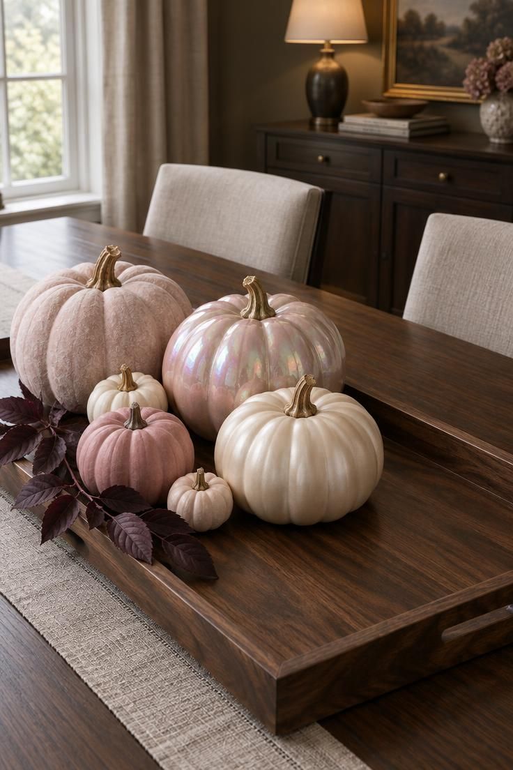
Pink pumpkin centerpiece ideas, which are a signature of pink halloween decor, live or die on finish contrast.
Grouping five pumpkins in one pink family but four different surfaces creates depth that a matched set cannot.
The chalk-matte pieces read soft and modern, the pearlized one catches light and reads slightly glam, and the single satin cream pumpkin keeps the whole arrangement from tipping into uniformity.
Off-center placement on the tray matters as much as the color mix, since centering five objects of similar size flattens the composition.
A warm wood or aged metal tray gives the cluster a defined boundary so it does not seem to float on the table.
Scale does the rest: one large anchor pumpkin, three medium, two small tucked low in the gaps.
Real pumpkins offer the truest matte texture but have a short season and limited pink variety, while painted or fabric versions store flat between years and can be reused, at the cost of a slightly less natural surface.
Keep any painted finish out of prolonged damp conditions, since moisture and handling can affect it.
A single dark plum or charcoal leaf sprig sharpens the palette without adding a second competing color.
Style Blueprint:
- Finish contrast: chalk-matte against pearlized against one satin cream
- Scale mix: one large anchor, three medium, two small tucked low
- Grounding: a warm wood or aged metal tray to contain the cluster
- Partner color: one dark plum or charcoal accent leaf, kept to a single sprig
- Placement: off-center on the tray, with open space on one side
Pastel Pink Ghost Garland Draped Across a Cream Mantel
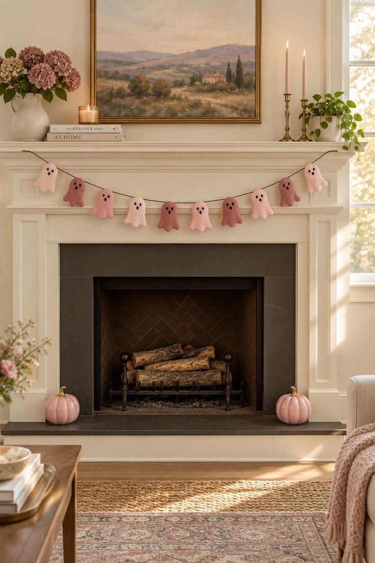
A pastel pink ghost garland leans on tonal range rather than a single perfect color.
Three pinks in one strand read as collected instead of store-bought, and the ghost form itself does the seasonal work so the pale palette never has to shout.
Black embroidery is the only dark accent needed, and keeping it to tiny eyes and mouths preserves the soft overall effect.
Anchoring the mantel ends with two low pumpkins creates a visual base that keeps the garland from feeling like it is floating in the middle of the wall.
On a wide mantel, a single swag can look sparse, so a shallow second curve or a doubled strand often fills the span better.
Felt holds its shape season to season and stores flat, while paper or cardstock cutouts are cheaper to try in a new color but crease easily.
Dust settles into felt over time, and a soft brush restores the nap better than washing.
Center placement works here specifically because the two end pumpkins frame it.
Style Blueprint:
- Tonal range: three pinks in one garland so it reads collected, not matched
- Embellishment: minimal black facial stitching for the seasonal read
- Anchoring objects: two low pink pumpkins at the mantel ends
- Swag depth: a shallow, even curve rather than a deep drape
- Center treatment: keep the middle open and uncrowded
Fuchsia Bats Rising Across a Pale Wall
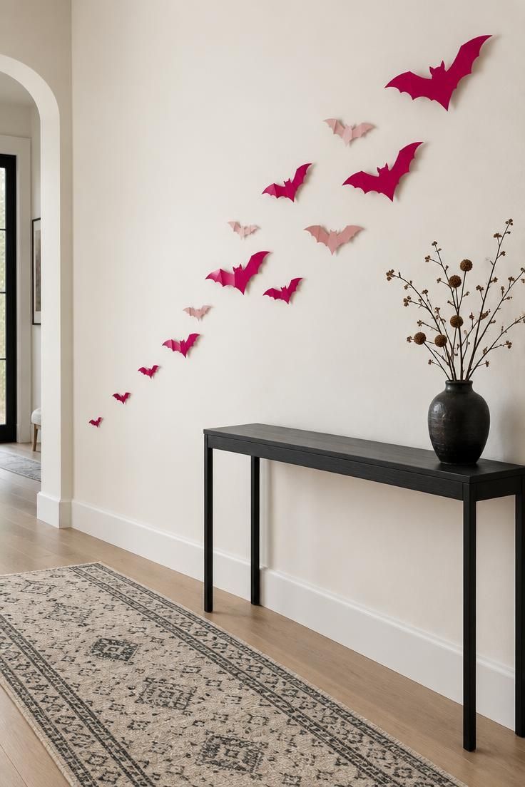
Shape and arrangement carry this idea more than color does.
A diagonal drift of fuchsia bats reads as motion because the smallest sit low and the largest rise toward the upper third, so the eye travels naturally across the wall.
Blush bats mixed into the fuchsia keep the cluster from looking like a single flat block, and leaving about half the wall bare gives the drift room to feel deliberate rather than scattered.
Saturated pinks hold up against black and white especially well, which suits a graphic approach.
Paper and cardstock cutouts are the most flexible way to try this, since they can be repositioned without commitment, though they are light and can curl over time.
A black vase or vessel below anchors the composition and prevents the wall from reading as detached from the room.
On a very tall wall, extending the drift higher in stages keeps the scale proportionate; on a short wall, fewer and smaller bats preserve the negative space that makes the pattern work.
Style Blueprint:
- Palette: saturated fuchsia as the lead, blush as the secondary
- Arrangement: diagonal drift rather than a centered cluster
- Scale gradient: small at the low corner, larger toward the upper third
- Negative space: leave roughly half the wall bare
- Grounding object: one black vase or vessel below the arrangement
Hot Pink and Black Tablescape with Mixed Candle Heights
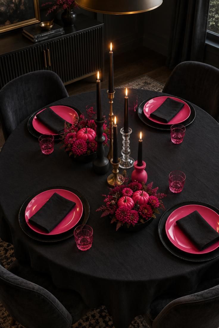
A pink and black tablescape succeeds on palette discipline.
One hot pink, one true black, and one metallic leave no room for a fourth color to muddy the effect.
The repeating unit is the place setting: pink plate on a black charger, mirrored around the table, which gives the eye a rhythm before the center run takes over.
Black tapers at four different heights keep the candelabra line from looking like a matched set, and spacing them irregularly keeps the arrangement lively.
Two low hot pink pumpkin clusters between the candles and the settings work only if they stay below eye level, so they never block sightlines across the table.
Matte black linens against glossy pink plates give the finish mix a deliberate texture contrast.
Real wax tapers burn down over an evening, so extras kept on hand save a mid-dinner swap.
Hot pink at full scale can read as party rather than Halloween, and the black tablecloth is what holds it in the seasonal register.
Style Blueprint:
- Palette discipline: one hot pink, one true black, one metallic
- Candle staging: four tapers at four heights in four different holders
- Place setting: pink plate on black charger as the repeating unit
- Center run: two low pink pumpkin clusters kept below eye level
- Finish mix: matte tablecloth against glossy plates and one brass holder
Dusty Rose and Black Wreath with Tulle and Ribbon
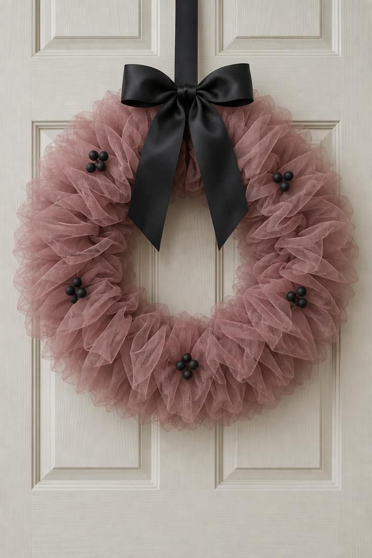
A pink Halloween wreath with black accents depends on the black staying contained.
One wide satin bow at the top provides the contrast, while small matte black berries spaced unevenly around the ring add subtle punctuation without turning the whole wreath dark.
Tulle gives volume and an airy silhouette that feels soft against a door, and dusty rose keeps the palette grown-up rather than playful.
A cream, ivory, or soft grey door lets the rose read clearly; a dark door would blunt it.
Tulle can compress in storage, and hanging the wreath in a warm spot before rehanging it helps the gathers relax.
If the bow sits too low, the wreath loses its top-heavy lift, so positioning it high on the ring keeps the silhouette balanced.
For a wider door, a slightly larger tulle ring reads better than a small wreath with more berries.
Style Blueprint:
- Base material: dusty rose tulle for volume and a soft silhouette
- Contrast: one wide black satin bow at the top, not throughout
- Small accents: matte black berries or spheres, spaced unevenly
- Door ground: cream, ivory, or soft grey so the rose reads clearly
- Bow placement: high on the ring to lift the whole silhouette
Design Pro-Tip: When mixing pinks across paper, felt, ceramic, and glass, choose a tonal range, pale, mid, deep, instead of trying to match one exact pink. The same nominal color never looks identical across materials, and a deliberate range reads as collected rather than mismatched.
Pink Taper Candles in Mixed Holders on a Dark Runner
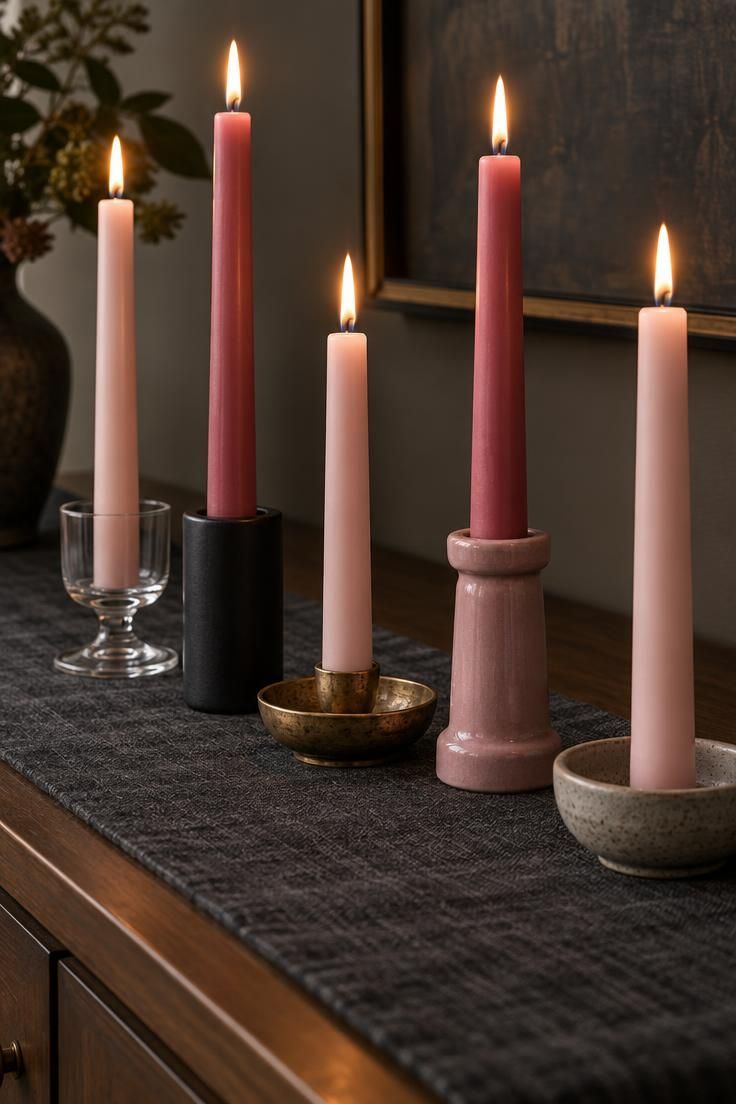
Height variety and finish variety matter more than collecting a matched candlestick set.
Five pink taper candles in mixed holders create a run with an uneven, collected rhythm, and having each holder sit at a different height gives the line a lift that a flat set cannot.
Pale blush through deeper rose gives the run depth.
Glass, matte ceramic, aged metal, and stoneware work together because the shared wax color unifies them.
A charcoal linen runner grounds the bright pinks and provides just enough seasonal darkness.
Taper candles can be difficult to seat in holders with wide mouths; a small amount of melted wax at the base, or a snug holder, prevents tilting.
Burn time depends on the wax type and draft, so an indoor spot away from open windows keeps the candles burning evenly.
If the arrangement sits near eye level, consider trimming wicks shorter for a calmer flame.
Style Blueprint:
- Height variety: five holders at five distinct heights
- Finish mix: glass, matte ceramic, aged metal, and stoneware together
- Pink range: pale blush through deeper rose so the run has depth
- Grounding: a charcoal linen runner under the whole set
- Unifying thread: one shared wax color across all holders
Pink Bottle-Brush Trees and Small Figures on a Shelf
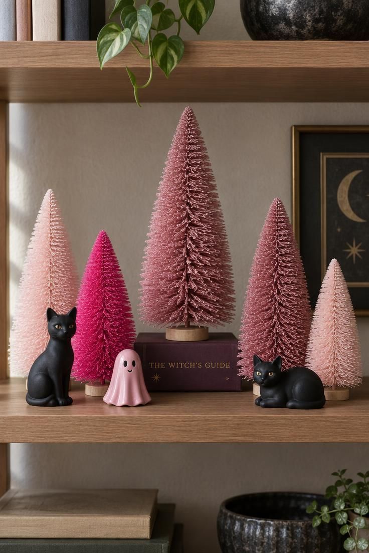
Bottle-brush trees bring a matte, cone-shaped silhouette that reads as both Christmas crossover and small Halloween totem, and grouping them in three pinks keeps the shelf from looking uniform.
Varying the heights makes the eye move across the display.
Two matte black cat figures sharpen the palette and give the pinks a hard edge, and a single tiny pink ceramic ghost ties the group back to Halloween specifically.
Using a flat book as a riser under the tallest tree breaks the centered symmetry that would otherwise make the shelf feel static.
Bottle-brush trees hold their form well and store easily, while ceramic ghosts and figures need careful wrapping between seasons.
Small figures can collect dust quickly, and a soft brush is usually enough.
On a shallow shelf, keep the taller trees toward the back so they do not crowd the shelf edge; on a deep shelf, a slight diagonal placement keeps the group from looking lined up.
Style Blueprint:
- Silhouette: bottle-brush cones for a textured, matte form
- Pink range: three pinks across the group, not one uniform color
- Counterpoints: two small matte black figures to sharpen the palette
- Level change: one flat book as a riser so the tallest object is off-center
- Staging depth: taller trees toward the back of the shelf
Pink Felt Ball Garland Swagged Across a Doorway
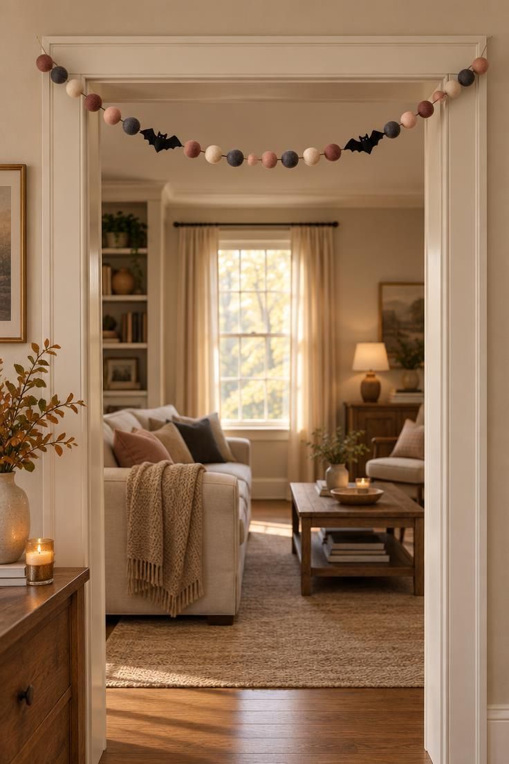
Color rhythm is the whole design here.
Alternating pink and neutral felt balls with charcoal as the dark beat gives the garland a pattern that reads at a glance, and threading two small black bats onto the strand keeps the seasonal signal clear without overloading the doorway.
A shallow, even swag suits most doorways better than a deep asymmetric drape, which can look accidental rather than styled.
Felt balls hold their shape, store compactly, and are forgiving if a strand gets packed tightly.
Threading on a slack cord makes it easier to adjust the swag depth after hanging.
On a wide opening, two matched shallow curves look better than one very deep one.
When the surrounding room is neutral, the pinks and charcoal carry the display on their own, which keeps the doorway from competing with the rest of the space.
Style Blueprint:
- Color rhythm: alternate pink and neutral balls with charcoal as the dark beat
- Seasonal cue: two or three small black felt bats threaded onto the strand
- Swag depth: a shallow, even curve rather than a deep drape
- Cord: use a slack cord so the swag depth can be adjusted
- Surrounding wall: keep the room beyond neutral so the garland carries
Rose and Charcoal Throw Pillows Layered into a Neutral Sofa
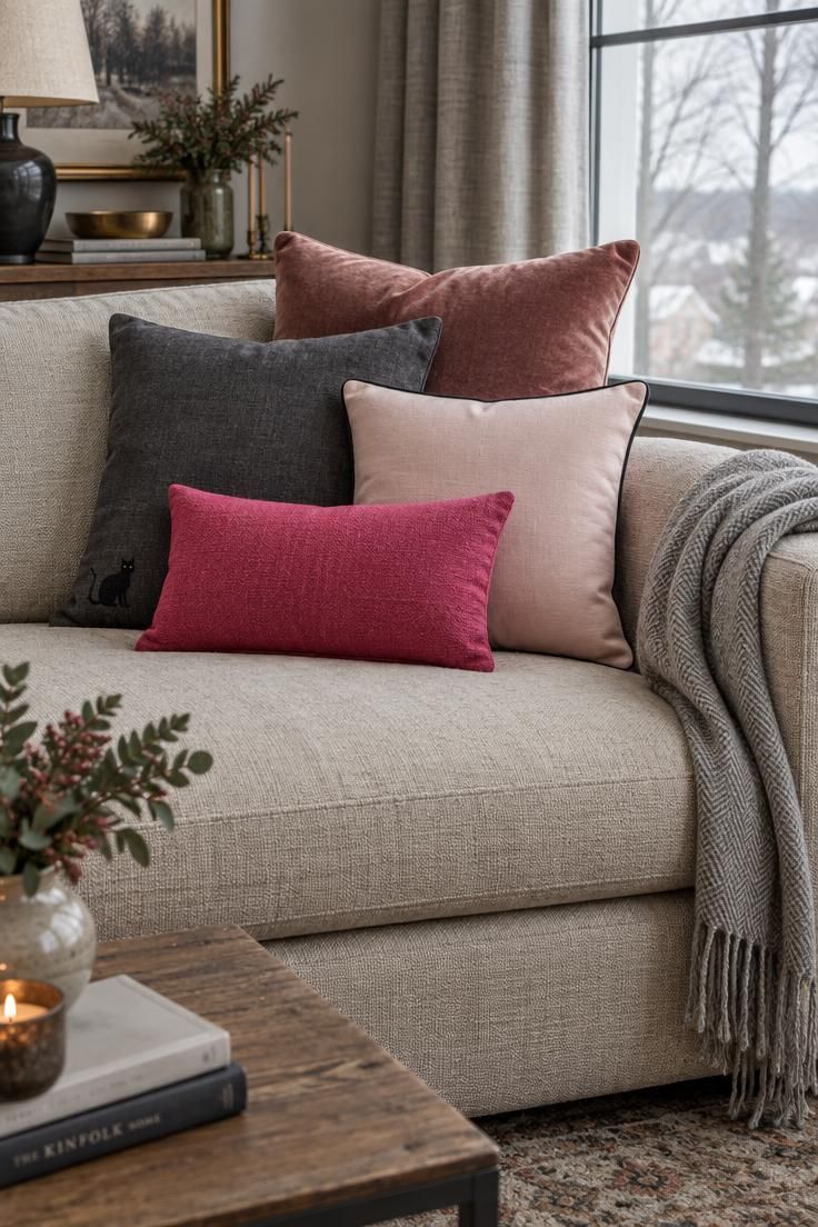
Layering order does most of the work in a pillow arrangement.
Largest and darkest at the back, smallest and brightest at the front gives the stack depth and keeps the hot pink lumbar from fighting the larger pieces.
Mixing velvet, linen, and a woven throw adds tactile variety that a single fabric cannot.
Keeping one clear Halloween motif on one pillow only, the black cat on the charcoal linen, prevents the stack from reading as a costume.
A neutral oatmeal or cream sofa lets pink carry the change without a larger furniture commitment.
Textile decor is the fastest way to shift an existing room toward pink, and pillows and throws swap and store easily between seasons.
Velvet shows crush marks and benefits from a light steam, while linen wrinkles by nature and looks best with a relaxed hand.
On a smaller sofa, three pillows read better than four; on a deep sectional, five can fill the width without crowding.
Style Blueprint:
- Layering order: largest and darkest at the back, smallest and brightest at the front
- Texture mix: velvet, linen, and a woven throw in one stack
- Motif restraint: one clear Halloween motif on one pillow only
- Neutral base: oatmeal or cream sofa to carry the pink
- Scale to seat: three pillows on a small sofa, up to five on a deep sectional
Design Pro-Tip: If pastel pink starts reading as spring, add one clearly seasonal form, a ghost, bat, pumpkin, or spider silhouette, or one dark accent like black ribbon or charcoal felt. The form does the seasonal work; the pink just sets the mood.
Pink Pumpkin Porch Grouping with Mixed Sizes and Finishes
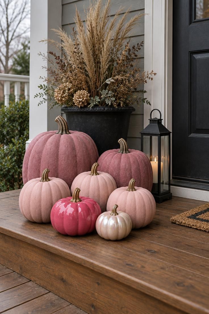
Outdoor groupings benefit from the same tonal logic as indoor ones, just at a larger scale.
Seven pumpkins in four pinks and three finishes read as collected rather than duplicated, and one glossy hot pink pumpkin among matte pieces gives the whole cluster a focal accent.
Keeping the arrangement to one side of the door rather than split on both sides makes the porch feel styled.
A black planter and a narrow black lantern anchor the grouping and reinforce the grounding partner color.
Real pumpkins offer the best natural finish and heirloom varieties come in limited pinkish tones, but they last only through the season, while painted or fabric pumpkins store flat and reuse year after year.
On a covered porch, painted and natural pumpkins hold up better against weather than they would in full exposure.
Painted surfaces can be affected by moisture and handling, so keeping them under cover helps them last.
A grouping this size needs support from a step or low platform so the pumpkins sit level with each other.
Style Blueprint:
- Tonal logic: four pinks and three finishes in one grouping
- Focal accent: one glossy hot pink pumpkin among the matte pieces
- Grounding objects: a black planter and a narrow black lantern nearby
- Placement: cluster to one side of the door, not split on both sides
- Surface: a step or low platform so pumpkins sit level
Conclusion
Every idea above comes down to two decisions.
Choose which pink does the work, and choose the single partner color that grounds it.
Blush with cream, hot pink with black, dusty rose with charcoal or plum: the pairing is what keeps the scheme seasonal rather than sweet.
Start with one surface.
A mantel, a dining table, a front door, or a single shelf gives the palette a place to prove itself before you commit to a whole room.
Spreading pink across every surface at once tends to blur the effect.
Two practical notes are worth keeping in mind.
Reusable objects like felt, ceramic, and fabric pieces take up storage space between seasons, and an exact match across paper, felt, ceramic, and glass is nearly impossible.
Choosing a tonal range solves the second problem.
The soft spooky look works because form and accent signal Halloween, and pink handles the rest.