This post may contain affiliate links. If you make a purchase through these links, we may earn a commission at no additional cost to you.
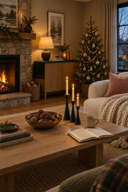
A warm modern Christmas color palette starts with restraint: two or three hues, a clear dominant neutral, and texture doing most of the visual work.
Bright red and green give way here to cream, wood, graphite, blush, and deep green, each held steady from the entry to the living room to the table.
Keeping the color story fixed across a home is what separates a considered scheme from a collection of decorations.
The ideas below describe palettes as design directions, with the materials, finishes, and placement that carry each one.
Cream and Raw Wood in a Quiet Reading Corner
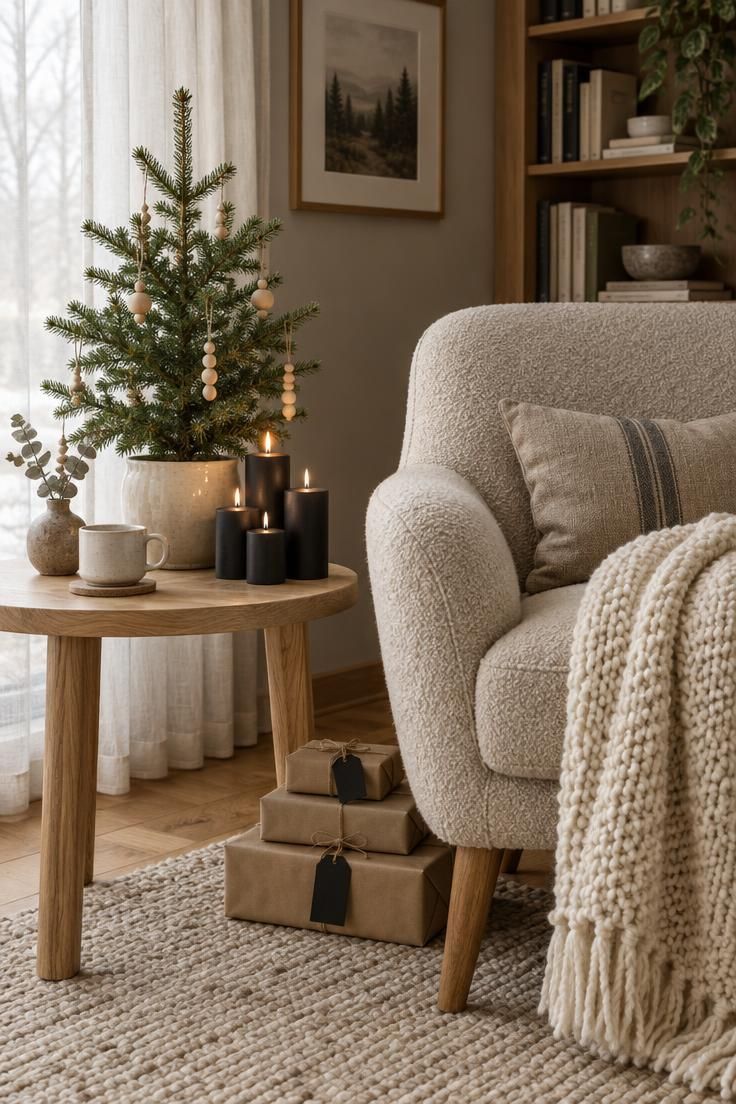
A pale field lets the wood grain and a handful of black paper tags do the work of contrast.
Cream textiles, an oak table, and a tabletop tree with wooden ornaments hold this corner together without a single bright color.
Limiting ornaments to ceramic and wood keeps the corner from feeling busy, and a low stack of kraft-wrapped gifts repeats the warm tan without introducing a new hue.
This approach suits small-space holiday color schemes particularly well, since a restrained palette with one oversized textile reads clearly in a tight room.
The tradeoff is definition: an all-pale corner can dissolve into mush without a dark anchor, so the black tags and matte candleholders earn their place.
Design Pro-Tip: Cluster three pillar candles at different heights on the oak table to create the room's warm focal point.
Style Blueprint:
- Oatmeal bouclé chair with a chunky cream knit throw
- Light oak side table with a small potted fir in cream ceramic
- Wooden bead ornaments and matte black paper tags
- Three matte black pillar candles at varied heights
Graphite Ribbon and White Gift Wrap
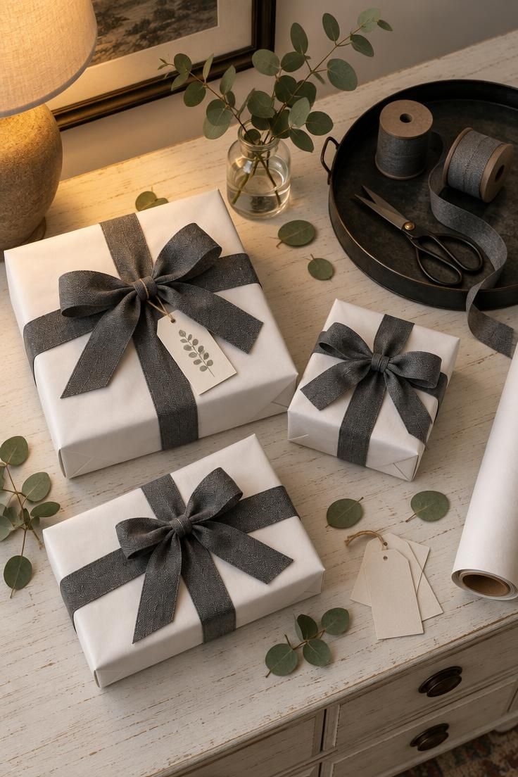
Crisp white paper keeps a small room bright, while wide graphite ribbon supplies the dark anchor the scheme needs.
Black and white Christmas accent colors work best here with a single accent only, a deep green eucalyptus sprig, to avoid color creep.
Matte paper and cotton ribbon read more modern than glossy wrap and satin, and a black tray echoes the ribbon without adding a third strong color.
Handling marks show on both paper and ribbon, so the station benefits from a dedicated tray that keeps spare spools contained between wrapping sessions.
Style Blueprint:
- Matte white wrapping paper
- Wide graphite cotton ribbon
- Black metal tray for spools and tools
- Small glass jar with fresh eucalyptus
Layered Ivory Textures on an Open Shelf
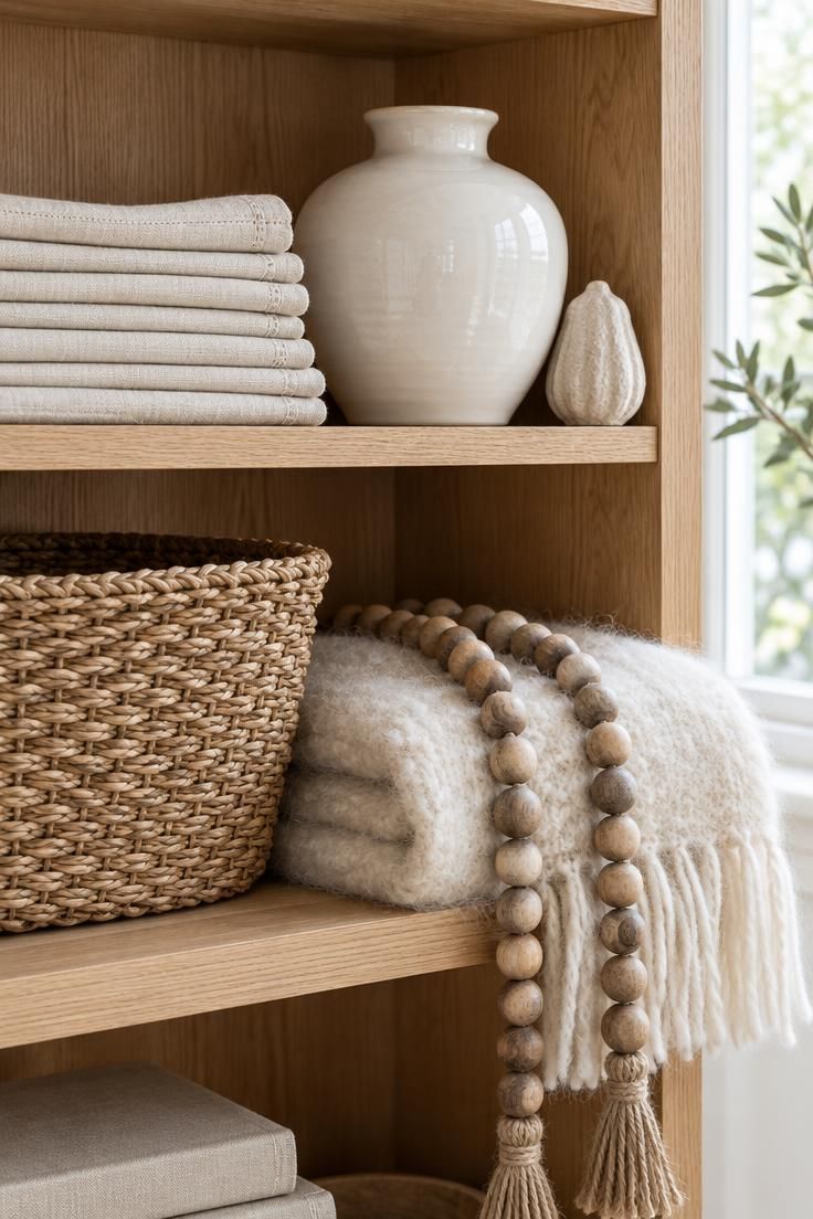
Four ivory materials, nubby linen, glossy ceramic, woven seagrass, and fluffy mohair, carry this shelf as a monochromatic study.
Sheen and texture differences keep the pale layers from reading flat, and one or two wooden beads or a single brass candleholder on a lower shelf give the eye a rest.
Unglazed limestone or plaster ornaments read modern against all that cream because their chalky surface breaks up the shine.
Pale schemes show every layer of dust, so a weekly pass with a soft cloth keeps the shelf looking as crisp as it did on day one.
Style Blueprint:
- Ivory linen napkins in low stacks
- Seagrass basket for texture contrast
- Glossy white ceramic vase
- Cream mohair throw
- Rustic wooden bead garlands
Matte Black and Warm Brass Candleholders
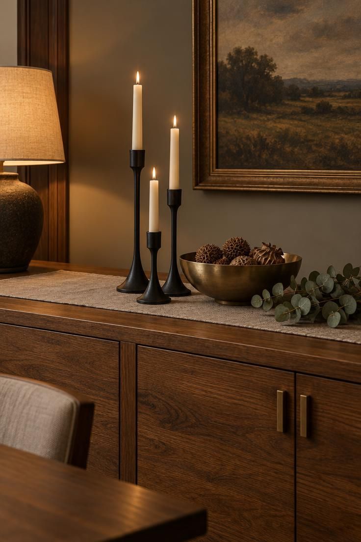
Black provides a modern anchor here, and the single warm brass bowl keeps the grouping from tipping industrial.
Cream candles soften the contrast, and the varied candleholder heights give the arrangement a natural rhythm across the credenza.
Any red or green accent would pull this palette back toward traditional, so a strict two-material discipline serves the look better than extra objects.
This grouping works especially well against warm wood furniture, where the black adds definition without introducing a new color to the room.
Style Blueprint:
- Three matte black candleholders in varied heights
- Cream taper candles
- One shallow warm brass bowl
- Oatmeal linen runner
Handmade Ceramic Baubles in Blush and Cream
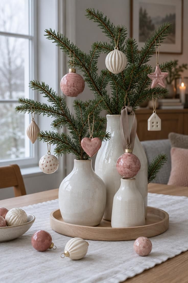
The ceramic's slightly irregular matte finish gives pink an adult feel, and cream keeps the palette from turning saccharine.
Equal parts pink and cream can look flat, so vary the size and value of the baubles and tuck in one darker rose cluster for depth.
This pairing of neutral Christmas decor with wood tones suits white or light wood furniture, though the pink reads less obviously Christmas in a room already full of competing color.
A taupe ribbon rather than a pink one avoids a matchy look while keeping the palette intact.
For a centerpiece that endures through January without feeling overly seasonal, choose branches with a few dried seed heads left on the stem.
Style Blueprint:
- Handmade ceramic baubles in blush, rose, and cream
- White ceramic vases for the branches
- White linen runner
- Taupe satin ribbon
Espresso Ribbon and Gingerbread Gift Tags
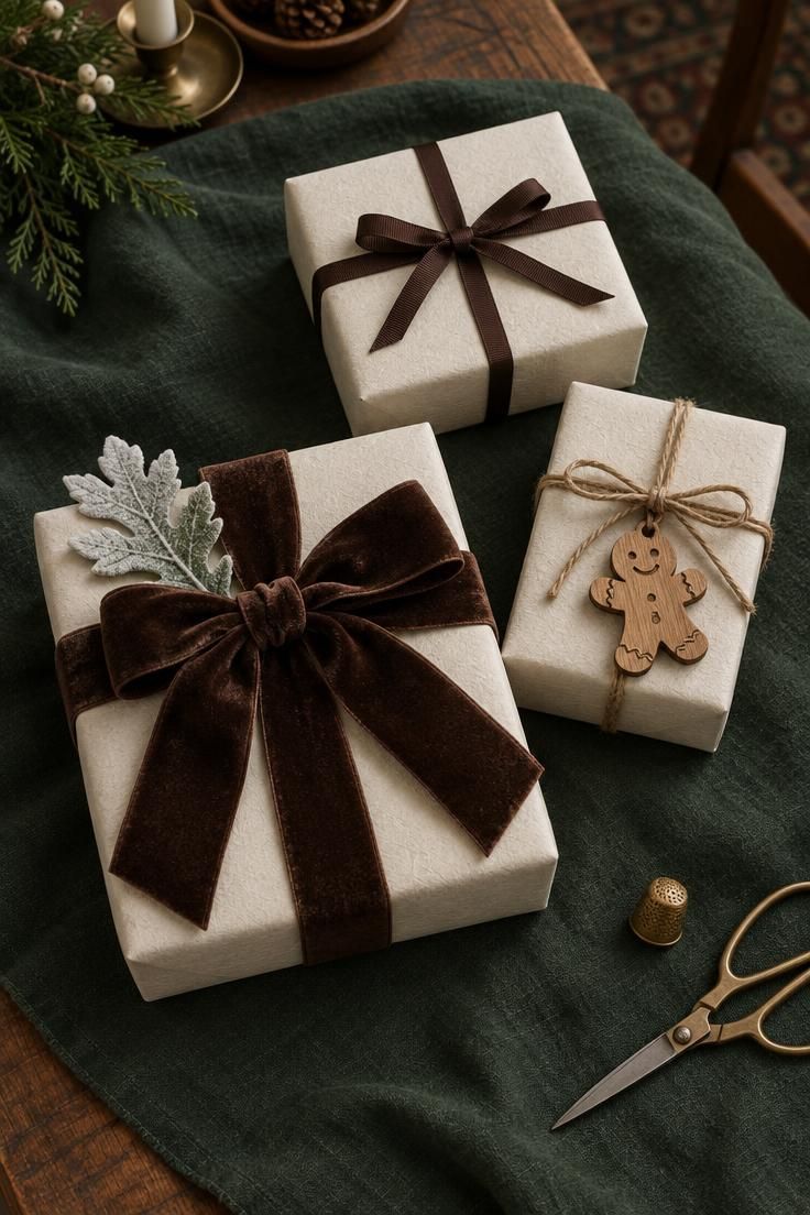
Deep espresso ribbon reads modern against cream paper, especially with a small brass accent nearby.
Keep burnt orange and rust out of this grouping, since either can push the look toward autumn rather than December.
Use kraft paper sparingly here, because too much tan alongside the brown ribbon flattens the contrast the palette depends on.
A frosted white leaf or a small white silk flower supplies the cool counterpoint that keeps the scheme seasonal.
Brown and cream carry through January, which makes this palette useful for households that rotate decorations rather than store them all at once.
Style Blueprint:
- Cream wrapping paper
- Wide espresso velvet ribbon
- Narrow espresso grosgrain ribbon
- Carved wood gingerbread tags
Deep Green Velvet and Antique Brass Ornaments
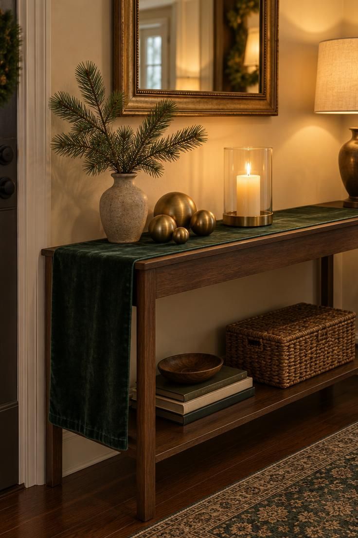
Deep green keeps one foot in tradition, while antique brass avoids the high-shine gold of older looks.
Deep green and brass Christmas styling stays current through finish discipline: brushed metal, deep saturated green, and nothing reflective enough to compete.
A single real or faux evergreen branch in a stoneware vase adds cool foliage that stops the scheme from reading too warm.
Even one bright red object would pull the palette back to the expected combination, so keep red out of this composition entirely.
Warm bulbs rather than cool white keep the brass looking aged rather than sharp.
Style Blueprint:
- Deep green velvet table runner
- Brushed brass ornaments in varied sizes
- Stoneware vase with a pine branch
- Clear glass hurricane with a candle
Matte Blush and Stoneware on a Kitchen Tray
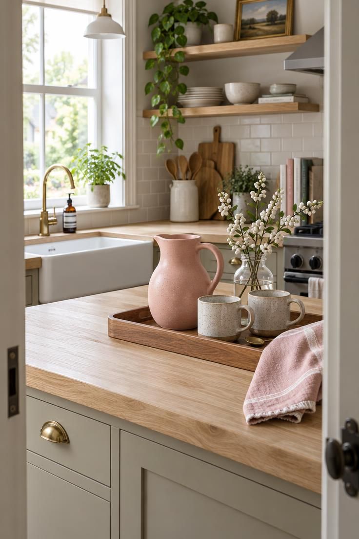
A dusty, smoky pink rather than a clear nursery pink is what makes this modern christmas color palette feel adult on a kitchen counter.
One metallic, a small brass spoon, is enough, and keeping the other accessories neutral prevents clutter on a small tray.
The blush can travel through the kitchen in a tea towel or a small vase, which ties the counter to the rest of the room without adding objects.
Choosing one large item, the pitcher, and scaling everything else down from it keeps the arrangement composed rather than crowded.
Style Blueprint:
- Matte blush ceramic pitcher
- Speckled stoneware mugs
- Small brass spoon
- Clear glass jar with white berry stems
Small-Space Mantel in Slate and Silver
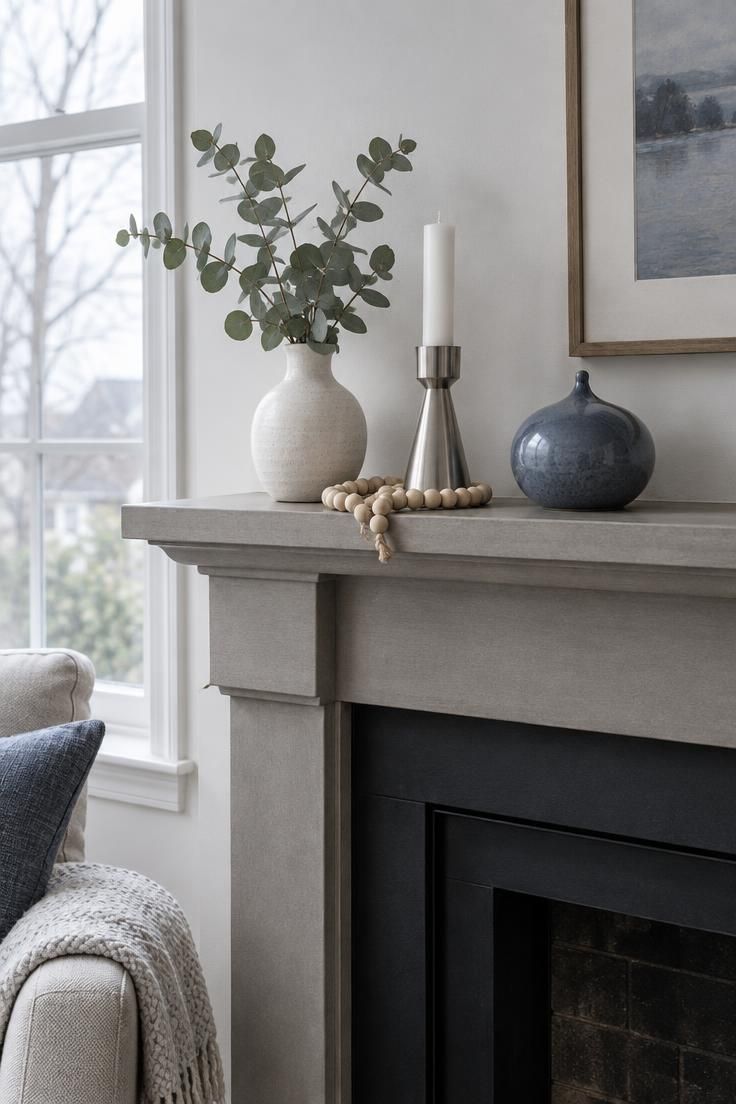
Slate blue, icy white, and matte silver create a bright, airy feel in a small room, but the scheme needs one warm anchor: a pale wood bead garland or a single warm-white candle.
Two or three objects in the same cool family are enough for a narrow surface; more overwhelms the shelf.
Silver should be matte or brushed rather than polished, since high shine competes with the pale blue.
This palette is most effective when the wall behind it is white or very light gray, where the slate ornament reads as the one deliberate note of color.
Style Blueprint:
- Slate blue ceramic ornament
- Matte silver candleholder
- White vase with eucalyptus
- Pale wood bead garland
Warm White Paper and Antique Brass Bells
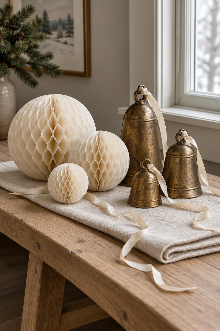
Winter white monochrome holiday decor works best when the base is unbleached or cream paper rather than bright white, which keeps the feel warm instead of stark.
The brass bells supply all the contrast the scheme needs when varied in size and hung at slightly different heights.
This setup stays small and flexible, so it fits a console, a shelf, or a side table in a room where a full tree is not practical.
Narrow cream ribbon rather than gold cord keeps the metal from reading too shiny, and it lets the patina on the bells stay the focal point.
Style Blueprint:
- Cream paper honeycomb ornaments in two sizes
- Folded cream linen runner
- Three antique brass bells at varied heights
- Narrow cream ribbon
Conclusion
The strongest modern palettes repeat two or three colors with varied texture and scale rather than adding hues each season.
Look at the room's fixed surfaces first, the floor, wall, and main furniture, then choose a palette that already sits well with those tones.
A single dark anchor or a brushed metallic keeps a pale scheme from washing out.
Changing the material or the height of an object adds interest without new color, so a cream wool throw beside a glossy ceramic vase can feel as deliberate as two strongly different shades.
That discipline keeps a home calm and connected through December, and easy to pack away in January.