This post may contain affiliate links. If you make a purchase through these links, we may earn a commission at no additional cost to you.
A neutral room can contain everything on a designer’s checklist and still feel like it is waiting for someone to move in.
The usual advice, remove more, tends to make that feeling worse.
What separates a finished neutral room from a bare one is not the quantity of things in it but the logic behind what stayed.
Treating minimalist rules as a chain of decisions changes how a room comes together.
Each choice about what to keep, where it sits, and what it is made of sets up the next one.
The skill lies in knowing what deserves to stay and why.
Minimalism Is Editing, Not Emptiness
Designer Mikel Welch describes minimalism as having more of what matters rather than simply having less, a framing that upends the familiar picture of a bare white room with a single chair.
The bare version removes without deciding.
The edited version chooses.
That distinction matters because removal alone produces a room with no point of view.
Selection gives a spare room its logic: an object stays because it serves a function, supplies texture the room otherwise lacks, or carries meaning worth keeping visible.
Designer Vyanca Soto of Market Studio Interiors calls the process editing with intention and describes the result as breathing room rather than emptiness.
The phrase is useful because it puts the emphasis on the act of choosing rather than the state of having chosen.
This means a room can hold relatively little and still feel warm, as long as the few things present are worth their space.
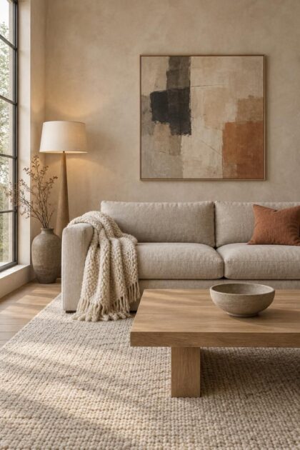
A well-proportioned linen sofa, one good lamp, and a single piece of art can carry a living room when each has earned its place.
The working question shifts from what can I remove to what deserves to stay, and that question tends to produce better rooms than a purge does.
Upgrading the chosen pieces, rather than thinning the pile, is where most of the finished quality comes from.
Design Pro-Tip: Before adding an object to a neutral room, rate it on two counts: does it do something useful, and does it mean something to the household? If it scores on neither, it is probably filler.
The Warm Minimalism Correction
The minimalism most people picture, all white walls and chrome, has been quietly revised.
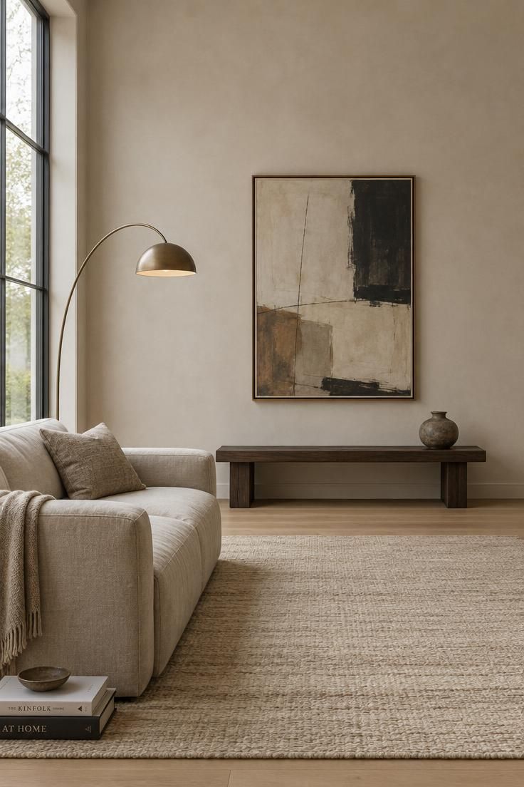
Designer Molly Torres Portnof of DATE Interiors defines warm minimalism as pairing simplicity and intentionality with warm, earthy tones, layered textures, and natural materials.
Designer Sarah Ellison of Frank & Faber frames it as an evolution of the pared-back interiors of the past decade, sharing their calm restraint without the austerity or starkness.
The restraint stayed; the temperature changed.
That shift shows up in the colors homeowners now reach for: creamy whites, taupes, soft terracottas, and earthy ochres in place of cool grays.
Designer Chelsea Miller of Good Ave Design Studio recommends exactly this warmer group over cooler palettes.
Materials moved with the palette.
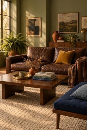
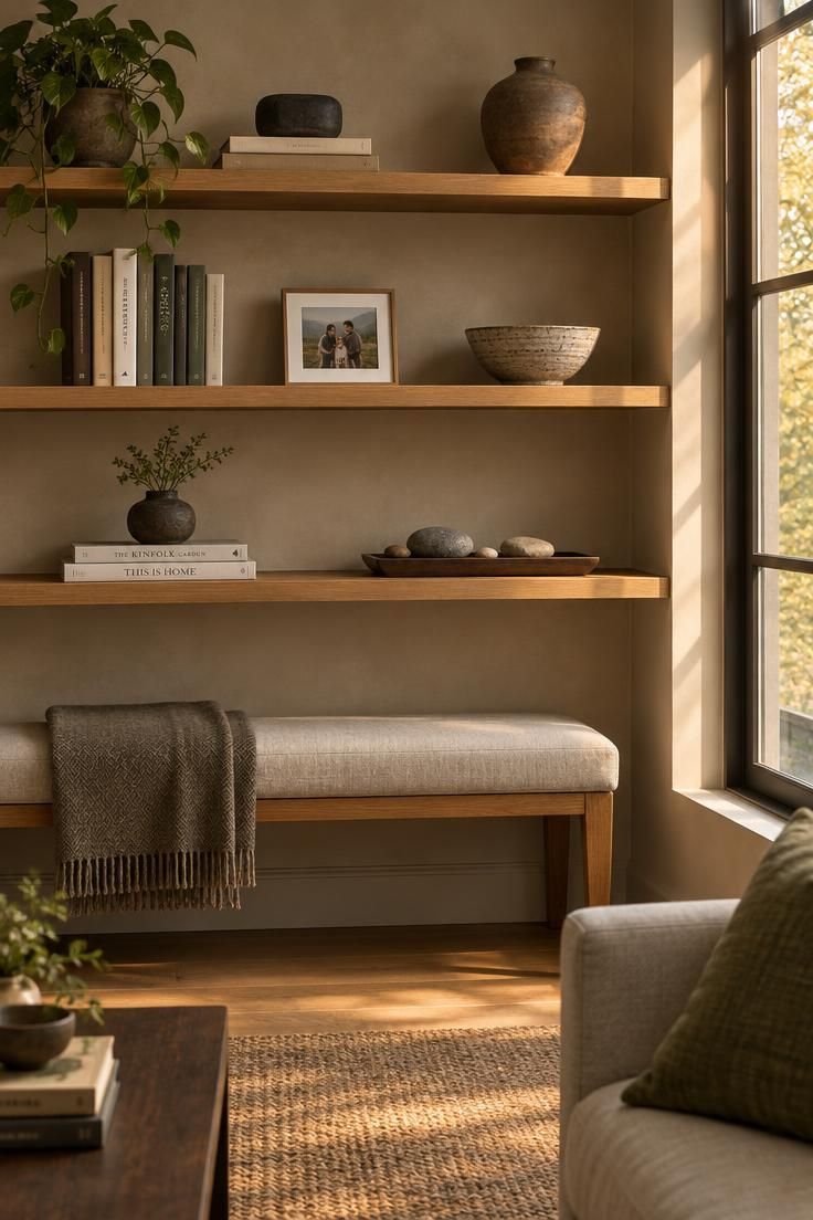
Bouclé, wool, raw oak, and matte ceramics replaced glossy surfaces and hard edges, giving neutral rooms something to look at beyond the color of the wall.
Designer Bethany Adams describes the result as embracing the simplicity of the original look while welcoming softer colors and richer materials.
The practical reason is straightforward: a warm neutral palette is more forgiving than a cool one.
Creamy walls and earthy textiles hide the small marks of daily life better than bright white and cool gray, and they accept a wider range of wood tones and metals without clashing.
For anyone furnishing a home now, the correction offers a simpler starting point.
Begin with warm neutrals, layer in natural texture, and the room will read as considered before a single accessory is placed.
Start from the Rug, Not the Ceiling
Designer Elizabeth Bolognino, known for what she calls layered minimalism, begins rooms from the floor up.
She treats the rug as the shoes of the room, the grounding surface that sets the palette before furniture is chosen, rather than designing top down from wall color or artwork.
The logic is practical.
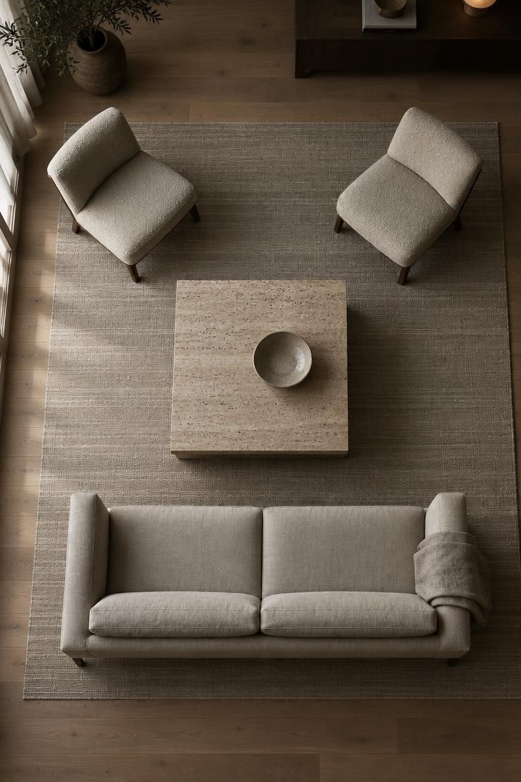
A rug covers a large share of the visible floor and introduces the room’s dominant texture and its secondary colors in one move.
Choosing it first gives every later decision a reference point, from the wood tone of a coffee table to the shade of a throw.
This approach also solves a common problem in warm minimalism for a neutral living room: the drift into beige-on-beige monotony.
A rug with visible weave variation or a quiet pattern introduces contrast at the foundation, where it supports everything above it instead of competing for attention.
Scale deserves attention at this stage.
The rug’s size sets the proportions for the furniture arrangement and for the empty floor space around it, so a rug that is generous relative to the seating group leaves room for the negative space the rest of the room will depend on.
One caution applies here.
A rug chosen purely for color, without regard to how its texture reads against the sofa and curtains, tends to disappear once the room is complete.
Weave and pile matter as much as hue.
Design Pro-Tip: Once the rug is in place, pull its quietest secondary color as the guide for a single accent elsewhere in the room. It keeps the palette coherent without matching everything.
Texture Does the Work Pattern Used to Do
In a room with little pattern, texture takes over the job of holding visual interest.
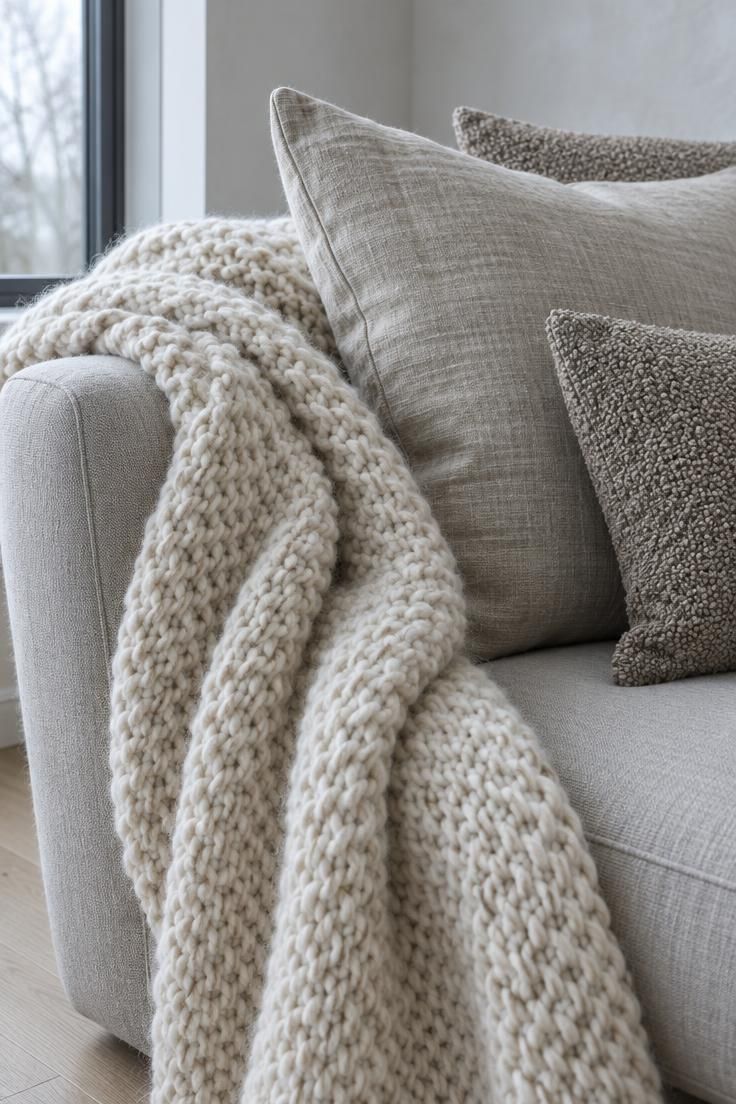
Designer Leigh Kirby describes building warmth through tonal textures such as bouclé, wool drapes, velvet, and cashmere within a single narrow palette, noting that texture slowly reveals itself to the eye.
Bolognino calls texture the secret sauce that keeps neutral rooms from going dull.
The materials worth knowing are few.
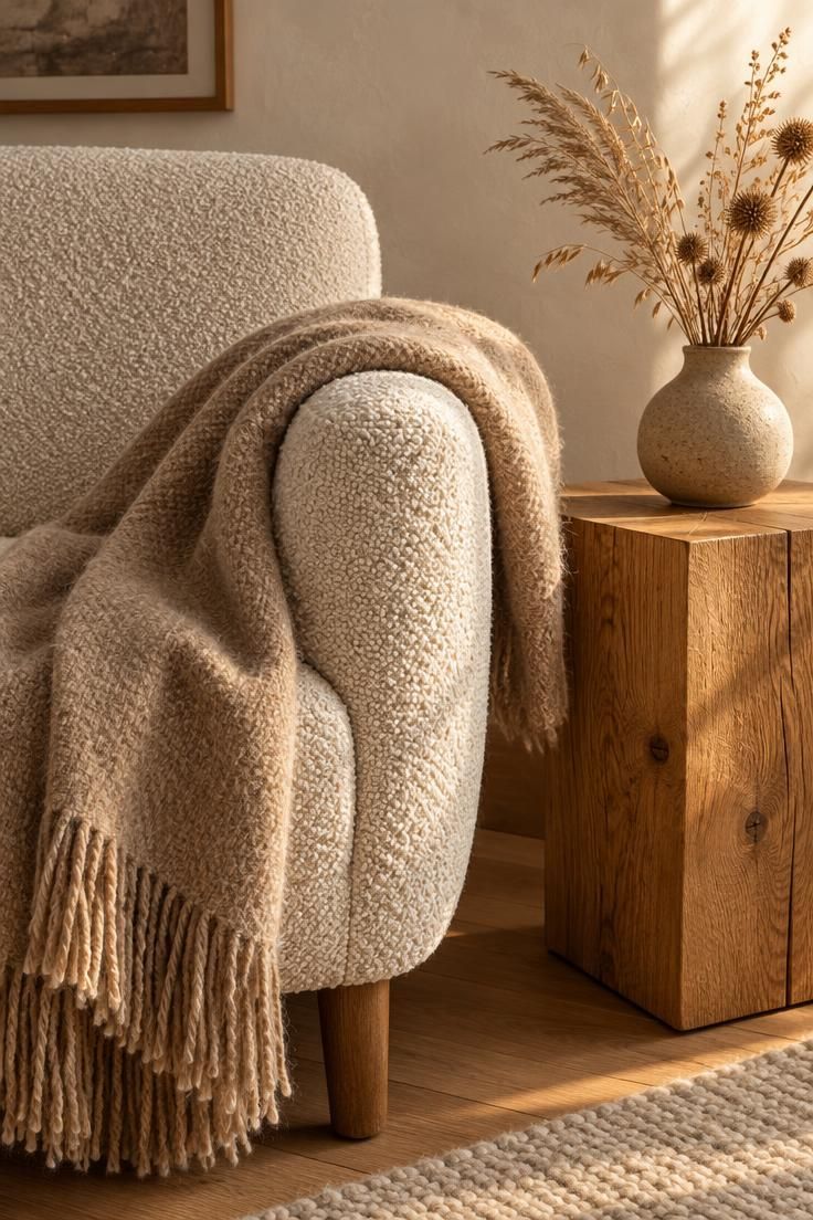
Bouclé brings a nubby looped surface, wool drapes bring weight and a matte finish, linen brings a slight slub and crease, unpolished stone brings coolness and mineral movement, raw wood brings grain, and matte ceramics bring an even, chalky surface that absorbs light.
Mixing them comes down to weight and surface.
Pair rough with smooth by setting a nubby bouclé pillow against a crisp linen cushion cover.
Pair soft with hard by placing a wool throw over a stone-topped table.
Keep the color range narrow so the eye reads the contrast as material rather than as pattern.
Layering texture in a neutral bedroom follows the same logic at a smaller scale.
A linen duvet, a chunky knit throw folded at the foot, wool curtains at the window, and one bouclé cushion give the bed four distinct surfaces within a cream and taupe range, which reads as depth rather than decoration.
The narrow palette is what makes the mixing work.
Too many colors and the textures stop registering as texture.
Too few materials and the room flattens into a single soft blur of beige.
Budgeting for texture follows Bolognino’s Touch Test: spend on the pieces hands and feet meet daily, such as the sofa, the rug, and the bedding, and save on pieces that are only looked at, such as curtain rods and decorative hardware.
In a neutral room those touched surfaces carry most of the visual weight.
Allocation matters more than total spend here.
A modest linen blend that creases naturally can read better than an expensive flat synthetic, because the surface tells the truth about what it is.
One Deliberate Color Move
A minimalist room does not require an all-neutral palette.
Designer Andrea Diego puts it plainly: a house can be deeply minimalist and, at the same time, full of color.
The question is how that color is placed.
The rule that holds up is one color, used with control.
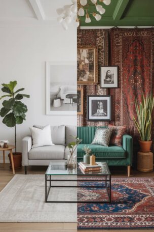
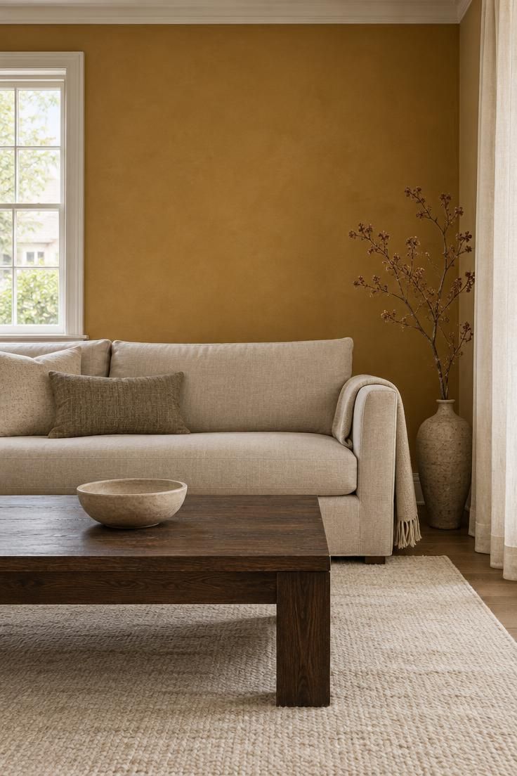
A single painted wall, one upholstered chair, or a large ceramic vessel in a saturated tone reads as a decision.
Many small colored accessories spread across the room read as indecision, and they undo the restraint the rest of the room is working for.
Soto’s examples suit neutral rooms well: soft sage green, muted ochre, or dusty rose work when used in clean silhouettes and balanced proportions.
Each has enough depth to hold its own against warm neutrals without demanding a second color to keep it company.
For one deliberate color accent in a neutral room, placement does as much work as hue.
A wall behind a focal piece gives the color a job.
An upholstered chair gives it a shape.
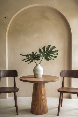
A large vessel gives it a single, contained form the eye can rest on.
Balance the color with adjacent texture so it does not sit flat against the neutrals.
A muted ochre wall reads richer beside a nubby throw and a raw wood surface than beside smooth painted trim alone, because the materials give the color something to play against.
Designer Meeshie Fahmy of Haus of Meeshie makes the case for restraint when adding color, pointing to an emerald green room with sculptural seating as refinement that does not need more.
The color is the event; the rest supports it.
Fewer, Larger, Better Placed
Scale is where many neutral rooms lose their footing.
A cluster of small accessories, each individually pleasant, reads as scattered once the walls and surfaces are otherwise bare.
One large statement object in the same spot reads as composed.
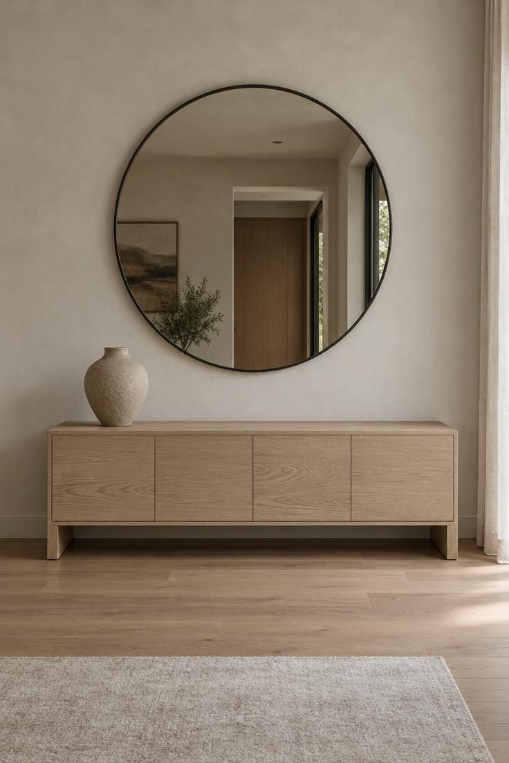
Designer Janaika Elders of Urban Nest makes the case for a single statement piece, such as a sculptural lamp or a handmade pot, as a way to add character without overwhelming simplicity.
Designer Bani Singh of Grounded Design points to objects with organic lines and natural finishes, plus meaningful pieces such as artwork or heirlooms, as the focal points worth building around.
This works because a large object gives the eye a place to land.
In a room with few distractions, the eye needs somewhere to rest, and one well-chosen piece provides that far better than five small ones competing for the same attention.
There is a real tradeoff.
Large pieces cost more and demand more thought before purchase, and a mistake at that scale is harder to hide.
The benefit is that a prominent object occupies the space, which quietly prevents the slow accumulation of small clutter around it.
Placement matters as much as size.
The object should have visible breathing room rather than filling its surface edge to edge, and it should sit where the room’s composition wants a focal point rather than in a leftover gap.
Design Pro-Tip: Before buying a statement object, mark its footprint on the surface with painter’s tape. If the tape leaves less surrounding empty space than the object is tall, the piece is probably too large for that spot.
Negative Space Around a Focal Point
Empty space is a design material in its own right.
The Japanese concept of ma, which treats the interval between things as part of the composition, sits behind much of minimalist practice, and it explains why a well-spaced fireplace or shelf reads better than a full one.
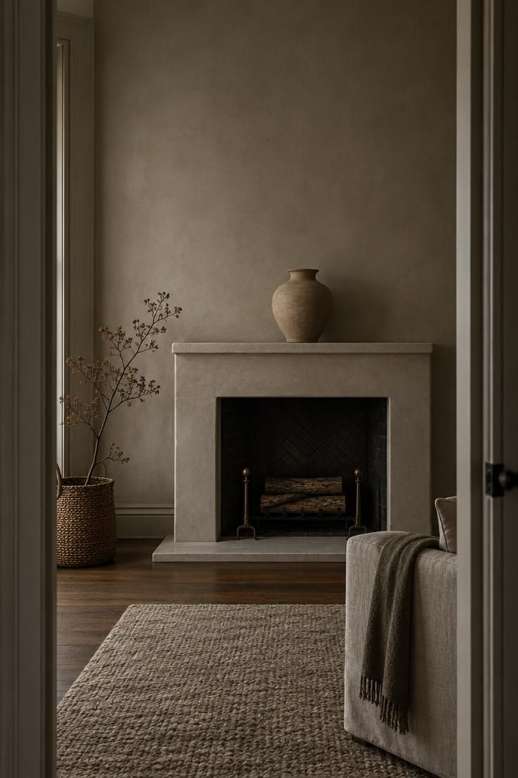
Negative space around a fireplace mantel is a useful test case.
A mantel lined with a dozen small objects divides attention and makes the fireplace look like a display shelf.
One sizable vessel or a deliberate pair, with visible wall above and beside it, lets the mantel function as the room’s focal point.
The decision rule is simple to apply.
When a surface feels crowded, the answer is rarely to rearrange the objects.
Remove one, or replace several with a single piece large enough to hold the space, and the composition resolves far more reliably.
Singh’s advice to resist filling every surface and corner, leaving room for objects to breathe, applies to floors and walls as well as shelves.
Empty floor beside a chair and bare wall above a console are doing the same work as the gap around a mantel.
There is a practical reason to leave that space open, too.
Empty surfaces stay easy to keep clean and easy to reset, which makes the finished look less fragile in daily use.
The line between composed and staged runs through this same territory.
Overly even spacing, with objects placed at identical intervals, can look manufactured.
A little asymmetry, with one side of the mantel holding more than the other, keeps the arrangement from feeling like a showroom display.
The empty space also makes the kept object easier to see.
A single vessel on a broad mantel gets attention it would never receive in a dense arrangement, and the surrounding wall becomes part of the object’s presence.
When the Rules Break Down
Minimalist rules need adjusting in real homes, and the adjustments are worth planning for.
Designer Stephanie Hunt, known as The Flairhunter, cautions that the approach is harder in rooms lacking architectural interest or with unremarkable finishes, where expressive art, collections, fabrics, or stronger contrasts can act as a foil.
Room type matters too.
Designer Reesa Emadi of Poppy Street Interiors recommends going room by room, noting that private spaces such as bedrooms and baths take to minimalism more readily than the busier heart-of-the-home spaces like living rooms and kitchens.
A whole-house approach is harder to sustain than a considered partial one.
The staged look is the next risk.
Emadi warns that removing too much at once leaves a space without a sense of evolution, which can make it feel staged rather than lived in.
Adding piece by piece over time produces a different result from furnishing a room in one shopping trip.
Personal objects are the counterweight.
Designer Leigh Kirby notes that minimalism does not require the absence of heirlooms and sentimental objects, and the warm take on the style makes more room for art, books, and collections than the stark version did.
Household agreement is the practical limit.
Reporting on IKEA’s Our Life at Home Report, which surveyed more than 21,000 people across 22 countries, Better Homes & Gardens Australia noted that 49 percent of respondents cited differing ideas of mess as a main household argument.
Two people sharing a neutral room need a shared answer about what stays visible.
Designer Meeshie Fahmy points to a further risk: copy-and-paste minimalism can lack character, producing a cold lack of expression.
The fix is not more objects but more specific ones, chosen for this household rather than for the style.
The useful stance is to treat minimalist rules as defaults that can be overridden with reason.
A room with strong architecture can hold more restraint.
A room without it may need a bolder artwork or a collection to carry the visual weight the walls cannot.
Keeping It Finished Without Constant Styling
A finished neutral room is less a one-time achievement than a set of habits.
The visible surfaces stay clear only when the hidden ones do their job, which makes storage and routine the quiet backbone of the whole approach.
An Ipsos iSay survey on minimalist living found that the most-cited maintenance habits were short daily tidy-ups, immediate disposal of junk mail, regular review and donation of unused items, and a designated place for everything.
The survey also reported one in, one out as a habit among a smaller share of respondents, and that guardrail is the one that stops slow re-accumulation.
The design implication is direct.
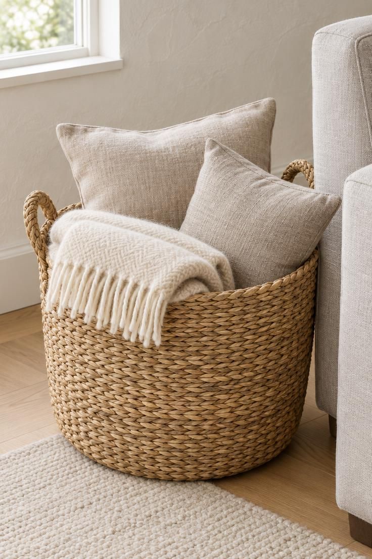
Every surface kept deliberately sparse needs a nearby home for what would otherwise land on it, whether that is a closed cabinet, a woven basket, or a drawer.
Plan the storage before the styling.
Keeping a minimalist room from feeling staged depends on the same habits.
A room that is reset daily accumulates the small signs of use that make it read as lived in, while a room styled once and left untouched tends to look like a set.
Budget follows the same logic as texture.
Bolognino’s Touch Test directs spending toward the pieces hands and feet meet daily, such as the sofa, the rug, and the bedding, and toward saving on pieces that are only looked at.
In a neutral room those touched surfaces carry most of the visual weight, so the money is best placed where it is felt.
The habits also protect the palette.
When everything has a place and paper is dealt with on arrival, the warm neutrals stay visible instead of disappearing under a layer of daily clutter.
Conclusion
Minimalist rules are not about having less.
They are a sequence of choices about what carries weight in a room, and each choice makes the next one easier.
Start from the rug so the palette has a foundation.
Let texture carry the interest a pattern would otherwise provide.
Make one color move with control, and leave the space around a focal object open enough to do its work.
The goal is a room that feels both finished and personal, not an empty stage.
Test any surface or corner against the editing rule: remove one small item, let one larger object hold the space, and keep the surrounding area visible.
Try the nearest crowded mantel or console first.
The change will show quickly whether the room was waiting for more or simply waiting for a decision.