This post may contain affiliate links. If you make a purchase through these links, we may earn a commission at no additional cost to you.
Most minimalist closet advice begins with a donation bag.
Clear out the excess, the thinking goes, and calm follows.
That approach asks a household to keep editing forever, and it leaves the room's largest object untouched.
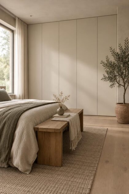
A better starting point is the closet itself: its front, its color, its height, and the way its interior is divided.
Minimalist closet organization works on two planes at once.
The outer plane is how the storage reads in the bedroom, from door surface to wall relationship to proportion.
The inner plane is how the interior is planned so the calm exterior survives real mornings, real laundry piles, and real seasonal change.
The two planes need to be designed together, because a quiet facade over a chaotic interior rarely lasts a month.
What Counts as a Minimalist Closet, and What Does Not
A minimalist closet is a set of visual moves, not a target number of garments.
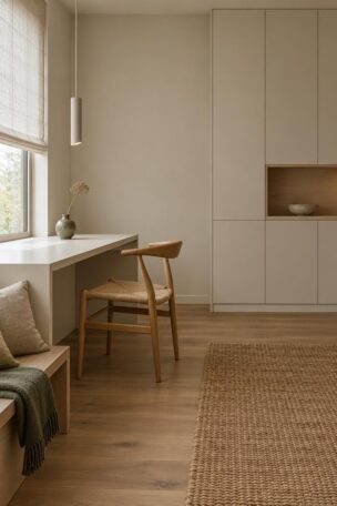
Flat fronts without visible hardware, quiet plaster-and-stone tones, and full-height cabinets that read as part of the wall all belong to the look.
Inside, the collection is edited enough that the storage is not straining at its limits.
None of these moves requires owning almost nothing.
They require removing visual noise from the biggest object in the room.
That distinction separates minimalist from organized, and the two are not the same project.
Minimalist describes composition: uninterrupted planes, restrained color, proportions that let the eye rest.
Organized describes a functional system: a place for every category, a buffer for new arrivals, a plan for out-of-season pieces.
A closet can be one without the other.
The pairing matters because a handle-less front with a single rail behind it turns into a jumble by the second week, and the calm exterior stops delivering.
Treating the closet as architecture rather than furniture changes how the details get decided.
Door thickness, reveal lines, and the tone relationship between cabinet and wall all carry more weight than the contents.
Editing a collection is still part of the work, but it supports the composition instead of standing in for it.
The moves below begin with the most visible decision and work inward.
The Door Front Sets the Tone
The door surface is the decision a guest notices first, even before the color.
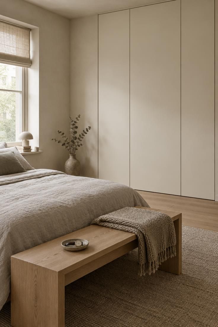
Handle-less wardrobe doors remove the small interruptions of knobs and pulls, leaving one continuous plane from floor to ceiling.
That plane is what makes the storage recede, and it is achieved through a few recognizable routes: push-to-open catches, routed finger pulls along an edge, or recessed channels between adjacent doors.
Each route feels different in daily use.
Push catches can feel imprecise, and the repeated pressing they invite becomes noticeable in a busy household, especially with young children leaning on the fronts.
Finger-pull channels tend to feel more reliable and show less wear over time, because the hand finds the same groove every morning.
Neither is a purely visual choice, and that is the point: the calmest facade is the one that still feels agreeable on a rushed Tuesday.
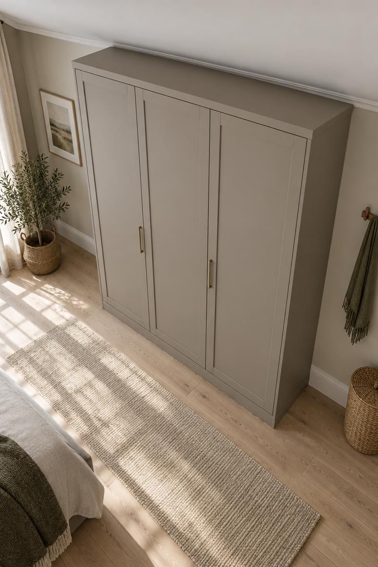
On a freestanding wardrobe, the same effect can be approximated without changing the door at all.
Swapping standard handles for slim edge pulls fitted along the top of each door keeps the front visually quiet while remaining easy to grab.
It is a composition idea rather than a commitment to a full handle-less system, which makes it useful in a rental or a room where the storage piece may move later.
Sliding wardrobe door tradeoffs deserve their own accounting.
A wide sliding panel gives a large uninterrupted surface and needs no swing space, which matters when a bed sits close to the storage wall or a doorway runs tight against it.
The cost is partial access, since only one section of the interior stands open at a time.
Tracks collect dust and need occasional vacuuming, very wide panels feel heavy to move, and runner quality shows immediately: smooth gliding doors stay quiet for years, while poor runners judder on every push.
The visual gain is genuine, and it comes with a maintenance line item worth accepting on purpose.
Color, Contrast, and the Disappearing Wardrobe
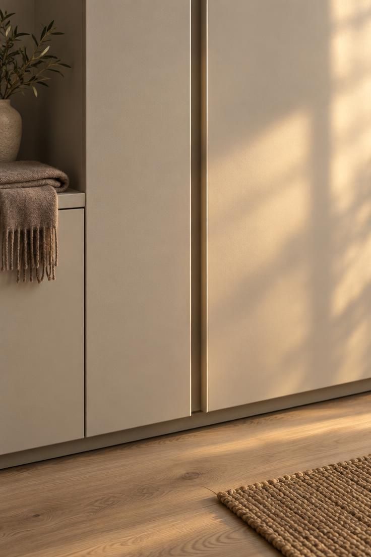
The palette has moved away from stark white toward warmer neutrals: off-whites with a hint of cream, bone, mushroom, pale clay, muted greige.
Deeper olive or charcoal appears as an accent, often on a single piece rather than a whole wall.
These tones read as calm rather than clinical, and they hold shadows with more depth than a blue-white finish does.
The key compositional technique is a matched wall and closet color, close within a shade or two.
When the cabinet tone and the plaster sit near each other, the storage stops reading as an object and starts reading as part of the room, and the space appears larger.
A contrasting closet does the opposite: it becomes a deliberate feature the eye returns to.
Both choices are valid, and they answer different questions.
Only the matched version makes the storage recede.
Wood supplies the warmth in an otherwise neutral scheme.
A timber headboard, a bedside unit, or an oak floor gives the eye a single place to land, so the room avoids the flatness that comes from repeating one tone everywhere.
Keep the wood in one or two places rather than spreading it across the room.
The result reads considered without adding another color to the mix.
Height, Proportion, and the Dust Gap
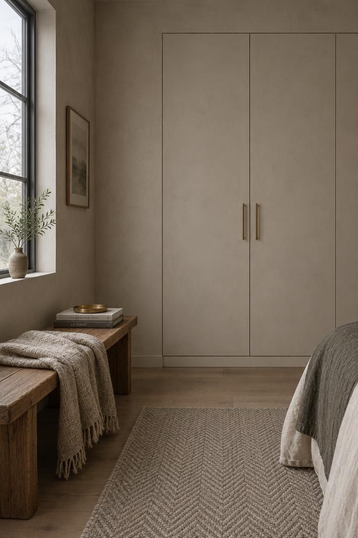
Minimalist rooms tend to use taller storage, not shorter.
Running a wardrobe close to ceiling height removes the gap where dust collects and where boxes and off-season bags accumulate in a crooked line.
The piece then reads as architecture rather than furniture, and the room gains a clean vertical edge that makes the ceiling feel higher.
High ceilings complicate that move for a freestanding piece.
Where full height is impractical, accept a clear gap and keep it genuinely clear.
A gap half filled with storage bins looks like overflow.
An empty gap looks like a decision.
That single distinction does more for the composition than any styling object placed on top.
The same logic applies to baseboards, crown transitions, and the space where the cabinet meets the floor.
Continuity at the edges is what lets the storage disappear into the wall.
Every visible break pulls attention back to the object.
Choosing full height is partly a commitment to that continuity, and it is worth confirming before ordering anything.
Zoned Interiors Make the Calm Exterior Last
One long rail and a single shelf is the default interior, and it is the reason many minimal exteriors fail.
A zoned closet interior divides the same space into working sections: double hanging for shirts and folded trousers, a bay of long hanging for dresses and coats, open shelves at eye level for folded knits, drawers for small items.
Each zone holds one category, so putting things away becomes a decision the layout has already made.
Zoning matters aesthetically as much as functionally.
A well-divided interior stays tidy with less effort, which is what makes a handle-less, closed front worth having.
When the interior has a clear place for everything, the doors can stay shut and the calm plane outside holds.
When it does not, the overflow migrates to chairs, dressers, and the floor.
Leave roughly a fifth of the interior empty.
That rule of thumb is a planning heuristic rather than a measured standard, and it accounts for the way clothing expands seasonally.
A closet filled to capacity on day one has nowhere to absorb new arrivals, and the overflow that follows undercuts the minimal look.
Empty space is a working part of the system, not wasted storage.
Supporting storage can absorb what the main wall should not hold.
A separate clothes-storage unit in a spare room, a set of storage boxes under the bed, or a hallway cupboard for out-of-season pieces keeps the primary closet from bulking up.
The goal is a main wall that stays edited while the household still has somewhere to put things.
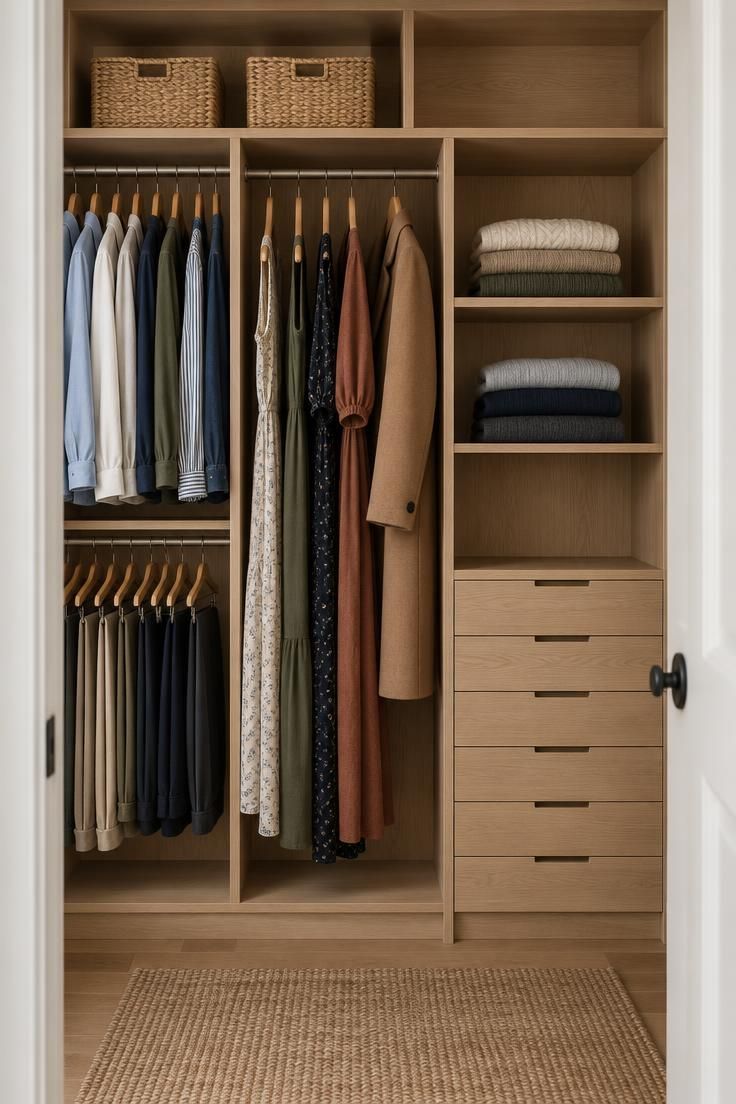
Design Pro-Tip: Before ordering any interior fittings, count your long-hanging garments and your folded stacks separately, then assign each category a zone. The zone sizes you actually need will differ from the default layout that ships with most systems.
Open Modular Systems Versus Closed Fronts
The most consequential decision is whether the closet has doors.
Closed fronts deliver the calm uninterrupted plane described earlier, concealing contents entirely.
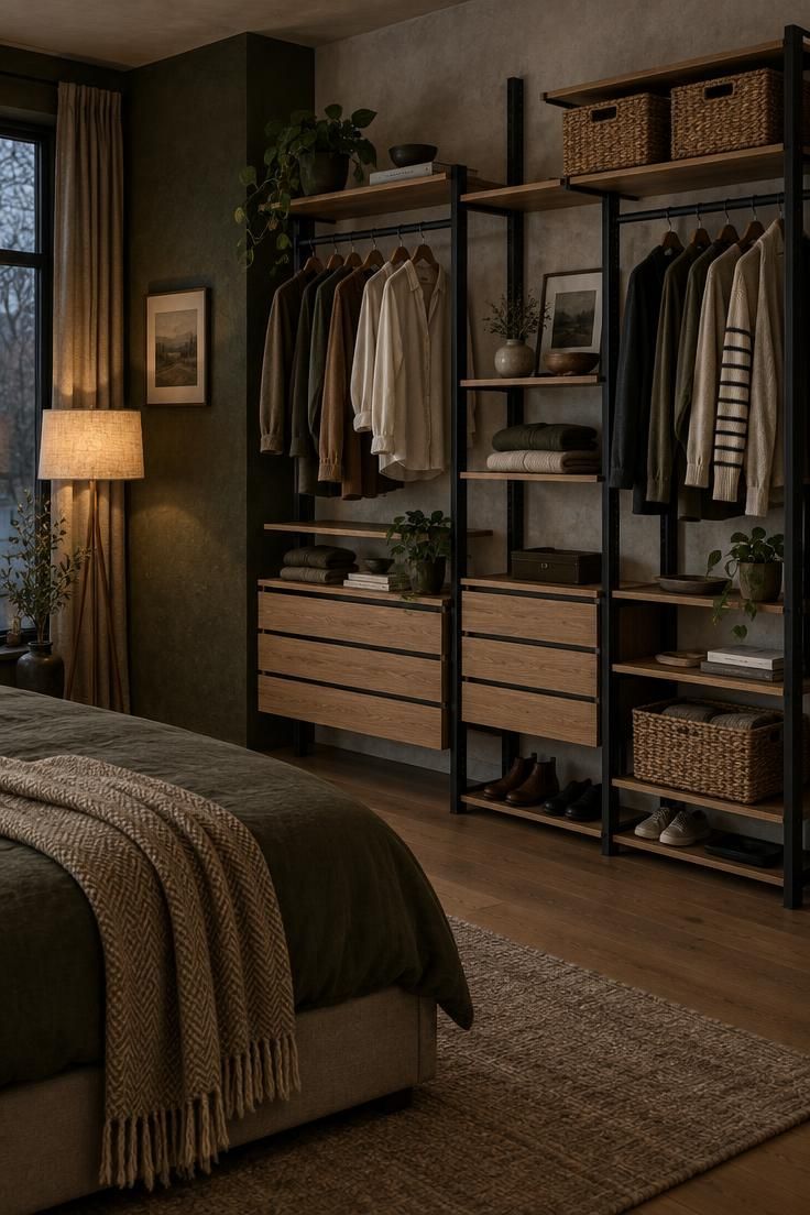
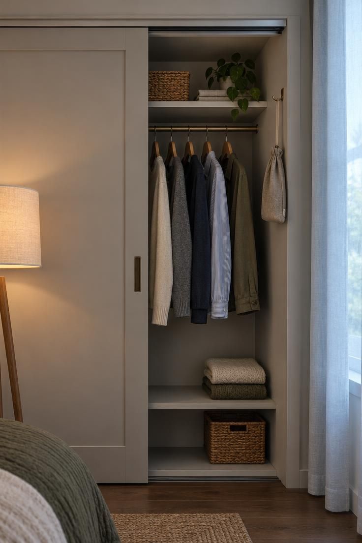
Open modular closet systems take the opposite route, using wall-mounted rails and interchangeable modules such as rods, shelves, drawers, shoe niches, and baskets.
Because the modules sit against the back wall, depth reads clearly and full height stays usable from top to bottom.
Modularity is the practical advantage.
Modules can be repositioned as needs change, so a closet planned for a renter's wardrobe can be reconfigured for a growing family or a change in work dress.
Total visibility of contents makes finding things quick.
The systems also let a room show its structure, which suits certain bedroom layouts better than a solid bank of doors would.
The honest downsides appear in daily use.
Everything is on display, so the curation burden is constant.
Open systems suit edited collections far better than dense ones, and visible contents can look busy in a small, dim room where shadows pool between hanging garments.
Nothing hides a mismatched set of wire hangers or a stack of half-folded sweaters.
The decision criterion comes down to temperament.
Open systems reward people who genuinely enjoy seeing and editing their clothes, treating the closet as part of the room's display.
Closed systems reward people who want the calm plane and will maintain the interior zoning behind it.
Neither approach is universally better, and most households will know which side they sit on within a sentence.
A hybrid works for many bedrooms: closed fronts on the main wall, one open bay or an end unit for frequently worn items.
The mixed approach keeps the largest surface quiet while giving the daily-use pieces a place to breathe.
It also softens the commitment, since changing course later means adjusting one bay rather than replacing a full run.
Negative Space, Rhythm, and Restraint
An organized closet does not need every inch filled.
Intentional empty space on shelves, breathing room around categories, and consistent spacing between hung garments all read as calm and curated.
Negative space is the difference between a closet that looks composed and one that looks packed, and it costs nothing to plan for.
Consistency is the other half of that composure.
Repeating the same hangers, finishes, and labeling style removes the small visual distractions that make an otherwise organized closet feel busy.
A row of identical wooden hangers does more work than another shelf, because it renders the hanging section as one visual block instead of a dozen separate decisions.
Texture carries the interest when the palette narrows.
Ribbed or fluted fronts add shadow and depth without introducing a new color, and the same principle applies elsewhere in the room.
A chunky throw, a visible-weave rug, or unlined linen curtains give the eye somewhere to rest.
Without texture, a flat neutral scheme can tip toward blankness, and the room loses the warmth the palette was meant to supply.

Mirrors and Light, Used Sparingly
Mirrors still earn a place in a minimalist bedroom, though the full mirrored front has lost ground.
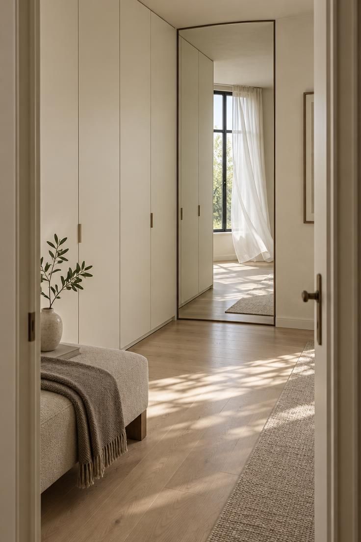
A single mirrored panel within a run of plain doors, or one large freestanding mirror, keeps the reflection useful without turning the entire wall into a second surface.
Restraint here is what makes the mirror feel intentional rather than decorative.
Placement does most of the work.
A single mirror positioned to reflect a window brings daylight deeper into the room, which helps a dark corner feel less shut in.
Several mirrors facing each other create visual busyness, the opposite of the goal.
Positioning a single mirrored panel at the end of a run rather than the center gives the reflection a purpose while keeping the main doors quiet.
Light planning follows the same restraint.
Let a window do the primary work and add one lamp for evening, rather than layering several small sources across the ceiling.
Daylight bouncing off a single mirror can lift the room more than an extra fixture would, and it keeps the palette readable without washing it out.
Where Minimalist Closets Get Hard
Open systems turn every item into decor, and that means upkeep is continuous rather than occasional.
A closed closet can hide a rushed morning; an open one cannot.
Anyone drawn to open storage should test the reality of a busy week against the appeal of the look before committing a full wall to it.
Handle-less fronts and sliding tracks need periodic attention.
Channels collect lint and fine dust, tracks need vacuuming, and the feel of a push catch changes gradually enough that the decline is easy to miss until a door sticks.
None of this is difficult, and all of it is easy to postpone, which is where a small maintenance rhythm helps.
The one-fifth-empty buffer only works if overflow has somewhere to go.
Households without a spare storage room or under-bed space will find the buffer collapsing during seasonal change.
Matching a closet to the wall works beautifully but limits future repainting flexibility: repaint one surface and the receding effect changes, so the pairing needs to be repainted together or reconsidered as a deliberate contrast.
Small, dim rooms expose another tradeoff.
Heavy opaque storage can make a tight bedroom feel closed in, and clear or lighter containers may preserve a sense of depth.
Clear containers also expose mismatched contents unless the contents themselves are uniform, which is its own ongoing work.
Weigh the visual gain against the discipline it requires.
Maintenance comes down to regular editing.
A seasonal mini-audit, done at the change of wardrobe rather than on a rigid calendar, keeps the zones honest and the buffer intact.
Re-evaluating which categories have grown or shrunk matters more than any single reorganization, because the system only holds if it continues to match the household.
Before You Copy This
Start with closed versus open.
That single answer shapes the budget, the maintenance load, and the visual character of the bedroom more than any other decision.
If the answer is closed, decide next whether the front will be handle-less and, if so, which grab route feels right in daily use.
Move to the wall relationship.
A matched wall and closet color makes the storage recede; a contrasting tone makes it an object.
Both are valid, and the choice should follow the room rather than a photograph.
Consider whether future repainting is likely before committing to a matched pair.
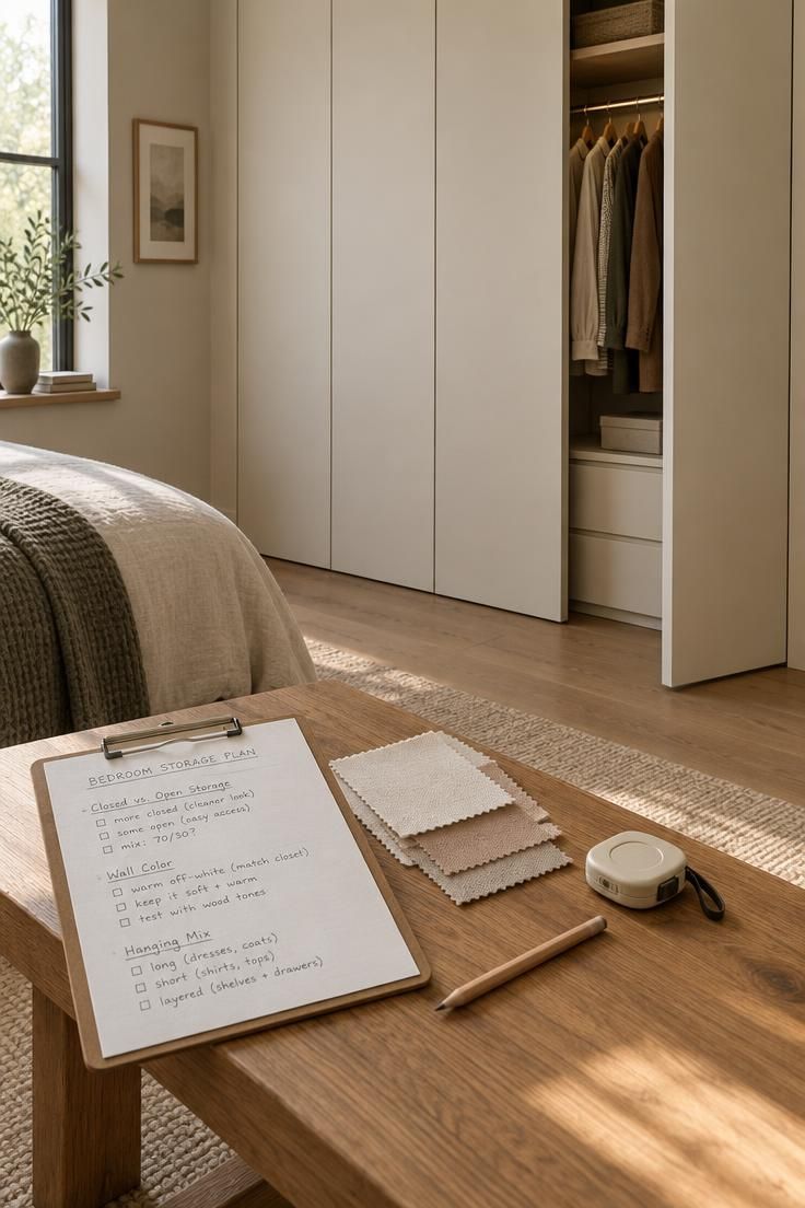
Then work through the practical decisions: full height versus a deliberate clear gap, the hanging mix and how much long versus short storage the household needs, drawers versus shelves for small items, and how much empty space can realistically be held.
Treat all of this as design inspiration and planning criteria.
Nothing here covers structure, wiring, plumbing, or installation, and those decisions belong to someone qualified to make them.
Conclusion
Minimalist closet organization lives on two planes.
The outer plane is door fronts, color, and proportion.
The inner plane is zoning, negative space, and regular editing.
Both planes need attention, and neither compensates for the other over time.
The most useful choice is the one matching your tolerance for visible curation against your preference for calm concealment.
Decide whether the closet should recede into the wall or read as a deliberate object, then build the interior to support that answer.
Leave roughly a fifth of the space empty as a buffer, and let a seasonal mini-audit keep the zones honest.
Start with one decision: matched wall and closet color, or contrast.
That single choice tells you which doors, finishes, and interior plan make sense, and the rest of the decisions follow from it.
Everything else in this guide can wait until that first answer is settled.