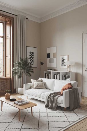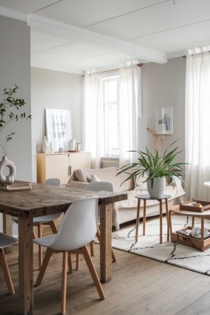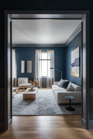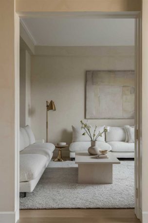
This post may contain affiliate links. If you make a purchase through these links, we may earn a commission at no additional cost to you.
Your living room color palette decides how you feel the moment you walk through the door.
The right combination of wall tones, upholstery shades, and accent colors can turn an ordinary room into a place where you actually want to sit down and stay.
These 13 ideas range from quiet, neutral layering to rich, saturated pairings, and each one is built around a specific mood you can recreate in your own space.
Whether you lean toward earthy tones or prefer something cooler and more restrained, there is a living room color palette here that will make the room feel like it belongs to you.
Warm Clay Walls With a Cream Sofa and Brass Accents
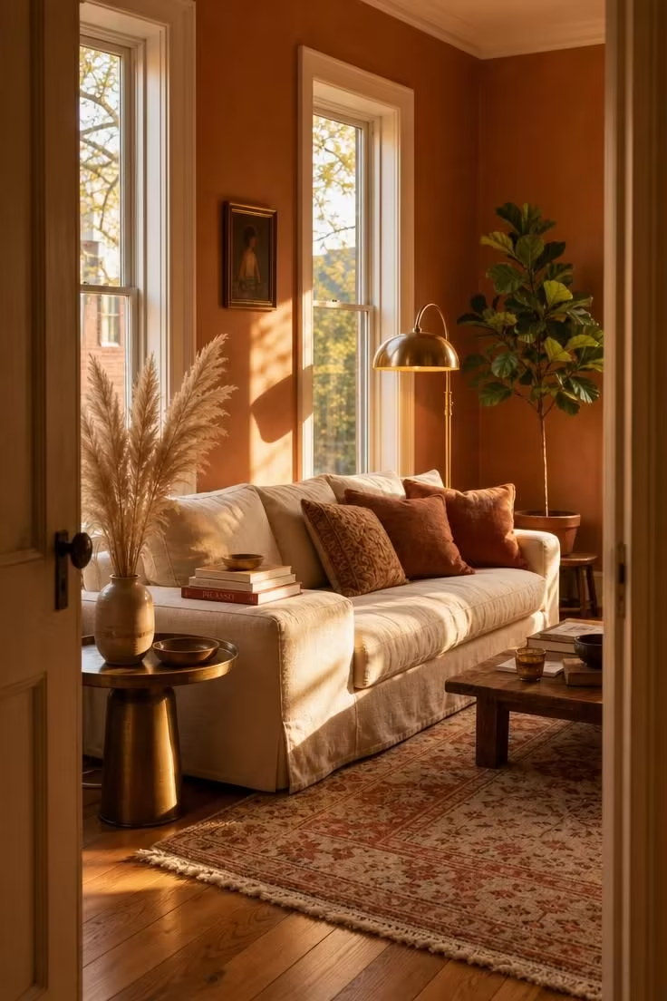
A warm color scheme built around clay and cream does something no cool-toned room can replicate.
It makes the space feel heated from within, as though the walls themselves are radiating warmth.
The clay tone here is not a flat terracotta but a layered, slightly dusty shade that shifts between peach and brown depending on the light.
Against it, the cream sofa reads as soft and grounded rather than stark.
Brass accents carry the warmth further without competing, adding just enough shine to keep the palette from feeling flat.
This is a paint colors for living room combination that works especially well in spaces with western or southern exposure, where natural light intensifies the warmth throughout the day.
Style Blueprint:
- Clay or sienna-toned wall paint with warm undertones
- Deep cream linen sofa with loose, lived-in cushions
- Brass floor lamp and round brass side table
- Hand-knotted rug in faded coral and cream
- Dried pampas grass in a ceramic vase
Sage Green Upholstery Against a Warm White Plaster Wall
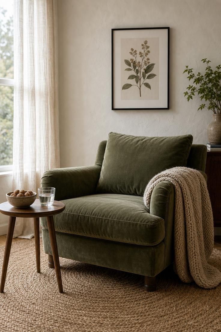
A sage green living room feels fresh without trying too hard.
The velvet here deepens the green just enough to make it feel weighty, not minty or pale.
Against a warm white wall with visible plaster texture, the color reads as natural rather than trendy.
The warm white prevents the green from going cold, which is a common mistake when pairing green upholstery with pure white or blue-white walls.
A chunky knit throw in oatmeal softens the formality of the velvet and introduces a second neutral layer.
This combination is a strong example of color coordination between a single saturated piece and a quiet, textured backdrop.
The room stays calm because nothing fights for attention.
Style Blueprint:
- Sage green velvet armchair with a rounded silhouette
- Warm white plaster walls with hand-troweled texture
- Chunky knit throw in oatmeal
- Round jute area rug
- Single botanical print in a thin black frame
Charcoal and Camel Layered Across a Low Sectional
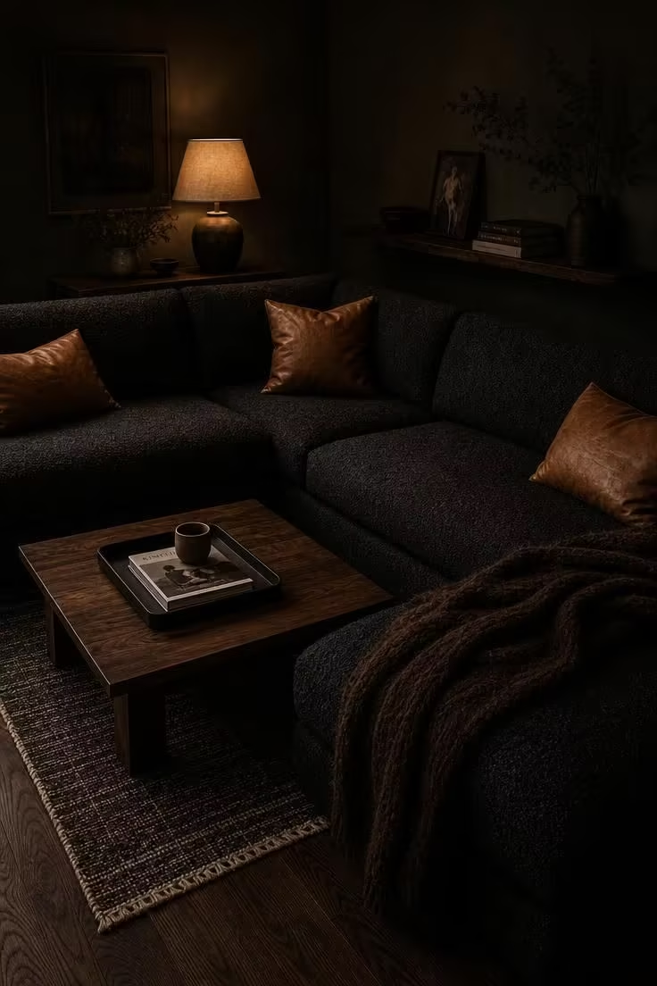
Charcoal and camel together create a living room that feels expensive without being cold.
The secret is in the contrast between the matte, textured charcoal and the smooth warmth of the camel leather.
Neither color dominates because they sit at roughly the same tonal depth, which keeps the room balanced even in low light.
Dark olive walls push the palette into richer territory, giving the neutrals something to lean against.
This is the kind of room that looks best at night, when the single table lamp turns everything amber and shadowed.
The warm wood tones of the walnut coffee table connect the two main colors, acting as a bridge that keeps the palette from splitting into two separate camps.
A thick wool throw adds one more layer of texture and prevents the sofa from reading as a single flat surface.
The mood here is deliberate and enveloping, built for long evenings and slow conversations.
Style Blueprint:
- Deep charcoal bouclé sectional sofa
- Camel-colored leather throw pillows
- Low walnut coffee table with matte black tray
- Dark olive or deep green wall paint
- Thick wool throw in dark chocolate
Dusty Rose Curtains Paired With a Dove Gray Rug
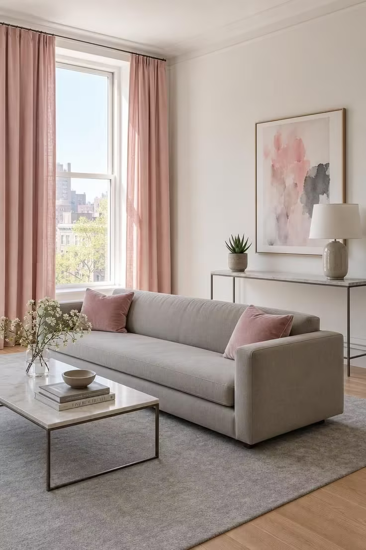
Dusty rose and dove gray is a living room color palette that avoids every cliché of pink decorating.
The rose here is muted enough to read as a neutral in most light conditions, closer to clay than candy.
Paired with a cool dove gray rug, it creates a soft tension between warm and cool that keeps the room interesting without any bold gestures.
The mushroom gray sofa sits exactly between the two colors, tying the floor and the window treatment together.
This palette works best in rooms with plenty of natural light, where the rose can shift subtly through the day.
In the morning it leans almost gray, and by afternoon it warms to a true blush.
Style Blueprint:
- Floor-length dusty rose linen curtains
- Large dove gray wool area rug
- Low-profile sofa in mushroom gray
- Slim marble-topped console table
- Abstract watercolor print in muted pink and gray
Navy Blue Accent Wall Behind a Cognac Leather Chair
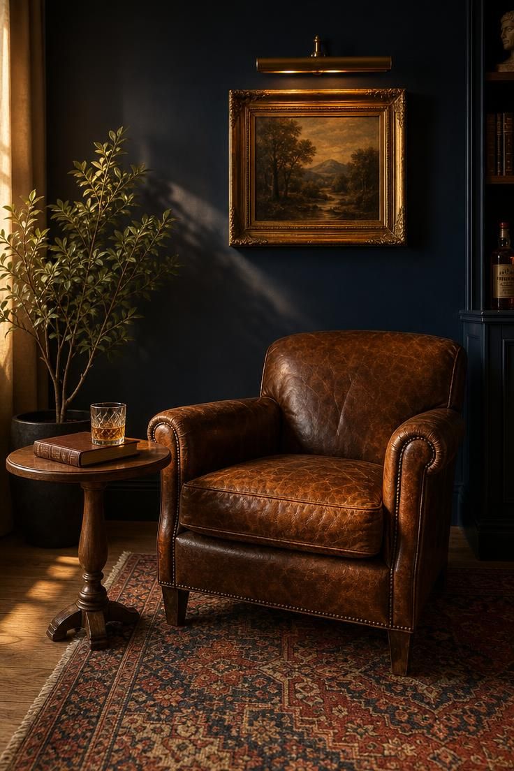
An accent wall in deep navy paired with cognac leather is one of the most reliable high-contrast palettes in home decorating.
The navy reads as sophisticated and grounding, while the cognac leather adds age and warmth that prevents the blue from feeling corporate.
What makes this pairing work is the shared depth of both colors, since they sit at similar saturation levels and neither one washes the other out.
The faded Persian rug introduces secondary reds and blues that echo the main palette without repeating it exactly.
Complementary colors play a subtle role here because the warm orange-brown of the cognac sits opposite blue on the color wheel, creating a natural visual pull.
A brass picture light adds a metallic accent that ties the warm side of the palette together.
This is a corner that earns its presence in the room by doing something the rest of the space does not.
The rest of the living room can stay neutral, and this single corner will anchor the entire color story.
Wide-plank white oak flooring keeps the base light enough that the dark wall does not shrink the room.
Style Blueprint:
- Deep navy blue paint for one accent wall
- Worn cognac leather club chair
- Small round oiled walnut side table
- Vintage Persian rug in faded reds and blues
- Brass picture light above framed artwork
Design Pro-Tip: When choosing an accent wall color, test it in the room at three different times of day. A color that looks perfect at noon may turn muddy after sunset or look washed out in morning light. Tape a large painted sample board to the wall and leave it for 48 hours before committing.
A Monochromatic Palette of Three Greens in One Room
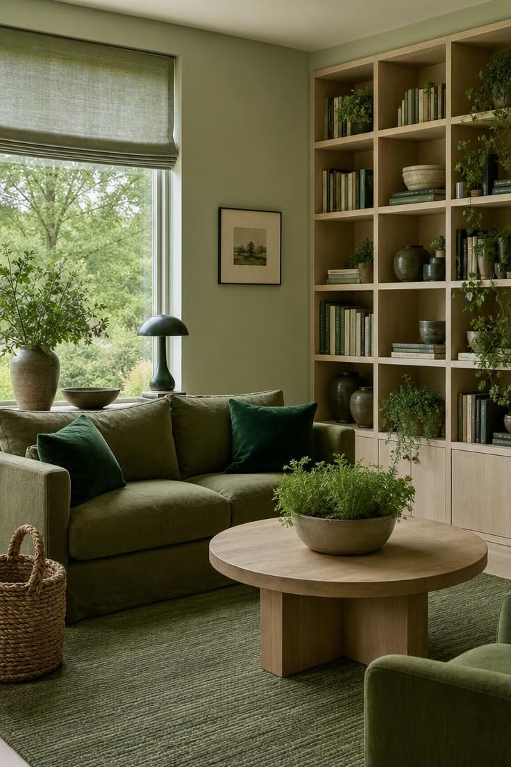
A monochromatic palette works when you spread a single hue across three or four distinct depths.
Here, celadon on the walls provides the lightest layer, olive on the sofa sits in the middle, and forest green on the pillows brings the darkest anchor.
The room reads as unified because every surface belongs to the same color family, but it stays interesting because the tonal range is wide enough to create real contrast.
This is an approach that suits smaller living rooms especially well, because a single color family does not visually fragment the space the way multiple competing hues can.
Fresh herbs on the coffee table reinforce the green palette with a living, organic element.
The cool, overcast light through the window gives every green its most accurate reading, with no warm cast to shift the tones toward yellow.
A neutral living room this is not, but it carries the same visual calm because nothing clashes.
Style Blueprint:
- Pale celadon wall paint
- Olive linen sofa with loose cushions
- Dark forest green velvet accent pillows
- Round light ash coffee table
- Woven seagrass basket and fresh herb planter
Ivory and Walnut With a Single Rust Pillow
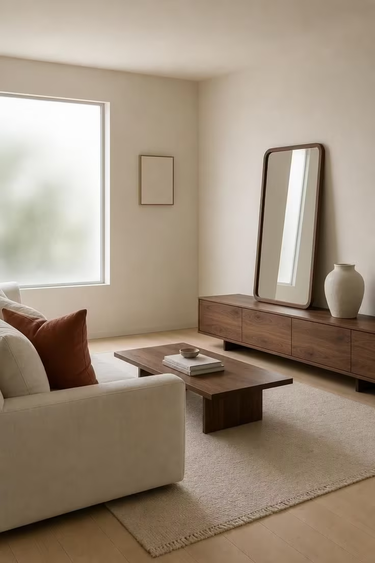
This palette proves that restraint is its own kind of drama.
Ivory on ivory sounds like it would flatten a room, but the warm wood tones of the walnut console and mirror frame give the neutrals something to orbit around.
The single rust pillow is doing all the color work, and that is exactly the point.
When only one object carries the accent color, the eye goes directly to it, which gives you complete control over where attention lands.
This is color coordination reduced to its simplest possible expression.
The empty ceramic vase is a deliberate choice here, because adding flowers or branches would introduce a second color and weaken the rust pillow’s solo impact.
A frosted glass window diffuses the light evenly so no corner of the ivory reads brighter or duller than another.
The room is quiet in a way that feels chosen, not empty.
Style Blueprint:
- Ivory walls and ivory linen sofa
- Single rust-colored linen accent pillow
- Low walnut media console and walnut-framed mirror
- Hand-thrown matte ivory ceramic vase
- Thin off-white wool area rug
Slate Blue Walls With Linen and Pale Oak Furniture
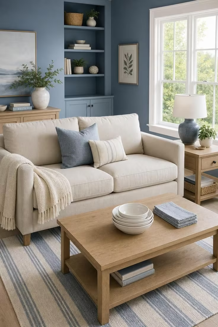
Slate blue is one of the few cool wall colors that still feels warm enough to live with every day.
It sits right between gray and blue, so it reads as calm without the chill that purer blues can carry.
Pale oak furniture lightens the room and keeps the blue from feeling heavy, and the natural linen upholstery adds a layer of texture that softens the painted surface.
A flat-weave cotton rug in ivory and soft blue stripes echoes the wall color at a lighter value, which ties the floor plane to the walls without repeating the exact shade.
This is a palette that pairs well with high-ceilinged rooms where the blue has vertical space to breathe.
Style Blueprint:
- Muted slate blue wall paint
- Pale oak coffee table and side table
- Natural linen loveseat
- Flat-weave cotton rug in ivory and soft blue stripes
- White ceramic tabletop accessories
Coffee and Cream Tones Grounded by a Sisal Area Rug
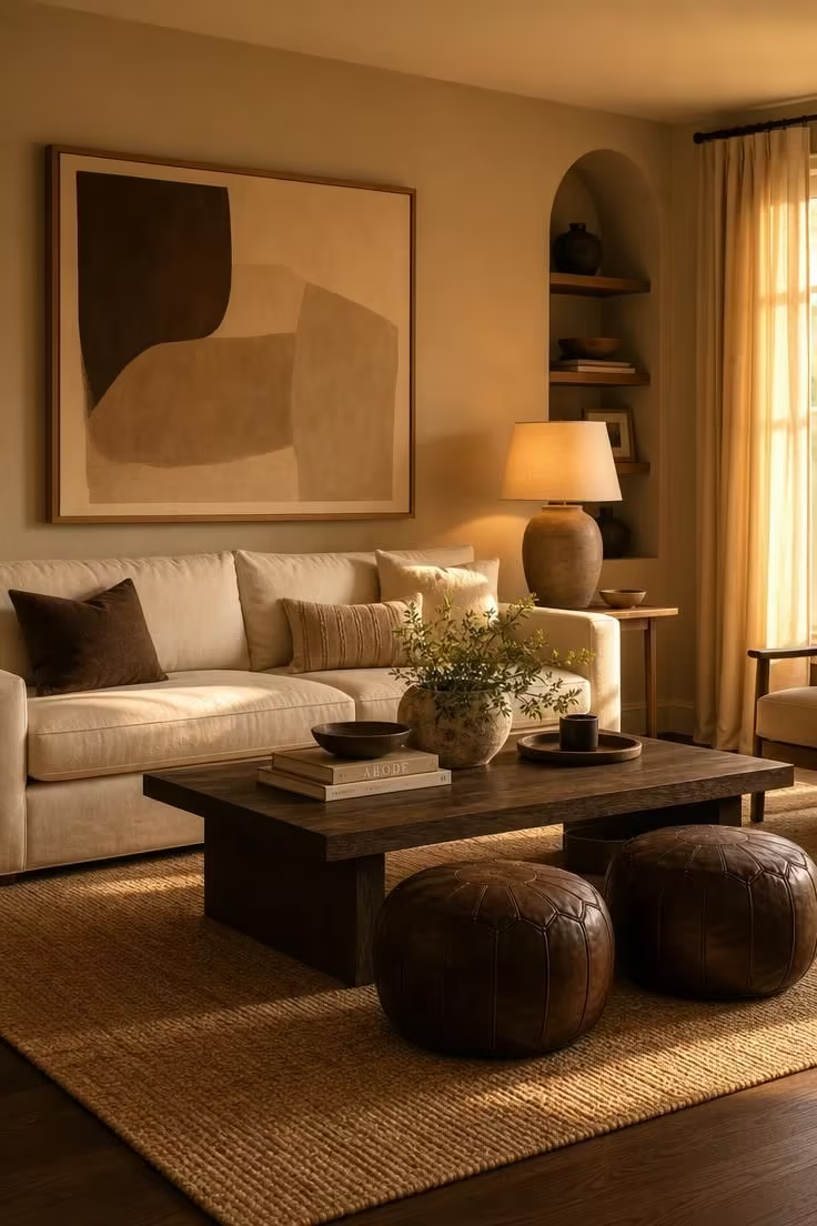
A palette built entirely from brown and cream tones has a grounding quality that no other color family can match.
It feels like earth and morning coffee and old leather, all at once.
The sisal rug anchors the room with a raw, unfinished texture that prevents the polished surfaces from feeling too refined.
Coffee brown on the poufs and the stained oak table gives the palette its depth, while the cream sofa and latte walls keep the room from sinking into darkness.
Earthy tones like these respond beautifully to golden light, growing warmer and richer as the afternoon progresses.
The tonal range from cream to espresso covers a full spectrum within a single color family, which gives the room visual variety without introducing any competing hues.
This is a neutral living room at its most intentional, where every shade is chosen to sit in quiet agreement with the others.
Style Blueprint:
- Soft latte-toned wall paint
- Warm cream linen sofa
- Large sisal area rug in natural tan
- Espresso brown leather poufs
- Dark stained oak coffee table
Design Pro-Tip: When building a monochromatic brown palette, arrange your fabric swatches from lightest to darkest and check that no two adjacent pieces share the same value. If two swatches are too close in tone, they will merge visually and flatten the room. Aim for clear steps between each shade.
Olive and Mustard Pillows on a Sand-Toned Sofa
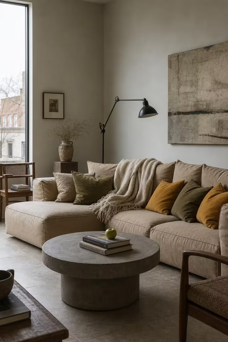
Olive and mustard are neighbors on the warm side of the color wheel, so they pair without friction.
On a sand-toned base, both colors pop enough to register as accents but stay muted enough to feel like they belong.
The pale warm gray walls provide a backdrop that does not compete, which is exactly what a multi-accent palette needs.
A green apple on the coffee table is a small, almost accidental echo of the olive pillows, but it connects the organic world to the designed one.
Raw concrete on the coffee table introduces a cool, industrial texture that balances the warmth of the mustard and olive.
Cool, flat light on an overcast day is the ideal condition for this palette because it shows the true color of each fabric without pushing it warmer or cooler.
The slim black metal lamp adds a graphic edge that prevents the soft, earthy tones from feeling too passive.
The fringed oatmeal throw ties back to the sand base of the sofa, closing the color loop.
This is a paint colors for living room setup where the walls do less and the textiles do more.
Style Blueprint:
- Large sand-toned cotton sofa
- Accent pillows in olive green and mustard yellow
- Pale warm gray wall paint
- Low round raw concrete coffee table
- Slim black metal floor lamp with adjustable arm
Matte Black Trim Framing a Soft White Living Room
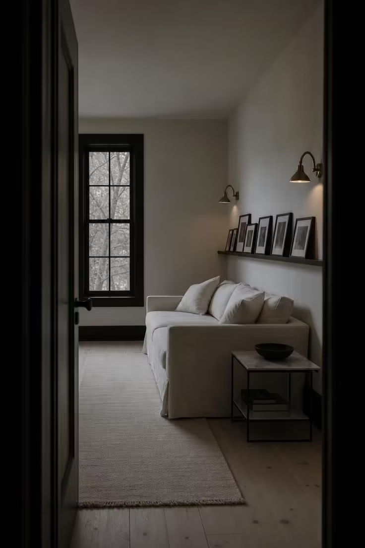
A black-and-white living room color palette is the most architectural approach on this list.
The matte black trim on the windows and baseboards outlines the room like a pen drawing, giving every surface and edge a graphic precision.
Against it, the soft white walls and linen sofa recede, creating a visual space that feels both open and defined.
This is not a cold palette because the brass sconces introduce just enough warmth to soften the contrast.
The black-and-white photographs on the picture shelf reinforce the achromatic theme and give the room a personal layer that prevents it from feeling like a showroom.
A white marble side table with thin black metal legs is the perfect furniture choice here because it echoes the room’s two dominant tones at a smaller scale.
Style Blueprint:
- Soft white walls with matte black window trim and baseboards
- White linen sofa
- Matte black narrow picture shelf with framed photographs
- White marble side table with thin black metal legs
- Pair of small brass wall sconces
Terracotta Floor Tiles With a Pale Blue Linen Armchair
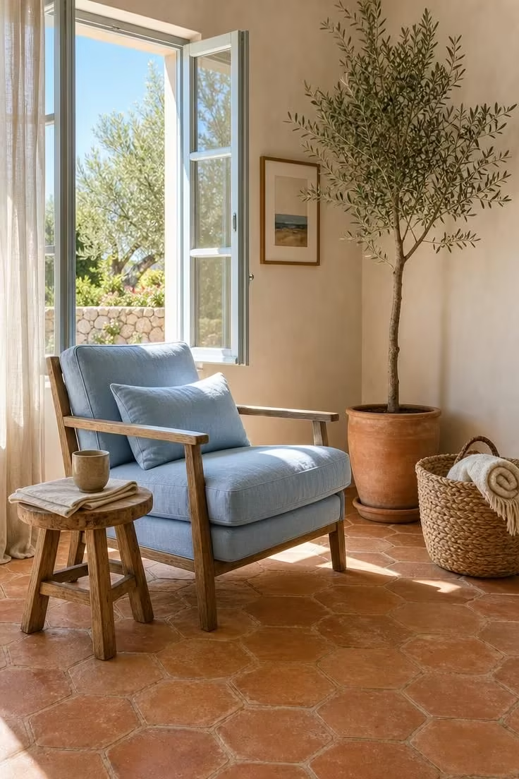
Terracotta and pale blue is a complementary colors pairing that borrows directly from Mediterranean interiors.
The warm, ruddy floor tiles set a foundation that is rich and grounding, while the pale blue armchair introduces a cool counterpoint that keeps the room from feeling heavy.
This palette works because the two colors are on opposite sides of the color wheel, creating natural visual interest without any bright accents needed.
The hand-fired quality of the tiles matters here because the slight imperfections give the terracotta a depth that machine-made tiles cannot replicate.
Warm off-white walls with a sand undertone bridge the gap between the floor and the chair, belonging to neither the warm nor the cool camp.
A potted olive tree in a matching terracotta planter repeats the floor color vertically, pulling the warm tone up into the room.
The woven straw basket and natural wood stool add organic textures that feel at home in this sun-washed palette.
This living room color palette is at its best in rooms with generous natural light, where the terracotta can glow and the blue can stay airy.
Style Blueprint:
- Warm terracotta hexagonal floor tiles (hand-fired)
- Pale blue linen armchair with wooden frame
- Small round wooden stool as a side table
- Potted olive tree in a terracotta planter
- Large woven straw basket with rolled cotton blanket
Warm White Walls With Layered Oatmeal and Honey Tones
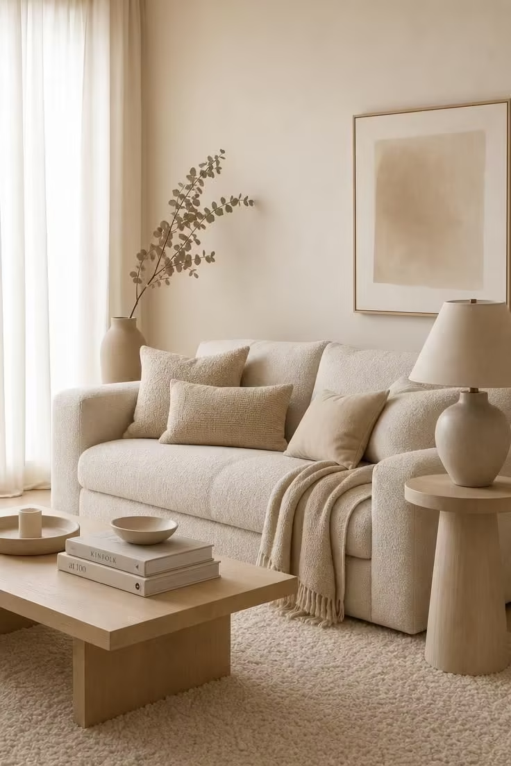
This is a palette where subtlety is the entire strategy.
Every surface in the room falls within a narrow band from warm white to pale honey, and the visual effect is one of continuous softness.
The oatmeal bouclé sofa provides enough texture to compensate for the limited color range, because the looped fabric catches light differently across its surface.
Pillows in wheat and honey tones create gentle variation without introducing any actual contrast.
The warm white walls carry a faint honey undertone that prevents them from reading as stark or cold, a detail that makes the difference between a room that feels bare and one that feels intentional.
A single branch of dried eucalyptus in a matte sand vase is the only element that breaks from the warm neutral family, and even it stays close, adding just a whisper of muted green.
This is the kind of room where the palette does not call attention to itself, because the comfort it creates is something you feel rather than see.
Style Blueprint:
- Warm white walls with a faint honey undertone
- Large oatmeal bouclé sofa
- Layered pillows and throws in wheat and honey tones
- Light maple coffee table on a plush ivory wool rug
- Tall matte sand ceramic floor vase with dried eucalyptus
Design Pro-Tip: In a tonal palette where every shade is close, texture does the work that color normally does. Mix at least three distinct textures in the room: one smooth (ceramic or marble), one woven (linen or cotton), and one looped or nubby (bouclé or chunky knit). Without texture variety, a tone-on-tone room will read as flat instead of layered.
Conclusion
A living room color palette is not a permanent decision, and treating it as one is the fastest way to stay stuck with a room you do not love.
Start with what you already have: the sofa, the floor, the biggest piece you are not replacing.
Build the palette outward from there, choosing wall colors and accents that respond to your existing furniture rather than fighting it.
If you are drawn to warmth, any of the clay, coffee, or honey combinations here will make the room feel like a place to settle in.
If you prefer cooler air, the slate blue or sage green palettes offer calm without coldness.
The best living room color palette is one you do not get tired of looking at, one that shifts with the light and still feels right at every hour.
Pick one from this list, test it with a few swatches taped to your wall, and give it a full weekend of living before you commit.