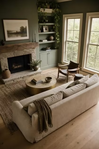
This post may contain affiliate links. If you make a purchase through these links, we may earn a commission at no additional cost to you.
For years, the default advice for living room walls was to keep things quiet, pick a neutral, and let the furniture carry the personality.
But the rooms that actually pull people in, the ones where guests settle deeper into the sofa and nobody rushes to leave, are rarely painted in the safest shade on the swatch.
The movement away from cool grays and flat whites is not a passing trend; it is a correction, driven by how designers and homeowners want to feel the moment they walk through the door.
Designers Are Calling Earth Tones the New Neutrals
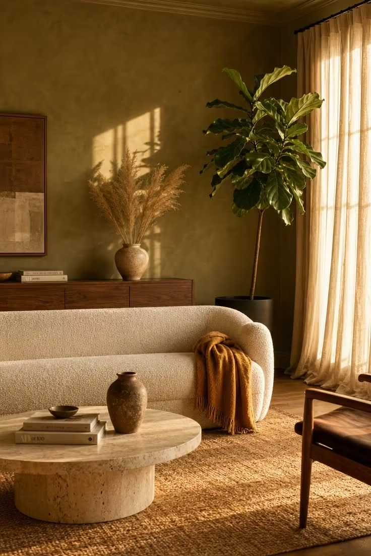
Valspar named Warm Eucalyptus its 2026 Color of the Year, a warm sage-inspired green that reads like a neutral in most lighting conditions.
Benjamin Moore followed with Silhouette AF-655, a plum-inflected shade designed to pair with nearly any material or furniture finish.
These are not niche or experimental picks from boutique paint brands.
They are mainstream recommendations from two of the largest paint manufacturers in North America, signaling a decisive turn toward cozy living room wall colors that carry weight without overwhelming a room.
Interior designer Marie Flanigan has pointed to Farrow & Ball’s Dead Salmon, a soft blend of pink, brown, and earth tones that functions as a neutral yet delivers more warmth and personality than any flat white ever could.
The common thread across every trending shade this year is the same: earth tones are now doing the job that cool grays used to do, acting as background colors that ground a room, but with far more emotional depth.
The Color Psychology Behind Rooms That Actually Feel Restful
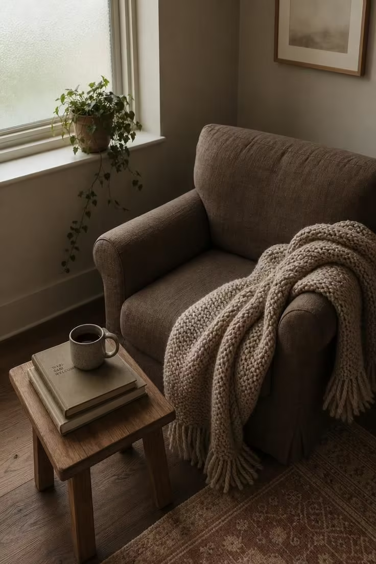
Warm tones do something to a living room that cool colors physically cannot replicate.
Research in color psychology living room applications consistently shows that warm hues, those with undertones of beige, rust, clay, or caramel, activate feelings of comfort, safety, and social connection.
Cool-toned walls, particularly the flat grays and icy whites that dominated the last decade, tend to produce the opposite effect.
They create a sense of visual distance.
Rooms painted in cool neutrals can feel polished, but they often read as clinical rather than inviting, especially under artificial evening lighting when most families actually use their living rooms.
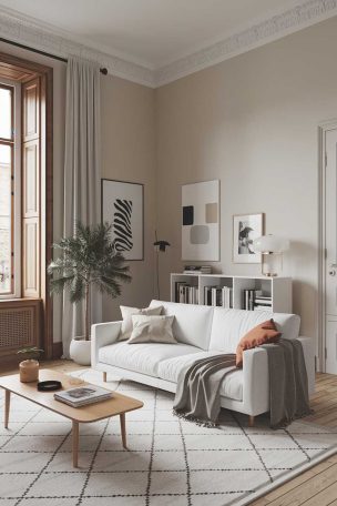
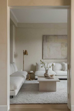
Warm neutral paint colors with beige or cream undertones encourage relaxation and a willingness to linger.
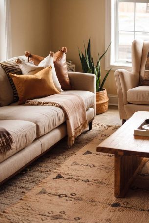
A living room painted in mushroom or caramel feels like a room where you can kick off your shoes without second-guessing whether you belong.
This distinction matters because living rooms carry an outsized emotional role in a home, and the wall color sets the baseline mood for everything that happens inside them.
What Olive Green Walls Do That No Neutral Ever Could
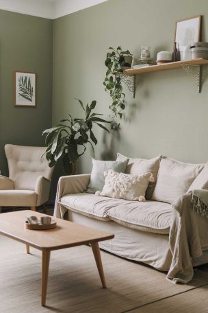
Olive, sage, eucalyptus, and moss greens are the color family leading the shift toward bolder living room walls in 2026, and the olive green living room has become a recurring reference point across design publications this year.
What makes green unusual among bold colors is its psychological duality: it reads as grounded and calm, like a neutral, yet carries enough chromatic richness to give a room genuine personality.
Designer Mugdha Girish Uma has noted that these earth tone living room walls tones are “so pleasant to look at any time,” a quality that separates them from louder accent colors that can fatigue the eye after a few months.
Olive green pairs naturally with leather furniture, light oak floors, matte black hardware, and brass accents, making it one of the most adaptable bold choices available.
Paint picks from designers include Sherwin-Williams Muddled Basil and Benjamin Moore Creekside Green, shades that land in the middle of the green spectrum without tipping into either neon vibrancy or muddy darkness.
Green walls connect a room to the natural world in a way that no gray or white can, and that biophilic link is part of why the color resonates so strongly right now.
The color works whether you commit to all four walls or limit it to a single surface; its tonal range means it can serve as a whisper or a statement depending on the shade you choose.
Design Pro-Tip: When choosing a green for your walls, test the paint sample at 8 p.m. under your actual lamps, not just in midday sun. Greens shift dramatically under warm artificial light, and the shade you fell in love with at noon may look completely different after dark.
Why Terracotta and Clay Shades Keep Coming Back
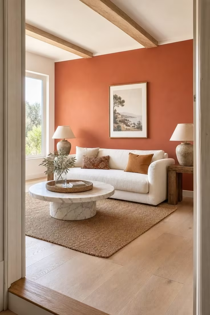
Terracotta wall paint has a staying power that most trending colors never achieve.
Its roots in Mediterranean and Southwestern architecture give it a heritage quality that prevents it from feeling like a passing fad.
The color pairs effortlessly with linen textiles, natural stone surfaces, raw wood furniture, and plaster wall finishes, making it a natural fit for rooms that favor organic materials over synthetic ones.
Clay tones age gracefully in a space; they mellow under different lighting conditions rather than looking dated, which is the opposite of what happens to most trendy paint colors within a few years.
Several interior designers have singled out terracotta as a warm paint color for living room settings that want to feel collected and intentional rather than overly decorated.
How Color Capping Replaced the Accent Wall
The accent wall, once the go-to method for adding color without risk, is losing ground to a more sophisticated color capping technique.
Benjamin Moore coined the term “color capping” in 2025, describing a tonal painting method that uses graduated shades from the same color family across walls, trim, and ceiling.
Instead of isolating color to a single surface, color capping wraps the entire room in a layered gradient that draws the eye upward and makes the ceiling a featured design element rather than an afterthought.
Helen Shaw, Benjamin Moore’s director of marketing, has described the technique as “a clever way to refresh your home and achieve a designer look with just a few tins of paint.”
The visual effect can make a compact room feel taller and a large room feel more cohesive, depending on whether you start with darker tones at the base and lighten toward the ceiling, or reverse the sequence.
Color capping works particularly well with warm palettes like sage, clay, muted terracotta, and sandy caramel, where the base notes of each shade create natural harmony across the gradient.
Design Pro-Tip: If you want to try color capping without committing to five separate paint shades, start with just two: the main wall color and one shade darker from the same swatch strip painted on the ceiling and the top four inches of the wall. That two-tone version delivers most of the impact with half the effort.
The Unexpected Rise of Muted Blues and Plaster Pinks
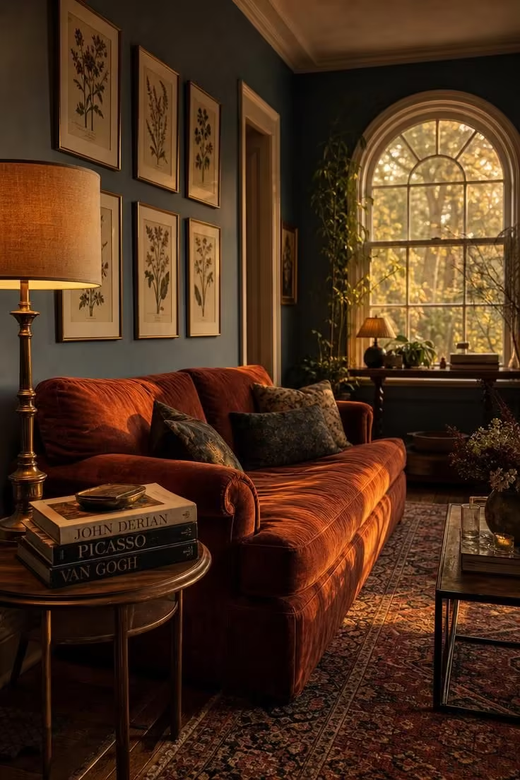
Nobody predicted that muted blue would become a contender for the new living room neutral, yet here it is.
Designers Sydney Foley and Emma Legg of Kindred Interior Studios have called soft blues “calm, airy, and rooted in nature,” colors that bring personality without overwhelming a space.
Shades like Benjamin Moore’s Quiet Moments and Sherwin-Williams’ Sea Salt function almost like warmer whites, providing a versatile backdrop that shifts beautifully throughout the day as natural light changes angle and intensity.
On the other side of the color wheel, plaster pinks and dusty rose tones are carving out a similar niche.
Farrow & Ball’s Dead Salmon, a blend of pink, brown, and earth tones, has become a favorite among designers who want warmth without the orange-lean that some terracotta shades carry.
This “why now” moment reflects something bigger than a color cycle.
Homeowners are moving past the idea that a living room paint palette must be either neutral or bold, and discovering a middle territory where muted, complex colors function as grounding backdrops that still tell a story about who lives there.
The cultural shift toward individuality in interiors, away from the identical-looking rooms that filled social media feeds for years, is pushing people to choose colors that feel personal rather than polished.
How to Start Without Repainting Every Wall
The fastest entry point is not a gallon of paint; it is a sample pot and a piece of poster board.
Paint the board in your chosen shade and move it around the room at different times of day, watching how the color reacts to morning sun, afternoon shade, and evening lamp light.
Many paint companies now offer digital visualizer tools that let you upload a photo of your actual room and preview a living room color trends shade on your walls before buying anything.
If the idea of four colored walls still feels like a leap, color capping offers a low-risk starting point: keep your current wall color and paint just the ceiling one shade deeper from the same family.
Accent wall ideas remain valid for rooms where the layout naturally anchors one surface, like a fireplace wall or the wall behind a large sofa, but treat the accent wall as a starting point, not an endpoint.
Pair new wall colors with what you already own before shopping for new decor.
Most warm paint colors for living room settings work naturally with existing wood furniture, leather pieces, and neutral textiles, meaning a color shift on the walls can refresh the entire space without replacing anything else.
Conclusion
The movement toward bolder, warmer cozy living room wall colors is not about chasing a trend or committing to a color you will regret in two years.
It is about choosing shades that make a room function better emotionally, that absorb light in a way that feels welcoming, and that reflect something real about the person who lives there.
Start with one wall, one room, or even one ceiling.
Test a warm olive, a muted clay, a soft blue, or a plaster pink against your actual furniture and your actual light.
The safest choice for a living room wall is not the most neutral shade you can find; it is the one that makes you want to stay.