This post may contain affiliate links. If you make a purchase through these links, we may earn a commission at no additional cost to you.
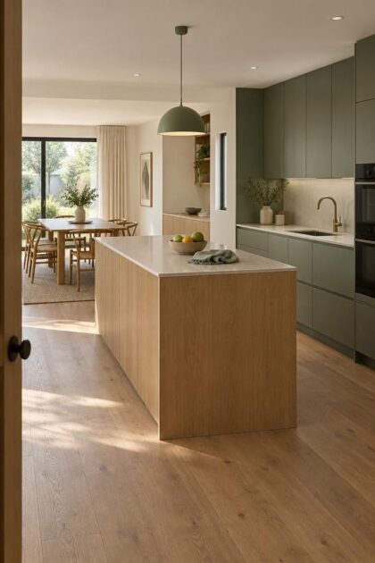
A minimalist kitchen often gets described as a look: blank counters, flat doors, a single bowl of lemons.
That version tends to collapse the moment a real household moves in.
The rooms that hold their calm are planned around something less photogenic: who cooks, when they cook, and where their hands reach without thinking.
The Layering Test: What Stays Out and Why
Designer Britany Simon, speaking with House Beautiful, frames the kitchen in layers: what needs to be immediately available, what can be tucked away, and what should be integrated so it supports the design without interrupting it.
That single sentence is a workable brief for how to design a minimalist kitchen without turning the room into a showroom.
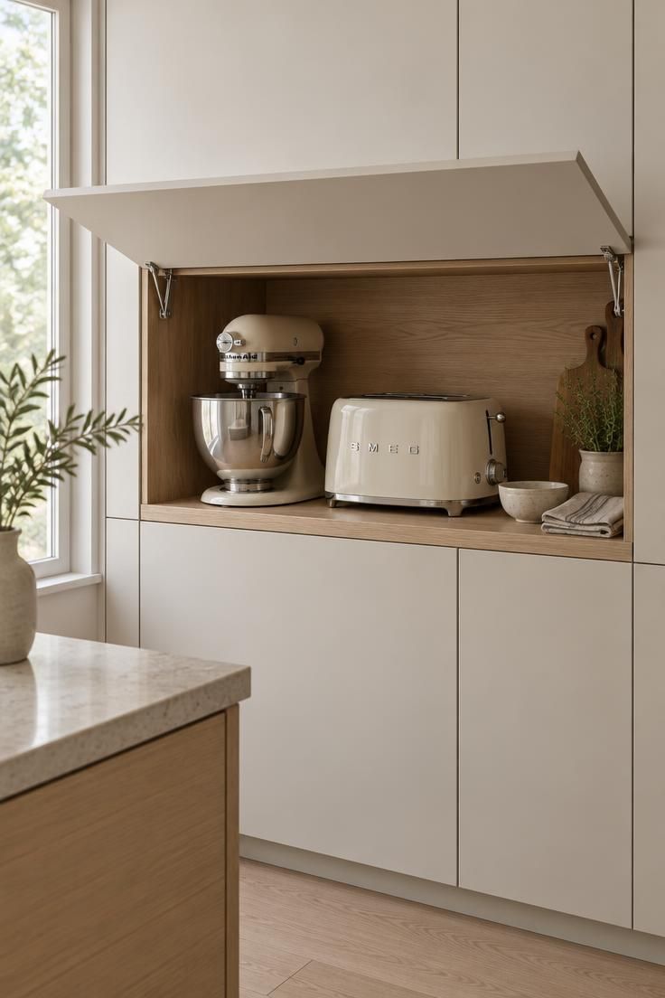
Danielle Chiprut, also quoted by House Beautiful, describes appliance nooks as a way to keep everyday items accessible while tucking them away when not in use.
Her phrasing matters: it is not about hiding the function, it is about refining it.
A toaster that lives in a dedicated slot is still a toaster.
It simply stops being the first thing you see.
Three questions cover most objects.
How often does it get used?
Does it need to be visible to be used?
Where does the hand naturally reach for it?
A stand mixer used twice a week and a kettle used twice a day belong in different places, even if they are the same size.
A knife block earns counter space because reaching for a drawer mid-chop interrupts the work.
A bread box can live behind a door because nobody minds opening one.
Design Pro-Tip: Before choosing cabinet layouts, spend a week watching where items actually end up. Note which tools migrate to the counter and which stay in drawers, then plan storage around that pattern rather than around an imagined ideal.
How Many People Actually Cook Here
Household size is the quiet variable that decides how much kitchen a home needs.
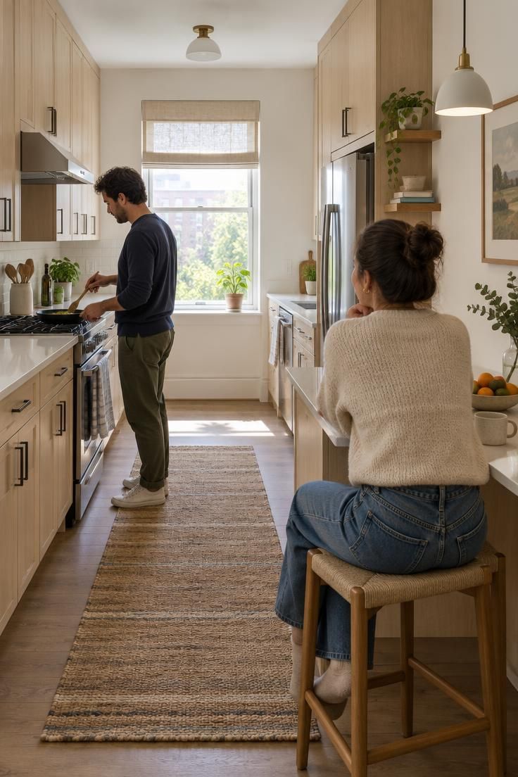
The John Burns Research and Consulting Kitchens survey, published in August 2023, found that one person typically cooks in 48% of households and two people cook in 43%.
The everyday kitchen is mostly a one- or two-person room.
That finding has direct layout consequences.
Counter runs and floor space should support one or two people working at once, not the occasional holiday crowd.
A run that lets two people pass without turning sideways is worth more than a wider room with a useless middle.
The same survey gives a useful check on seating.
For everyday dining, 38% of households need seating for two, and 32% need seating for three or four.
Families skew higher, but the headline is that most households sit down in small numbers most nights.
A tucked-away appliance garage kitchen is one way to serve that small daily pattern without adding a second prep zone.
An appliance garage is a counter-level cabinet with a door that conceals small appliances in place, keeping them plugged in and reachable.
It suits households where one or two people cook and the counter needs to stay clear between meals.
The survey also found that 73% said a small open kitchen would fit their needs, while 89% would prefer a large open kitchen over a smaller kitchen with a hidden secondary prep space.
That gap is worth sitting with.
People like the idea of a scullery more than they like the trade it requires.
Before drawing any layout, measure the actual routine.
Count how many people are in the kitchen at the busiest ten minutes of a normal weekday, and where they stand.
A household that cooks in relays needs different circulation than one that cooks side by side.
Storage That Follows the Task, Not the Object
Storage That Follows the Task, Not the Object
Most storage advice organizes by object type: plates here, pans there.
A task-based kitchen organizes by what happens next.
Prep, cooking, cleanup, drinks, and breakfast each get their own zone, and objects live where the work is done.
A clutter-free kitchen relies on thoughtful storage solutions that keep everyday essentials organized and out of sight.
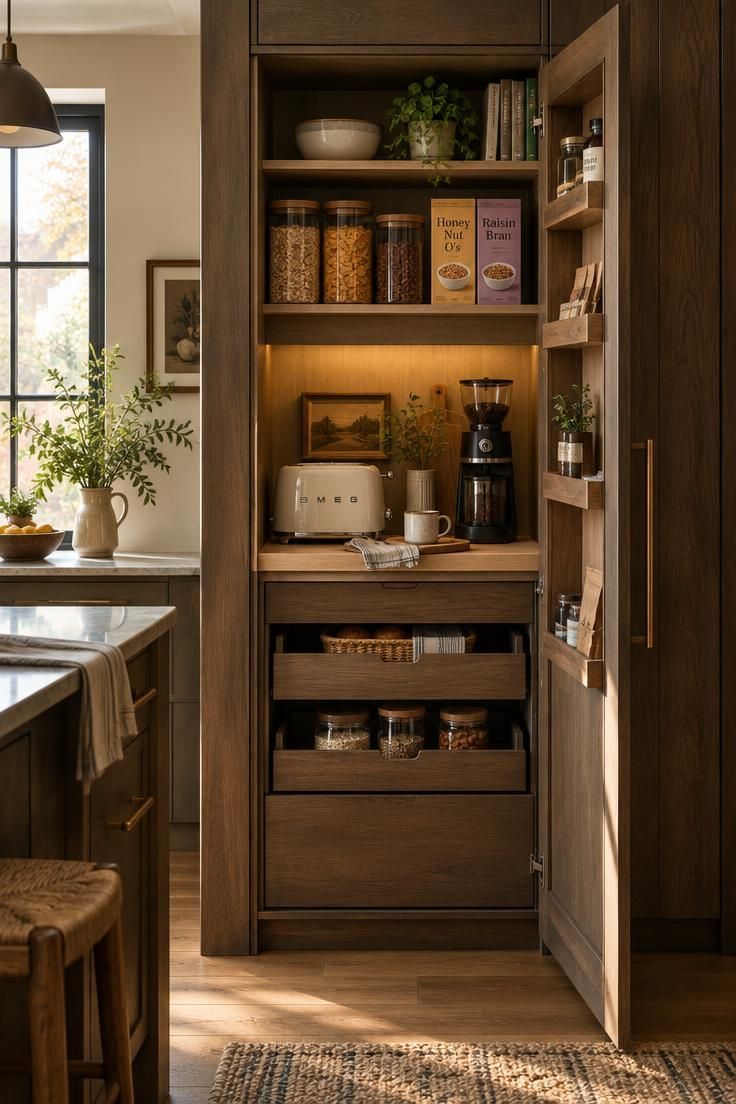
Hidden larders with pull-out drawers, built-in spice racks, rotating corner units, and dedicated organizers for cutlery and pans make better use of available cabinet space.
Breakfast cabinets can accommodate coffee makers, toasters, tea, and cereals, while corner pantries and pull-out storage units help keep countertops clear and maintain a clean, streamlined appearance.
The counterintuitive result is that a pared-back kitchen often needs more dedicated storage than a conventional one, not less.
Cabinetry that reaches the ceiling and internal drawers that use the full depth of each cabinet can contribute more to calm, uncluttered surfaces than simply removing items.
One important consideration is the order in which storage decisions are made.
Concealed storage works best when accessibility and daily routines are considered during the initial kitchen design process.
Adding pull-out mechanisms or dedicated appliance compartments after cabinetry has been installed can require unnecessary modifications, so it is worth deciding where hidden storage belongs before finalizing the cabinet layout.
The Island Question: Prep Surface or Just a Counterweight
An island is not a default feature of a good kitchen.
It is a decision about where work happens, and it should be made after the task map, not before.
For a minimalist kitchen, L-shaped and open galley layouts can offer efficient workflows without adding unnecessary surfaces or features.
An oversized island may take up valuable floor space without improving functionality, making it important to consider whether it serves a practical purpose or simply adds visual weight.
Homes.com’s coverage of the NKBA 2026 Kitchen Design Trends report, drawing on more than 600 designers, found 92% agreeing that the island can express personal style through color and material.
That is real, and it explains why islands stay popular.
It is also a reason to treat the island as a considered choice rather than a reflex.
The tradeoff is spatial and visual.
An island adds a second circulation loop, which can make a small room feel choppy.
It also creates a large horizontal surface that has to stay clear to keep the room calm, and a clear island is a daily commitment, not a one-time styling act.
For smaller rooms, minimalist kitchen storage ideas matter more than island geometry.
Wall-to-wall tall units, deep drawers, and a slim peninsula can deliver the same function without consuming the floor space that makes a compact kitchen feel settled.
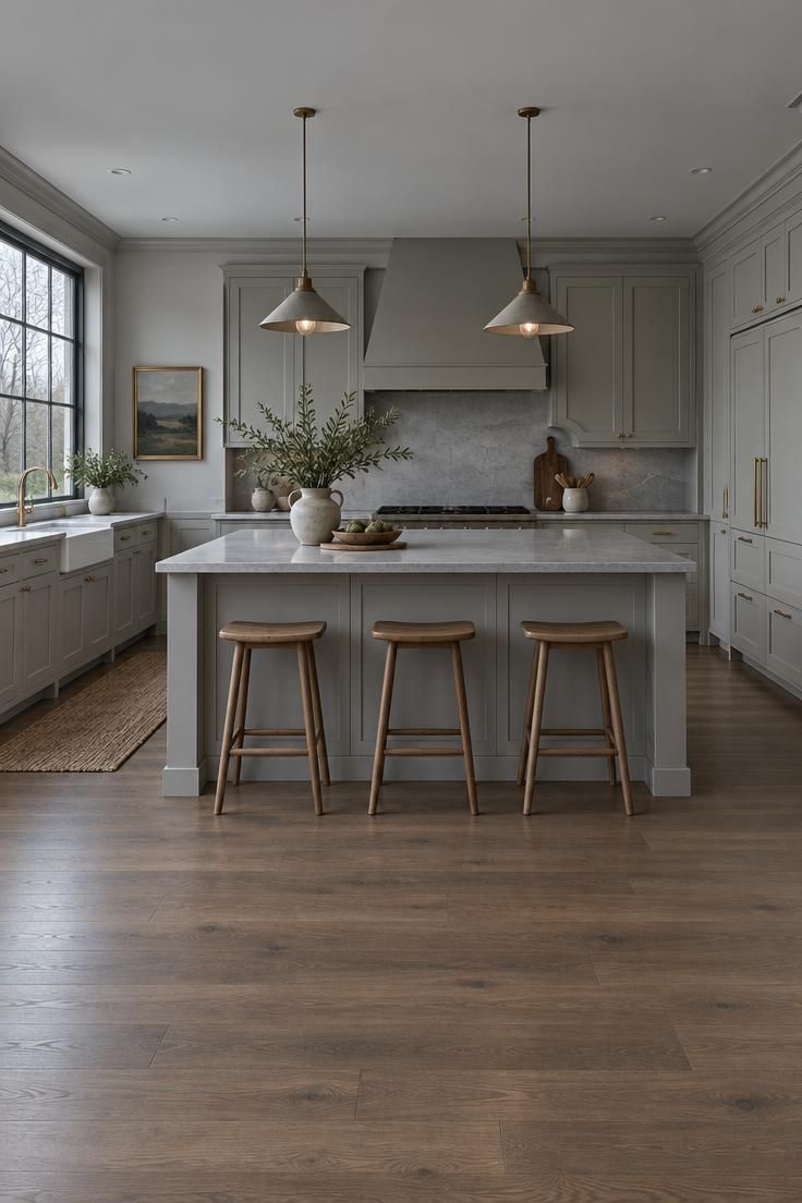
Handleless, Flat-Front, and the Case for Quiet Surfaces
Cabinetry does most of the visual work in a pared-back kitchen, and much of its impact comes from reduction.
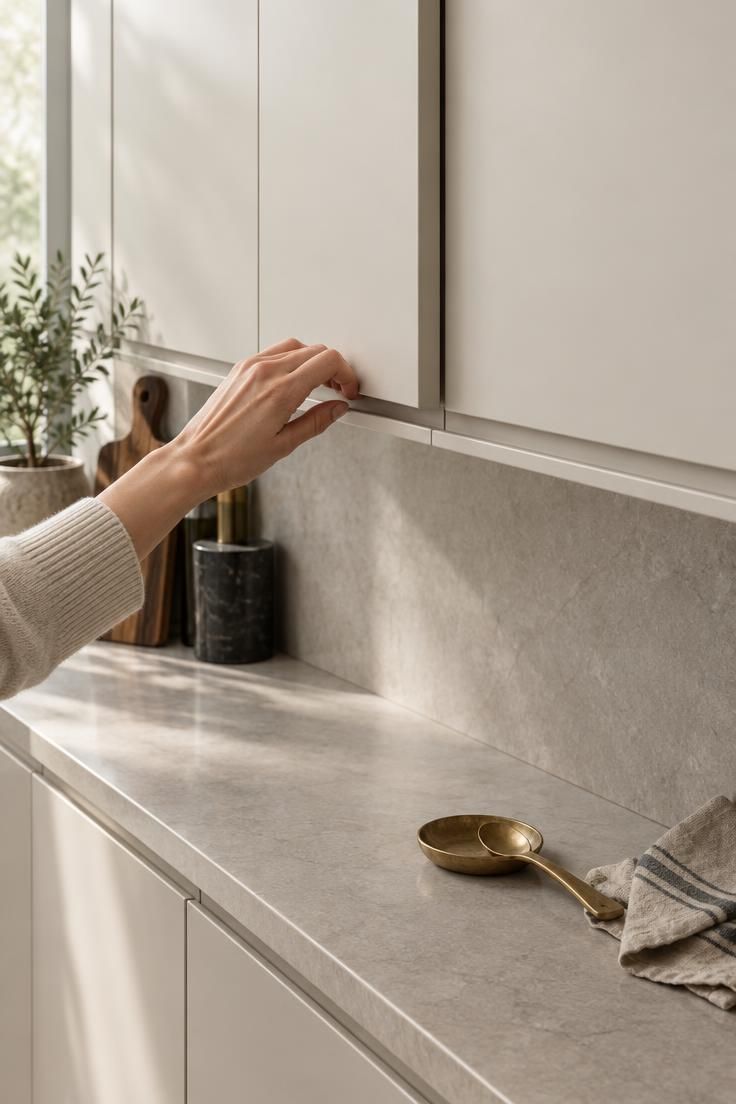
Flat slab doors, handleless fronts or simple linear pulls, and integrated appliances create the clean, uninterrupted surfaces that define modern kitchen design.
Rooted in the modernist principle of form following function, this approach favors slab doors, minimal or absent crown molding, and understated linear hardware, often in brushed or polished metal finishes.
While modern design draws from an established architectural tradition, contemporary kitchens adapt these principles to current materials, finishes, and everyday needs.
Handleless kitchen cabinets are one expression of that logic, while slimline Shaker doors with reduced ornament offer a softer alternative for those who find full slab fronts too severe.
Either way, the goal is a surface that reads as one plane rather than a field of small interruptions.
Maintenance is where the choice gets practical.
Handleless fronts and flat slabs reduce the number of grooves and edges where residue collects, but they show fingerprints differently depending on the finish.
Matte and textured surfaces generally make fingerprints less noticeable than high-gloss finishes, which matters in a room wiped down several times a day.
The tradeoff is tactile.
A handle gives the hand a clear target; a routed channel or push latch asks for a little more attention.
Test the motion before committing a whole run to it.
Warm Minimalism Without the All-White Stereotype
Minimalism does not have to mean an all-white kitchen with glossy surfaces and little personality.
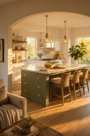
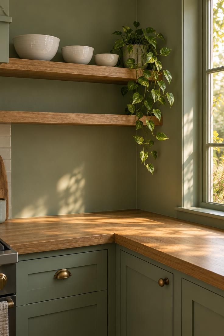
A warmer approach introduces earthy tones such as sand beige, sage green, and greige, occasionally balanced with deeper colors for contrast.
The goal is to create a space that feels simple and uncluttered without sacrificing warmth, texture, or character.
A warm minimalist kitchen relies on materials rather than decoration to establish its character.
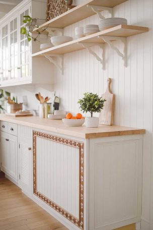
Wood grain, honed stone, and matte paint give a pared-back room depth without adding visual noise, while their natural textures develop character over time.
An all-white palette can achieve a similar effect when paired with contrasting materials.
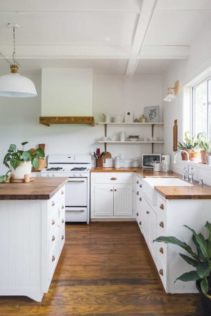
White cabinetry, exposed oak beams, and a marble-textured countertop, for example, create a restrained composition where architectural details and natural finishes become the focal points.
Palette matters less than contrast and proportion.
A room in three close neutrals can feel flat if every surface has the same sheen; a room in two tones can feel rich if one is rough and the other smooth.
Texture is doing the work that color usually does.
Lighting as Task Support, Not Decoration
In a pared-back kitchen, lighting works best as a practical system rather than a decorative feature.
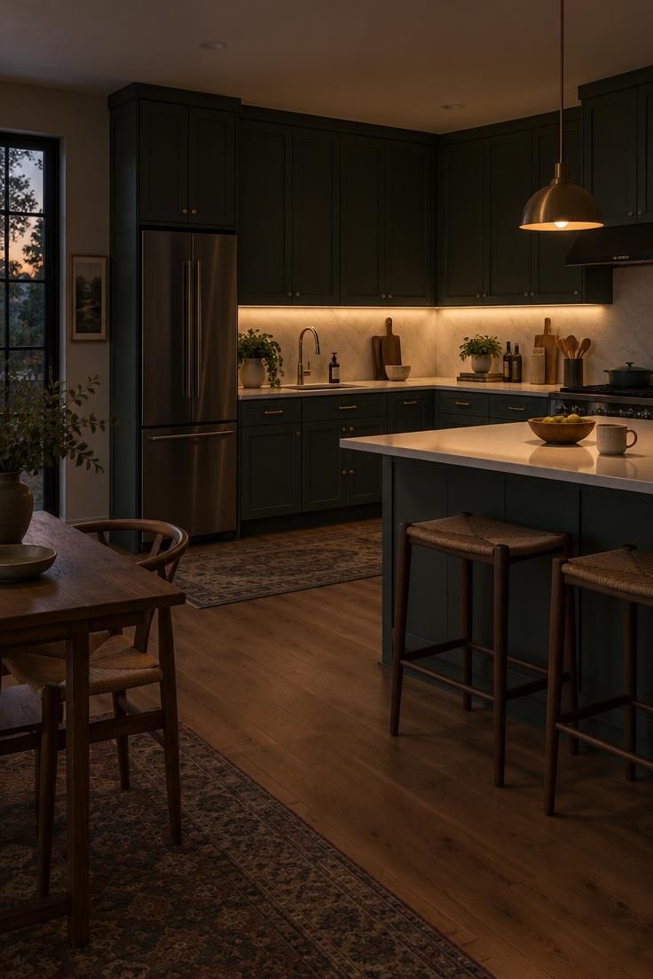
Recessed ceiling lights, concealed under-cabinet strips, and simple geometric pendants provide illumination without overwhelming the room.
The hierarchy is straightforward: task lighting comes first, while fixtures remain secondary.
A layered approach combines ambient, task, and accent lighting, with dimmers allowing brightness to be adjusted throughout the day.
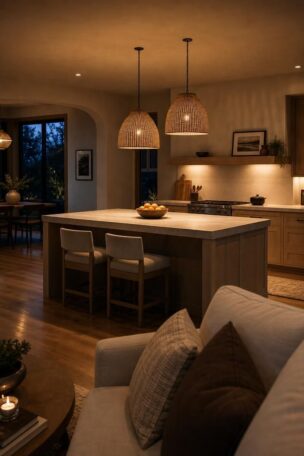
This flexibility lets the kitchen shift from bright, focused illumination during morning preparation to a softer, more relaxed atmosphere in the evening.
Lighting beneath wall cabinets, inside glazed units, and within pantry storage improves visibility without introducing unnecessary visual elements.
Integrated cabinet lighting is particularly useful because it illuminates shelves and stored items while keeping the overall design uncluttered.
What matters most is placement relative to daily activities.
Well-positioned lighting above the sink, preparation counters, and cooking area contributes more to functionality than a decorative fixture placed in the center of the ceiling.
A pendant above a peninsula serves a practical purpose by defining the workspace and providing focused illumination.
Keep fixtures visually understated wherever possible.
Recessed fittings, concealed LED strips, and slim profiles allow the kitchen’s architecture and materials to remain prominent.
A single carefully chosen statement fixture can establish a focal point without competing with the room’s clean lines.
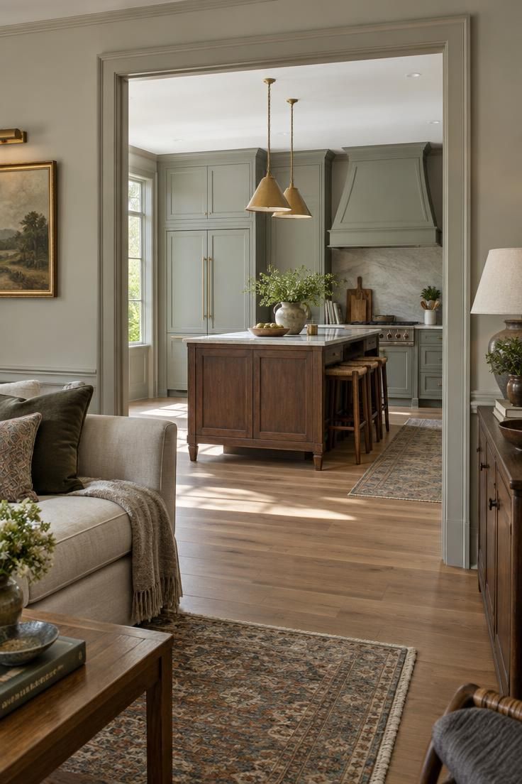
Reading the Room: Sightlines from Sofa to Sink
In an open-plan home, the kitchen is rarely out of view.
The growing preference for hidden appliances and integrated storage reflects a practical challenge in open floor plans, where the kitchen is always visible from living and dining areas.
The room has to work from the sofa as well as from the hob.
This often means keeping outlets discreet, counters relatively clear, and only a few simple styling items on display.
That is a composition goal, not a strict rule about outlets or countertop accessories.
It is about reducing the number of small interruptions the eye meets from across the room.
While a hidden secondary prep space can help contain everyday clutter, a large open kitchen keeps cooking, dining, and living connected.
For households that prefer this arrangement, sightline planning becomes an essential part of the design brief.
A small open kitchen layout lives or dies on what the eye catches first.
Stand at the main seating position and list what stands out.
If the first three things are a fridge door, a kettle, and a row of jars, those are the items to address through paneling, a niche, or a different counter routine.
The result is a hierarchy.
One or two elements should carry the visual weight, whether that is a run of cabinet fronts, a hood, or a single piece of furniture-style storage, and the rest should recede.
The Evening Walkthrough That Catches Drift Before It Settles
Minimalism in a working kitchen is not finished on installation day.
Kitchens naturally attract clutter, and maintaining a pared-back room requires ongoing attention, sparing accessorizing, and keeping open shelving reserved for carefully chosen possessions.
The design sets the conditions; the routine keeps them.
An evening walkthrough is a simple way to hold the line.
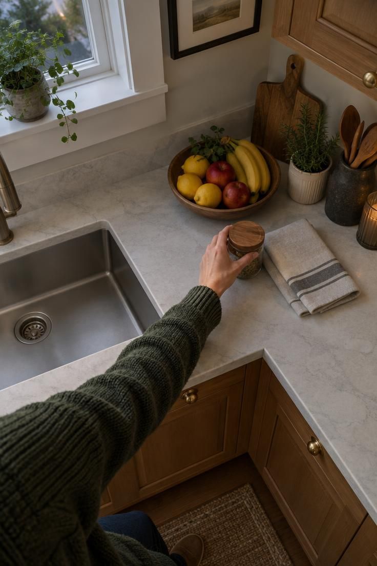
Move through the kitchen in the same order each night, return stray objects to their task zones, and wipe the surface where the next meal will begin.
Finish by scanning the room from the doorway.
Anything that interrupted the sightline during the day will be obvious from that position, and it is easier to catch at night than in the middle of cooking.
The sequence matters more than the surfaces.
A kitchen that gets reset in the same order every evening stays calm because the routine is predictable, not because the finishes are special.
Conclusion
Four decisions carry this approach.
Map the real daily tasks first.
Decide what has to stay visible for each one.
Choose storage and surfaces that follow those zones rather than the object categories.
Then build a reset routine that protects the empty counter.
The room that results may not look like a magazine spread on the day the groceries arrive, and that is the point.
Minimalism here is an allocation problem: a series of decisions about what earns its place in view, made by the people who actually use the kitchen.
Start with the week of watching before you buy anything.
Note what migrates to the counter and what stays in drawers, and let that list drive every later choice.
As a final test of the finished room, imagine clearing the counter in thirty seconds: whatever would be missing that should not be is the thing to solve next.