This post may contain affiliate links. If you make a purchase through these links, we may earn a commission at no additional cost to you.
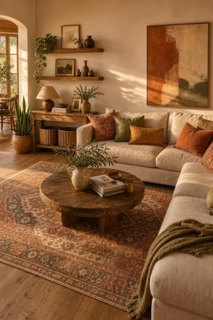
Most people blame the clutter in a boho room on too many objects, too many textures, or too many patterns stacked on top of each other.
The real problem is usually underneath all of that: the boho color palette itself.
When the colors in a room fight each other, every rug, every pillow, and every piece of pottery you add makes the chaos worse rather than better.
These seven mistakes explain why a room can look carefully decorated and still feel like something is off.
The Real Reason Your Boho Color Palette Looks Messy
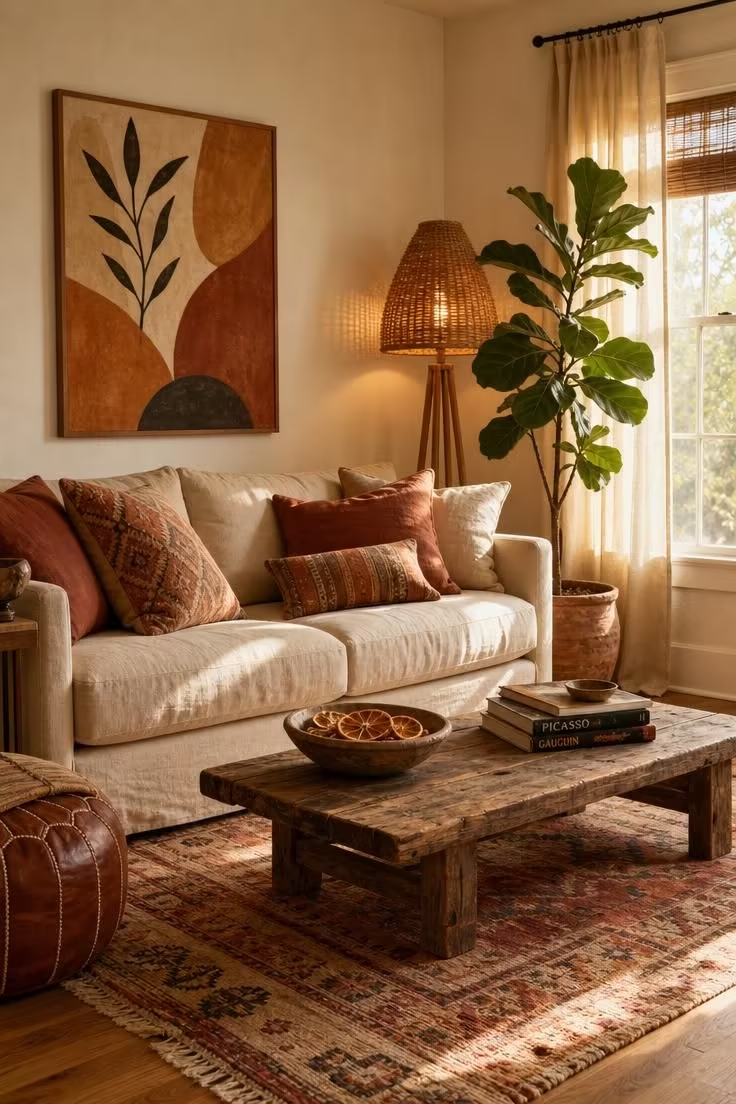
Interior designer Katelyn De Spain describes the foundation of a lasting bohemian color scheme as “earthy, muted tones, inviting textures, and relaxed furnishings that encourage you to slow down.”
That description sounds free and spontaneous, but it actually points to a specific set of color relationships working together beneath the surface.
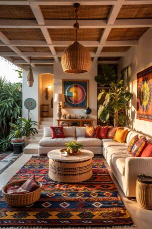
The approach that holds most successful boho rooms together is the 60-30-10 rule: roughly 60 percent of the room in a warm base tone (cream, sand, soft terracotta), 30 percent in a supporting shade (warm brown, sage, clay), and 10 percent in a bold accent (emerald, rust, or deep magenta).
Knowing that structure matters less than knowing where it breaks down, and these seven mistakes are where it breaks down most often.
Going All-Neutral and Losing the Bohemian Spirit
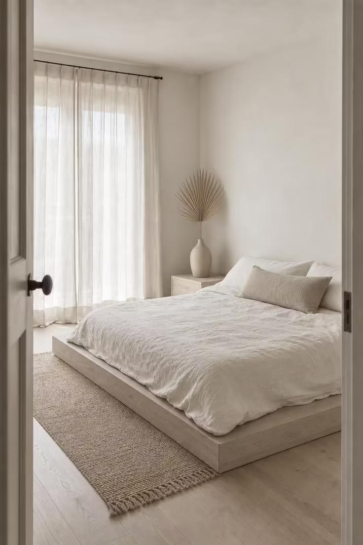
A room dressed entirely in beige, cream, and white might look calming, but it reads as bland rather than bohemian.
The most common mistake with boho living room colors is stripping out every trace of warmth in the name of keeping things “simple.”
Boho spaces need earthy tones to feel alive: think coral, rust, mustard, blush, and sage woven into the textiles, the pottery, and the small objects that fill a shelf.
These are not loud colors, and they do not need to dominate the room.
A single rust-colored throw draped over the arm of a sofa or a set of sage linen pillow covers can shift an all-neutral room back toward the warmth that makes bohemian spaces feel personal.
Clashing Undertones That Make Your Eye Restless
This is the subtlest mistake on the list and the one that causes the most confusion.
A room can have the “right” boho paint colors and still feel unsettled if the color undertones are fighting each other.
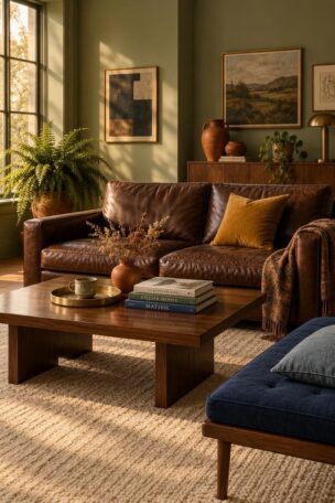
Cool-toned walls with a blue or gray base, like the popular greige shades, clash with the warm terracotta throws, amber pillows, and honey-toned wood that define most boho rooms.
The effect is hard to name but easy to feel: one design writer described it as a room that “goes slightly seasick and no one can say why.”
The fix starts with the walls, since they cover the largest surface area in any room and set the undertone for everything else.
Warm-leaning neutrals like Benjamin Moore’s Pale Oak or Sherwin-Williams Antique White read warm without turning yellow, and they let every rug, textile, and piece of pottery you place against them feel at home.
The broader rule is simple: keep your 60 percent base and your 30 percent supporting color within the same undertone family, warm or cool, so the room reads as one unified story rather than two competing ones.
Too Many Bold Colors Without Breathing Room
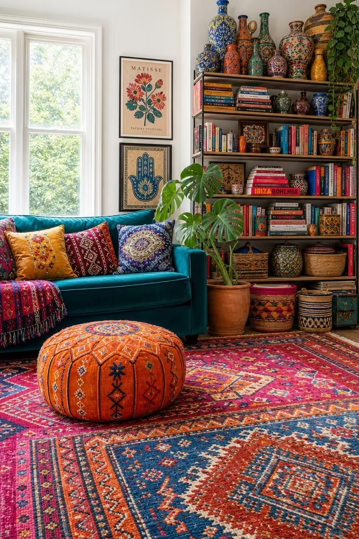
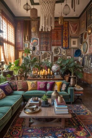
Jewel tones, saturated patterns, and richly colored accent pillows can all belong in a boho room, but only if the room gives your eye somewhere to rest between them.
The difference between a room that feels eclectic and one that feels overwhelming is the presence of neutral breathing room: plain walls, simple furniture silhouettes, or solid-colored layered textiles mixed in among the patterned ones.
Negative space does not mean empty space in a boho context, and it does not mean going minimal.
It means giving each bold color enough room to register on its own before the eye moves to the next one, which is what turns a collection of bright objects into a room that actually feels composed.
Design Pro-Tip: Before adding another colorful pillow or patterned throw, count the visual rest stops in your room. If every surface carries pattern or color, the eye has nowhere to settle, and the whole space starts to feel loud instead of layered. One solid-colored linen cushion between two patterned ones can change the rhythm of an entire sofa.
Dropping Accent Colors in Once and Calling It Done
A single pop of rust on one pillow, sitting alone in a room full of creams and greens, reads as a random accident rather than a deliberate choice.
Accent colors need repetition to feel like they belong.
The general guideline is to repeat an accent at least three times across a room: once in a textile (a pillow, a throw), once in an object (a vase, a ceramic bowl), and once in something on the wall (a piece of art, a woven hanging).
That repetition creates a visual thread that ties different parts of the room together, and in a bohemian color scheme where pattern and layering already add visual complexity, these threads are what keep the space from feeling scattered.
This principle applies to the 10 percent accent portion of the 60-30-10 rule, and it is the reason some boho rooms feel intentional and collected while others feel like a random assortment of pretty things.
Using the Same Boho Palette in Every Room
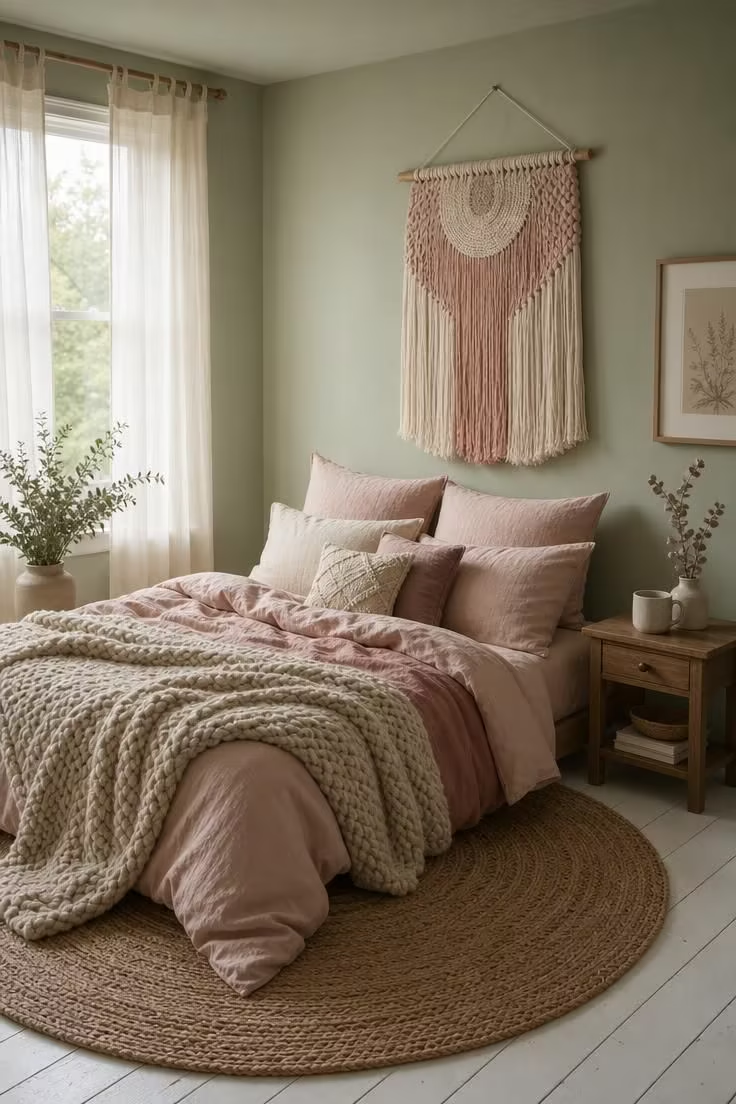
A boho bedroom palette needs different colors than a boho living room, and both need different colors than a small entryway or a home office.
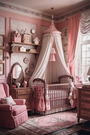
Bedrooms call for softer, cooler-leaning warmth: blush, sage, dusty blue, and oatmeal tones that settle the mind instead of stimulating it.
Living rooms can absorb bolder, deeper shades because you spend active hours there and the scale of the room usually supports more visual weight.
North-facing rooms, which receive cooler natural light throughout the day, need warmer wall tones and richer textiles to keep from feeling flat and chilly.
Sun-drenched south-facing rooms can handle slightly cooler accents because the warm light compensates naturally.
The mistake is treating every room in the house with the same warm neutrals and the same earthy tones, which is how a home that should feel thoughtfully collected ends up feeling monotone.
Choosing Colors Because They Are Trending Right Now
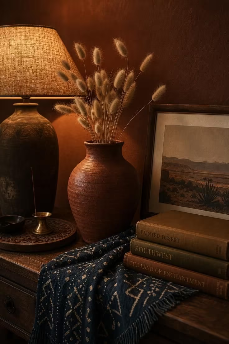
The interior design world shifted from forest-inspired palettes in 2025 toward desert-inspired tones in 2026, with sandy neutrals, sun-bleached terracotta, and warm clay replacing the cooler greens and blues that dominated the year before.
Trend cycles like this one move fast, and a boho room built entirely around a trending palette will feel dated within a year or two.
The irony is that boho style is supposed to feel personal, collected, and built over time, which is the opposite of what happens when you repaint a room every season to match the latest mood board.
Trending colors work best as part of that 10 percent accent layer: a set of throw pillow covers, a new ceramic vase, or a few small objects on a shelf that can be swapped when the trend passes without touching the foundation of the room.
The most reliable way to build a palette that lasts is to pull your colors from something you already own and love, like a rug picked up on a trip, a piece of art that has hung in your home for years, or a textile handed down from someone in your family.
Design Pro-Tip: If a trending color catches your eye, try it first through items you can switch in a weekend: pillow covers, a throw blanket, a small ceramic piece. This lets you test the color in your actual light and against your actual palette before committing to anything permanent.
Conclusion
A boho color palette is not a formula to memorize but a set of relationships to understand: warm color undertones working in the same direction, bold and neutral shades held in proportion, accent colors repeated with intention, and each room treated as its own separate composition.
Every mistake on this list traces back to one root cause: treating color as surface decoration rather than the structural foundation of the room.
When you get the palette right, with the 60-30-10 rule as your guide and your own belongings as the source of your color story, every rug, every piece of art, and every handful of layered textiles you add will make the room feel more like you instead of more like a mess.