This post may contain affiliate links. If you make a booking or purchase through these links, we may earn a commission at no additional cost to you.
A bedroom color palette does more than set a mood.
It signals whether a room belongs to this moment or to a decade you have already moved past.
The palettes that felt like the right call 18 months ago are quietly aging bedrooms across the country, and the reasons have less to do with trend cycles and more to do with a shift in what people actually want rest to look and feel like.
Here are six bedroom color palette choices that designers say are past their prime, and the warmer, more intentional alternatives replacing them.
The Bedroom Color Palette Shift Designers Are Tracking Right Now
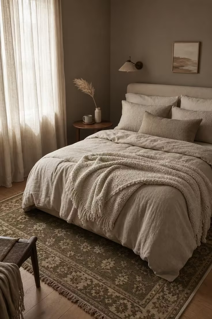
The movement away from cold, clinical bedroom paint colors is not a rumor at this point.
Designers across the industry have been noting a clear direction: away from colors that prioritize looking clean and toward colors that prioritize feeling restful.
Rhian Barker, group design director at interior design studio Accouter, frames it directly: rather than stark or clinical colors, the bedroom color palette choices gaining ground prioritize softness, warmth, and emotional resonance.
That language matters.
Emotional resonance is a different goal than “goes with everything,” and it produces different results on a wall.
The shift is strongest in bedrooms because bedrooms carry a heavier emotional load than a living room or kitchen.
A bedroom wall color sets the backdrop for the most private hours of a day, which is why the palette that reads as outdated here registers more sharply than it might anywhere else in the house.
Cool Gray Walls That Read as Cold and Impersonal
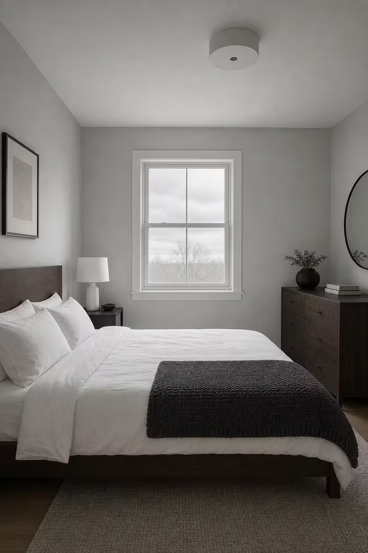
Cool gray walls had a run that lasted well over a decade.
The shade became the default pick for anyone who wanted a neutral bedroom wall color without the perceived warmth of beige.
It photographed well on Pinterest boards and looked modern in staged real estate listings.
Interior designer Lauren Saab has watched the tide turn: cool gray is starting to feel dated, she says, because so many homeowners chose it as the safe option, and safe often ends up looking sterile.
Janiece Lonvelin, founder of Velène Design House, puts it more bluntly: those cool, icy tones can feel cold and uninviting, especially in a room designed for rest and relaxation.
The undertone is the real culprit.
Most of the popular cool gray walls from the 2010s lean blue or violet, which pulls warmth out of a room instead of adding it.
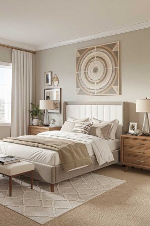
Warmer replacements are already in place: mushroom tones, soft taupe, and warm greige shades like Farrow and Ball’s Jitney or Drop Cloth sit in the neutral zone without draining a room of its warmth.
Design Pro-Tip: Test your current gray with a white piece of paper held against the wall in natural afternoon light. If the wall looks blue or violet next to the paper, the undertone is cold. Warm grays will read as slightly brown, green, or pink next to pure white.
Stark White That Feels Empty Rather Than Serene
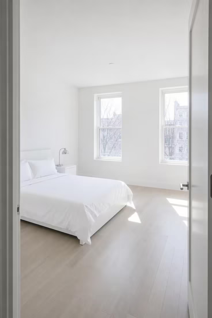
The all-white bedroom has been a magazine staple for years, but designers are clear about the distinction between white that works and white that dates.
Molly Torres Portnof of DATE Interiors says blank white boxes are completely out, and the replacement is not another shade of white.
The issue is not the color family itself.
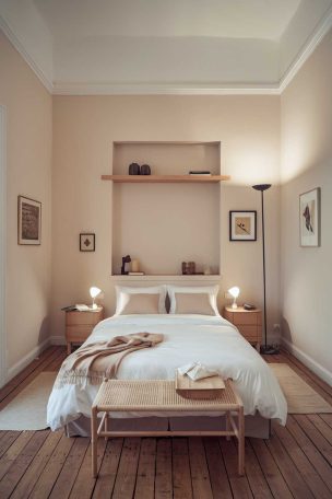
Warm white paint with a pink, peach, or soft cream undertone still reads as fresh and intentional.
The dated version is the blue-white or violet-white that builders and landlords default to, a shade that makes a bedroom feel like a waiting room instead of a retreat.
Cozy bedroom colors in the warm white family, such as Benjamin Moore’s Swiss Coffee or Sherwin-Williams Alabaster, bring soft depth without abandoning lightness.
Icy Pastels That Stopped Feeling Fresh
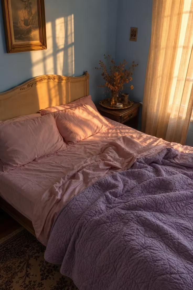
Icy pastels entered the bedroom as a breath of fresh air.
Washed-out pinks, pale lavenders, and baby blues offered a softer alternative to the cool gray walls and stark whites that had dominated for years.
Stacy Garcia, CEO of Stacy Garcia Design Studio, sees their expiration clearly: cold, overly bright pastels, especially icy blues and washed-out pinks, feel dated now.
Anna Tatsioni, lead designer at Decorilla, adds that blush pink has been a bedroom staple for three or four years, and that kind of saturation turns any color predictable.
The replacements lean warmer and carry more weight.
Whisper greens, muted atmospheric blues, and warm earth hues create the same calm without the saccharine edge that icy pastels developed over time.
If you still love pastel, the fix is context: pair it with grounding earthy tones, natural wood finishes, and textured linen rather than layering pastel on pastel, which flattens a room into a single bland note.
Design Pro-Tip: A pastel works longer when it is the accent, not the base. Use a warm neutral on walls and bring pastel in through a throw pillow or a single piece of art where it can be swapped out when it tires.
Dark Moody Accent Walls That Compete With Everything
The jewel-box bedroom had its moment.
Deep navy, forest green, and dark maroon moody accent wall treatments spread through design blogs and social media as a way to add instant drama.
Lindsey Jamison, partner and lead designer at Rumor Designs, sees those choices dating quickly.
Bold shades often compete with furniture and artwork, she says, leaving the space feeling busy or overwhelming rather than atmospheric.
The visual tension is the real problem.
A deep, saturated wall absorbs light and pulls attention inward, which means lamps, textiles, and bedside styling have to work harder to hold their own.
Over time that competition exhausts the eye, and the room that once felt bold starts to feel heavy.
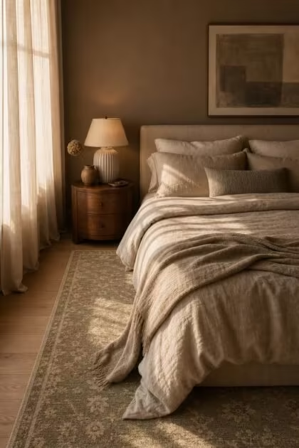
The mid-tone alternative is gaining ground: muted, complex shades with depth but not drama.
Warmer alternatives in the mid-range, like Farrow and Ball’s Elephant Breath or Sherwin-Williams Pinky Beige, add richness to a bedroom color palette without dominating the room.
Why the “Goes With Everything” Greige Is Going Nowhere Good
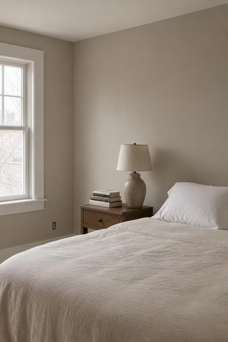
The greige bedroom was supposed to be the best of two worlds, a shade that carried the neutrality of gray and the warmth of beige in a single balanced tone.
Flora Slater, founder of Studio Flora London, says the era of the cool, pale greige bedroom is over.
That particular shade, the one that promises to go with everything, tends to go with nothing.
A greige bedroom often signals that a color decision was never fully made, and the room ends up feeling unresolved rather than refined.
Committed color choices are replacing it: a true warm beige, a dusty olive, or a soft clay tone that declares something specific about the room’s character.
The difference between greige and a committed neutral is intention, and the eye can tell whether a wall color was chosen with care or simply defaulted into.
Flat Beige: The Bedroom Color Palette That Says Nothing
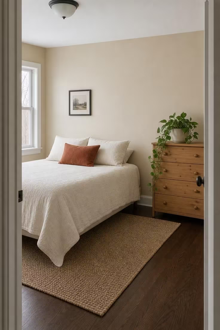
Flat beige had the longest run of any neutral in the American bedroom, and that is precisely why it dates a room so quickly now.
Builder-grade beige, the shade that comes standard in apartments and tract homes, lacks the warmth or undertone that gives a neutral personality.
It does not lean pink, peach, or green; it sits in the middle of nothing.
The warm neutrals replacing flat beige carry deliberate undertones that respond to changing light throughout the day.
Muted dusty greens, such as Behr’s 2026 color of the year and Valspar’s warm eucalyptus, are stepping in as the new neutral category for bedrooms that want calm without blandness.
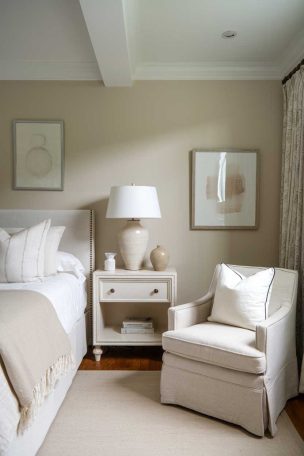
Terracotta-adjacent warm tones bring life to a room without leaving the comfort zone of neutral territory, and they pair naturally with the wood tones and natural textiles that define the current look.
The difference between the dated flat beige and today’s earthy tones is simple: one was chosen because nothing else came to mind, and the other was chosen because it felt right for the room.
Design Pro-Tip: If your walls are currently builder beige, you do not need a full repaint to update the feel. Swap your bedding to a textured linen in a warm stone or soft sand shade, add a rug with visible earthy undertones, and layer in a single accent color through a throw or pillow. The wall recedes when the bed becomes the focal point.
Conclusion
The six bedroom color palette choices covered here share one trait.
Each one was originally chosen because it felt safe, neutral, or universally appealing, and each one quietly aged the room it was supposed to protect.
The replacement bedroom paint colors are not radical departures.
They are warmer, more intentional versions of the same neutral territory, picked with attention to undertone, light response, and how the shade actually makes a room feel at nine in the evening rather than just how it looks in a midday photograph.
Three criteria separate a bedroom wall color that lasts from one that dates quickly.
First, check your undertone against the direction your bedroom windows face: north-facing rooms need warmer undertones, south-facing rooms can handle slightly cooler shades without feeling cold.
Second, choose a shade you respond to emotionally, not one that simply “goes with everything,” because a color that goes with everything usually commits to nothing.
Third, build depth through texture and material variation instead of relying on one flat coat to carry the entire room.
A dated bedroom color palette is rarely about the wrong color.
It is almost always about a color chosen without enough intention, applied without enough layering, and left to carry a room it was never equipped to hold on its own.