This post may contain affiliate links. If you make a purchase through these links, we may earn a commission at no additional cost to you.
A boho Christmas color palette trades bright red and green for earthy, muted, layered tones that feel collected rather than coordinated.
This approach leans on natural materials and texture, with clay, linen, rattan, and dried stems carrying the holiday mood.
The ideas below show how to build a warm, relaxed seasonal look in a residential home, room by room, with concrete objects and finishes making each direction clear.
Use them as starting points, then adapt the colors and quantities to your existing space, your light, and the pieces you already own.
Terracotta and Cream Holiday Styling
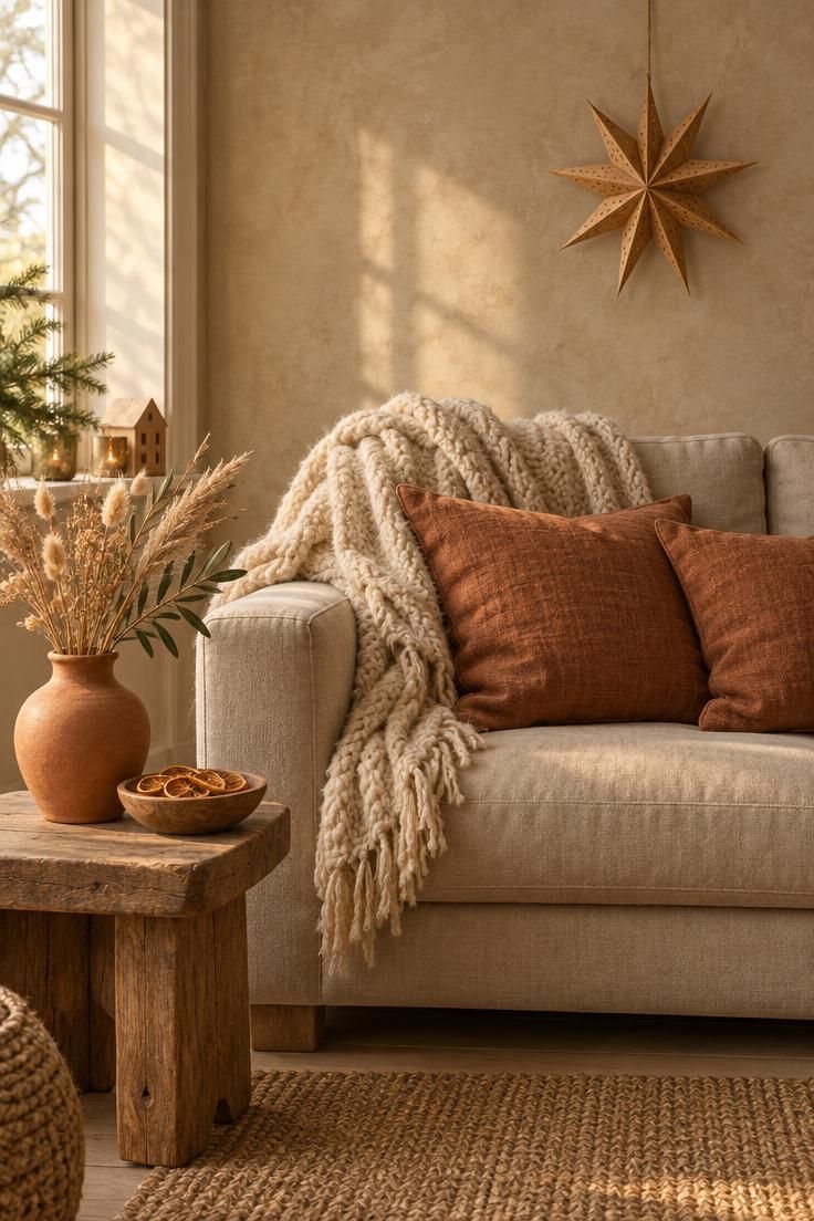
Terracotta and cream make a grounded base for a boho Christmas because the two tones sit close together in value, so the warmth comes from material rather than contrast.
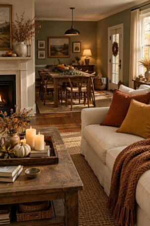
A chunky cream wool throw over the sofa back, rust linen cushion covers with a visible weave, and an unglazed clay pot of dried grasses put that idea into a single composition.
Keep the narrow range from falling flat by layering finishes: soft wool next to crisp linen, chalky clay next to raw wood, matte paper next to dried citrus.
The eye reads the texture shifts as much as the color, which is what keeps a two-tone scheme from looking like a flat swatch.
This pairing can read more autumnal than festive, so a sprig of fir in the vase or a paper star above the sofa anchors the season without breaking the palette.
Larger textiles in cream set the base, then rust accents sit on top in smaller doses: cushions, a runner, a bowl.
Style Blueprint:
- Chunky cream wool throw
- Rust linen cushion covers
- Unglazed terracotta vase with dried grasses
- Wooden bowl of dried orange slices
- Handmade paper star ornament
Sage and Sand Palette
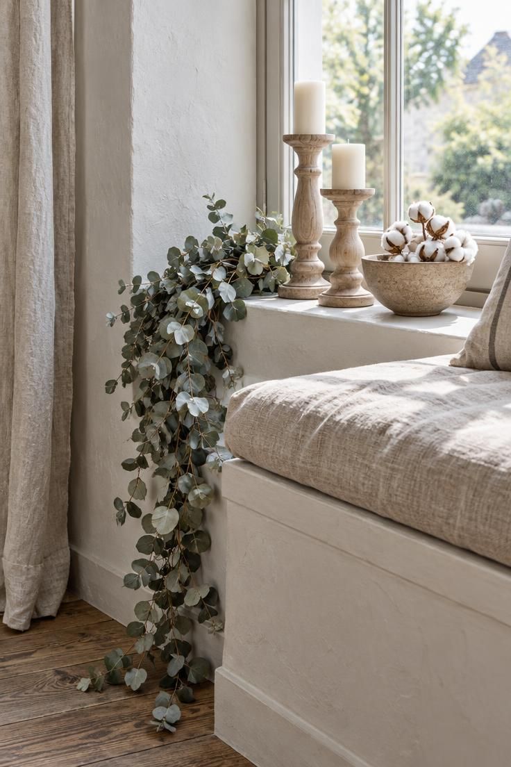
The sage and sand palette builds its quiet character from soft botanicals against sandy neutral textiles, so raw linen pillowcases in sand and a worn wooden tray of sage-toned ceramic candleholders do most of the work.
A dried eucalyptus bundle tied with cotton twine and laid on a shelf adds the green without demanding attention.
Low contrast is the appeal here, and also the risk: in dim rooms the arrangement can wash out, so one deeper olive accent, a cushion, a ceramic, or a few darker leaves, keeps the composition from disappearing.
That single accent gives the lighter tones something to sit against.
For small spaces, this scheme earns its place because it relies on texture rather than large blocks of color.
A single sage stem bundle or one sand linen pillow shifts the whole look, which suits a compact apartment where every addition counts.
Earthy Christmas decor rewards restraint, and this palette shows why: one dominant neutral, one muted green, and a handful of wood tones stay coherent where a broader mix would turn muddy.
Test a sand fabric and a sage ceramic together near your actual window before buying more of either.
Style Blueprint:
- Raw linen pillowcases in sand
- Worn wooden tray
- Sage-toned ceramic candleholders
- Dried eucalyptus bundle tied with cotton twine
- One deeper olive accent piece
Design Pro-Tip: Keep the same dried stems grouped in odd numbers for a deliberately informal look.
Ochre and Charcoal Contrast
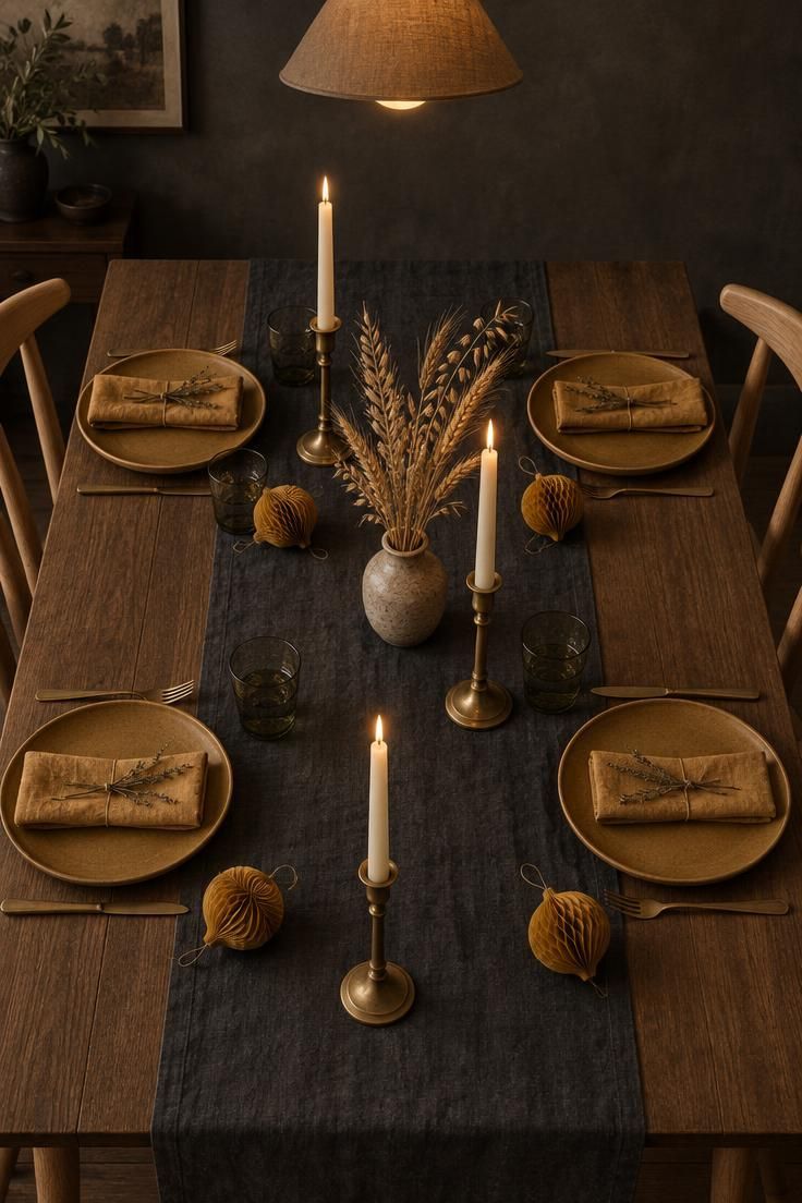
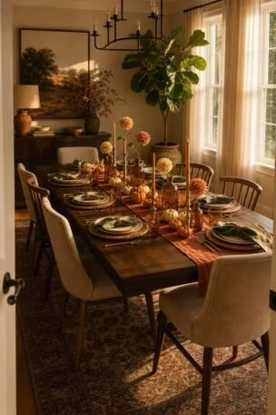
Mustard and honey tones pop against warm charcoal or near-black, and a dining table is where that contrast reads most clearly.
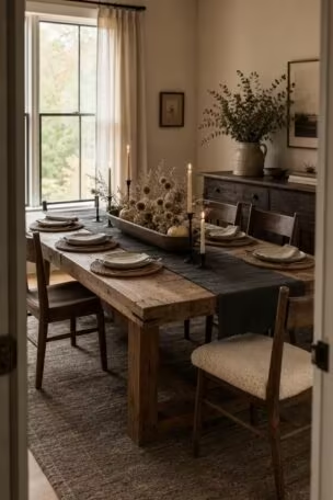
A charcoal linen runner, ochre ceramic plates, brass candlesticks, and folded paper honeycomb ornaments in mustard set the scene for evening entertaining, when small accents carry further.
Terracotta and cream holiday styling habits, such as keeping the base quiet and letting one warm tone lead, translate well here in reverse: the dark backdrop is the quiet element and the ochre does the speaking.
High contrast makes even a modest arrangement feel deliberate.
One tradeoff: a dark backdrop can make a small dining area feel heavier.
Balance it with pale wood chair backs, cream dishes, or an unbleached linen napkin so the table keeps some lift.
Brass is the bridge between the two sides, catching lamplight and warming the charcoal without competing with the ochre.
Keep metals aged rather than polished so the table stays in boho territory.
Design Pro-Tip: Use candlelight rather than overhead lighting to bring out the honey tones.
Style Blueprint:
- Charcoal linen table runner
- Ochre ceramic plates
- Aged brass candlesticks with cream candles
- Mustard paper honeycomb ornaments
- Dried wheat in a stoneware vase
Blush and Clay Soft Warmth
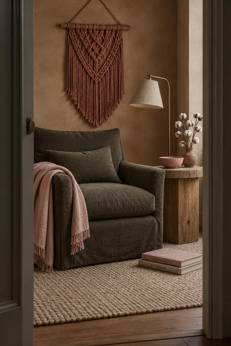
Dusty pink, muted rose, and terracotta combine without sliding into pastel sweetness because both blush and clay carry an earthiness that keeps the pink grounded.
A blush linen cushion and throw, a clay-colored macramé hanging, and a matte pink ceramic bowl on raw wood form a soft, cohesive corner.
Dried pampas and eucalyptus stems suit this corner well, adding pale neutrals and a little silvered green that keep the warm tones from closing in on themselves.
A few cotton stems in a clay vase work the same way on a smaller scale.
Guard against too much white here, which can tip the palette toward a nursery feel.
Let oatmeal, natural wood, and the clay tones anchor the room instead.
Repetition is what makes a soft palette look intentional: the clay tone can appear in the hanging, a vase, and the wood stain so the eye finds it in three places.
Vary the texture each time, from fiber to ceramic to timber.
Because blush and clay are close in value, add one slightly darker element, a rust-toned book spine or a deeper clay pot, to give the corner structure.
Without it, the softness can blur.
Evening lamplight warms this palette noticeably, so check the arrangement after dark as well as in daylight before settling on quantities of pink and clay.
Style Blueprint:
- Blush linen cushion and throw
- Clay-colored macramé wall hanging
- Raw wood side table
- Matte pink ceramic bowl
- Dried cotton stems in a clay vase
Design Pro-Tip: Repeat the clay tone in at least three spots around the room to create rhythm.
Olive and Rust Rich Pairing
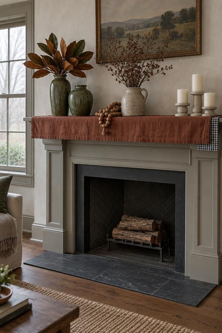
Olive and rust form a deeper, more saturated earth pairing that feels richer and more autumnal than the paler schemes.
A rust linen runner across the mantel, olive-green ceramic vases, dried magnolia leaves, and raw wooden beads give the arrangement weight and a collected feel.
Rooms with strong natural light handle this palette best, since the saturated tones can look heavy in dim corners.
Cream candles and a stoneware jug lighten the composition without diluting it.
Rust and olive together skew toward fall, so a winter signal matters: cream pillar candles, a paper star, or a small evergreen clipping keeps the mantel reading as holiday decor rather than a harvest display.
Layering a small piece of black-and-white checked fabric under the runner cuts the warmth slightly and adds a graphic pause, which helps the two strong colors stay distinct instead of blending into one brown mass.
The sage and sand palette is airier, and this pairing trades that lightness for depth.
Choose between them based on how much daylight the room receives and whether you want the mantel to recede or hold the wall.
Style Blueprint:
- Rust linen runner
- Olive-green ceramic vases
- Dried magnolia leaves
- Raw wooden beads
- Cream pillar candles
Bone, Brown, and Brass Monochrome

A nearly monochrome neutral scheme warmed by aged brass and dark wood reads as quietly collected rather than stark.
A bone-colored linen runner down a console, turned dark-wood candlesticks, matte brass bells, and paper ornaments in cream and tan show how subtle value shifts do the work that stronger color usually performs.
Material contrast keeps the palette alive: wicker baskets below, a dark wooden bowl, paper ornaments, and raw ceramic each bring a different surface to the same narrow color family.
Without that variation, an all-neutral scheme looks flat.
Texture is the deciding factor in this direction.
Woven wool, rattan, raw clay, and unbleached linen give the eye something to find as it moves across the table.
One small glossy dark object, a glazed jug or a polished bowl, catches the light and provides a focal point among the matte finishes.
It also gives the arrangement a center.
This palette adapts easily to what a household already owns, since most homes have some wood, paper, and metal to build from.
Add one brass or bone element at a time and step back before adding more.
Style Blueprint:
- Bone-colored linen runner
- Turned dark-wood candlesticks
- Matte brass bells
- Cream and tan paper ornaments
- Woven baskets
Dusty Blue and Cinnamon Mix
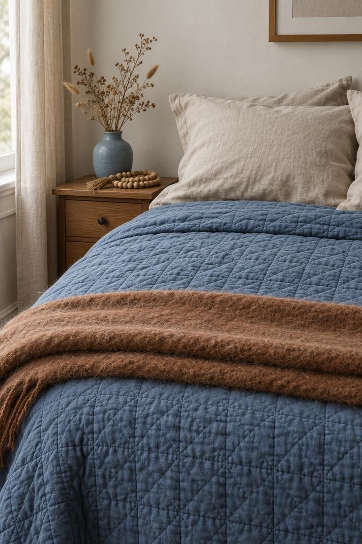
A cool-warm contrast using muted blue linens or ceramics against warm spice tones gives a bedroom a softer holiday presence than red and green would.
A dusty blue quilt, a cinnamon wool throw across the foot of the bed, oatmeal linen pillowcases, and a small blue ceramic vase of dried stems set the direction.
Neutral linen Christmas textiles are the bridge that makes the pairing work: keep larger textiles in off-white or sand so the blue and cinnamon meet each other without clashing directly across the whole bed.
The eye then reads the two colors as accents rather than dueling fields.
Rooms with northern light suit this palette because the cool blue keeps the warm tones from feeling overheated.
In brighter rooms, the blue reads paler and the cinnamon carries more of the mood.
Placing blue accents at eye level, the vase, a cushion, a small framed print, while cinnamon settles lower in the throw and rug, keeps the bed visually balanced and stops the two colors from competing for the same zone.
Off-white bedding also makes it simple to shift the season later by swapping just the throw and the vase.
Style Blueprint:
- Dusty blue cotton quilt
- Cinnamon wool throw
- Oatmeal linen pillowcases
- Blue ceramic vase with dried stems
- Sand linen curtains
Design Pro-Tip: Place blue accents at eye level only, letting cinnamon settle lower in the room.
Mushroom and Moss Grounded Look
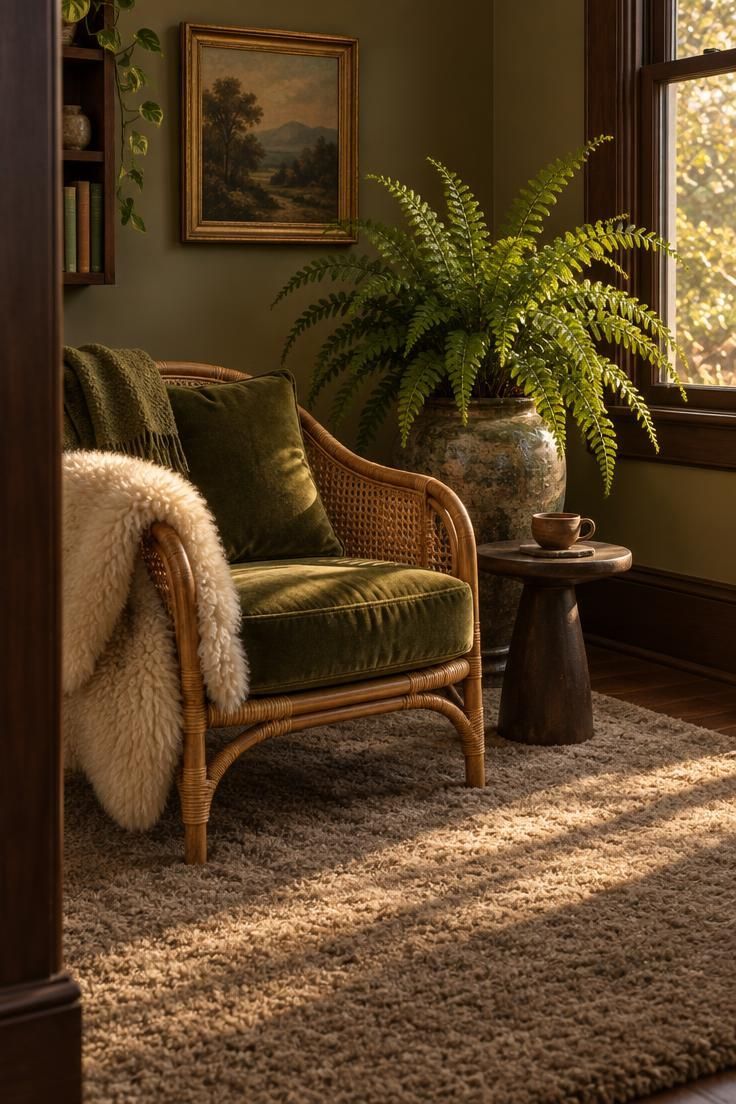
Taupe and greige paired with deep botanical greens give a living room corner a grounded, understated character.
A mushroom-colored wool rug, a moss-green velvet cushion on a rattan chair, a cream sheepskin, and a large ceramic planter of fern read as an extension of the outdoors.
Homes with lots of wood trim absorb this palette well, since the browns in the wood echo the taupe in the rug and settle the greens against a familiar warmth.
The rattan adds a lighter fiber note so the corner stays airy.
Moss green can bring out yellow undertones in certain taupes, so test fabric samples together in the room before committing to yardage.
A taupe with a cooler cast may pair more cleanly than a warmer greige.
Vary the green across objects, from a yellow-green fern frond to a blue-green velvet cushion, and the arrangement gains depth without adding a new color.
The eye finds the shift in hue within a single family.
Because this scheme borrows from the garden, it also transitions easily after the holidays by removing the velvet and leaving the fern and rug in place.
Style Blueprint:
- Mushroom-colored wool rug
- Moss-green velvet cushion
- Rattan chair with cream sheepskin
- Ceramic planter with a living fern
- Olive throw
Design Pro-Tip: Vary the green from yellow-green to blue-green across different objects to add depth.
Black and Natural Graphic Accents
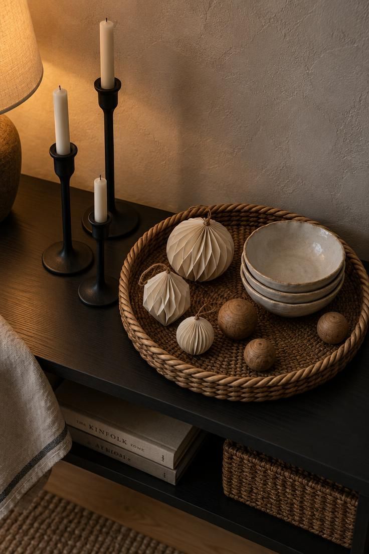
Dark accents with rattan, paper, and pale wood create a more modern boho read.
A shelf display with matte black candlesticks, a twisted rattan tray, cream paper ornaments, and a few raw wood spheres shows how a little black provides graphic pauses that keep the neutral palette from becoming too sweet.
The contrast does the heavy lifting here, so the natural materials need enough texture to hold their own: a visible rattan weave, a rough paper edge, an irregular ceramic rim.
Smooth pale wood alone would let the black dominate.
Too many black pieces scattered across a light room can feel disjointed, so group them.
A pair of candlesticks and a tray on one shelf reads intentional; the same pieces spread over three surfaces reads accidental.
Repeating black in small doses, wire, picture frames, a thin candlestick stem, keeps the look coherent without adding another bold element.
Style Blueprint:
- Matte black candlesticks
- Twisted rattan tray
- Cream paper ornaments
- Raw wood spheres
- Cream ceramic bowls with irregular rims
All-Neutral Layered Whites
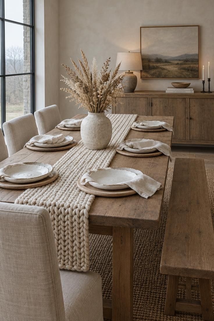
Cream, ivory, and ecru carried entirely through texture and material variation give a table a layered, tactile elegance.
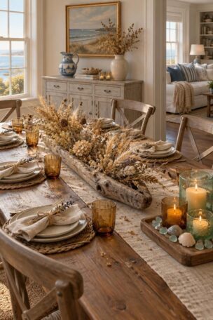
A chunky knit runner, whitewashed wood chargers, raw ceramic plates in varying off-whites, linen napkins, and a centerpiece of dried grasses in a chalky vase make the palette legible without a single strong color.
Success depends on visible weave, rough and smooth contrasts, and irregular handcrafted edges.
Every piece needs a distinct surface, or the table reads as one pale field.
In low light, all-white can go flat, so place the setting near a window or bring in warm wood, a bench, a charger, a serving board, to give the neutrals something to contrast with.
Mixing three distinct textures on the table before adding any greenery, linen, raw clay, and wool, gives the arrangement structure and makes the eventual sprig of evergreen read as punctuation rather than filler.
Style Blueprint:
- Chunky knit cream runner
- Whitewashed wood chargers
- Raw ceramic plates in varied off-whites
- Linen napkins in ivory
- Chalky vase with dried grasses
Jewel-Toned Boho Evening Mood
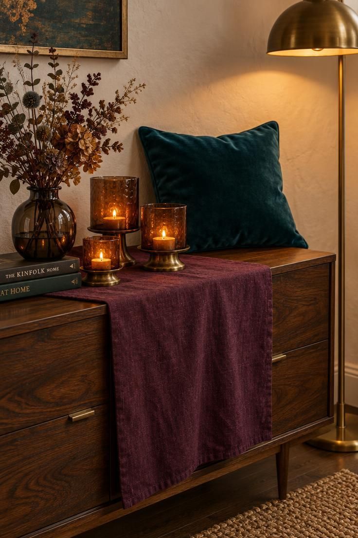
Muted teal, plum, and amber offer a richer, evening-leaning option than bright jewel tones.
A deep teal velvet cushion, a plum linen table runner, amber glass votives, and brass candleholders give a living room arrangement a collected, well-traveled feel that reads especially well under lamplight.
These deeper hues change character after dark, when warm light moves through amber glass and the velvet takes on depth.
Daylight shows the plum and teal more plainly, so check the sideboard at both times.
Too many dark jewels at once can overwhelm a small room.
Keep the base neutral with cream walls and a jute rug, then let the teal, plum, and amber sit as a cluster on one surface.
Amber or smoked glass for votives softens the glow compared with clear glass and keeps the arrangement within the muted scheme.
Style Blueprint:
- Deep teal velvet cushion
- Plum linen table runner
- Amber glass votives on brass holders
- Smoked glass vase with dried botanicals
- Jute rug as neutral base
Conclusion
A boho Christmas color palette works because it relies on natural materials, muted tones, and layered texture rather than loud seasonal symbols.
Choosing one dominant neutral and one or two earth accents carries the look across a room, whether the setting is a sofa, a mantel, a dining table, or a bedroom corner.
Small adjustments, a sprig of evergreen, a warm metallic, a paper star, keep the palette reading as holiday rather than simply autumnal.
Begin with pieces already in the home, then add a nubby throw, a few dried stems, and matte ceramics to test the direction before committing to more.