This post may contain affiliate links. If you make a purchase through these links, we may earn a commission at no additional cost to you.
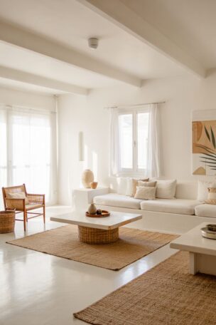
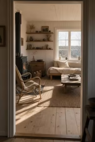
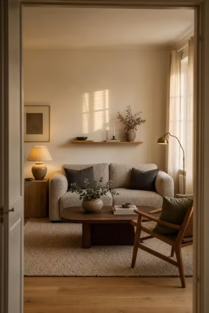
A scandinavian color palette is supposed to make a room feel like a quiet exhale, bright enough for morning coffee and soft enough for falling asleep on the sofa.
Most people who attempt this palette end up somewhere colder than they planned, though, and the reason is almost never the colors themselves.
The walls look washed out, the furniture feels disconnected from the paint, and the overall mood reads closer to waiting room than Nordic retreat.
The fix comes down to seven specific habits that pull warmth out of a room one decision at a time, and each one is surprisingly simple to reverse.
Picking a Blue-White When the Room Needs a Cream-White
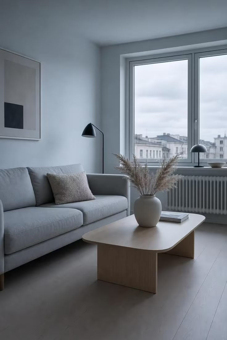
This is the single most common scandinavian color palette mistake, and it shows up in nearly every home that attempts the style for the first time.
Optical white paint, the kind with blue or violet undertones, reflects light in a way that reads as sharp and sterile rather than airy and calm.
The walls bounce cool tones into every other surface in the room, making warm wood floors look muddy and grey upholstery look flat.
A warm white with cream or yellow undertones does the opposite: it catches light and softens it, letting the rest of the room breathe.
Interior designers across Scandinavia have been shifting away from stark whites for several years now, and the 2026 favorite is a warm off-white closer to putty or parchment than snow.
Benjamin Moore’s Pale Oak, a soft greige-white, has become one of the most recommended wall colors for Nordic interior design rooms in North America this year.
The fix takes one afternoon and a paint roller, but the difference between a blue-white and a cream-white can change the entire personality of a space.
Ignoring the Undertone Conversation Between Paint and Wood

Every paint color carries a hidden lean, a slight pull toward green, pink, yellow, or blue that only becomes obvious once the paint dries next to a piece of wood.
Cool grey walls next to honey oak flooring create a visual friction the eye registers as “something is off” without being able to name the problem.
The 2026 movement toward warmer, oiled natural wood tones like honey oak, pale walnut, and smoked ash means walls need to shift warmer to keep pace.
Warm whites pair with warm woods because their undertones speak the same language: golden, amber, buttery.
Cool greys pair better with cooler woods like bleached ash or whitewashed pine, where both lean toward silver and slate.
The test is simple: hold your paint chip against bare wood in natural light and look for the cast.
If the paint turns slightly green next to your floor, the undertones are fighting each other and the room will never feel settled.
A mismatched undertone relationship is behind most “I painted the room and it somehow got worse” experiences, and it costs nothing to fix except a new sample pot and an hour of observation.
Relying on Color Alone When Texture Does Half the Work
A perfectly chosen scandinavian color palette still reads as cold if every surface in the room is smooth, flat, and uniform.
Texture is the invisible layer that separates a Nordic room that feels warm from one that feels like a showroom for paint chips.
Bouclé on a sofa catches light in small irregular loops that make beige look three-dimensional.
Ribbed plaster on a wall creates micro-shadows that add depth to a white that would otherwise read as blank.
Raw linen curtains filter light through their weave and add a softness that no amount of careful color matching can replicate on its own.
The Nordic design philosophy treats texture as the primary visual interest layer in a room, filling the role that bold patterns play in other styles, and without it, even the warmest neutral color scheme falls flat.
Lighting the Room with One Cool-Toned Ceiling Fixture
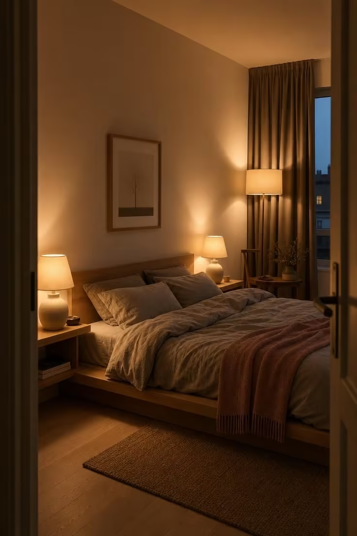
A single ceiling light at 5000 Kelvin or higher can undo every warm color decision in a room in one flick of a switch.
Cool-toned overhead lighting flattens warm undertones in paint, drains golden tones from wood, and makes warm white walls look grey after sundown.
Layered lighting is the Scandinavian answer, and it works by creating multiple small pools of warm light rather than one uniform wash from above.
Table lamps on side tables, a floor lamp in a reading corner, and a pendant fixture at 2700 to 3000 Kelvin build the kind of warmth that a single overhead bulb cannot.
This is where the hygge atmosphere concept becomes practical rather than abstract: it is the sum of several small, warm light sources placed at varying heights throughout a room.
Scandinavian homes during winter months lean heavily on low, distributed light for a reason, because even five hours of natural daylight per day cannot carry a room through the evening without help.
The 2026 direction in Nordic interior design pushes this further, moving away from bright, minimal rooms toward spaces that feel embracing and personal, and the lighting temperature shift is one of the biggest reasons.
Swapping a 5000K overhead bulb for a 2700K warm alternative costs under five dollars and takes two minutes, making it the single highest-return fix on this list.
A room designed around layered lighting holds its warmth from morning through midnight without depending on natural light alone.
Design Pro-Tip: Place at least three separate light sources in any room where you spend your evenings, each at a different height: one at table level, one at floor-lamp level, and one overhead. Set them all to 2700-3000K. The overlapping warm pools will do more for your scandinavian color palette than any paint change.
Adding Too Many Accent Colors and Breaking the Calm
The overcorrection happens when someone reads that a Nordic room needs “a pop of color” and introduces sage green cushions, a dusty blue throw, a terracotta vase, and a mustard candle all in the same space.
Each of those muted accent colors works on its own, but layered together they fracture the visual quiet that makes a Scandinavian room feel restful.
The Nordic approach uses one accent color, repeated in two or three small doses across the room, rather than a sampler of four or five.
A pair of sage linen cushions on the sofa, a sage ceramic bowl on the shelf, and sage stems in a vase on the dining table create a gentle rhythm the eye can follow without effort.
Four different accent colors create four separate visual interruptions, and each one asks the eye to recalibrate, which is the opposite of calm.
The 2026 palette favorites for Scandinavian interiors lean into dusty terracotta, faded sage, warm taupe, and blush stone, but the principle remains the same: pick one, commit, and let the rest of the room stay neutral.
Restraint with accent color is the single clearest signal that a room was designed with intention rather than decorated with accumulation.
Matching Every Neutral to the Same Value and Losing All Depth
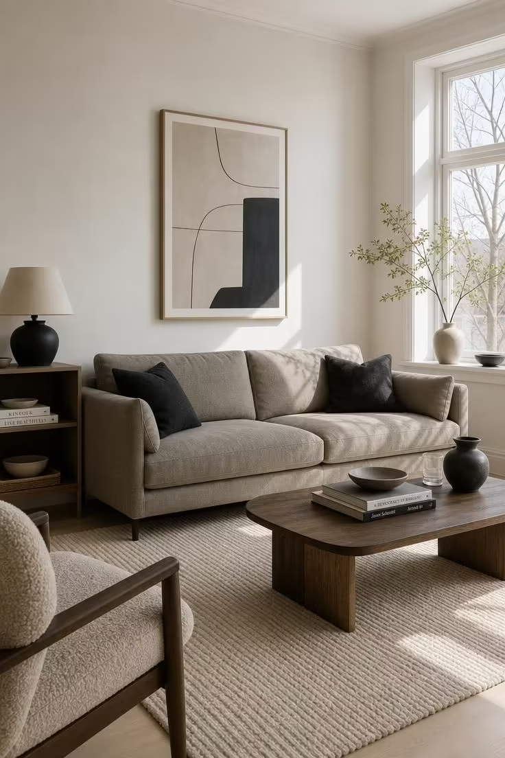
A room where the walls, sofa, rug, and curtains all sit at the same lightness level reads as a single flat plane rather than a layered space.
This is the “beige on beige on beige” problem, and it is more common than the all-white mistake because the colors technically match.
The fix is value contrast: pairing a light base (warm white walls) with a medium-tone anchor (greige sofa, oatmeal curtains) and a dark grounding element (charcoal cushion, anthracite lamp, smoked wood frame).
A neutral color scheme gains depth from the distance between its lightest and darkest tones, not from the number of different hues in the room.
The 60-30-10 ratio adapted for Nordic rooms means 60 percent light base, 30 percent mid-tone neutral, and 10 percent dark accent, and the dark accent is what keeps the room from floating.
Charcoal and anthracite work better than pure black for this purpose because they ground the space without creating a harsh edge that fights the softness of everything else.
Design Pro-Tip: Squint at your room. If everything blurs into one undifferentiated tone, you need more distance between your lightest and darkest neutrals. Add one element at least four shades darker than your walls, something small like a lamp base, a picture frame, or a set of textured neutrals in a deeper tone.
The eye needs a resting point and a contrast point in the same view, and without that range, even the most carefully chosen warm undertones will feel monotonous.
Forgetting That Your Window Direction Rewrites Every Color You Chose
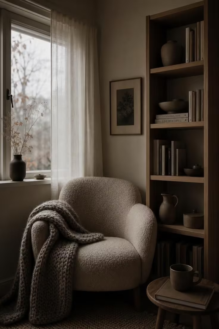
North-facing rooms receive cool, indirect light that pushes every color in the room toward blue and grey, and a scandinavian color palette chosen under showroom lighting will behave differently once it lives in that space.
South-facing rooms do the opposite, warming everything they touch with golden, direct light that can make cool-toned whites feel perfectly comfortable.
The same paint swatch can read as calm cream in a south-facing bedroom and as clinical ivory in a north-facing living room, and no amount of wishing changes the physics.
Cool-toned whites and textured neutrals in pale grey work well in south-facing spaces where natural light adds the warmth the color lacks.
North-facing rooms need warm white walls, golden-toned wood, and warm undertones baked into every material choice because the light will not provide warmth on its own.
The only reliable test is time: tape your swatches to the actual wall, observe them at morning, midday, and evening, and let 48 hours of real light tell you what your screen or paint-store lighting could not.
Conclusion
Every mistake on this list traces back to the same root: treating a scandinavian color palette as a collection of individual paint chips rather than a living relationship between warmth, undertone, texture, and light.
Warm white walls instead of cool-toned whites fix the foundation, matching undertones between paint and natural wood tones stop the hidden clashes, and adding texture prevents the flat-room trap that color alone cannot solve.
Layered lighting at 2700K holds the warmth after sundown, one muted accent colors repeated in small doses preserves calm, value contrast between light and dark neutrals creates depth, and testing every color against your actual window direction catches the mistakes that showroom swatches hide.
Start with one room, one swatch test on the wall, and one warm bulb swap in the overhead fixture, then let the warmth build from there.