This post may contain affiliate links. If you make a purchase through these links, we may earn a commission at no additional cost to you.
Most color advice assumes you have walls to paint.
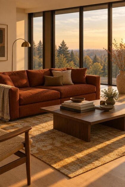
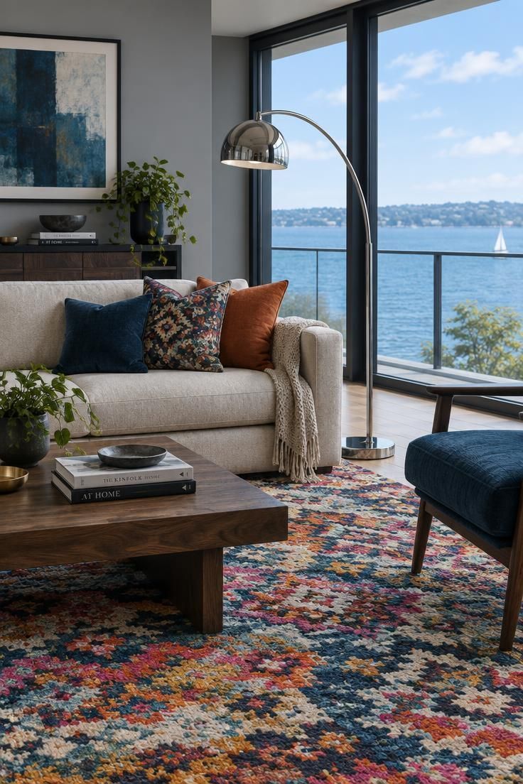
A room wrapped in glass obeys a different set of rules, and the usual sequence of choosing a wall color first, then a sofa, then an accent, quietly falls apart there.
The window itself becomes the largest and most changeable field of color in the room.
Planning around that fact is what separates a palette that holds together from one that looks unresolved by mid-afternoon.
Why a Wall of Glass Breaks Most Color Advice
Glass is not a neutral opening.
It reflects sky, foliage, neighboring buildings, and the surfaces inside the room, which means the perceived tint of a large window shifts constantly through the day, from cool daylight tones in the morning to a dark mirror after sunset.
Conventional palettes are built on the assumption that solid wall area dominates the room's color impression.
In a heavily glazed space, that assumption is reversed: paint may cover only a fraction of the visible envelope, so the window, floor, and upholstery do more of the work than the walls ever will.
This is why the standard three-part formula of wall, sofa, and accent tends to produce rooms that feel either thin or mismatched.
The formula leaves out the biggest colored surface in the room.
Treat the glazing as a color field in its own right and the planning order changes.
You start with what the glass reflects and how the light moves, then build the rest of the palette in relation to it.
Get that order right and most other decisions become easier, because each new color has something concrete to answer to.
The First Decision: Is the View Your Anchor or Just a Backdrop?
Before any color is chosen, decide what the room is competing with.
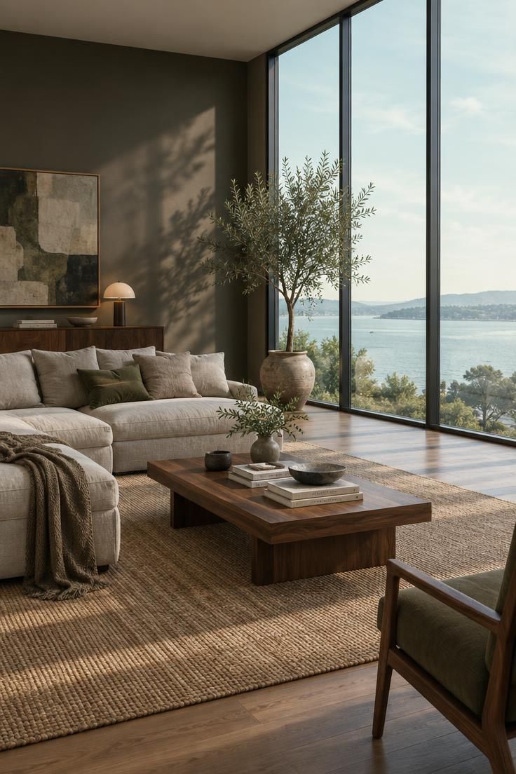
When the view is genuinely attractive, whether that means a garden, trees, water, or open sky, the interior palette usually works best when it stays quiet.
Soft neutrals, muted greens, earthy mid-tones, and natural woods let the outdoors carry the color statement.
That approach treats every solid surface in the room as a supporting player.
The view supplies the interest, and the interior supplies calm.
The opposite case is just as common.
An overlooked window, a parking area, a blank neighboring wall, or a view that simply reads as flat all push the room toward a different strategy.
Here the interior has to generate its own focal point, which often means a deeper wall color on whatever solid wall exists, a patterned rug, or a single piece of upholstery in a color strong enough to hold attention.
Deciding which category your room belongs to takes a few honest questions.
How much of the glazing is filled with sky versus built structures?
Does the view hold up in winter as well as summer?
Is the room used mostly during daylight hours or after dark?
A room used mainly in the evening can afford a busier interior, because the view is rarely the main event at that hour.
The mental shift that helps most is to think of the window as a color surface in a living room rather than as a hole in the wall.
Once the glass is treated as one more field with its own tint, the question stops being whether to compete with it and becomes how much to let it lead.
Reading the Light: Warm and Cool Palettes in Different Exposures
The direction the main glazing faces shapes how colors render more than most people expect.
North-facing glass tends to deliver cooler, more even light through much of the day, which can pull warm neutrals toward grey and make cool whites read distinctly blue.
South-facing glazing is typically brighter and warmer for longer stretches, and west-facing windows swing from neutral to intensely warm and low as the afternoon advances.
East light starts warm and softens toward neutral by midday.
These are tendencies, not guarantees, and they shift with latitude, season, climate, and shading, but they are reliable enough to plan around.
That variability is the reason the warm versus cool palette for a sunlit living room is really a question about fit rather than a question about style.
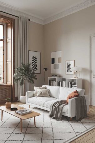
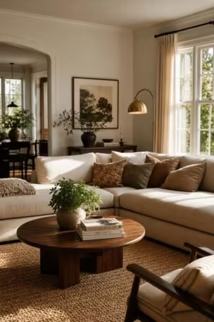
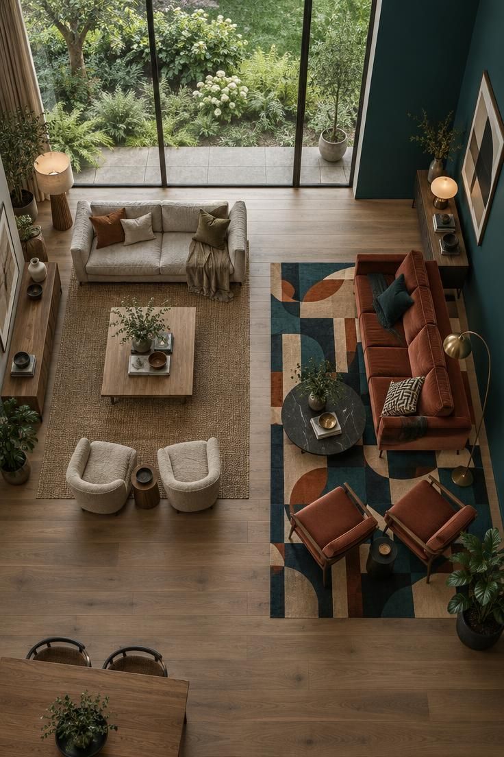
Warm earthy tones, including clay, mushroom, camel, olive, and muted ochre, add depth and weight in rooms where abundant daylight can otherwise flatten surfaces into an even wash.
Cool palettes, including soft greys, blue-greys, and crisp whites, hold their own in rooms that already receive warm light or that look out onto a warm-toned view.
They also suit anyone who wants a room to feel airy and defined rather than enveloping.
Recent design reporting has noted a shift away from the all-grey and all-white schemes that dominated for years, with warmer neutrals and natural materials taking their place.
That is a trend signal rather than a verdict, and cool neutrals remain a legitimate choice wherever the light and the view support them.
The practical test is simple.
Hold a large sample against the wall that receives the most daylight and look at it at three different hours on two different days, including one overcast day.
A color that survives that test is a color you can commit to.
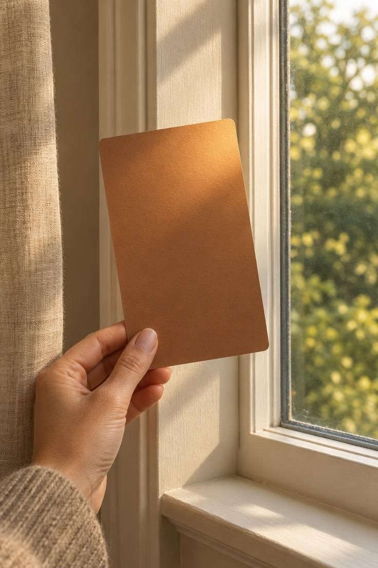
Design Pro-Tip: Paint a large sample board rather than a small chip, leave a white border around the color so your eye has a reference, and move the board to three spots in the room before committing.
The Four Color Fields You're Actually Designing
The three-part formula does not fit a room with limited solid wall.
A four-field model works better, and it accounts for the surfaces that actually carry the color weight.
The first field is the solid-wall color.
It is often the smallest area in the room, but it is the one readers ask about first, and its job is to relate to the view without fighting it while holding up under whatever direction the light arrives from.
The second field is the floor and rug.
With less wall in play, the floor plane takes on more responsibility, and the combination of wood tone, rug color, and rug pattern goes a long way toward setting the room's overall temperature.
The window field comes third, and it is the one most often left out of color planning.
Frames, mullions, shades, curtain fabric, and the reflective tint of the glass itself all belong here.
Upholstery and soft goods form the fourth field.
Sofa, chairs, cushions, and throws are frequently the largest saturated surfaces in a glazed room, and they are also the surfaces most exposed to direct daylight.
How these four fields relate determines whether the room reads as calm or layered.
When all four sit within a narrow value range and share an undertone, the effect is cohesive and quiet.
When one field is deliberately darker, cooler, or more saturated than the others, the room gains structure and a sense of depth.
Neither pattern is better.
The calm version suits rooms where the view is the main event, and the varied version suits rooms that need to generate their own interest.
Choose the pattern first, then fill in the specific colors.
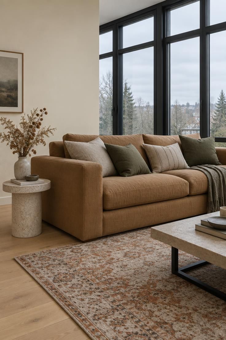
Window Frames and Trim: Small Areas, Oversized Influence
Frames and trim cover a modest amount of surface area, but they draw a line around the largest visual field in the room, which gives them influence out of proportion to their size.
The window frame color in a bright living room effectively sets the border of the view.
Dark frames, whether charcoal, bronze, or near-black, create a graphic outline and add contrast to a bright space.
They make a wall of glass read as a deliberate composition rather than an absence of wall.
Light frames, including warm white, cream, and pale oak, do the opposite.
They let the window recede, and the view appears to extend closer to the room's edges, which supports a sense of openness.
Wood tones occupy the middle ground.
They can tie the windows to the flooring and furniture, which is useful in rooms where the frame material is already visible from several angles.
Curtain rods and visible hardware belong to the same decision.
Design reporting has noted a move toward bronze and matte black hardware as a contrast element in otherwise warm, light rooms, and that reflects a simple visual idea: a dark line around a bright field draws the eye on purpose.
The main tradeoff is between definition and expanse.
Dark frames give the room structure and make the glazing feel intentional; light frames let it disappear and make the room feel larger.
Neither is wrong, but the choice should be made as part of the palette rather than left to whatever was installed by default.
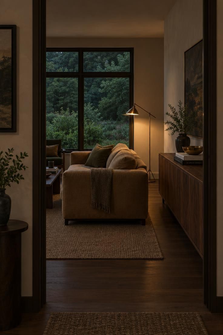
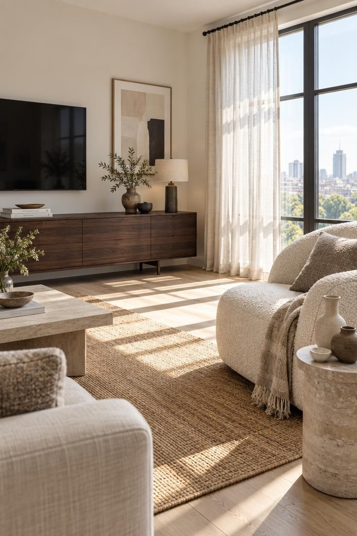
Why a Light, Neutral Palette Can Fall Flat in a Sunlit Room
A room done entirely in pale tones can lose its dimension in strong daylight, especially when the view is bright.
The surfaces compete with one another at similar values, and the eye has nowhere to rest.
The daylight color shifts in a glazed living room make this worse, because the same wall can read darker in the morning and washed out by early afternoon.
A palette with no internal contrast has nothing to hold it together through those changes.
Adding a single dark anchor is often the most efficient fix.
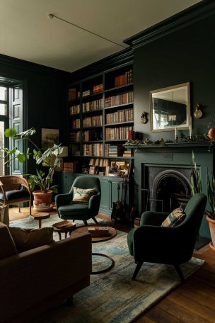
A dark fireplace surround, a walnut console, a charcoal chair, or dark curtain rods give the eye one strong point of reference without requiring a wholesale color change.
Mixed wood tones work in a similar way.
Using more than one wood species across the floor, tables, and frames creates variation without introducing new hues, which keeps the room cohesive while giving it depth.
Texture variation within a narrow color range is another approach.
Boucle, linen, wool, jute, stone, and ceramic all read differently under the same light, and combining several of them keeps a limited palette from feeling flat.
A rug with enough pattern or tonal variation can hold the floor plane visually, and artwork or plants on the solid walls give the eye something to examine at close range.
None of these moves require saturation, which matters in a room where the view already supplies plenty of color.
The tension to manage is between calm and under-resolved.
A pale palette with one dark anchor and several textures reads as intentional.
The same palette without those elements reads as unfinished.
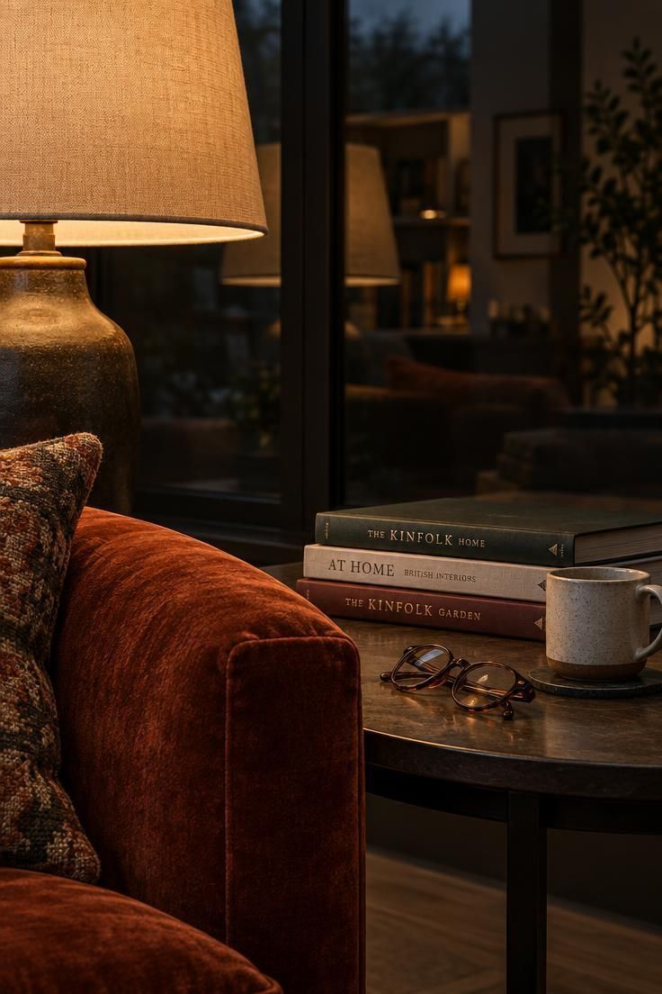
Day to Night: How the Same Palette Reads After Dark
After sunset, a large window stops being a source of light and becomes a dark reflective sheet.
The glass now mirrors whatever is lit inside the room, which changes the character of every color near it.
Interior colors generally appear richer and warmer once artificial light takes over.
A palette that looked washed out at noon can feel considerably deeper at nine in the evening, and that shift is worth planning for rather than discovering by accident.
This is why lighting belongs in the palette conversation from the start.
Lamp color temperature, the placement of fixtures, and the use of dimmers all determine what the colors actually look like after dark.
A warm earthy palette tends to hold its character under warm artificial light, which makes the transition from afternoon to evening fairly gentle.
A cooler palette depends more heavily on the lighting choice, since cool surfaces under warm lamplight can shift toward neutral or even slightly muddy.
Layered lighting helps in either case.
A mix of overhead, task, and accent sources lets the room change gradually as the daylight fades, rather than snapping from one condition to another when a single switch is flipped.
The most useful step is to test paint and fabric samples under the actual evening lighting, not just in daylight.
Colors that were chosen in the afternoon can behave quite differently once the lamps are on.
Design Pro-Tip: Buy one warm and one cool bulb, try each in the lamp you use most in the evening, and keep the one that leaves your chosen paint and fabric looking closest to what you intended.
Eight Ways a Big-Window Palette Goes Wrong
Choosing the wall color in isolation is the most common failure.
Without reference to the view or the light direction, even a well-liked color can read as a mismatch once it is on the wall.
A close second is a cool white that behaves perfectly on a sample board in another room and then reads blue-grey against a bright window wall.
The same paint can shift noticeably depending on what surrounds it.
Letting window frames and hardware become the only strong color in the room is another frequent problem.
The eye latches onto the darkest element, so a set of black frames in an otherwise pale room can end up reading as the palette.
Unintentional clashes between interior and view cause trouble too.
A cool grey interior facing a warm-dominant landscape, or the reverse, creates a contrast that may look accidental rather than deliberate.
Keeping all four fields at roughly the same value leaves the room without depth.
The floor, walls, window field, and upholstery all need somewhere to differentiate, even if only slightly.
Underestimating how daylight changes saturated fabric colors is a quiet but costly error.
A fabric that looks restrained in a showroom can read much stronger when it sits directly in front of a bright window.
Selecting curtain fabric for its pattern without checking how the color behaves when backlit is a related mistake.
Light passing through fabric shifts its apparent color considerably, and the effect is hard to predict from a flat sample.
The thread running through all of these is the same: each one is avoidable once the window is treated as a color surface rather than a neutral opening.
Testing Gloss and Sheen on Reflective Surfaces Near the Glass
Finish matters as much as hue in a room with abundant glazing.
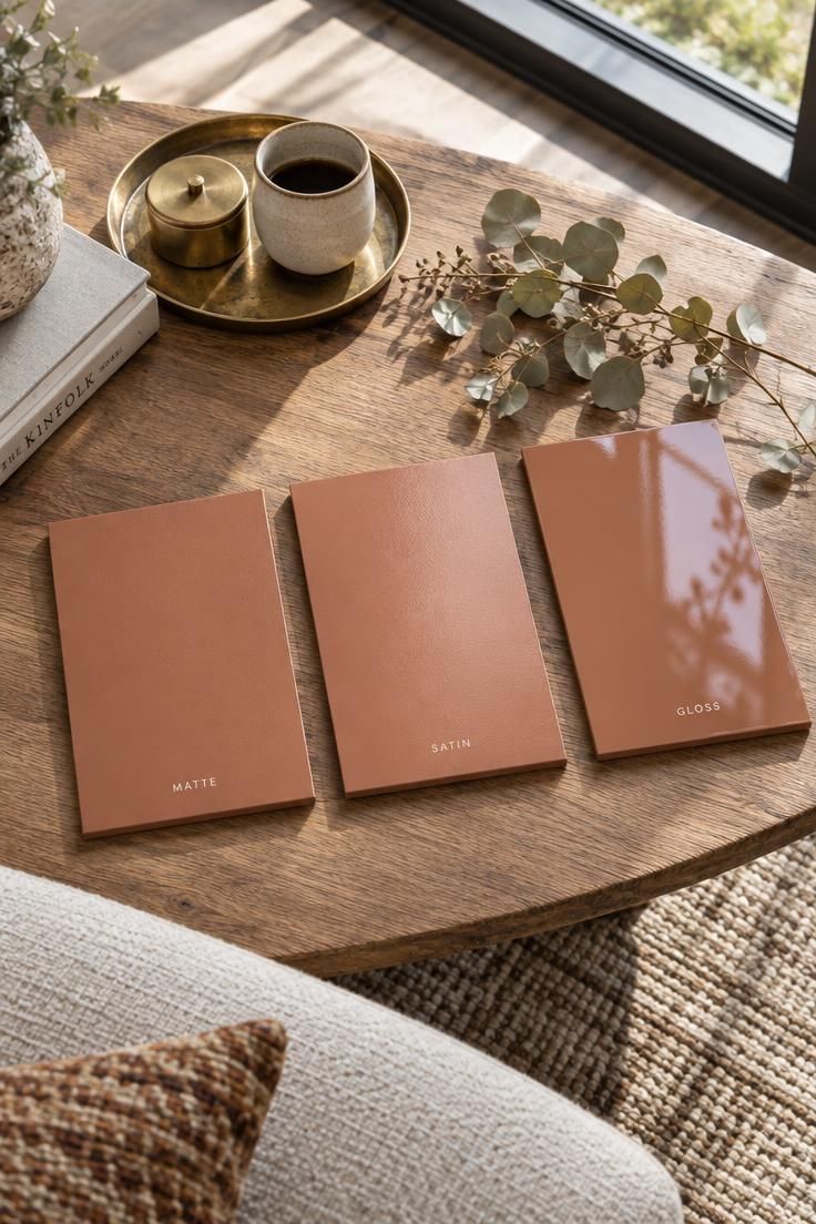
The palette for a living room with large windows is partly a decision about sheen, because the same color in a high-gloss finish and a matte finish will not look the same near a bright window.
High-gloss surfaces reflect direct light sharply, which can create bright spots that pull attention away from the rest of the room.
Matte and low-sheen finishes tend to distribute light more evenly and hold a steadier appearance as the daylight changes.
This applies beyond wall paint.
Lacquered millwork, polished stone, and metal accents all behave the same way, and each one adds another reflective surface to a room that already contains a large one.
Sheen changes perceived depth and saturation, so it belongs in the color decision rather than after it.
A color that feels too flat in a matte finish may read exactly right in a satin, and the reverse is equally true.
How Ceiling Height and Window Proportion Shift Your Color Strategy
Proportion changes how color distributes across a room.
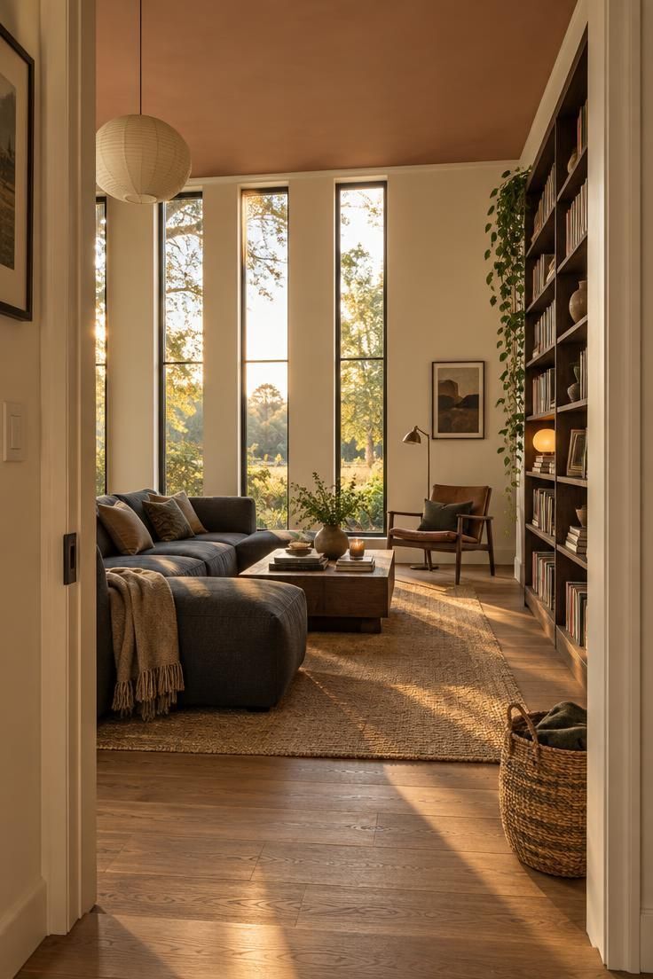
Tall glazing with clerestory windows pushes the eye upward and makes the ceiling a more visible field, especially when daylight washes across it.
Wide, low window bands work differently.
They stretch the room horizontally and leave more upper wall available, which means the wall above the glazing carries more visual weight than it would in a taller space.
Design reporting has noted growing interest in painted ceilings, tonal transitions from wall to ceiling, and darker trim as ways to manage rooms with large glazed expanses.
Those are design-practice observations rather than universal rules, and each one suits a particular proportion better than others.
In a living room with big windows, a ceiling that stays close in tone to the walls tends to let the glazing dominate, while a ceiling in a slightly deeper or warmer tone can bring the upper part of the room into the composition.
Both are legitimate choices, and the deciding factor is whether the room needs the window to lead or needs the architecture to share the role.
Design Pro-Tip: Before choosing between a light and dark window frame, tape heavy paper strips in each color around one window for a full day and compare how each border changes the view.
Conclusion
The window is the largest and most variable color surface in a room wrapped in glass.
Once that reframe takes hold, the conventional order of choosing a wall color first stops making sense.
Two moves prevent most palette failures.
The four-field model, covering solid walls, floor and rug, the window field, and upholstery, keeps attention on the surfaces that actually carry the color weight.
The interior-exterior fork, deciding early whether the view or the interior leads, gives every later choice a reference point.
The sequence that works is straightforward.
Assess the view and decide whether it anchors the room or needs a backdrop.
Determine which direction the main glazing faces so you know what kind of light you are planning around.
Choose the window frame color as part of the palette rather than accepting the default.
Test solid-wall paint against real daylight at three times of day.
Start with the window frame.
It is a small surface with outsized influence, and settling it first makes every remaining color decision noticeably easier.