This post may contain affiliate links. If you make a purchase through these links, we may earn a commission at no additional cost to you.
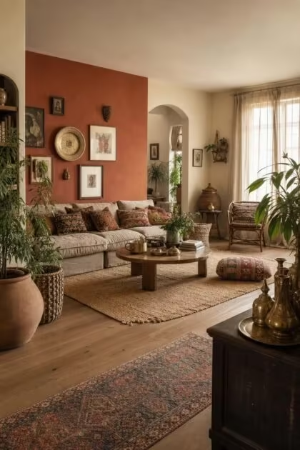
The wall behind your sofa does more for your boho living room than any rug, pillow, or plant shelf ever will.
Color sets the emotional baseline of a room, and in a bohemian space, the right shade turns a collection of mismatched furniture and global textiles into something that looks deliberately, lovingly gathered.
These 11 boho living room wall colors range from soft plaster finishes to bold, moody tones, each one chosen to make the room feel warmer, deeper, and more like a place you never want to leave.
A Terracotta Accent Wall Behind a Low Linen Sofa With Kilim Pillows
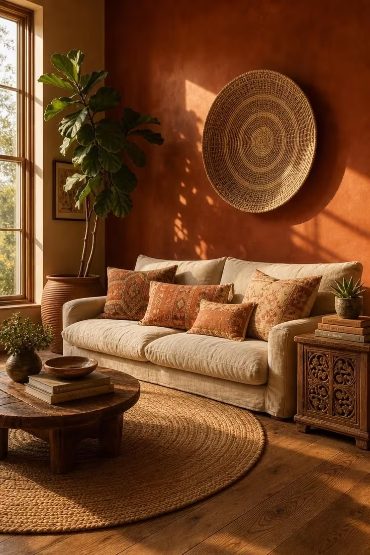
Terracotta is the wall color that makes people stop in the doorway and say the room feels like somewhere they have been before, even when they have not.
It carries a specific kind of warmth that cool grays and whites simply cannot replicate, a warmth that comes from clay and earth rather than from artificial pigment.
Against this deep, baked tone, a linen sofa in oatmeal or flax looks richer than it would against a white wall.
Kilim pillows pull secondary colors from the terracotta, making reds, creams, and faded corals feel like they belong to the same story.
The effect is a room that reads as collected over time rather than decorated in a weekend.
Pairing a terracotta accent wall with natural fibers like jute, rattan, and raw wood keeps the palette earthy and grounded without tipping into heaviness.
One strong wall is enough, leaving the remaining walls in a warm cream to let the terracotta breathe.
Style Blueprint:
- A low-profile linen sofa in oatmeal or flax
- Faded kilim pillows in rust, cream, and muted peach
- A round jute rug on wide-plank oak floors
- A carved mango wood side table with vintage books
- A large circular woven basket hung on the accent wall
Design Pro-Tip: When choosing a bohemian wall paint, always test the color at three different times of day. A terracotta that feels warm at noon can look muddy at dusk if the room faces north, and a shade that seems too bold in store lighting often softens beautifully once surrounded by textiles and wood.
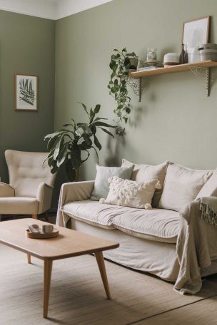
Sage Green Walls Framing a Rattan Bookshelf and Trailing Pothos
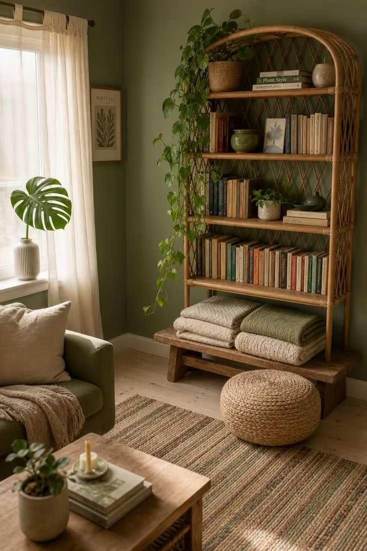
Sage green walls turn a living room into something that feels halfway between indoors and out.
The color sits in a sweet spot between green and dove, muted enough to recede behind furniture but present enough to shift the entire mood of the room.
Rattan furniture looks completely at home against sage, the warm honey tones of the cane playing off the cool green undertone of the wall.
Trailing plants like pothos or string of pearls double the effect, blurring the line between styled decor and living greenery.
This is one of the most forgiving boho living room wall colors because it pairs with almost every neutral, from cream to charcoal.
A flat-weave rug in muted stripes keeps the floor from competing with the walls and lets the green do its work quietly.
Style Blueprint:
- Sage green walls in a matte paint finish
- A tall rattan bookshelf styled with books and ceramic pots
- Trailing pothos vines draped over shelf edges
- A round woven pouf on a flat-weave rug
- A low wooden bench with folded linen blankets
Dusty Rose Plaster Covering a Fireplace Wall With Brass Sconces
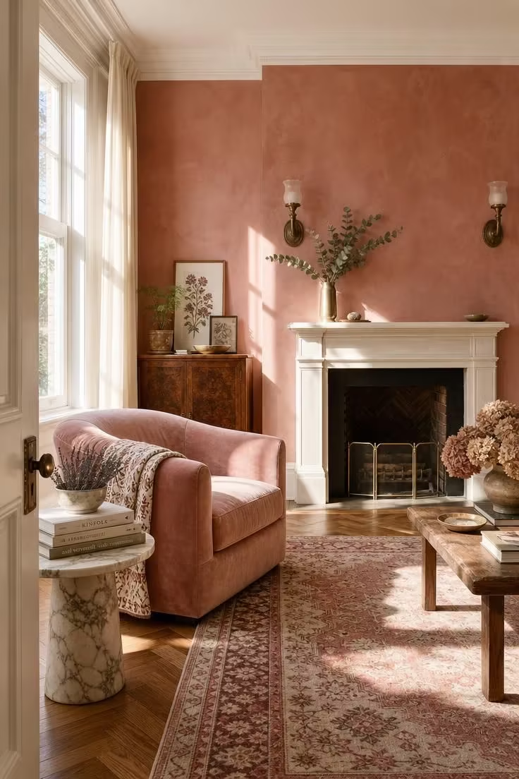
Dusty rose works differently from pink because it carries enough brown and mauve to feel grounded rather than sweet.
On a plaster finish, the color shifts with the light, looking almost lavender in the morning and deepening to a warm clay rose by evening.
This is a boho color palette choice that rewards pairing with metals, especially brass, which picks up the warm undertone and amplifies it.
A faded Persian rug in rose and cream tones creates a layered, tonal effect that makes the room feel rich without adding competing colors.
Velvet upholstery in a similar blush shade reads as deliberate rather than matching, giving the space a collected, old-world quality.
The plaster texture matters here because a flat matte wall in the same shade would feel static, while the uneven surface adds movement and depth.
Dried botanicals in muted greens and lavenders keep the palette soft without introducing bright contrast.
Brass hardware and sconces tie the warm tones together, reflecting light back into the dusty rose and making the room glow.
Style Blueprint:
- A dusty rose accent wall with visible plaster texture
- Vintage brass wall sconces flanking a white fireplace mantel
- A low velvet armchair in faded blush with a cotton throw
- A faded Persian rug in rose and cream on herringbone oak
- Dried eucalyptus in a slim brass vase on the mantel
Deep Indigo on a Reading Nook Wall With Woven Basket Art
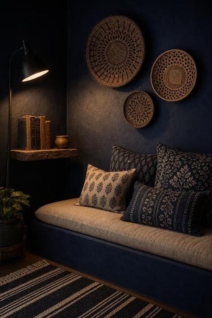
Indigo turns a small corner of a living room into a destination.
Where lighter boho living room wall colors open a space up, deep indigo pulls it inward, creating a cocoon that feels intentional rather than cramped.
This color borrows from Mediterranean and North African tile traditions, and it pairs naturally with woven basket art, block prints, and raw linen.
Hanging baskets directly on a dark wall gives them contrast they would lose on a white or neutral surface.
The trick with indigo is keeping the textiles light, oatmeal and cream cushions prevent the nook from feeling like a cave.
A single warm lamp is enough to activate the color, letting the indigo shift and deepen in the low light.
Style Blueprint:
- A deep indigo wall in a matte paint finish
- A built-in bench with a linen cushion in natural oatmeal
- Block-printed cotton pillows in indigo and cream
- Three woven baskets in varying sizes hung on the wall
- A reclaimed wood shelf with old hardcovers and a clay cup
Warm Ochre Covering the Full Room With a Jute Rug and Rattan Chairs
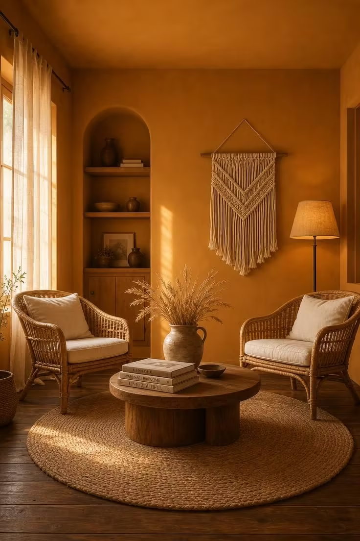
Ochre is the boho wall color for people who want warmth everywhere, not just on one accent wall.
It wraps a room in a tone that feels like late afternoon all day long, especially in spaces with natural light from the west.
Where some bold colors can overwhelm a room when applied on all four walls, ochre stays welcoming because its undertone is yellow rather than red.
Rattan furniture becomes almost invisible against ochre, blending into the warmth instead of standing out, which makes the room feel open and airy despite the strong color.
A large jute rug reinforces the earthy living room tones without adding visual noise.
Dried wheat and stoneware keep the accessories in the same tonal family, letting the color do the work.
The key is choosing a matte finish so the walls absorb light rather than bouncing it, creating a soft glow instead of a shine.
Style Blueprint:
- Warm ochre walls in a smooth matte paint finish on all four walls
- Two rattan armchairs with cream linen cushions
- A large round jute rug on dark-stained pine floors
- A low round wooden coffee table with art books
- A woven wall hanging in cream and natural rope
Design Pro-Tip: If you want a bold boho wall color on all four walls instead of just one, choose a shade with a yellow or brown undertone rather than a red one. Ochre, sand, and warm clay wrap a room without closing it in, while heavily red tones can make the space feel smaller than it is.
A Lime Wash Cream Finish on Textured Walls With a Gallery of Woven Art
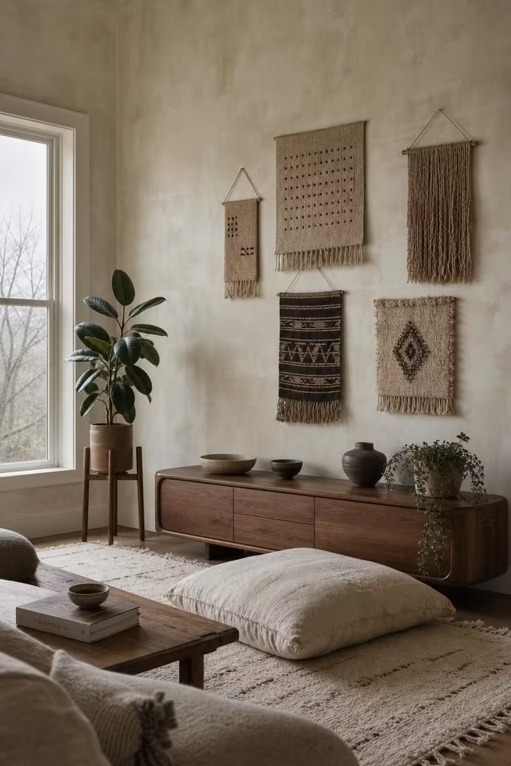
Lime wash cream is the warm neutral backdrop that does not look or feel like a standard painted wall.
The technique leaves behind a cloudy, mineral-rich surface that shifts slightly from one patch to the next, giving even a flat wall a sense of handmade depth.
In a boho space, this finish reads as intentional and worldly, the kind of wall treatment you see in old Mediterranean homes and Moroccan riads.
It is the ideal background for a gallery of woven art because the texture of the wall echoes the texture of the fibers without competing.
A walnut console in a rounded, mid-century shape adds structure to the organic feel of the room.
The lime wash texture catches light differently depending on the hour, looking chalky and cool in the morning and softly warm by late afternoon.
This finish works for renters too, since some brands now offer peel-and-apply lime wash panels that mimic the real technique.
Stoneware and raw cotton accessories complete the look, keeping everything tonal and letting the walls carry the visual interest.
Style Blueprint:
- Lime wash cream walls with visible brush strokes and tonal variation
- Five woven textile pieces in natural fibers arranged as a gallery
- A long, low walnut media console with rounded edges
- A large floor cushion in raw cotton on a pale wool rug
- A wooden plant stand with a rubber tree
Olive Green Behind a Carved Wood Console and Ceramic Collection
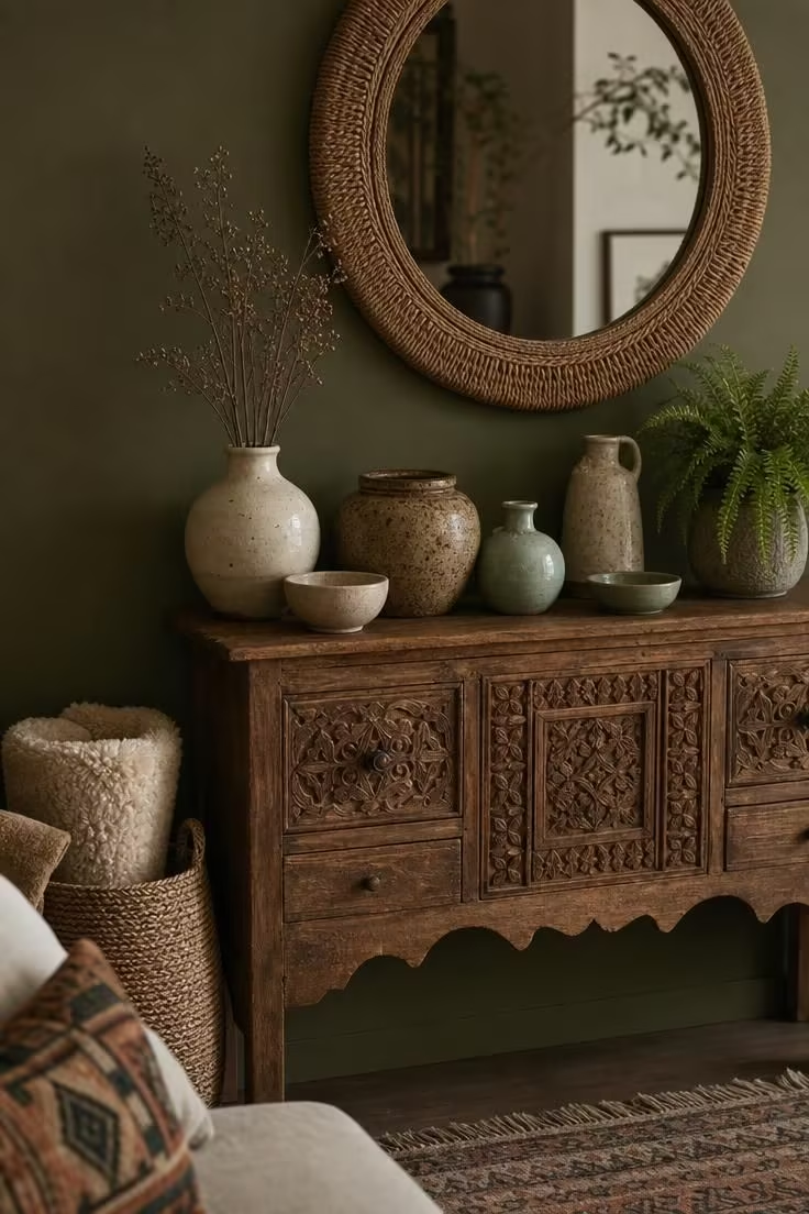
Olive green is the deeper, quieter cousin of sage, and it brings a gravity to a boho living room that lighter greens cannot.
Where sage green walls feel airy and open, olive pulls the eye in and creates a sense of weight and warmth.
Carved wood furniture looks especially good against olive because the deep green picks up the brown tones in the grain, making the wood feel richer.
A collection of handmade ceramics in mixed glazes turns the console into a small still life, and the olive wall behind it acts like a backdrop in a gallery.
This shade rewards restraint with accessories, letting a few well-chosen objects carry the vignette instead of crowding the surface.
A woven mirror frame above the console adds texture without introducing a new color, keeping everything tonal and calm.
Style Blueprint:
- Olive green walls in a flat matte finish
- A carved wood console with visible grain and patina
- Handmade ceramic vessels in cream, speckled brown, and celadon
- A round mirror with a woven frame
- A large woven basket holding a rolled sheepskin throw
Warm Taupe Walls With a Floor Cushion Seating Area and Layered Rugs
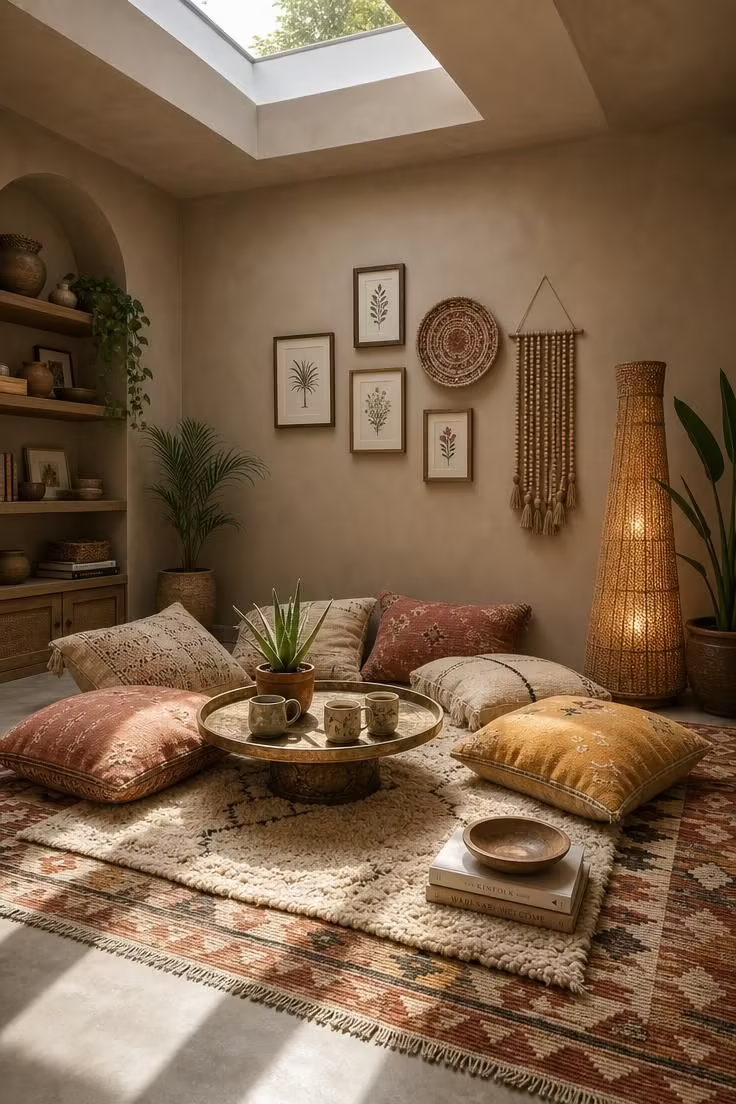
Warm taupe is the wall color for the maximalist bohemian, the person whose living room is already overflowing with textiles, art, and objects.
It steps back and lets everything else in the room do the talking, which is exactly what a warm neutral backdrop should do.
Unlike cool gray, taupe keeps the room feeling warm even when the light fades, and unlike stark white, it does not wash out colorful rugs and pillows.
A floor cushion seating area looks especially grounded against taupe walls because the color reinforces the low, relaxed energy of sitting close to the earth.
Layered rugs are a boho staple, and taupe walls give you permission to pile on a kilim, a shaggy wool throw rug, and a woven mat without the room feeling chaotic.
The eclectic wall decor above the seating area gains cohesion from the taupe backdrop, which visually unifies mismatched frames, woven plates, and beaded hangings.
This is a color that works in every light condition and with every style of boho furniture, making it the safest choice for rooms that change often.
Style Blueprint:
- Warm taupe walls in a smooth matte finish
- Oversized cotton floor pillows in cream, ochre, and faded rust
- Two layered rugs: a flat-weave kilim and a shaggy wool rug
- A round brass tray table with ceramic mugs
- Eclectic wall decor: framed prints, a woven plate, and a beaded hanging
A Matte Burgundy Wall Behind a Velvet Daybed and Fringed Throw
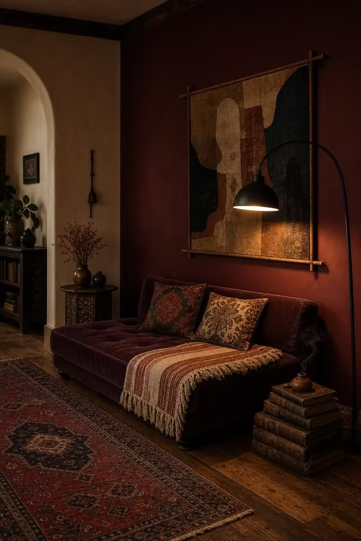
Burgundy is the wall color that makes a boho living room feel like it has a past.
It carries an old-world weight that newer, trendier shades lack, and in a matte finish, it absorbs light in a way that makes the room feel soft and close rather than dark.
A velvet daybed in a similar plum tone creates a tonal layering effect that feels deliberate and rich, like a room you might find in a Parisian apartment or a Marrakech riad.
The fringed throw breaks up the smoothness of the velvet, adding the texture that every boho space needs.
Cream and rust stripes in the throw pull warmth from the burgundy without repeating the exact shade, keeping the palette alive.
A dusty rose accent on the remaining walls or in the throw would push this too pink, so cream is the better counterpoint.
Vintage books and a clay incense holder add the kind of lived-in touches that make the room feel like it was built over years, not styled in an afternoon.
This is a bold boho color palette choice, but in a room with enough texture and warmth, it never feels heavy.
Style Blueprint:
- A matte burgundy accent wall with remaining walls in warm cream
- A low velvet daybed in deep plum
- A fringed wool throw in cream and rust stripes
- A large abstract textile hung on a wooden frame
- Vintage leather-bound books and a clay incense holder
Design Pro-Tip: Dark boho living room wall colors like burgundy and indigo look best when you keep the ceiling light. A cream or warm white ceiling reflects ambient light back into the room and prevents the space from feeling closed-off, even with rich, saturated walls.
Sandy Blush Walls With a Driftwood Mirror and Macrame Curtain
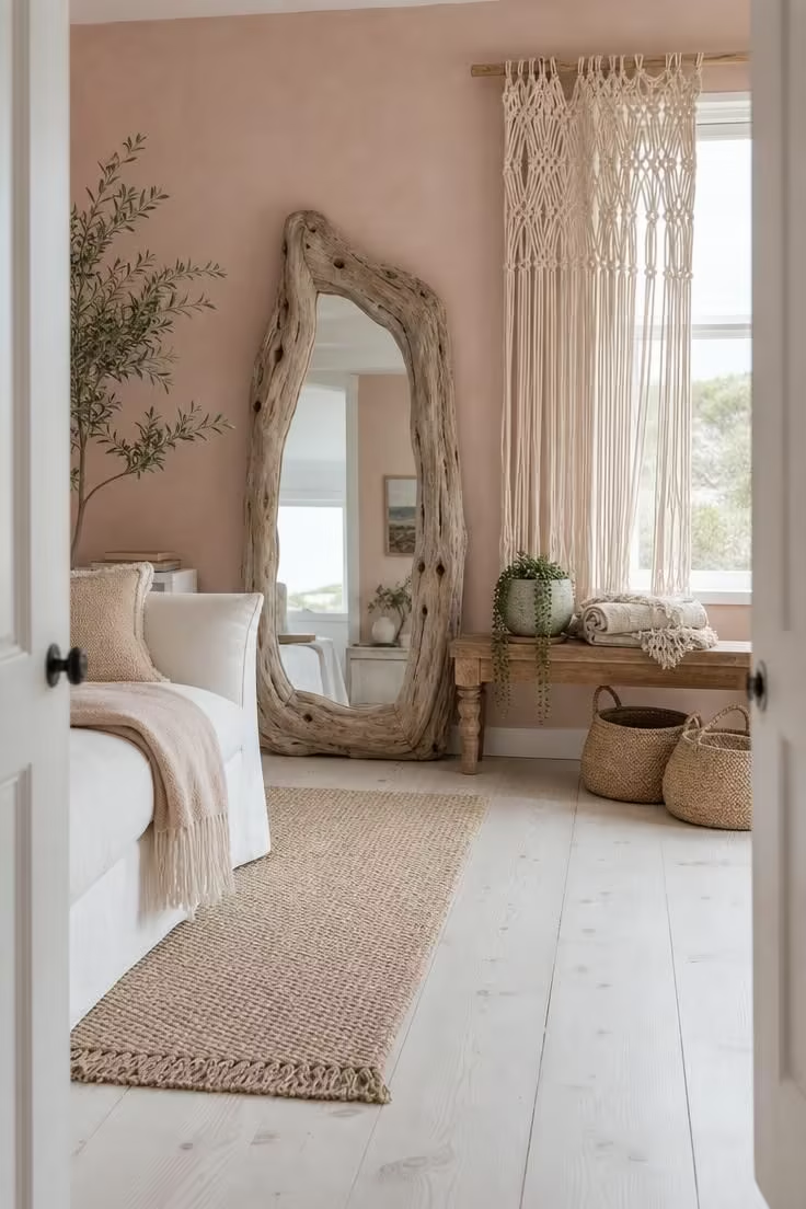
Sandy blush sits at the intersection of pink and beige, warm enough to read as a color but quiet enough to function like a neutral.
It is the boho wall color for spaces that get a lot of natural light and need something warmer than white but softer than terracotta.
Driftwood furniture and decor look completely natural against this shade, as if the room grew up near salt air and sun-bleached wood.
A macrame curtain in thick cotton rope adds texture without blocking light, filtering the view through the window into a soft, woven frame.
The chalky matte finish matters here because any sheen would pull the blush toward pink, while the flat surface keeps it firmly in sand territory.
Whitewashed pine floors and a pale sisal rug maintain the light, breezy quality that this color invites.
Style Blueprint:
- Sandy blush walls in a chalky matte finish
- A large, irregularly shaped driftwood mirror
- A macrame curtain in thick natural cotton rope on a wooden dowel
- A low wooden bench with a folded linen blanket
- Woven straw baskets on whitewashed pine floors
Deep Teal on a Focal Wall With Copper Pendant Lights and a Sheepskin Chair
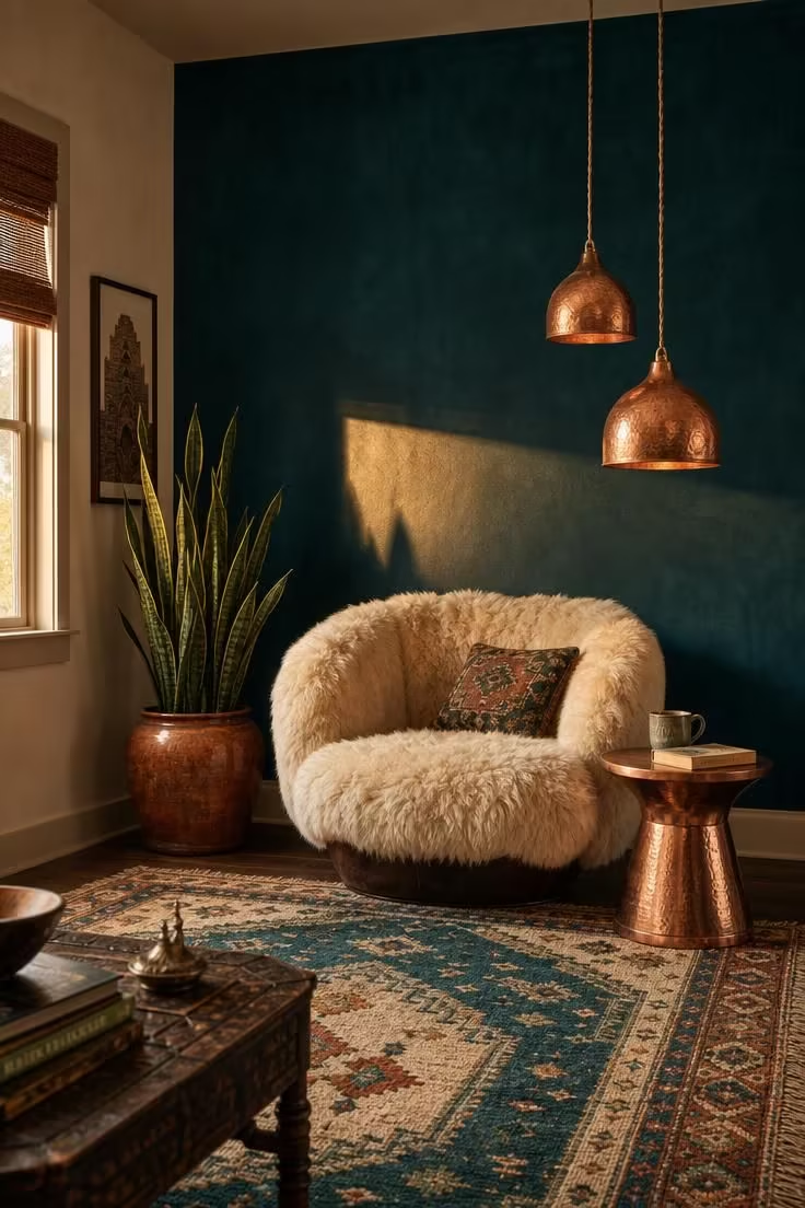
Teal is the boho living room wall color that makes copper glow.
The blue-green depth of teal against the warm orange-brown of copper creates a complementary contrast that feels intentional and worldly, like a room decorated with pieces from a Moroccan souk and a Scandinavian design shop.
A sheepskin draped over a rounded accent chair softens the boldness of the wall, keeping the room tactile and inviting rather than gallery-like.
Pendant lights hung at different heights add visual rhythm, drawing the eye upward and giving the teal wall a sense of vertical movement.
The remaining walls in soft cream keep the room bright and prevent the teal from dominating, which is the key to using a bold bohemian wall paint on a single surface.
A woven rug that picks up the teal plus cream and rust ties the floor to the wall, creating a color story that runs through the whole room.
Late afternoon light hitting a teal wall produces a rich, shifting surface that looks entirely different from the same wall at noon, making it a color that rewards attention.
Style Blueprint:
- A deep teal focal wall in a smooth, saturated matte finish
- A wide sheepskin-draped accent chair in a rounded shape
- Two copper pendant lights hung at different heights
- A woven rug in teal, cream, and rust on dark walnut floors
- A tall snake plant in a glazed clay pot
Conclusion
Boho living room wall colors work best when they come from the earth rather than from a trend report.
Terracotta, sage, ochre, and indigo have stayed in bohemian interiors for decades because they pair naturally with the handmade textures and collected objects that define the style.
The right shade depends on your room’s light, the furniture you already own, and the mood you want to walk into every day.
Start with a single accent wall if a full room of color feels like a risk, and choose a matte or lime wash finish to keep the surface tactile.
Every boho color palette starts with one confident choice, and the rest of the room will build itself around it.