This post may contain affiliate links. If you make a purchase through these links, we may earn a commission at no additional cost to you.
A saturated wall color, a worn wool rug, and a chair that does not match anything else can change the entire temperature of a room.
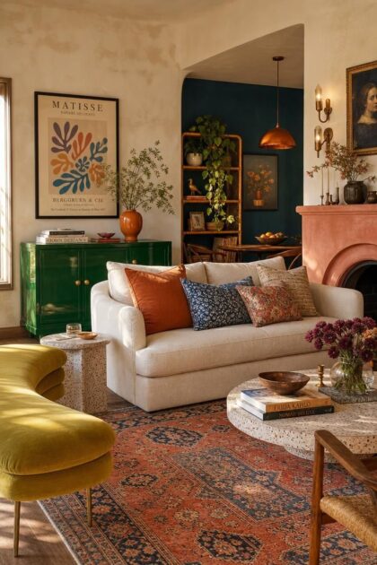
Colorful eclectic living rooms feel like they have been gathered over time, each piece carrying a small history rather than arriving as a matched set.
The best versions of this look walk a careful line between joyful abundance and visual chaos.
Every strong colorful eclectic living room uses one quiet anchor, repeated color ties, and deliberate furniture pairings to keep the mix intentional.
These visual field notes describe rooms that feel collected, not decorated.
Emerald Lacquer Sideboard as the Room's Color Anchor
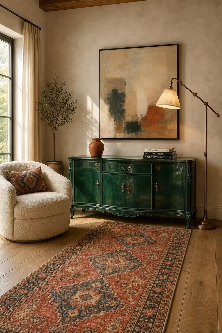
A single high-gloss lacquered piece acts as a color exclamation point rather than background furniture.
Gloss finish amplifies the emerald in natural light, making the sideboard read as a saturated focal object instead of a quiet storage unit.
Pair the emerald lacquer against warm ivory boucle and a vintage Turkish rug to create three distinct finishes: reflective, soft, and woven.
That variation keeps the eye moving across the room without overwhelming it.
The sideboard carries a practical role as storage or media furniture while staying visually dominant.
Keep its top nearly clear, with only two or three carefully chosen objects, so the lacquered surface itself remains the main event.
Yellow-based greens like emerald pair effortlessly with burnt orange and dusty rose in smaller doses.
Those hues share warmth, which lets them sit together without the room feeling like a primary-color exercise.
Above the sideboard, mix a black metal gallery frame, a small handmade ceramic vessel, and a short stack of art books.
The arrangement should feel loose rather than symmetrical, with the frame slightly off-center.
One quiet counterweight across the room keeps this composition from tipping into overload.
A single cream linen sofa with no pattern lets the sideboard lead while the rest of the room remains visually calm.
Warm-golden light deepens the emerald during the day and makes it appear almost jewel-like after sunset.
That shifting quality is part of the finish's appeal, a surface that never looks exactly the same twice.
Style Blueprint:
- Primary anchor: high-gloss emerald lacquered vintage sideboard
- Secondary furniture: curved boucle armchair in warm ivory
- Flooring: wide-plank oak with a vintage Turkish wool runner
- Wall treatment: warm white limewash plaster with subtle texture
- Lighting: brass articulating floor lamp aimed at art above sideboard
Mismatched Wood Tones Around a Mid-Century Modern Sofa
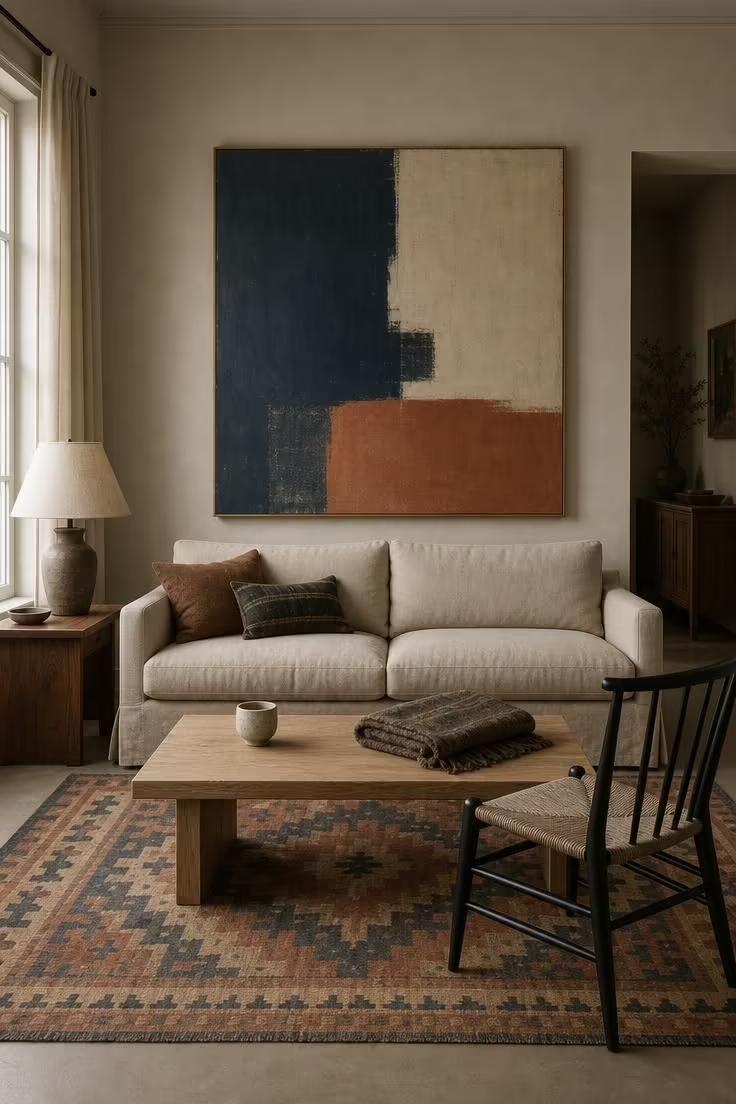
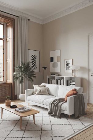
A quiet, linen-upholstered mid-century modern sofa is the anchor rule in action.
The muted solid piece lets mismatched wood tones and colorful accents breathe without competing for attention.
Pale oak, mid-tone walnut, and black-painted wood coexist because each has a distinct visual weight and provenance.
The oak feels light and informal.
The walnut reads as warm and mid-century.
The black-painted piece adds graphic punctuation.
The kilim rug defines the seating zone and introduces pattern without overwhelming it.
A large geometric field in muted terracotta and indigo works better than a small busy print, which would fight the furniture shapes.
The oversized abstract canvas acts as a second color source.
It pulls one hue from the rug and one from the sofa, creating a visual bridge between floor and seating.
Smaller color moments arrive through two kilim pillows and a throw in deep indigo.
Repeating one accent color in more than one place ties the entire arrangement together without making it matchy.
Soft-diffused light flatters linen and wood grain far more than direct sunlight.
This setup reads calm rather than cluttered because every surface sits in gentle, even illumination.
Style Blueprint:
- Anchor seating: low-profile slipcovered mid-century modern sofa in oat or sand
- Wood layers: pale oak coffee table, walnut side table, black-painted spindle chair
- Textile: flat-weave kilim rug in muted terracotta and indigo
- Wall: warm greige with a single oversized abstract canvas
- Lighting: fabric-shaded table lamp on the walnut side table
Design Pro-Tip: Choose one saturated color and repeat it exactly twice in different scales. Use it once in a rug border and once in a pillow or vase. That single repeat is what separates curated eclecticism from random clutter.
Overhead View of Layered Rugs in Clashing Geometric Patterns
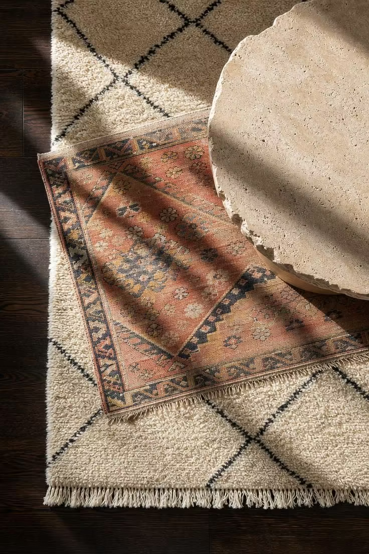
Layered rugs are the primary structural move beneath eclectic furniture groupings.
The floor plane becomes a composition in itself, not just a neutral support.
Pair a high-pile cream Moroccan Beni Ourain rug with minimal black geometry under a flat-weave kilim in clashing but faded colors.
The Beni Ourain's soft, deep pile and the kilim's crisp, flat surface create physical and visual contrast.
A round travertine coffee table anchors the layered composition with a material that is neither textile nor wood.
Stone, wool, and flat-weave cotton sit in three different textural registers.
Placing one rug slightly off-axis interrupts the room's rectangular grid.
The small angle makes the arrangement feel lively rather than rigid, as if the rugs have settled naturally over time.
Pull the kilim's coral into a single cushion across the room.
Leave the Beni Ourain's cream to echo the sofa upholstery, creating two separate color connections from the floor upward.
A non-slip underlay matters when layering flat-weave over high-pile wool.
Without it, the top rug slides out of position after a few days of walking and shifting furniture.
Bright midday light exposes texture with unusual clarity.
Pile variation, knots, and the irregular stone edge all read more vividly in strong, directional light than in soft or dim conditions.
Keep the top rug smaller by at least 18 inches on each side.
That visible border of the base layer preserves the layered effect and keeps the Beni Ourain from disappearing entirely.
Style Blueprint:
- Base layer: cream Moroccan Beni Ourain rug with black diamond lattice
- Top layer: vintage Turkish kilim in faded coral, ochre, and indigo
- Object: round travertine coffee table with chipped edge
- Floor: original dark hardwood
- Lighting: bright midday window light raking across rug pile
Chartreuse Curved Bench Beneath Woven Pendant Lights
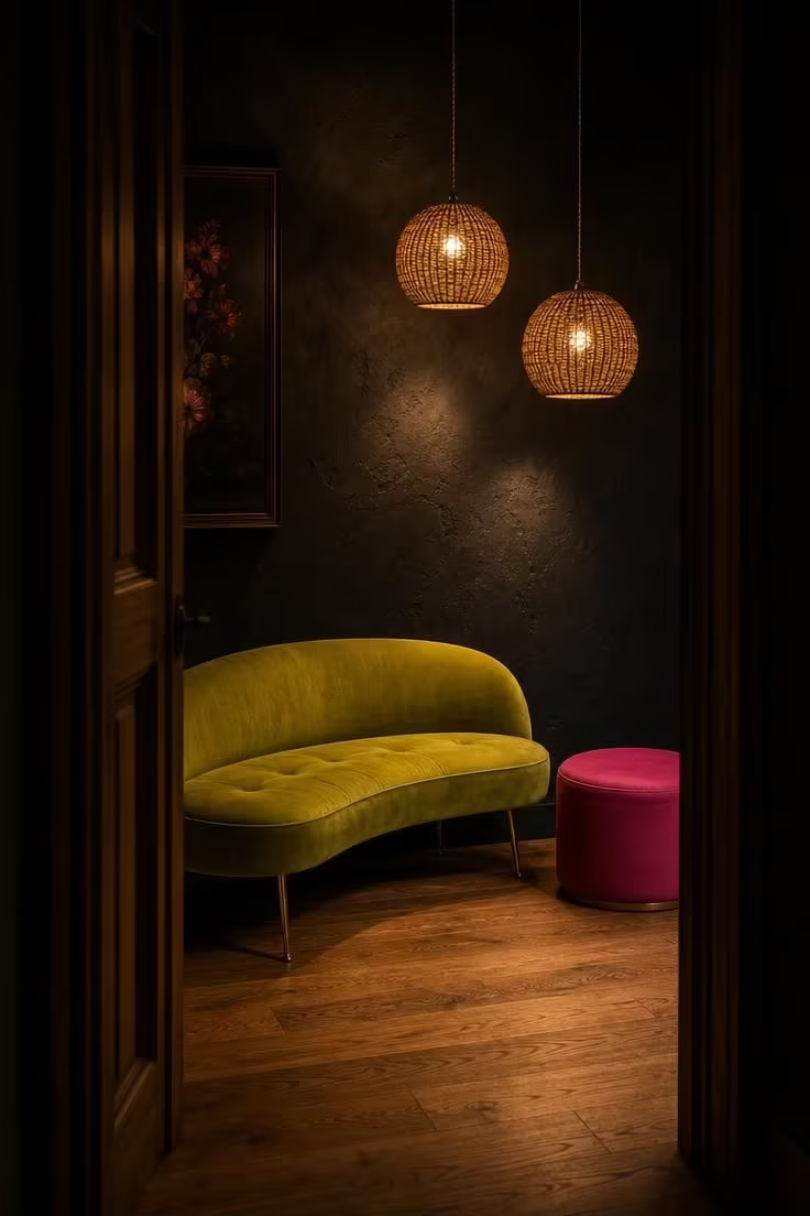
Chartreuse works as a high-voltage accent against a deeply saturated, moody wall.
The contrast is strong without competition because the bench is bright and the wall is dark.
A curved bench reads as furniture-as-object rather than as standard seating.
Its silhouette has sculptural power that a rectangular piece would not deliver in this shadowy corner.
Woven rattan pendants bring warm, natural counterweights to a bright, synthetic-feeling color.
The material dialogue between rattan and velvet is tactile and unexpected.
Staggered pendant heights create vertical rhythm.
They draw the eye upward from the low bench line toward the dark wall above.
A hot pink ottoman introduces a small, unexpected clash with the chartreuse.
Both colors feel deliberate only because each appears in a contained dose rather than spread across the room.
Moody-low light makes the bench appear to glow from within.
Dim pools from the pendants fall on the velvet and leave the edges dark, a perfect strategy for a corner vignette.
Style Blueprint:
- Seating: curved chartreuse velvet bench with brass legs
- Lighting: paired woven rattan globe pendants at staggered heights
- Wall: deep charcoal or near-black plaster
- Floor: warm mid-tone oak
- Accent: small hot pink ottoman beside the bench
Hand-Painted Floral Wallpaper on a Single Focal Wall
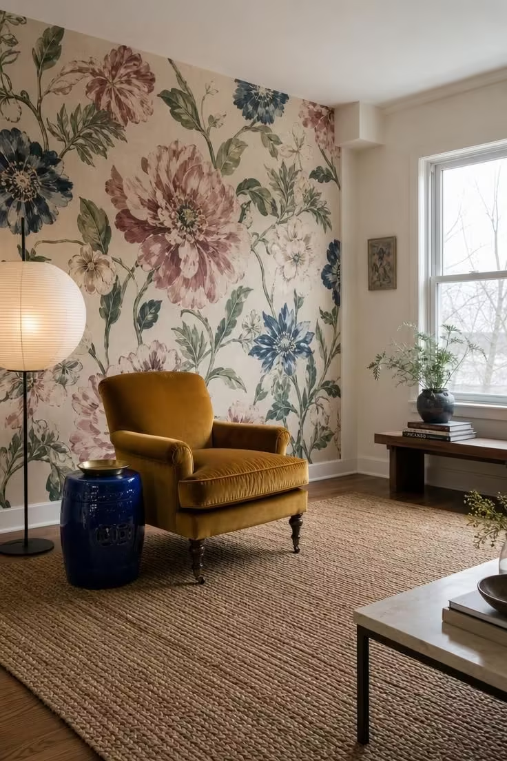
A single focal wall of dramatic floral wallpaper acts as both color and pattern anchor in a colorful eclectic living room.
The wall carries enough visual weight to organize the rest of the room around it.
Dusty pink, sage, and indigo in the wallpaper provide a ready-made color story.
Those three hues can reappear in furniture, textiles, and small objects throughout the room.
Choose a wallpaper with a cream ground rather than a saturated one.
A light ground prevents the wall from swallowing light and keeps even large-scale blooms from feeling oppressive.
The mustard velvet chair is the primary furniture response to the wallpaper.
Its solid color and soft texture sit comfortably against the busy pattern without trying to compete with it.
A seagrass rug brings neutral, textured floor coverage that does not fight the wallpaper.
The natural fiber tone echoes the cream ground of the paper while adding roughness underfoot.
A cobalt blue ceramic stool acts as the third color act.
It pulls indigo from the wallpaper into a three-dimensional object that the eye can move around.
The paper-shaded floor lamp provides soft, diffused lighting that keeps wallpaper colors from glaring under cool-overcast light.
Harsh spot lighting would flatten the hand-painted quality.
Once a single wall carries this much pattern, the rest of the room should remain relatively quiet.
Plain walls, simple curtains, and restrained decor let the wallpaper lead without distraction.
A wide shot captures the wallpaper's scale while showing that it anchors only one wall.
The frame of view makes clear that the pattern is a deliberate accent rather than an all-over treatment.
Style Blueprint:
- Wall treatment: single accent wall in hand-painted floral wallpaper, large-scale blooms
- Seating: mustard velvet chair with turned wood legs
- Flooring: natural seagrass rug
- Additional color source: small cobalt blue ceramic stool
- Lighting: white paper-shaded floor lamp
Terrazzo Side Tables Paired with a Hot Pink Ottoman
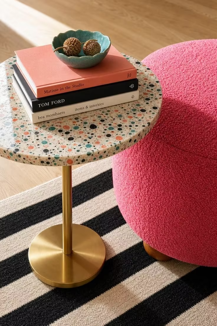
Terrazzo introduces multiple colors at once without becoming a solid block of any single hue.
The embedded chips do the work of adding color while the resin ground stays pale and light.
A hot pink ottoman works as a deliberate clash with terrazzo chips.
Each piece pulls one chip color into conversation, making the pairing feel intentional rather than random.
A brass stem on the table adds a reflective note that contrasts with the matte fabric of the ottoman.
The mix of shiny metal and soft boucle keeps the vignette visually active.
The black-and-cream striped rug underneath provides graphic grounding without adding another color.
Stripes read as pattern but behave like a neutral in this composition.
On the tabletop, a small stack of art books with spines repeating one terrazzo chip color creates a layered, thought-out moment.
Add a small ceramic bowl in another chip color to continue the conversation.
The table and ottoman should be similar in height and roundness to read as a pair despite different materials.
Matching silhouettes create a visual relationship between the two objects.
Bright midday light reveals terrazzo's embedded chips best.
Angle the shot to catch the slight gloss on the resin surface while letting the chips cast tiny shadows inside the material.
Style Blueprint:
- Side table: round terrazzo top with brass stem
- Ottoman: hot pink boucle or velvet, round, with wooden feet
- Floor: warm white oak
- Textile: black-and-cream striped flat-weave rug
- Decor: small stack of art books with terrazzo-toned spines
Design Pro-Tip: When styling open shelves in a colorful eclectic room, group objects by color until you see at least three items sharing a similar undertone. That grouping gives the eye a resting place and makes the shelf feel collected, not chaotic.
Sage Green Walls Framing a Rattan Bookshelf with Trailing Pothos
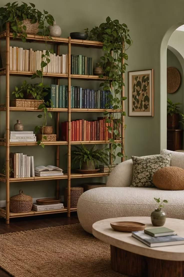
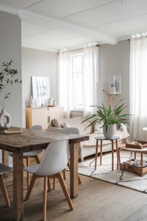
Sage green acts as a botanical neutral.
It is muted enough to serve as a backdrop yet colored enough to feel intentional behind the shelving.
Rattan open shelving partners naturally with sage because both materials carry an organic, slightly vintage quality.
The pairing feels as if the two belong to the same climate.
On the shelves, books arranged by color family create visual order.
Handmade ceramic objects and small plants break the horizontal lines.
Each shelf becomes a small composition rather than just storage.
Trailing pothos softens shelf edges and introduces a natural green variation against sage.
The plant's living drape adds movement and keeps the shelving from reading as static carpentry.
The low cream sofa is the quiet anchor that grounds the room's center while the bookshelf provides vertical drama.
One high mass and one low mass balance each other across the frame.
A jute rug brings warm, neutral texture that ties wood, rattan, and sage together without adding another strong hue.
It behaves like a soft floor that connects all the organic materials.
Soft-diffused light flatters sage and rattan, which both read best without harsh shadow lines.
Direct sun would create busy patterns on the already textured shelf surfaces.
A tall bookshelf on one side needs a lighter, lower mass on the other.
The sofa plus a large plant accomplishes that balance, keeping the room from feeling lopsided or top-heavy.
Style Blueprint:
- Wall color: matte sage green
- Storage: tall rattan and bamboo bookshelf with open shelves
- Plants: multiple trailing pothos and a medium-sized fern
- Seating: low cream boucle sofa
- Floor: jute rug over dark wood
Dusty Rose Plaster Fireplace Wall with Brass Sconces
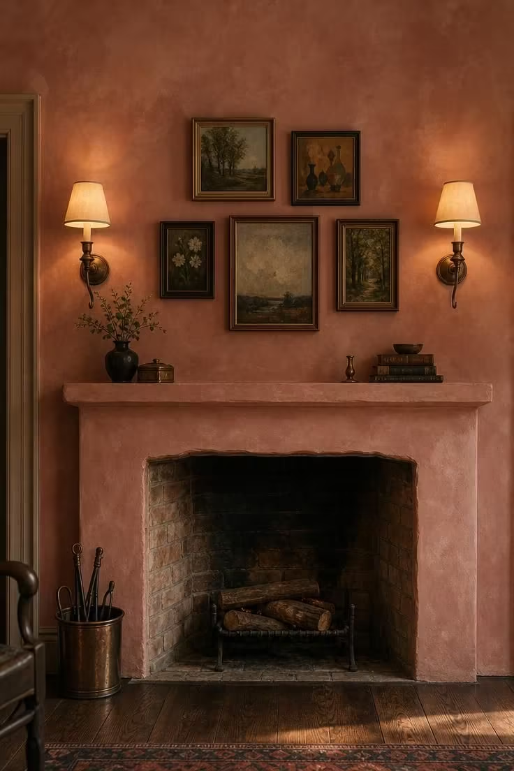
Dusty rose reads as sophisticated color rather than pastel.
It carries a fireplace wall without overwhelming the room, providing warmth without turning sweet.
Limewash or clay-based plaster creates visible depth and subtle tonal variation that flat paint cannot.
The material moves across the wall, revealing lighter and darker areas as light shifts.
Patinated, unlacquered brass sconces add a metallic gleam that responds to warm-golden light.
Their aged surface feels collected rather than polished.
Small oil paintings above the mantel form a tight cluster in mismatched wood frames.
The arrangement creates an intimate gallery moment without requiring a full-room commitment to art.
Dark walnut flooring anchors the rosy wall and prevents the fireplace area from feeling too one-note.
The dark floor offers a grounded counterpoint to the warm, light-filled plaster above.
Style Blueprint:
- Wall finish: dusty rose limewash or clay plaster
- Fireplace: original unpainted brick or plastered surround
- Lighting: two aged brass wall sconces with linen shades
- Decor: small oil paintings in mismatched wood frames
- Floor: dark walnut
Deep Teal Focal Wall with Copper Pendant and Sheepskin Chair
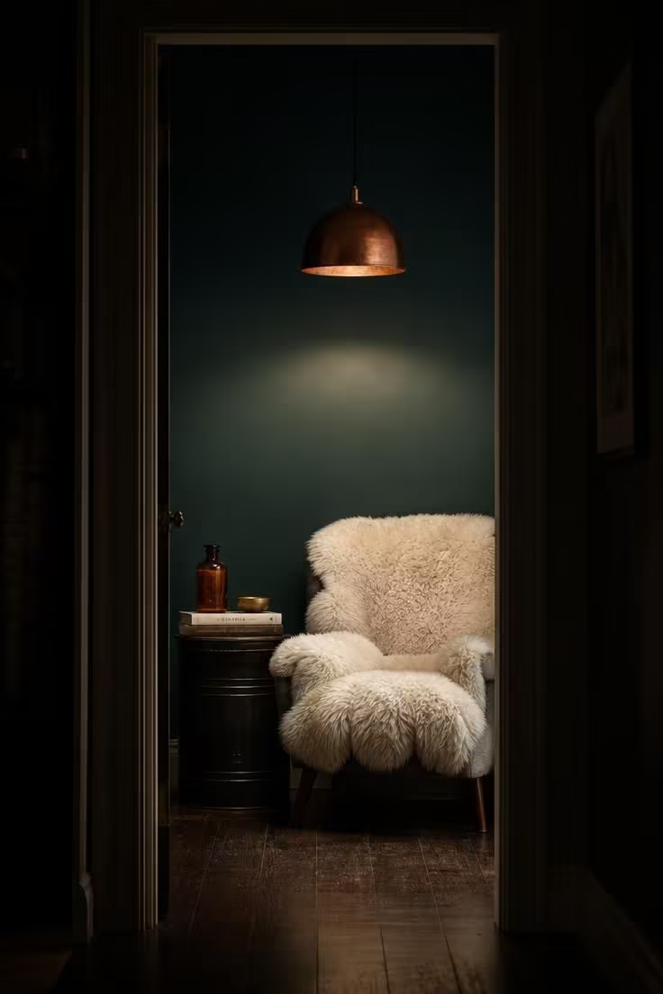
Deep teal acts as the moody anchor color that supports warm brass, copper, and amber accents.
The hue recedes without going fully black, holding the corner in shadowed color.
A copper dome pendant is the right light source because its reflective interior throws warm, focused light downward onto the chair.
The circle of light defines the seat as a separate space.
A sheepskin chair introduces textural softness against the hard metal and dark wall.
White sheepskin pops against teal, providing the only bright surface within the corner.
The black metal side table plays a nearly invisible support role.
Its dark finish lets the chair and light lead while keeping the composition stable.
Amber glass on the side table adds a small, glowing color note that echoes the copper and deepens the warmth.
Light collects inside the bottle, turning it into a tiny lamp of its own.
A moody-low light strategy uses one strong pendant pool of light and no overhead general lighting.
Shadowy edges keep attention on the chair and its immediate surroundings.
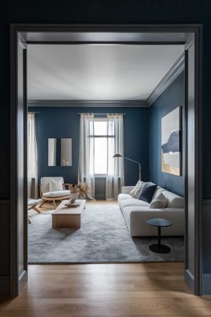
The doorway threshold view frames this corner as a separate room within a room.
It works best as a reading nook or conversation corner, separate from the larger living space.
Style Blueprint:
- Wall color: deep teal, single focal wall
- Lighting: copper dome pendant with warm LED bulb
- Seating: armchair draped with white sheepskin
- Side table: black metal drum with a small stack of books
- Decor: amber apothecary glass bottle and a small brass bowl
Design Pro-Tip: Let one object be the brightest thing in a dark corner. Whether it is a sheepskin chair, an amber bottle, or a pale lampshade, a single light-catching surface inside a moody palette gives the eye a clear place to land.
Antique Carved Armchair with a Tribal Textile Pillow
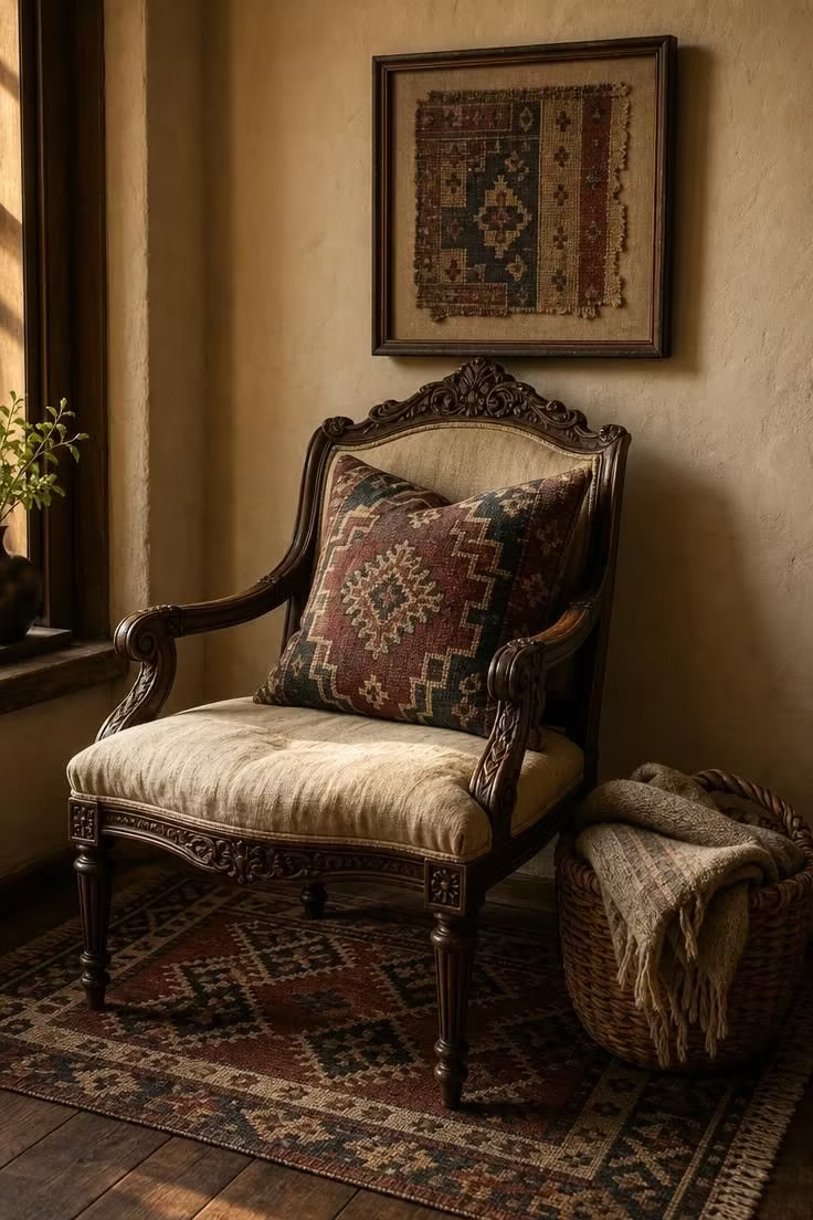
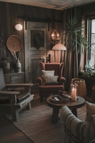
An antique carved armchair brings the weight of age and handwork into a colorful eclectic living room.
Its carved frame and worn finish add depth that a new piece cannot duplicate.
A tribal textile pillow in faded burgundy, indigo, and cream introduces pattern directly on the chair.
The pillow's old, soft colors work with the carved wood rather than fighting it.
The kilim rug under the chair adds a second pattern source.
Its muted tones keep the arrangement from feeling overly cluttered while still adding color.
A woven basket holding a folded wool throw reinforces the collected, functional quality of the corner.
The basket adds texture and gives the arrangement a practical purpose.
Framed vintage textile fragment on the wall echoes the pillow's colors and materials.
The repetition creates a visual link between the chair and the wall without making them match exactly.
Warm-golden light brings out the carved wood's depth and the pillow's faded hues.
The corner feels like a small portrait within the larger room.
Style Blueprint:
- Seating: antique carved armchair with dark wood frame
- Textile: tribal textile pillow in faded burgundy, indigo, and cream
- Floor: flat-weave kilim rug in muted tones
- Storage: woven basket with folded wool throw
- Wall decor: one framed vintage textile fragment
Lacquered Chest as a Bold Entry Table with a Handmade Ceramic Vase
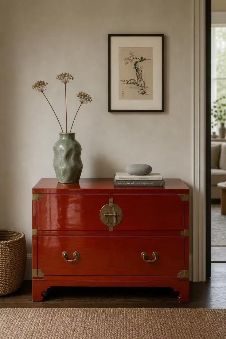
A lacquered chest steps beyond a plain wooden chest or console because the high-gloss finish turns the piece into a color block.
The surface catches and reflects light, making the red-orange hue feel more alive than a matte paint would.
Place a single handmade ceramic vase in sage green on top.
The vase's muted tone and organic shape provide a quiet counterpoint to the chest's high-shine surface.
Keep the top nearly clear.
A lacquered chest carries enough visual energy on its own, and a crowded arrangement would dilute the effect.
A small stack of books with a smooth river stone on top adds a grounded, natural touch.
The stone's matte, organic surface contrasts with the glossy lacquer below.
A woven basket in natural seagrass beside the chest introduces a raw, fibrous texture.
The basket softens the polished chest and makes the arrangement feel more lived-in.
The chest works as an entry table or landing spot near the living room's edge.
Its bold color defines a boundary without the need for a wall or partition.
Soft-diffused daylight shows the lacquered surface without creating harsh glare.
The finish should look rich and saturated, not blindingly reflective.
Style Blueprint:
- Furniture: glossy red-orange lacquered chest with brass hardware
- Decor: handmade ceramic vase in sage green with dried stems
- Floor object: woven basket in natural seagrass
- Wall: warm greige with a small framed ink drawing
- Surface styling: small stack of books with smooth river stone
Conclusion
A colorful eclectic living room succeeds when one quiet anchor holds the space while saturated hues and mismatched objects move around it.
The anchor might be a cream sofa, a pale rug, a dark wall, or a single large piece of furniture that refuses to compete.
Repeated color ties, even small ones, pull distant objects into relationship with each other.
Material contrasts such as glossy lacquer next to woven rattan or sheepskin next to copper give the room a tactile, layered quality that flat color alone cannot deliver.
The most inviting rooms of this kind feel as though every object was chosen with care but none were chosen to match.