This post may contain affiliate links. If you make a purchase through these links, we may earn a commission at no additional cost to you.
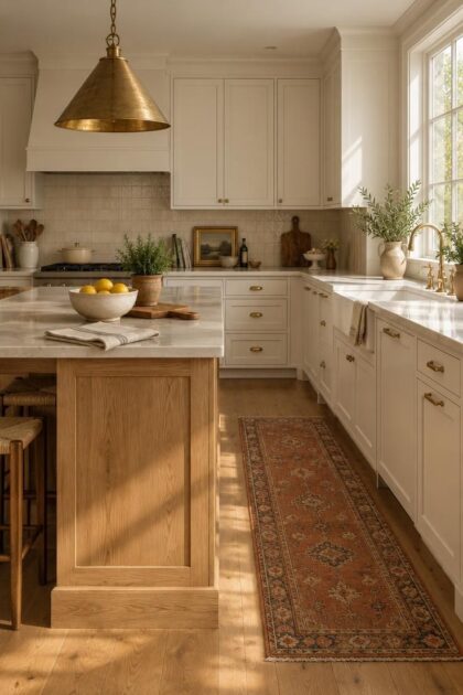
A white kitchen can feel bright and clean while still feeling unfinished, as though the room is waiting for someone to move in.
The paint usually is not the problem.
What is missing is warm material around the white: wood, stone with visible character, metals with a softer finish, and textiles in earthy tones.
Keep the white cabinetry you already like, then let those layers do the work.
The Numbers Behind the Shift From All-White to Warm Layers
Wood is gaining on white in kitchen cabinetry choices, and the margin is slim enough to be interesting.
Houzz’s 2026 kitchen trends data shows wood selected by 29% of renovating homeowners for cabinetry, just ahead of white at 28%, while the 2023 study had white leading at 40% and wood at 24%, according to Houzz’s kitchen trends reporting and the 2023 U.S. Houzz Kitchen Trends Study.
NKBA’s 2026 trends report places neutrals as the leading kitchen color family and notes that wood grain, especially white oak, keeps gaining ground against painted cabinetry.
Read those numbers together and the story is not that white is out.
Homeowners still choose white at high rates; they are adding wood alongside it rather than replacing it.
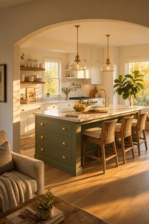
That is why a white oak kitchen island has become such a common answer for the middle of the room, where a large block of grain can carry warmth without touching the perimeter cabinets.
Start With a Warmer White Instead of Fighting Cool Paint
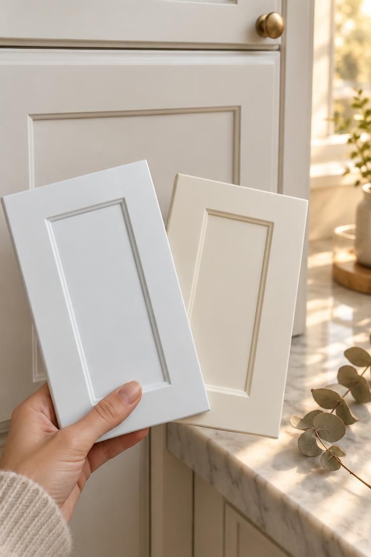
Not every white behaves the same way on a cabinet door.
A blue-white reflects whatever cool light reaches it, which is why some white kitchens look gray by midmorning and almost icy at night.
Creamy white, ivory, putty, and warm off-whites carry a trace of yellow, beige, or gray that keeps surfaces from reading as stark, and that shift alone can change how the whole room feels.
Testing matters more than the paint name.
A white that looks warm in a showroom can turn blue or gray in a north-facing room, so paint a few large samples and view them on the actual wall in daylight and again under the kitchen’s artificial light before committing.
The same logic applies to warm white kitchen cabinets you are ordering rather than painting, since a door sample viewed in your own space tells you more than a catalog swatch.
If painting or replacing cabinetry is not in the plan, this step can wait; the layers that follow will still work against the white you already have.
Design Pro-Tip: Compare a few large painted samples side by side on the wall for at least a full day, checking them in morning light, afternoon light, and after dark before you decide.
Bring In a White Oak Island as the Warm Counterbalance
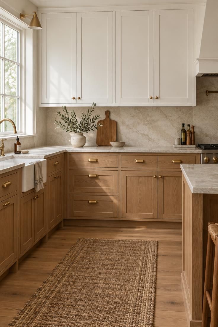
An island sits at the center of the room, so changing its material shifts the balance of the entire kitchen without touching a single perimeter cabinet.
White oak suits this job because of its color range, which runs from pale honey to a deeper golden tone depending on the cut and finish, and because its grain stays visible even on wide boards.
That visible grain does the warming work that a painted surface cannot, while the wood’s light value keeps the room feeling open rather than heavy.
There are a few ways to get there.
You can replace an island base with white oak cabinetry, add wood panels to the sides of an island you already own, or choose a freestanding table-style island that reads more like furniture than built-in casework.
Board width and finish tone are the two decisions worth slowing down for.
Narrow strips create a busier, more furniture-like surface, while wide planks let the grain run in longer lines; a matte or satin finish keeps the oak looking natural, and a high-gloss seal can make it look plastic and cool.
One or two wood tones in the kitchen read as intentional, but three or four unrelated ones start to look accidental, so treat the island as the anchor and match other wood elements to it.
Design Pro-Tip: Choose a matte or satin finish for white oak rather than a high-gloss one; the flatter sheen keeps the grain readable and the wood feeling natural under both daylight and evening light.
Use Aged Brass Hardware as Repeating Warm Sparkle
Small repeated details can shift a room’s temperature more efficiently than one large purchase.
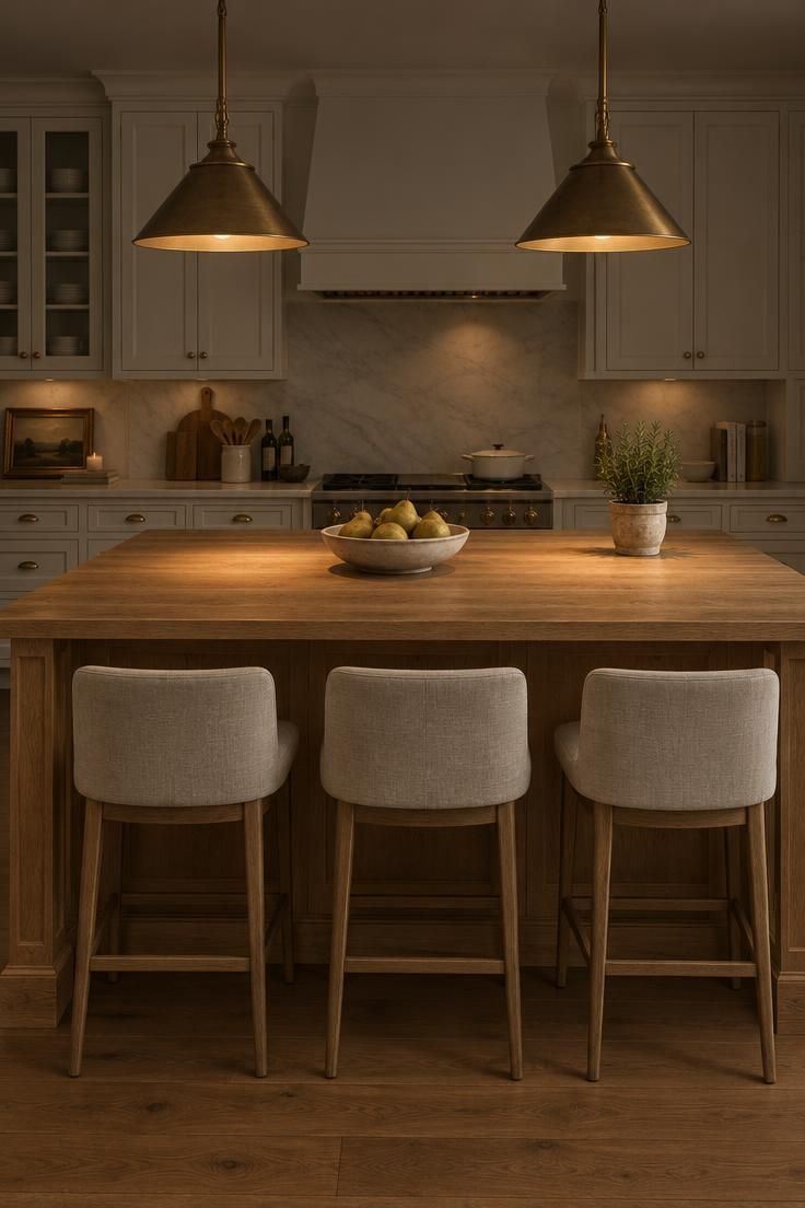
Aged brass kitchen hardware works this way: each pull and knob is a small point of warm color, and because hardware repeats across every cabinet door, those points add up fast.
The finish matters more than the metal itself.
Polished brass catches light in sharp highlights and can read as shiny and new, while aged and unlacquered brass have a softer, darker, slightly uneven tone that suggests a surface that has been handled.
Repeat the finish for coherence rather than spreading it everywhere.
Brass pulls, a brass faucet, and brass or bronze lighting create a family of related tones, and the room reads as considered even when the appliances stay stainless steel or matte black.
Matching every metal perfectly is not the goal; a deliberate mix usually looks better than a full set.
Design Pro-Tip: Gather every metal sample you are considering, including appliance finishes, and view them together in the room under both daytime and evening light before anything is installed.
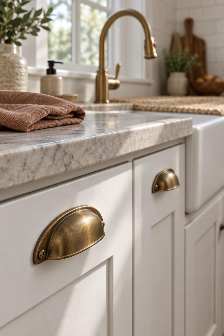
Warm Backsplash Ideas That Add Color Without Closing In
A backsplash covers a modest amount of wall, which makes it a low-risk place to introduce color and texture.
Handmade and zellige-style tile bring slight variations in depth and tone across each piece, so the wall shifts subtly with the light instead of reading as one flat plane.
Cream and ivory subway tile, soft beige or taupe stone, and terracotta accents all push the wall toward warm without demanding attention.
Full-height installations remain common; Houzz data shows 67% of renovating homeowners extend the backsplash to the cabinets or hood, per Houzz’s kitchen cabinet and countertop trends, which means the tile often becomes a larger visual field than a short splash would be.
That scale changes the tradeoffs.
A glossy white backsplash stays cool and flat, and on a full wall it can make the room feel clinical even when the cabinets are warm.
A handmade tile adds tonal variation that breaks up that flatness, but if the countertop and floor are already busy, the safest warm kitchen backsplash ideas are the quiet ones: a simple field tile with a slightly irregular surface and warm grout.
Design Pro-Tip: Choose a grout color with a warm undertone rather than bright white; grout lines cover much of the wall and subtly shift the overall tone of the installation.
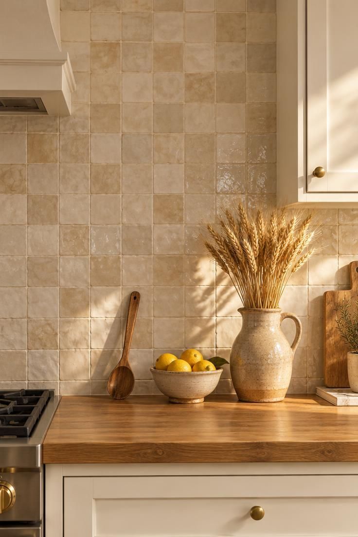
Ground the Room With an Earthy Rug and Textiles
Kitchens are mostly hard surfaces, which is part of why they can feel severe even when the finishes are beautiful.
An earthy kitchen rug and textiles soften that hardness by adding surfaces that give slightly underfoot and absorb some of the room’s echo.
A washable flatweave runner in terracotta, tan, rust, olive, or camel placed in front of the sink run is the most practical starting point, since it lands where you stand longest and where spills are most likely.
Beyond the floor, linen café curtains, Roman shades, upholstered counter stools, and woven baskets each add a different kind of softness, and they can echo tones already present in the backsplash or the wood.
Practicality decides more than appearance here.
A rug that cannot be cleaned will not survive a kitchen, so choose something machine washable or at least spot-cleanable, and keep the pile flat so chairs and stools move easily across it.
If you have been searching for how to warm up a white kitchen without repainting anything, textiles and lighting are the two changes that deliver the most visible difference for the least disruption.
Design Pro-Tip: Choose a runner with a subtle pattern rather than a solid color; the pattern hides crumbs and small spills between cleanings.
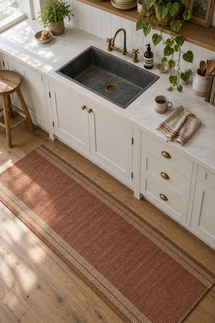
Choose a Warm Countertop Material Before Replacing the Cabinets
White cabinets tend to absorb the character of the countertop they sit against.
A pale quartz with gray veining can leave the whole room feeling cool, even when the cabinet paint is a soft cream and the hardware is brass.
Swapping the countertop to a warm stone, or choosing a warm stone look in a new kitchen, gives the white cabinetry a neutral partner that reads closer to sand or clay than to snow.
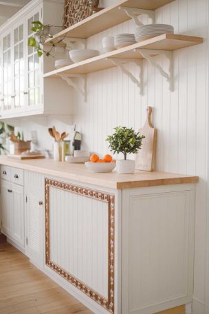
Soapstone, travertine, honed marble with tan veining, and wood-edge laminate all create that effect through different budgets and maintenance needs.
A deep honed quartzite with bronze and umber movement offers a quieter alternative to the usual white-and-gray slab.
The important move is selecting a surface with beige, taupe, rust, or honey undertones rather than blue or stark black veining.
Pairing that warmer counter with an unlacquered brass faucet and a woven fruit bowl on the surface gives the eye several warm anchors in a room that still keeps its white upper half.
Before committing to a full replacement, test a large sample panel against the cabinet paint and the floor.
Observe it under the kitchen’s evening lighting rather than only in daylight, because most people see the room after dark as often as they see it during the day.
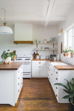
Design Pro-Tip: If a full stone swap is not in the budget, look at a butcher-block worktop in one zone, such as a coffee station or a short run beside the range, as a warm focal surface that still sits comfortably next to white cabinets.
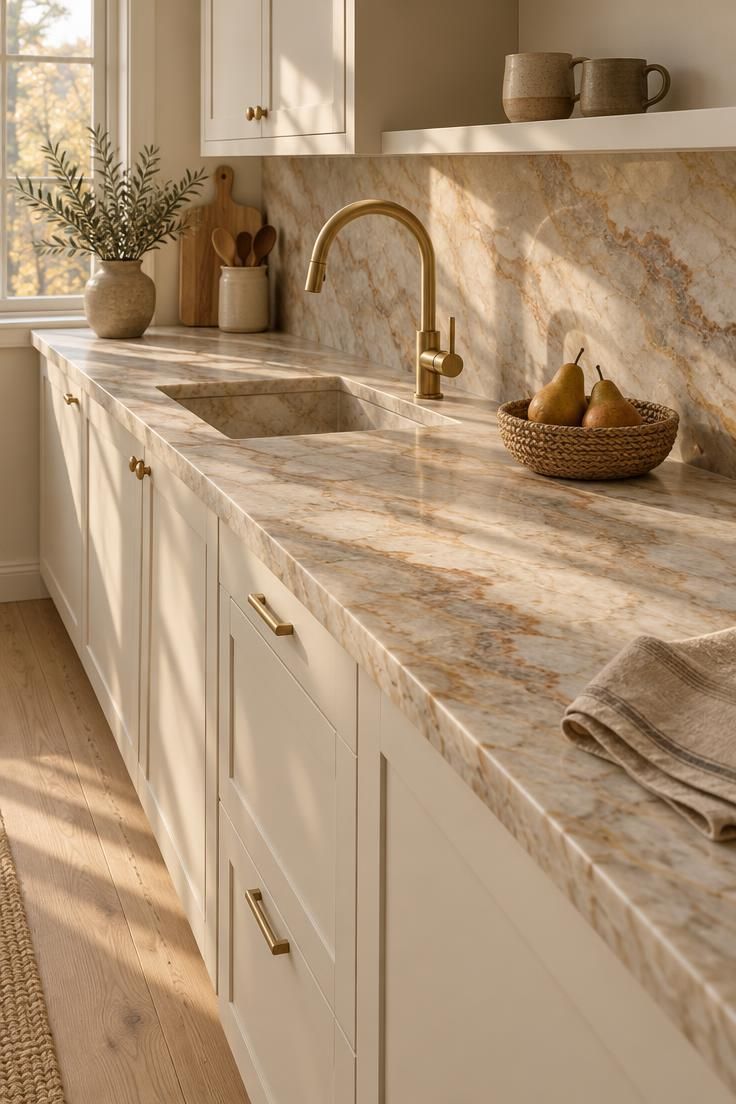
Why This Warm-Over-White Direction Makes Sense Now
The shift toward warmer whites and natural materials has a practical logic behind it.
Homeowners increasingly want kitchens that feel collected and comfortable rather than perfectly matched and showroom-like, and layered materials deliver that without giving up the brightness white provides.
Houzz’s 2025 emerging trends report points to rising interest in copper lighting, warm gold finishes, and vintage kitchens and hutches.
Those are search and survey signals about what people are looking at and choosing, not evidence of any effect on how a room makes anyone feel, and they are worth reading as direction rather than proof.
White remains the flexible backdrop it has always been; the change is in what gets layered against it.
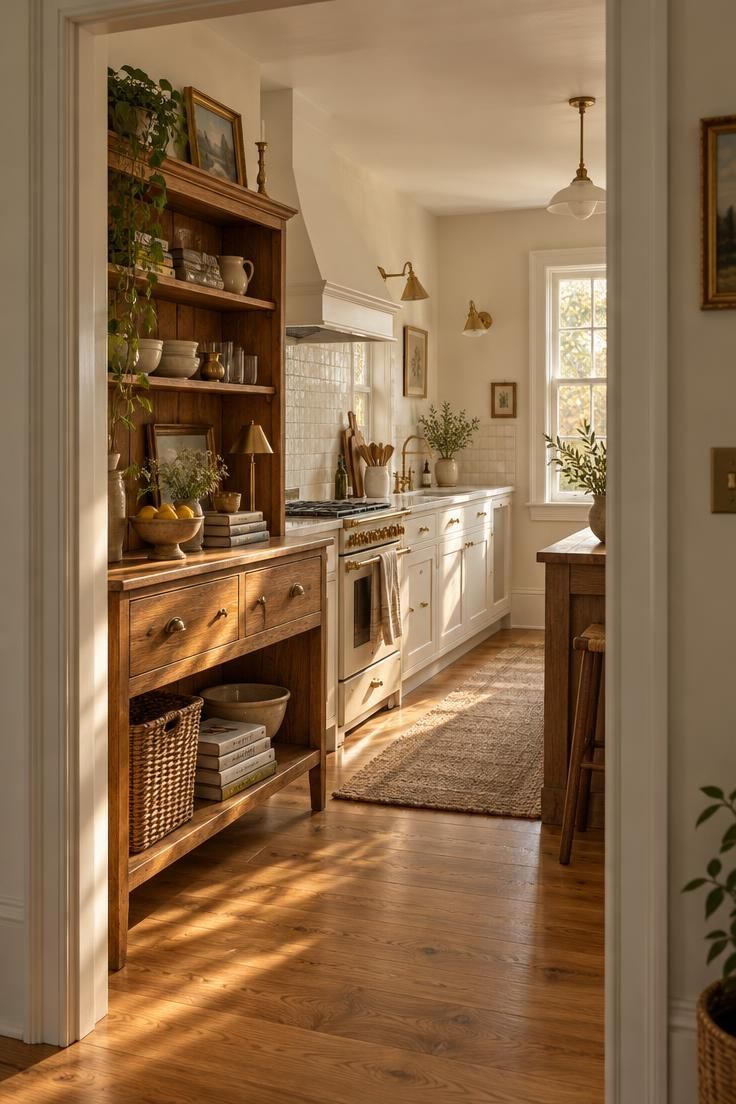
A Proportional Plan to Check Before You Buy
A rough ratio keeps a warm white kitchen from tipping into either sterility or visual clutter.
One workable guideline is about 60% light neutrals across cabinets, walls, and major surfaces, about 20% wood or another natural material in floors, island, shelves, or stools, about 10% warm metal in hardware and lighting, and about 10% color and texture in rugs, art, pottery, and plants.
The numbers are a checkpoint, not a rule.
Look at your kitchen as it stands and estimate which category is overrepresented or missing; a room with white cabinets, white counters, white walls, and pale gray floors is heavy on the first category and thin on everything else.
Then choose one element from each underweighted category instead of buying items at random.
A single wood element, one warm metal family, and one earthy accent color often accomplish more than a cart full of small accessories.
Design Pro-Tip: Compare the kitchen in daylight and again in the evening to see which areas still read cold before you shop.
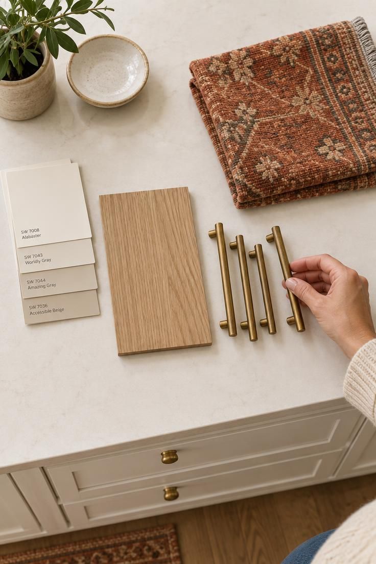
Common Mistakes That Make a White Kitchen Feel Colder
Most cold white kitchens come from a handful of avoidable decisions rather than one wrong purchase.
Using several unrelated wood tones is the most common, because each new wood introduces a different undertone and the room starts to look like a sample display; limit yourself to one or two wood tones and repeat them.
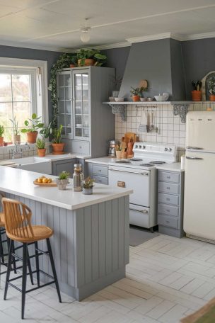
Pairing blue-white cabinets with gray countertops compounds the coolness, since both surfaces push toward the same blue-gray range; a warmer stone or a honed surface with cream or taupe veining breaks that pattern.
Relying only on bright overhead lighting flattens the room and leaves every white surface looking clinical, so add warm under-cabinet light and a decorative layer.
Adding many small objects to compensate for a cold design usually backfires, because clutter reads as noise rather than warmth; a few meaningful pieces in earthy kitchen rug and textiles, pottery, and plants do more than a crowded counter.
Matching every metal finish perfectly can make a kitchen look like a catalog set, and a deliberate mix of two finishes tends to read as more personal.
An impractical rug is its own trap: a beautiful flatweave that cannot be cleaned will not last in a kitchen, and a machine-washable option in a muted earth tone will serve longer.
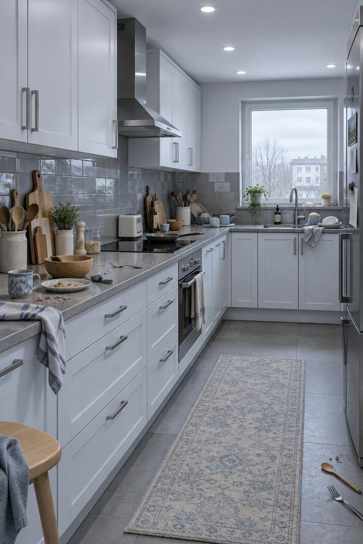
Conclusion
Warming up a white kitchen is a layering project, not a renovation.
Choose a warmer white as your base, add one strong wood element such as a white oak island, repeat an aged brass finish across hardware and lighting, ground the floor with an earthy washable rug, and shift your bulbs toward a warm color temperature.
If you can only do one thing today, change the under-cabinet and pendant bulbs, or put down a washable runner in a muted earth tone.
Then live with it for a week.
Notice which surfaces still read cold in the evening, and let that observation decide your next purchase, whether it is a wood shelf, a brass faucet, or a new backsplash.
The goal is a kitchen that stays bright and flexible while feeling collected, comfortable, and a little less perfect.