This post may contain affiliate links. If you make a purchase through these links, we may earn a commission at no additional cost to you.
A minimalist bathroom can fail in two directions at once: too much stuff, or too little warmth.
The rooms that feel calm rather than cold usually share a hidden discipline.
Someone decided what stayed, what left, and how the remaining pieces relate.
What Minimalism Looks Like in a Small Bathroom
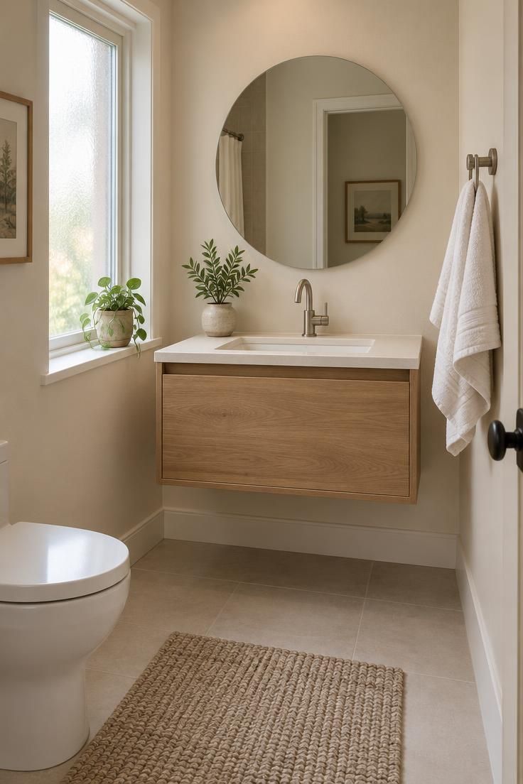
In a compact room, every surface competes for attention.
A wall, a countertop, a strip of floor beside the tub: each one either supports the room’s calm or interrupts it.
Two small bathrooms can share the same white walls and simple fixtures and still feel completely different.
One reads as deliberate.
The other reads as unfinished.
The difference usually comes down to material continuity and where the everyday items live when they are not in use.
Minimalism here is an editing discipline, not a subtraction exercise.
The useful test for any addition is simple: does this reduce visual noise or add to it?
Warm Minimalist Bathroom Color Palette
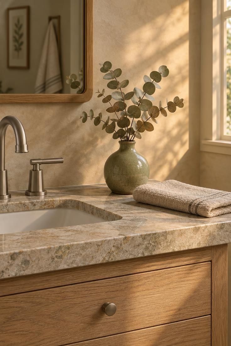
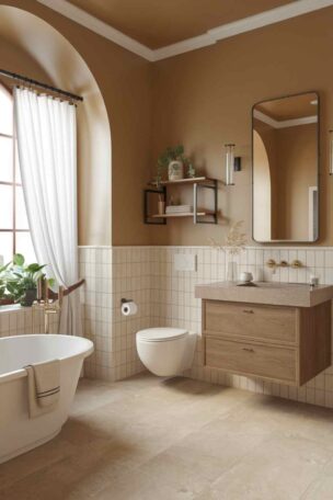
A warm minimalist bathroom color palette usually rests on two or three colors rather than many.
Start with a base of warm white, beige, taupe, greige, or soft clay.
Then choose one secondary material or tone.
Natural oak, walnut, matte black, or brushed metal each bring a different temperature to the same base.
One muted accent completes the scheme: sage, clay, charcoal, or a soft blue.
Knowing how to decorate a minimalist bathroom starts with accepting that the third color is a finishing touch, not a starting point.
All-white bathrooms with high-gloss surfaces tend to read as clinical.
The fix is not more color.
It is more texture: wood grain, honed stone, linen, handmade ceramic, or a plant suited to humid air.
Finish consistency matters as much as color count.
Too many cool grays, blue-whites, and glossy surfaces in one room split the light in ways that make the palette look accidental.
Choosing one dominant metal finish and repeating it is the quieter path.
Large-Format Tile for a Minimalist Bathroom
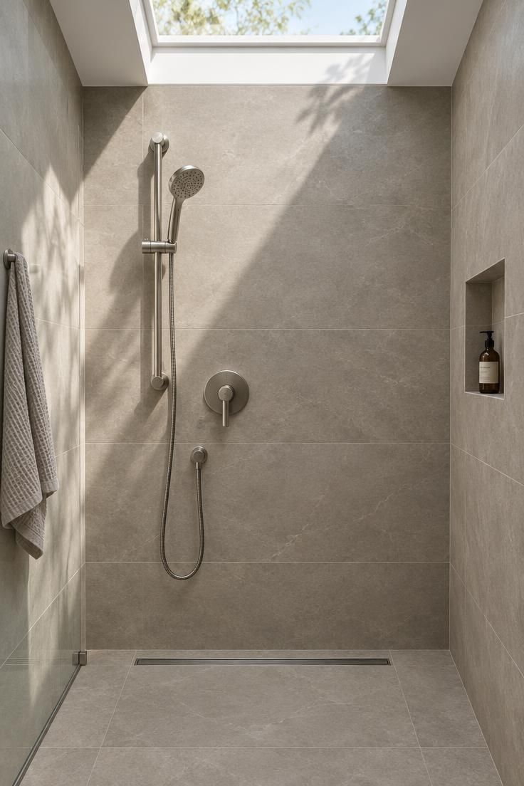
Large-format tile for a minimalist bathroom does one job especially well: it reduces the number of lines the eye has to process.
Fewer grout joints mean fewer interruptions across a wall or floor.
Continuous surfaces also change how a small room reads.
A shower wall that appears as one field rather than a grid of squares lets the space feel less segmented.
There is a real tradeoff.
Large tiles demand a properly prepared substrate and skilled installation, and uneven surfaces can show up across a wide format.
This is one of the few places where the technical side genuinely affects the decorating decision, so it is worth discussing with whoever handles the work before committing to a size.
Grout color carries more weight at this scale.
Matching grout to tile produces the calmest result.
A mid-tone grout is often easier to live with than pure white, while a contrasting grout turns the tile pattern into a feature.
Not every minimalist bathroom needs tile everywhere.
Microcement and plaster-look finishes offer a softer, more continuous surface with a different kind of quiet.
Layered Lighting for a Minimalist Bathroom
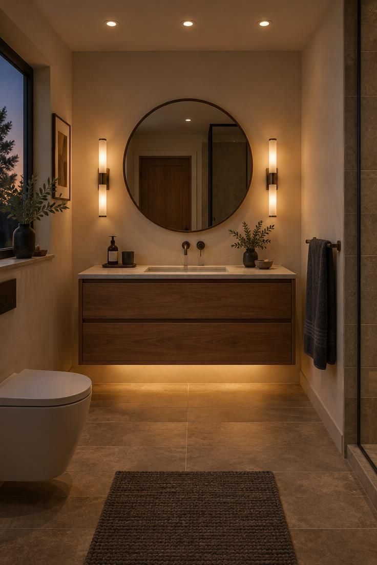
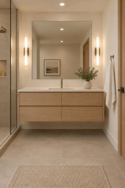
Layered lighting for a minimalist bathroom does more aesthetic work than in almost any other room.
With fewer objects to carry interest, light itself becomes part of the composition.
Three layers cover the practical range.
Ambient light from recessed ceiling fixtures or a low-profile flush mount sets the overall level.
Task light from vertical sconces on either side of the mirror or a backlit mirror handles the face-on view.
Accent light from under-vanity strips or niche lighting adds depth without adding objects.
Sconces beside the mirror are generally more flattering than a single fixture above it.
Light arriving from the sides softens shadows across the face in a way that overhead light does not.
This is a visual effect, not a health claim.
Color temperature is a design decision worth making consciously.
Warm-to-neutral white in the range of roughly 2700K to 3500K tends to suit residential bathrooms, and the warmer end keeps stone, wood, and ceramic looking like themselves rather than blue.
Pedestal Sink with a Closed Laundry Cabinet
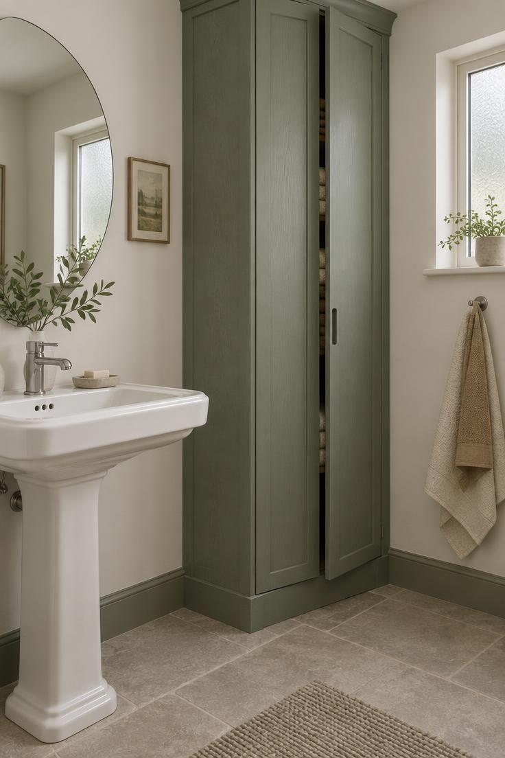
For floating vanity storage trade-offs, a pedestal sink offers less visible storage than a floating vanity, but it can still anchor a calm bathroom.
The trade-off becomes workable when a separate closed cabinet absorbs the daily essentials that would otherwise gather around the basin.
Keeping the sink area visually light makes the room feel less crowded than a wide countertop or a bank of drawers.
The cabinet should match the room’s wall or trim color rather than contrast with it.
Matching the surround allows the tall storage piece to recede while still adding usable space for towels, cleaners, and spare toiletries.
Choose a cabinet with doors, not open cubbies, so the interior can be practical without demanding constant styling.
A slim profile fits beside a pedestal, and a floor-to-ceiling panel door can make a shallow unit feel intentional instead of like an afterthought.
A pedestal paired with closed tall storage suits a bathroom where the floor plan is narrow but the ceiling height allows a vertical cabinet.
It also works for households that prefer their counters bare and are willing to open a door rather than reach into a drawer.
The main limitation is reach.
Items used every day should go on the cabinet’s middle shelf, while bulk goods and extra linens move higher.
Minimalist Bathroom Storage Ideas for Small Spaces
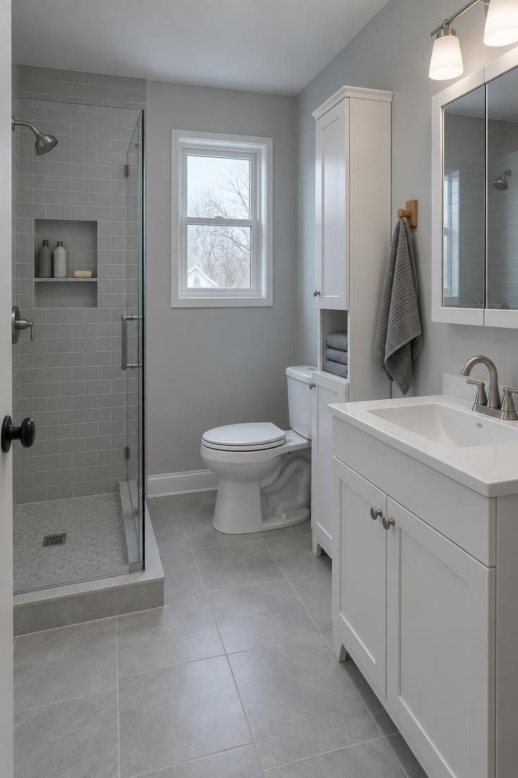
The most useful minimalist bathroom storage ideas for small spaces lean toward concealment.
A mirrored medicine cabinet replaces both a decorative mirror and a shelf.
A recessed shower niche holds bottles without a hanging caddy.
A tall, narrow linen cabinet uses vertical space beside the toilet that would otherwise sit empty.
Hooks and rails near the shower keep towels off the floor and off the vanity.
That single change removes more visual clutter than most decorative additions.
Open shelving can work if it is limited to a few intentional items: folded towels, a vase, a small container.
Everyday products on open shelves undo the calm the rest of the room is working toward.
Clutter control is the main factor separating a small bathroom that stays minimalist from one that drifts.
Storage decisions made early carry more weight than any finish choice made later.
A Single Open Shelf Styled by Hand
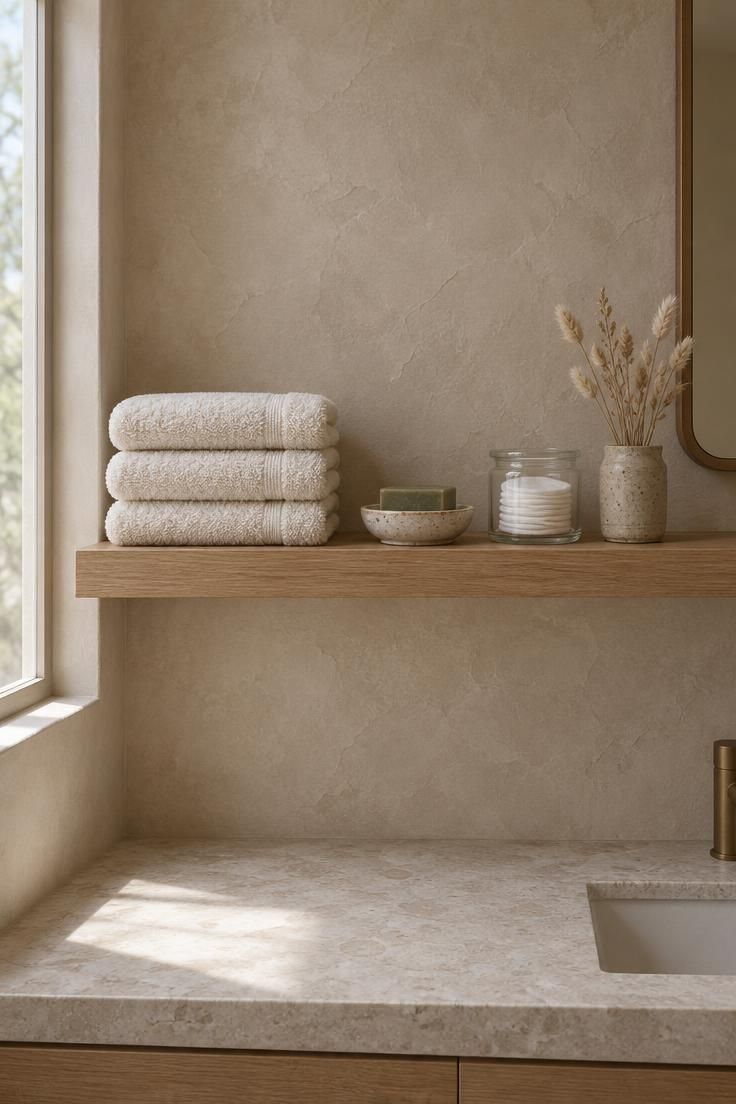
An open shelf can replace several decorative objects when the contents themselves become the artwork.
Fewer items arranged with space between them read as intentional, while the shelf offers a clear boundary that keeps the area from looking unfinished.
Everyday cotton rounds, soap, and a spare hand towel can sit out without becoming clutter because the shelf limits the available surface.
Items that perform a daily job earn their place more easily than purely ornamental pieces.
A small shelf works best when the objects share a common height range and material temperature.
Folded towels in cream, a speckled clay cup, and a pale oak board keep the composition quiet without matching too precisely.
One organic element is enough to break the horizontal line.
A single dried grass bundle or a short eucalyptus stem introduces an irregular shape that keeps the arrangement from looking too staged.
The shelf’s placement relative to the mirror, vanity, and light source shapes how the room feels from the doorway.
Setting it slightly lower than eye level helps the everyday items feel within easy reach rather than decorative.
Accessories That Edit Instead of Add
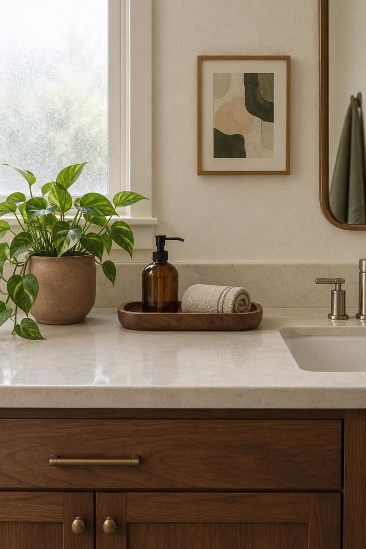
Accessories in a minimalist bathroom carry more visual weight than accessories anywhere else in the home.
With so little else on view, each visible object reads louder.
Three to five intentional items are usually enough.
A small plant suited to humid conditions, a stone or wood tray, one attractive soap dispenser, coordinated towels, and a single framed print placed away from the splash zone cover the range without crowding.
Grouping small necessities on a tray keeps a counter orderly without hiding everything.
The tray does the editing, so the individual items do not have to match perfectly.
The layered lighting for a minimalist bathroom covered earlier matters here too: accent light on the counter or in a niche gives these few objects somewhere to sit visually.
Each accessory should be both attractive and useful, and anything that fails either test is a candidate for removal.
Planning for Accessibility Without Losing the Look
A curbless shower entry, a built-in bench, and a handheld showerhead can be drawn into the room from the start rather than added afterward.
When their finishes match the rest of the scheme, they read as part of the design rather than as equipment.
Grab bars in a finish that matches the faucets and sconces blend into a minimalist room far more easily than chrome bars added to a bronze scheme later.
Lever handles and slip-resistant flooring follow the same principle: choose them alongside the other finishes, not after.
Planning these elements early tends to produce a more coherent result than retrofitting.
The visual logic of the room stays intact because nothing was inserted into a finished composition.
Budget Tiers: Where to Spend and Where to Hold Back
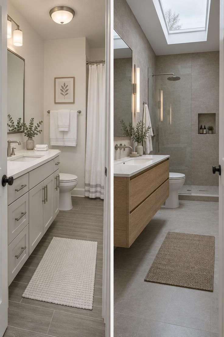
A low-cost refresh can change a bathroom more than its price suggests.
Decluttering the countertop, replacing mismatched accessories with a coordinated set, hanging a larger simple mirror, swapping cabinet hardware, painting the walls a warm neutral, and adding baskets to conceal products cover most of the visible surface area in the room.
A mid-range update opens up the vanity and the mirror.
A floating wood-tone vanity, a large frameless mirror, a new faucet, and retiling just the shower wall or vanity backsplash shift the room’s character without touching the layout.
A major renovation allows the room to be reconfigured: a larger shower, large-format porcelain tile throughout, a concealed niche with an integrated bench, layered lighting, and a wood-faced vanity with custom internal storage.
A coordinated palette and better storage accomplish more than expensive decoration at any tier.
The tiers exist to help match ambition to budget, not to suggest that the look requires the top level.
Common Mistakes and How to Correct Them
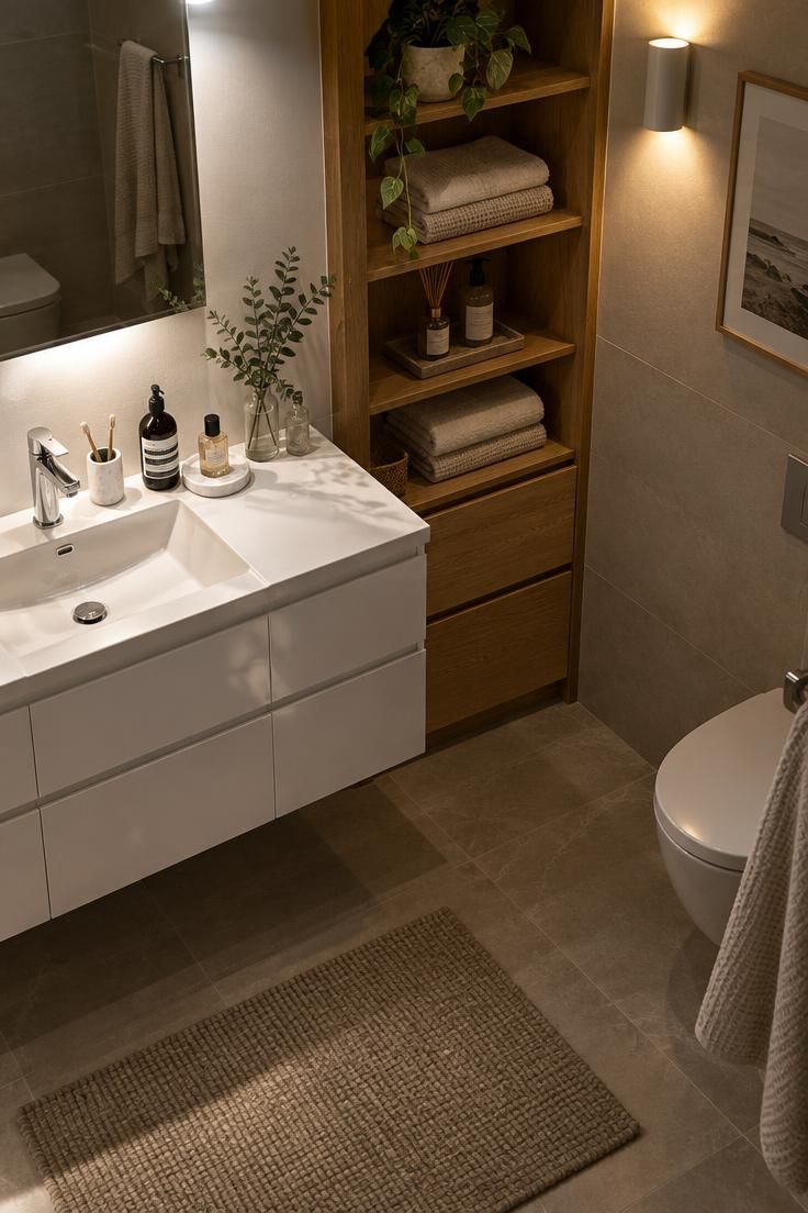
Too much white and gloss is the most common failure.
The correction is wood, stone, texture, or a warmer base color, not more decoration.
Prioritizing appearance over storage is the second.
Plan drawer count and concealed capacity before choosing finishes, and the room will hold its composure after a week of daily use.
Using too many materials splits the palette.
Limit the room to one tile, one cabinetry material, one dominant metal finish, and one accent.
Trendy fixtures over durable simple ones is a tradeoff rather than a rule.
Simple shapes tend to age well, and a faucet chosen for its silhouette rather than its moment usually stays satisfying longer.
Poor lighting flattens everything.
Layering ambient, task, and accent light fixes the shadows that a single ceiling fixture creates.
Practical details round out the list: ventilation, surfaces that clean easily, and enough towel storage.
These are decision criteria, not absolute rules.
Weigh each one against the room’s daily routine before committing.
Conclusion
A successful minimalist bathroom is not the room with the fewest objects.
It is the room where the necessary objects are well designed, well placed, and easy to use.
The core decisions form a flexible formula: a warm base color, continuous surfaces, mostly concealed storage, layered lighting, one dominant metal finish, and a small number of accessories that earn their space.
Start with storage and palette before anything else.
Get the drawers and the base color right, then add only what reduces visual noise.
The first thing to try is clearing the countertop completely and living with it for a few days.
What gets pulled back out reveals what the room actually needs.