This post may contain affiliate links. If you make a booking or purchase through these links, we may earn a commission at no additional cost to you.
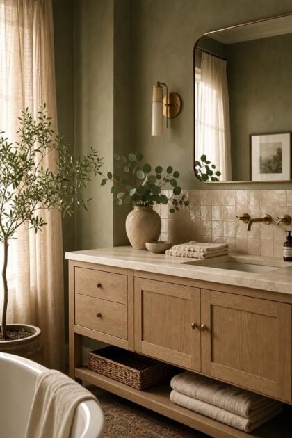
The bathroom is the one room where color does the quiet work of setting your mood before the day even starts.
The right palette can turn a plain, builder-grade space into somewhere you actually want to linger.
These bathroom color palette ideas range from soft, spa-inspired greens to deep, moody navies that feel rich after dark.
Each one pairs a wall color with the tile, wood, and metal finishes that make it sing.
Pick the scheme that matches the calm you want to come home to.
Sage Green Walls With White Oak Vanity and Cream Zellige Tile
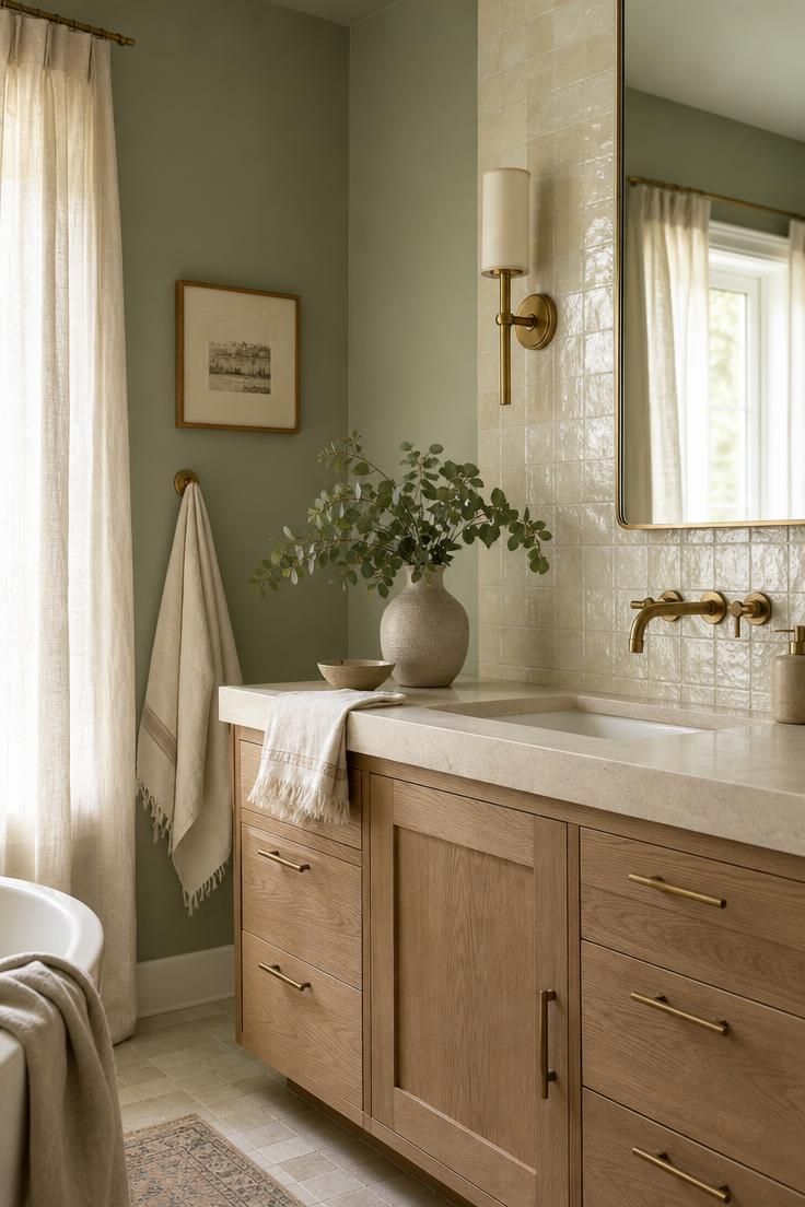
Sage green sits at the restful end of the color wheel, and that is exactly why it works so well on bathroom walls.
It reads as a soft neutral in the morning and deepens into something moodier once the lights come on.
Against a white oak vanity, the green feels grounded rather than cold.
Cream zellige tile adds a handmade ripple of texture that keeps the palette from looking flat.
A sage green bathroom flatters warm skin tones in the mirror, which matters more than most people expect.
Keep the metals warm, like brushed brass, and the whole room settles into an easy calm.
Style Blueprint:
- Sage green eggshell paint in a soft, muted tone
- White oak or light ash vanity with a natural finish
- Cream or off-white zellige tile for the backsplash
- Brushed brass faucet and drawer pulls
- Linen roman shade in a warm ivory
Deep Navy Vanity Against Crisp White Subway Tile and Brass Taps
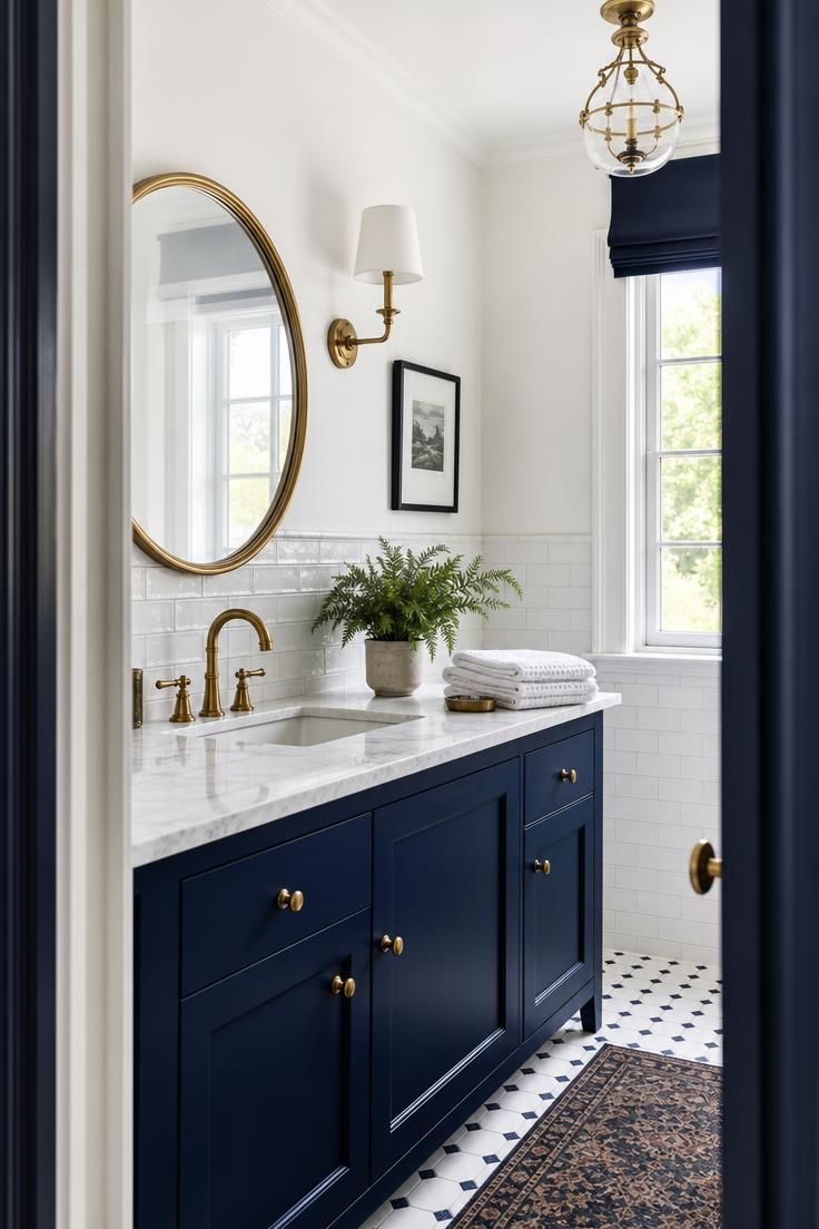
Deep navy is the classic choice when you want a bathroom that feels crisp and a little formal.
Paired with white subway tile, it creates the kind of high-contrast look that never goes out of style.
The trick is to let the navy anchor the lower half of the room, usually on the vanity or the wainscoting.
White walls above keep the space feeling open instead of heavy.
Unlacquered brass taps warm up all that cool blue and age beautifully over time.
A navy bathroom photographs well because the contrast gives the eye a clear place to land.
This is one of those bathroom paint colors that works in both traditional and modern homes.
Style Blueprint:
- Deep navy semi-gloss paint for the vanity
- Glossy white subway tile with white or gray grout
- Unlacquered brass or aged brass faucet
- White quartz or marble countertop
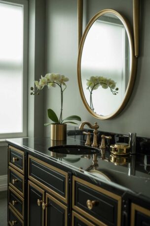
- A round mirror with a thin brass frame
Warm Terracotta and Cream With Unlacquered Brass Fixtures
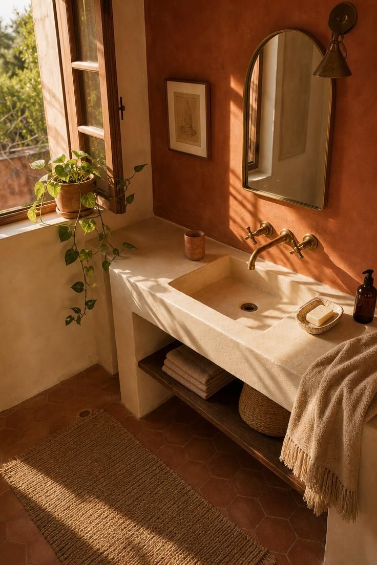
Terracotta brings a sun-baked warmth that few other colors can match.
Softened with cream, it moves away from anything loud and lands somewhere earthy and calm.
This palette leans Mediterranean, the kind you might find in a whitewashed villa with the shutters thrown open.
Warm bathroom colors like this feel especially good in rooms that get afternoon light.
The cream keeps the terracotta from overwhelming a small footprint.
Unlacquered brass fixtures pick up the orange undertones and tie everything together.
Add a few clay or stoneware accessories to echo the wall color in miniature.
The result feels collected over time rather than bought in a single trip.
Style Blueprint:
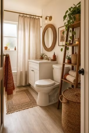
- Terracotta or muted clay paint for an accent wall
- Cream limewash or plaster on the remaining walls
- Warm brass or bronze fixtures
- Natural jute or wool bath mat
- Stoneware soap dish and tumbler in earthy tones
Charcoal Limewash Walls With Matte Black Hardware
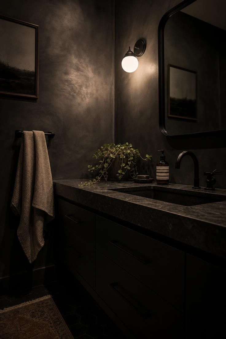
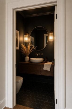
Charcoal is proof that dark bathrooms can feel cozy instead of cave-like.
Limewash paint gives the walls a soft, cloudy depth that flat paint simply cannot copy.
The subtle movement in the finish catches low light and keeps the room from feeling like a black box.
Matte black hardware disappears into the palette for a quiet, modern bathroom color scheme.
Small bathroom colors do not always have to be pale, and this look proves it.
A single warm bulb over the mirror turns the whole space into a jewel box after dark.
Style Blueprint:
- Charcoal limewash paint on all four walls
- Matte black faucet, pulls, and towel bar
- Warm-toned vanity light with a soft bulb
- Honed black or dark stone countertop
- A textured oatmeal hand towel for contrast
Design Pro-Tip: When you go dark, paint the ceiling the same color as the walls. Dropping the contrast at the top makes a small bathroom feel taller and more enveloping, not shorter.
Soft Blush Pink With Honey Oak and Aged Brass Accents
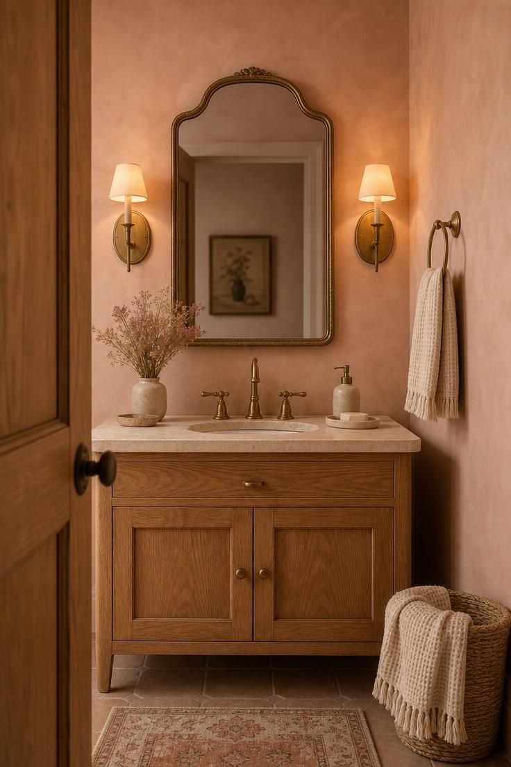
Blush pink has quietly grown up.
Gone are the bubblegum bathrooms of decades past, replaced by soft, dusty rose tones that read almost neutral.
Paired with honey oak, blush turns warm and grounded instead of sweet.
Aged brass accents add a hint of vintage polish.
This palette flatters everyone in the mirror, which is a real perk in a room built around one.
The warmth of the wood keeps the pink from feeling too delicate.
Blush works surprisingly well in windowless powder rooms because it reflects light with a gentle glow.
Layer in a few cream textiles to give the eye a place to rest.
It is a romantic look that still feels current.
Style Blueprint:
- Dusty blush or rose-beige paint
- Honey oak or warm walnut vanity
- Aged brass faucet and wall sconces
- Cream waffle-weave towels
- A vintage-style framed mirror
All-White Palette Layered With Marble, Linen, and Chrome
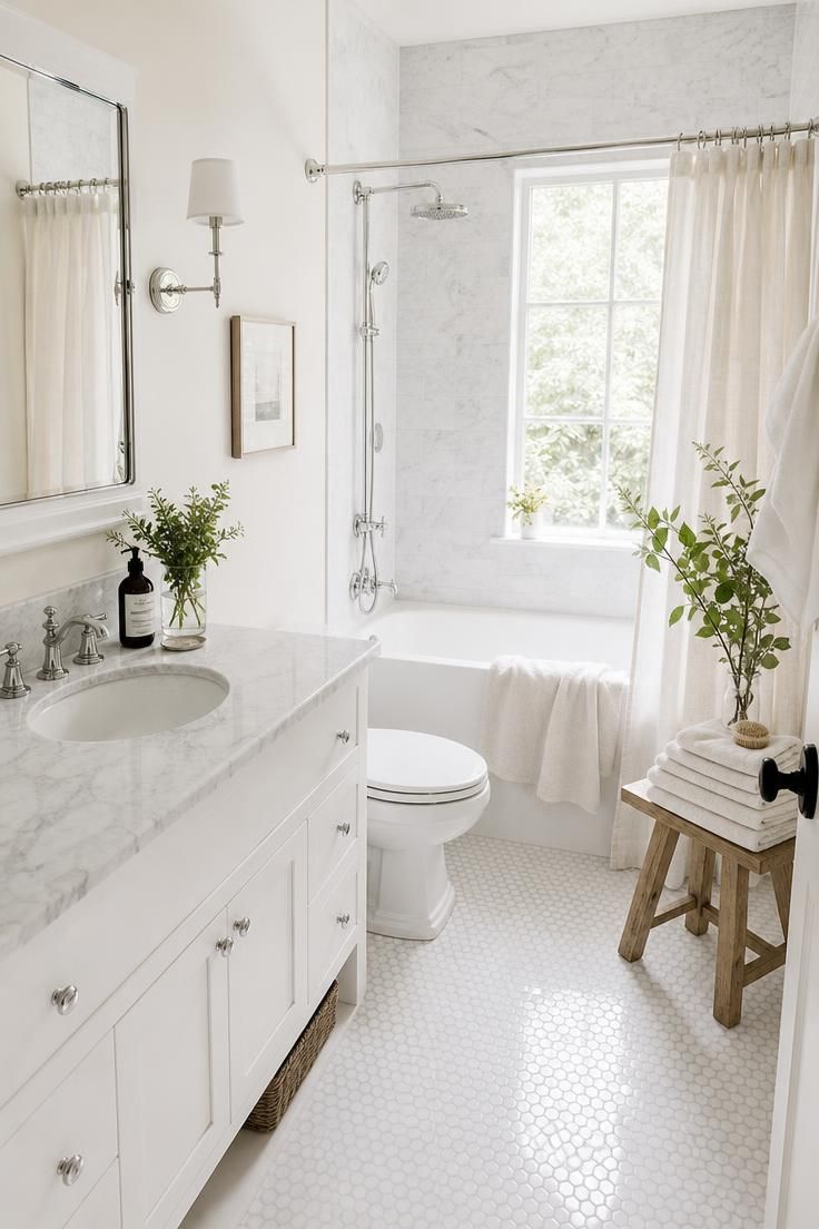
Sometimes the calmest palette is no color at all.
An all-white bathroom relies on texture to keep it from feeling clinical.
Layer marble veining, linen, and a little chrome, and the white starts to feel rich rather than plain.
This is the go-to scheme for making small bathroom colors feel bright and open.
The subtle difference between a warm white wall and a cool white tile adds quiet depth.
Chrome fixtures keep the look fresh and easy to clean.
Bring in a wood stool or a green plant so the room does not tip into sterile territory.
Style Blueprint:
- Warm white paint with a soft undertone
- White marble or marble-look countertop
- White subway or hexagon tile
- Polished chrome fixtures
- Natural linen shower curtain and towels
Emerald Green Vanity With Veined Marble and Gold Trim
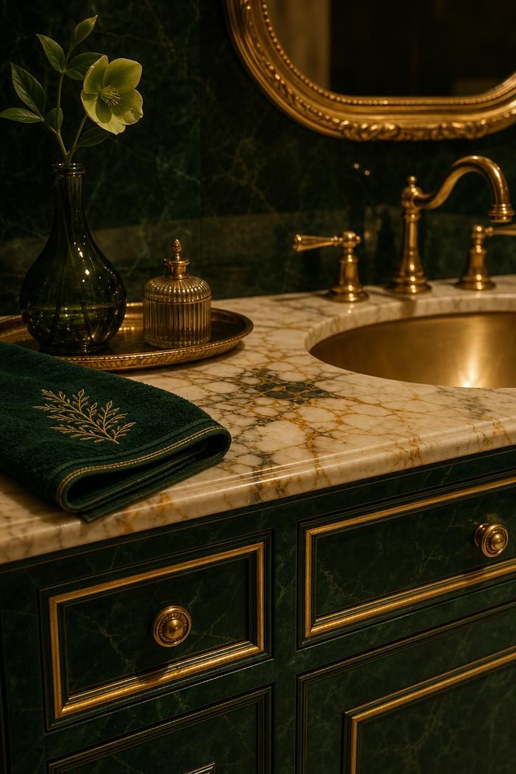
Emerald green is the palette for anyone who wants a bathroom that feels genuinely luxurious.
The depth of the color reads almost like velvet against pale marble.
Gold trim, whether on the mirror or the taps, gives the whole room a jewelry-box quality.
This works best as a color-drenched vanity rather than every surface, so the richness does not tip into heavy.
Emerald flatters warm marble with cream and gold veining especially well.
The palette feels most at home in a room with a bit of drama, like a powder room off an entryway.
Keep the lighting warm and slightly dim for the full effect.
It is bold, but the marble keeps the look elegant rather than loud.
Style Blueprint:
- Emerald green lacquer or satin paint on the vanity
- Cream marble with gold or amber veining
- Gold or antique brass faucet and mirror frame
- Warm, dimmable vanity lighting
- Plush emerald or forest hand towels
Greige and Taupe Walls With Travertine and Warm Nickel
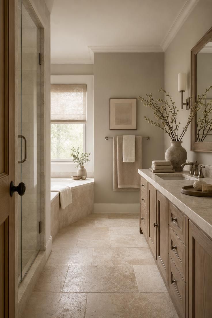
Greige is the color that solves arguments.
It sits right between warm beige and cool gray, which makes it endlessly easy to live with.
Paired with travertine and warm nickel, greige creates a soft spa bathroom palette that never feels dated.
These neutral bathroom colors work in almost any light, which is why designers reach for them so often.
The look is understated on purpose, the kind of calm that grows on you.
Style Blueprint:
- Greige or warm taupe paint
- Travertine tile or a travertine-look porcelain
- Warm nickel or champagne bronze fixtures
- Layered beige and ivory towels
- A simple wood-framed mirror
Design Pro-Tip: Test your bathroom paint colors on the wall for a full day before committing. Bathroom lighting and steam shift undertones more than any other room, and a swatch that looks warm at noon can read gray by evening.
Pale Blue Beadboard With White Trim and Polished Chrome
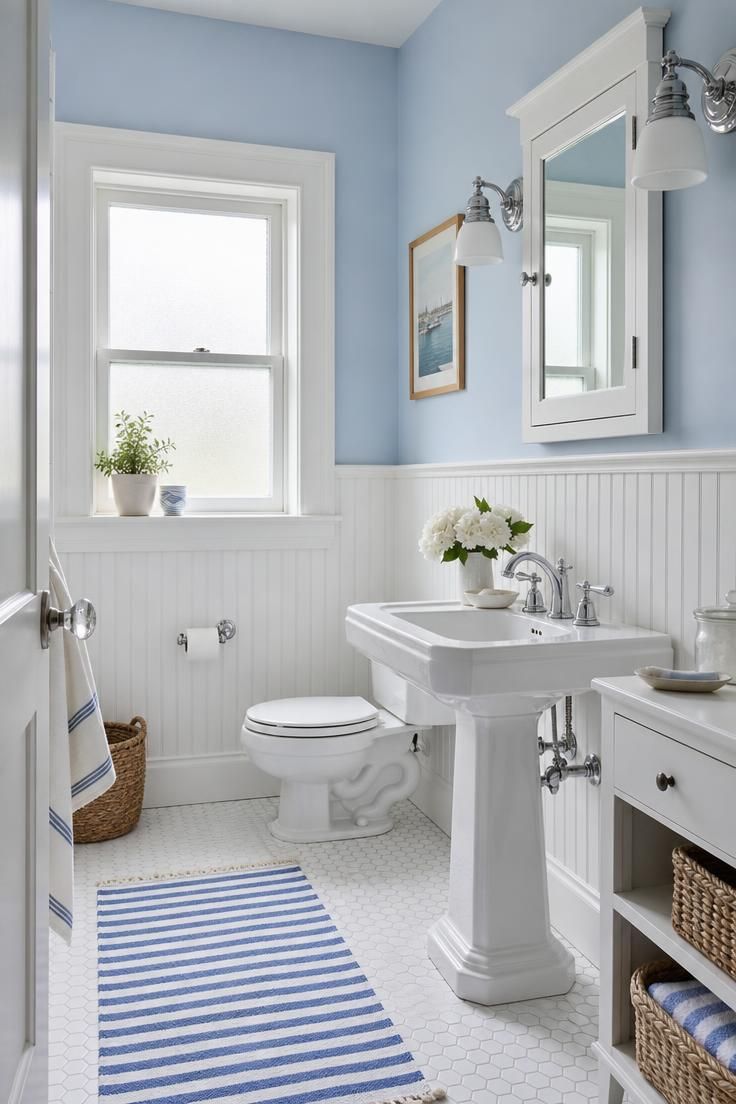
Pale blue is the coastal classic that always feels fresh.
Against crisp white beadboard, it reads clean, breezy, and a little nostalgic.
This palette leans into soft, overcast morning light and feels calm even on a gray day.
Polished chrome keeps the look crisp rather than rustic.
Pale blue is a smart pick for a family bathroom because it feels cheerful without being childish.
It also pairs beautifully with white bathroom tile colors like classic subway or small hexagons.
Add a few woven baskets for warmth and the coastal feel clicks into place.
Style Blueprint:
- Soft powder blue paint above white beadboard
- White beadboard or shiplap wainscoting
- Polished chrome fixtures
- White subway or hexagon floor tile
- Woven baskets and a striped cotton rug
Black and White Checkerboard Floor With Warm Wood Vanity
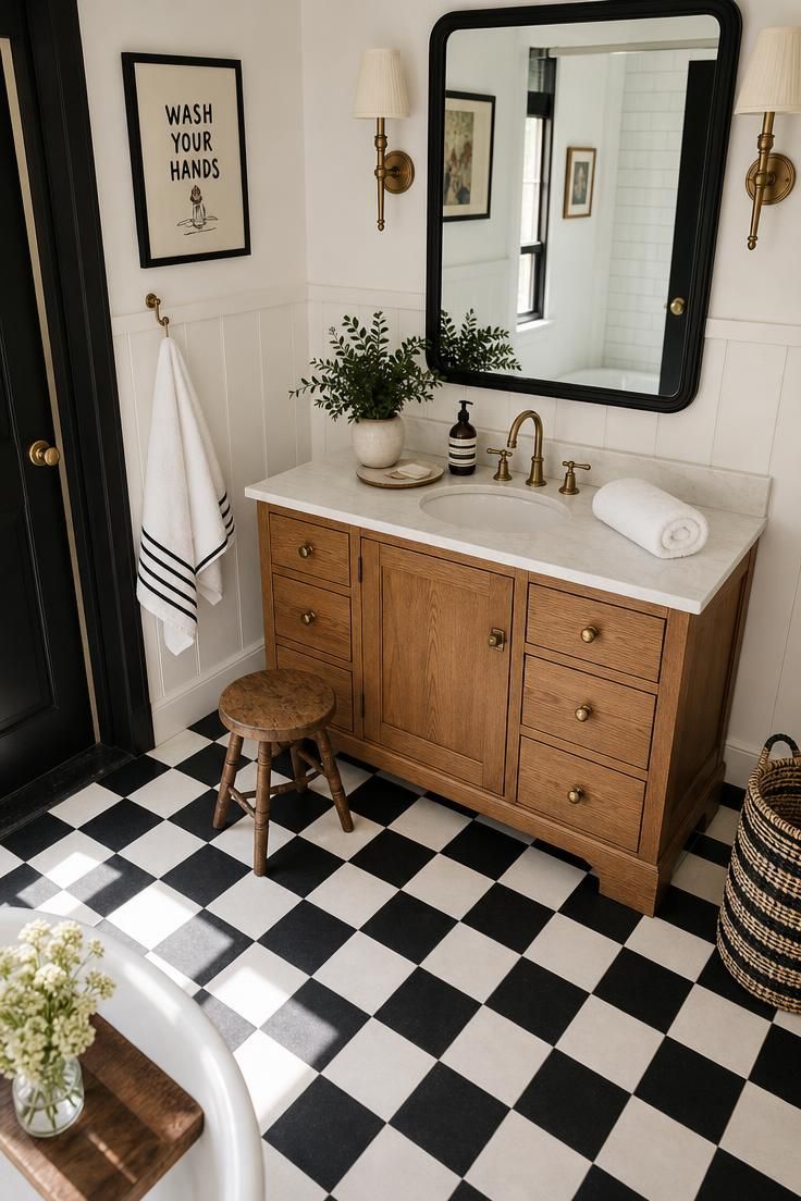
Black and white never really leaves.
A checkerboard floor gives a bathroom instant graphic energy and a hint of vintage charm.
The trick to keeping it warm is a wood vanity, which softens all that high contrast.
Warm wood tones stop the palette from feeling stark or cold.
This look makes a great bathroom accent wall moment if you tile just one wall in the checker pattern.
It is playful, classic, and endlessly photogenic.
Style Blueprint:
- Black and white checkerboard floor tile
- Warm oak or walnut vanity
- White walls with black hardware
- A black-framed mirror
- Brass or black sconces for warmth
Conclusion
The best bathroom color palette ideas are the ones that match the way you want to feel in the room.
Maybe that is the spa-like hush of sage and oak, or the crisp confidence of a navy bathroom.
Maybe it is the warm glow of terracotta or the quiet luxury of emerald and marble.
Start with the mood, then let the tile, wood, and metal finishes fall into place around it.
Whatever you choose, a thoughtful palette turns a simple bathroom into a small daily retreat.