This post may contain affiliate links. If you make a purchase through these links, we may earn a commission at no additional cost to you.
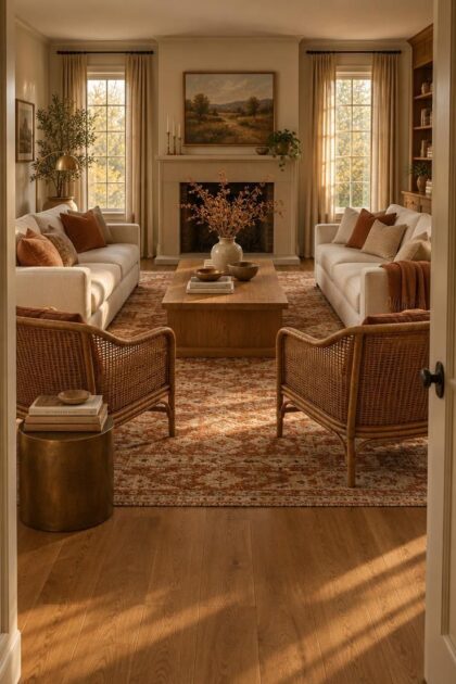
A living room can hold beautiful furniture and still feel wrong.
The sofa points at the television, the chairs sit marooned in corners, and guests end up clustered near the doorway because no one knows where to settle.
Arrangement, not square footage, decides whether a room invites people to stay and talk or quietly pushes them toward the next room.
The Fastest Test for Any Living Room Layout
Illustrative design concept created with AI assistance and reviewed by the Simple Spaces editorial team.
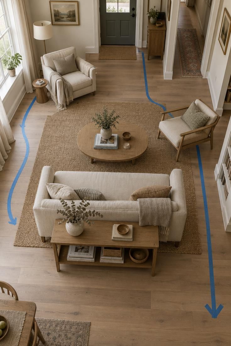
Before measuring anything, walk the room the way you actually use it.
Trace the routes people take: entry to hallway, sofa to kitchen, seating to window, chair to side table.
Notice where you hesitate or step around a corner.
Those small stumbles mark the real problems, and they often have nothing to do with the size of the room.
A walkway that cuts straight through the middle of a conversation group is the most common issue.
Two people are talking, a third person crosses between them with a laundry basket, and the conversation resets.
Shifting a single chair usually solves it.
Hesitation near a doorway tells a different story.
People pause there because the entry feels blocked or because they cannot read where the seating begins.
Angling the nearest chair or pulling the sofa a few inches forward can resolve that pause without removing a single piece of furniture.
This is where learning how to arrange living room furniture starts to feel less abstract.
The room tells you what is wrong if you move through it slowly and pay attention to your own feet.
Design Pro-Tip: Put a strip of painter’s tape on the floor to mark the intended walkway before moving anything, then walk the route again with the tape in place.
What Designers Are Choosing Instead of Sofa-Against-Wall
For generations, the default living room pushed every seat toward the perimeter, leaving a wide empty middle that nobody used.
That layout made sense when the fireplace or a formal display wall was the organizing feature.
It makes far less sense in a room meant for people.
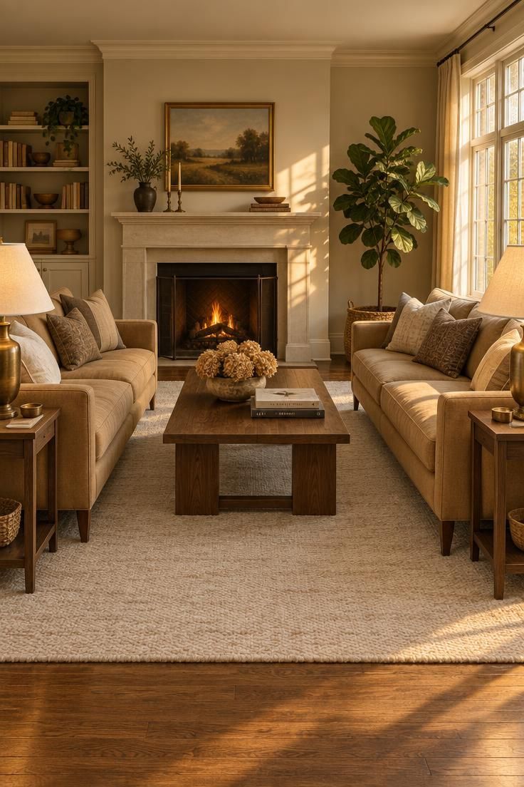
A 2025 Apartment Therapy survey of 154 designers found that 45 percent preferred two sofas facing each other, making it one of the clearest recent layout signals.
The arrangement is old, borrowed from eighteenth-century parlors, but its return says something about how people want to use the room now.
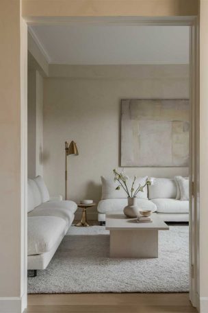
Two sofas facing each other creates an unmistakable social center.
When someone sits down, the room’s purpose is obvious: talk to the person across from you.
There is no screen to compete with and no dominant wall pulling attention away from the group.
The layout works best in rooms with enough width to leave a comfortable gap between the two sofas without crowding the coffee table.
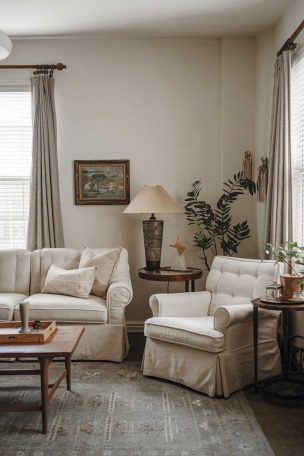
In a narrow room, the same idea can be scaled down to a sofa facing two armchairs rather than a second sofa.
Entertaining households tend to get the most from this arrangement.
Two facing sofas seat four people in genuine eye contact with one another, and the ends of each sofa extend the group without breaking it.
A room built around a primary television gets less from facing sofas unless the screen can be integrated quietly or hidden.
If most evenings center on shared viewing, another layout will serve better.
Two sofas facing each other also demands attention to the space behind each one.
A sofa back floating in open floor needs a finished look, whether from a console, a bench, or a piece of furniture on the far side.
The payoff is a room where conversation happens by default rather than by effort.
That is a real shift from the theater-style rows that dominated living rooms for decades.
Making Conversation the Focal Point, Even With a Television
Rooms rarely have only one job, and the television is usually part of the picture.
The question is whether it organizes the entire room or sits inside an arrangement built for people first.
If the screen is central to most evenings, giving it the main wall is a reasonable choice.
Center it on the seating group rather than on the wall itself, and keep glare from windows and lamps in mind when the seating faces it directly.
If conversation matters more, several options keep the screen available without letting it dominate.
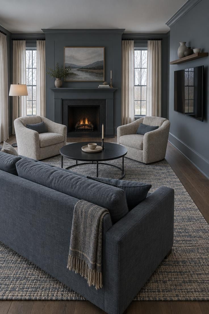
A television on a perpendicular wall lets the main seating face the fireplace or a window while the screen stays visible from an angle.
A swivel mount does similar work for rooms with multiple seating directions.
Concealment is another route.
A cabinet with doors, or a media console that reads as furniture rather than equipment, lets the screen disappear when it is not in use.
The room’s focal point then shifts to whatever sits on the main wall.
The most useful decision criterion is simple: count how often people sit and talk in this room versus how often they watch.
Let the more frequent activity shape the primary axis, and let the other use adapt around it.
One seat angled slightly away from the screen creates a small secondary pairing.
Two people can hold a conversation there while a show plays, without either person turning their back on the room.
Design Pro-Tip: Angle a side chair a few degrees away from the screen so it pairs naturally with the nearest sofa seat, giving the room a conversation option that does not require moving furniture.
Floating Furniture Away from Walls, One Step at a Time
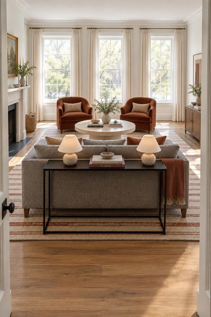
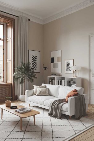
The single change that most often makes a living room feel intentional is pulling the main seating away from the wall.
Even a few inches of separation changes how the room reads, because the furniture stops looking stored and starts looking placed.
Floating furniture away from walls works on a simple sequence.
Choose a rug large enough to hold the seating group, place the largest piece first, then add chairs and tables around it.
The rug becomes the boundary of the room within the room.
Full floating, where the sofa sits well out into the floor, suits larger rooms with space to spare behind the seating.
Partial floating, where the sofa moves a modest distance from the wall, suits almost any room and delivers most of the visual benefit.
The tradeoff is real.
Floating seating gives up easy access to the wall behind it, which may matter if outlets, shelves, or a radiator live there.
In a small room, pulling the sofa too far forward can make the remaining living room walkway clearance feel tight.
A slim console behind the sofa turns that lost wall access into a useful surface.
Lamps, books, and a tray for keys all land there, and the sofa back gains a finished edge instead of a bare rear view.
Once the group is floating, the arrangement tends to stay put because it has an internal logic.
The rug holds it, the coffee table centers it, and the seating faces inward rather than outward at the walls.
Anchor the Seating Group With a Console or Bench
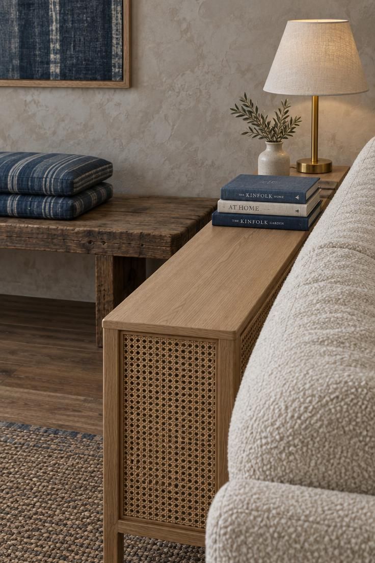
The back of a floating sofa is a design opportunity that most rooms waste.
A narrow console, a low bench, or a row of floor cushions turns empty rear space into something the room uses.
A console adds the most function.
It provides a surface for lamps, books, and a bowl for keys, and it gives the sofa back a clean horizontal line.
Painted wood keeps it casual, cane softens the look, and matte metal reads more architectural.
A low bench offers a different trade.
It provides overflow seating for gatherings and a place to set a tray, and it sits low enough that it does not block sightlines across the room.
A row of floor cushions behind the sofa keeps the profile lowest of all.
This choice suits casual rooms and households with children, where flexible seating on the floor gets used more than anyone plans.
Material choices should follow the surrounding palette rather than announce themselves.
A console in the same wood tone as the coffee table ties the group together, while a contrast finish in black or aged brass adds a deliberate accent.
The right pick depends on what the room lacks.
Rooms short on surface area want a console.
Rooms that host groups want a bench.
Rooms that feel stiff want the cushions.
Use a Corner Table as the Flexible Extra Seat
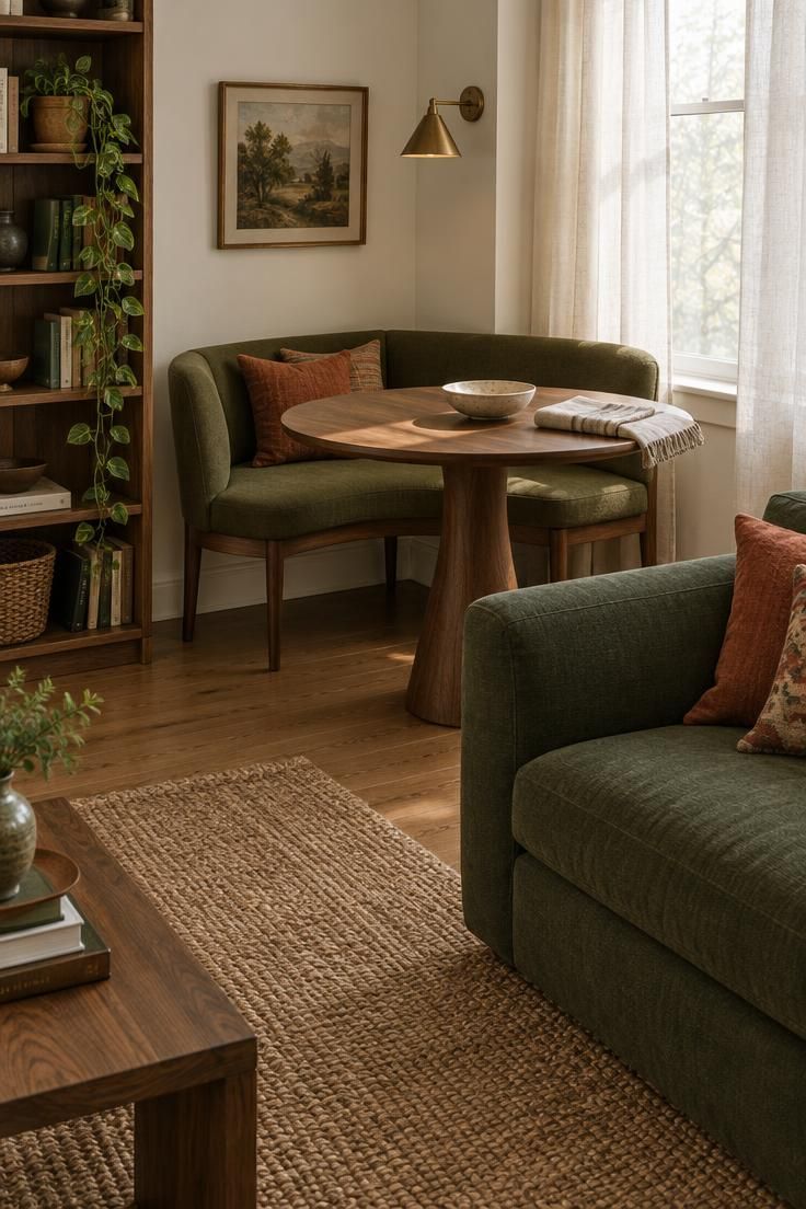
Hard corners often become dead space in a living room because standard sofas and armchairs do not fit there without blocking the route.
A small round table with a low bench or backless seat can turn that awkward zone into useful overflow seating without adding a bulky chair to the floor plan.
The corner placement keeps the walking path straight.
Furniture angled toward the center of the room tends to interrupt movement, while a compact piece set diagonally into the corner leaves the main route open and still feels connected to the conversation area.
A backless bench tucks under the table edge when not in use.
That arrangement occupies less floor than a chair with arms, and the same surface can hold a book, a phone, or a cup without requiring a separate side table.
The table material matters more than its size.
A light or reflective top against a dark corner keeps the area from feeling like a visual hole, while a dark wood top against pale walls can define the spot as its own small zone.
This approach works well in rooms where a second sofa would be too wide and a pair of armchairs would crowd the route.
The bench offers seating for one adult or two children without requiring permanent floor access on both sides.
Keep the bench height close to the sofa seat height so a person sitting there does not have to look sharply up or down to join the conversation.
A low back or no back also keeps the sightlines across the room open.
Design Pro-Tip: Use a round table in the corner instead of a square one, since the curved edge lets the bench slide in at different angles and leaves the walking path wider at the turn.
Open Plan Living Room Zones That Don’t Fight Each Other
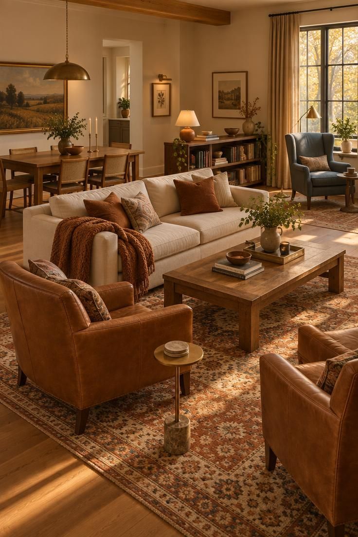
An open plan asks furniture to do work that walls once did.
Without division, the living area, dining area, and kitchen bleed together until the whole space feels like one undifferentiated floor.
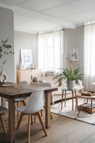
Conversation area rug placement is the simplest tool for marking the main zone.
A rug sized to sit under the front legs of the seating group, or under all of it, draws a clear boundary on the floor without adding a single vertical element.
The main seating group should stay visually dominant.
If the living zone and the secondary zones carry equal weight, the room reads as scattered.
Keeping the largest rug and the largest furniture in the conversation area preserves a clear hierarchy.
A secondary zone works best when it serves a specific activity.
A reading corner needs a comfortable chair, a lamp, and a small table for a cup.
A work nook needs a surface and a place to sit that does not compete with the main group.
Flexible furniture supports this approach.
A pair of light chairs that can move between the living group and the dining table adapts the room for a party or a quiet evening without rearranging everything.
Orienting the main seating so its back faces the adjacent area creates a soft boundary.
The sofa back becomes a low visual wall between the living zone and the kitchen or dining table, and the seating itself faces inward toward conversation.
Too many zones is the common failure.
Three or four small groupings in one open plan dilute the room’s purpose, so it helps to limit the plan to one primary zone and at most one secondary use.
Try a One-Day Layout Review Before Committing
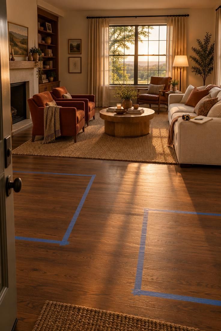
Arrange in a sequence rather than all at once.
Measure the room and the largest furniture first, identify the focal point, place the biggest piece, then test the walk-through.
Skipping the measuring step is the mistake that forces a second round of moving.
Live with the arrangement for a day before final decisions.
A layout that looks fine in the moment often reveals its problems during an ordinary evening, when people are actually sitting in it.
Look at the room at two different times of day.
Morning light and evening lamp light change how the arrangement reads, and a layout that feels open at noon can feel cramped after dark when the lamps are on.
The recent direction in design coverage supports this slower approach.
Houzz’s collection of the most popular new living rooms of 2025 favored comfortable furnishings, easy circulation, and integrated storage, and the ASID 2026 trends outlook emphasized flexibility and long-term usefulness.
Those signals point toward arrangements that can be adjusted rather than fixed in place.
Open plan living room zones respond especially well to this review.
Testing the boundaries between the main group and secondary areas for a day shows whether the divisions hold up when the room is in real use.
Conclusion
The best arrangement makes the room’s purpose obvious the moment someone walks in.
Conversation feels natural, movement happens without thought, and the furniture stops being a collection of objects.
Start with the largest piece and the walk-through test.
Place the sofa or the primary seating first, then trace the routes people take and adjust whatever forces a detour.
Choose a rug that touches the seating group rather than sitting alone under the coffee table.
A rug that reaches under the front legs of the sofa and chairs ties the arrangement together and marks the conversation area clearly.
Leave one seat angled toward another person rather than squared at the screen.
That single chair creates a conversation pairing the room can use at any moment.
Try one change this week.
Pull the sofa away from the wall by a few inches, or turn two chairs so they face it, and notice how the room responds.