This post may contain affiliate links. If you make a booking or purchase through these links, we may earn a commission at no additional cost to you.
The air outside has shifted, and now your rooms feel like they belong to a different season entirely.
A fall color palette is more than a predictable spread of pumpkin orange and chocolate brown.
The right combination of muted earth tones, unexpected accent colors, and layered textures can make your entire home feel like it exhaled and settled into something deeper.
These 11 fall color palette ideas move through rich warmth, cool contrast, and moody depth, each one built around a specific room scene you can actually recreate.
Burnt Sienna Walls With Cream Linen and Aged Walnut Furniture
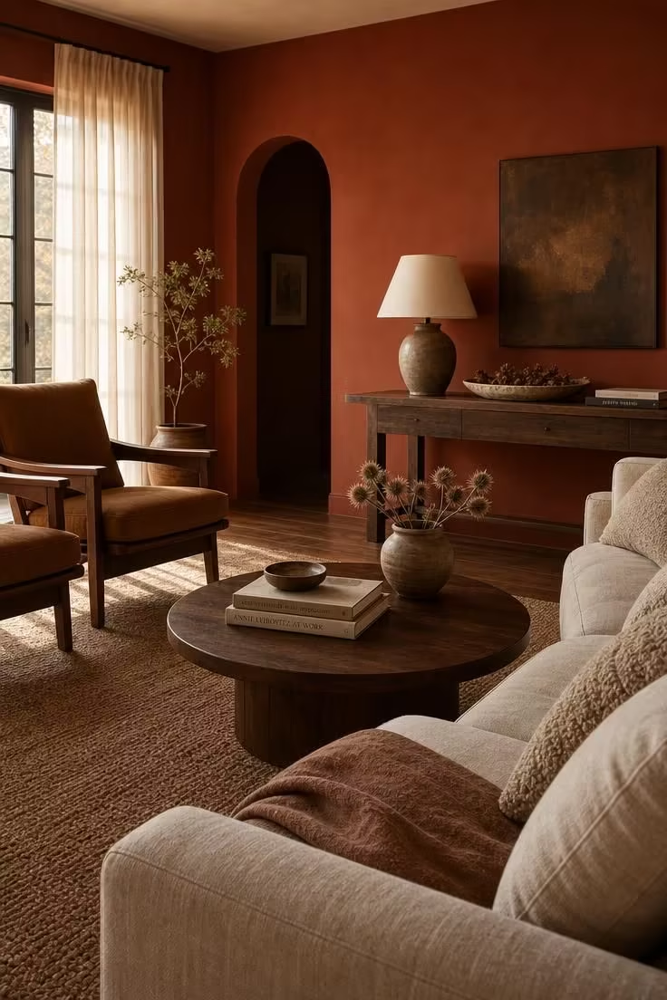
There is a reason burnt sienna keeps showing up in fall color palette conversations, and it has nothing to do with trend forecasting.
This shade sits in the space between brick red and deep clay, carrying enough brown to feel grounding and enough red to feel alive.
Against cream linen upholstery, the color loses its intensity just enough to become livable rather than aggressive.
Aged walnut furniture deepens the palette without pulling it toward cold brown, because walnut has its own red-amber undertone that matches the wall color like a conversation between two voices in the same register.
The boucle texture on the pillows catches light differently throughout the day, giving the cream tones a shifting quality that flat cotton would never manage.
A jute rug adds another layer of natural fiber without competing for attention.
This is the autumn color scheme for people who want the room to do the talking.
Style Blueprint:
- Burnt sienna wall paint (flat or eggshell finish for depth)
- Cream linen sofa with removable slipcovers
- Aged walnut coffee table and matching armchairs
- Oatmeal boucle throw pillows in varying sizes
- Woven jute area rug in a natural tan weave
Sage and Terracotta Layered Across a Kitchen Countertop
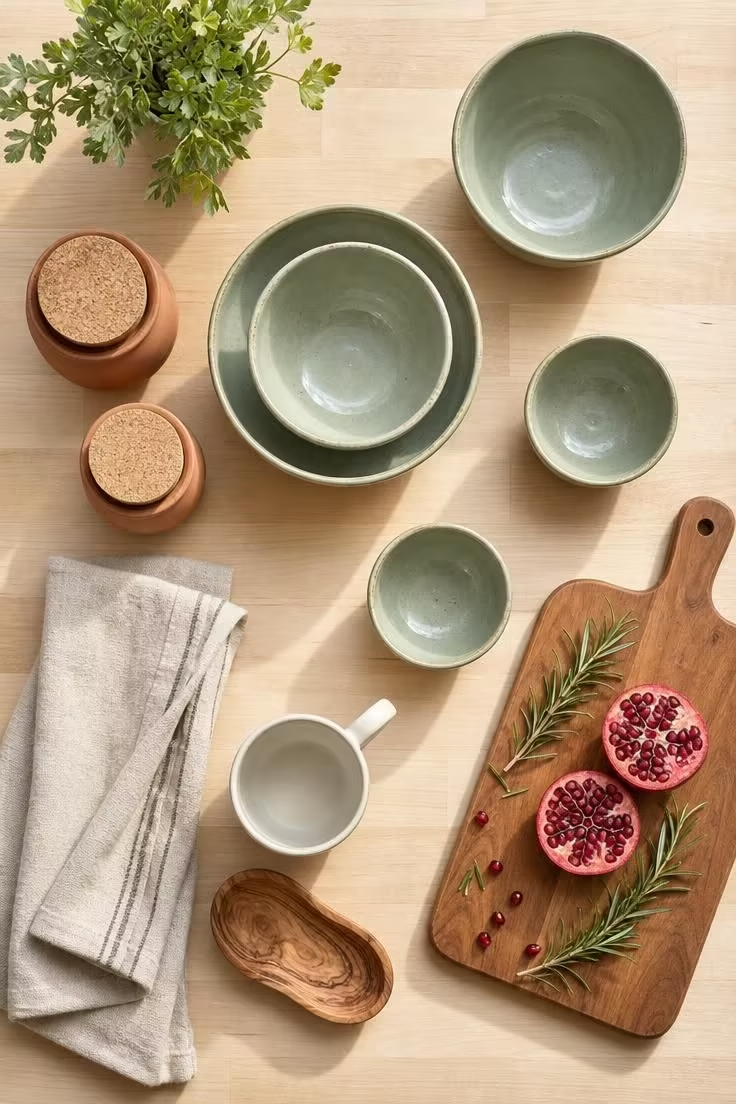
Sage and terracotta are opposites on the temperature spectrum, and that tension is exactly why they work.
The cool green pulls the eye toward calm while the warm terracotta pushes back with energy, and the result is a fall color palette that feels fresh instead of heavy.
On a light wood countertop, these two colors hold their own without darkening the room.
The linen dish towel in oat acts as a neutral bridge, softening the jump between the green and the red-brown.
This palette is the fastest way to bring fall decor colors into a kitchen without repainting or replacing hardware.
A single pomegranate and some fresh rosemary do more seasonal work here than an arrangement twice the size.
Style Blueprint:
- Handmade sage green ceramic bowls in 3 graduated sizes
- Small terracotta canisters with natural cork lids
- Oat-colored linen dish towels
- Light maple or birch cutting board
- Fresh rosemary sprigs for a living accent
Dusty Rose Bedding on a Dark Iron Frame With Dried Eucalyptus
Most people do not think of pink when they think of fall, and that blind spot is a missed opportunity.
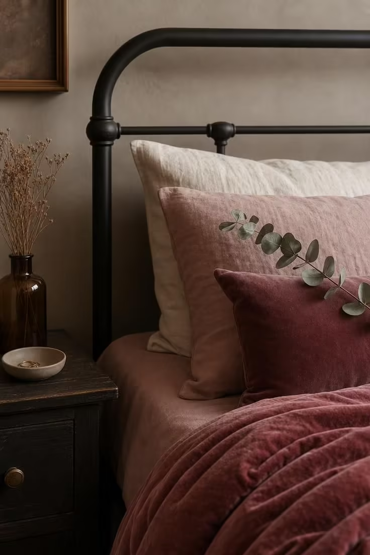
Dusty rose, when it leans toward mauve rather than bubblegum, reads as a dried flower rather than a spring bloom.
Against a dark iron frame, the softness of the color gains an edge it would not have against white wood.
The velvet quilt adds a weight that linen alone cannot deliver, and that heaviness is what pushes the palette from “year-round pink” into fall bedroom colors territory.
Dried eucalyptus brings in the only green, and its silvery muted tone refuses to compete with the rose.
This palette works in bedrooms where the goal is rest, not statement.
The iron frame does the structural work, the textiles do the color work, and the eucalyptus does the seasonal work.
Notice how every material here has a matte finish, and that consistency is what keeps the room from feeling scattered.
Style Blueprint:
Design Pro-Tip: When building a muted fall color palette in a bedroom, keep all finishes in the same family. Matte ceramics, flat iron, and unpolished linen create a cohesive surface language that lets color differences register as variety rather than chaos.
- Dusty rose linen sheet set
- Rose velvet quilt or coverlet
- Dark matte iron bed frame with simple curves
- Dried eucalyptus stems (3-5 sprigs)
- Matte ceramic nightstand accessories in mushroom tones
Mustard Accent Chair Against a Charcoal Shiplap Wall
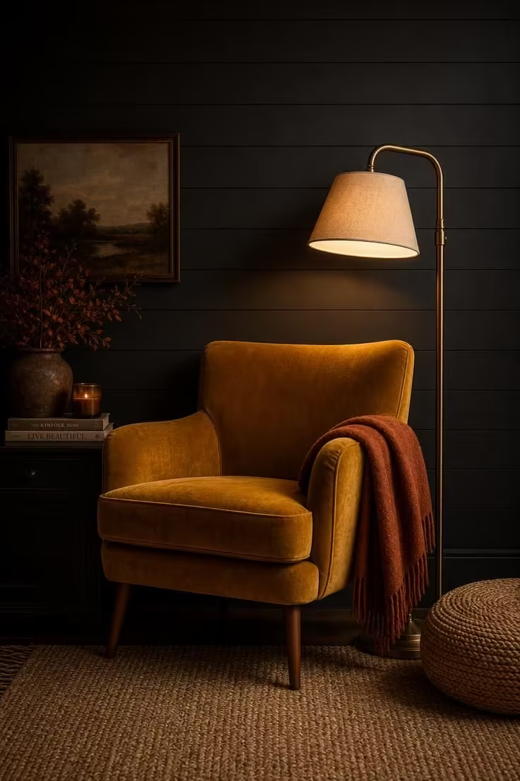
Charcoal shiplap is doing something specific here that a smooth dark wall would not.
The horizontal lines of the shiplap create a rhythm of tiny shadows, and those shadows make the charcoal feel textured rather than flat.
Against that depth, a mustard velvet chair becomes a focal point that almost glows.
This fall color palette reads modern because it strips the season down to two decisive tones instead of layering five or six.
The rust throw on the chair arm is the only concession to traditional autumn warmth, and its restraint is what keeps the palette from tipping into predictable.
Brass adds a warmth that polished chrome or matte black hardware would not.
Style Blueprint:
- Deep mustard velvet accent chair with walnut legs
- Charcoal-painted shiplap accent wall
- Rust-colored wool throw blanket
- Slim brass floor lamp with linen shade
- Woven jute pouf in a natural round shape
Rust, Cream, and Olive in a Layered Dining Table Setting
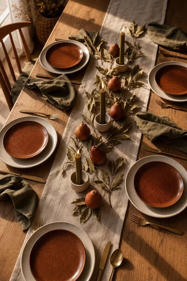
The dining table is the most underrated surface in the house for a seasonal color palette.
People pour energy into living room pillows and bedroom throws, then set the table with the same white plates year-round.
This harvest color palette changes that by treating the table like a styled vignette.
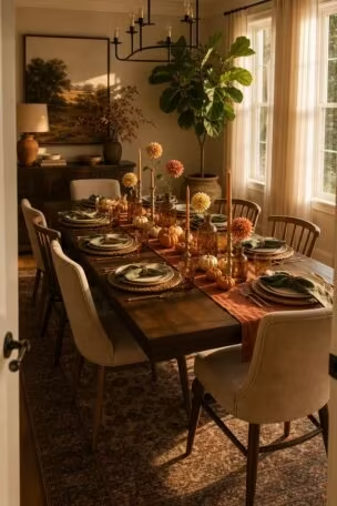
The rust-glazed salad plates stacked on cream stoneware create a color frame around every plate, and this pairing of terracotta and rust against cream is one of the most reliable combinations in a fall dining palette.
Olive green napkins are the cooler counterpoint, pulling the palette away from all-warm monotony.
Matte gold flatware bridges the gap between the warm and cool tones, reading as neither orange nor green but as something in between.
The centerpiece keeps low on purpose, because a tall arrangement blocks conversation and eye contact, which defeats the point of a table meant for gathering.
Style Blueprint:
- Cream stoneware dinner plates and rust-glazed salad plates
- Olive green linen napkins
- Raw flax linen table runner
- Olive taper candles in small ceramic holders
- Matte gold flatware set
Plum Velvet Pillows on a Camel Leather Sofa With Brass Details
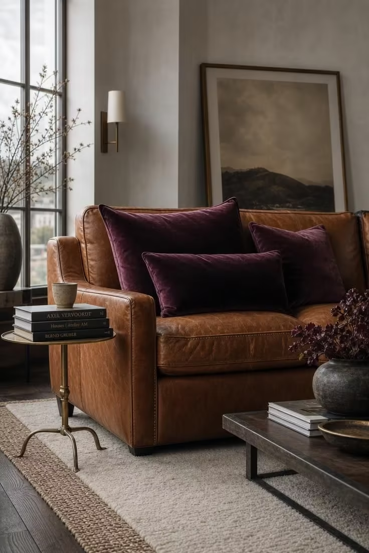
This is the fall color palette for rooms that come alive after five in the afternoon.
Plum velvet reads like a glass of red wine caught in low light, rich without being sweet, and that depth pairs with camel leather the way a heavy coat pairs with a broken-in bag.
The patina on the leather matters.
A brand-new sofa in this shade would feel stiff, but one with slight wear and softened edges tells the room that comfort has already been earned.
Brass details on the side table bring warmth without introducing any competing color, because brass is a tone, not a hue, and it recedes into the palette rather than fighting the plum.
The wool-over-sisal rug layering gives the floor the same kind of tonal depth that the pillows give the sofa.
This palette proves that fall home decor does not need to lean on the usual earth tones to feel seasonal.
The moodiness does all the work.
Style Blueprint:
- Plum velvet throw pillows in 3 sizes (18″, 20″, 22″)
- Camel leather sofa with visible stitching
- Small brass side table with clean lines
- Cream wool area rug layered over sisal
- Ceramic tumbler and hardcover books for surface styling
Design Pro-Tip: If your fall color palette includes jewel tones like plum or emerald, keep all metals in one finish. Mixing brass with chrome or matte black creates visual noise that competes with the rich fabric colors and dilutes their impact.
Oatmeal, Cinnamon, and Ivory in a Monochromatic Bedroom
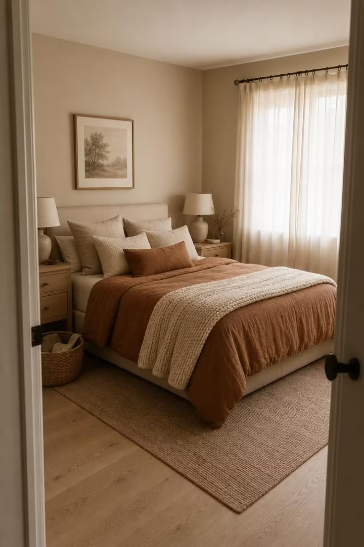
Monochromatic does not mean boring, and this room is the proof.
Every surface in this bedroom lives within the same narrow band of warm neutrals, from pale cream to deep cinnamon, and the result feels deliberate rather than bland.
The trick is texture variation.
Linen duvet, chunky knit throw, woven basket, smooth ceramic, matte wood: five different surface treatments that keep the eye moving even when the color barely shifts.
This is a warm earth tones palette stripped down to its quietest expression.
The cinnamon lumbar pillow is the darkest point in the room, and because it is the only element at that depth, it reads as an anchor rather than an accent.
Style Blueprint:
- Warm oatmeal wall paint in matte finish
- Cinnamon linen duvet cover
- Ivory chunky knit throw blanket
- Light ash wood nightstands
- Woven seagrass basket for floor storage
Teal Ceramic Vases on a Rust-Stained Wooden Shelf
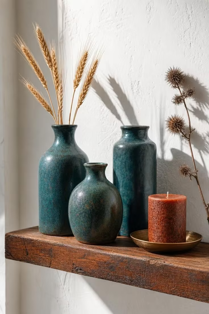
One cool accent is all a warm fall color palette needs to avoid feeling predictable.
Teal sits far enough from the orange-rust family to create genuine contrast, but its depth keeps it from reading as a summer leftover.
These vases are handmade, and the slight irregularity in their shapes matters because perfectly uniform ceramics would make this shelf look like a retail display rather than a collected arrangement.
The rust stain on the shelf pulls the wood into the same color family as the seasonal color palette accents throughout the room.
Dried wheat brings in the harvest without reaching for the obvious choices of pumpkins or pine cones.
A single teal shelf vignette like this can shift the color mood of an entire hallway or living room wall.
The restraint here is the point: three vases, one candle, one botanical.
Style Blueprint:
- Deep teal handmade ceramic vases in 3 heights
- Reclaimed wood floating shelf with rust stain
- Dried wheat stalks (5-7 stems)
- Small brass dish for holding a candle
- Dried thistle or similar dried botanical
Olive Linen Curtains Framing a Window Seat With Copper Throws
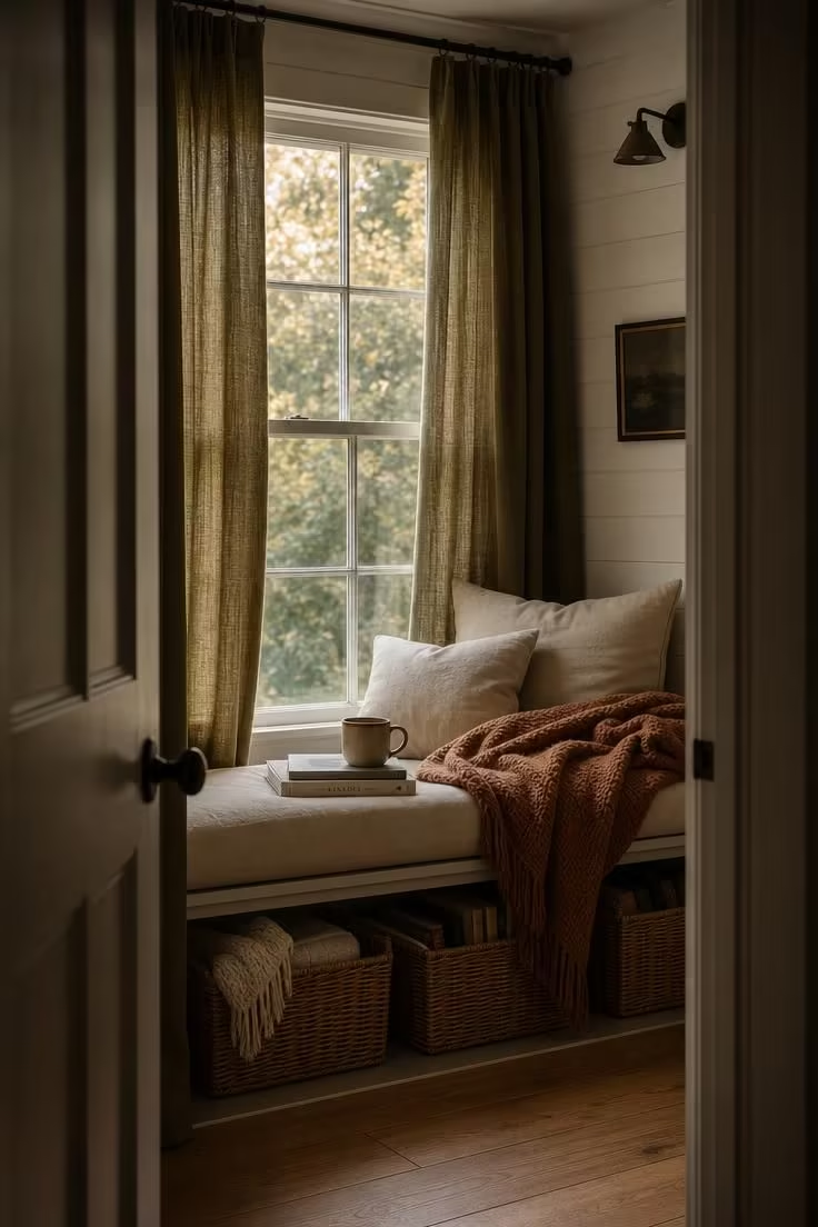
Olive is the fall neutral that too many people overlook because they default to gray.
Where gray cools a room down, olive warms it sideways, carrying green and brown in equal measure so the eye never fully decides whether it is looking at a warm or cool tone.
As curtain fabric, olive linen softens the light that enters a room, giving it a faint earthy tint that changes every surface it touches.
The copper throw on the seat picks up the brown side of the olive, reinforcing the connection between the two tones without making it obvious.
This is a cozy fall living room corner that could live in a cottage, a city apartment, or a suburban den.
The window seat itself is generous enough to curl up in, and the cream cushion keeps the base light so the olive and copper can do the color work above it.
Woven baskets below the seat turn dead storage space into a textural accent.
This palette works in any room with a window deep enough for a seat, which is more rooms than most people realize.
Style Blueprint:
- Olive green linen curtains (rod pocket or clip ring)
- Copper-toned knit throw blanket
- Cream linen window seat cushion (custom or standard bench size)
- Woven storage baskets sized for below the seat
- White-painted wood paneling for the window alcove
Saffron, Stone, and Dried Lavender on an Entryway Console
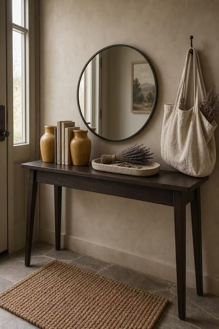
The entryway sets the color mood before a guest reaches the living room, and most people waste that advantage.
Saffron is the brightest tone in this palette, and on a small ceramic vessel it radiates warmth without overwhelming a narrow space.
Stone-toned walls recede behind the console, creating depth that a pure white wall would flatten.
Dried lavender adds color and scent at the same time, and its purple-gray hue prevents the saffron from dominating the vignette.
A slim console is the right furniture choice here because entryways punish anything bulky.
The muted fall tones on this surface feel collected rather than decorated, like each piece arrived at a different time and happened to work.
Style Blueprint:
- Saffron ceramic bookend vessels or small vases
- Slim dark-stained wood console table with tapered legs
- Shallow stone tray for keys and small items
- Dried lavender bundles (2-3 bundles)
- Small round mirror with matte frame for wall lean
Design Pro-Tip: Entryway palettes should be limited to 3 main colors at most. In a small space, more than three competing tones create visual clutter that makes the transition from outdoors to indoors feel chaotic instead of welcoming.
Merlot Accent Wall Behind a White Oak Dresser With Linen Decor
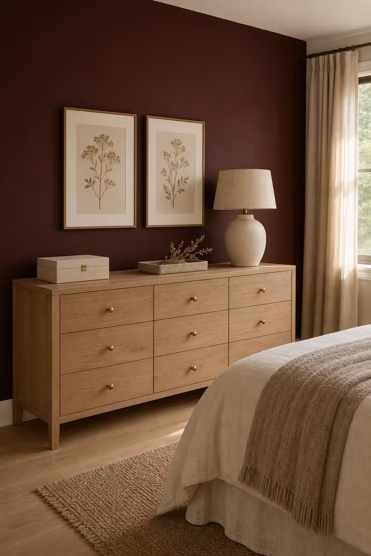
Merlot is the fall color palette equivalent of a statement made at a low volume.
It is deep, wine-rich, and undeniably warm, but because it lives in the red-brown family rather than the red-orange family, it never reads as loud.
One accent wall in this shade changes the entire character of a bedroom without requiring a full repaint.
The white oak dresser pushes back against the depth of the merlot, keeping the lower half of the wall feeling open and breathable.
Linen accessories in cream and flax echo the lightness of the oak, and together they create a neutral base that lets the wall do its work.
Brass hardware and frames add just enough warmth to tie the merlot to the rest of the room without introducing a new color.
This is a palette that carries through from fall straight into winter without needing a single adjustment.
Style Blueprint:
- Deep merlot wall paint in eggshell or satin finish
- White oak dresser with clean modern lines
- Brass knob hardware and thin brass picture frames
- Cream and flax linen accessories (jewelry box, tray, lampshade)
- Dried botanical sprig for a minimal organic accent
Conclusion
A fall color palette is not a formula you follow and not a trend you chase.
It is a conversation between color, texture, and light that shifts from room to room and season to season.
The 11 ideas here move through warm earth tones, moody jewel shades, and unexpected pairings like dusty rose and iron, proving that autumn in your home can look like whatever version of warmth feels right to you.
Start with the one palette that made you pause longest, change one surface or one set of textiles, and let the rest of the room respond.
The best fall color palette is the one that makes your home feel like it belongs to this exact moment of the year.