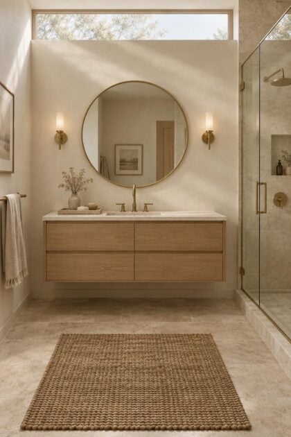
This post may contain affiliate links. If you make a booking or purchase through these links, we may earn a commission at no additional cost to you.
Gold does not create luxury on its own.
In a bathroom, gold behaves more like a mirror than a paint color: it reflects and exaggerates whatever sits beside it, so one mismatched tone or one oversized pull can undo an otherwise careful room.
That is why so many gold schemes land badly.
The metal rarely causes the problem.
The decisions arranged around it do.
Editing gold, not adding it, is what separates a bathroom with gold accents that reads as considered from one that reads as costume.
Why Finish Choice Decides Whether Gold Reads as Luxe or Loud
Begin with the finish, not the color, because "gold" describes a family rather than a single material.
The NKBA 2026 Bath Trends Report found that among surveyed design professionals, brushed finishes were preferred by 51%, satin by 46%, and polished by 39%, a spread that shows how sharply these surfaces now diverge in appeal.
Picture the range as a sliding scale of reflectivity.
Polished gold throws back hard highlights and reads as period glamour.
Brushed, satin, aged, and champagne finishes soften those highlights and read as warmer and more architectural.
The mechanism is visual, not emotional.
A highly reflective surface mirrors its surroundings and sharpens contrast, while a satin surface diffuses light across a broader area and mutes the edges of an object.
Names make this harder than it should be.
Brushed gold, satin brass fixtures, and champagne bronze are not standardized terms, so two fixtures carrying the same label from different makers can arrive looking like different metals.
A single polished fixture sitting among brushed companions reads as an oversight rather than a scheme.
Matching the finish across the room costs nothing extra and does more for cohesion than any upgrade you can buy.
Decide finish first, then color, and decide it by handling physical samples rather than studying product pages on a screen.
Design Pro-Tip: Order physical finish samples from every brand you're considering and view them together in your own bathroom at morning and evening; screen renders hide the reflectivity differences that matter most.
Mistake 1: Mixing Gold Tones Without Testing Them Side by Side
Tonal mismatch starts quietly.
A bright yellow-leaning pull goes on a drawer near a pale pink champagne faucet, and the assumption is that two golds will harmonize because both are gold.
Bathrooms make that assumption unusually visible.
Surfaces sit close together, and a mirror doubles the comparison by reflecting the opposite wall back into the frame.
Think in tonal families rather than names.
Some golds lean yellow, some lean pink, some carry a greenish cast, and others settle into bronze, and a room composed from several families at once tends to look assembled from leftovers.
Price offers no protection here.
An expensive fixture and a budget one can clash exactly as easily as two budget pieces, which is why the match has to be judged in person.
The workable ceiling is two metals: one dominant, one supporting, each repeated at least twice.
That repetition turns a mix into a hierarchy instead of a scatter.
Published design commentary supports the value of metallic contrast when it is deliberate.
Designers Morgan Carper and Leslie Ward, discussing a monochrome bathroom in Homes & Gardens, explained that metallic accents keep a black-and-white room from reading flat, which is an attributed viewpoint rather than a rule.
If two samples look mismatched in daylight, they will look more mismatched under warm artificial light, so test them the way the room will actually be lit.
Mistake 2: Letting Gold Spread Across Every Surface
The overuse pattern is easy to spot once you know it.
Faucet, shower trim, cabinet pulls, mirror frame, sconces, towel bars, hooks, a soap dispenser, and a tray all arrive in the same metallic family.
When every surface glints, the eye loses its resting point.
Nothing functions as an accent anymore because the entire room is competing at the same volume.
Restraint is what current examples tend to practice.
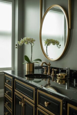
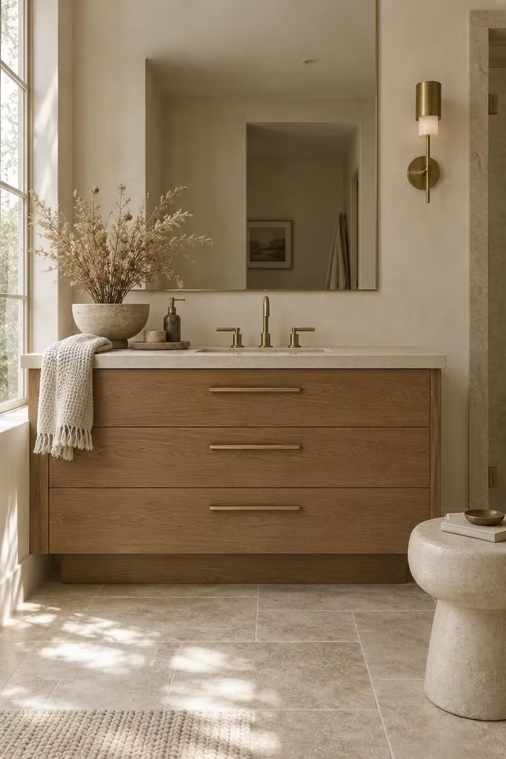
Gold is usually limited to two to four coordinated elements, most often a faucet, cabinet hardware, a mirror frame, and gold bathroom lighting.
Give one element the lead role.
The faucet or the mirror frame usually carries it, with the remaining gold pieces supporting that focal point rather than rivaling it.
An all-brass period scheme can work beautifully, and it deserves the distinction of being a different intent.
That approach is historically coherent and consistent in finish from top to bottom, not an accent strategy applied unevenly.
Where a fifth gold object feels tempting, substitute texture instead.
Wood, stone, linen, and ceramic supply warmth without adding another reflective surface.
Restraint also protects your budget against changing taste, since fewer gold elements means less to replace when the room evolves.
Count your gold elements before buying anything else.
In a standard bathroom, four is usually the practical limit, so cut one if the count runs higher.
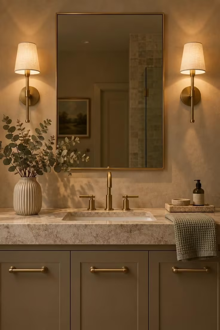
Design Pro-Tip: Photograph your bathroom in progress and count the gold objects in the frame; if you can't immediately name which one is the focal point, you have one too many.
Mistake 3: Ignoring the Backdrop Gold Sits Against
Gold never floats on its own.
It is read against wall color, tile, stone, and cabinetry, and those surfaces determine whether it looks warm or merely yellow.
The NKBA 2026 Bath Trends Report found neutrals leading the bath color family, with off-white, light brown or tan, and white among the most popular choices.
A warm neutral bathroom palette, cream, beige, taupe, and warm gray tend to sit close to gold on the tonal scale, so the combination reads as cohesive rather than competitive.
Stark cool white and cool gray sit further away tonally, which can push a warm metal toward a brassy cast by comparison.
That is a composition effect rather than a verdict on either color.
Dark backdrops change the conversation entirely.
Charcoal, deep green, and black tile set up high contrast that emphasizes reflectivity, a bolder look that demands stricter finish consistency throughout.
Natural materials give gold something tactile to rest against.
Wood vanities, travertine, limestone, and warm-veined marble all qualify, and the NKBA's finding that wood-faced vanities have overtaken painted vanities in expected popularity supports that pairing logic.
Choose the backdrop first and the gold finish second.
Reversing that order is where most mismatches begin.
Mistake 4: Getting the Scale and Quantity of Gold Hardware Wrong
Hardware scale goes wrong in both directions.
A long bar pull on a narrow drawer overwhelms it, while tiny knobs across a wide cabinet front disappear into the wood.
Reflectivity compounds the problem, because a bright metallic surface already appears larger than a matte one of identical size.
Oversizing gold hardware multiplies an effect that is already working against proportion.
Quantity matters as much as size.
One well-scaled pull repeated across every drawer reads as a scheme, while irregular hardware in mixed sizes reads as whatever was left in the bin.
Hardware is also the most replaceable gold element in the room, which makes it the safest place to experiment and the easiest place to correct a wrong turn.
Consistency across all cabinetry looks more resolved, though mixing sizes is genuinely correct when drawer widths differ enough that a single size would look forced.
Judging that tradeoff requires looking at the actual cabinet rather than a specification sheet.
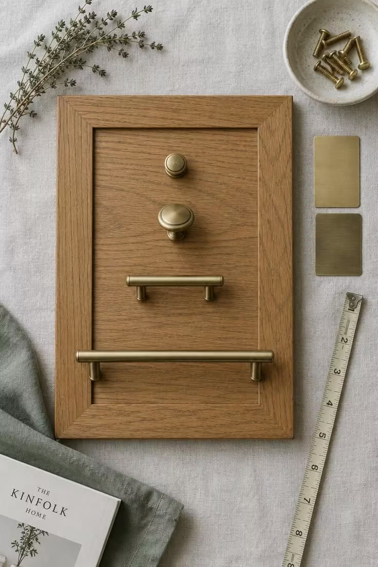
Tape hardware samples to the cabinet front at eye level and step back to the doorway.
Proportion problems show up immediately from that distance and hide at close range.
Mistake 5: Building a Permanent Gold Scheme Instead of a Flexible One
Committing gold to tile, stone, a tub surround, or any built-in surface is the mistake with the longest tail.
Those are the choices you live with longest and change most expensively.
Interest in gold is measurably strong right now.
Houzz's 2025 emerging-trends report recorded searches for gold bathroom vanity lights up 60% and brushed gold bathroom faucet up nearly 50%.
Adoption tells a more measured story.
The 2025 U.S. Houzz Bathroom Trends Study found 14% of renovating homeowners chose brushed-gold vanity handles, against 32% for brushed nickel and 18% for black.
That study surveyed 1,737 U.S. homeowners with recently completed, current, or planned bathroom renovations, according to the Houzz study overview, which puts the numbers in useful proportion.
Forecasts are not unanimous either.
Gold remains visible across design media while some 2026 predictions give more room to neutral, natural, and gunmetal finishes, as Homes & Gardens coverage of Shea McGee's bathroom trends illustrates, so the practical risk is overuse rather than obsolescence.
Keeping gold on replaceable layers is the flexible strategy.
Hardware, lighting, mirror frames, and accessories can shift with taste at modest cost.
Permanent gold can still be the right answer for a historically specific or deeply personal scheme, provided that commitment is deliberate rather than accidental.
Ask whether you would want to live with a gold element in ten years.
If the answer is no, it should not live on a surface you cannot swap.
Design Pro-Tip: Before committing gold to any fixed surface, price out what replacing it would cost; if that number surprises you, move the gold to hardware or lighting instead.
Mistake 6: Choosing Gold on Appearance Alone, Then Being Surprised by Care
A showroom display shows a finish at its best.
It rarely shows what that finish looks like after a year of daily use.
The tradeoff is straightforward.
Polished surfaces are generally more reflective and more visually distinctive, while brushed and satin surfaces are typically more forgiving of everyday marks and fingerprints.
Hard water adds another layer to the decision, since mineral deposits tend to be more visible on highly reflective surfaces.
Some schemes respond by keeping the most reflective finish away from the most-used wet fixtures.
Construction deserves separate attention from color.
A decorative coating is not the same as solid brass, and internal build quality is a distinct consideration from the tone you see on the surface.
This matters across a wide field, because faucets rank as the single most-upgraded bathroom feature, with 87% of renovators making that change according to the 2025 U.S. Houzz Bathroom Trends Study.
Follow the fixture manufacturer's own care instructions rather than a generic cleaner, and test any cleaner on an inconspicuous area first.
Finish warranties commonly depend on using the care routine the maker specifies.
Read the care and warranty documentation before purchase.
If the required routine is one you will not realistically follow, that finish is the wrong choice regardless of how it looks.
Mistake 7: Reading Small Bathrooms as a Chance for More Gold
A compact powder room or guest bath can feel like a license for extra drama.
These rooms usually need less gold than a large one, not more.
Every element in a small room falls within a single glance.
Mismatched tones and crowded metallics become more obvious at that distance, not less.
Published designer perspective supports bold choices in compact rooms when they are handled with intent.
Cullman & Kravis discuss using brass floor details, gold leaf, layered lighting, and dramatic finishes in a small powder room in Benjamin Moore's designer feature, which is an attributed viewpoint rather than a prescription.
A restrained small bathroom gold details scheme is simpler than it sounds.
One mirror, one faucet, and one light carry the gold, while everything else stays in warm neutrals or natural texture.
These are visual-composition suggestions only.
Questions about what a wall can support or how a fixture gets installed belong with the relevant trade and the product literature.
Start with one gold element in a small bathroom and add a second only if the room still reads as unfinished.
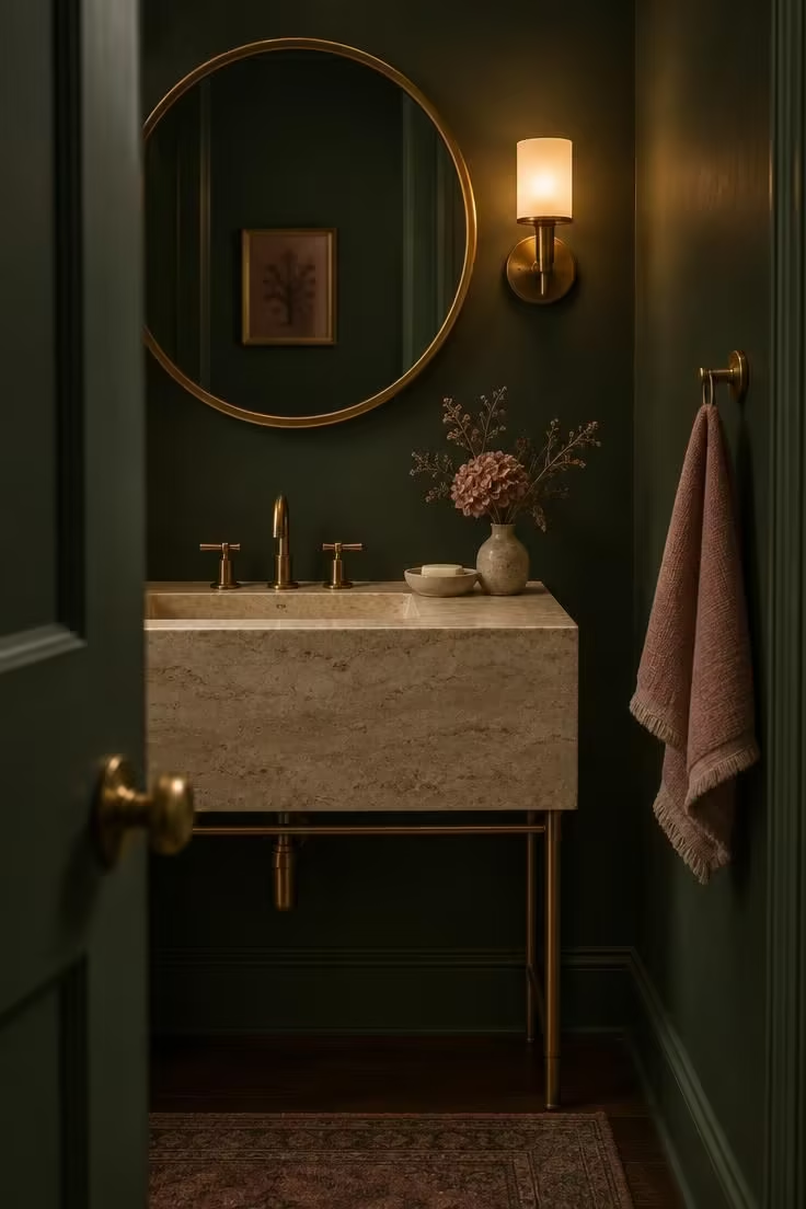
Design Pro-Tip: In a powder room, pick the mirror frame as your single gold moment and let the faucet and hardware recede; one confident accent outperforms three competing ones.
Where Gold Actually Earns Its Place
Placement matters as much as finish, because not every surface benefits equally from a warm metal.
Some applications reward it generously, and others quietly undermine it.
Faucets and shower trim carry the highest visibility and the most daily contact, which is why faucet finish carries so much weight in the overall scheme.
Cabinet hardware is the most repeatable and most replaceable application.
It is also the easiest place to establish a finish that the rest of the room can follow.
Mirror frames and lighting most often become the focal point, and that pair usually decides whether a scheme reads as intentional or as accumulation.
Accessories extend a scheme at low cost.
Towel bars, hooks, trays, and glassware are useful for reinforcement and equally easy to overdo.
Gold tends to disappoint on large flat surfaces, in high-traffic utility zones, and anywhere the finish will be judged by how it wears rather than how it looks on day one.
Prioritize gold on the elements you see first and touch daily, and leave the rest of the room neutral.
The Current Relevance of Restraint
The design conversation has shifted over the past two years.
The question is no longer whether gold belongs in a bathroom but how much of it, in which finish, and against what.
Adoption data keeps the trend context grounded.
Brushed-gold vanity handles were chosen by 14% of renovating homeowners, against 32% for brushed nickel and 18% for black, while 87% upgraded faucets, both figures from the 2025 U.S. Houzz Bathroom Trends Study.
Finish preference is moving at the same time.
Houzz's 2025 emerging-trends report shows sharply rising search interest in gold, while the NKBA 2026 Bath Trends Report, which surveyed 688 industry professionals, shows professional preference tilting toward matte, brushed, and satin over polished.
That gap between rising interest and quiet adoption is the story of the moment, and it is where most gold accent mistakes begin.
A closer look at polished gold vs brushed gold explains some of that preference gap, since brushed and satin finishes read as quieter and more adaptable to mixed materials.
Material choices reinforce the same direction.
Neutrals lead bath color and wood vanities have gained ground on painted ones, per the NKBA 2026 Bath Trends press release.
A rising-interest, minority-adoption, finish-shifting moment rewards thoughtful editing over maximal application.
The room benefits from fewer decisions made more carefully.
Trend reporting is context rather than instruction, and no forecast should override how a finish looks in your own light.
A Workable Set of Rules for Getting Gold Right
All seven mistakes trace back to a single root cause.
Gold gets treated as decoration to be added rather than as a compositional decision to be placed.
Choose finish before color, and choose it from physical samples viewed in your own bathroom under your own lighting.
Limit gold to two to four coordinated elements, and give one of them a clear lead role in the room.
When mixing gold and brass finishes, repeat each metal at least twice so the scheme reads as a decision rather than an accident, and cap the total at two metals.
Set gold against warm neutrals, natural materials, or muted color rather than cool stark white or competing brights.
Scale hardware to the cabinetry it sits on, and view it on the actual cabinet front before buying.
Keep gold on replaceable layers when flexibility matters, and read the maker's care and warranty guidance before purchase for anything involving champagne bronze hardware or another specialty finish.
Apply gold last, after the backdrop, the materials, and the lighting plan are settled.
If the room already looks finished without it, you will know exactly how much to add.