This post may contain affiliate links. If you make a purchase through these links, we may earn a commission at no additional cost to you.
A single can of paint can do more for a living room than a season of shopping trips.
The right color changes how a room feels the moment you walk in.
This year, the boldest painting ideas for living room walls lean into warmth, depth, and a little drama instead of playing it safe with beige.
Some of these looks use one saturated color across every surface.
Others rely on a quiet tonal shift between wall and ceiling.
Below are ten ways to bring real color into your living room, plus the specific materials and finishes that make each one work.
Deep Aubergine Color-Drenched Walls Behind a Matte Black Fireplace Surround
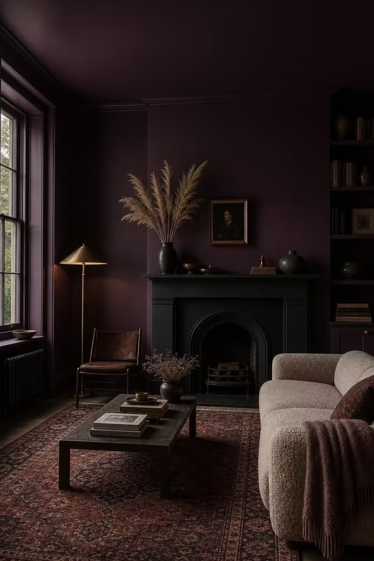
Aubergine is not a color most people reach for first.
It reads as confident rather than loud, especially once it wraps the ceiling too.
Color drenching a single hue across every surface removes the visual stop points a room usually has.
Your eye stops hunting for where one wall ends and another begins.
That continuity is what makes a small or oddly shaped living room feel intentional instead of chopped up.
Pair the dark backdrop with warm metals and pale textiles so the room still feels livable at night.
Style Blueprint:
- Deep aubergine paint in a matte or eggshell finish
- A matte black fireplace surround or mantel
- Warm brass lighting fixtures
- A pale, texture-rich rug to balance the dark walls
- Soft neutral upholstery in oatmeal or cream
Sage Green Walls Capped With a Warm Cream Ceiling Line
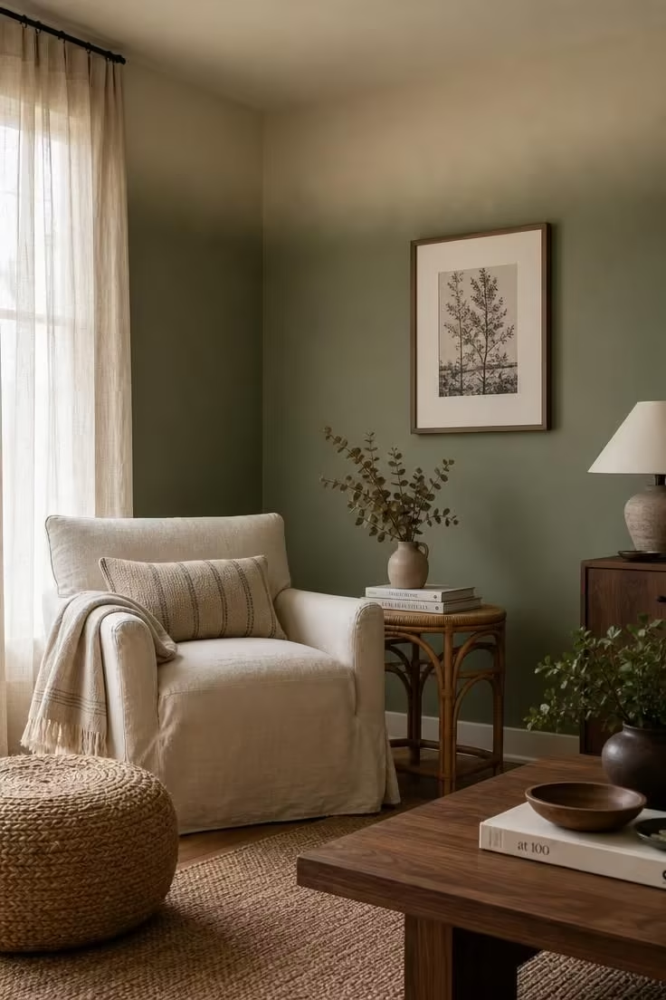
Sage green walls have become one of the most requested looks in living rooms this year.
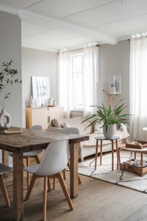
It works because sage sits between a neutral and a true color, so it never fights with wood tones or existing furniture.
Capping the ceiling in a lighter cream instead of painting it stark white keeps the room from feeling clinical.
The soft gradient at the ceiling line also tricks the eye into reading the room as taller.
This technique works especially well in rooms with lower ceilings, where a hard white line can feel like a cap pressing down on the space.
Keep the transition soft rather than crisp for the coziest result.
If your room gets strong afternoon sun, sage tends to shift slightly gray, so test a sample first.
Style Blueprint:
- Sage green paint for the walls
- A warm cream or ivory shade for the ceiling
- Natural fiber accents like rattan or jute
- Linen slipcovers in a neutral tone
- Dried botanicals for a soft organic touch
Terracotta Clay Paint Behind a Walnut Media Console
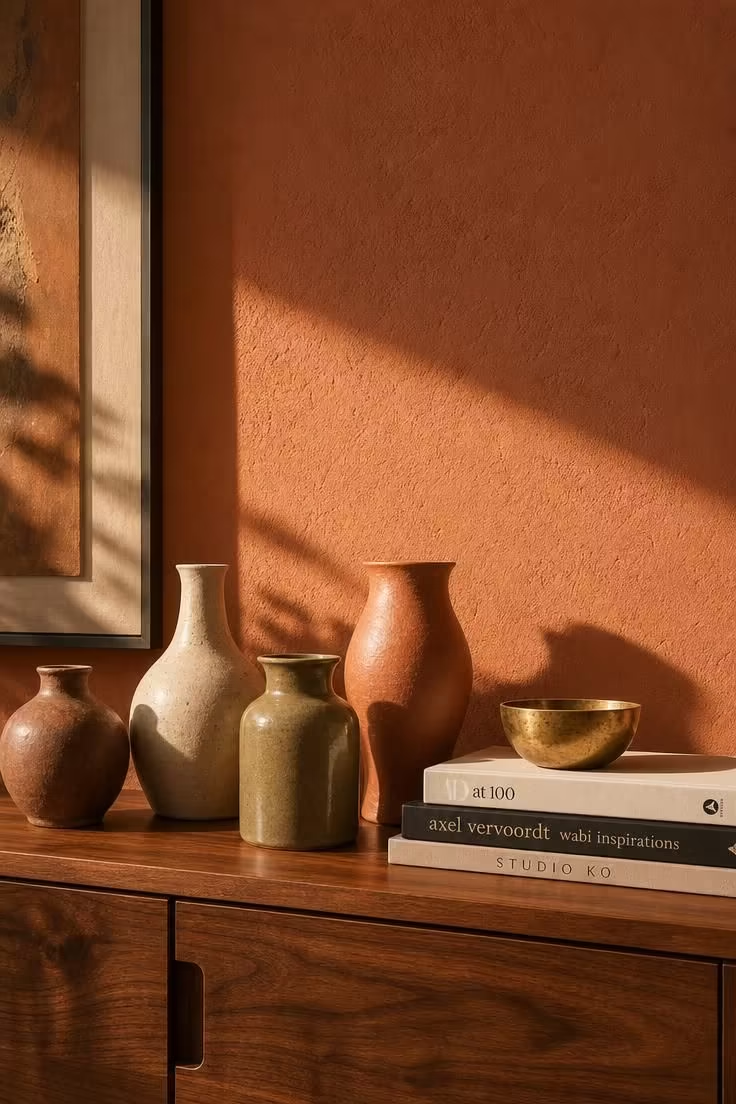
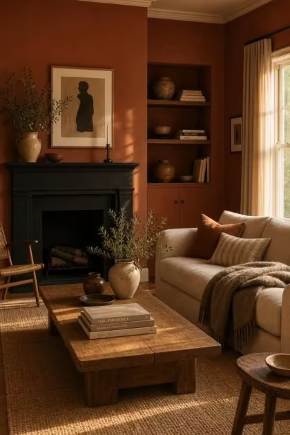
Terracotta paint has moved from Mediterranean kitchens into modern living rooms.
Used as an accent behind furniture rather than across the full room, it reads as warm without overwhelming the space.
Walnut and other honey-toned woods sit especially well against clay reds because both belong to the same earthy paint colors family.
The pairing feels grounded rather than trendy, which matters if you want the room to hold up over several years.
Keep the rest of the room’s palette quiet so the terracotta wall stays the clear focal point.
A single accent wall like this is one of the easiest accent wall alternatives to a busy wallpaper or gallery display.
Style Blueprint:
- Terracotta clay paint in a matte finish
- A walnut or other honey-toned wood console
- Ceramic vessels in varied earthy tones
- Brass or unlacquered metal accents
- A neutral sofa to let the wall lead
Two-Tone Greige and White Dove Wainscoting, One of the Coziest Painting Ideas for Living Room Walls
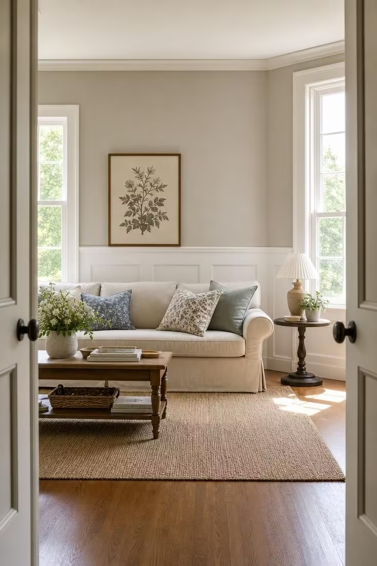
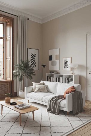
Two tone walls give a room architectural interest without adding a single piece of trim.
Painting the lower third in white dove and the upper wall in a warm greige creates a natural dividing line that mimics wainscoting.
This is one of the more forgiving painting ideas for living room spaces with awkward proportions, since the horizontal break visually widens a narrow room.
It also protects the lower wall, which tends to take the most wear from furniture and foot traffic.
Choose a warm greige rather than a cool one so the pairing feels soft instead of sterile.
A simple picture rail at the color break line finishes the look without requiring real millwork.
This approach photographs beautifully in bright, sunlit rooms where the contrast between the two tones really shows.
Style Blueprint:
- White dove paint for the lower third of the wall
- A warm greige for the upper wall
- A simple picture rail or painter’s tape line
- Oatmeal or cream linen upholstery
- A framed botanical or line art print
Design Pro-Tip: When splitting a wall into two paint colors, place the divide at roughly one third of the total wall height, not exactly in the middle. A lower divide reads as classic wainscoting proportions, while a centered split can make the ceiling feel lower than it is.
Hale Navy Built-In Bookshelves Flanking a Limestone Hearth
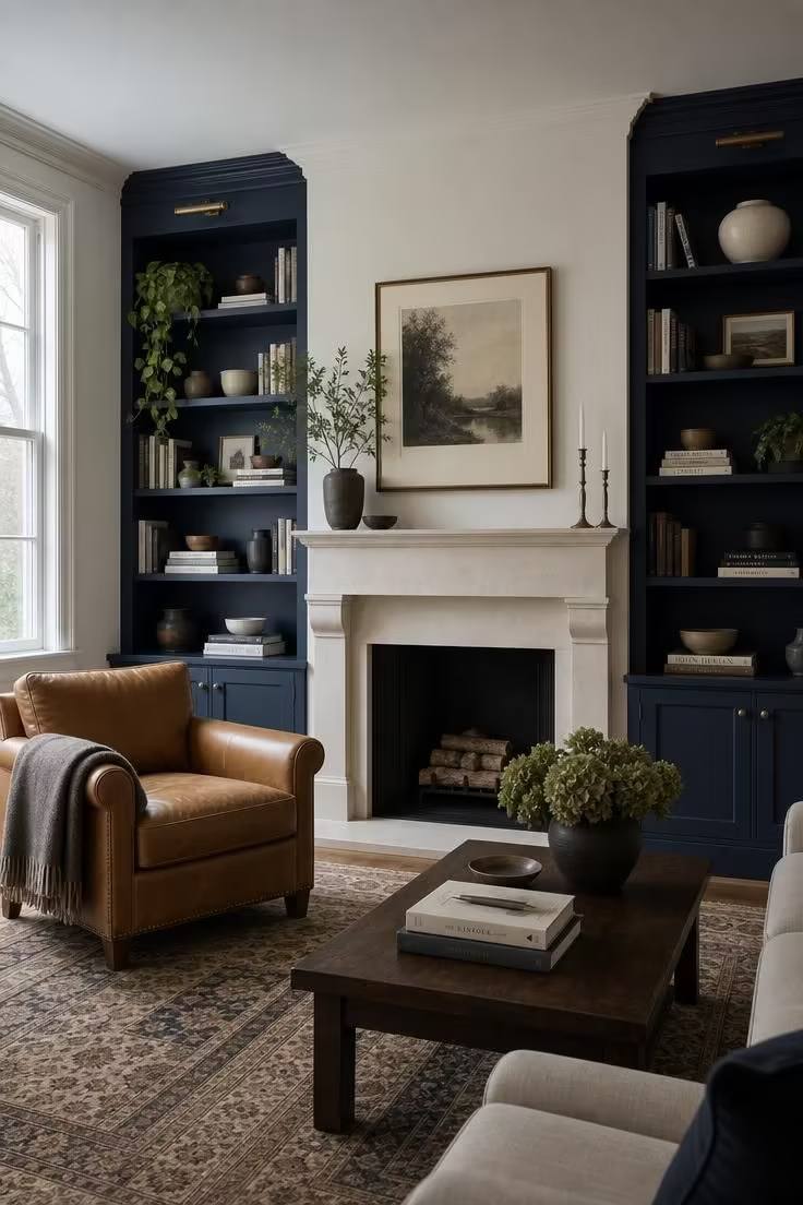
Navy is the easiest deep color to introduce into a living room because it reads as neutral once you live with it.
Painting only the built-ins rather than the full wall keeps the color contained and easy to change later if your taste shifts.
Limestone and pale stone hearths pair naturally with navy, since both have a cool, grounded quality that keeps the combination from feeling heavy.
Camel leather furniture warms up the pairing and stops the room from tipping too cool.
This is a good option if you want a bold color commitment that still feels safe for resale.
Buyers tend to respond well to navy built-ins in a way they do not always respond to full navy walls.
Style Blueprint:
- Hale navy paint for built-in shelving
- A pale limestone or stone fireplace surround
- Camel or cognac leather seating
- A trailing houseplant for the shelves
- Mixed ceramic objects for shelf styling
Muddled Basil Green Ceiling Over Whitewashed Oak Trim
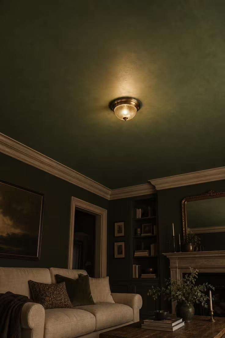
Painting the ceiling instead of the walls is still one of the least expected moves in a living room.
Basil green on the ceiling reads as sophisticated rather than childish because the shade is deep and slightly muted.
Whitewashed oak trim keeps the room from feeling closed in, since the pale wood reflects light back up toward the dark ceiling.
A single warm light fixture, rather than harsh overhead cans, makes the green ceiling glow instead of going flat and dark.
This tonal ceiling treatment works especially well in rooms with strong architectural detail worth highlighting, like coffered beams or crown molding.
Style Blueprint:
- Muddled basil green paint for the ceiling
- Whitewashed or pale oak trim and molding
- A warm brass flush mount light fixture
- Linen upholstery in a light neutral
- A low wooden coffee table
Warm White Drenched Walls With Brass Picture Lights
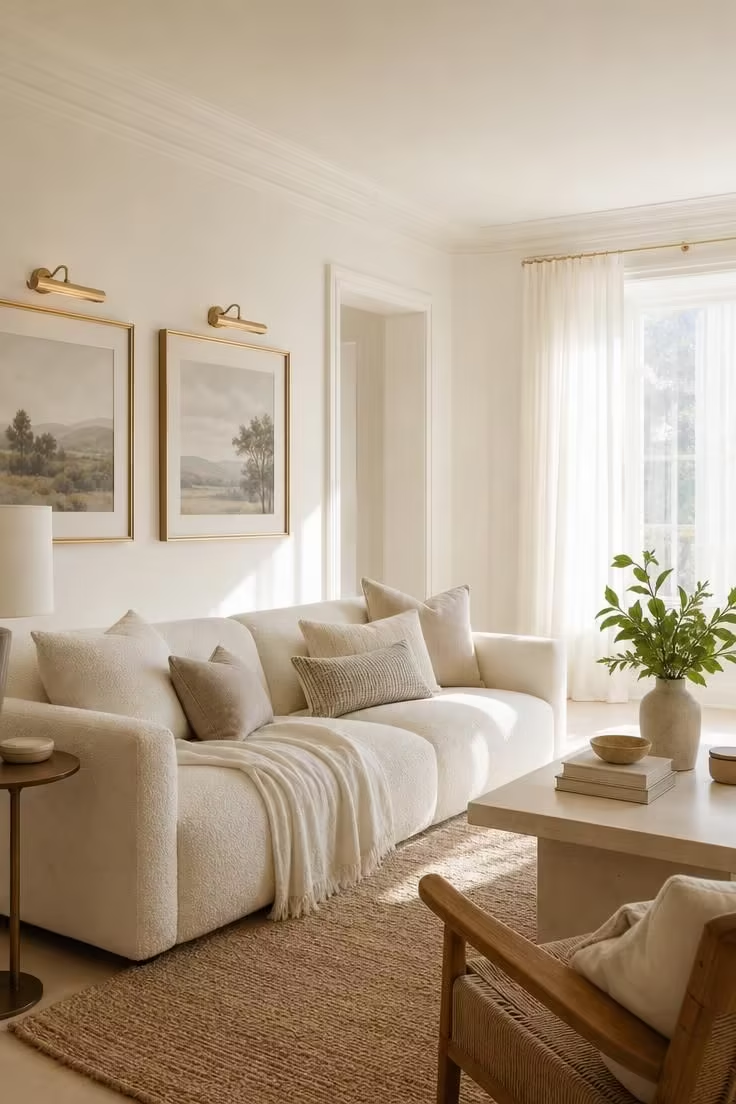
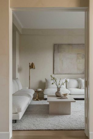
Warm white has replaced stark white as the safe neutral choice this year.
Drenching the entire room, walls, trim, and ceiling, in the same warm white removes any harsh contrast between surfaces.
Brass picture lights add a layer of architectural warmth without introducing another color into the mix.
This approach suits living rooms that get strong natural light, since warm white can look slightly flat in a dim, north-facing space.
Layer in natural textures like jute and linen so the all-white room still feels tactile rather than sterile.
It also happens to be one of the most flexible warm neutrals if you plan to change your furniture or art over time.
A room this pale photographs beautifully but needs a few grounding pieces so it does not feel empty.
Darker wood furniture or a patterned rug both do that job well.
Style Blueprint:
- Warm white paint for walls, trim, and ceiling
- Brass picture lights above framed art
- A natural jute or sisal rug
- Cream bouclé upholstery
- A darker wood furniture piece for contrast
Cinnamon Slate Paint, One of the Coziest Painting Ideas for Living Room Reading Nooks
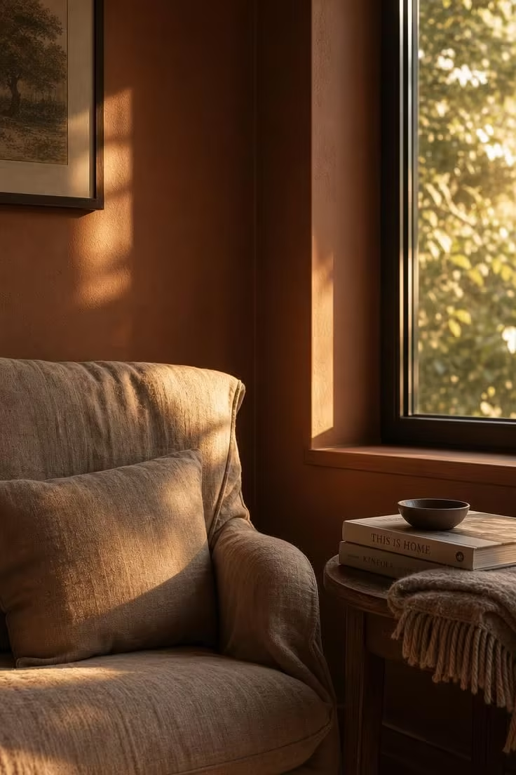
Not every color idea needs to cover a full room.
Painting just one corner in a rich cinnamon slate is one of the coziest painting ideas for living room reading nooks specifically, since it sets that spot apart from the rest of the space.
The warm, slightly muted tone works like a visual signal that this corner is meant for slowing down.
A single armchair angled toward natural light does more work than a whole seating arrangement in a nook this size.
Keep the surrounding walls a quieter neutral so the cinnamon corner stays a deliberate moment rather than competing with the main seating area.
Style Blueprint:
- Cinnamon slate paint for the nook wall
- A slouchy linen armchair
- A small wooden side table
- A folded wool or knit throw
- Soft, directional window light
Design Pro-Tip: A single accent corner only reads as intentional if the color stops at a natural break, like a doorway or a change in wall plane. Stopping mid-wall for no structural reason tends to look like an unfinished paint job rather than a design choice.
Charcoal Color-Capped Ceiling Above Cream Board-and-Batten Walls
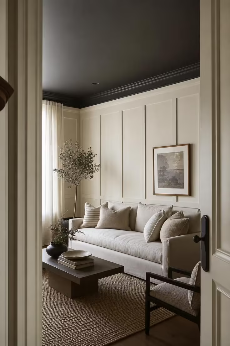
Charcoal on the ceiling sounds like it would make a room feel smaller, but the opposite tends to happen.
A dark tonal ceiling draws the eye upward and creates a defined edge, similar to a frame around the whole room.
Cream board-and-batten paneling below keeps the space feeling light and detailed rather than heavy.
This combination works particularly well in rooms with crown molding or another architectural line to mark the color capping transition.
Diffused, even light shows off the contrast best, so avoid harsh directional lighting that can make the dark ceiling feel like a shadow instead of a design choice.
Style Blueprint:
- Charcoal paint for the ceiling
- Cream or ivory board-and-batten paneling
- Crown molding to mark the transition
- A neutral linen sofa
- Soft, even ambient lighting
Mushroom Greige Walls With High-Gloss Black Trim Detail
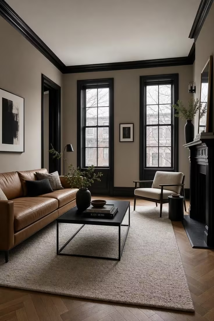
Mushroom greige has become one of the most versatile warm neutrals for living rooms because it shifts slightly depending on the light.
Pairing a soft, matte wall color with high-gloss black trim adds contrast without introducing a second full color.
The sheen on the trim catches light differently than the flat wall, which keeps a fairly quiet living room color palette from feeling boring.
Black metal furniture, like a simple coffee table base, echoes the trim and ties the look together.
This pairing tends to photograph well in almost any light, which makes it a safe but still striking choice.
Keep upholstery in warm neutrals like camel or oatmeal so the black trim reads as an accent rather than the main event.
Style Blueprint:
- Mushroom greige paint in a matte finish
- High-gloss black paint for window and baseboard trim
- Camel leather seating
- A black metal coffee table
- A pale wool rug
Conclusion
Painting ideas for living room walls do not have to mean picking a single safe neutral and hoping it works.
Whether it is a fully drenched aubergine room or a quiet greige and black pairing, the strongest choices lean into color rather than around it.
Start with one wall, one nook, or one ceiling if a full room feels like too much of a leap.
Once you see how a single bold choice changes the way the room feels, the rest of the palette tends to follow naturally.