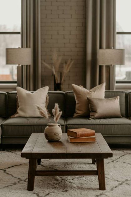
This post may contain affiliate links. If you make a purchase through these links, we may earn a commission at no additional cost to you.
Moody neutral living rooms blend sophisticated darkness with earthy warmth to create spaces that feel cocooning rather than cold.
These interiors trade bright whites for charcoal grays, warm greiges, and deep sages.
The result? Rooms that invite you to slow down and breathe.
1. Charcoal Sophistication Meets Organic Texture
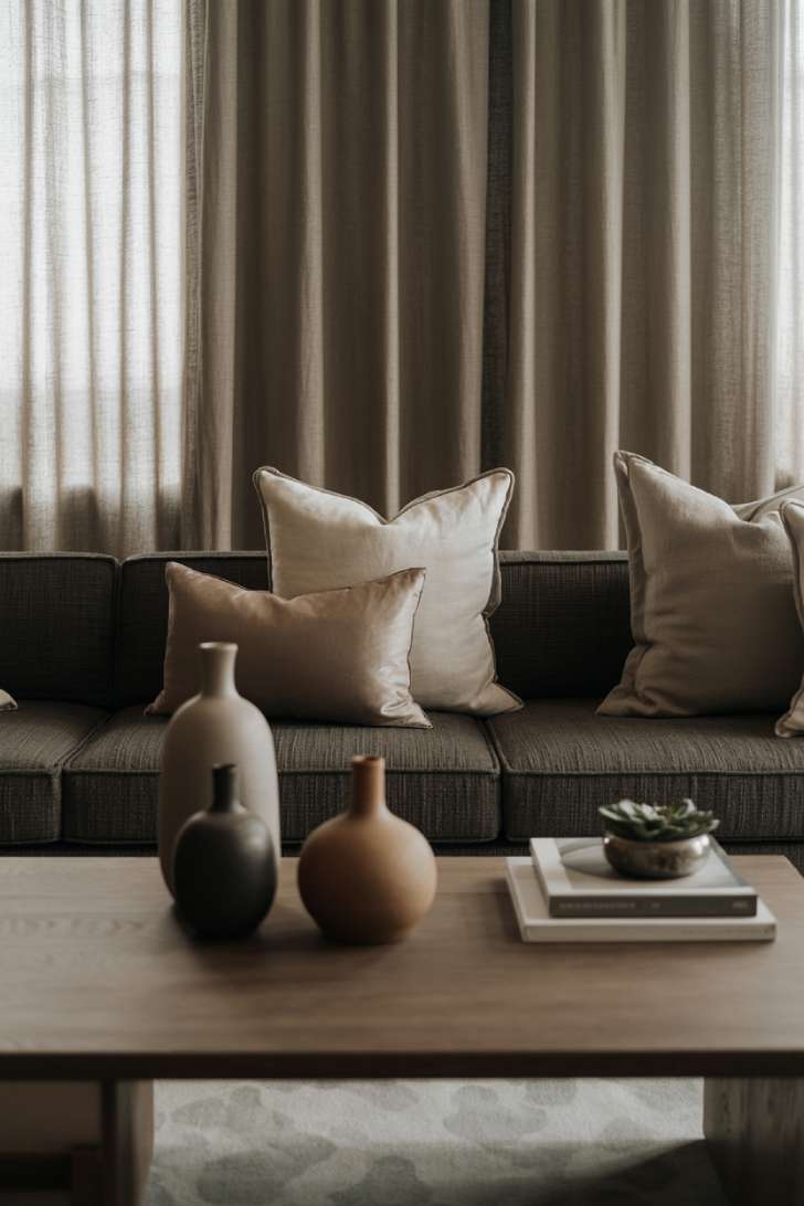
Deeper tones give the room a more enveloping, cohesive look.
Rich neutrals add depth and help the lighter finishes stand out more clearly.
The charcoal sectional anchors the room without overwhelming it.
Matte black ceramics create distinct focal points against the warm beige accents.
That contrast distributes visual weight across the room and keeps the composition from feeling too dense in one area.
The low-profile coffee table preserves open sightlines and gives the darker furnishings more breathing room.
Diffused light through the sheer curtains softens the contrast between dark and light surfaces.
It also reduces harsh shadows, helping the deeper colors feel layered rather than flat or overly enclosed.
Style Blueprint:
- Charcoal gray sectional with deep seating
- Matte black ceramic vases in varied heights
- Sheer linen curtains for light diffusion
- Low walnut coffee table
2. Layered Earth Tones with Warm Ambient Glow
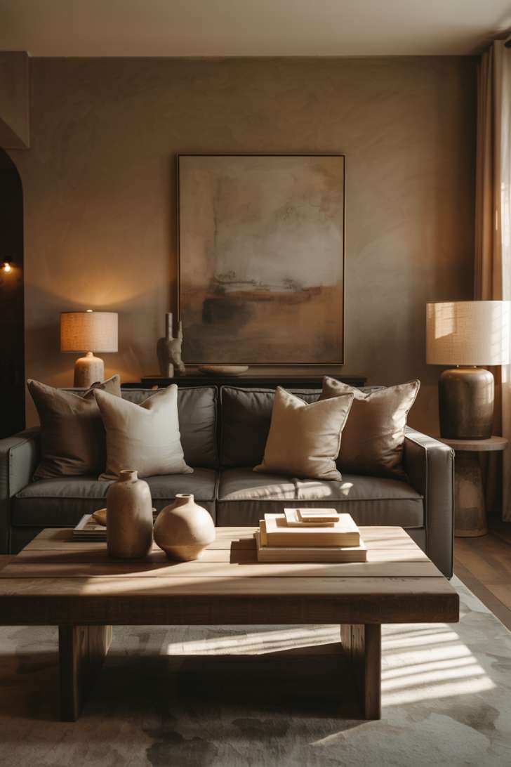
Greige walls are the unsung hero of moody neutral home decor.
They shift between warm and cool depending on the light, creating visual interest throughout the day.
This design uses a biophilic palette of earth tones that echoes the colors and material relationships found in natural landscapes.
The muted greens, browns, and warm neutrals create a visually cohesive composition with soft contrast, layered depth, and a grounded overall appearance.
The abstract painting above the sofa introduces movement without pattern overload.
Table lamps with linen shades create what designers call “layered lighting”—multiple light sources at different heights that mimic how light behaves in nature.
This beats overhead lighting every time for creating a mood.
The rustic wood coffee table introduces organic texture that prevents the space from feeling too polished or staged.
Style Blueprint:
- Large abstract art in muted earth tones
- Table lamps with natural linen shades
- Rustic wooden coffee table with visible grain
- Warm greige wall paint
3. Minimalist Calm with Natural Fiber Accents
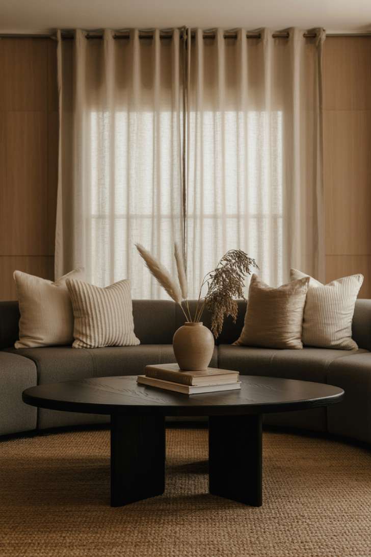
Jute rugs add visible texture and warmth, creating contrast against smoother furniture and flooring.
Their woven surface brings depth and variation to areas dominated by flat, polished finishes.
The natural fibers introduce an earthy texture that pairs easily with wood, linen, stone, and other organic materials.
The beige walls and wood paneling emphasize horizontal lines, visually stretching the room from side to side.
These repeated horizontal elements reinforce the room’s width and give the composition a more expansive appearance.
The black coffee table adds a defined point of contrast that anchors the seating area without overpowering the surrounding neutral palette.
Dried pampas grass introduces soft, irregular shapes that contrast with the room’s straight architectural lines and solid surfaces.
Its feathery plumes catch changing daylight, adding subtle shifts in texture, shadow, and highlight throughout the day.
Style Blueprint:
- Large jute area rug with visible weave
- Sleek black coffee table
- Dried pampas grass in ceramic vessel
- Warm beige walls with wood accent paneling
4. Sage Green Depth with Reclaimed Wood Character
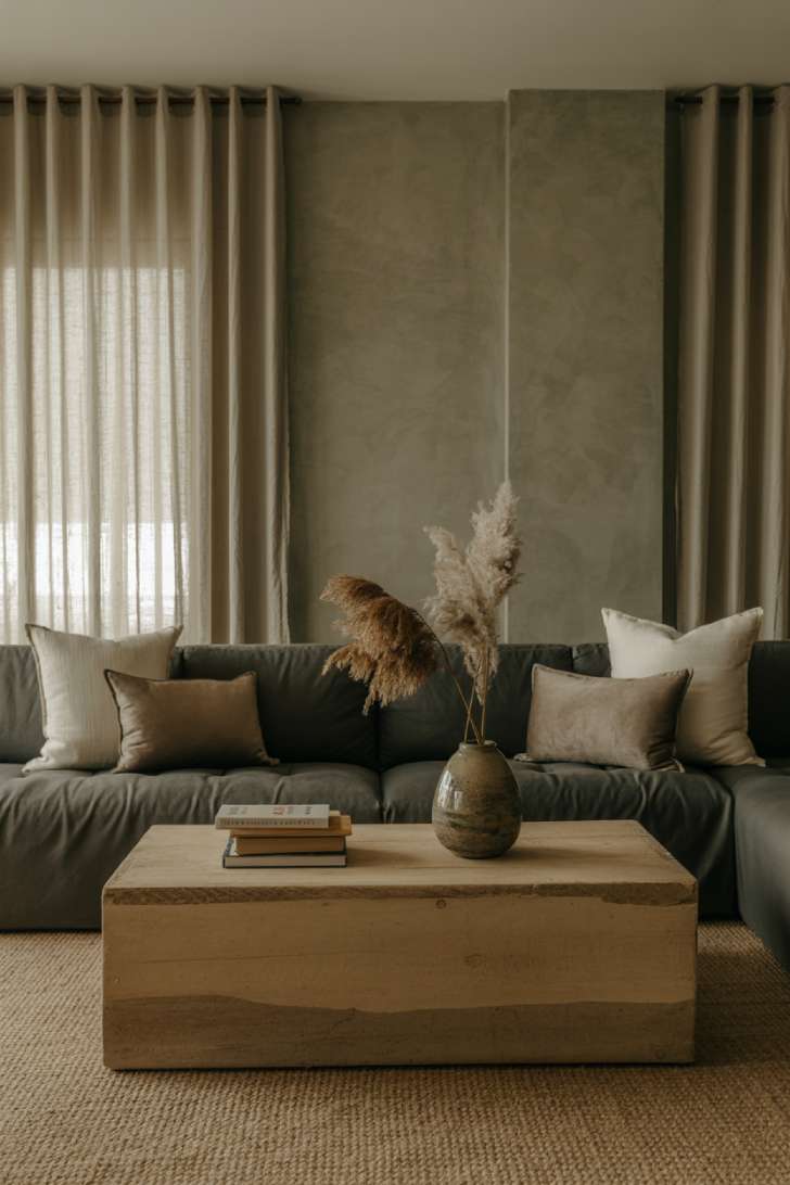
A sage green accent wall softens the contrast in a moody lounge room, adding a muted mid-tone between darker furniture and lighter decorative elements.
Its subdued color also gives the room a natural backdrop that works well with wood, woven fibers, and warm neutrals.
The reclaimed wood coffee table adds texture and variation through its visible grain, irregularities, and worn finish.
Against smoother upholstery and painted surfaces, those imperfections keep the room from looking overly polished or uniform.
The natural fiber rug connects the cool sage wall with the warmer tones of the wood, creating a more cohesive palette across the room.
Cream and taupe pillows break up the large charcoal surface of the sofa and repeat the lighter tones found elsewhere in the space.
Together, these lighter accents balance the darker furniture and keep the composition from feeling visually bottom-heavy.
Style Blueprint:
- Sage green accent wall paint
- Reclaimed wood coffee table with visible character
- Natural fiber area rug
- Dried pampas grass arrangements
5. Contemporary Drama with Concealed Lighting
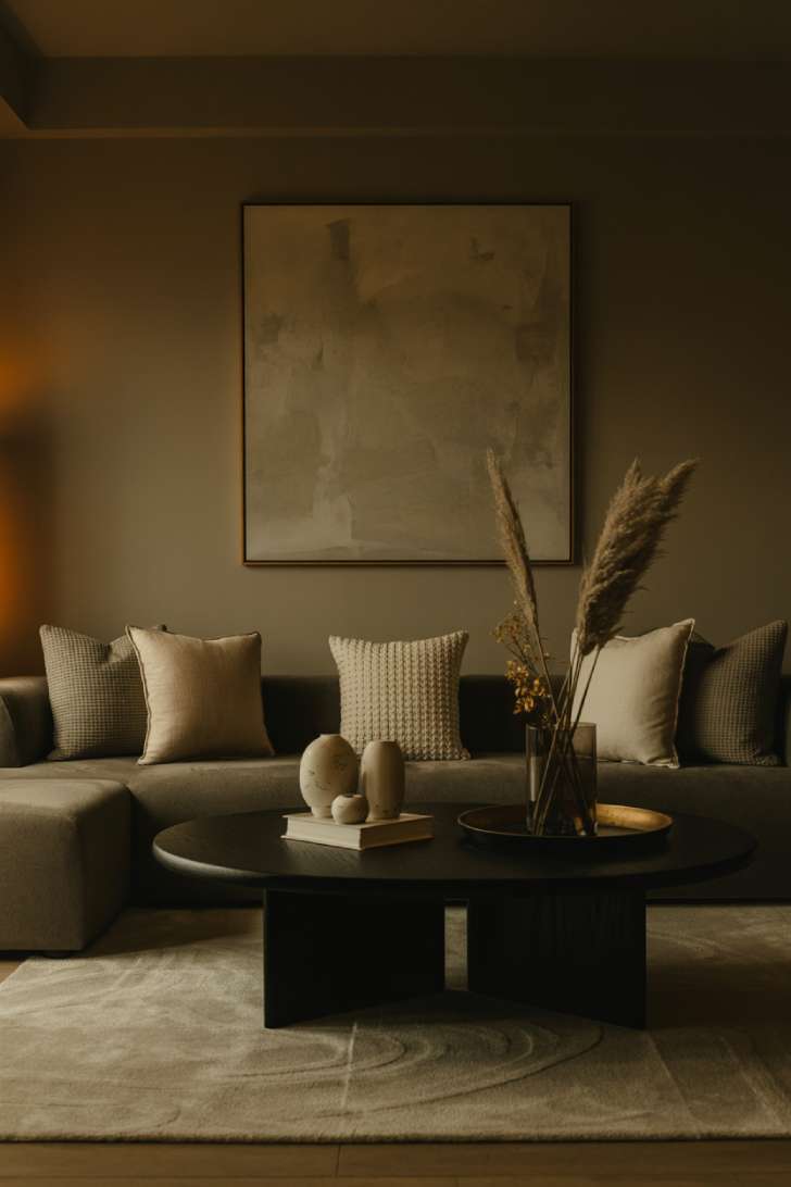
Concealed lighting is a game-changer for moody neutral living room design.
It creates atmosphere without revealing its source—your eye sees the effect but not the cause.
This triggers a subtle sense of mystery that makes spaces feel more expensive.
The mushroom gray walls read as luxurious rather than dull because of how the lighting plays across their surface.
Shadows become part of the design, not something to eliminate.
The black coffee table grounds all that atmospheric lighting with a solid, defined edge.
Large abstract art at this scale becomes architecture rather than decoration.
It changes how you perceive the room’s proportions.
Style Blueprint:
- Concealed LED lighting for wall washing
- Mushroom gray wall paint
- Large-scale abstract art
- Sleek black coffee table
Design Pro-Tip: The 60-30-10 color rule transforms good rooms into great ones. Use your dominant neutral (charcoal, greige, or sage) for 60% of the space, a secondary tone for 30%, and an accent color for the final 10%. This creates visual hierarchy your brain naturally finds pleasing.
6. Textured Luxury with Charcoal Velvet
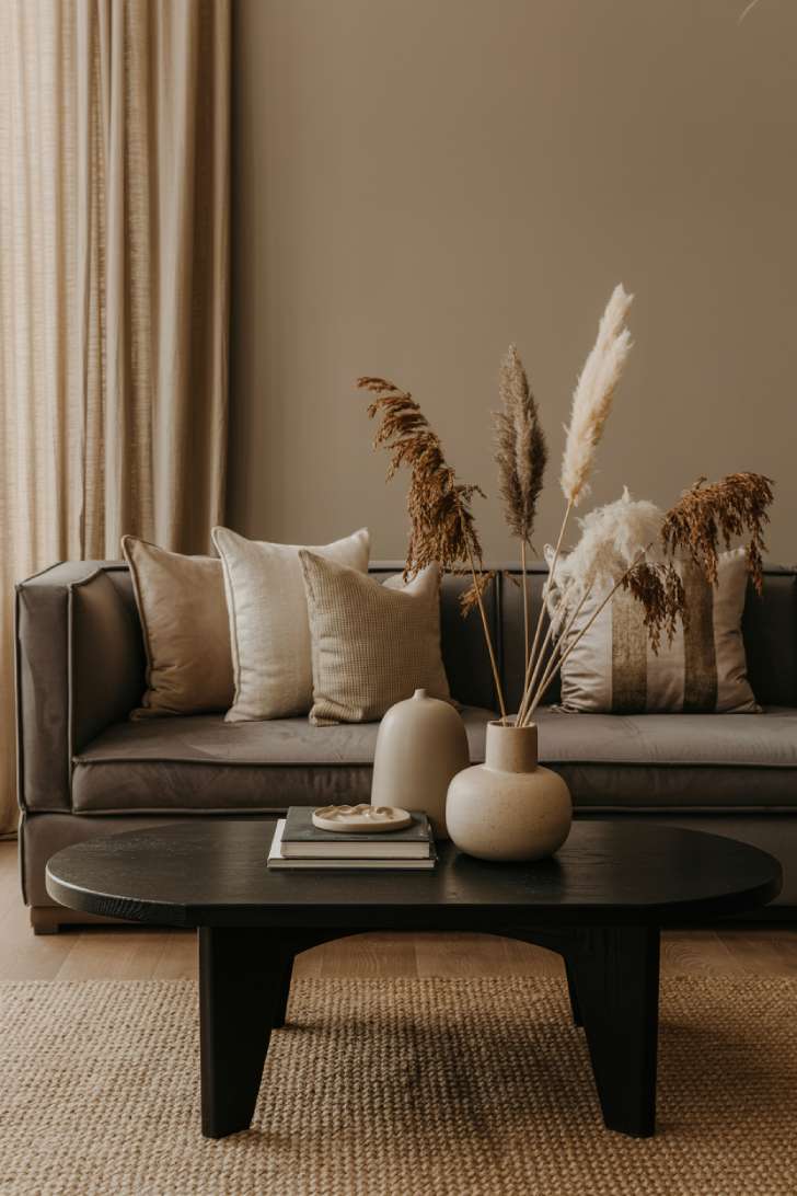
Velvet does something magical to light.
Its pile catches and reflects rays differently than flat fabrics, creating depth through shadow play.
This textural variation keeps a dark neutral living room from feeling flat or one-dimensional.
The jute rug underneath provides contrast in both color and texture.
Your feet read rough natural fiber while your eyes see soft plush velvet—this sensory contrast creates richness.
Matte white ceramics here prevent the darker elements from dominating.
They act as visual breathing room.
Greige walls shift the temperature warmer than pure gray would, preventing that cold, industrial feeling.
Style Blueprint:
- Charcoal velvet sofa
- Textured jute area rug
- Matte white ceramic vessels
- Greige wall paint
7. Brass Accents and Shadow Play
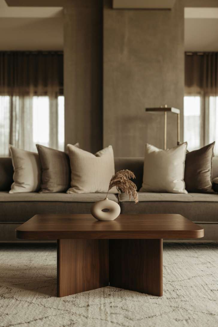
Brass floor lamps add a warm metallic accent that stands out against dark neutral walls and furnishings.
The brass surface picks up warm light and gives the room a softer, more golden highlight than cooler metals such as chrome or nickel.
These warm highlights create small areas of contrast throughout the room and break up large expanses of dark color.
Dark walnut wood adds visual depth through its rich tone and varied grain pattern.
Furniture with flatter or more uniform veneer surfaces usually shows less variation in color and grain.
The cream area rug creates a clear visual boundary around the seating arrangement.
Its lighter tone separates the conversation area from the darker surrounding surfaces and helps organize the furniture into a cohesive group.
Subtle wall texture catches light differently throughout the day, producing gentle changes in shadow, tone, and surface detail as the natural light shifts.
Style Blueprint:
- Modern brass floor lamp
- Dark walnut coffee table
- Luxurious cream area rug
- Textured wall treatment
8. Deep Sage Drama with Woven Naturals
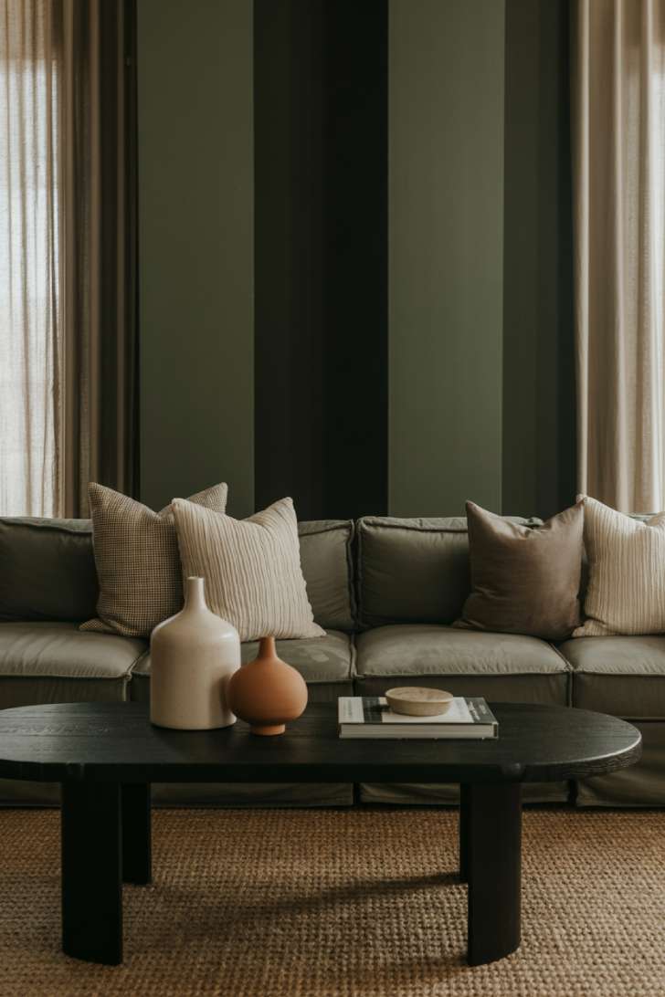
Deep sage walls give the lounge depth and create a darker backdrop for lighter furnishings and natural textures.
The muted green-gray tone works as a versatile base that pairs easily with both warm and cool colors.
Terracotta accents add a warm contrast to the cooler sage walls and keep the palette from feeling too monochromatic.
Combining warm terracotta with cooler sage creates more color variation and gives the room a layered, collected look.
The woven jute rug adds visible texture at floor level and creates contrast with smoother surfaces such as painted walls and upholstered furniture.
Its coarse weave also introduces another material into the composition, helping separate the seating area from the surrounding surfaces.
Sheer linen curtains soften incoming light and add a light, translucent layer around the windows.
The brighter fabric and filtered daylight create contrast against the deep wall color, keeping the overall composition from becoming visually too dark or enclosed.
Style Blueprint:
- Deep sage green accent walls
- Woven jute area rug
- Terracotta ceramic accents
- Sheer linen window treatments
9. Fireplace Focal Point with Cream Foundation
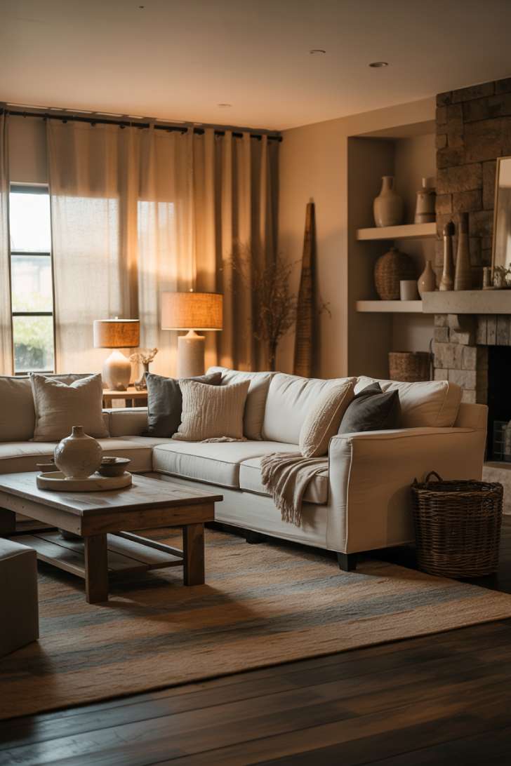
Starting with a cream sectional instead of charcoal creates a lighter center within the moody neutral palette.
The darker tones appear through the accent walls, flooring, and decor, allowing the main seating to stand out against the surrounding depth.
This creates a composition built around a bright central element framed by deeper, darker tones.
The stone fireplace provides a strong textural focal point and gives the room a clear visual anchor.
The natural variation in the stone introduces texture, irregularity, and contrast against the smoother surrounding surfaces.
Layered rugs add dimension to the floor and help define the seating area through changes in texture, pattern, and scale.
Overlapping rugs break up the flat expanse of flooring and introduce another visible layer to the composition.
Linen-shaded lamps placed throughout the room create several warm points of light at different heights.
Using multiple lamps distributes light across the room and softens the strong contrast that can result from relying on a single overhead fixture.
Style Blueprint:
- Cream-colored sectional sofa
- Stone fireplace surround
- Layered area rugs (jute base, patterned top)
- Multiple table lamps with linen shades
Design Pro-Tip: Never underestimate the power of “light layering.” Combine three types of lighting—ambient (overhead or concealed), task (reading lamps), and accent (uplights on art or plants). This trio creates depth and prevents the flat, lifeless feeling that single-source lighting produces.
10. Floating Shelves and Chunky Textures
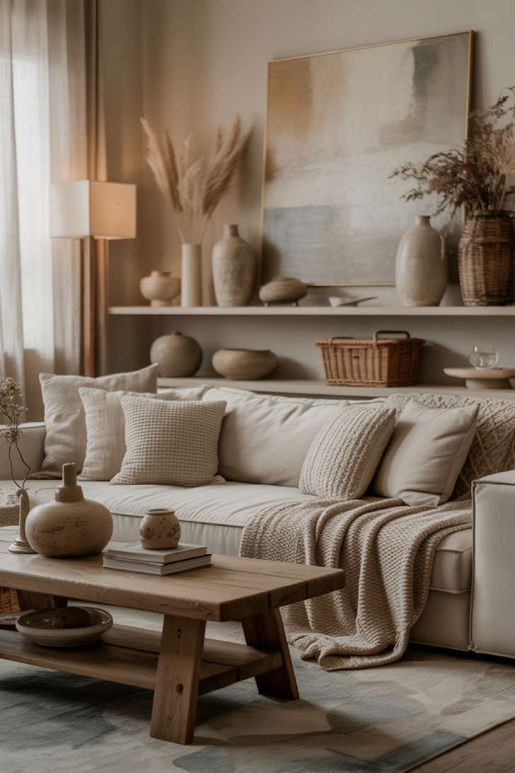
Floating shelves break up wall space without the visual weight of floor furniture.
They create horizontal lines that guide your eye across the room rather than just up and down.
This is directional design—controlling how people visually navigate your space.
The chunky knit blanket introduces tactile appeal that smoother textures can’t provide.
Your brain associates these oversized weaves with comfort and handmade quality.
Ceramic vases and woven baskets on shelves create visual rhythm through repetition.
Repeating organic shapes in different scales creates what designers call “controlled variety.”
Natural light filtering through sheers prevents the darker elements from overwhelming the space.
It’s that push-pull between light and dark that makes moody neutral home decor work.
Style Blueprint:
- Floating wall shelves in dark wood
- Chunky knit throw blanket
- Mixed ceramic vases and woven storage
- Sheer curtain panels
11. Matte Black Accent Wall with Warm Oak Floors
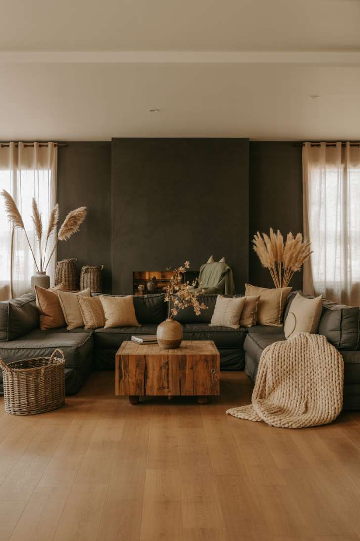
A matte black accent wall is one of the boldest choices you can make within a neutral color palette.
The dark surface creates a strong backdrop that gives lighter furniture, textiles, and decorative details greater visual definition.
Warm oak floors balance the black wall with a lighter, golden tone.
The natural variation in the wood also keeps the room from looking too flat or dominated by a single dark surface.
Sage green pillows introduce a muted third color that sits comfortably between the warm wood tones and the black wall.
This creates a more layered palette without taking attention away from the room’s neutral foundation.
Against the dark backdrop, the grain and weathered texture of the reclaimed wood coffee table become more visible.
The contrast between the black wall and the lighter natural materials gives the room clearer separation between surfaces, colors, and textures.
Style Blueprint:
- Matte black accent wall paint
- Warm oak hardwood flooring
- Reclaimed wood coffee table
- Sage green linen pillows
Moody Neutral Living Room Elements
| Design Element | Material/Finish | Mood Created | Maintenance Level |
|---|---|---|---|
| Charcoal Sectional | Velvet or Linen | Cocooning & Protective | Medium (spot clean) |
| Greige Walls | Matte Paint | Warm & Adaptable | Low (touch-ups rare) |
| Jute Rugs | Natural Fiber | Organic & Textural | Medium (vacuum weekly) |
| Black Coffee Tables | Wood or Metal | Grounding & Defining | Low (dust as needed) |
| Sage Accent Walls | Matte Paint | Calming & Restorative | Low (touch-ups rare) |
| Dried Pampas Grass | Natural Stems | Movement & Softness | Very Low (dust monthly) |
Conclusion
Moody neutral living rooms prove that darkness doesn’t mean dreary.
These spaces work because they balance rich depths with warm textures and strategic lighting.
Whether you choose charcoal grays, warm greiges, or deep sages, the secret lies in layering tones rather than committing to just one.
Mix your materials.
Vary your light sources.
Let shadows become part of the design rather than something to fight.
The result is a space that invites you to sink in and stay awhile.