This post may contain affiliate links. If you make a booking or purchase through these links, we may earn a commission at no additional cost to you.
A grey bedroom becomes something worth remembering the moment a single bold hue shows up.
The trick is choosing a pop of color that does more than decorate, one that shifts the entire feeling of the room from quiet to personal.
These 15 grey bedroom ideas with pop of color prove that warmth, personality, and a layered look can all come from one well-placed accent.
Whether you lean toward rich jewel tones or soft earthy shades, every room here shows how grey becomes the perfect backdrop when color gets the final word.
A Charcoal Upholstered Bed Frame With Mustard Linen Lumbar Pillows
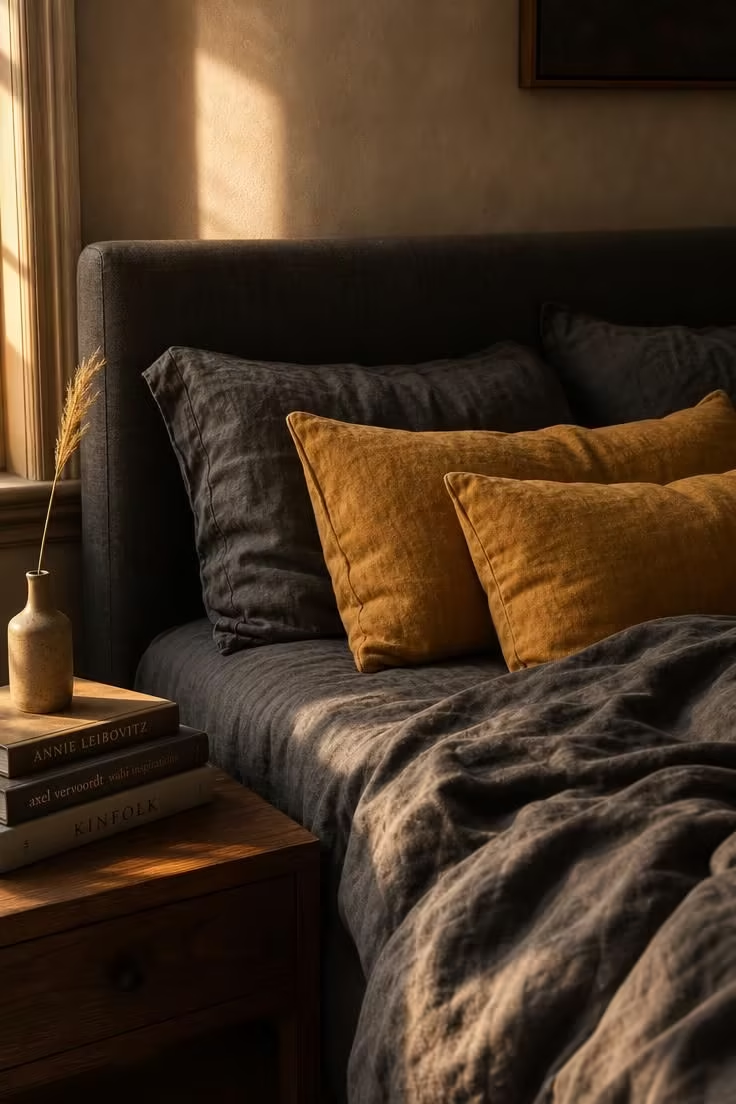
Mustard against charcoal is one of those combinations that just works without trying too hard.
The warmth of the yellow tone pulls the dark grey away from feeling cold or flat, giving the bed an immediate sense of invitation.
Linen lumbar pillows add a casual, textural quality that keeps the accent from looking overly polished or staged.
What makes this pairing succeed is the contrast in both value and temperature, with a warm hue sitting against a cool, deep neutral.
The charcoal bed frame acts as an anchor, grounding the entire bedroom color palette while the mustard does the talking.
A walnut nightstand beside the bed bridges the two tones, carrying warmth without adding another competing color.
This is the kind of grey bedroom idea with pop of color that feels intentional from every angle in the room.
Style Blueprint:
- Charcoal linen upholstered bed frame in a low-profile silhouette
- Two mustard-yellow linen lumbar pillows with a relaxed, unfilled shape
- Dark grey linen fitted and flat sheets in a cool-toned charcoal
- Walnut nightstand with a simple slab top and tapered legs
Pale Dove Grey Walls Behind a Tufted Emerald Velvet Accent Chair
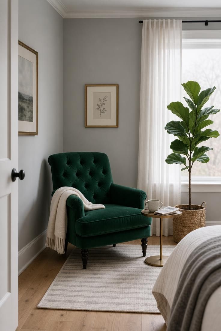
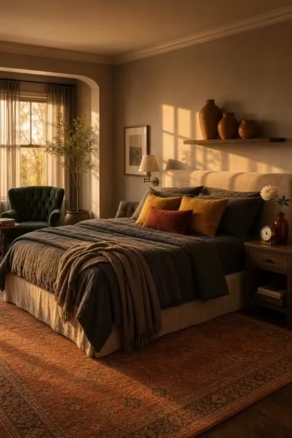
Emerald velvet against pale dove grey creates a jewel-box effect without overwhelming the space.
The tufting on the chair catches and releases light differently across its surface, giving the green depth that a flat fabric would miss entirely.
Dove grey walls in this setup serve as a blank gallery wall for the color, making the emerald feel like a deliberate statement rather than an afterthought.
Cool morning light from the window keeps the grey walls from reading yellow, preserving that silver undertone that makes the green pop cleanly.
A cream wool throw draped over the arm softens the formality of the velvet and ties the chair back to the lighter tones in the room.
This corner becomes a natural focal point, pulling the eye without needing bedroom wall art or a gallery arrangement to compete for attention.
Style Blueprint:
- Tufted emerald velvet accent chair with turned wooden legs
- Pale dove grey wall paint in a matte or eggshell finish
- Small round brass side table with a slim profile
- Cream wool throw blanket in a loose weave
- Woven seagrass planter basket for a medium floor plant
A Greige Linen Duvet Layered With Burnt Sienna Knit Throws
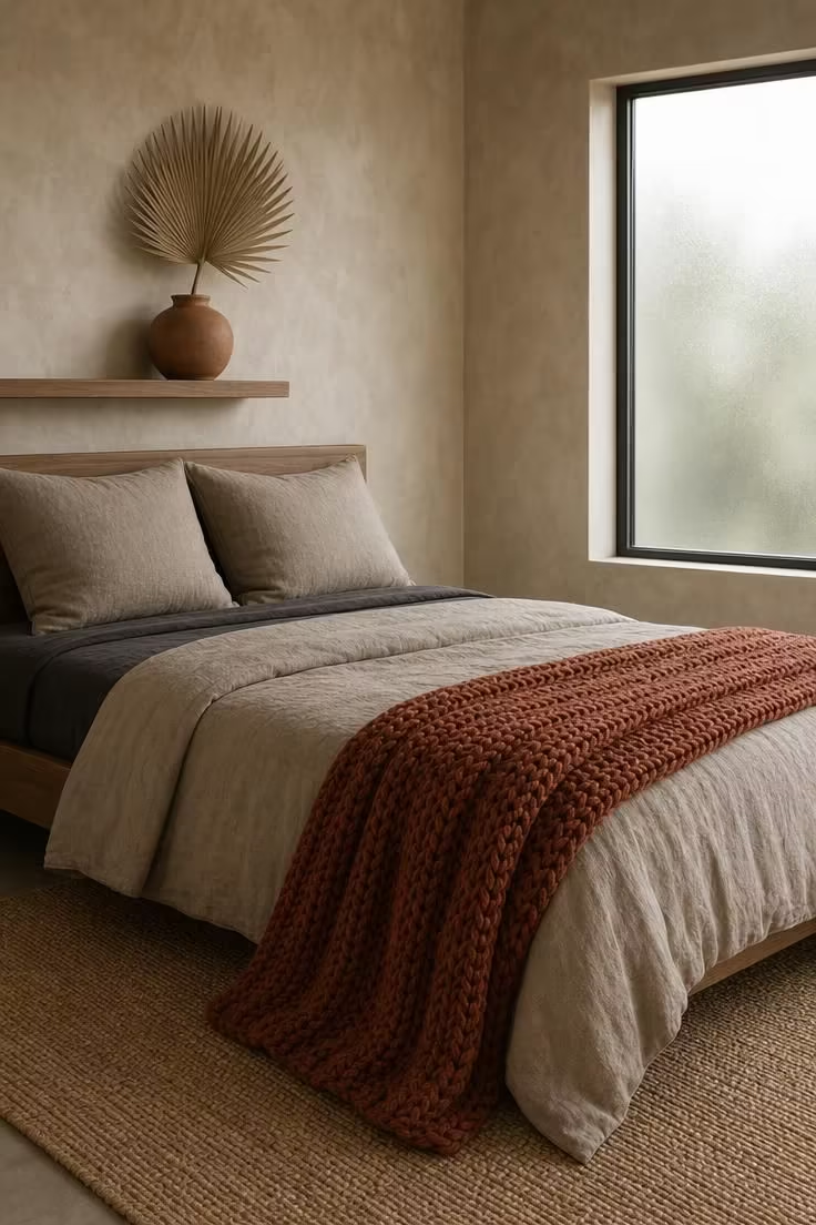
Layering a burnt sienna knit throw over greige bedding brings a depth of color that feels organic rather than designed.
The sienna tone reads as earthy and grounded, pulling warmth from the greige underneath without clashing or competing.
A chunky hand-knit texture adds a third dimension to the bed that smooth fabrics alone cannot achieve.
Grey bedding beneath the duvet provides a tonal foundation that keeps everything connected through value, even as the hue shifts.
The greige duvet sits right at the border between warm and cool, which is exactly why burnt sienna works here so naturally.
Soft diffused daylight is the ideal light for this combination, letting the knit texture show its full surface variation without harsh shadows.
A dried palm fan in a terracotta vase on the shelf above repeats the warm earth tones without adding clutter or visual noise.
This is the kind of bedroom accent color approach that ages well and never feels tied to a passing season.
Style Blueprint:
- Greige linen duvet cover in a stonewashed finish
- Chunky burnt sienna hand-knit throw in a cable or seed stitch
- Two greige euro shams in a slightly darker tone than the duvet
- Flat-weave jute rug in a natural undyed tan
- Round terracotta vase for a single dried botanical stem
Slate Floor Tiles Anchoring a Coral Ceramic Table Lamp Collection
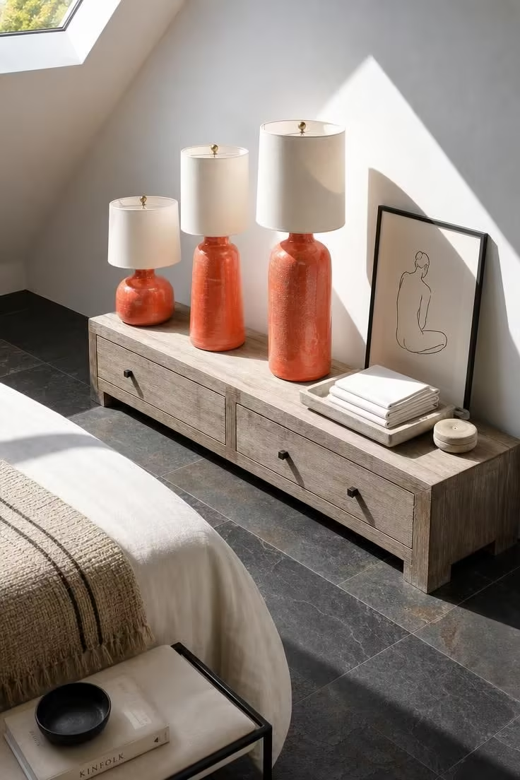
Coral ceramics against slate floors create a contrast that is both unexpected and surprisingly easy to live with.
The warmth of coral sits in a middle ground between pink and orange, which means it reads as approachable rather than bold.
Slate tiles bring a rugged, natural texture underfoot that grounds the brightness of the lamps and keeps the room from feeling precious.
Grouping three lamps at different heights turns the accent color into a considered collection rather than a single decorative object.
Bright midday light from a skylight is the kind of illumination that shows every nuance in a ceramic glaze, from matte to glossy.
Throw pillows bedroom often get the credit for color pops, but a lamp grouping like this provides color and function at the same time.
This setup works especially well in bedrooms where the floor itself does much of the visual heavy lifting.
Style Blueprint:
- Three coral-glazed ceramic table lamps in graduated heights
- Long, low grey-washed wooden console with simple lines
- Natural slate floor tiles in dark grey and charcoal tones
- Thin black metal picture frame for a leaning print
- Small pale stone coaster and white linen napkin tray
A Fog Grey Accent Wall With a Floating Shelf Holding Ochre Pottery
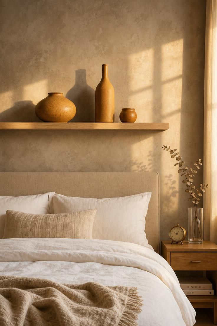
An accent wall bedroom setup in fog grey gives ochre pottery the quiet stage it needs to stand out.
The muted grey absorbs just enough light to let the warm amber and ochre glazes glow, especially in late-afternoon sun.
Placing the pottery on a single floating shelf keeps the arrangement controlled and intentional, avoiding the visual clutter that a full gallery wall can sometimes create.
Varying the heights and shapes of the vessels, from a wide squat form to a tall narrow bottle, creates rhythm across the shelf without needing symmetry.
A padded oatmeal linen headboard below the shelf acts as a soft transition between the cool wall and the warm accents above.
The nightstand decor on the right echoes the warmth with brass and dried eucalyptus, keeping the accent color story consistent across the room.
Style Blueprint:
- Fog grey matte wall paint for the accent wall behind the bed
- Light maple floating shelf spanning the headboard width
- Three ochre-toned pottery pieces in varying heights and shapes
- Padded oatmeal linen headboard panel
- Small brass clock and clear glass cylinder vase for nightstand decor
Design Pro-Tip: When using a single accent wall, keep the remaining three walls one to two shades lighter than the accent. This creates a natural depth that makes the colored objects on the accent wall feel like they are pushed slightly forward, giving the room a sense of dimension without extra furniture or layering.
Pewter Curtains Framing a Window Seat With Teal Velvet Cushions
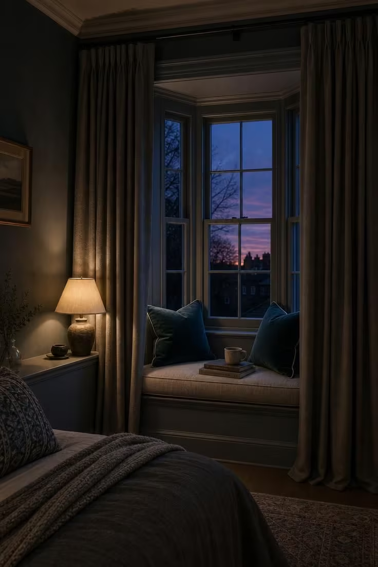
Pewter curtains and teal velvet cushions together create one of the richest tonal pairings a grey bedroom can offer.
The heaviness of the pewter fabric gives the window alcove a sense of enclosure, making the small space feel like a private retreat within the room.
Teal sits between blue and green on the spectrum, which means it picks up the cool undertones in a blue-grey wall without matching too closely.
Piped edges on the cushions add a polished detail that lifts the velvet from casual to considered.
Low lamp light at dusk is the ideal condition for this combination, when the teal deepens and the pewter takes on a soft sheen.
A window seat like this works as both a reading nook and a place to display accent pillows that might get lost on the bed.
The dusk sky visible through the glass extends the color story beyond the room itself, blending indoor and outdoor tones.
This is a grey and white bedroom alternative that trades brightness for mood and gains something more memorable in the process.
Style Blueprint:
- Floor-length pewter grey curtains in a heavy linen-blend fabric
- Two teal velvet cushions with contrast piped edges
- Built-in window seat bench upholstered in light grey linen
- Small cream-shaded table lamp for ambient alcove lighting
- Medium grey wall paint with a slight blue undertone
A Concrete-Look Nightstand Topped With a Ruby Glass Bud Vase
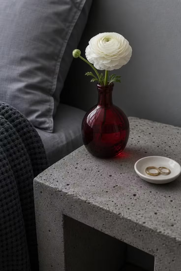
A single ruby glass vase on a concrete nightstand proves that a pop of color does not need to be large to be felt.
The translucency of the glass means the red shifts in intensity depending on the light, brighter in sun, deeper on overcast days.
Concrete as a nightstand material brings an industrial texture that makes the delicate glass feel even more precious by contrast.
Cool grey sateen sheets on the bed keep the surrounding palette restrained, letting the red vase hold all the visual weight.
This kind of small-scale color pop works well in bedrooms where the owner wants personality without committing to a full accent pillow or throw pillow bedroom overhaul.
Two gold rings in a white ceramic dish add a personal touch that makes the vignette feel genuinely lived-in rather than styled for a photograph.
The white ranunculus stem softens the red and ties the vase back to the lighter tones in the room.
Style Blueprint:
- Concrete-look nightstand with a raw, porous surface texture
- Ruby-red glass bud vase in a slim, tapered silhouette
- Cool grey sateen sheets and a charcoal waffle blanket
- Small white ceramic ring dish
- Mid-grey wall paint in a cool undertone
Storm Grey Bedding Paired With a Hand-Dyed Saffron Lumbar Cover

Saffron is a color that brings warmth without the brightness of yellow, and against storm grey linen, it feels like a quiet sunrise.
The hand-dyed quality of the lumbar cover matters here because the uneven dye pattern adds visual interest that a solid saffron fabric could not match.
Storm grey sits deeper than most bedroom greys, which gives the saffron more contrast and more room to feel alive.
A single lumbar pillow is all it takes to shift the entire bed from monochrome to warm and layered.
Soft diffused morning light is the ideal setting for this combination, when the saffron reads as golden rather than orange.
A weathered pine nightstand brings a natural wood tone that supports the warmth of the saffron without competing for attention.
Style Blueprint:
- Storm grey linen duvet and pillowcases in a heavy, textured weave
- Hand-dyed saffron cotton lumbar cover with visible dye variation
- Simple iron bed frame in a matte black finish
- Weathered pine nightstand with a lightly distressed surface
- Small grey cement pot holding a low succulent
A Silver Grey Headboard Wall With a Cluster of Paprika-Toned Abstract Prints
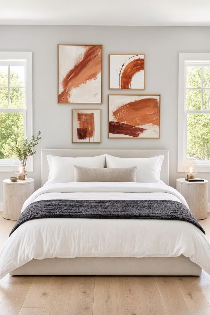
A cluster of paprika-toned prints on a silver grey wall turns the headboard area into a gallery without needing a single shelf or ledge.
Silver grey is cooler than most bedroom greys, which makes the warm paprika and rust tones in the artwork feel more alive and more deliberate.
Grouping four prints in an asymmetric arrangement creates movement and energy that a single centered piece cannot achieve.
Natural oak frames tie the prints to the white-washed nightstands, building a secondary material story through the wood tones.
Bright midday light from flanking windows is the best condition for viewing art, keeping the colors true and the details sharp.
White linen bedding keeps the bed from competing with the wall, letting the prints remain the clear focal point of the room.
A single grey knit throw at the foot adds texture without introducing another color, which is the right restraint when the wall is this active.
This is bedroom wall art done with a color purpose, not just a decorative afterthought hung because the wall felt empty.
Style Blueprint:
- Four paprika and sienna-toned abstract prints in thin natural oak frames
- Silver grey matte wall paint for the headboard accent wall
- White linen duvet and pillowcases in a crisp, smooth finish
- Two cylindrical white-washed oak nightstands
- Grey knit throw blanket in a medium weight
Design Pro-Tip: When hanging a cluster of prints, start by laying them out on the floor first and adjusting the spacing until the group feels balanced. The gap between frames should be consistent, usually two to three inches, and the overall cluster should sit roughly at eye level from a standing position, not centered to the headboard height alone.
Ash Grey Woven Wallpaper Behind a Blush Pink Upholstered Bench
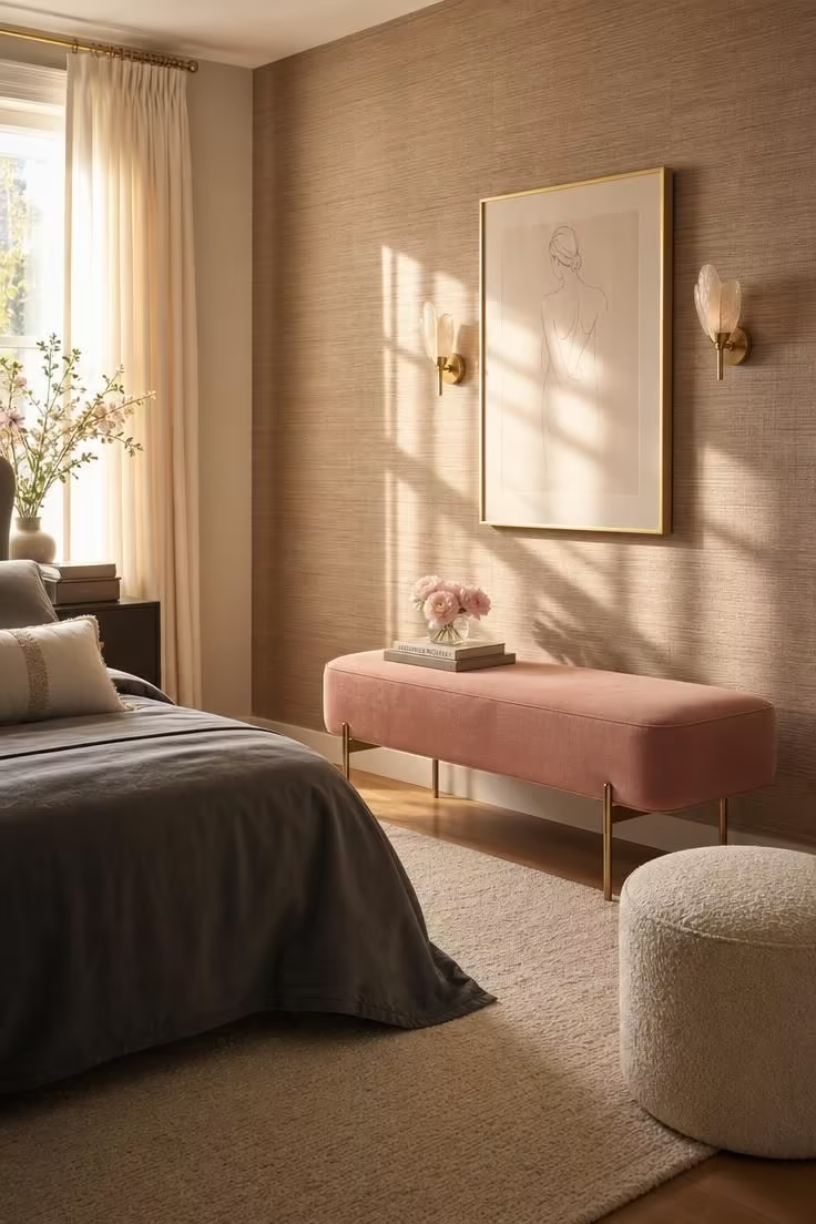
Blush pink against ash grey woven wallpaper feels romantic without tipping into anything saccharine or overdone.
The grasscloth texture on the wall gives the grey dimension that a flat painted surface would not, catching light differently across every strand.
A bench at the foot of the bed is one of the most underused spots for introducing bedroom accent colors, visible from the doorway and easy to swap with the seasons.
Slim brass legs on the bench add a metallic warmth that connects the pink and grey without needing another accessory to do the bridging.
Warm morning light is the ideal moment for blush, when the pink reads as soft and golden rather than cool or powdery.
A cream boucle pouf beside the bench adds another layer of texture at a lower height, keeping the eye moving through the scene.
This velvet headboard alternative places the accent fabric lower in the room, which can feel less visually heavy in a smaller space.
Style Blueprint:
- Blush pink cotton velvet upholstered bench with slim brass legs
- Ash grey woven grasscloth wallpaper in a natural fiber
- Grey bedding with two white accent pillows
- Cream boucle floor pouf in a round shape
- Cream wool area rug in a flat weave
A Dark Graphite Ceiling With a Citrine Pendant Light as the Focal Point
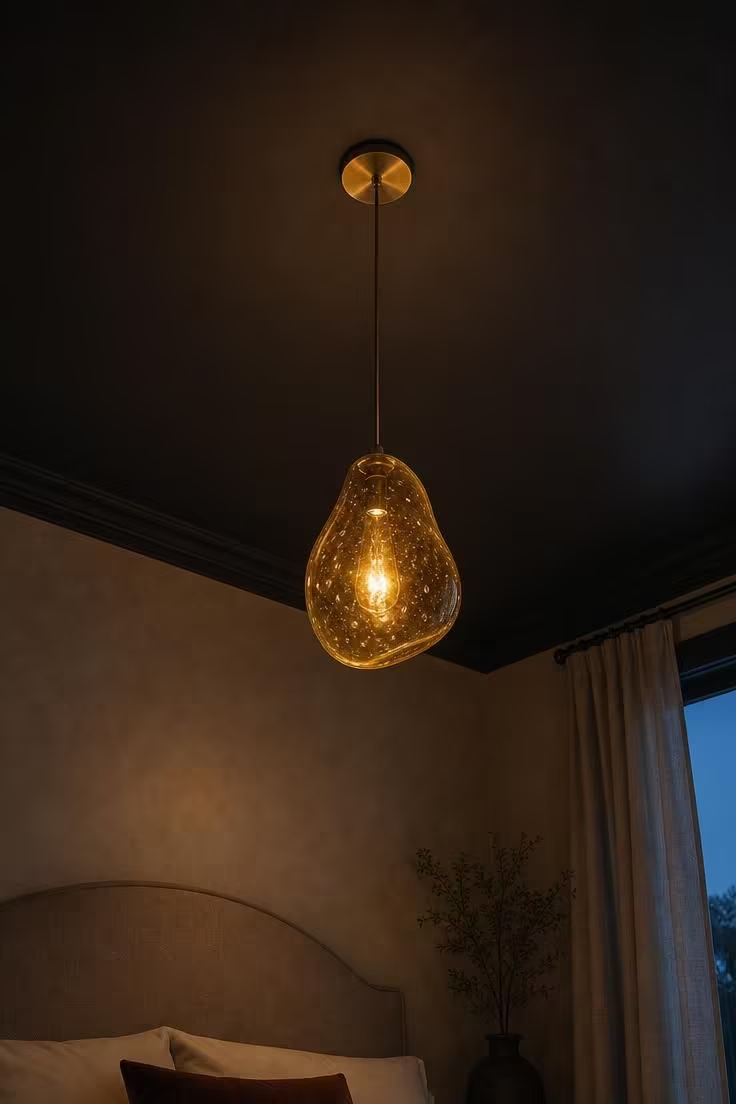
Painting the ceiling in dark graphite is a bold move that pays off when a citrine pendant light drops down as the room’s single source of warm color.
The eye is naturally drawn upward by the contrast between the dark surface and the glowing glass, which makes the pendant feel almost suspended in space.
Citrine sits between yellow and amber, which means it reads as warm and rich rather than bright and cheerful.
A blown glass pendant with visible air bubbles adds an artisanal quality that prevents the fixture from feeling mass-produced.
Moody low light conditions are where this combination performs best, when the citrine glow spreads across the graphite surface in a soft halo.
Lighter warm grey walls below the ceiling line keep the room from feeling too enclosed, providing enough visual relief to balance the dark overhead plane.
Style Blueprint:
- Dark graphite matte ceiling paint in a true charcoal tone
- Citrine-yellow blown glass pendant light with an organic shape
- Thin brass cord and ceiling medallion for pendant mounting
- Warm grey wall paint in a lighter tone than the ceiling
- Linen-covered headboard in a neutral oatmeal shade
Heather Grey Sheer Panels Flanking a Bold Plum Painted Door Frame
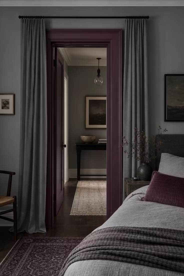
Painting a door frame in plum is the kind of unexpected color choice that changes the personality of a grey bedroom without touching a wall.
The architectural bones of the room become the accent, which gives the color pop a sense of permanence that a pillow or throw cannot match.
Heather grey sheer panels soften the hard edges of the doorway and add a floating, layered quality that makes the plum feel less stark.
Cool overcast light brings out the berry undertone in plum, shifting it away from purple and toward something warmer and more complex.
Echoing the plum in a single lumbar pillow on the bed creates a visual link between the doorway and the sleeping area without overdoing the accent.
The simplicity of this approach is its greatest strength, one paint color on one architectural element, and the entire room reads differently.
A cream hallway runner visible through the doorway provides a warm neutral transition from the moody bedroom into the brighter hallway beyond.
This is one of those grey bedroom ideas with pop of color that relies on editing rather than adding.
Style Blueprint:
- Rich plum paint for door frame and trim in a satin finish
- Heather grey sheer curtain panels in a lightweight linen blend
- Slim matte black curtain rod mounted above the door frame
- Plum-toned lumbar pillow for the bed to echo the door color
- Heather grey wall paint in a matte finish
A Cement Grey Plaster Wall With Tangerine Throw Pillows on a Low Platform Bed
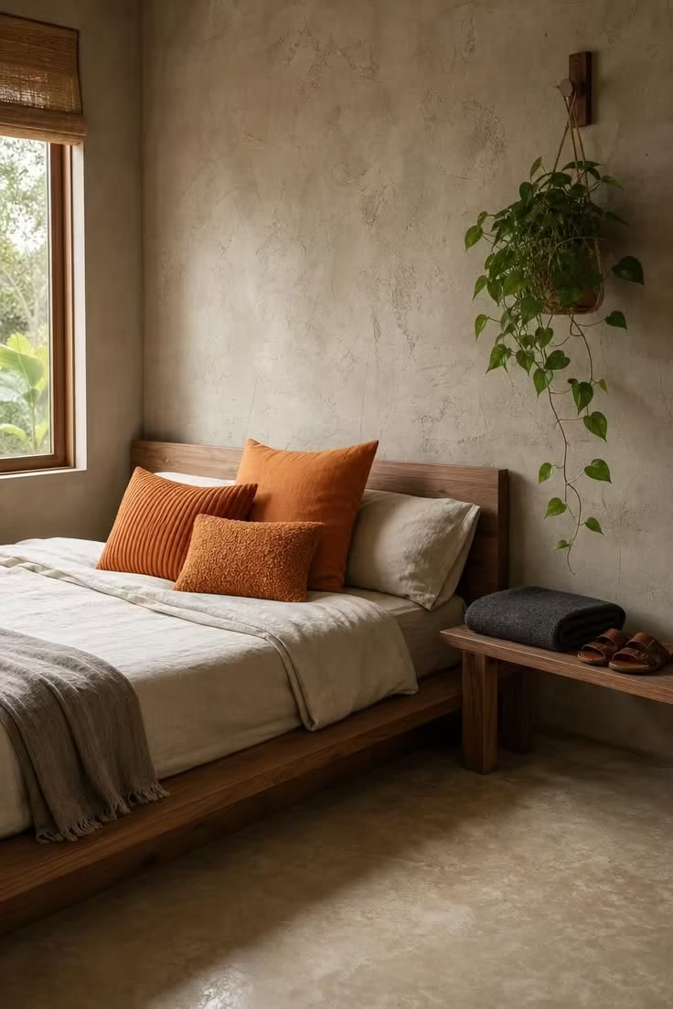
Tangerine against cement grey plaster is a combination that leans modern but stays approachable.
The raw, hand-applied texture of the plaster wall gives the grey surface a character that painted drywall cannot replicate.
Three throw pillows bedroom lovers would identify as a considered set, each in a different fabric, create variety within the single accent color.
A low platform bed in walnut keeps the room grounded and horizontal, which lets the bright pillows sit at a height that catches the eye immediately.
Soft diffused afternoon light warms the tangerine just enough to shift it from sharp orange to something closer to a ripe peach.
Polished concrete floors in pale grey echo the plaster wall, creating a continuous grey envelope that makes the tangerine feel even bolder.
A trailing pothos on a wall hook adds a casual green note that complements the orange through color theory, without adding another decorative layer.
Style Blueprint:
- Low walnut platform bed in a Japanese-influenced profile
- Three tangerine throw pillows in linen, ribbed cotton, and boucle textures
- Cement grey hand-applied plaster wall with visible trowel marks
- Narrow wooden bench for bedside storage
- Polished pale grey concrete flooring
Design Pro-Tip: When mixing throw pillow textures in a single color, pick one smooth, one medium, and one heavily textured fabric. This three-tier approach gives the eye enough variety to stay interested while the consistent color keeps the grouping from looking scattered or random.
Nickel Grey Closet Doors Behind a Freestanding Marigold Linen Armchair
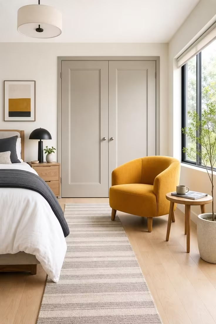
A marigold armchair in front of grey closet doors turns a forgotten zone of the bedroom into something worth noticing.
The closet area is often the most neglected wall in a bedroom, and placing a colored chair there gives it purpose and presence.
Nickel grey paint on the closet doors is a subtle upgrade from builder-grade white, adding just enough tone to read as intentional.
Marigold linen has a warmth and slight sheen that makes it photograph beautifully in bright midday light, the fabric almost glows.
The rounded back of the chair contrasts with the rectangular panel detailing on the closet doors, mixing soft and structured geometry.
A thin grey and cream striped runner on the floor ties the chair zone to the rest of the room, creating a visual path between the sleeping and dressing areas.
Style Blueprint:
- Pair of tall closet doors painted in nickel grey with slim panel detailing
- Freestanding marigold linen armchair with a rounded back and solid oak legs
- Small round oak side table for a magazine and mug
- Light birch hardwood flooring
- Grey and cream striped runner rug
A Warm Greige Bedroom With a Single Oversized Vermillion Woven Rug
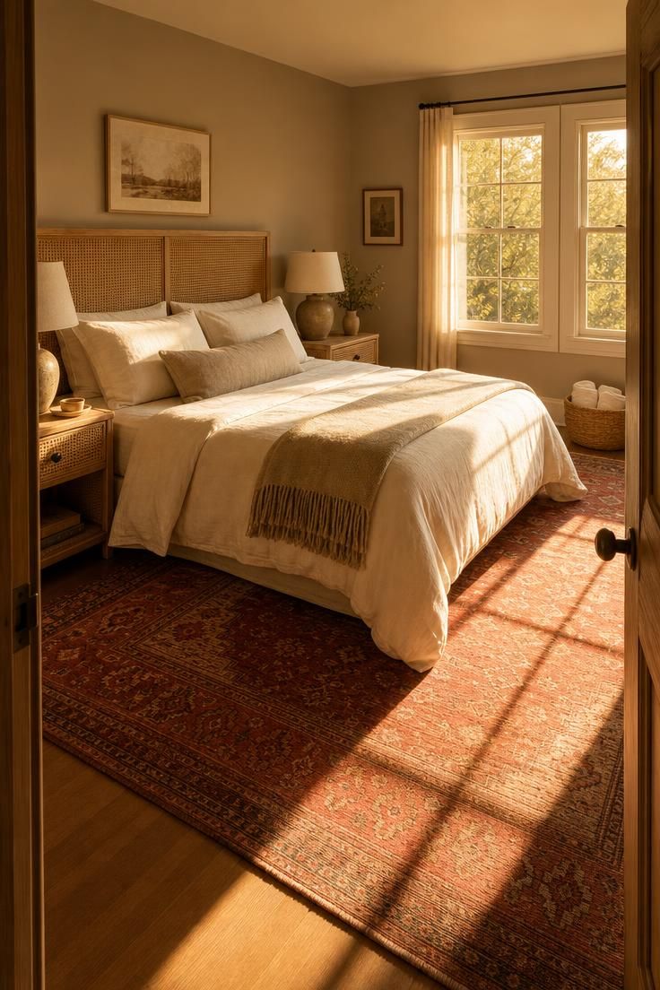
An oversized rug is the most effective place to put a pop of color because it anchors the entire room from the ground up.
Vermillion in a handwoven, slightly faded finish feels lived-in and collected, closer to a vintage find than a department store purchase.
Warm greige walls wrap the room in a tone that is neither fully grey nor fully beige, which gives the vermillion rug a neutral backdrop that leans cozy.
The scale of the rug matters here, covering most of the floor means the color is experienced with every step, not just glanced at from across the room.
Golden afternoon light intensifies both the greige walls and the vermillion fibers, making the whole bedroom feel sun-warmed and inviting.
Natural cane in the headboard and rattan on the nightstands bring a woven texture that echoes the rug’s handmade quality.
Creamy white linen bedding provides the visual breathing room the room needs to keep the vermillion from dominating.
This grey bedroom idea with pop of color works because the rug earns its place through both beauty and function, softening footfalls and warming bare feet.
Style Blueprint:
- Oversized vermillion handwoven area rug with a slightly faded, sun-washed finish
- Warm greige wall paint in a soft matte finish
- Creamy white linen duvet and pillowcases
- Wide natural cane headboard panel in a light wood frame
- Pair of matching rattan nightstands with ceramic lamps
Conclusion
Grey bedrooms become personal the moment a single bold accent enters the picture.
Every one of these 15 grey bedroom ideas with pop of color shows that warmth is not about how many colors you use, but about choosing the right one and placing it with care.
A mustard lumbar pillow, a vermillion rug, a plum-painted door frame, each one proves that grey is never boring when it has a strong partner.
The best part is how flexible this approach stays over time.
Swap the accent color with a new season, a new mood, or a new find at a local market, and the grey backdrop adapts without missing a beat.
Start with one pop, live with it for a week, and see how the room feels before adding anything more.