This post may contain affiliate links. If you make a booking or purchase through these links, we may earn a commission at no additional cost to you.
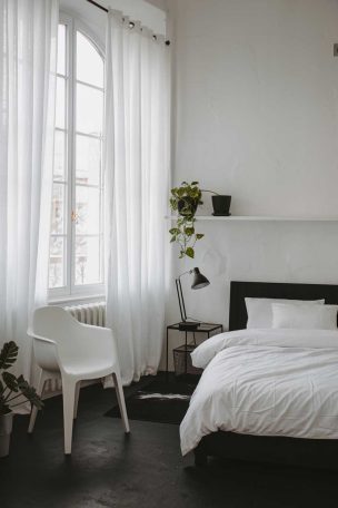
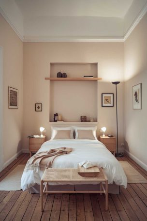
A neutral bedroom with black accents can look polished in a photo and still feel like nobody actually lives there.
The difference between a room that reads as “styled” and one that reads as “home” rarely comes down to the furniture, the paint color, or how much you spent.
It comes down to how honest the room is about the person sleeping in it.
The Ratio Most People Get Wrong With Black in a Neutral Room
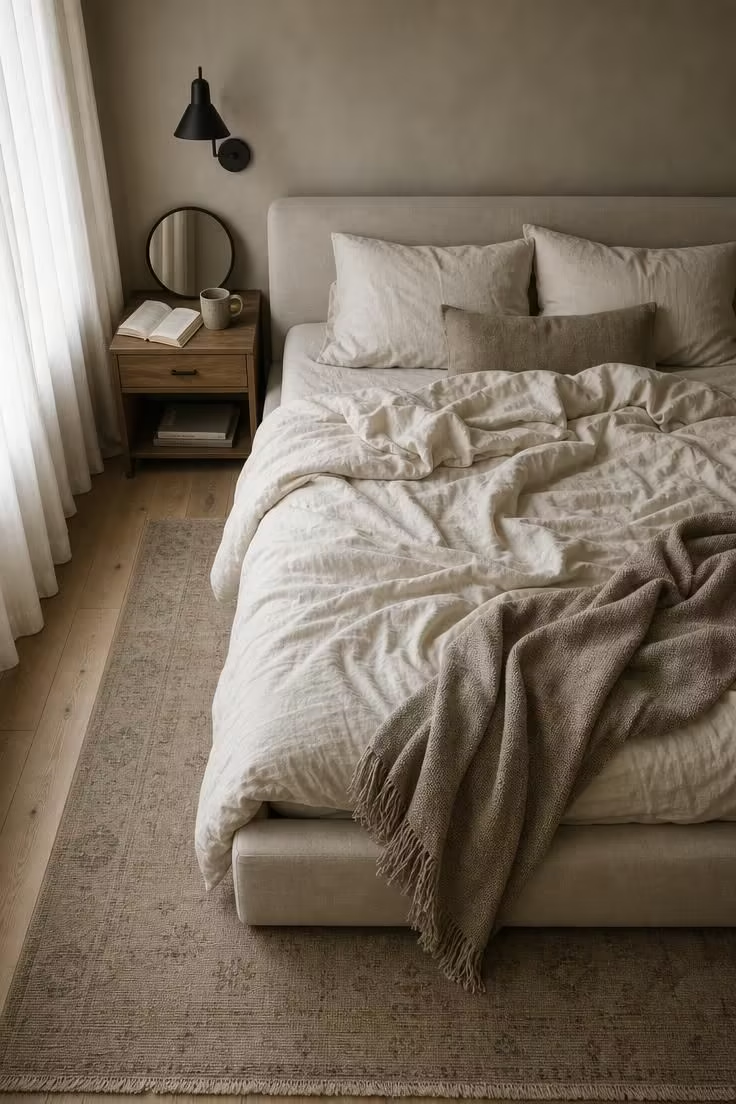
The most common mistake with a neutral color palette bedroom that uses black is treating black like a primary color rather than punctuation.
When every fixture, frame, handle, and lamp in the room is the same flat matte black, the eye has nowhere to rest and nowhere to be surprised.
Interior designers working in 2026 have noticed a marked shift away from blanket black hardware suites toward more selective placement.
One designer described the older approach as “uniform distribution,” where black was spread so evenly across every surface that nothing stood out as intentional.
The updated method treats black like a bold italic in a paragraph of plain text: it only works if it’s rare enough to carry weight.
A good working ratio is roughly 15 to 20 percent of the room’s visual surface area, concentrated in two or three anchor points rather than scattered across a dozen small details.
That restraint is what keeps the room from tipping into “showroom floor” territory and lets the neutral base breathe.
Why the Best Neutral Bedrooms Look Collected, Not Decorated
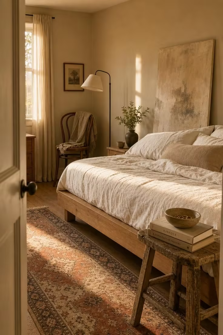
Rooms that feel genuinely personal almost never come from a single shopping trip.
They develop over months or years, piece by piece, and that timeline is what gives them their character.
The wabi-sabi bedroom philosophy captures this well: a space built around honest materials, handmade imperfections, and objects that show signs of use rather than objects chosen to photograph well.
A neutral bedroom with black accents lands in personal territory when the black elements arrived at different times and serve different purposes, like a reading lamp bought for function, a mirror frame inherited from a relative, and drawer pulls chosen because they felt right in the hand.
Compare that to a room where every black element was selected from the same product line on the same afternoon.
The first room tells a story, and the second room tells you it was decorated.
This distinction matters more than most people realize, because a bedroom is the most private room in a home and the one least served by showroom logic.
The goal is not to avoid planning or intentional choices, but to leave room for things that are chosen for reasons beyond appearance.
Where Black Actually Belongs in a Bedroom That Feels Warm
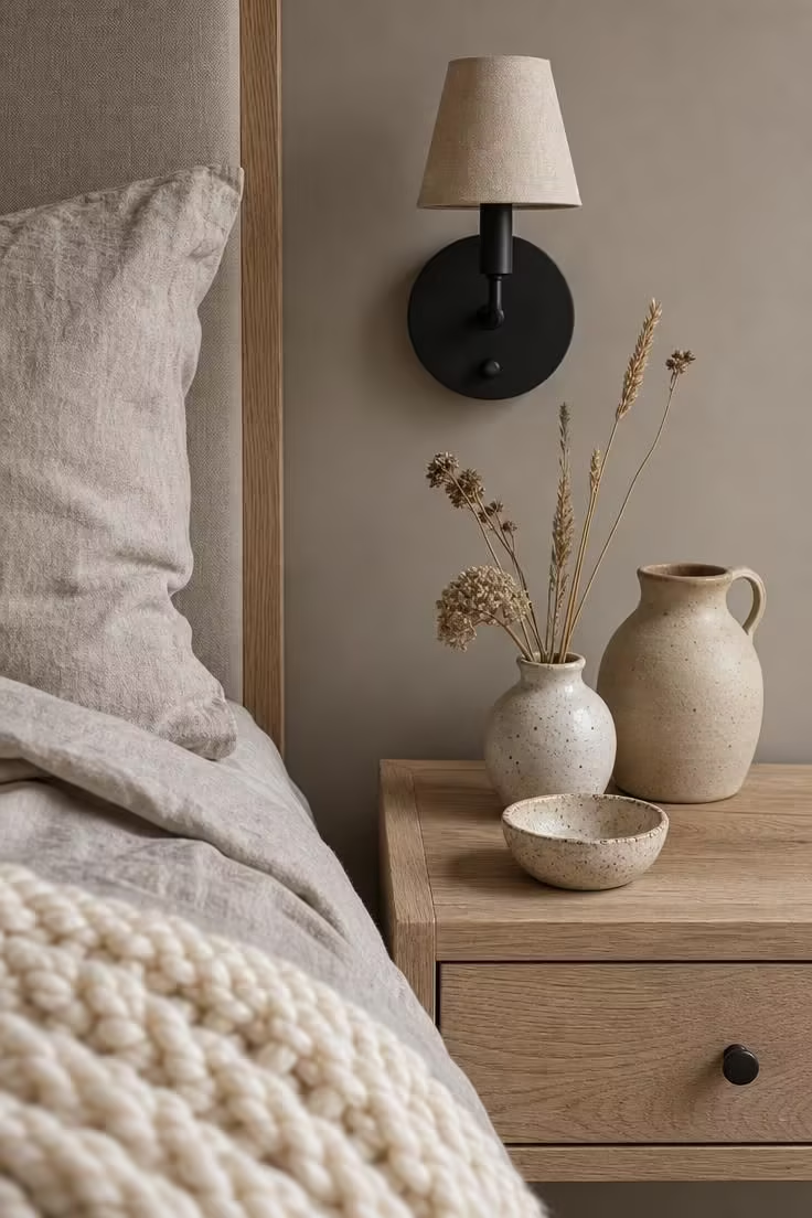
Not every surface in a bedroom benefits from black.
Matte black bedroom fixtures tend to work best when they serve a structural or functional role: a bed frame that anchors the room, a pair of sconces that define the sleeping area, or hardware on a single piece of furniture that draws the eye without overwhelming the space.
Spreading black across decorative objects like vases, trays, and picture frames dilutes its impact and turns a deliberate accent into background noise.
The stronger approach is to choose two or three spots where black makes the biggest visual statement and let the rest of the room remain in its neutral palette.
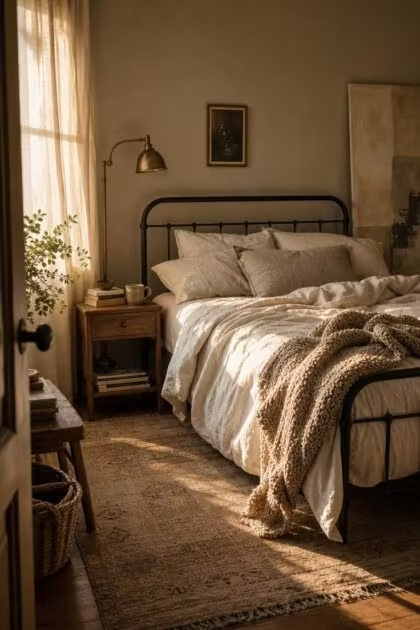
A matte black iron bed frame paired with warm linen bedding layers creates a focal point that needs very little else to feel complete.
When the black elements are grouped in a logical zone, the room reads as intentional and grounded rather than scattered or catalog-coordinated.
Mixing Finishes Instead of Matching Everything
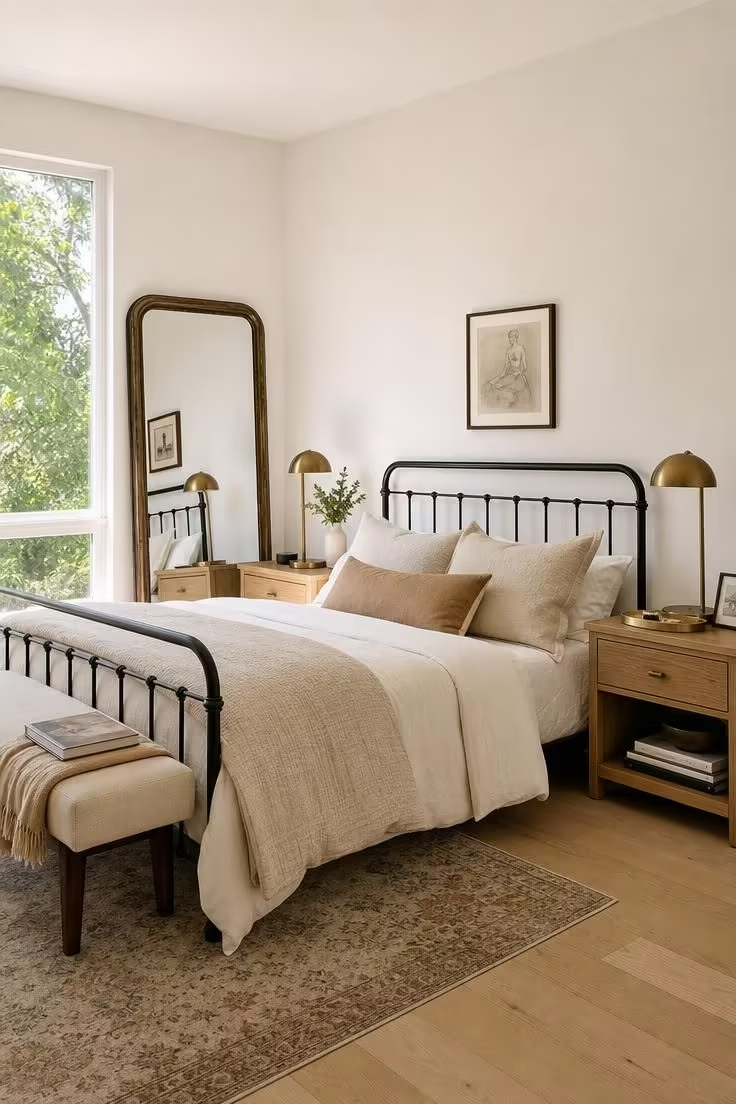
Matching every metal finish in a room to the same shade of black is one of the fastest ways to make a space feel rigid and over-designed.
Mixed metal finishes, like pairing matte black with brushed brass on the nightstand lamps or an aged bronze frame on the wall, create the kind of visual variety that real homes develop naturally.
This mixing is not random, though.
It works best when the finishes share a temperature family: warm blacks (those with brown or amber undertones) pair well with brass, copper, and warm bronze, while cooler matte blacks sit comfortably beside brushed nickel or pewter.
The effect is a room that looks like it was furnished by someone with good taste and patience rather than someone who filtered an online store by “matte black” and bought everything on the first page.
Interior designers in 2026 have increasingly moved toward this “two or three metals” rule, where a primary finish anchors the room and one or two complementary finishes add depth.
A matte black sconce above the bed, a warm brass drawer pull on the dresser, and a patinated iron curtain rod create three distinct tones that feel related but not identical.
The contrast between the metals draws attention to each piece individually, which is the opposite of what happens when everything matches and nothing stands out.
Practical application means starting with the largest black element first (usually the bed frame or a statement light) and then choosing secondary metals that echo without copying its tone.
Design Pro-Tip: When mixing metals in a neutral bedroom, keep matte black as the heaviest visual weight and let the other finishes (brass, bronze, iron) appear in smaller doses. A 60-30-10 split between your three finishes prevents any single metal from competing with the others.
The Texture Test That Tells You If a Room Has Enough Depth
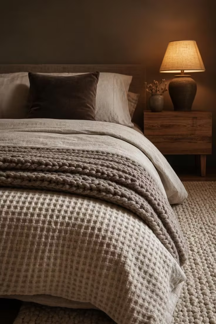
In a room with a restrained color palette, texture does the work that color does in bolder spaces.
A neutral bedroom with black accents that feels flat almost always has a texture problem, not a color problem.
The simplest diagnostic is what some designers call the “close your eyes” test: run your hand across the surfaces in the room and notice whether you can feel a change between each one.
If the bedding, the rug, the curtains, and the upholstery all feel roughly the same, the room will look one-dimensional in person even if it photographs fine.
Layered bedroom textures should include at least four distinct tactile categories: something soft and draping (linen, cotton gauze), something structured and woven (a jute or wool rug), something smooth and hard (matte metal, polished stone), and something irregular and handmade (a ceramic lamp base, a hand-thrown bowl).
Raw materials like an unfinished natural wood nightstand or a stoneware vase with visible finger marks add the kind of character that factory-smooth surfaces never will.
The interplay between black metal and these softer natural materials is what gives a neutral room its visual tension, the contrast keeps the eye moving without relying on color.
Making Neutral Walls Work Harder With the Right Undertone
Choosing the right wall color is one of the most overlooked steps in making a neutral bedroom with black accents feel warm rather than cold.
Pure white walls can make black accents feel harsh and high-contrast, like a pen stroke on blank paper, while cool gray walls flatten the entire room into a monochrome haze, whether the black appears as a bedroom accent wall or a single piece of furniture.
The warm earth tones that designers are gravitating toward in 2026, greige, sandy beige, mushroom, soft clay, do something different: they absorb the black rather than fighting it, creating a sense of depth and warmth that pulls the room together.
This is partly about light physics and partly about color psychology.
Warm-toned neutrals reflect light with a golden or amber cast that softens matte black fixtures instead of making them look starkly industrial.
The undertone of the wall paint should share a family with the undertone of the black finish, which means checking whether the black leans warm (with brown or amber underneath) or cool (with blue or charcoal underneath) before committing to a wall shade.
A warm matte black bed frame against a mushroom-toned wall will feel rich and connected, while the same bed frame against a cool dove-toned wall may feel disconnected or clinical.
The shift toward warm, layered neutral palettes is one of the strongest signals from professional designers heading into 2026, and it makes particular sense in a bedroom where comfort and emotional warmth take priority over visual drama.
Personal Objects That Earn Their Place on the Nightstand
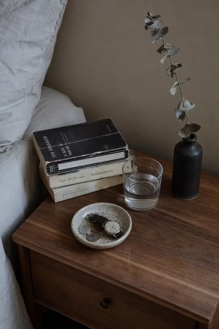
The fastest way to tell whether a bedroom was styled for a camera or for the person sleeping in it is to look at the nightstand.
A staged nightstand holds a single object and a lot of empty space, perfectly centered, perfectly clean, perfectly meaningless.
A personal nightstand holds evidence of an actual life: a book with a creased spine, handmade ceramics that were chosen because they felt right in the hand, a glass of water that nobody thought to remove before the photograph.
These objects are what prevent a neutral bedroom with black accents from feeling like a model unit.
They signal to anyone who walks in that this room belongs to someone, and they do it more effectively than any accent wall or designer lamp ever could.
The key is not to clutter the surface, but to be honest about what stays and what goes: keep the things you reach for in the dark and remove the things that exist only because they “look good.”
Design Pro-Tip: Limit your nightstand to four or fewer objects, but make sure at least two of them are things you use daily. A room that looks lived-in because it is lived-in will always feel more inviting than one styled to simulate the same effect.
Why This Look Works Better Now Than It Did Five Years Ago
Five years ago, the dominant aesthetic for neutral bedrooms was clean, matched, and unmistakably “done.”
Everything coordinated, every surface was smooth, and the goal was a room that looked like it had been plucked from a catalog and placed into someone’s home without a single crease.
That approach has lost its appeal for a reason that goes beyond design trends.
People are genuinely tired of rooms that perform well on a screen but feel empty in person.
The cultural mood has shifted toward authenticity, and bedrooms are leading that shift because they are the most private, most personal spaces in a home.
The growing influence of the wabi-sabi bedroom concept, which prizes honest materials, visible handwork, and spaces that feel collected over time, is not just a style trend but a response to years of over-polished interiors that left many homeowners feeling disconnected from their own rooms.
This is also why black accents have staying power in the neutral palette: black is the only accent color that can look both polished and raw depending on how it is used, and that flexibility matters when the goal is a room that feels real.
A Practical Framework for Pulling It All Together
Start with the walls.
Choose a warm neutral tone with amber, clay, or golden undertones, something that sits between white and beige and makes the room feel like it glows rather than reflects.
Next, select your two or three black anchor points: a bed frame, a pair of sconces, or a set of drawer pulls on a single piece of furniture, not all three unless the room is large enough to absorb that much contrast.
Add one or two mixed metal finishes in smaller doses, a brass lamp, an aged bronze mirror frame, an iron curtain rod, to break up the matte black and create the “collected over time” look.
Layer your textiles in at least four different textures: linen bedding layers for softness, a woven rug for structure, a knit throw for warmth, and a single velvet or boucle cushion for richness.
Bring in natural materials with visible character: a natural wood nightstand with grain you can see, handmade ceramics with slight irregularity, a stoneware vase that is clearly not machine-perfect.
Last, add the personal objects, the ones that are there because you use them, not because they complete a color story.
A neutral bedroom with black accents that follows this sequence will feel warm, grounded, and unmistakably yours, which is the whole point of a room you sleep in every night.