This post may contain affiliate links. If you make a booking or purchase through these links, we may earn a commission at no additional cost to you.
The bedroom you keep coming back to, the one that makes you exhale the moment you walk through the door, almost always starts with color.
Not a single bold paint choice, but a full palette, a layered conversation between walls, bedding, furniture finishes, and the small objects you reach for every morning.
The right cozy bedroom color palette ideas pair specific shades with real materials so you can picture exactly how each combination settles into a room.
These 10 palettes range from soft warm neutrals to deeper earthy bedroom tones, and each one comes with a full scene you can recreate at home.
Warm Sand Walls With a Cinnamon Linen Duvet and Raw Hickory Nightstands
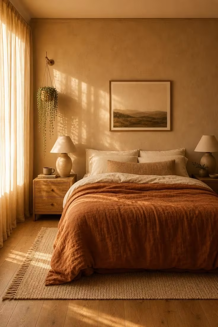
Warm sand is the kind of bedroom wall paint that disappears into the background while making everything in front of it glow.
It sits right in the middle of the warm bedroom colors spectrum, not quite beige, not quite gold, with enough yellow undertone to catch natural light and scatter it softly across the room.
Pairing it with cinnamon linen pulls the palette into a tonal range that feels like a late afternoon in October.
The raw hickory nightstands add a cooler wood tone that keeps the warmth from becoming one-note.
What makes this palette work is its restraint: three materials, one color family, and nothing competing for attention.
The linen duvet brings texture without pattern, the wood brings grain without polish, and the walls bring warmth without weight.
You could swap the cinnamon for a deeper rust or a lighter camel and the palette would still hold together, because the foundation is the sand tone doing quiet work behind everything else.
Style Blueprint:
- Warm sand wall paint with yellow undertone (look for shades labeled “sand dollar” or “warm wheat”)
- Washed linen duvet cover in cinnamon or warm brown
- Raw hickory or white oak nightstands with visible grain
- Matte ceramic lamps in putty or warm gray
- Hand-loomed cotton rug in natural undyed fiber
A Sage Green Ceiling Paired With Oat-Toned Bedding and Matte Ceramic Lamps
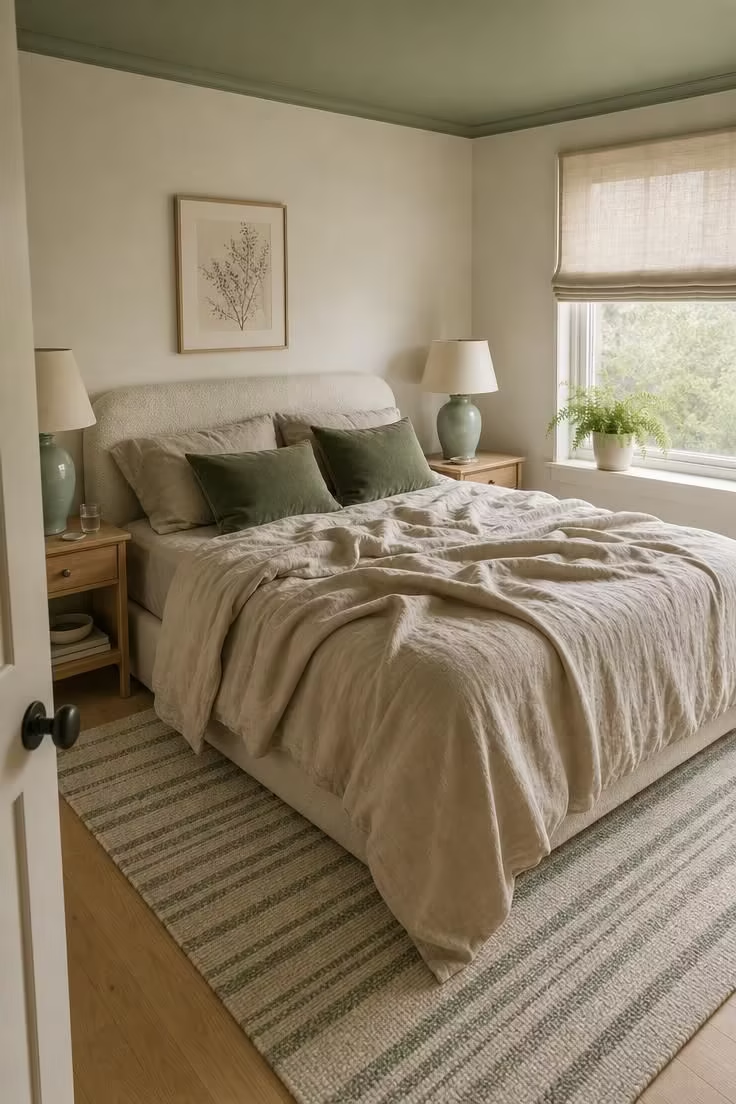
Painting the ceiling instead of the walls is a move that changes the entire geometry of a bedroom.
A sage green ceiling lowers the visual plane just enough to make the room feel wrapped rather than tall, which is exactly the sensation a cozy space needs.
The oat-toned bedding keeps the lower half of the room light and neutral, so the green overhead reads as a canopy rather than a weight.
Matte ceramic lamps in celadon pick up the ceiling color at eye level and pull it down into the room without matching too precisely.
This is a muted color scheme that works because every element shares the same softness, the same low saturation.
Nothing is bright, nothing is shiny, and nothing demands you look at it first.
Style Blueprint:
- Sage green ceiling paint in a matte or eggshell finish
- Oat or natural linen bedding set (sheets and blanket in the same tone)
- Low upholstered headboard in cream bouclé or linen
- Matte ceramic lamps in celadon or soft green glaze
- Flat-woven wool rug in cream with subtle green stripe
Dusty Rose Pillows Layered on a Cream Bouclé Headboard With Walnut Trim
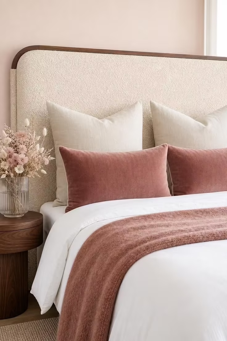
Dusty rose is one of those calming bedroom shades that reads completely differently depending on what surrounds it.
Against a dark wall it becomes dramatic, but against cream bouclé it softens into something that barely registers as pink.
The walnut trim along the headboard gives the palette a grounding line, a thin border of warmth that keeps the rose and cream from floating into something too light.
This combination works well in bedrooms that get strong midday light, because the brightness washes out any sweetness the pink might carry and leaves behind just the warmth.
Layering the rose only in pillows and a throw means you can change the accent seasonally without touching the larger pieces.
Swap the dusty rose for a dried terracotta in fall, or a soft lilac in spring, and the cream and walnut base stays exactly the same.
The bedroom decor colors here are doing their best work at the detail level, not the wall level.
That restraint is what keeps the palette from feeling like a themed room and more like a space that a real person put together over time.
Style Blueprint:
- Cream bouclé upholstered headboard with walnut or dark wood trim
- Dusty rose velvet lumbar pillows (two is enough)
- White cotton bedding with a dusty rose mohair or wool throw
- Round walnut side table with clean lines
- Dried flower arrangement in pale pink and cream tones
Charcoal Plaster Walls Behind a Camel Leather Bench and Ivory Wool Throw
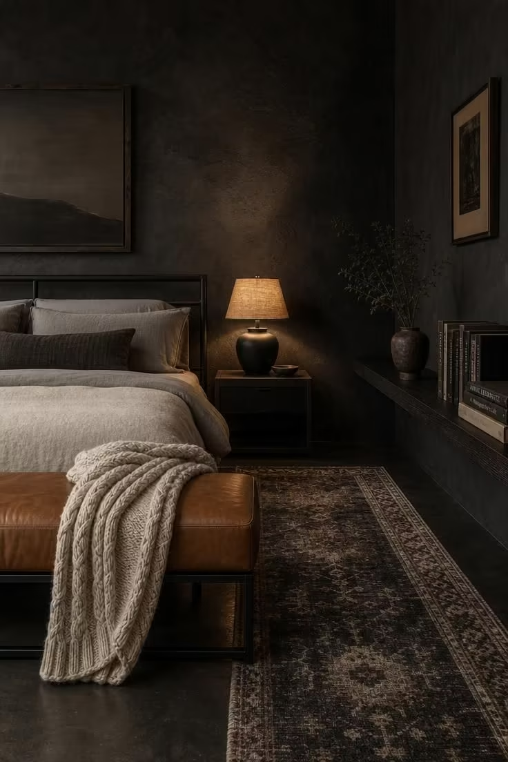
A bedroom accent wall in charcoal plaster does something flat paint cannot: it absorbs light unevenly, creating depth that shifts throughout the day.
In low light, the ridges and valleys of the plaster surface pick up shadows that make the wall feel alive rather than flat.
The camel leather bench introduces a material warmth that plays against the coolness of the charcoal, and the two tones sit close enough on the neutral spectrum that neither one overwhelms.
Ivory wool brings the lightest value in the palette and gives the eye a place to rest.
Without that ivory, the room would tip into heaviness.
With it, the dark walls feel like an intentional backdrop rather than a dominant force, and the whole room reads as a place built for winding down.
Style Blueprint:
- Charcoal lime plaster wall finish (or lime wash for a similar effect)
- Camel or cognac leather bench at the foot of the bed
- Ivory cable-knit or chunky wool throw
- Blackened steel bed frame with simple geometry
- Matte black ceramic lamp with a linen shade
A Rust and Ochre Bedding Stack on a White Oak Slatted Bed Frame
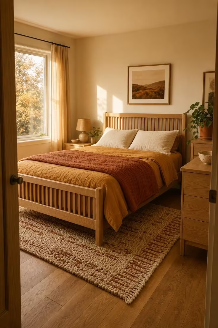
Layered bedding colors in the rust-to-ochre range create a bed that looks like a stack of warm autumn leaves.
The trick is using three tones from the same family but at different saturations: ochre at the lightest, amber in the middle, and rust at the deepest.
This gradient effect gives the bed visual depth without needing pattern or print.
White oak keeps the furniture from competing with the bedding palette.
Its pale honey tone sits just outside the rust family, close enough to harmonize but different enough to read as a separate layer.
The cream rug and pillow anchors keep the warmth from becoming monolithic, and those small cool breaks are what make the warm tones feel richer by contrast.
This is a palette that works best in rooms with generous natural light, where the sun can move through the tonal layers and shift the mood from golden morning to amber evening.
Style Blueprint:
- White oak slatted bed frame with matching headboard
- Ochre linen sheet set as the base layer
- Rust cotton quilt for the mid-layer
- Amber or honey linen coverlet as the top layer
- Chunky hand-woven wool rug in cream and rust
Design Pro-Tip: When building a layered bedding palette, start with the lightest shade on the sheets and work outward to the deepest tone on top. This creates a gradient that draws the eye inward and makes the bed look intentionally styled rather than randomly assembled. If you go dark-to-light instead, the layers flatten and lose their depth.
Slate Blue Accent Wall With Warm Brass Hardware and a Flax Linen Curtain
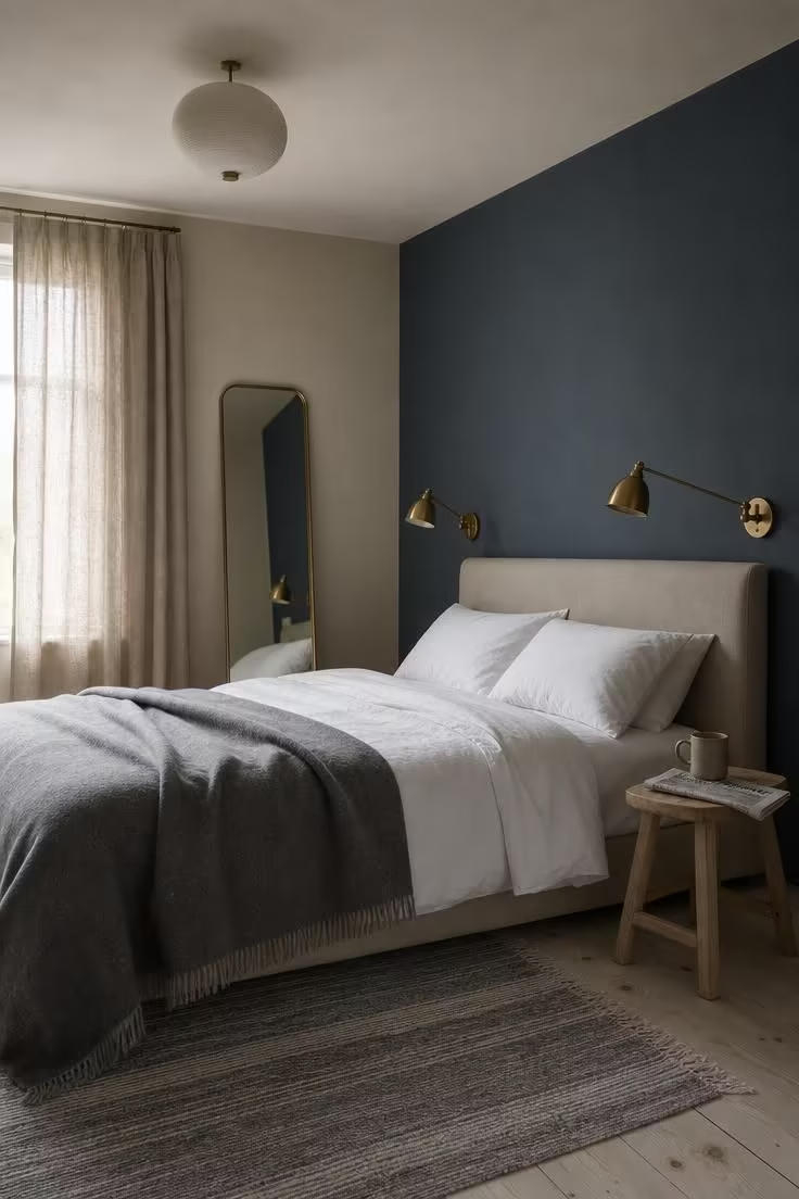
Slate blue is the cooler end of the cozy bedroom color palette ideas spectrum, but it earns its warmth from what you pair it with.
On its own, a blue wall can feel cold and institutional.
Flanked by warm brass hardware and softened by a flax linen curtain, it becomes something closer to the sky just before dusk.
The brass reading lights are doing double work here: they provide function and they pull gold warmth onto the blue surface, creating a contrast that makes both materials look more intentional.
Bedroom paint colors in the blue family need this kind of warm metal counterpoint, or they risk pulling the room’s temperature down.
The flax curtain, left in its natural undyed state, bridges the gap between the cool wall and the warm accents.
Its color sits somewhere between oatmeal and wheat, neutral enough to work with the blue but warm enough to keep the room from feeling clinical.
This is a palette for people who want calm without defaulting to beige, and the slate blue delivers that calm with more visual interest than any neutral could.
Style Blueprint:
- Slate blue paint with a gray undertone for one accent wall
- Warm putty white on remaining walls
- Wall-mounted brass reading lights with adjustable arms
- Flax linen curtains in natural undyed tones
- Low oatmeal linen headboard
Olive Velvet Pillows Against a Warm Cream Plaster Wall With Rattan Details
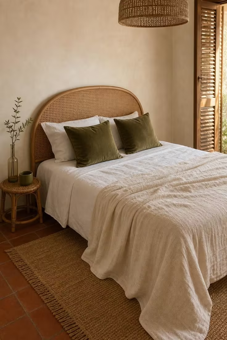
Olive green carries a weight that brighter greens do not, and that weight is what makes it feel cozy rather than fresh.
When you set olive velvet pillows against warm cream plaster, the green sinks into the space rather than popping off it.
The rattan cane headboard introduces a woven texture that softens the contrast between the dark pillows and the pale wall.
Rattan reads as casual, which keeps the velvet from feeling too formal and pulls the whole room toward a relaxed Mediterranean quality.
The neutral bedroom palette here is really cream doing most of the work, with olive as the single point of saturation.
That ratio, a lot of neutral and a little color, is one of the most reliable formulas for a room that feels both restful and interesting.
Style Blueprint:
- Warm cream plaster wall finish (smooth or lightly textured)
- Rattan cane headboard with rounded or arched shape
- Olive green velvet pillows (two square or lumbar)
- White linen sheets with a cream cotton coverlet
- Rattan stool or side table as a nightstand
Terracotta Paint on the Lower Wall With a Crisp White Upper Half and Pine Shelving
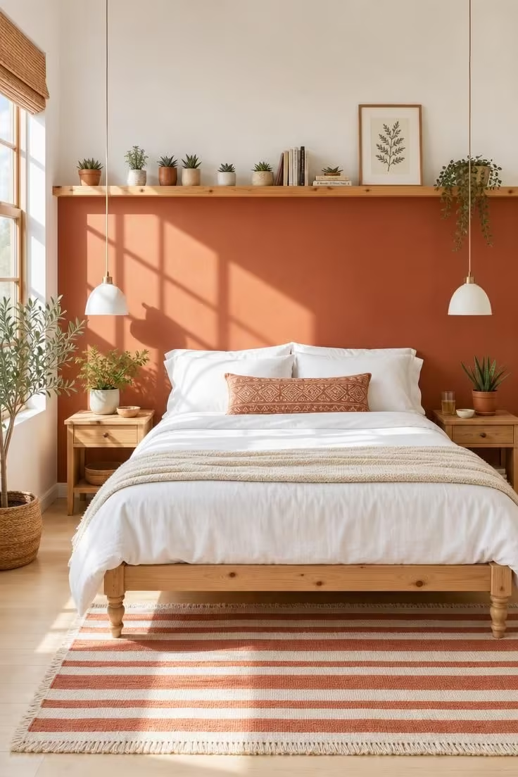
The two-tone wall approach takes a bold color like terracotta and makes it livable by limiting where it goes.
Painting only the lower two-thirds keeps the room feeling open at the ceiling line, while the terracotta wraps around you at bed level where you actually experience it.
This is one of the earthy bedroom tones that benefits from a hard boundary: the clean line between terracotta and white gives the wall a graphic quality that keeps it from looking like a color that just faded out.
Pine shelving along that dividing line turns the paint break into a functional feature.
The warm yellow tone of pine complements the orange undertones in terracotta without matching them, and the succulents in their ceramic pots add irregular spots of green that break up the warm palette.
White bedding is the right call here because terracotta needs breathing room.
If the bedding were another warm tone, the room would feel heavy.
The white sheets and ecru blanket create a cool neutral zone in the center of the room that balances the warmth radiating from the walls.
This is the kind of bedroom paint colors approach that lets you commit to a strong color without committing the entire room to it.
Style Blueprint:
- Terracotta paint on the lower two-thirds of the wall with a clean horizontal line
- Crisp white paint on the upper third and ceiling
- Light pine floating shelf at the paint line transition
- White cotton bedding with a natural ecru woven blanket
- Striped cotton dhurrie rug in terracotta and white
Mushroom Gray Bedding on an Iron Frame With Dried Lavender and Beeswax Candles
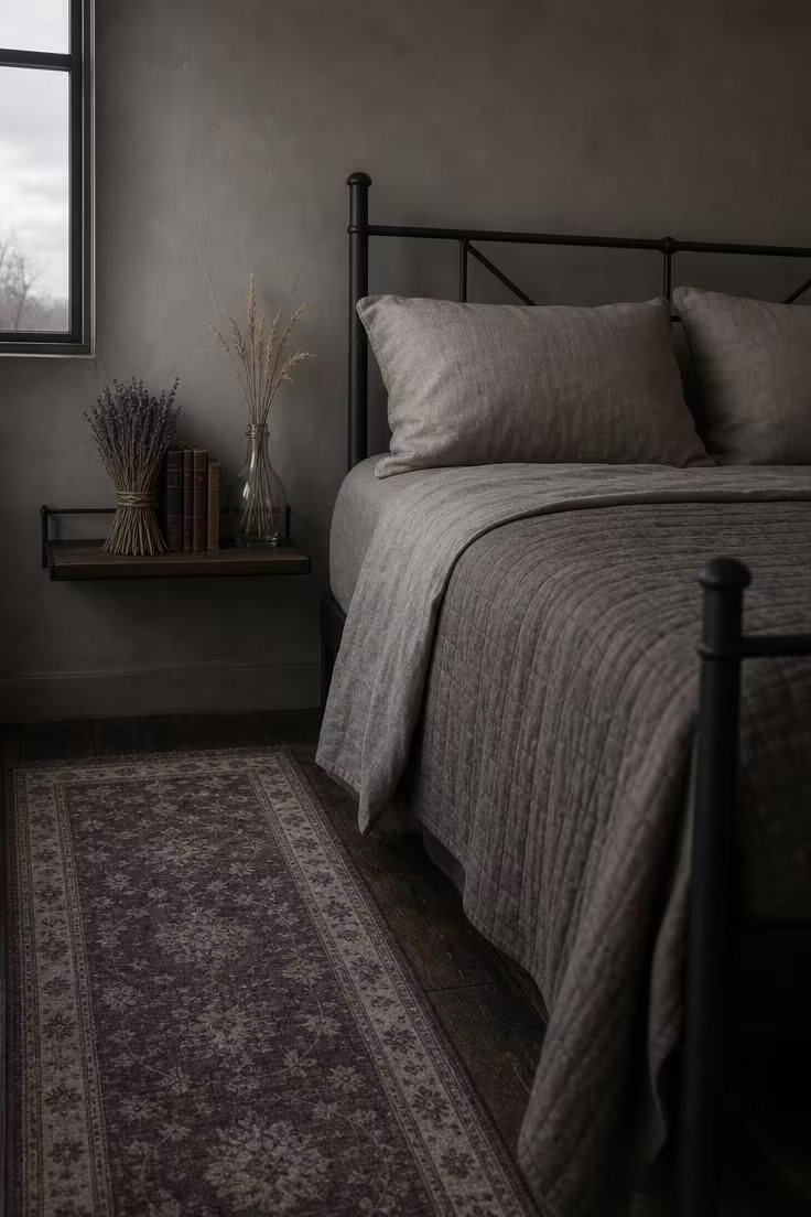
Mushroom gray is the neutral that people overlook when building warm bedroom colors palettes, but it carries more warmth than standard gray because of its brown undertone.
It reads as the color of a rainy afternoon, which is exactly the mood a cozy bedroom should be able to hold.
On an iron bed frame, the softness of mushroom-toned linen creates a material contrast that keeps the room from feeling either too industrial or too soft.
The dried lavender introduces a whisper of purple that lifts the gray palette just enough to keep it from feeling flat.
It is a small detail, a bundle of dried stems on a shelf, but it gives the eye a color note that the grays alone cannot provide.
The faded vintage runner in muted plum picks up that lavender tone at floor level and extends the purple thread through the room without making it a defined accent color.
This is a palette for bedrooms that face north or get limited direct sunlight, where the soft gray tones mirror the light rather than fighting it.
Style Blueprint:
- Mushroom gray linen bedding set (sheets, coverlet, and pillowcases in tonal grays)
- Matte black iron bed frame with slim posts
- Dried lavender bundle and dried wheat stalks for natural texture
- Dark oak flooring with a faded vintage wool runner
- Cool warm gray wall paint with slight plaster texture
Design Pro-Tip: If your bedroom palette leans heavily neutral, add one dried botanical element in a muted color (lavender, eucalyptus, dried rose) to give the room a subtle color note without introducing a full accent. Dried plants hold their color for months and age gracefully, which keeps the palette feeling natural rather than styled.
A Honey and Spice Palette With Woven Jute, Amber Glass, and Cotton Gauze Panels
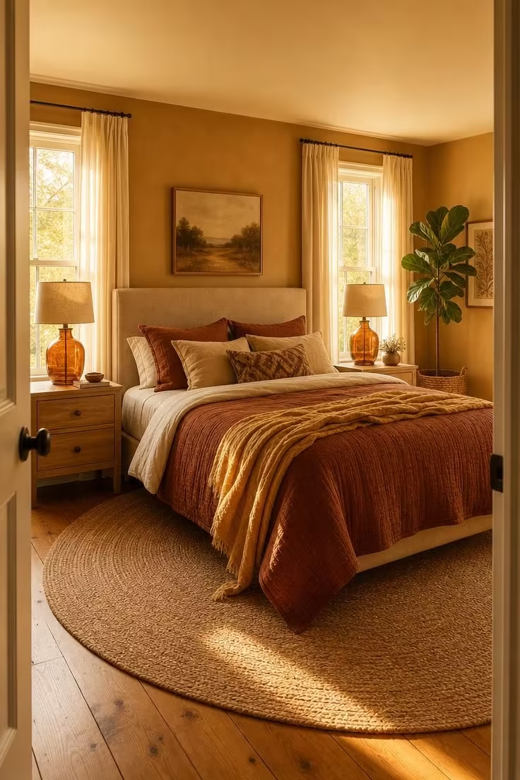
A honey and spice palette is the warmest expression of cozy bedroom color palette ideas, the one that makes the room feel like it is glowing from within even on an overcast day.
Honey walls in a satin finish catch and bounce light in a way that matte finishes cannot, creating a subtle luminosity that shifts with the time of day.
The spice-toned quilt in cinnamon-paprika sits at the deepest point of the palette and anchors the bed with visual weight.
Without that depth, the honey and cream tones would blur together and the room would lose its layered quality.
Amber glass lamps pull the warm tone into a translucent material, and when lit, they cast a golden glow that reinforces the wall color from within the room rather than relying entirely on window light.
The woven jute rug adds a raw, unfinished texture underfoot that grounds all the softness happening at bed level.
Cotton gauze panels at the windows filter the light one more time, softening it further and adding a final layer of warmth before it reaches the walls.
This is the palette equivalent of a room lit entirely by late afternoon sun, and every material choice is designed to sustain that feeling after the sun goes down.
Style Blueprint:
- Honey-toned wall paint in satin finish
- Spice-colored linen quilt in cinnamon or paprika
- Amber glass table lamps with linen drum shades
- Woven jute area rug in natural tones
- Cotton gauze curtain panels in warm ivory
Conclusion
The right cozy bedroom color palette ideas start with understanding what warmth actually looks like in a room: not a single bold color, but a layered system of tones that share an undertone and speak to each other across walls, bedding, furniture, and light.
Whether you lean toward the deep anchor of charcoal plaster, the gentle wrap of sage on the ceiling, or the all-over glow of a honey and spice palette, the pattern holds.
A dominant warm neutral, one or two supporting tones from the same family, and a single textural or tonal accent that keeps the eye interested.
These calming bedroom shades work because they prioritize how a room feels over how it photographs, and the difference is in the materials: washed linen, raw wood, matte ceramic, woven jute.
Start with the palette that made you pause, pick one wall or one layer of bedding, and let the rest of the room follow.