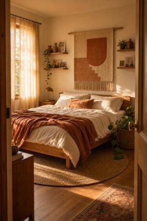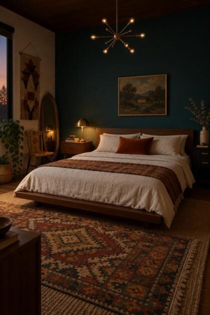
This post may contain affiliate links. If you make a booking or purchase through these links, we may earn a commission at no additional cost to you.
Mid century modern restraint and eclectic collecting pull in opposite directions.
That tension is exactly what gives a mid century eclectic bedroom its character.
The anchor style supplies clean silhouettes, warm woods, and low-profile furniture that keeps the floor plane quiet.
The eclectic layer brings in pieces from other eras, other cultures, and other material families, so the room reads as collected rather than styled from a single catalog page.
What holds the mix together is usually one repeated element: a color, a wood tone, or a shared scale.
The ideas below move from warm palettes to cool ones, so a composition and a color direction can be borrowed from the same room.
Layered Kilim Over Jute Beneath a Low Walnut Bed
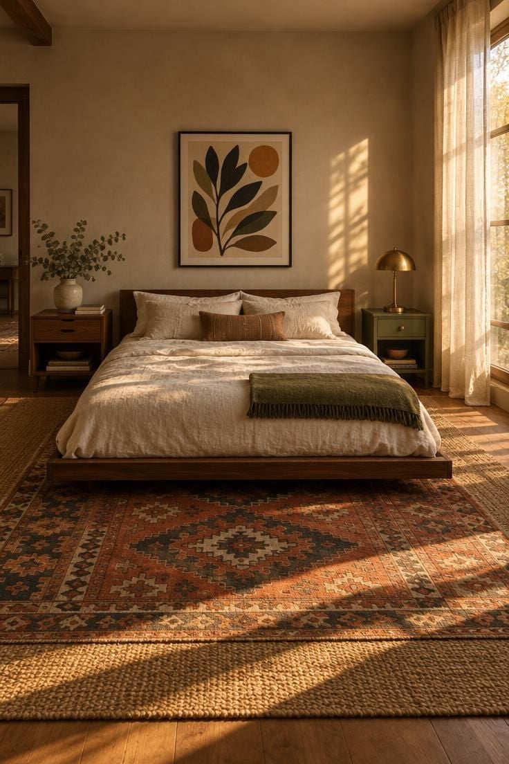
Layering a patterned kilim over a larger plain fiber rug does two jobs at once.
It introduces the pattern that carries the eclectic story, and it builds a soft, uneven surface underfoot that a single thin rug cannot match.
The jute underneath should extend well beyond the kilim on every visible side, so the smaller rug reads as a deliberate inset rather than a mistake in sizing.
For a bed this low, the visible floor space matters as much as the rug itself.
A kilim that stops short of the nightstands leaves the composition looking unsettled.
Run the patterned layer wide enough that both nightstands sit at least partly on it, or pull the kilim forward so a clear margin of jute shows along the sides and foot.
Flat-woven kilims are thin and their edges tend to curl.
Rotating the rug periodically and weighting the corners for a few days after each move keeps the profile flatter.
Jute sheds, particularly when new, so a smooth mat underneath helps contain the fibers.
The mismatched pair here is the second deliberate move.
A walnut nightstand on one side and a painted olive one on the other only works because both share a similar height and a similar footprint.
Height agreement does most of the calming work.
Pull one color out of the kilim and repeat it somewhere away from the floor.
A single olive pillow or a rust-toned print gives the eye a thread to follow around the room, and it makes the rug feel like the source of the palette rather than a separate purchase.
Keeping the bedding plain cream lets the kilim and the wood grain hold the visual weight.
Two strong patterns near a low bed usually fight each other; one pattern plus one wood tone reads calmer and more intentional.
Style Blueprint:
- Low walnut platform or simple upholstered frame as the visual base
- Vintage kilim laid over a larger jute or sisal layer for texture contrast
- At least one repeated color pulled from the kilim into pillows or art
- Two mismatched nightstands, one wood and one painted or metal
- A single brass or black table lamp when only one side needs light
Teak Dresser Paired With a Victorian Oval Mirror
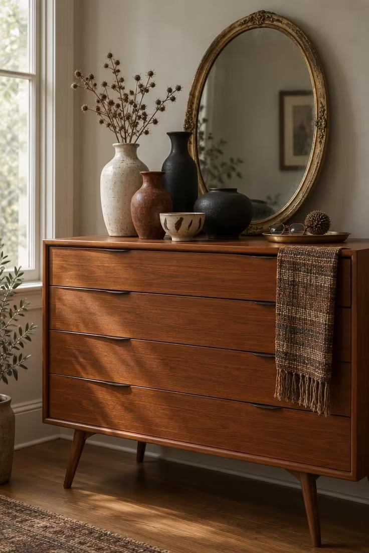
A teak dresser from the 1960s and a Victorian mirror come from eras that share almost nothing, which is precisely why the pairing works.
The dresser stays low and horizontal with its tapered legs and warm golden grain, and the mirror adds a tall vertical curve with a decorative frame.
The contrast in direction and in period gives the vignette its interest without any need for extra objects.
This is one way eclectic bedroom decor comes together: two unrelated pieces meet when one shape or finish repeats between them.
Leaning the mirror rather than hanging it suits this pairing visually.
The slight backward tilt keeps the gilt frame from competing directly with the flat plane of the wall, and it lets the mirror be moved or swapped when the arrangement starts to feel tired.
A slim strip of felt or cork along the bottom edge protects the frame finish from scuffs.
Mirrored surfaces double whatever sits in front of them.
A crowded dresser top becomes twice as busy the moment a large mirror is added behind it.
Three to five objects is usually the workable range: one tall, one low and wide, and a few small pieces to fill the gaps.
The oval shape of the mirror echoes the mid century modern bedroom preference for curved and organic forms, so the era clash still shares a visual language.
That shared curve is the quiet thread that keeps the pairing from reading as accidental.
Brass is the easiest bridge finish between the two eras.
A brass tray, a brass lamp base, or brass drawer pulls on the dresser will connect the warm metal tones of a gilt frame to the cooler wood of the teak.
Give the ceramics room to breathe.
Grouping them tightly into a single mass flattens the vignette; spacing them with visible gaps lets the eye travel across the surface and lets each piece hold its own shape.
If the mirror frame has any loose gilding or flaking finish, treat it as a patina to preserve rather than something to repair.
Aggressive cleaning on old gilt does more harm than good, and a dry soft brush handles most of the dust.
Style Blueprint:
- Teak dresser with tapered or splayed legs as the era anchor
- Victorian oval mirror with a gilt or painted frame as the era contrast
- One repeated finish, brass or black metal, to bridge the two periods
- Three to five ceramic or glass objects at varied heights
- A small woven or linen textile to soften the hard dresser top
Design Pro-Tip: When two eras sit side by side, repeat one shape or one finish between them. A shared oval, a shared brass tone, or a shared leg profile does the connecting work that color alone cannot.
Painted Folk-Art Chair Beside a Walnut Nightstand
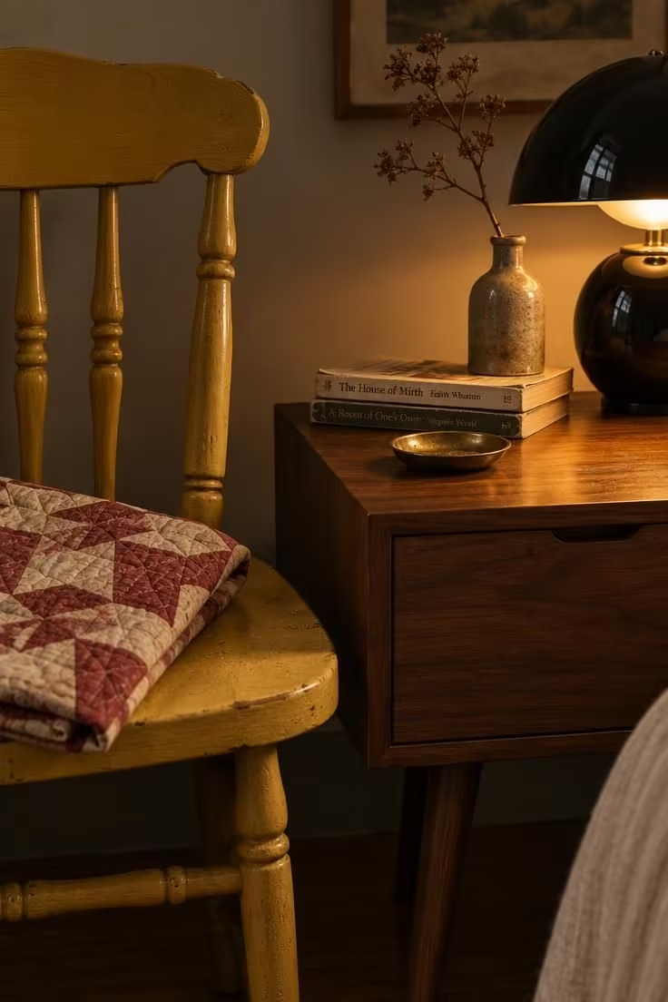
A painted chair placed beside a wood nightstand is the clearest version of the deliberate odd piece.
Instead of a matching seating pair or a fully coordinated bedroom set, one chair carries a saturated but muted hue and a hand-painted surface, and it does the eclectic work on its own.
The chair back height relative to the nightstand top decides whether the pairing looks balanced or awkward.
A chair back that rises well above the lamp shade crowds the arrangement from the side.
A chair back that falls roughly level with or just below the lamp's top edge keeps the two objects in conversation.
One bold solid hue outperforms a pattern in this position.
A patterned chair competes with the wood grain, the lamp, and the quilt square all at once, while a single muted color reads as a deliberate accent and lets the walnut stay the visual anchor.
Painted antique and vintage chairs chip, especially along the seat rails and the back edges where hands land.
Local touch-ups with a matching craft acrylic are usually enough.
Stripping and refinishing a folk-art chair removes the very surface quality that made it worth placing here.
The textile on the seat matters more than it might seem.
A folded quilt square or a small woven runner softens the hard seat, adds a second material to the corner, and gives the eye a bridge between the painted wood and the walnut.
Repeating that chair color somewhere away from the corner keeps it from reading as an isolated object.
A pillow, a small framed print, or a ceramic in a similar tone ties the accent back into the wider room.
Keep the nightstand surface light.
A lamp, one small dish, and a short stack of books is enough.
The chair is already the loud element; the surface beside it should stay quiet so the contrast holds.
Style Blueprint:
- Walnut nightstand with a tapered leg profile
- Painted folk-art chair in one saturated but muted hue
- Globe or dome lamp in brass or black enamel
- A small textile softening the chair seat
- A repeated color between the chair paint and one pillow or print
Sunburst Pendant Over a Mismatched Nightstand Pair
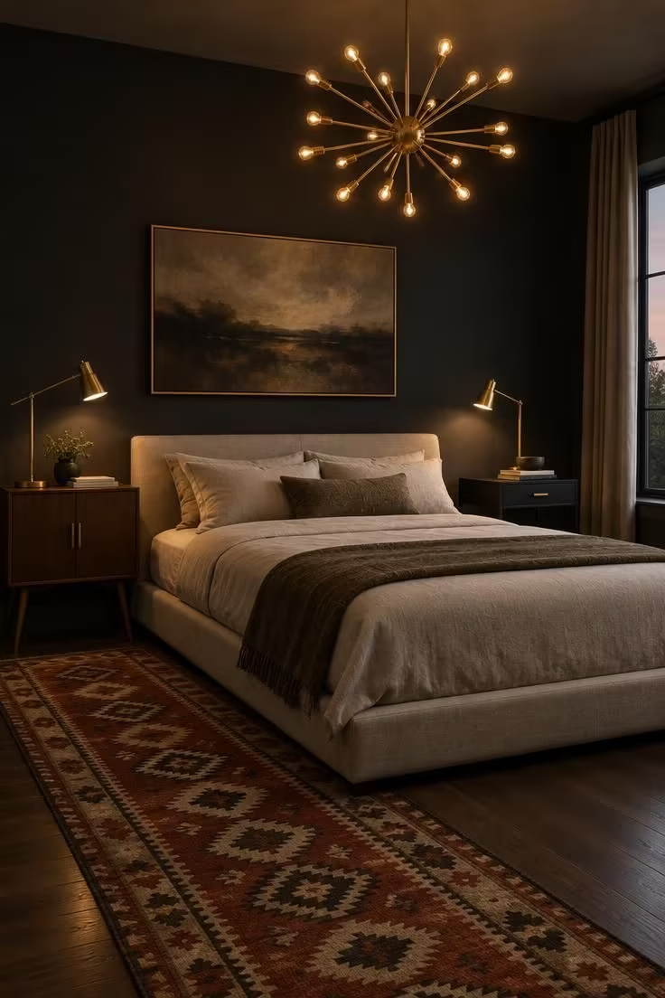
Mismatched nightstands read as unfinished when nothing connects them and as deliberate when one element repeats.
Matching lamp shapes, matching hardware finishes, or matching heights each solve the problem on their own, and using two of the three makes the pairing read as a decision rather than an oversight.
Height agreement is the fastest route to calm.
When the two tops sit within a small margin of each other, the eye reads the pair as a unit even though the materials and silhouettes differ.
A large height gap draws attention to the mismatch rather than the styling.
Once a sunburst or sputnik fixture occupies the ceiling, it should carry the room's overhead lighting on its own.
Adding a second ceiling source in a modest bedroom splits the visual focus and dilutes the fixture's presence.
Table lamps on the nightstands handle the lower level.
The low bed frame keeps the pendant from crowding the ceiling line.
A tall headboard combined with a large ceiling fixture and a low room can feel compressed, so the bed staying low gives the fixture the vertical room it needs.
Replacing one broken nightstand in a mismatched pair is more complicated than replacing one from a matched set, since a like-for-like find may take time.
Choosing pieces that are common shapes and common finishes makes future substitution easier.
Keep a shared metal tone running through both sides.
Brass lamp bases on a walnut cabinet and a black metal frame work because the eye catches the repeated warm metal and treats it as the thread.
Balance visual weight across the bed rather than stacking everything heavy on one side.
A solid wood cabinet on the left and an open metal frame on the right already lean heavier on the left, so placing the larger lamp or the taller stack of books on the lighter side evens the composition.
Style Blueprint:
- Sputnik or starburst ceiling fixture as the era signifier
- Two nightstands of different materials, one wood and one metal or painted
- One unifying element: matching hardware, matching lamp shape, or matching height
- Low bed frame to preserve ceiling space
- Matching table lamps on both sides to steady the asymmetry
Moroccan Pouf and Nesting Tables in a Reading Corner
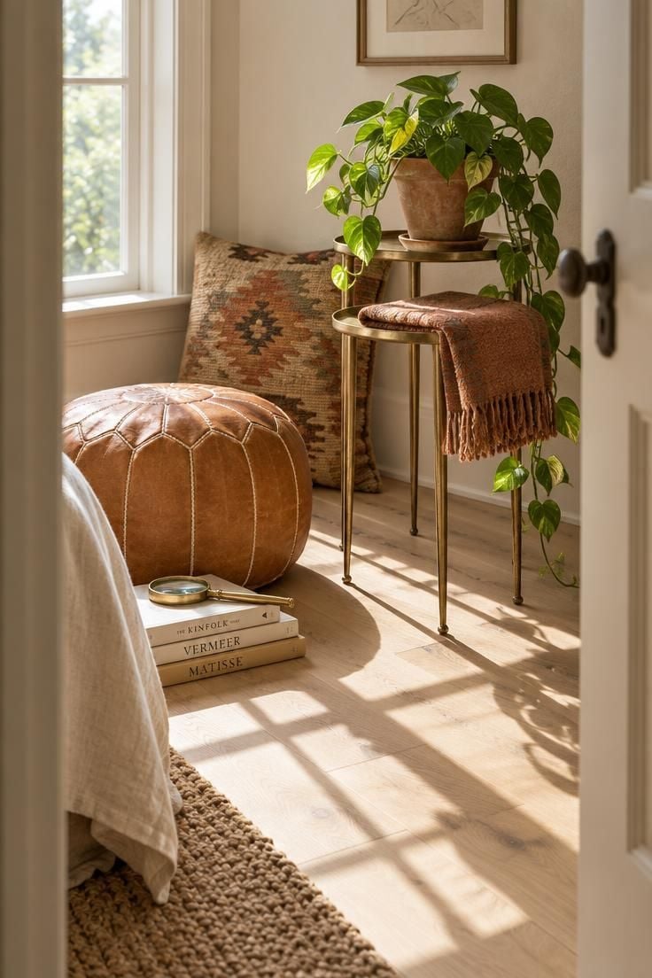
Nesting tables earn their place in a small corner because they can be pulled apart when two surfaces are needed and pushed together when the floor needs to stay clear.
A fixed side table occupies the same footprint whether or not anything is on it.
In a bedroom that doubles as a reading spot, that flexibility is the whole point.
A leather pouf adds a soft, low seat that does not block sightlines the way a full armchair does.
It also introduces a rounded organic form that connects to the curved motifs running through mid century design.
Poufs compress with use and lose some of their shape over time.
Unzipping the cover and adding or redistributing the filling restores the volume, and rotating the pouf periodically keeps the wear even across the surface.
Repeating brass or black metal from the main bedroom into the corner is what keeps this cluster from reading as a separate zone.
The nesting table legs carry that metal tone, and the eye registers the corner as part of the same room.
The trailing plant belongs on the higher surface where its vines can fall freely without tangling in the pouf or brushing the floor.
Keeping the pot on the upper table also lifts the greenery into the light.
Scale the corner to the pouf.
Nesting tables that rise well above the pouf's back edge make the seat look undersized, while tables that sit low and wide feel proportionate.
A gap of a few inches between the pouf and the nearest table keeps the corner walkable.
The blanket on the lower table does quiet styling work.
Draping a textile over a hard brass surface softens the metal, adds a color note, and gives the corner the layered feel that a single table would lack.
Style Blueprint:
- Leather or woven Moroccan pouf in tan or natural
- Brass or black metal nesting tables with tapered legs
- One woven or wool textile, a blanket or kilim cushion
- A trailing plant on the higher surface
- A repeated metal tone linking the corner to the main room
Design Pro-Tip: A corner arrangement works better than a wall-centered one when the pieces are small. Two walls meeting behind a pouf and a table give the cluster a natural pocket, and the composition holds without needing a large anchor piece.
Gallery Wall of Thrifted Frames Above a Low Bed
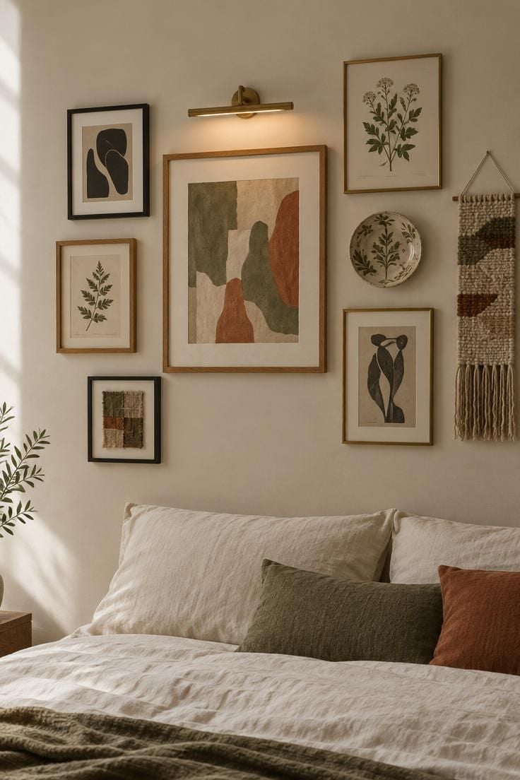
A collected gallery wall and a crowded one differ in one respect: breathing room.
Spacing pieces roughly the width of one average frame apart lets each item register as an individual object.
Pushing everything into a tight grid turns the wall into a single textured mass, which defeats the point of showing varied work.
Including one non-frame element, such as a woven hanging, a ceramic plate, or a small mirror, breaks the rectangular rhythm.
That single interruption is what separates a gallery wall from a stack of pictures in different sizes.
Repeat one mat color or one frame finish across at least a few of the pieces.
Cream mats on four of seven frames gives the cluster a quiet spine even when the frame finishes vary widely.
Align the composition to the bed's width rather than the wall's.
A cluster that spans far past the mattress edges starts to feel like it belongs to a different room, while one that sits within the bed's footprint reads as attached to the sleeping area.
Planning the layout on the floor before anything goes up saves a lot of patching later.
Tracing each frame onto paper and taping the paper to the wall lets the arrangement be adjusted and reviewed before any holes are made.
The bottom edge of the lowest frame should clear the headboard with visible space.
When frames crowd the headboard line, the wall feels compressed and the bed loses its visual calm.
Mixing eras and origins succeeds when the mat treatment stays consistent.
A folk-art print, a black-and-white photograph, and a textile collage can sit together comfortably if the framing approach is similar enough to hold them.
More pieces mean more future patching and rearranging when the arrangement changes.
A cluster of five to nine frames is manageable to revise; a wall of twenty becomes a project.
Style Blueprint:
- Five to nine mismatched frames in varied size and finish
- At least one non-frame element, a woven hanging, plate, or small mirror
- A repeated mat color or frame finish to tie the cluster
- Composition aligned to the bed's width, not the wall's
- Breathing room of roughly one frame width between pieces
Antique Trunk as a Bench at the Foot of the Bed
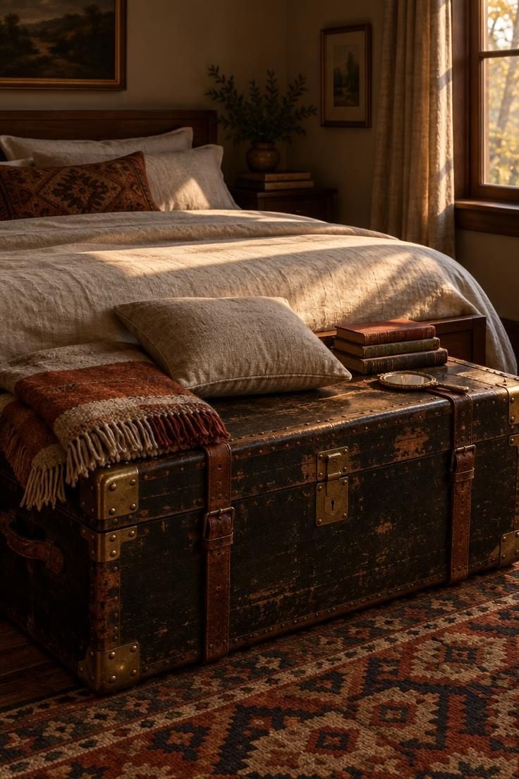
A vintage trunk does the work of two pieces at once.
It reads as storage with a visible history, and it provides a horizontal surface at the foot of the bed where a throw, a tray, or a stack of books can land.
That dual purpose is why it suits a collected room better than a purpose-built bench.
The trunk's top is hard, so it functions as seating only with a cushion or a folded blanket layered on.
Without that soft layer, the piece reads as luggage left in the room rather than an intentional part of the furniture plan.
Height relative to the mattress matters more than the trunk's overall size.
A trunk that sits well below the mattress top lets the bed remain the dominant form.
A trunk that rises above the mattress starts to compete with the headboard as the room's visual peak.
Matching one tone between the trunk and the bed frame ties the two together across the gap of floor between them.
Brass corner hardware on the trunk and a brass detail on the bed, or a shared warm wood tone, keeps the pairing from feeling like two unrelated objects.
Beside the bed rather than at its foot is sometimes the better placement.
A narrow room benefits from a trunk used as a wide nightstand, which frees the foot of the bed for walking and keeps the composition from feeling blocked.
The surface styling should stay minimal since the trunk itself carries a lot of detail.
One folded textile and one or two small objects is usually enough.
A crowded trunk lid hides the hardware and the patina that made it worth using.
Storage inside the trunk means the objects rotating through the room have a place to live between arrangements.
Seasonal textiles, extra bedding, and off-season accessories can all sit inside, which keeps the eclectic layer from spilling into every other surface.
A vintage kilim rug bedroom often gains from having a storage piece like this, since it absorbs clutter that would otherwise compete with the patterned floor.
Style Blueprint:
- Vintage trunk with brass or leather corner hardware
- Folded wool throw or quilt to soften the hard top
- Low bed frame so the trunk does not compete with the headboard
- One repeated wood or metal tone connecting trunk to bed
- A small tray or stack of books to keep the surface from looking empty
Design Pro-Tip: Before committing to a trunk at the foot of the bed, walk the path around it for a few days. A piece that leaves a comfortable stride on both sides earns its place; one that forces a sidestep will end up moved to a wall within a month.
Paper Lantern Pendant With a Minimalist Bed Frame
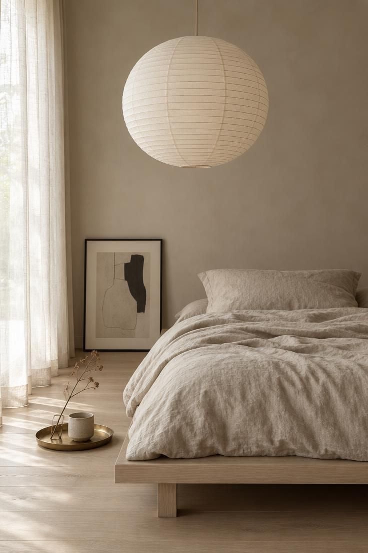
A paper lantern spreads light across a broad, even surface rather than throwing it in one direction, which keeps a quiet room from developing harsh pools and dark corners.
The form itself stays light, so the fixture occupies the ceiling without adding visual mass to a minimal scheme.
Layered lighting bedroom arrangements benefit from this type of overhead source because a paper lantern fills the room evenly while a single table lamp or floor lamp handles the lower, task-focused layer.
Paper shades collect dust and mark easily.
A soft brush or a vacuum on the lowest setting handles routine dusting, and the shade should be handled by its frame rather than its surface when it needs to be moved.
The bed frame should stay visually quiet when the pendant is the focal point.
A simple low wood or upholstered frame in one tone lets the lantern hold the ceiling, and it keeps the vertical space above the bed clear.
A single pendant over the center of the bed handles the overhead layer for most bedrooms of average size.
A second light source becomes useful when the room is large, when the bed sits off-center, or when reading light is needed on one side.
The lantern's round form repeats the curved silhouettes that run through mid century design, so it fits the anchor style without needing a period-specific shape.
That shared geometry is what makes the pairing feel connected.
Breaking the minimalism with one small vintage object keeps the room from reading as a blank canvas.
A single ceramic, a brass tray, or a short stack of worn books adds a human note that a fully pared-back scheme would lack.
Keep window treatments slim or absent where the room allows.
Bare windows or unlined linen curtains preserve the diffuse quality of the light and let the lantern remain the brightest surface in the room.
Style Blueprint:
- White or natural paper lantern ceiling pendant
- Minimalist low bed frame in wood or upholstered
- Linen bedding in a single muted tone
- One small vintage object to break the minimalism
- Slim or no window treatment to keep light diffuse
Jewel-Tone Accent Wall Behind a Painted Dresser
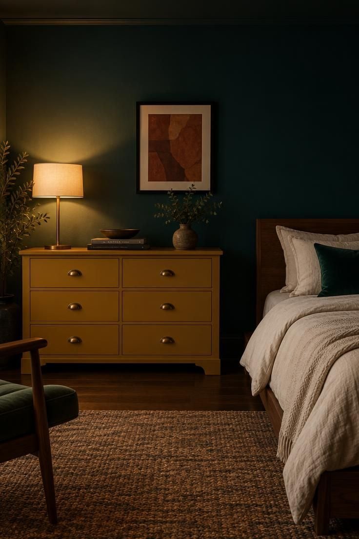
One saturated wall in a deep teal, olive, mustard, or rust gives a room a strong color anchor while the remaining walls stay calm.
A fully saturated room in the same hues becomes overwhelming fast, and the restraint of a single painted plane is what makes the color read as intentional.
Painted accent wall colors in this range work best when one hue repeats elsewhere in a cushion, a print, or a lamp base.
Dark walls show dust, scuffs, and fingerprints more readily than pale ones.
A matte finish hides some of that better than a high sheen, and keeping a small touch-up pot of the same color on hand makes spot repairs quick.
An accent wall changes how the room's proportions read.
A wall that runs the length of the bed can make the room feel deeper, while a wall behind the headboard tends to feel like a backdrop.
The wall chosen changes the effect even when the color stays the same.
Keep the overall palette to three or four dominant hues.
Deep teal, mustard, warm wood, and a neutral cream is a complete scheme; adding a fifth saturated color starts to dilute the impact of the accent wall.
Warm woods fit comfortably against both cool and deep hues.
Walnut and teak hold their own next to teal because their warmth sits opposite the wall's cooler tone, and the contrast keeps the wood from disappearing into the background.
Repeat the accent color once more somewhere small.
A velvet cushion, a lamp base, or a framed print in a related tone ties the wall color back into the room and keeps it from reading as a single painted plane with no relationship to anything else.
The dresser on this wall is the anchor piece that justifies placing the color where it sits.
A painted dresser in a complementary or contrasting hue sits against the deep wall and reads as deliberate, while a similar piece against a neutral wall would simply disappear.
Style Blueprint:
- One accent wall in deep teal, olive, mustard, or rust
- Painted dresser in a complementary or contrasting hue
- Brass hardware or lamp bases as the warm bridge
- Neutral bedding to keep the wall from dominating
- One small jewel-tone repeat in a cushion or print
Rosewood Armoire With a Block-Print Quilt
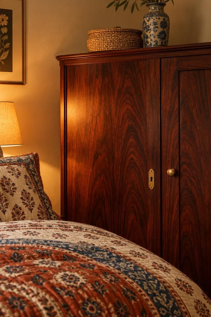
A dark wood armoire anchors an eclectic textile layer because it provides a solid, unpatterned mass for the printed quilt to sit against.
Without that visual weight, a busy quilt can take over the room and leave the eye with no place to rest.
Tall case pieces can overwhelm a low-ceilinged room.
A shorter armoire or one with open or glass upper sections keeps the top of the piece from reaching the ceiling and allows visual space above.
In a room with generous ceiling height, a fuller height works without crowding.
Pattern scale decides how busy a block-print quilt can get before the room tips.
A large-scale print in two or three colors reads as a single graphic statement.
A small-scale print in five colors asks the rest of the room to stay very plain.
The repeated color between the quilt and the armoire's wood tone is what holds the pairing together.
Pulling a warm terracotta or a deeper rust from the quilt and letting it echo the rosewood's reddish-brown keeps the dark wood from sitting apart from the textile layer.
Placement should keep the armoire off the main rug.
A tall case piece sitting on the edge of a patterned kilim interrupts the rug's design and creates a visual stop where the pattern would otherwise flow.
Setting the armoire on bare floor or on a plain border leaves the rug pattern intact.
A woven basket or a single tall vase from a thrifted ceramic decor collection on top of the armoire uses the height that is already there for one more layer of material.
It also keeps the top surface from looking bare, which can make a tall piece feel unfinished.
Sourcing a rosewood armoire in good condition takes patience, since the wood was used mostly on higher-end vintage pieces.
Walnut and teak furniture in a similarly dark tone can achieve a comparable visual effect when rosewood is difficult to find.
Style Blueprint:
- Rosewood or dark walnut armoire as the era anchor
- Indian block-print quilt in a warm palette
- A single repeated color between the quilt and the armoire's wood tone
- A woven basket or ceramic on top of the armoire for height
- Placement that keeps the armoire off the patterned rug
Black Metal Sconces Flanking an Oval Mirror
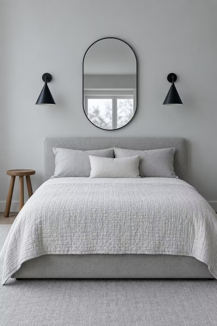
Two matching sconces in the same shape create symmetry that calms a room with a lot of variation elsewhere.
The repetition of the cone or dome form reads as a deliberate gesture, and it gives the eye a predictable pair to settle on when the rest of the room is mixed.
Sconces placed at eye level draw attention to the wall plane rather than to the bed itself.
When the bed is the piece meant to lead the composition, positioning the sconces slightly higher or using smaller shades keeps them in a supporting role.
An oval mirror suits mid century wall composition because it repeats the curved and organic forms that run through the style.
A slim or frameless oval sits quietly between two sconces, while a heavily ornate frame would compete with the metal shades.
Light temperature changes how the whole palette reads.
A cool light source strengthens the graphic contrast of black metal against a pale wall, while a warm source softens the metal and shifts the room toward a cozier feel.
Matching the sconce bulbs to each other keeps the effect consistent.
Warm wood earns its place in a cool scheme by giving the eye a counterpoint.
A single wood stool, nightstand, or frame in walnut or teak keeps the room from reading as uniformly cool, and it ties the cool palette back to the anchor style.
Keeping the wall plain when black metal and an oval mirror already carry the composition prevents the arrangement from feeling cluttered.
Additional decor on the same wall competes with the sconces and dilutes the symmetry.
If the sconces are the only light source at the bed, both sides need them.
A single sconce next to an oval mirror breaks the symmetry that made the arrangement work and leaves one side of the bed without light.
Style Blueprint:
- Two matching cone or dome sconces in black enamel
- Oval or round mirror with a slim or no frame
- Low upholstered or wood bed frame
- A cool neutral wall tone that lets the metal read clearly
- One warm wood object to balance the cool metal
Wool Wall Hanging Above a Slatted Walnut Headboard
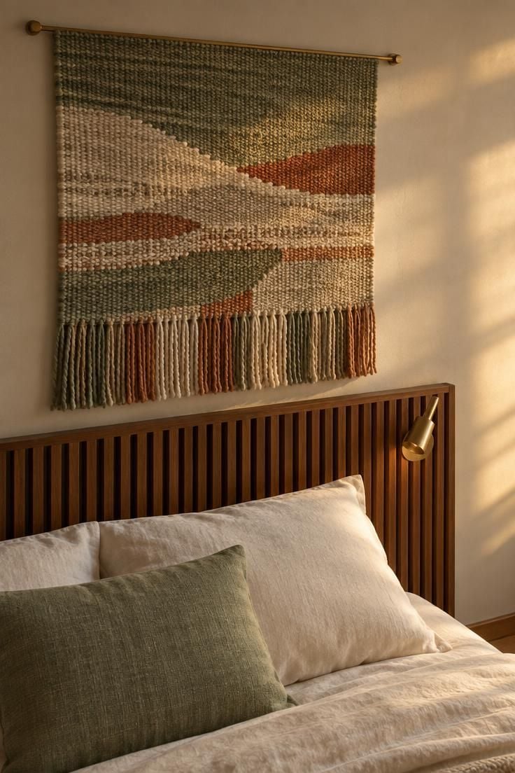
A textile hanging softens the hard horizontal line of a slatted headboard by adding a vertical plane of texture directly above it.
The weave catches light differently from the wood, so the wall gains a second material without introducing a new shape or color family.
Wool hangings collect dust and benefit from periodic airing.
Taking the wall hanging down once or twice a year and letting it sit outdoors in the shade for a few hours freshens the fiber, and a gentle vacuum on a low setting handles routine dust between airings.
Width relative to the bed is the main scale decision.
A wall hanging noticeably narrower than the mattress reads as a poster rather than a wall piece, while one that spans close to the bed's full width gives the composition a clear base.
Stop the hanging short of the ceiling line.
Leaving a band of wall above the textile keeps the piece from feeling pinned to the top of the room and preserves the sense that the bed and the textile below it form their own zone.
Weave direction changes how the wall feels.
A horizontal weave emphasizes the width of the bed and reads as calm and grounded, while a vertical weave adds height and pulls the eye upward.
Either works, but the choice changes the proportions of the room.
Repeating one hue from the wall hanging in the bedding ties the wall piece to the sleeping area.
A sage pillow against cream bedding, or a rust throw folded at the foot, keeps the textile from reading as a separate display.
Keep additional wall decor off this wall.
The wall hanging needs empty space around it to hold its own, and adding frames or a second textile to the same plane crowds the composition and flattens the effect.
Style Blueprint:
- Slatted walnut or teak headboard
- Hand-woven wool wall hanging in a muted, earthy palette
- A single repeated hue between the textile and bedding
- Minimal additional wall decor to let the hanging breathe
- A slim rod in brass or black metal to hold the piece
Design Pro-Tip: Before hanging a heavy textile, hold it up against the wall at different heights and review it from across the room. The right position often turns out to be a few inches lower than the first instinct, closer to the headboard and further from the ceiling.
Rattan Pendant Over a Monstera-Filled Corner
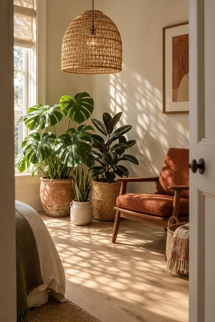
An open-weave rattan or bamboo pendant throws patterned light through its structure rather than a single even glow.
That patterned light lands on the plants and the wall below and gives the corner a sense of movement that a solid shade cannot produce.
Open pendants collect dust in their gaps, and plants need regular watering.
The combination means this corner calls for more routine care than a plain chair and side table would.
A soft brush reaches the pendant's open weave, and a tray under each pot contains drips and makes moving the plants easier.
Plant scale relative to the pendant keeps both elements legible.
Plants that rise close to the bottom of the pendant crowd it and block the light, while low plants leave a clear gap where the patterned light can fall.
Keeping the tallest plant's top well below the shade gives the pendant room to work.
A corner suits this cluster better than a wall center because the plants can lean into two walls and the pendant can sit above the natural pocket they create.
A plant group against a flat wall spreads out horizontally and takes up more floor.
Repeating natural fibers across the corner, in the basket, the stoneware, and the pendant, ties the elements together without needing a shared color.
The materials themselves become the unifying thread.
A vintage chair or stool in the corner gives the plant cluster a purpose.
Without a seat, a group of plants can read as a staging area rather than a part of the room.
The chair turns the corner into a usable spot.
Keep the palette warm without letting it collapse into a single hue.
Terracotta, green, and tan sit close to each other, so one cooler note, in a stoneware pot or a similarly toned throw, gives the eye a place to rest.
Style Blueprint:
- Woven rattan or bamboo pendant with an open or cage form
- Two to four potted plants of varied height
- One vintage chair or stool anchoring the corner
- A woven basket or terracotta pot repeating the natural-fiber theme
- Trays under the pots for easy watering and moving
Velvet and Boucle Mix in a Cool-Toned Seating Nook
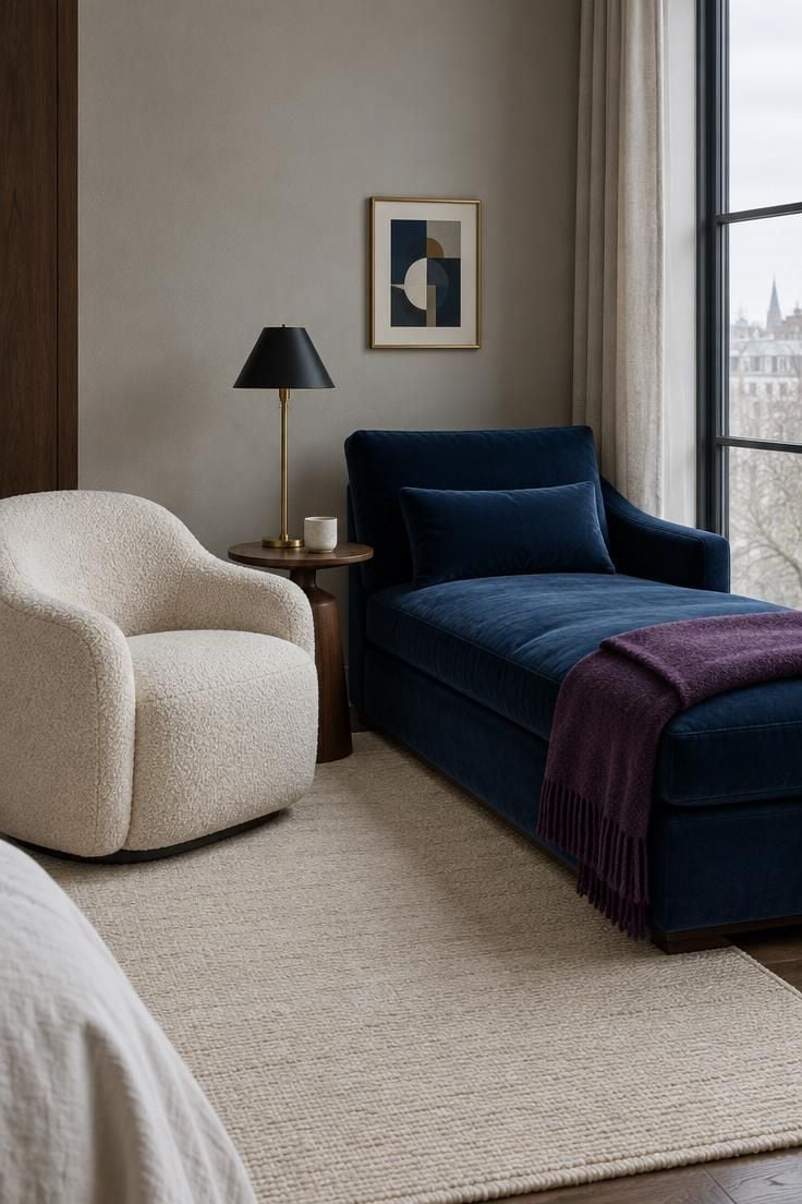
Pairing a nubby boucle with a deep matte velvet sets two textile surfaces against each other so each one reads more clearly.
The looped texture of the boucle catches light in small points, while the velvet absorbs it and holds color in a dense, even tone.
Boucle and velvet upholstery together create the contrast in surface that does the work a color contrast would do elsewhere.
Cool-toned upholstery in sapphire, emerald, or plum gains depth from the way velvet reflects light.
That same quality means velvet shows marks and impressions where it has been sat on, and brushing the nap back in one direction after use keeps the surface looking even.
Walnut between two upholstered pieces gives the seating area a mid century anchor.
Without that warm wood note, a cool upholstery pairing can drift away from the anchor style and read as a separate, purely contemporary arrangement.
Boucle is prone to snagging on jewelry, zippers, and pet claws.
Keeping a small pair of scissors on hand for trimming loose loops, rather than pulling them, preserves the surface and prevents a single snag from running.
A single jewel tone across two large pieces is enough.
Adding a third saturated color in the same seating area starts to compete with the upholstery, so a plum throw or a brass-framed print in a related or neutral tone keeps the palette coherent.
The rug under a seating nook should be wide enough that both pieces sit fully on it, or narrow enough that both sit clearly off it.
A rug that catches only the front legs of both pieces leaves the arrangement looking unsettled.
Keep the side table small and the lamp slim.
In a nook, oversized furniture in the gaps between pieces crowds the seating and blocks the sightline between the two chairs.
Style Blueprint:
- Boucle armchair in a light neutral
- Velvet chaise or sofa in a deep cool jewel tone
- Walnut side table or frame as the warm mid century anchor
- A slim brass lamp with a dark shade
- A flat-weave rug wide enough to ground both pieces
Conclusion
Mid century modern restraint is what the anchor pieces supply, and the eclectic layer carries the personal voice.
What holds them together in every room above is one repeated element, whether that is a color pulled from a rug into a pillow, a warm wood tone running through several pieces, or a shared scale across a mismatched pair.
The warm and cool versions of the same style are separated mostly by wall tone and light temperature, not by a completely different furniture plan.
Borrow one composition at a time, whether that is a layered rug, a mismatched pair, or a textile wall, and let the room grow around it.
Sourcing vintage means accepting variation in finish, size, and availability, so the collected look is built slowly and revised as better pieces turn up.