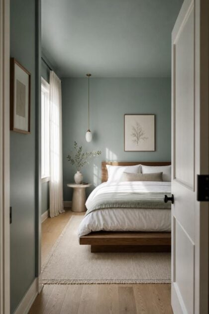
This post may contain affiliate links. If you make a booking or purchase through these links, we may earn a commission at no additional cost to you.
Most small bedroom advice starts with the furniture, swap the nightstand, ditch the dresser, mount the shelves higher.
But the single fastest way to reshape how a room feels has nothing to do with floor plan, it has everything to do with what goes on the walls.
The right paint color can push boundaries back, lift a ceiling, and make an 11-by-12-foot room breathe like one twice its size.
The wrong one does the opposite, and you feel it the moment you open the door.
Why Paint Color Changes Perceived Square Footage More Than Layout Ever Will
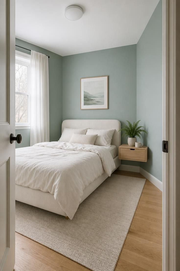
Lighter wall colors can make room boundaries appear farther away, but the effect depends on lightness, contrast, illumination, and the surfaces being judged.
Treat color as one part of a small-room strategy rather than expecting a fixed percentage change.
Research on perceived interior dimensions supports an effect from surface lightness, not a universal 10–15% gain.
That is not a styling opinion, it is a measurable optical effect.
Color temperature changes how the human eye reads depth.
Cool tones, blues, greens, soft grays, sit on the receding end of the visible spectrum, meaning they appear to pull surfaces away from the viewer.
Warm tones, reds, oranges, saturated yellows, do the opposite, pushing walls forward and compressing the perceived volume of a space.
Interior designer Emily Henderson has pointed out that paint color is the most cost-effective square footage you will ever buy.
A $40 gallon of the right shade delivers a spatial shift that no $400 shelving unit can match.
The Cool Tone Advantage and When It Backfires
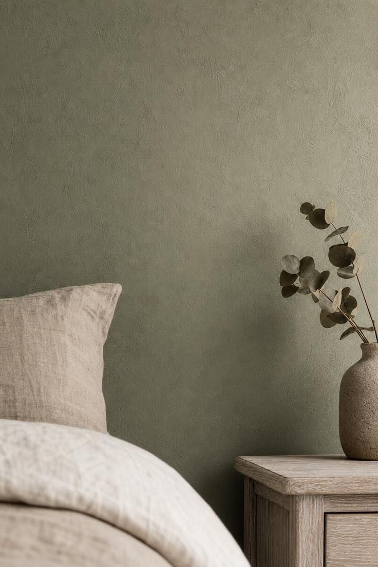
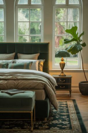
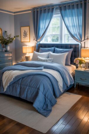
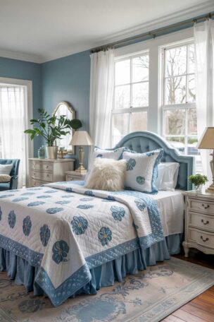
Blue and green bedroom wall color ideas dominate designer recommendations for small spaces, and the reason is rooted in optics, not taste.
Shorter-wavelength colors literally recede from the human eye, creating a sense of distance between you and the wall.
Benjamin Moore Palladian Blue (HC-144) is one of the most frequently specified shades for compact bedrooms, a soft blue-green with enough gray to keep it from reading childish.
Sherwin-Williams Rainwashed (SW 6211) sits in similar territory, a watery sage that works under both warm and cool natural light conditions.
The mistake happens when the shade goes too cool.
A bedroom painted in icy blue without any warm undertone can feel clinical, like a waiting room rather than a place to rest, and that visual coldness makes the room feel uninviting rather than larger.
Warm Neutrals That Add Depth Without Closing In
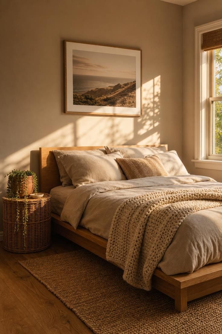
The assumption that warm colors always shrink a room is one of the most persistent myths in small bedroom paint colors advice.
It is also wrong, or at least oversimplified.
Sherwin-Williams named Universal Khaki their 2026 Color of the Year, an earthy neutral that sits between beige and taupe with a subtle green undertone.
In a small bedroom, that shade does not close walls in, it grounds them, creating a cocoon effect that reads as cozy rather than cramped.
Benjamin Moore’s 2026 pick, Silhouette AF-655, goes darker still, blending espresso brown with charcoal undertones.
On a single wall behind the headboard, it adds a sense of forward depth that actually makes the room feel longer.
The rule is not warm versus cool, it is saturation and value.
A warm neutral bedroom in a muted, mid-tone shade will always outperform a bright, saturated warm color when the goal is spatial openness.
Design Pro-Tip: Test your paint color with a 2-by-2-foot swatch on the wall that gets the least natural light. If it still reads as open and airy at 7 PM with no lamps on, it will work all day.
What Bedroom Color Psychology Actually Says About Sleep and Space
Bedroom color psychology has some research behind it, but the evidence is more nuanced than claims that a particular paint color will directly improve sleep.
A large 2025 systematic review of 132 peer-reviewed studies on color and emotion found consistent associations between color and emotional responses.
Blue, green, green-blue, and white were generally associated with positive, lower-arousal emotions, while red, yellow, and orange were more often associated with higher-arousal emotions.
The researchers also emphasized that lightness and saturation matter alongside hue.
Experimental research supports that distinction.
A study examining hue, saturation, brightness, heart rate, and skin conductance found that brighter and more saturated colors were associated with greater arousal, and reported arousal increased from blue and green toward red.
This suggests that the visual intensity of a bedroom palette can matter as much as the color family itself.
The connection between wall color and sleep, however, is less firmly established.
The Sleep Foundation notes that relatively little research directly examines bedroom color and sleep.
Blue and green are commonly associated with relaxation and positive emotions, which can make them practical choices for a bedroom, but that is different from proving that these colors produce longer or deeper sleep.
It is also important to distinguish paint color from colored light. Light exposure can directly affect circadian rhythms and melatonin.
For sleep, the Sleep Foundation recommends a dark bedroom and explains that blue-rich light in the evening can increase alertness and suppress melatonin.
That does not mean a blue-painted wall has the same physiological effect as blue light emitted by a screen or lamp.
For bedroom design, the most defensible approach is therefore to choose colors that create a visually calm environment for you, paying attention to hue, brightness, and saturation, rather than treating any single paint color as a proven sleep aid.
The Monochromatic Trick That Erases Walls Entirely
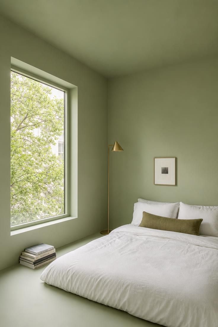
Color drenching bedroom walls, ceiling, and trim in a single shade is the most aggressive small-room strategy in a designer’s toolkit, and also the most effective.
When every surface shares one color, the eye cannot find the seams where wall meets ceiling or ceiling meets corner.
Those visual breaks are exactly what makes a small room read as small, and removing them is like deleting the room’s boundaries altogether.
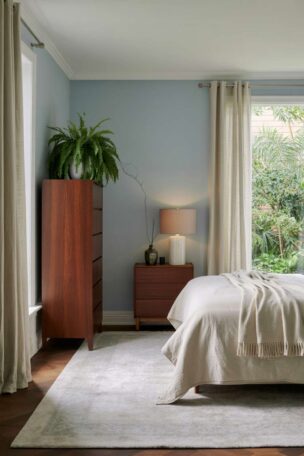
The technique works best in light paint colors for small rooms, particularly soft sage, pale blue-gray, or warm white with enough pigment to avoid looking flat.
A newer variation called color capping uses a slightly lighter or darker shade from the same family on the ceiling, creating subtle dimension without breaking the monochromatic bedroom illusion.
Interior designer Sarah Sherman Samuel has described the effect as making “the architecture disappear so the room can just be about how it feels.”
For the best result, keep the sheen consistent across surfaces, or use eggshell on walls and satin on trim for a barely-there contrast that adds polish without fragmenting the color story.
Accent Walls in Small Bedrooms: The One Rule That Decides If It Works
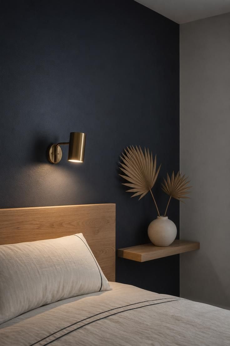
The bedroom accent wall color debate in small rooms comes down to one variable: which wall you paint.
Paint the wall your eye hits first when you enter the room, almost always the headboard wall, in a shade two to three values darker than the surrounding surfaces.
That darker surface creates a focal point that anchors your gaze, and the lighter walls around it recede by comparison, stretching the perceived width of the room.
The reverse approach, painting a side wall dark, pulls that wall forward and makes the space feel narrower.
A bright or saturated accent in a neon or primary color creates a visual stop sign rather than a depth cue, which is why muted, deeper tones work and vivid ones rarely do.
Design Pro-Tip: If your bedroom has only one window, paint the wall opposite the window your darkest shade. Light bounces off the lighter walls and hits the dark surface last, pulling the eye forward and stretching the room visually.
The Five Specific Shades Designers Keep Choosing for Rooms Under 150 Square Feet
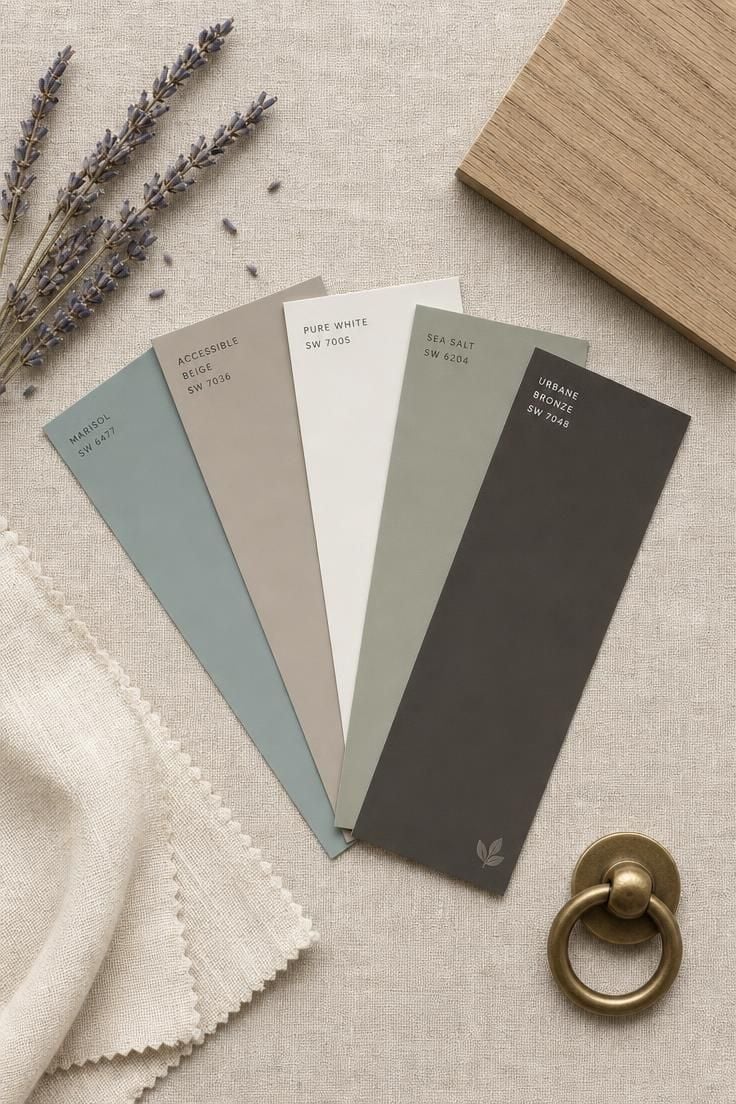
Benjamin Moore Palladian Blue (HC-144) is a soft blue-green with gray undertones that reads airy without feeling cold.
Pair it with warm white trim, like Simply White (OC-17), to keep the room from tipping too cool.
Sherwin-Williams Universal Khaki (SW 6150), their 2026 Color of the Year, is a mid-tone earthy neutral with a green undertone that grounds a room without weighing it down.
It works well with cool tones for bedroom trim in pale gray or off-white to balance the warmth.
Benjamin Moore Calm (OC-22) is a white with enough body to avoid looking stark, carrying a barely-there warm undertone that makes walls feel soft rather than bare.
Use it floor to ceiling for the full monochromatic effect in very tight rooms.
Farrow and Ball Mizzle (No. 266) is a complex sage that shifts between green and gray depending on the light, making it one of the most versatile light paint colors for small rooms available.
It pairs well with natural wood tones and brass hardware.
Benjamin Moore Silhouette (AF-655) is the bold choice, a deep espresso-charcoal that works on a single accent wall to create dramatic forward depth, making the room’s other three walls feel like they stretch further back.
This shade pairs best with the best colors for bedroom trim in warm whites or cream to soften the contrast.
The five shades together cover the full spectrum of approaches, from open and airy to deliberately dark, giving you a starting point no matter which direction your light, layout, and personal comfort pull you toward.
There is no single answer to the best colors for bedroom walls in a small space, but there is a reliable method: match the color’s temperature to your room’s light, its value to your spatial goals, and its undertone to the materials already in the room.
Conclusion
The best color for your small bedroom is the one that matches both your sleep needs and your natural light exposure.
Start by observing your room at three different times of day, morning, midday, and evening, and note whether the light runs warm or cool.
If cool, lean toward a warm neutral or complex white that will not turn icy under overcast skies.
If warm, a soft blue-green or muted sage will balance the golden light and keep the space feeling open.
Paint a large swatch, at least two feet square, on the wall that gets the least direct light, and live with it for 48 hours before committing.
And paint the ceiling too.
That one step, matching walls to ceiling, is the single fastest way to make the square footage you have feel like more than enough.