This post may contain affiliate links. If you make a booking or purchase through these links, we may earn a commission at no additional cost to you.
Bedroom color matters because it changes with the room’s light, orientation, furnishings, and surrounding surfaces.
Morning daylight, afternoon sun, and artificial light can all shift how a paint color appears, so evaluate hue, saturation, undertone, and light together rather than judging a color from a small swatch.
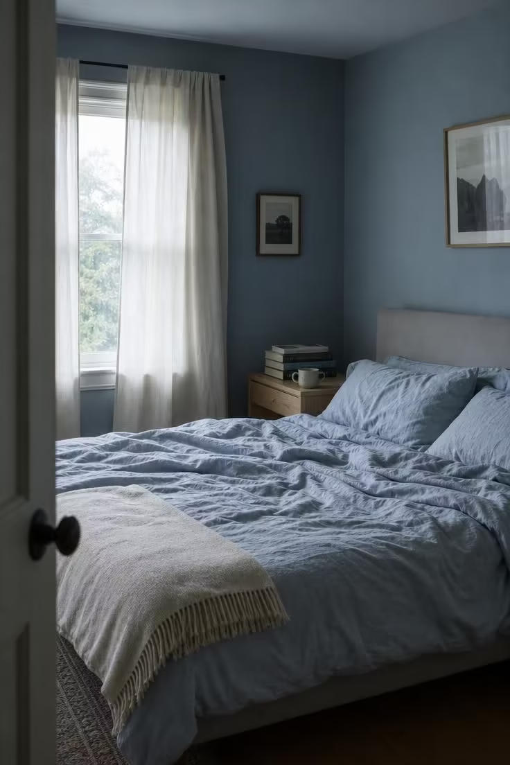
A muted blue may look airy and soft in a bright room but cooler or steely in a space with limited natural light.
Sage can appear warm and earthy beside wood tones or grayer next to cool finishes.
Deep brown can create strong visual depth and contrast, but in a small or dimly lit room it may also make the walls feel more dominant.
The surrounding palette matters as well.
Bedding, flooring, curtains, furniture, and trim can emphasize or neutralize different undertones in the wall color.
Lighter colors generally reflect more available light, whereas darker colors create greater contrast and visual weight.
Neither approach is inherently better; the effect depends on the proportions, lighting, and overall composition of the bedroom.
Before committing to a paint color, test large samples on more than one wall and examine them under the room’s actual morning, afternoon, and nighttime lighting.
Compare the samples directly with the major furnishings and finishes so you can judge how the complete palette works together.
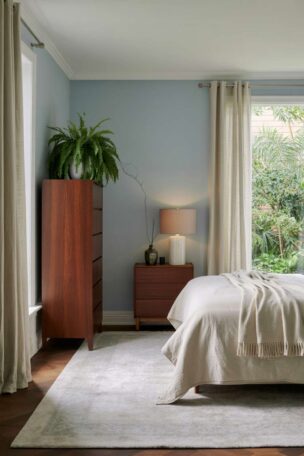
Soft Blues That Quiet a Room Without Making It Feel Cold
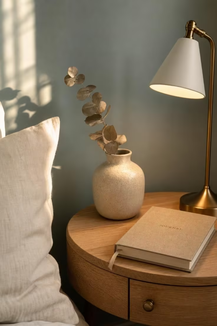
Blue spans a wider emotional range than most people realize.
A pale sky blue can feel airy and weightless, while a deep mineral blue reads as grounded and protective, and the wrong blue can make a bedroom feel like a dental office.
The shades that consistently perform well in bedrooms sit in the middle of that range: think Sherwin-Williams Upward (SW 6239), a gentle blue-gray that color marketing manager Emily Kantz describes as “an uplifting blue that breathes air into any space,” or Benjamin Moore Quiet Moments (1563), a blue with enough green to keep it from going icy.
Undertone is the factor most people overlook.
A green-blue reads warmer and more organic than a gray-blue, which leans cooler and more modern, and a pure blue without much gray or green at all can swing toward the childlike if it is too saturated.
For bedrooms that face north and get mostly cool, indirect light, a blue with a warm gray base keeps the room from feeling chilly even on overcast mornings.
South-facing bedrooms can handle a cleaner, cooler blue because the warm daylight naturally balances the wall color throughout the afternoon.
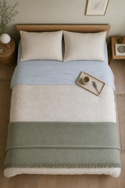
Pairing soft blue bedroom walls with warm materials, like linen bedding in cream or oatmeal, white oak furniture, or brass hardware, prevents the palette from tipping too cold.
Design Pro-Tip: If you love blue but worry about it feeling too cool, paint a test swatch on your headboard wall and your window wall at the same time. The wall that catches direct light will show you the color’s warm side; the shaded wall will show you its cool side. If you like both versions, the color is right for your room.
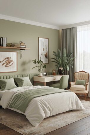
The Sage and Moss Range That Replaced Greige in Designer Bedrooms
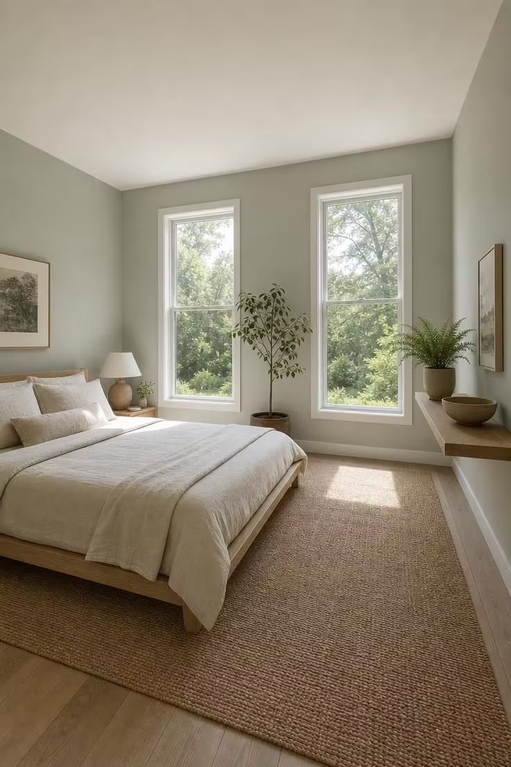
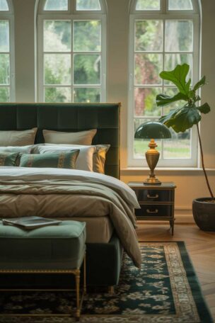
Muted greens such as sage, olive-gray, and moss can work especially well in bedrooms because they introduce color without requiring the visual intensity of a highly saturated shade.
Green spans a useful range for bedrooms because muted sage, moss, and blue-green can behave almost like neutrals while still introducing color.
Gray-green usually reads more restrained, yellow-green warmer, and blue-green cooler.
Test each candidate beside the flooring, trim, bedding, and largest furniture pieces before committing.
The shades gaining the most ground in bedrooms right now are not the bright, leafy greens of a few years ago.
They are the gray-greens, the sage-olive-muted family that sits so close to neutral it barely registers as a “color” at all.
Sherwin-Williams Sea Salt (SW 6204) is one of the most specified calming bedroom paint colors in 2026, a soft blue-green that color consultants recommend for bedrooms because of its ability to shift between blue, green, and gray depending on the light.
Benjamin Moore October Mist (1495), their 2022 Color of the Year, remains a consistent favorite: a sage with enough gray to read as sophisticated rather than earthy.
Behr’s 2026 Color of the Year, Hidden Gem (N430-6A), is a smoky jade that signals green’s graduation from accent color to full-room neutral.
Designer Nadia Watts told Homes and Gardens that green brings “a sense of calm, wellness, and restorative energy, making it especially suited for bedrooms,” and the pairing advice from multiple designers converges on the same materials: linen, white oak, wool, and stone.
Dusty Rose and Muted Mauve: The Colors Most People Are Afraid to Try
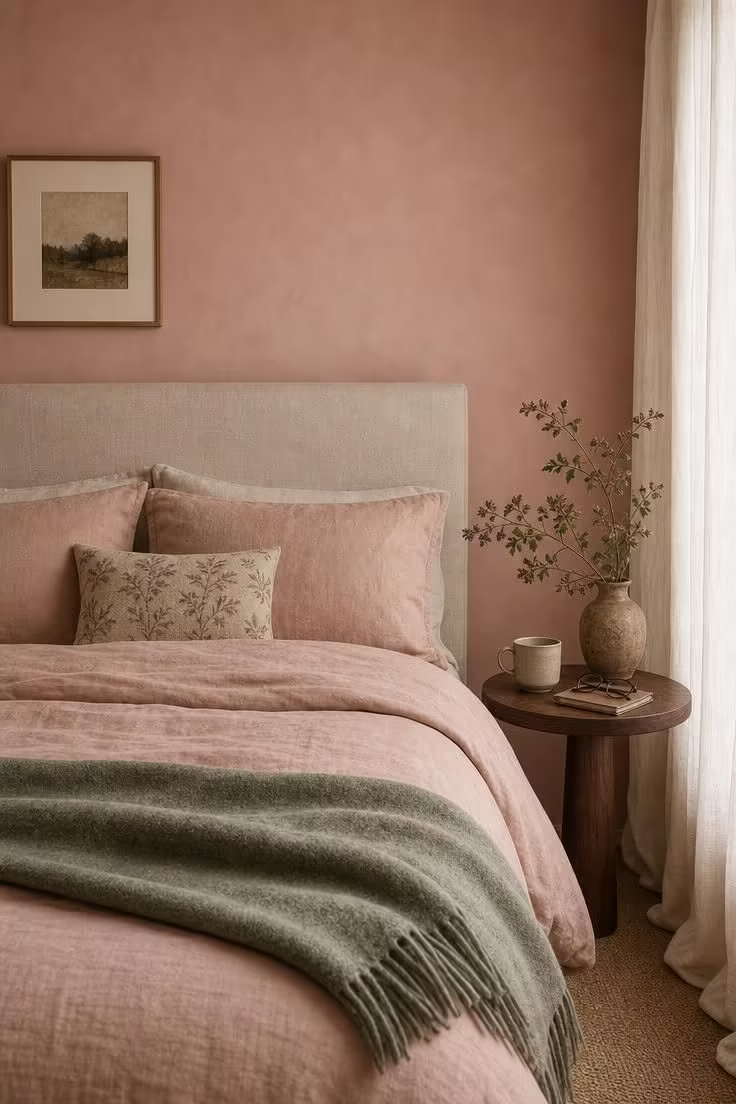
Pink is the color most people dismiss before they try it, and the shades gaining traction in bedrooms right now are nothing like the bubblegum or millennial blush that created the stigma.
Designer Mary Beth Sullivan specified Farrow and Ball Setting Plaster for a bedroom and noted that “people are quick to write off pink as too girly, but this is a rare shade that can actually lean masculine.”
Bobby Berk describes the right dusty rose as “a gray-tinged rose that reads nothing like a traditional pink and everything like a considered, sophisticated choice,” adding that it flatters skin tones better than almost any other wall color, which matters in a room where you see yourself in mirrors regularly.
Benjamin Moore First Crush (CSP-310) is part of their 2026 color trends palette, a tender neutral with delicate blush undertones that sits comfortably beside walnut furniture and warm brass.
A muted lavender bedroom works on similar principles, pulling enough gray into a purple base to keep it from feeling juvenile, and the 2026 trend toward deeper mauve and plum tones (Farrow and Ball, Little Greene, and Backdrop have all released variations) suggests this color family is moving from risk to mainstream.
Design Pro-Tip: If you want to try dusty rose or mauve but are not ready to commit to four walls, paint just the ceiling. A soft pink ceiling reflects a warm, flattering glow onto the room below without announcing itself as a “pink bedroom.” It works especially well in rooms with cool gray or warm white walls.
Why Room Orientation Changes Everything About the Color You Picked
The same paint color will look like three different shades depending on which direction your bedroom windows face, and this is where most paint-chip decisions fall apart.
North-facing bedrooms get consistent, cool, indirect light all day, which amplifies blue and gray undertones in any color you put on the wall.
A soft sage that looked warm on the paint chip can read as a flat gray-green under northern light, which is why choosing the right north-facing room paint color means reaching for warm whites, golden-tinged neutrals, and greens with noticeable yellow undertones.
South-facing bedrooms are the most forgiving: they get warm, direct light for most of the day, which means cooler colors like mineral blue, true sage, and even a clean lavender will stay balanced without going cold.
East-facing bedrooms are bright and warm in the morning but shift to muted and cool by afternoon, which makes warm neutral bedroom tones, like creamy off-whites or soft clay, a reliable choice because they adapt to the light swing rather than fighting it.
West-facing bedrooms get the opposite pattern, with a cool morning and intense golden-orange afternoon light that can make warm colors look uncomfortably saturated by late afternoon.
The practical rule is this: use peel-and-stick samples, or paint swatches at least 12 by 12 inches, and check how each color looks with your flooring, furniture, fabrics, and natural light in the morning, at midday, and in the evening before deciding.
LRV, or Light Reflectance Value, shows how much light a paint color reflects on a scale from 0 to 100.
For bedrooms, colors in the 40 to 65 range often work well because they keep the walls from looking too dark while still adding enough depth and contrast to give the room a layered, finished look.
The Finish Question: Matte, Eggshell, or Satin on Bedroom Walls
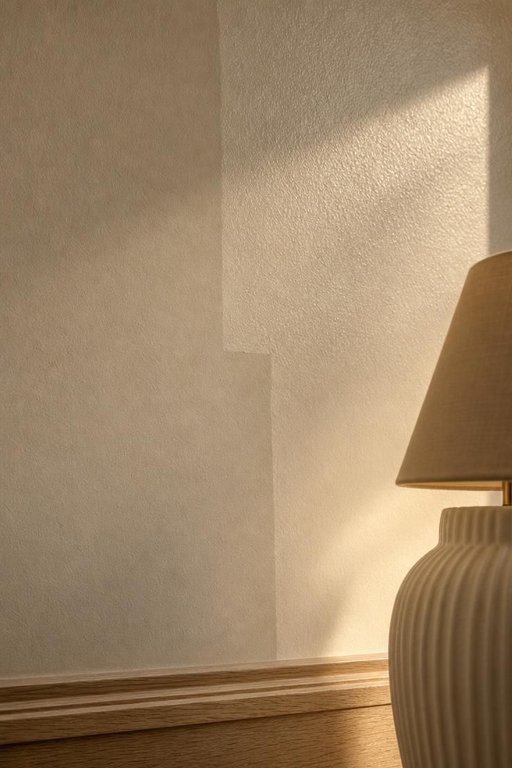
The color you choose matters, but the finish you apply it in changes how that color behaves in your room.
Matte finishes absorb light rather than bouncing it back, which deepens the perceived color and creates a velvety, almost tactile quality on the wall, and this is why designers lean toward matte for bedrooms where mood is the priority.
The tradeoff with matte is that it marks easily, does not clean well with scrubbing, and can soften in humid conditions without proper primer underneath.
An eggshell paint finish sits between matte and satin, offering a subtle pearl-like glow that hides moderate wall imperfections while cleaning more easily than flat paint, and it is the most popular finish for bedroom walls in the United States for that reason.
Satin is the right call for kids’ bedrooms or multi-use rooms that see regular contact, but its higher sheen amplifies bumps, patches, and uneven surfaces in a way that matte and eggshell forgive.
The 2026 trend in matte finish bedroom walls includes limewash and suede finishes that add visible texture to the wall surface itself, creating depth that a standard roller application cannot replicate.
Design Pro-Tip: Whatever finish you pick, ask for a quart of your chosen color in both matte and eggshell and paint side-by-side swatches. The difference in perceived color between the two finishes can be dramatic, especially with greens and blues, where matte versions typically look one to two shades deeper than the same color in eggshell.
What the 2026 Color-of-the-Year Picks Tell Us About Where Bedrooms Are Heading
Every major paint brand has released its 2026 color prediction, and the pattern they form collectively is more instructive than any single pick.
Benjamin Moore chose Silhouette (AF-655), a deep espresso-charcoal that signals the “moody cocoon” direction, where bedrooms wrap you in color rather than simply displaying it.
Behr went with Hidden Gem (N430-6A), a smoky jade green that positions green as a versatile bedroom palette color with neutral versatility, no longer relegated to accent-wall status.
Pantone selected Cloud Dancer, a soft, airy white that represents the opposite end of the spectrum: clarity, space, and visual quiet.
Ruth Mottershead, creative director of Little Greene Paint and Paper, described the broader shift: consumers have moved away from the blue-toned grays that dominated bedrooms for years and are opting for earthier hues with inherent warmth.
Designer Diana Lombard noted that burgundy, a rich and enveloping shade, is gaining momentum as a bedroom color because it “feels both sophisticated and grounding.”
What this means for someone choosing a bedroom wall color right now is that the range of acceptable bedroom tones has widened considerably, and the old divide between “safe neutral” and “bold accent” is collapsing into a middle ground of saturated-but-muted, warm-but-calm, and colorful-but-quiet.
How to Test a Bedroom Wall Color Before You Commit to the Whole Room
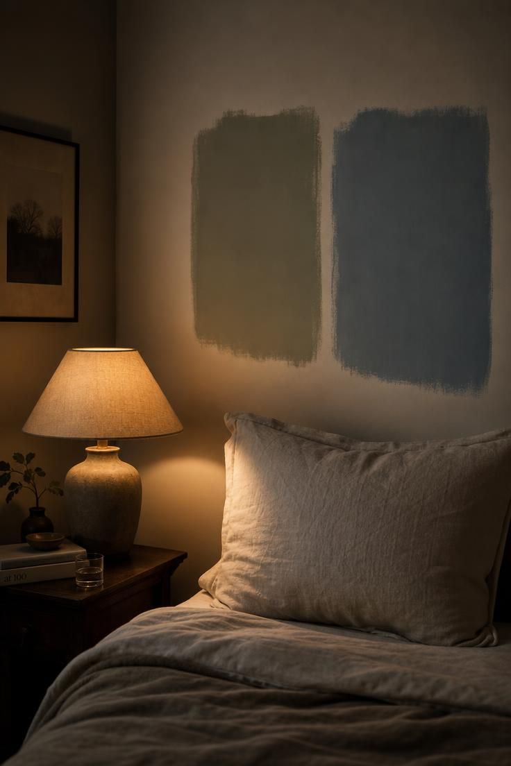
Bobby Berk recommends buying sample pots of your top two or three choices, painting large swatches of at least 12 by 12 inches directly on the wall, and living with them for a minimum of 48 hours, checking the color in morning light, afternoon light, evening lamp light, and full darkness.
Peel-and-stick paint samples from companies like Samplize are a cleaner alternative that you can move around the room, though they are slightly less accurate than paint applied directly to the wall surface because the paper backing changes how light interacts with the pigment.
The wall you test on matters as much as the color itself: paint your swatch on the headboard wall and one adjacent wall, so you can see how the color behaves under both direct and reflected light conditions in the same room.
Check your samples against existing elements that are not changing: the floor color, your bedding, the wood tone of your furniture, and any fixed materials like stone or tile in an adjoining bathroom, because undertone clashes between wall paint and permanent surfaces are the most common source of a bedroom color feeling “off.”
Digital paint visualizer tools from Benjamin Moore, Sherwin-Williams, and other brands are useful for narrowing a long list down to three or four finalists, but they cannot replicate how pigment behaves on a physical wall in your specific light, which is why they should start the process but never end it.
Conclusion
The best bedroom wall color is the one that works with the room’s light, fixed finishes, and the atmosphere you want, not one claimed to produce a specific biological effect.
They are the specific shades that work with your room’s natural light, your existing materials, and the kind of rest you actually need.
Start with the science: cool-to-neutral undertones in the blue, green, or soft warm-neutral range support your nervous system’s ability to wind down.
Then narrow by orientation, test with physical samples on your actual walls, and choose a finish that matches both your aesthetic preference and your practical needs, whether that is the velvety depth of matte, the balanced practicality of eggshell, or the durability of satin for a room that sees heavy use.