This post may contain affiliate links. If you make a booking or purchase through these links, we may earn a commission at no additional cost to you.
Most people approach a combined sleeping and sitting room as a shopping problem.
They assume furniture small enough to fit will make the rest work itself out.
That instinct gets the sequence backward.
The rooms that feel calm and generous are the ones where someone decided, early on, where the sleeping function stops and the waking function starts.
Get that decision right and almost any style of furniture can work.
Skip it and even a beautifully furnished room feels like a storage unit with a bed in it.
The Strongest Signal: Soft Separation Is Replacing the Open-Room Look
The clearest direction in current residential design is a move away from the wide-open combined room and toward gentle, layered division.
The Houzz 2025 U.S. Emerging Summer Trends Report documents this shift, noting that furniture, curtains, shelving, rugs, lighting, and color are being used to define zones without permanently closing anything off.
That finding matters because it reframes the whole problem.
Most of the mistakes in this article are not aesthetic failures.
They are zoning failures that happen to show up as bad rooms.
Micro-zoning is the working method behind the trend, and the current focus on micro-zoning a combined room has made planning feel more practical than aspirational.
Rather than treating a combined room as one big space with a bed at one end, the room is broken into smaller activity zones: sleeping, conversation, work or reading, storage or dressing.
Homes & Gardens describes the standard toolset as open shelving, half-height bookcases, curtains, fluted-glass screens, rugs, and deliberate sofa placement.
None of these require construction, which is exactly why the approach has spread.
Bedroom design is moving in a parallel direction.
The Architectural Digest 2025 Interior Design Forecast points to a more layered, enclosed feeling in bedrooms, achieved through upholstered headboards, wallpaper, layered curtains, and fabric treatments.
In a bedroom with living room area, those same moves can mark the sleeping zone without a single wall going up.
It helps to know which type of combined room you actually have.
A studio apartment is a self-contained dwelling with its own kitchen and bathroom, so the sleeping zone carries the full privacy burden.
Many studio apartment layout ideas begin from that constraint rather than from furniture choices.
A smaller unit sometimes goes by another name, and a bedsit is a rented single room with shared facilities.
An alcove studio has a recess or nook that offers separation without a full wall.
A bedroom living room combination inside a larger home is the most flexible of the group, because the rest of the house absorbs some living-room functions.
The privacy weight changes completely depending on which one you are working with.
The nine mistakes ahead are best read as decisions rather than purchases.
Each one is a fork in the planning process.
Each has a correction that costs more in attention than in money.
Design Pro-Tip: Before buying anything, sketch the room twice, once with all furniture removed and once with only the entry, windows, and doors marked, so zoning decisions follow circulation rather than shopping.
Mistake 1: Treating the Bed as Just Another Piece of Furniture
The bed usually gets placed wherever it happens to fit.
That spot is frequently the first thing visible from the door or the visual center of the room.
This single default choice undermines most of what follows.
A better standard: the bed should read as a deliberate sleeping zone rather than furniture temporarily parked in a room.
That distinction is entirely visual.
It can be created with things you already have access to.
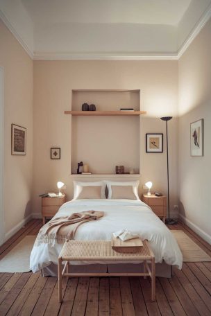
A headboard is the simplest anchor.
A distinct wall treatment behind the bed does similar work.
A pendant or wall sconce hung on the bed's own side of the room separates its lighting from everything else.
A curtain drawn along one side of the bed creates a soft edge.
A rug sized for the bed alone gives the sleeping zone its own floor.
The current cocooning direction in bedroom design offers a useful menu here.
Upholstered headboards, layered curtains, and fabric treatments can visually enclose a sleeping area inside a larger room.
That is precisely the problem a combined space presents.
Layout does more than decoration.
Setting the bed in the farthest corner from the entrance, or tucking it into a recess if the architecture offers one, gives the sleeping zone separation for free.
The tradeoff is access.
Corner placement often closes off one long side of the bed.
Aim to keep at least one long side approachable.
Two-sided access is more comfortable when the room allows it.
Here is a fast test.
Stand at the door and look in.
If you cannot immediately tell which end of the room is for sleeping, the bed has not been given a defined position yet.
Mistake 2: Letting the Sofa Face the Bed Instead of Dividing the Room
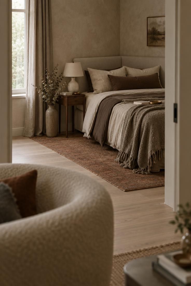
Push a sofa against a wall and point it at the bed, and the two functions end up staring at each other.
Neither one gets a territory.
The room becomes a single crowded space with two activity centers competing for the same air.
The correction is counterintuitive but simple.
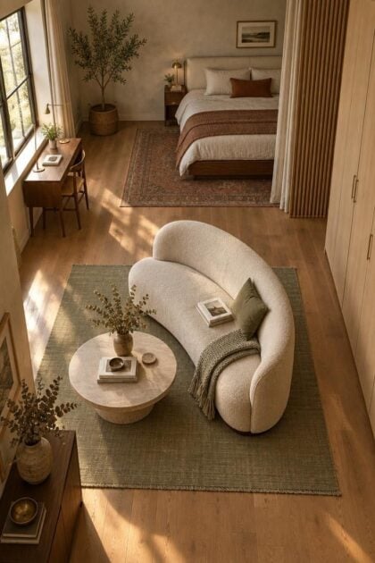
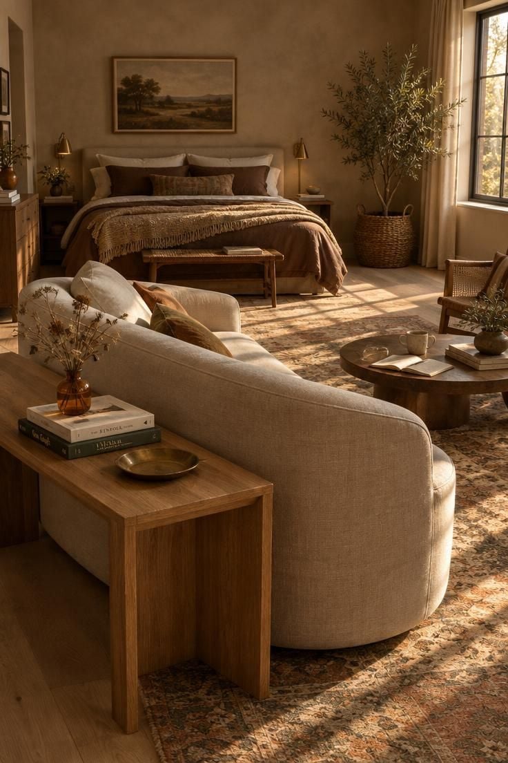
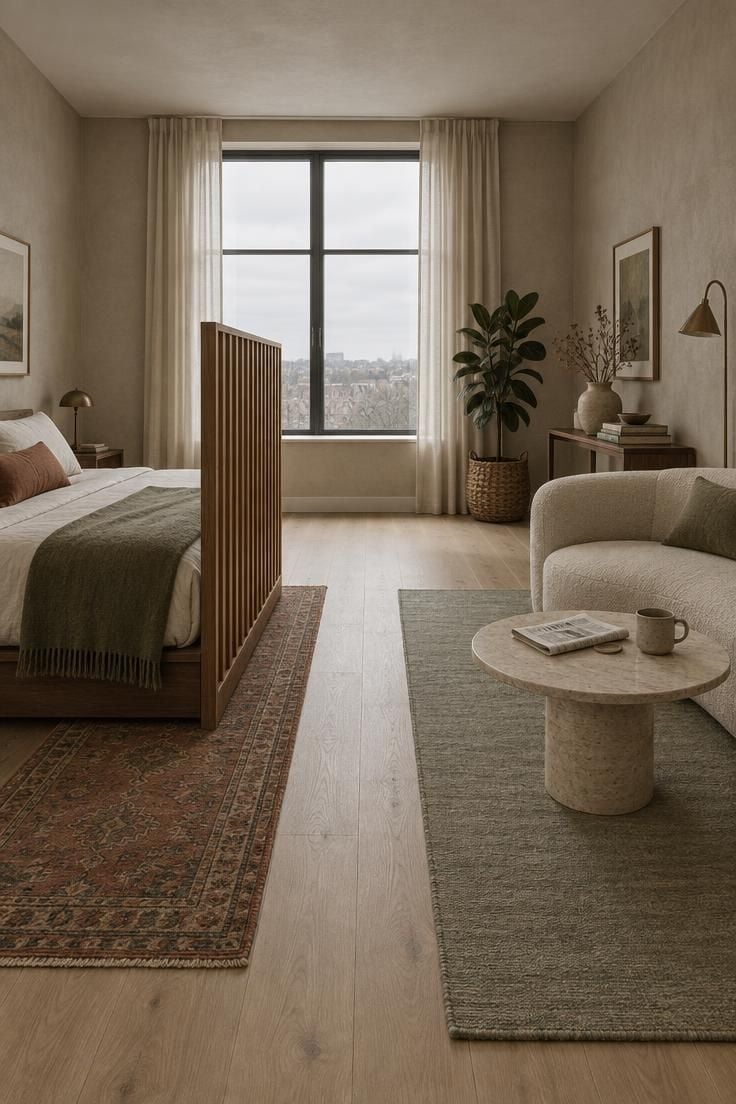
Place the sofa facing away from the bed, and let the back of the sofa become the boundary between zones.
The sofa stops being furniture aimed at something and starts being architecture.
A floated sofa works because it creates a visual and functional edge without blocking daylight.
A solid partition would do the separating job too.
It would also shrink the room and cut the light that reaches the inner zone.
A sofa back does the same work at waist height and disappears from the sightline.
The full working sequence goes like this.
Set the bed away from the main entry sightline.
Float the sofa between the bed and the living area.
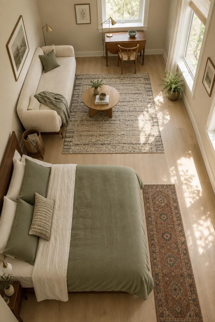
Put one rug under the sofa and a smaller rug or runner near the bed.
Add a curtain, open bookcase, or low divider beside the bed.
Keep one base palette across both zones.
Give each zone a slightly different accent color.
Control the bedroom and living room lighting separately.
Choose furniture with concealed storage so the clutter has somewhere to go.
Once the sofa is floated, the living side has its own logic.
A small coffee table sits in front of it.
A narrow desk or dining table can go near a window without competing for the sleeping zone's floor area.
In a rectangular room, the same principle translates cleanly.
Bed in the farthest corner.
Divider beside it.
Sofa facing the opposite wall.
Tall storage along one wall.
A clear route from the entry to the bathroom or kitchen kept open throughout.
The tradeoff is real.
Floating furniture consumes central floor area, so this approach rewards rooms with width and punishes narrow ones.
In a tight room, a low divider, a curtain, or a slim console behind a small settee may replace the floated sofa.
The decision criterion is physical.
The back of the sofa should be the line a person crosses when moving from waking space into sleeping space.
Mistake 3: Using One Rug, One Light, and One Palette for Two Functions
A single rug spanning the whole floor, a single ceiling fixture, and one flat color treatment erase the distinction between zones.
This is under-differentiation.
It is the most common reason a technically tidy combined room still feels unresolved.
Rugs do the first round of work.
One rug goes under or at the foot of the bed.
A second anchors the living area.
They should complement each other rather than compete, which usually means sharing a palette while differing in scale or texture.
Rugs also soften sound in a single open room, where hard surfaces let noise bounce.
Lighting does the second round.
Layered lighting with separate controls lets warm bedside light operate independently from brighter general and task lighting on the living side, kept at a gentle low level near the bed.
The layers the research supports include bedside sconces or pendants for the sleeping zone, floor or table lamps for the living zone, adjustable task lighting for a desk, concealed or soft lighting for shelving, and dimmable overhead lighting for the whole room.
Palette does the third round.
Keep one coordinated base throughout.
Then let each zone carry a slightly different accent.
The room reads as intentional rather than divided.
The current warm direction in interiors fits this approach well.
Beige and mushroom, terracotta, olive and sage green, cocoa brown, muted rust, deep blue, and dusty rose are all documented in the Houzz 2025 U.S. Emerging Summer Trends Report.
The same report tracks color drenching, warm palettes, and vintage-influenced rooms.
One test tells you whether the zoning has taken hold.
Switch off a single lamp.
If the room collapses into one undifferentiated space, the lighting has not been zoned yet.
Design Pro-Tip: Wire zones on separate switches or smart plugs at the start. Retrofitting separate bedside and living-area control later is far more trouble than deciding it before the first lamp is placed.
Mistake 4: Choosing Oversized Furniture That Crowds Both Zones
Bringing in seating, tables, or storage scaled for a dedicated living room and a dedicated bedroom is the fastest way to break a combined space.
Neither function ends up with room to operate.
The room stops reading as two zones and starts reading as one overcrowded zone.
The research is direct on this point.
Furniture scaled to the room, fewer and appropriately sized pieces, and zoning rather than crowding form the core recommendation.
What to look for instead runs toward dual-purpose furniture for small rooms and compact pieces.
A daybed.
A small-scale sofa.
Nesting tables.
A drop-leaf desk.
A console table that doubles as a workstation.
Storage ottomans.
These give the room multiple personalities without demanding floor area for each one.
Storage scale matters just as much.
Vertical and perimeter storage preserves central floor space: tall shelves and wardrobes along walls, under-bed drawers, wall-mounted shelves, over-door organizers.
The middle of the room stays open for the activities that define it.
There is a simple physical test.
If a person cannot cross the room from the entry to the window without turning sideways or stepping around furniture, at least one piece is oversized.
Measure the walkway before the purchase, not after.
Mistake 5: Skipping Storage, Then Watching Clutter Take Over Both Zones
Clothing, bedding, work equipment, and entertainment items compete for the same surfaces in a combined room.
The overflow predictably lands in the most visible place.
Storage pressure is one of the acknowledged disadvantages of combining sleeping and living functions.
Open storage is riskier here than in a dedicated bedroom.
There is no door to close on the mess.
Everything the room contains is on display at all times, including the things that have no natural home.
The concealed-storage approach is the answer.
Baskets, boxes, drawers, and cabinets absorb small items.
Some surfaces get deliberately left clear.
Clear surfaces are not empty.
They are the visual breathing room that makes the room feel composed.
Specific storage categories worth planning for include under-bed storage, built-in cabinets, floating shelves, storage benches, wardrobes with sliding doors, ottomans with hidden compartments, hydraulic-lift bed storage, and fold-down desks.
Each one either hides something or uses space that was otherwise idle.
Storage placement reinforces the boundary between functions when it sits at the perimeter.
A run of tall storage along one wall gives both zones a shared spine and keeps the middle of the room open.
There is a limitation worth naming.
Built-in and wall-mounted solutions suit owners making long-term changes.
Renters are generally better served by freestanding shelving, storage benches, and furniture with concealed compartments that can move when they do.
The decision criterion is behavioral.
If the living-area seating cannot be used without first moving personal items out of the way, storage capacity is the problem.
Tidying will not fix a shortage.
Mistake 6: Ignoring Circulation, Doorways, and What Has to Move
Furniture arranged purely by appearance blocks things.
Doors, drawers, wardrobe fronts, radiators, vents, windows, and the walking route from the entry to the bathroom or kitchen are all vulnerable to a layout chosen on looks alone.
The research offers a practical target rather than a rule: roughly 30 to 36 inches for a main walkway where the room allows it.
Treat that as a design guideline.
Adjust it to the room you actually have.
Access checks make a layout genuinely work.
Wardrobe doors and drawers need to open fully.
Windows need to be able to open.
The passage between sofa and coffee table needs to be usable rather than a tight squeeze.
Behind seating, leave enough room to move comfortably instead of pressing furniture flat against the wall.
A combined room has one specific circulation requirement that a dedicated bedroom does not.
A clear route must be preserved from the entry to the bathroom, the kitchen, or the windows, whichever the room connects to.
That route is the spine of the layout.
Everything else arranges around it.
Some safety-relevant limits belong in the plan rather than the fine print.
Keep exits clear.
Avoid overloaded outlets.
Keep curtains and screens away from heaters and cooking appliances.
Do not use improvised dividers that block escape routes.
Anything beyond furniture arrangement, including whether a room can legally serve as a sleeping space, depends on local requirements worth confirming directly.
The test is physical and specific.
Walk the full route from the door to the window and then to the bathroom door, carrying something.
If that walk requires a detour, the layout needs revision.
Design Pro-Tip: Tape the proposed furniture footprints on the floor with painter's tape and live with them for a week before committing. Circulation problems show up in days, not in photographs.
Mistake 7: Assuming a Divider Has to Be a Wall
The instinct to solve a combined room with construction is understandable and usually unnecessary.
The goal is not always to build a wall.
Visual and functional separation is often enough.
The range of partial-separation options is wide.
Half-height walls.
Glass partitions.
Slatted wood screens.
Sliding doors.
Built-in wardrobes used as a divider.
Raised platforms with drawers underneath.
Open bookcases that admit light while breaking sightlines.
Ceiling-mounted curtains.
Each offers a different balance of privacy, light, and permanence.
The curtain and transparent-divider approach deserves particular attention in a bedroom living room combination.
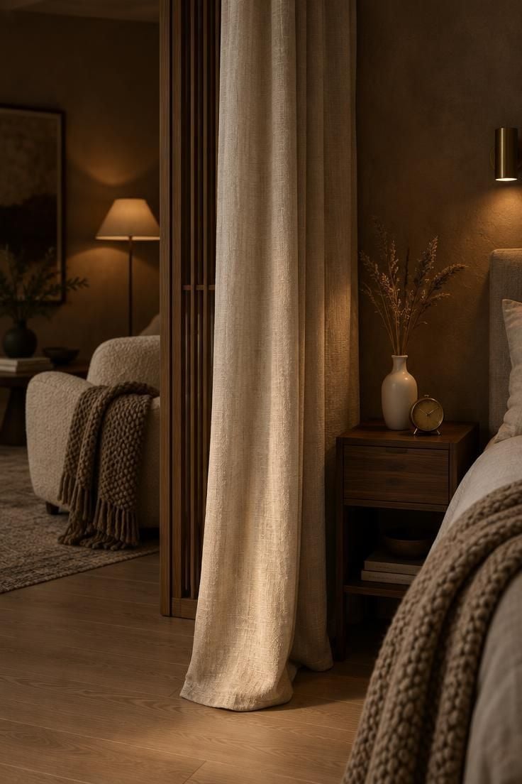
A ceiling-mounted curtain provides privacy at night and opens during the day.
The room can be one space or two depending on the hour.
Fluted, reeded, or smoked glass offers a similar effect while preserving light.
That matters in any room where the sleeping zone sits away from the window.
Renters have practical options here.
Curtains, folding screens, freestanding shelving, rugs, and removable wallpaper can all be installed and removed without permanent changes.
They are the most flexible choices for anyone who does not own the space.
The tradeoffs are worth knowing in advance.
Screens and transparent dividers offer less acoustic separation than solid partitions.
Dark or solid dividers reduce the daylight that reaches the inner zone.
A curtain room divider for bedroom use can be opened to restore the daylight, which is exactly why the approach has become so common.
One more consideration applies to any soft separation in a bedroom: the divider itself can carry a texture or weave that ties the sleeping zone to the rest of the room rather than looking like a temporary fix.
Mistake 8: Building the Room Around One Function's Comfort
Asymmetric design is easy to fall into.
Seating depth, lighting brightness, temperature, and fabric choices all get optimized for the living function.
The sleeping function inherits whatever is left over.
The room then works beautifully for hosting and poorly for rest.
Acoustics are the first tradeoff to consider.
Sound reflects easily in a single open space.
Soft furnishings reduce that reflection: curtains, rugs, upholstered furniture, bookshelves, and fabric wall panels all absorb some of it.
A combined room with hard surfaces throughout will sound hollow.
The sleeping zone will hear every chair scrape.
Ventilation and air quality are the second.
An open-plan sleeping and living space needs good airflow, especially where cooking happens.
Windows, exhaust fans, or mechanical ventilation where available all help.
Keep the bed away from the cooking area.
Keep fabrics clear of strong cooking odors, which cling to textiles.
Temperature is the third.
The sleeping area may need a different temperature or light level from the living area.
The two functions do not always want the same conditions at the same time.
Place the bed away from a heater and away from a strong draft.
The decision criterion is honest and quick.
If the room works well for a movie night but badly for falling asleep, the living function has been over-served.
Adjust the balance rather than the furniture.
Mistake 9: Copying a Photo Instead of Solving the Room
Recreating a styled reference, architecture and all, is the last mistake and the most tempting.
Photographed rooms come with features a given space may not have: an alcove, a structural opening, or enough width for a floated sofa.
The composition solves that room, not yours.
That is why the copy tends to fail.
The arrangement depends on conditions that were never part of the plan.
Removing them leaves a collection of objects without a structure.
The redirect is from products to principles.
A defined sleeping zone.
A comfortable seating zone.
Adequate storage.
Good ventilation and lighting.
A clear circulation path.
Some ability to conceal or screen the bed.
Furniture scaled to the room.
Minimal visual clutter.
Those eight conditions apply regardless of style, budget, or architecture.
Some styles carry the load more easily than others.
Modern, Scandinavian, minimalist, and Japandi approaches work well in combined rooms because they emphasize simplicity, functionality, and uncluttered space.
A small bedroom with seating area suits that emphasis directly.
Before adapting any reference, identify the single feature that makes it work.
If that feature is missing from your room, borrow the principle rather than the arrangement.
The principle travels.
The specific composition does not.
Why This Is Landing Now, and What to Do About It Next
The conversation around combined rooms has shifted.
The question used to be how to fit everything in.
It is now how to make two functions feel intentional, which is why soft separation and micro-zoning have become the dominant direction for 2025 and 2026.
The Houzz 2025 U.S. Emerging Summer Trends Report tracks that movement across micro-zoning, warm palettes, layered lighting, natural materials, and vintage character.
Bedroom design has moved in step.
The layered, enclosed direction documented in the Architectural Digest 2025 Interior Design Forecast gives combined rooms a way to mark the sleeping zone without construction, using upholstery, wallpaper, and textile layers instead of walls.
The practical driver is flexibility.
Multifunctional rooms and adaptable layouts are in demand.
Dual-purpose furniture is now expected rather than exceptional.
Sofa beds, daybeds, storage beds, lift-top coffee tables, modular sofas, drop-leaf desks, and swivel chairs all serve rooms that need to change function through the day.
Bedroom living area zoning works best when those flexible pieces are placed along the edges of each zone rather than in the center.
Materials and character have shifted too.
Warm palettes, natural wood, woven shades, linen, wool, boucle, rattan, cane, textured plaster, vintage lamps, and mixed wood tones have replaced the flat, generic-minimalist look.
That direction suits a bedroom with living room area because warmth and texture can distinguish zones without adding visual weight.
The order of decisions matters more than any single choice.
Zoning first.
Circulation second.
Storage third.
Lighting control fourth.
Furniture scale fifth.
Palette and materials last.
Working in that sequence prevents the common situation where a beautifully chosen sofa has nowhere to go.
The takeaway is to narrow the scope.
Pick the two or three mistakes from this list that match the room's actual constraints.
Correct those.
Resist solving all nine at once.
Then start with the first thing tomorrow: stand at the door, look in, and decide which end of the room is for sleeping.
Everything else follows from that answer.